
There’s a lot to cover on Wednesdays. We should know, as collectively, we read an insane amount of comics. Even with a large review staff, it’s hard to get to everything. With that in mind, we’re back with Wrapping Wednesday, where we look at some of the books we missed in what was another great week of comics.
Let’s get this party started.
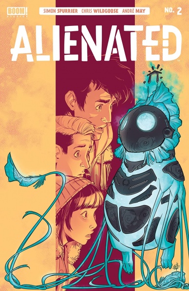
Written by Simon Spurrier
Illustrated by Chris Wildgoose
Colored by André May
Lettered by Jim Campbell
Reviewed by Kobi Bordoley
Has BOOM! Studio struck gold with “Alienated” #2? From Spurrier’s superb script to the art team’s synchronized perfection, it’s certainly looking like it. “Alienated” follows three teenagers–Samuel, Samantha, and Samir–whose lives become intertwined after they accidentally adopt an adolescent alien. Given that premise, it’s easy to imagine how the story could pan out. But “Alienated” #2 is a lot darker than it is zany, and all expectations are out the window. And judging by the second issue in the series? It’s going to be awesome.
“Alienated” #2 works so well because Spurrier (“The Spire,” “Godshaper,” “Motherlands”) is an insidious writer — in the best way possible. What we mean is that he pricks you with an idea, and then lets that theme spread through the story, in dialogue, plot beats, in background action. In “Alienated” #2, the theme is hubris. We see it from different angles and in different shades. Chelsea, the class socialite, and hopeful influencer is self-obsessed to a nauseating degree. But at the same time, Samuel, the ever woe-is-me, down on my luck protagonist, fails to recognize that he too is prone to selfishness and the desire for power. Spurrier’s storytelling is smart, and he captures the anxiety of small-town high school while updating its dilemmas to the 21st century. Oh, and he’s also juggling three major characters, whose stories have only begun to unfold. By the end of “Alienated” #2, you almost forget that there’s an alien or any sci-fi elements involved. The drama is that good.
That’s not to say the script is always crystal clear. With three people speaking out loud and through telepathic communication, sometimes in the same panels and scenes, things get muddled. Luckily, these moments are brief, and few and far between — because the art team here puts in work. While each deserves praise, Campell especially adds flair to the story. His lettering is pristine, and the font work in “Alienated” #2 goes a long way in upping the story’s clarity. Really, this is a clean read.
It looks like “Alienated” has found its footing in the second issue. While saying this is an auto-add to every pull list would be over the top — we will say that if you’re in quarantine and looking for a smart, captivating comic, you could do a lot worse.
Final Verdict: 9.1 – Teenage dreams mixed with sci-fi nightmares, tuned for the 21st century. Gen Z is not okay!

Written by Greg Pak
Illustrated by Ario Anindito & Robert Gill
Colored by Rachelle Rosenberg
Lettered by VC’s Joe Sabino
Reviewed by Joe Skonce
One of the most impressive things about “Atlantis Attacks” #3 is Pak’s ability to balance a comic with an incredibly crowded cast. For the majority of the issue, there are at least one or two panels per page that feature yet another character introduction. In other books, it might feel like too much to juggle, but Pak is able to give each character a beat that feels significant enough to have them there, yet not have them do so much that it becomes overwhelming. But the real meat of the issue lies in the presentation of the central conflict between the Atlantians and the Sirenas. In “Atlantis Attacks” #3, Pak takes a fairly straightforward story and elevates the conflict.
With each subsequent issue of “Atlantis Attacks,” Pak is able to add new layers of tension. In issue 2, he establishes a growing conflict between both Atlas teams. The thing is, both teams fell in line behind their leader. In “Atlantis Attacks” #3, the conflict between Atlantis and the Sirenas began to split those bonds. The highlight of the issue comes when both sides tell the same history of the dragon Kala Teer. While the history is the same, to one side it is a story of triumph in keeping their home safe and to the other, it is the slaughter of their people. There are similarities to Pak’s other book, “Ronin Island,” which shows how things like history and ideology are easily manipulatable. In the case of Atlantis Attacks, it effectively puts the large cast of characters in conflict with one another.
Continued belowThe art throughout “Atlantis Attacks” #3 is good, but the best part of the book comes when we are told the history of the conflict of Kala Teer. Ario Anindito and Robert Gill create two distinct looks for both cultures’ versions of history. Atlantis’s art looks reminiscent of cave paintings and the Sirena’s art looks like mosaic flooring. In both cases, they create distinct visuals that reinforce the respective stories. It’s good visual storytelling, not only showing how history is portrayed, but how other more subtle things like the mediums used to tell history can impact the overall stories.
“Atlantis Attacks” #3 continues to escalate the story in meaningful ways. With every turn, the original promise of Pan becomes more suspect, the role of the Agents of Atlas less heroic. It seems to be building to something big and I’m excited to see where Pak goes next.
Final Verdict: 8.2 – “Atlantis Attacks” #3 is Pak at the top of his game, allowing him to build an exciting and messy conflict through top-notch visual storytelling.
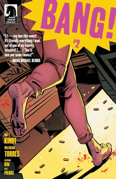
Written by Matt Kindt
Illustrated by Wilfredo Torres
Colored by Nayoung Kim
Lettered by Nate Piekos
Reviewed by Matthew Blair
The superhero genre is a difficult genre to introduce anything new or exciting. In an industry that has given us nearly every origin story, every power set, and every motivation for dressing out and saving lives any book that tries to introduce a new hero is going to have to be very, very good.
Thankfully, “Bang!” #2 is a very good comic.
“Bang!” #2 comes courtesy of superstar writer Matt Kindt, and his talents are on full display here. On the surface, “Bang” #2 is a standard superhero story where the main hero has three inhalers that either give him increased reflexes, enhanced intellect, and super strength. The catch is that these inhalers come to the hero through the mail from a mysterious corporate source. Also, there is a mysterious terrorist organization that seems committed to cause as much chaos as possible, and strange novelizations of his adventures that seem to be written before he lives through them.
Long story short, if you’re a fan of Kindt’s “Mind Mgmt” then you’ll like this comic.
As for the art, “Bang!” #2 looks like a book for a much younger audience. Artist Wilfredo Torres has a minimal style that focuses on the humans in the story and leaves very little room for background and environments. It could be safe to say that it almost looks like a “Tintin” book, but with much more violence and swearing. It’s probably not the best style of art for this type of story, but it does allow the story to have very clean action and simple faces that allow for very clear emotion.
“Bang!” #2 is proof that there is still room in the superhero genre for new characters and stories, provided that it be created by an artistic team that is incredibly talented and capable.
Final Verdict: 9.3 – A deceptively simple superhero story with an engaging mystery, interesting rules, and very well drawn and clear action.

Written by Tom Taylor
Illustrated by Karl Mostert
Inked by Trevor Scott, Neil Edwards, & Karl Mostert
Colored by Rex Lokus
Lettered by Saida Temofonte
Reviewed by Quinn Tassin
When your Boomer parents and Gen Z siblings and cousins ask you what the worst-case scenario is if they go outside right now, just hand them the accidentally timely “DCeased: Unkillables #2” answers that question. The miniseries follows the non-zombie heroes and villains of the DC universe who got left behind on the zombie-infested earth of “DCeased. The heroes- Red Hood, Commissioner Gordon, and Cassandra Cain, try to protect sick children at a hospital while the villains- Lady Shiva, Mirror Master, Deathstroke, Vandal Savage, Ravager, and Bane, hideout on an island to survive.
Everything inevitably goes wrong of course- the island gets attacked and the villains take refuge in the hospital. They go further south when Mirror Master is zombified after sending everyone to safety. He attacks children, then turns Bane, who knocks down the wall keeping the apocalypse out. It’s just as overwhelmingly bleak as “DCeased” was but adds a sprinkling of quirkiness to the mix. The issue is at its best when hard decisions have to be made. Think of Gordon not telling the kids that arcs left Earth without them or the Unkillables shooting up a room of zombified sick people.
Continued belowThe art team does awesome work here, capturing the terrifying, gory reality of a zombie apocalypse with gusto. The image of an undead Wonder Woman attacking Vandal’s island and tearing him in half is jaw-dropping, unforgettable stuff. The same goes for zombie Mirror Master’s chilling assault on the hospital where he turns Bane and eats a child. The team also captures hand to hand combat incredibly well; Shiva’s fight with Cassandra and Jason is simple but dynamic which makes for a thrilling, effective couple of pages.
“DCeased Unkillables #2” is yet another great entry in Tom Taylor’s superhero zombie dystopia. It’s a relentlessly sad affair- one that features child death and quite a few doses of existential dread. At the same time, it’s oddly fun. We see Bane befriend a dog! Another villain teaches kids about witty things to say when beheading zombies! Solomon Grundy wears a centipede tee-shirt that says “I am a tree lobster”! It’s quite the companion to the real world we’re living in right now.
Final Verdict: 8.0 – The Unkillables do not live up to their title in the simultaneously bleak and fun “DCeased: Unkillables #2”

Written by Kelly Thompson
Penciled by Chris Bachalo, Irene Strychalski
Inked by Wayne Faucher, Al Vey, Livesay, Jaime Mendoza, Tim Townsend, Derek Fridolfs, Irene Strychalski
Colored by David Curiel, Rachelle Rosenberg
Lettered by VC’s Joe Sabino
Reviewed by Luke Cornelius
In “Deadpool” #4, the Merc with a Mouth’s first arc as King of the Monsters comes to a satisfying close. Deadpool’s battle with Kraven the Hunter continues through the issue and Thompson fills the sequence with humorous exchanges, particularly with some deliberately clunky dialogue being given to Kraven. Thompson rarely gives Deadpool material that falls flat. Moreover, Thompson’s script delves beneath the Deadpool exterior too and exposes the pain that Wade always feels, particularly in the funeral scene. Wade’s problem of those close to him getting killed or in danger may be a trope of the superhero genre, but it nonetheless gives a little bit of character to the Merc. By the end of the issue, the story of Deadpool reigning over the monsters isn’t over, but the change in his attitude and the monsters’ towards him give a sense of closure to the arc and open up more possibilities for the future of the series.
Bachalo’s pencils ensure all of the fight sequences flow smoothly, with large numbers of the book’s pages featuring variations in their panel layouts. The range of panel sizes and structure not only makes the book feel dynamic but tells the story effectively. That being said, in the latter half of the fight when Deadpool’s army starts to arrive, there’s a repeated composition that draws attention to the repetitive nature of the fight which would have otherwise gone unnoticed. Bachalo’s range of facial expressions is limited by the book’s script, although the sheer bewilderment that he portrays on Kraven when he sees Kohlaab is fantastic. The five inkers involved in the main story all continue to work together seamlessly while Curiel’s colorwork is consistent. Sabino makes lettering the book look easy by fitting large passages of dialogue into small panels without hampering the visuals or the delivery of any of the jokes.
At the end of the issue, there is a two page ‘Wade & Jeff’ story that is technically sound and delivers a final, funny payoff before the close of the issue. This reviewer hopes that these additional stories remain throughout the series to give much-needed page time for Jeff the Landshark.
Overall, “Deadpool” #4 has an action-packed script, filled with jokes that rarely miss the mark, and also touches on the character beneath the mask, with artwork that gives the book a dynamic feel.
Final Verdict: 7.1 – “Deadpool” #4 gives the opening arc of the series an entertaining and satisfying end.

Written by Alejandro Arbona
Illustrated by Jim Towe
Colored by Diego Rodriguez
Lettered by Clayton Cowles
Reviewed by Christa Harader
“Doctor Tomorrow” #2 sees the two Barts meet the Timewalker, assemble a universe-wide team of superheroes, explain inter-dimensional travel and come face to face with Hadrian. What could possibly go wrong?
Continued below“Doctor Tomorrow” feels like a very accessible book, and that’s not a bad thing. Towe’s art is cartoony and sharp, with good line control and expressive detail. Arbona’s scripting is amusing, interesting and simple without feeling too scraped together or bare bones. The dialogue between younger Bart and older Bart is believable and funny, which is a feat unto itself. Working in slang or media references in comics is a painful experience 99% of the time, and “Doctor Tomorrow” does a good job by using it sparingly. Rodriguez’s colors are poppy and bright enough to complement Towe’s line without losing some of the moodier shadows the book needs to maintain its tension. And, Cowles’s lettering suits, with a crisp font, minimal balloon padding, and excellent placement.
Overall, “Doctor Tomorrow” #2 does what a second issue needs to do: kick the plot along and build out some of the more interesting concepts of the first, while setting up a conflict for issue #3 to spotlight. We expect high action next time around with the assembled cast, but we don’t miss it thus far because the pacing feels organic and steady.
Final Verdict: 7.0 – “Doctor Tomorrow” #2 is a solid, enjoyable second issue that sets up some good plot points for issue #3.
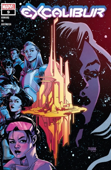
Written by Tini Howard
Illustrated by Marcus To
Lettered by VC’s Cory Petit
Colored by Erick Arciniega
Reviewed by Michael Govan
I have no interest in Harry Potter. Lord of the Rings literally put me to sleep. Suffice it to say, I’m not a ‘magic’ guy…but I love “Excalibur”. The exploration of magic through mutantkind/Krakoa’s perspective has been absolutely fascinating and continues to be in this issue.
There’s a lot of content packed into the pages of “Excalibur” #9 and writer Tini Howard is expertly juggling multiple plot points. The team of magic mutants is dealing with a brand-new omniversal threat while their enemies in the Coven Akkaba scheme in the shadows. Furthermore, this issue features three different magic rituals, all distinctive and unique in their own way. One is simply transcribed on a data page and it’s no less engaging than the other two.
Another strength of this issue is the small character moments found throughout. Tini Howard gives each character a unique voice that is true to them. Apocalypse is a sage mentor and cunning Chessmaster behind the scenes. Saturnyne leaves an impression in just a few short pages while Jubilee is a loving and protective mother to Shogo. Gambit remains distrustful of Apocalypse and lovey-dovey with Rogue while Betsy is still a bit insecure in her new role as Captain Britain.
Artist Marcus To’s contributions to this issue cannot be stressed enough. Art can help or hinder a title and here it definitely helps. There are so many great moments. I personally loved Saturyne and her priestesses, especially how they contrast against Coven Akkaba. One group is menacing and bloody, meeting in shadow while the other is celestial and puritanical all at once. The depiction of Shogo’s thoughts in his dragon form continues to be adorable and Excalibur still looks great in their fantasy-inspired Otherworld duds. The image of Apocalypse looking down from Starlight Citadel’s sky is foreboding while Jubilee has an amazing action hero moment that is explosive, to say the least. With both great writing and art, I have no idea why “Excalibur” wouldn’t be on your pull list.
Final Verdict: 8.5 – Howard and To create magic in “Excalibur” #9.
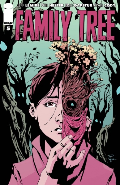
Written by Jeff Lemire
Illustrated by Phil Hester & Eric Gapstur
Colored by Ryan Cody
Lettered by Steve Wands
Reviewed by Chris Egan
With the family on the run from the extremists looking to kill Megan, and Grandpa Judd seemingly dead, things have gone into high gear in the newest issue of “Family Tree.” Megan’s transformation has sped up, becoming more tree-like to a point that took her and Josh’s father far longer to reach. Her legs becoming roots, sets the doctor off, knowing that the end of Megan’s human life is upon her.
As the anxious action of the series picks up, the discussions feel that they have become more long-winded, in an attempt to give more answers, but unfortunately, we don’t learn much more than what has already been explained in the first four issues. This chapter also sets the series on a completely new path. If you expected the series to continue in a similar fashion to what you have seen, then the big reveal at the end of this issue will come as quite a shock. Lemire seems to be taking a very different approach to this series than most of his other work. While no stranger to major narrative changes or surprises, this feels like he is looking to experiment in a new sub-genre: survival horror. While every issue has been at least very good, this still feels like a back-burner series for Lemire. It’s interesting, different in some ways, but overall feels like a plot that is just a little bit lesser than the genius he typically produces. It is his talent and the talents of the artists on this book that speak volumes. Their combined work elevates this idea to something much greater than one might expect.
Continued belowThe artwork by Hester and Gapstur is just as stunning and horrifying as ever, and their eye for design and layout is still evident, but with the bulk of this issue taking place within a car and only one or two places outside, they don’t have much of a chance to play with anything too different or extravagant as they have in the past. It all looks incredible though. Gorgeous, terrible and heartbreaking. Cody’s color work is outstanding, but the issue is dark, rainy, and all-around depressing, and really lets you feel it with his choices.
Readers will be getting a game-changer in terms of how the plot gets turned on its head. This is a turning point, not just for the story, but for readers. This could be a make or break moment for whether or not fans decide to keep reading the series. A new chapter in this horror series indeed.
Final Verdict: 7.5 – This is another well-crafted issue, although there is nothing groundbreaking going on, the talent of the creatives is sincerely evident on every page.
Written by Chris Warner
Illustrated by Brian Thies
Colored by Wes Dzioba
Lettered by Michael Heisler
Reviewed by Gregory Ellner
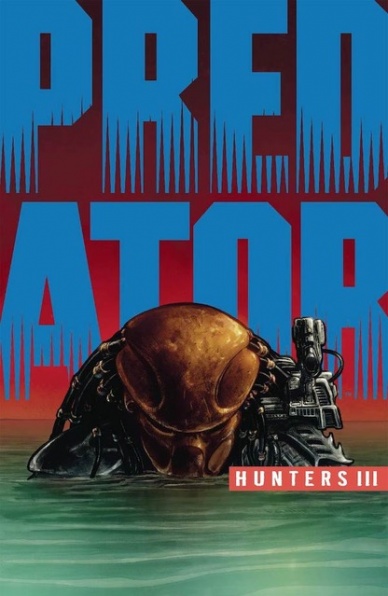
Part of the trick to licensed comics is setting a story within a world in a way that both invites others to see it and brings something new to the table for veterans, but also allows enough leeway to draw upon a wider world outside of the text itself. Thankfully, Chris Warner is more than up to the task with “Predator: Hunters III” #2. Drawing upon the fallout from the original Predator film while stretching out beyond it using the cast he pulls together, Warner assembles his motley crew of hunters while simultaneously showcasing the terror that is the Predator itself, working in nods to the wider mythos while simultaneously developing two sets of characters in classic horror film fashion.
While the script is already phenomenal, Brian Thies brings it to a completely different level with well-orchestrated perspective shots that appear to be a horror camera and intense emotional responses in some scenarios, even with close-ups of a person’s face that puts an assailant in a distant, threatening perspective. Humans and Predators alike are given room to show how dangerous they can be as well as how they can connect with one another in calmer scenes, adding an overall feeling of relatability to the entire story.
Wes Dzioba’s colors add to the liveliness of “Predator: Hunters III” #2, from the warm hues of a bar or a dock in broad daylight to the cooler, more dour ones down on a street. Even an outright oppressive atmosphere is clearly recognizable in parts involving the Predators and their aftermath, solely from the colors.
Final Verdict: 8.0 – Drawing from the original Predator film for a new story while simultaneously providing enough to bring in a new audience, “Predator: Hunters III” #2 is a treat.
Written by Matt Fraction
Illustrated by Steve Lieber
Colored by Nathan Fairbairn
Lettered by Clayton Cowles
Reviewed by Jodi Odgers
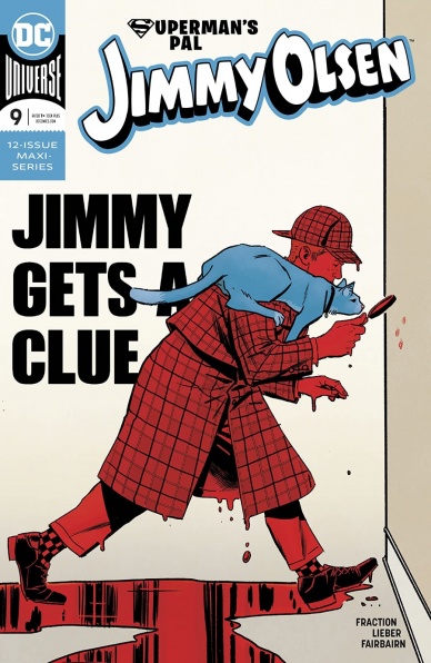
One of the strengths of “Superman’s Pal Jimmy Olsen” throughout its run has been the way in which the creative team expands the universe surrounding the titular character, and this is particularly evident in issue #9. Whether it’s Jimmy’s interview of Arm-Fall-Off-Boy, exploring how The Porcadillo seeks to come out of his family’s shadow and into the DC continuity, or the multiple interactions Jimmy has with his siblings across the issue, each unique, frequently bizarre set-piece is filled to the brim with charm and heart. “Superman’s Pal Jimmy Olsen” may leap between plot threads, but no moment feels incomplete – each scene says what it needs to say and moves on. The frantic pace may be slightly jarring for readers who have not read previous issues in the series but never feels rushed.
Steve Lieber’s skills are on full display here. Lieber renders the ever-expanding cast of the comic effortlessly, and the old-timey comic strip style of the Li’l Olsens segments effortlessly replicate the style of classics of the genre. This is aided by Nathan Fairbairn’s bold coloring and Clayton Cowles’ clean lettering. There may be fewer war-mongering aliens, spaceships, and versions of Jimmy Olsen than previous issues, but “Superman’s Pal Jimmy Olsen” is still a joy to look at. It also has Swamp thing as a bouncer wearing a shirt that says ‘Cuddle Time’ and multiple neo-retro-meta-Goldfinger pastiches.
Continued below“Superman’s Pal Jimmy Olsen” remains one of the most creative and refreshing comics coming out of DC right now. As the end of the 12-issue run looms and the pieces of the core mystery begin to fall into place, now is as good a time as any to catch up on this fantastic series.
Final Verdict: 9.3 – “Superman’s Pal Jimmy Olsen” is as quirky, fascinating, and masterfully-crafted as it has been since the first issue.

Written by Adam Glass and Robbie Thompson
Penciled by Eduardo Pansica
Inked by Julio Ferreira
Colored by Marcelo Maiolo
Lettered by Rob Leigh
Reviewed by Alexander Jones
DC’s hidden crown jewel “Teen Titans” continues this week with a phenomenal new issue showing the team attempting to save Djinn. This issue is a classic character piece that shows our heroes taking a substance allowing them to transcend reality as we know it to rescue their teammate. Authors Adam Glass and Robbie Thompson write a script that tests the resolve of each Titan making up the roster. Glass and Thompson dive into the backstory of each character and show how the demons of childhood affect the current psyche of our heroes. Turning back the clock to Damian’s origin is just as harrowing as seeing the trauma hinted at with Billy Wu’s backstory. The issue even makes a reference to the important ‘Terminus Agenda’ storyline that changed the course of Red Arrow’s role on the team.
Eduardo Pansica’s pencils are so expressive. The teenagers making up this roster are not short of melodramatic emotions and Pansica does not gloss over an emotive detail here. Pansica’s nimble layouts and expressive characters make the script from Glass and Thompson look even better. Thanks to some of the colors from Marcelo Maiolo it is easy to determine the setting of the issue as well. The emotional climax of the issue features a triumphant panel bleed with Damian that is an incredibly well-paced and beautiful sequence. Pansica’s pencils are a natural fit for the interiors of the issue. The issue even has an intricately laid out title page that sets the tone just right. Each of the Titans is passed out, getting ready to save Djinn with Jakeem Thunder scratching his head in disbelief.
Glass and Thompson never turn a blind eye to the important plot developments that happened earlier on in the series. Each and every character on the “Teen Titans” roster has had significant character growth during this run on the series. The modern incarnation of “Teen Titans” is a fleshed-out character piece as opposed to a hyper-violent exploration of the story that most readers would have expected. The last page is more than your average cliffhanger and sets the team in a completely different direction. “Teen Titans” #40 is another excellent chapter of the series full of dramatic tension and surprising character developments.
Final Verdict: 8.4 – “Teen Titans” #40 is a strong test of resolve for each hero making up the team.


