
There’s a lot to cover on Wednesdays. We should know, as collectively, we read an insane amount of comics. Even with a large review staff, it’s hard to get to everything. With that in mind, we’re back with Wrapping Wednesday, where we look at some of the books we missed in what was another great week of comics.
Let’s get this party started.
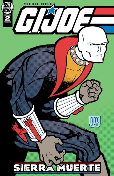
Written, illustrated, colored & lettered by Michel Fiffe
Reviewed by Tom Shapira
There’s a bit early on this issue in which Cobra Commander, the would-be world-conqueror and expert puppy kicker, is confronted with a spot of bad news and informs a subordinate to (literally) kill the messenger… only to take it back a moment later and collapse on his bed in despair. It’s such a great touch of character-acting: you can see emotions and physicality shift across the page, even though the character in question wears an obscuring hood; it is a sign of the issue and this mini-series as a whole – Fiffe is not here to play, he takes this story as seriously as his own acclaimed creator-owned series.
“Sierra Muerte” is a difficult needle to threat – make a self-sufficient story that can be slotted between the cracks of the original “Real American Hero” series by Larry Hama. I shouldn’t have worried, this turned out be as joyous as one could expect from a new Fiffe story: the action is flowing (there are few if any working artist in western comics who are as good as him in considering choreography in time and space), the characters are well-defined (there over a dozen of them in this issue and he does enough to let you know a bit on each one) and the plot is straightforward enough but there are enough little touches to keep it from being rote. This is deep-G.I.Joe lore stuff, but he keeps the info-dumps tight enough for the newbies.
My single complaint is with how short it all is: next issue is set to be the last and I just want more and more; I want to live in Fiffe’s world, to see his take on these characters and this setting.
Final verdict : 9.2 – YO JOE!

Written by W. Maxwell Prince
Illustrated by Martín Morazzo
Colored by Chris O’Halloran
Lettered by Good Ol’ Neon
Reviewed by Christa Harader
This is the first issue of “Ice Cream Man” that doesn’t necessarily impress. Prince chooses a topical theme but the execution leaves a little to be desired. “Ice Cream Man” has established lore at this point, and the tight focus on the subject, unknown before this issue, is a little disappointing. Banking on the gore level we’ve seen consistently over a year now isn’t such a sure path to entertainment perfection if we’re not going to get more of the deeper conflict at play, and the reality T.V. trope isn’t as insidious or shocking as it should be.
Morazzo’s art stumbles a little for the first time on this book. There’s a perspective issue on one of the pages, and some of the faces blur out unpleasantly at a distance. The line is precise but not as precise as we’ve seen in previous issues. O’Halloran’s colors are good, with some sickly neons to pump up the surreality, but the subtler edges of the palette don’t always work with the inset “camera” panel structure. There’s occasionally not enough contrast, like in the cooking scene, to make the art stand out. The scenes under the ghoulish, direct glare of the T.V. lights are much better, and show exactly why O’Halloran’s been such an asset to this book thus far. Good Ol’ Neon’s lettering is on point, though, and contributes to the media overwhelm the team is going for.
Issue #11 feels like a bit of work to get through, and just a touch phoned in as compared to what we’ve read to date. That’s not to say it’s bad, merely that it’s not entirely up to established standards. Given that we’re over a year into the series and this is the first example of less perfect work, that’s still a mean feat.
Continued belowFinal Verdict: 6.5 – “Ice Cream Man” #11 is the first stumble the series has taken, with a flatter plot than we’re used to in this tight anthology series.
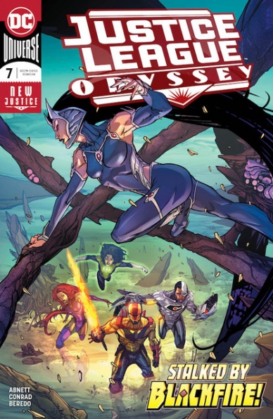
Written by Dan Abnett
Illustrated by Will Conrad
Colored by Rain Beredo
Lettered by Andworld Design
Reviewed by Gregory Ellner
Dan Abnett’s writing on “Justice League Odyssey” can be a bit odd, to say the least. For readers of these characters elsewhere, some, in particular Green Lantern Jessica Cruz (with her complete confidence in everything and lack of any talk with her semi-sentient ring beyond what every other Green Lantern would do) and Darkseid (being more a weak manipulator than a confident god in any way), can be seen as completely out of character for what they would normally do, to the point of seeming to be written a certain way to suit the story, rather than the story being written in a way to suit what would be rational for the characters. In so doing, Abnett can be seen as treating them as more semi-interchangeable props and power sets than individuals in their own right.
For those who are not previously aware of how these characters are known, the story is still rather run-of-the-mill and weakly handled. The problems come from a variety of sources: enemies come in at random with little previous exposure, exposition is given without much else to back it up beyond words said in the midst of a random fight, allegedly powerful individuals are reduced to begging, and the foes that they are meant to treat as all-powerful are seemingly removed from the equation within the course of the same issue in which they were introduced in the first place. Of course, there are justifications given on the latter one, but it still rings to a hollow threat.
Will Conrad does seem to do a marvelous job of portraying these characters in his artwork, at least for the most part. Interesting angles create tension or horror, or at times awe. Views from the villains’ perspective help to show how menacing a hero can truly be. The main problem seems to be when coming to some facial expressions of group shots. The central figure can be pretty impressive, but those behind seem bored, confused, ambivalent, or any mixture of the three.
Rain Beredo again brings a lot to the table, not unlike his work on the likes of “The Curse of Brimstone” and others. However, even his intense, glowing, at times burning color schemes cannot uplift this story by much.
Final Verdict: 5.5 – Mostly decent artwork fails to save a by-the-numbers, out of character tale in “Justice League Odyssey” #7.
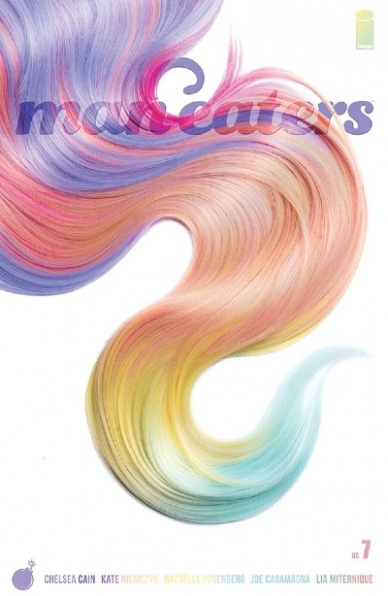
Written by Chelsea Cain
Illustrated by Kate Niemczyk with Lia Miternique, Stella Greenvoss, Ava Hood and Elise McCall
Colored by Rachelle Rosenburg
Lettered by Joe Caramagna
Reviewed by Chris Egan
The latest issue of Cain and Miternique’s brainchild begins to push the story forward. As this series has never played by the rules, it has been equally rewarding and frustrating from week to week. This is the goal of the creative team and they are nailing it, whether it is connecting with readers or not. As innovative and different as each has been, the lack of plot progression has felt like holding a delicious snack just out of reach. You can see it, nearly taste it, and yet, you can’t have it. Man-Eaters #7 picks up right where the last issue left off and the fun ‘jump cuts’ from narrative to in-world ads and supplemental art are still there. It’s moving back towards natural progression.
So many reveals and action beats get thrown at you it’s hard to believe the entire issue is set in one room. The character analysis and deconstruction of societal gender norms under “Man-Eaters” fantastical lens is as strong as ever, but issue 7 does continue the series main weakness – the choppiness of the storytelling. After a strong start, this series benefits more from being read in the collected trades as opposed to the single issues. The art and layout is, as always, a highlight and triumph, perfectly balancing a plausible near-future where science fiction meets fantasy.
Continued belowFinal Verdict: 7.0 – A quick and entertaining read that continues all of the series strengths and faults.

Written by Kieron Gillen
Illustrated by Caspar Wungaard
Lettered by Hassan Otsmane-Elhaou
Colored by Mary Safro
Reviewed by Michael Govan
When issue one of this series came out, I was completely unaware that Peter Cannon was a pre-existing character. As it turns out, Cannon’s been around since the sixties and was even in the DC universe for a bit. Somehow, never heard of the guy. Peter Cannon did feel familiar though and apparently for good reason. I didn’t realize until the evil Peter Cannon speaks on his ‘alien invasion trick’ that the character was very reminiscent of Ozymandias from “Watchmen”. Much like Doctor Manhattan was based on Captain Atom and Rorschach was based on the Question, Ozymandias was based on Peter Cannon.
The frustrating thing about the evil Peter Cannon is that it’s practically impossible to stop him. He’s committed countless atrocities and will continue to. On top of that, the genius’s twisted actions sort of make sense. He’s technically right but very wrong at the same time. The most intriguing part of this issue was watching the heroes stand powerless, unable to punish this monster for his sins or outsmart him.
It’s unexpectedly heartbreaking when they leap into battle anyway. They can’t beat him but can’t ignore his heinous actions either. In just three issues, I haven’t grown terribly attached to these characters but I still felt for them. Especially because the art team depicts a truly brutal sequence. There’s no mercy for any of them and sad as their end is, it all makes me more intrigued by the villain of the series. How do you beat a genius? How do you beat yourself? I’ve no idea how the showdown is going to shake out but I’m definitely excited to see what comes next.
Final Verdict: 6.5 – It’s just me, myself and I…
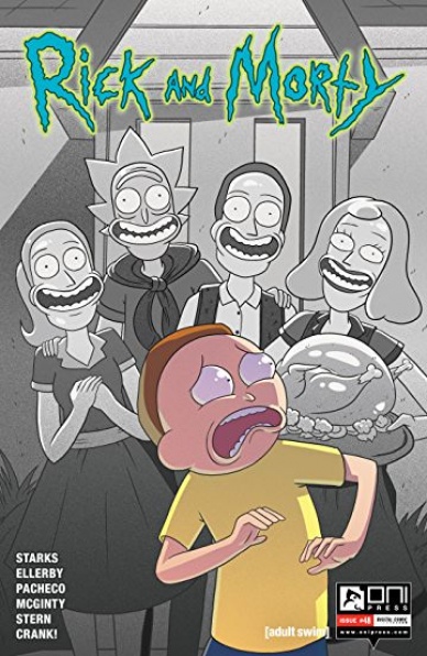
Written by Kyle Starks and Karla Pacheco
Illustrated by Marc Ellerby and Ian Mcginty
Colored by Sarah Stern
Lettered by Crank!
Reviewed by S.K. Malveaux
Oh Gosh oh Geez, it’s a “Rick and Morty” review. If you’re looking for a comic with the same vibe as the show you’ve found it. One of the things that set the cartoon apart from other sci-fi comedies of its genre is how self-aware it is of the troupes it’s using. The show is taking (gratuitously in some cases) from better-known TV and movie plots: Star Trek, The Twilight Zone, and most obviously Back to The Future. What’s fun about it though, is that it’s written from a geek’s standpoint. Every possible goofed up plot hole is explored and to hilarious ends.
“Do I need to watch the show to read the comic?” Nope. The comic stands on its own nerdy feet. What you get with each issue is one or two bite-sized sketches, complete with both drunk and awkward stuttering. Rick is still a jerk, Morty is still a dweeb and the rest of the family is still dumb as a bag of bricks.
Really, you wouldn’t have it any other way. Kyle Starks seems to have really gotten into his groove for writing the comic. The illustration by Marc Ellerby and Ian Mcginty is on point as well. It’s satisfying for both newcomers and fans of the show alike.
Final Verdict: 9.0 – You’ll r-r-really enjoy this one.

Written by Jim Zub
Illustrated by Max Dunbar
Colored by Espen Grundetjern
Lettered by Marshall Dillon
Reviewed by Elias Rosner
The ideas at play in “Stone Star” are nothing new, an amalgam of every Mojo-verse, Blade Runner, and Oliver Twist in space set-up you can think of, but the execution of said ideas and the new twists Zub, Dunbar, Grundetjern and Dillon put on it, are more than enough to distract from these well-worn tropes. What helps the series, too, is the method in which issue #1 was released. Suddenly dropped, as many ComiXology Originals are wont to do, the appearance of the comic mirrors the appearance of the titular Stone Star, appearing from nowhere to grace its eager patrons with entertainment where the elements are as old as the medium but the configuration is brand new.
Continued belowThis is very much an introductory issue, laying the groundwork for the characters, the central conflicts, and the world we’re entering. Dunbar and Grundetjern’s strikes me as Star Wars-esque, but that may be because the visuals are channeling modern sci-fi comics, with a shiny but muted color palette of “alien” blues and green, while everything else is varying shades of browns, reflecting the literal rock they are living in, with all its constructed, carved, and claustrophobic interiors. The opening page, in contrast, is lush with purples and pinks, with Dunbar setting the stage perfectly by drilling in from cosmic dust to showing the macro-view of this planet.
Dillon’s lettering reflects the constructed nature of the ship, with a thin, sans-serif font that feels like it has to be as economical as possible, expanding out only when the characters need to take up more room. This tightness isn’t true of the pit, providing a nice contrast in environments to Dial’s scavenging profession as well. Moreover, the whole comic goes from high-intensity action to high-intensity action, rarely letting up, except when it’s setting the stage for its next bout of action.
That said, this isn’t the strongest part of “Stone Star” #1. That honor goes to page 17, where the comic slows down to provide Dial’s first real introspective moment and the start of the central conflict. It’s a beautiful page, awash in the sunset of the planet, allowing the scene to be defined by the sheer amount of open space around Dial and Volness and, thus, the possibilities in front of Dial. It’s this scene, this one page, that solidified my desire to know what happens next.
Final Verdict: 6.1 – Not the strongest first issue but with a new take on old tropes, this could shape up to be a fantastic sci-fi story. Fans of this genre will most likely enjoy it more than those approaching it for the first time.

Written by Christos Gage
Penciled by Mike Hawthorne
Inked by Wade von Grawbadger
Colored by Jordie Bellaire
Lettered by VC’s Clayton Cowles
Reviewed by Gustavo S. Lodi
Continuing the adventures of Otto Octavius (a.k.a. Doctor Octopus) on the side of the angels, “The Superior Spider-Man” narrates how the not-so-good doctor struggles on balancing his own nature with what is expected of the guise of a Spider-Man. For the most part, the efforts by Gage and the creative team succeed.
There are some inspired choices, both in terms of the artist’s style of drawings, as well as how certain dialogue and character interaction are shown. Hawthorne and Grawbadger manage to portray a heroic book, with the usual tropes of action and larger-than-life moments, with a dirtier pencil and ink work. It generates a strong visual translation of Otto’s inner soul, and it also connects with character design.
Talking about that, the utilization of less-known properties like the Night Shift – in all of their weirdness – serves to display the alliances that Otto is comfortable with, and also to position him slightly better than those makeshift heroes.
Gage’s script, despite being nothing out of the ordinary, is well executed. The story of anti-villain seeking redemption is one readers are well-versed by now, but there is a sense of being genuine that translates to every page. Key to that is an especially heartfelt moment when Superior Spider-Man has to deal with death and the collateral damage of an attack he was not fully able to avoid.
On occasion, though, Gage fails to refrain on repeating certain themes that, after an attempt or two, start to fall flat to the book’s audience. One can read only so many times Otto explaining he is “superior” without stopping to think he is an arrogant man… and starting to think the script is shallow.
Regardless, “The Superior Spider-Man” is a very fun, genuine story of redemption, without losing sight of character… all mixed on an art style that blends very well with the overall narrative.
Final Verdict: 7.3 – Nicely balanced and put together, “The Superior Spider-Man” is more than worth the visit, and can become even better by ironing out minor flaws.
Continued below
Written by Jeff Lemire
Penciled by Joe Bennett
Inked by Dexter Vines and Scott Hanna
Colored by Mike Spicer
Lettered by Tom Napolitano
Reviewed by Alexander Jones
When DC first announced and launched “The Terrifics” property, it took a while for the team dynamics and characters to coalesce into one singular whole. Now that we have “The Terrifics” #14 serving as the final issue for author and team creator Jeff Lemire, readers get a much more detailed picture of the property and some of the changes and character arcs Lemire executed. When looking back on the series with a cursory glance, it appears that some of the detours and adventures into alternate worlds were all just window dressing. “The Terrifics” #14 drives characters together, fills in a few plot holes and pushes character plots forward.
If DC couldn’t book all-star talents like Ivan Reis or Evan “Doc” Shaner for “The Terrifics” #14, rising star Joe Bennett is a formidable choice. Bennett is no stranger to the title and his pencil style adapts perfectly to the weird, wild world of the comic book series. His rendition of The Dreadfuls serves as a great mirror for “The Terrifics” and creates a really interesting contrast on the page. Bennett’s arresting facial expressions strange poses add an unwieldy element to the story.
There is a horde of insane story elements and alternate worlds coalescing into one script. This issue features properties from different eras of DC and even Wildstorm characters represented with Tom Strong. Somehow Lemire’s script and Bennett’s pencils ensure that each member of the cast belongs on the page. The issue even circles back to a fan-favorite storyline from several years ago within DC Comics that will have readers cheering with delight.
Unlike the majority of the other New Age of Heroes titles “The Terrifics” hardly feels done a year into the property. Lemire lets lots of plot threads come together in “The Terrifics” #14 to the degree that the issue feels like an ending. Joe Bennett’s off-the-walls pencils create an endearing juxtaposition for the book when compared to his other work seen in a horror context. “The Terrifics” #14 is a great send-off for an underrated DC comic book switching hands to a new creative team.
Final Verdict: 7.9 – “The Terrifics” #14 is an effortlessly endearing and wild send-off for writer Jeff Lemire and artist Joe Bennett’s time on the title.

Written by Michael Moreci
Illustrated by Hayden Sherman
Colored by Jason Wordie
Lettered by Jim Campbell
Reviewed by Matt Ligeti
“Wasted Space” #8 is a departure from the series in nearly every way. Our merry band of misfits has been through a lot together, and it hasn’t necessarily brought them closer. For starters, no one is very merry anymore. There’s a heaviness there, lingering over the group, unspoken and divisive. You see it in the characters’ short fuses, and their unwillingness to put up with Billy’s humor or devil-may-care attitude.
The “Sturm und Drang” tone is perhaps even more evident in the weather. Hayden Sherman fills the issue with torrential rain, raging seas, and gale-force winds, but Jason Wordie’s color sells it with dark grays and blues that are uncharacteristic for “Wasted Space” thus far. All the stormy imagery mirrors how the characters feel about each other, and about themselves. It’s a constant reminder that everything is miserable, no one wants to talk about it, and something has to be done.
Their troubles feel huge and unwieldy, and this is represented in the massive environments that swallow the characters up. Rather than try to fill all the space with lettering, Jim Campbell uses very little of it. It’s more important to show how small they are in relation to the weight of the world around them.
Dust sees Billy slouching toward redemption and the two share a heartfelt scene where we gain a little insight into the weight these characters carry and their attitudes toward it. Michael Moreci pens it eloquently, tying Billy’s ethical dilemma back to the first issue of “Wasted Space” and comparing multiple philosophical points of view without it coming across as preachy or ingenuine.
This break from tradition – visually, tonally, and thematically – makes you pay attention. “This is important,” the creators are saying. And they’re right. “Wasted Space” #8 cuts to the core of the series. This is what the comic is about: how we carry that weight and how we get up every day, just to do it all over again, hoping the storm won’t last forever.
Final Verdict: 9.3 – A surprisingly heartfelt issue makes for an especially poignant and powerful addition to the “Wasted Space” canon.


