
There’s a lot to cover on Wednesdays. We should know, as collectively, we read an insane amount of comics. Even with a large review staff, it’s hard to get to everything. With that in mind, we’re back with Wrapping Wednesday, where we look at some of the books we missed in what was another great week of comics.
Let’s get this party started.
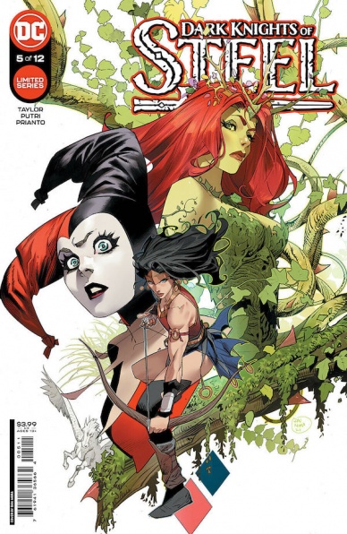
Dark Knights of Steel #5
Written by Tom Taylor
Illustrated by Yasmine Putri
Colored by Arif Prianto
Lettered by Wes Abbott
Reviewed by Henry Finn
“Dark Knights of Steel” #5 continues writer Tom Taylor’s reimagining of the DC Universe in a way that creates an interesting reshuffling of alliances and allegiances wrapped in a murder mystery set in medieval times.
With issue #5, Taylor’s experience and knowledge of the DC universe’s lore is on full display in the way that the deftly subverts expectations without breaking reader’s expectations based on the established tropes within the world. For instance Harley Quinn, now an ally and servant of both Batman and Superman, goes to recruit the lady of the forest to help. Who of course is Poison Ivy. Who else would it be? Taylor puts them on opposite sides of a coin while retaining the chemistry and familiarity that has made them a compelling duo in the past. Taylor also unfolds the story in a meaningful way that keeps adding information while also creating more mystery at the same time. For instance, for those who might have been wondering where the Kents have been during this series are treated to an appearance at the end that truly makes you want to pick up the next issue just to answer the question of how is he going to subvert expectations this time?
Illustrator Yasmine Putri does a magnificent job of bringing this new version of the DCverse to life. She fills her panels with thoughtfully laid out compositions. For instance, when the lady of the forest is finally revealed, we see Poison Ivy seated in the crook of a tree. Putri positions her just off center to keep her eye line appropriate with the direction but most importantly she gives her enough distance to see that the tree itself is a throne. In the same panel she says ‘I recognize no queen’ and that combined with the composition perfectly illustrates that the lady of the forest considers herself a queen as well. It is subtle choices like that which give more weight to the dialogue and she does this throughout the book in many ways.
Colorist Arif Prianto deserves recognition in adding materially to the overall effect of the artwork. Prianto has a bright tone and colorful palette that isn’t overpowering throughout the pages. He is constantly changing textures within the different settings and even within panels. In a shot when Princess Diana kicks a tree in half, the speed lines in the background are rendered with a rough brush instead of the customary straight lines with hard contrast. He even makes sure to add green and brown textures in the background that mix together colors from the tree itself to add to the effect of impact emotionally and thematically.
Final Verdict 8.0 – A great addition to this version of the multiverse and a book worth picking up.

Loaded Bible: Blood of My Blood #1
Written by Steve Orlando and Tim Seeley
Illustrated by Giuseppe Cafaro
Colored by Josh Rodriguez
Lettered by Fabio Amelia and Maurizio Clausi
Reviewed by Quinn Tassin
The original “Loaded Bible” comics came out from 2006-2008 and it makes sense because “Loaded Bible: Blood of My Blood” #1 is the best comic that the mid-aughts never saw. It’s a self aware, comedic, post-apocalyptic, epic about the war between vampires and humans. The former are called the New Vatican, the latter the Saved. A clone of Jesus is the biggest, most successful vampire killing soldier there is. Dracula is the main villain. It’s a lot. It’s meant to be a lot. And while that’s somewhat fun, it feels about 15 years old.
See, where this comic wants to be a crazy, fun, x-treme apocalyptic escape. It bears some semblance to some of the social conflicts that we know in the real world only if that’s what you want to see. Therein lies its charm. It’s silly and action-packed. Easy to laugh at and enjoy without thinking too hard. It also just reeks of Ennis-inspired not quite cleverness.
Continued belowIt’s not that “Loaded Bible: Blood of My Blood” #1 is quite bad- more baffling. It’s not nearly as fresh and funny as it clearly believes itself to be. The lampooning of Catholicism and involvement of vampires is fine but feels like it was written by someone who just listened to American Idiot for the first time and felt really inspired to write something that would upset their mom. The characters feel entirely two-dimensional and the world, while clearly built with care, just isn’t all that interesting.
Even the art style feels plucked out of the aughts. It’s perfectly competent and some of the action is genuinely great. That opening desert fight between Jesus and the vampires is dynamic and fun. The page with panels divided by a cross is a particular highlight. Mostly, though, the art is serviceable. The character design is simple but effective enough. The layouts are basic and even the ones that use blood as panels are conventional in their creativity. The settings feel thoroughly thought out but woefully under-illustrated. The colors, especially those in the desert sun, feel like they could use a bit of work but are hardly offensive.
If you weren’t careful, you could easily mistake “Loaded Bible: Blood of My Blood” #1 as some special reprint of a classic Image comic. Not as revelatory as it would like to be, this is a comic coming out two presidential administrations too late.
Final Verdict: 5.0- A comic that would have killed if it came out closer to its predecessors doesn’t pack the same punch now.
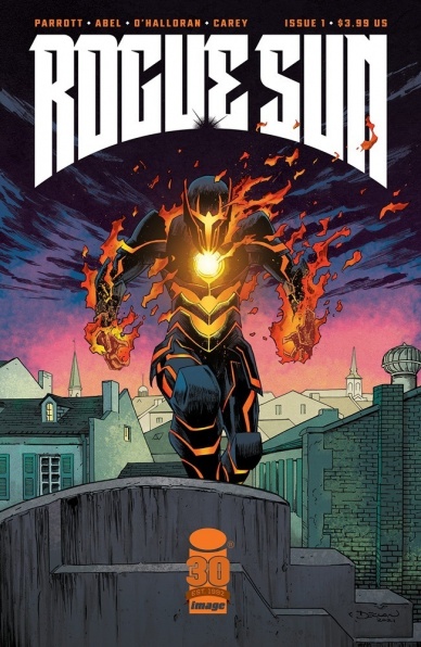
Rogue Sun #1
Written by Ryan Parrott
Illustrated by Abel
Colored by Chris O’Halloran
Lettered by Becca Carey
Reviewed by Alexander Manzo
“Rogue Sun” is a changing of the guard story after the original Rogue Sun is killed in the first six pages of the story. Ryan Parrott creates this story of a teenager getting thrown into the driver’s seat of being a hero by not only finding out his absentee father is dead but that he was one of the biggest superheroes in New Orleans. The main character, Dylan, isn’t shown in the brightest light in his everyday school life, but once the background is given to the reader, it becomes apparent why he is this way. Parrott does give Dylan something that most new heroes fail at in their introductions, and that’s the willingness to jump right into the deep end of getting into battle against a villain. Dylan not only realizes the opportunity he’s been given but that he has the chance to do what his father ultimately couldn’t do for him and balance family life.
Parrott does a great job of creating this awkward and a little tense scene while reading the will. Dylan and his younger half-brother Brock spar verbally about their father, and given that they have opposite upbrings, it makes sense to have them become instant enemies. (It also didn’t help that Dylan got to be next to the Rogue Sun instead of Brock)
The art by Abel in this issue is top-notch due to his clean lines and attention to detail. From the jump, it’s evident as we see a villain being thrown at the top of a building, and the reader can see the brick pattern in the building despite it taking place at night. Of course, it doesn’t just apply to the backgrounds of the panels, and there is a splash page of Dylan transforming into the Rogue Sun where the chinks of armor begin to encapsulate him and show off this badass design. The design is similar to the main character in the Radiant Black series that feels almost like super-powered Power Ranger but with a historical/mythical twist.
Final Verdict: 9.0 – A solid introduction to a spin-off series that gives the impression it will be able to more than stand on its own. It does a great job of showing the reader the circumstances of the new protagonist, but it does lack the action it hints at.

She-Hulk #2
Written by Rainbow Rowell
Illustrated by Roge Antonio
Continued below
Colored by Rico Renzi
Lettered by VC’s Joe Caramagna
Reviewed by Alexander Jones
Marvel’s latest “She-Hulk” series opened with a slower-paced debut issue. The first chapter of “She-Hulk” reintroduced the character of Jennifer Walters to new readers. Author Rainbow Rowell is writing “She-Hulk” alongside artist Roge Antonio who is crafting the interiors. The first issue of the series did not break any new ground for “She-Hulk” until the mysterious cliffhanger brought a surprise character back. “She-Hulk” was able to craft a solid tone in the first chapter that intimately wants to show readers what life is like for Jennifer as a lawyer and superhero. Fortunately, “She-Hulk” #2 opens the series up to those intriguing new elements and strays away from the conventional nature of the debut. Rowell and Antonio create a mind-melting “She-Hulk” issue that follows up on the first chapter with new mysteries.
Roge Antonio’s art is really special in this issue. Rowell crafts an issue that explores Jennifer’s life in a domestic setting. Rowell works with color artist Rico Renzi to create beautiful interior work for the issue. Renzi takes advantage of the intricate page layouts and facial expressions from Antonio. Renzi provides vivid detail in the shading of character expressions. The last page of “She-Hulk” #2 exposes the noir elements hidden beneath the subtext of the previous pages. Antonio and Renzi tease toward this page with the previously mentioned shadows and subdued expressions. The unconventional changes to the costume and innovative panel design cannot be understated here either. Thanks to the artwork, “She-Hulk” #2 is about a superhero lawyer that looks natural instead of silly.
“She-Hulk” #2 expands the scope of the series and introduces a major supporting character who has been lost to continuity. Walters is exposed to the return of a friend under extremely mysterious circumstances. Rowell dives deep into the question of how this individual has survived a fatal experience and what their relationship means to Jennifer in this new context. The issue is heartwarming and marks an important positive milestone to the foreboding life of a superhero. Rowell teases how the events of the issue came about in the first place in the final few pages. “She-Hulk” #2 gets over the slump from the debut issue to explore a fascinating sense of mystery.
Final Verdict: 8.2 – “She-Hulk” #2 opens up an intriguing noir element into the series.

X-Men #9
Written by Gerry Duggan
Illustrated by C.F. Villa
Lettered by VC’s Clayton Cowles
Colored by Marte Gracia
Reviewed by Michael Govan
“X-Men” #9 doesn’t really focus that much on the titular X-Men. In fact, only Sunfire and Rogue are featured. Instead it zooms out, checking in with various dealings in the mutant world from the Great Ring of Arakko to mutantkind’s enemy ORCHIS.
How much you enjoy it probably depends on how much you’ve been keeping up with the other books, because this issue is almost all ‘other book’ so to speak. If you have been keeping up though, “X-Men” #9 is a fun read. ORCHIS aligning with Duggan’s enthusiastically evil scientist M.O.D.O.K. will be very interesting to see going forward. On Arakko, we see some of The Great Ring want to head back to Amenth to resume the war. On Krakoa, the Quiet Council deliberated whether they should declare an all-out war themselves…
The bits with our two X-Men were the most interesting and where we see the best character moments. Sunfire may not have been the best X-Man the first time around, but in this new day and age, he’s fluoroshing, a lot more calm than usual, reaching for his full potential and seeking new challenges.
While Rogue trades blows with aliens, her mother and husband are trading verbal blows. Destiny is mysterious and dangerous under Hickman’s pen, under Duggan’s we’re treated to her petty side. This woman’s frustration with her son-in-law is so funny, I laughed out loud. Remy much to his credit, pushes back and effectively wins the argument, showing once again why he’s such a good partner for Rogue.
These pages are also where Villa’s work is the strongest, the alien brawl is action-packed and chaotic in the best way. It’s great to see Destiny calmly sipping her drink while a brute is sent flying backward in the background or Rogue socking someone in the face or Remy fighting off goons with his bo staff. Gracia’s vibrant colors are a great compliment, making sure the comic looks as fun as the script is.
Final Verdict: 8.0 – “X-Men” #9 may be light on, well, X-Men but it’s heavy on fun.


