
There’s a lot to cover on Wednesdays. We should know, as collectively, we read an insane amount of comics. Even with a large review staff, it’s hard to get to everything. With that in mind, we’re back with Wrapping Wednesday, where we look at some of the books we missed in what was another great week of comics.
Let’s get this party started.

America Chavez: Made in the U.S.A. #1
Written by Kalinda Vasquez
Illustrated by Carlos Gómez
Colors by Jesus Aburtov
Lettered by Travis Lanham
Reviewed by Quinn Tassin
For a hero that’s long been a fan favorite and the standout character in the team books she’s a part of, America Chavez hasn’t gotten the spotlight very often. Three years and five days after her last solo series ended, though, “America Chavez: Made in the U.S.A.” finally brings its titular character back to the forefront of her own story. Kalinda Vasquez pens a strong issue that serves as an easy entry point into America’s story while doing the good work of exploring her background in our universe with more depth than we’ve seen in the past. America has never been a character that people have had trouble connecting with but her newly revealed Moses-like backstory is instantly compelling and serves to make the character even more relatable than she has been in the past. Vasquez does great work letting us know where America is at in the Marvel universe, and using her backstory to inform where she’s going over the next four issues. The direction this miniseries is going doesn’t seem to be groundbreaking but it’s intriguing enough to make the second issue exciting.
The issue delivers the most average artwork that a 21st century superhero comic can have, that is to say, it’s dynamic, colorful, and fun but offers very little that makes it stand out from the pack. Carlos Gómez’s pencils are relatively strong, bringing a good sense of motion to the action, emotion to the characters, and well rendered landscapes. Jesus Aburtov’s colors are the weakest link here. It’s not that they’re bad too much as they feel a smidge too flat to really make the issue come to life. The final sequence, in which America and Spider-Man save America’s adoptive family from a burning building, is easily the strongest that the art team pulls off. It’s filled with urgency and energy, communicating America’s strength and desperation and her family’s relief beautifully.
All in all, “Made in the U.S.A.” is a welcome return for America Chavez. Kalinda Vasquez has a strong handle on the character and this is a more grounded tale than we’ve ever seen her in before.
Final Verdict: 7.5 – “America Chavez: Made in the U.S.A.” is a fun, engaging debut issue off a long overdue miniseries though it doesn’t quite reach the heights that its title character can.

Avengers #43
Written By Jason Aaron
Illustrated By Javier Garrón
Colored By David Curiel
Lettered By VC’s Cory Petit
Review By Matt Sherman
Jason Aaron’s run so far on “Avengers” has been a bit tacky. In the beginning it felt like a very generic Avengers fighting comic. However, the series has started to pick up and has become a lot of fun. “Avengers” #43 continues its cheesy tournament-style story arc centered around the Phoenix, but in a delightful way. The action is what is to be expected in this kind of story. Aaron does well embracing the story’s cheesiness by complimenting it with humor in some of the fights. We get to watch heroes fight that we wouldn’t normally see pinned against one another. Besides the silliness, Aaron brings some seriousness within the issue by expressing moral dilemmas between the characters. He also does a good job keeping true to the character’s personalities. This issue didn’t have any specific new developments on the story itself, however, it was well plotted and action packed, that it didn’t feel like a boring filler.
Javier Garrón pulls off illustrating the fight scenes perfectly. Every panel feels explosive with every punch thrown. Every panel flows really well into the next that keep the issue feeling heightened. Garrón illustrates characters body language well during the dialogue scenes, however, he lacks when it comes to characters’ facial expressions, as they seem a little stiff. Cory Petit’s lettering is very powerful. He makes sure every blown is felt by the reader, without getting in the way of the art. David Curiel picks a warmer color palette for the fight scenes, keeping the Phoenix’s energy prominent throughout the issue.
Continued belowIt took a while for this series to pick up, but this issue definitely continues to make it better. Jason Aaron does a good job picking up on seeds he’s planted early on. He still leaves some unanswered questions to keep readers on board, especially when it comes to whether Thor and the Phoenix are related and how Namor will shake up the Marvel Universe going forward. This issue is the the beginning of the end of this Phoenix story arc. Knowing this issue is bringing closer the conclusion, this makes the pacing feel right. It doesn’t feel rushed or too long. This issue was the most fun of the arc and really seems to be building toward an exciting finale.
Final Verdict 7.4 – Another quirky, yet fun issue that helps this series become more enjoyable.

Casual Fling #2
Written By Jason Starr
Illustrated By Dalibor Talajić
Colored By Marco Lesko
Lettered By Steve Wands
Review By Henry Finn
In the second issue, “Casual Fling” picks up the pace significantly and the penny really drops, as Neil Gaiman would say. A few pennies, actually. As Jennifer’s life begins to unravel, multiple plot points begin to appear; the gender-swapping of the traditional roles creates more uncertainty because you get a sense that the typical tropes cannot be resolved in a way you are familiar with.
With issue #2, writer Jason Starr reveals the swap is not a gimmick but a recontextualization of gender dynamics. For instance, when a female protagonist goes to the police to report a threat, will she be believed? Further, typically in an erotic thriller, the female spouse of a philanderer would be a helpless victim lacking agency. In “Casual Fling” #2, Starr turns this around by revealing both female lead and male supporting characters are perceived and react differently: familiar setups, but unique payoffs.
Talajić’s deliberate use of pacing and panel layouts shine here; in a genre that doesn’t have the benefit of super-powered punchouts to lead your eyes, Talajić’s careful attention to body language and facial expressions in each panel really helps bring the unspoken context within the story to life. The use of silent panels increases the drama and weight of the character’s “performances” in a way that shows how thoughtfully planned each image is. Because the panel layouts are simple and uncluttered, this actually draws you in and makes you feel like you’re watching a film as opposed to experiencing a design.
The coloring also serves the book well, simple but motivated in a manner consistent with the genre. The color scheme changes depending on the atmosphere of the scene and the mood of the characters.
Overall the creators’ love and knowledge of the genre shines through, and it will be interesting to see how crazy things get in the next three issues.
Final Verdict 9.4 – A solid leveling up from issue #1, promising an explosive climax.

Chariot #1
Written by Bryan Edward Hill
Illustrated by Priscilla Petraites
Colored by Marco Lesto
Reviewed by Conor Spielbrg
The first issue of any comic has a lot of difficult jobs it must accomplish and “Chariot” managed to succeed for the most part in all of them. A gripping introduction leaves out dialogue entirely, letting the action packed artwork of Pricilla Petriates speak for itself, which it very much does. The action beats are well thought out and given the appropriate panel space, the point of view character is made clear, and the color scheme is well contrasted to highlight the foreground and the background.
The main character, Jimmy is not present in this entire sequence and only shows up on page 9, which leaves very little time to establish him as such. Surprisingly, Bryan Edward Hill manages to fit in a lot of character exposition in a short amount of pages without dragging the book down to a slog. In fact, the gripping car chase followed by the introduction of Jimmy does a lot to showcase the talents of the artist and writer respectively.
The second half of the book does more to marry the art and writing after showing scenes where one takes prominence over the other in the first half of the issue. Unfortunately, the issue is thin on plot but this seems like a deliberate choice; attempting to leave the reader with more questions than answers by the end of the issue so they buy the next one. Hill and Petriates establish a compelling premise, a sympathetic main character and show off their artistic and writing chops while doing so. Only time will tell if their set up will pay off but issue 1 of “Chariot” certainly sets things off on the right foot.
Continued belowFinal Verdict: 7.9 – A promising beginning with tons of potential in its premise.
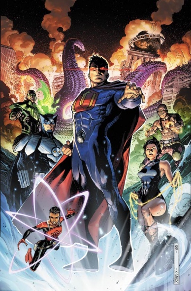
Crime Syndicate #1
Written by Andy Schmidt
Illustrated by Kieran McKeown and Bryan Hitch
Colored by Steve Oliff and Alex Sinclair
Lettered by Rob Leigh
Reviewed by Gregory Ellner
On the whole, perception of Andy Schmidt’s writing on “Crime Syndicate” #1 is heavily dependent upon the viewer’s familiarity with DC Comics as a whole. On the one hand, it is a relatively interesting look at an inverted moral world, taking famous moments in early Justice League stories and turning them on their head (along with taking some elements from the “Forever Evil” version of the team). The result moves in interesting ways beyond just a moral switch, such as a stoic Power Ring being berated and insulted by his own, far more outwardly emotional ring.
On the other hand, there isn’t really much new material to be seen here, and what there is, while not deliberately turned up to the highest extreme to at-least-borderline comical degrees like some more recent versions, still reeks heavily of recent real-life politics of 2016 onward in the United States. Even those who enjoy the story for what it is, and the visual nods for what they are, may find Schmidt’s use of Ultraman as what is essentially a takeoff on certain political figures to be too on the nose regardless of one’s own affiliations, especially if they wanted to get into these stories to get away from reality’s struggles for a few minutes.
With two stories come two teams for the artwork, both of which seem to have a cohesive art style between them. On the main plot, Kieran McKeown does a good job of emphasizing the uncanny “normalcy” of Earth-3, never treating it as objectively horrifying just for being a mirror universe. The use of close-ups helps to slowly show elements of the world and enhance what worrisome elements there are, and facial expressions help showcase a breadth of emotion. Bryan Hitch acts similarly on the artwork for the backup, ‘The Paranoid Titan.’ The artwork does have its scarier moments, but it comes across as a bizarre, alternate take on the likes of Frank Quitely’s work on “All-Star Superman.”
Much like the illustrations, Steve Oliff doesn’t outwardly increase the terror of most scenes through his color choices, instead appearing like, perhaps intentionally, a warped take on the Justice League. Just looking at the images, the team could be construed as a bit off, but still from the primary DC Universe, making the story itself that much more disturbing. On the other hand, Alex Sinclair seems to draw heavier emphasis on darker colors (justified by the fact of some scenes actually being in the night), making his take on an evil Superman instead seem like the makings of the film Brightburn.
Final Verdict: 6.0 – Despite some interesting ideas, it takes unfamiliarity with Earth-3, familiarity with classic DC Comics stories, and a willingness to accept heavy-handed modern politics to really glean enjoyment from this limited series debut.

Demon Days: X-Men #1
Written, illustrated, and colored by Peach Momoko
Lettered by VC’s Ariana Maher
Reviewed by Alexander Manzo
“Demon Days: X-Men” #1 is an unique start to a small series that will reimagine the Marvel universe into a traditional Japanese world. The characters inside the story are based on Marvel characters, but at a point where they are not superheroes, but more of likeness. It does distract from the story, since that hook forces the reader to start looking for who is who.
The story follows the familiar formula of a stranger traveling on the road to help solve the town’s problem in exchange for a bed to sleep in. The protagonist Sai, based on Psylocke, follows suit to fight the town monster, Venom. This is good to hook a reader, but this time feels like it gives more questions than answers. Very little information is given about the villagers, Sai, or even antagonists to make the reader care and then the battle is over. The final reveal of another female character, Mariko, reading the story in an old book is even more confusing because it creates this disillusion to what was just told.
Continued belowMomoko does create beautiful, manga-inspired artwork that helps sell the Japanese interpretation. The subtle notes of manga come through the story when the panels aren’t as close to the characters in Western comics and tend to look more animated rather than lifelike. The coloring throughout the issue looks similar to watercolors; the way Momoko draws full settings and backgrounds look as if they would belong in more traditional Japanese artwork rather than in the pages of a comic. There is a beautiful panel of a temple that Venom has taken over that has creates fear for the reader while showcasing the unknown power Venom has over this village.
Final Verdict 7.8 – Momoko does a good job of hooking the reader but this story felt rushed. Hopefully the second issue is more thought-out with the pacing.
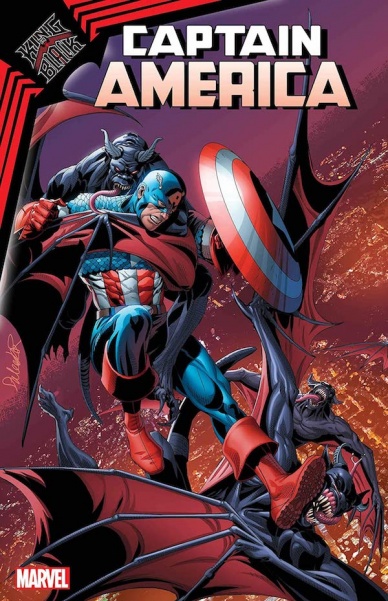
King in Black: Captain America #1
Written by Danny Lore
Illustrated by Mirko Colak, Stephano Landini, Rogê Antônio and Nico Leon
Colored by Eric Arciniega
Lettered by VC’s Joe Caramagna
Reviewed by Rebis
“King in Black: Captain America” is a tie-in issue that delivers good characterization but doesn’t stand out in the flood of “King in Black” tie-ins. Captain America is back in the fight after having been taken over by Knull in the early issues of the crossover event. Lore gives readers a Captain America that’s more than a little unsure of himself, having his confidence shaken by Knull and adding the god of Symbiotes to the list of evil people who have used him to corrupt the idea of hope. Steve is clearly on unstable ground struggling to focus due to the voice of Knull still actively in his head, showing him visions of great disaster due to his inability to act. This leads to an interesting Steve that is in line with what we are seeing from the Coates, run but ultimately doesn’t add anything new.
As far as the arts concerned, there’s not much to say. The art team kept themes from the rest of the series, like using symbiotes as panel borders, but they deliver a book that is visually all over the place. The continuity is inconsistent; one moment we see Cap with his shield, then in the next panel Bucky will have it. The faces of our heroes differ in age from one panel to the next. Unfortunately, it feels like it may be a case of too many cooks in the kitchen.
Final Verdict: 5.0 – “King in Black: Captain America” has an interesting Steve that is in line with what we are seeing from the Coates run but ultimately doesn’t add anything new.

Power Pack #4
Written by Ryan North
Illustrated by Nico Leon
Colored by Rachelle Rosenberg
Lettered by Travis Lanham
Reviewed by Elias Rosner
Each issue of “Power Pack” is better than the last. North, Leon, Rosenberg, & Lanham have made a pitch perfect book that’s equal parts fun, funny, heartfelt, and utterly, purely Marvel and issue #4 delivers on the action, the family drama, and the ridiculous fun that comes from having to keep your identity as a superhero secret from your parents when Wolverine shows up at your door to help you fight The Wizard after he kinda, sorta stole your powers for capitalist evil. If I had to level one critique at the book, it would be that North’s brand of writing can get quite word dense but he has such a strong control of voice that it’s rare for me to feel overwhelmed.
“Power Pack” #4 captures the joy of reading a superhero book without feeling cloying. It’s the kind of comic booking that I don’t see much anymore where not only is each issue satisfying on its own as well as building to the next but it capitalizes on the unique nature of the focal heroes. The central conflicts of “Power Pack” rely on the Outlawed status quo without them being on the run or narcs, the weight of their past adventures, these heroes being children (mostly) and thus having to keep their powers from their parents, and their unique powers.
Continued belowThe fight scenes feel unique because they’re predicated on the strengths and weaknesses of the Powers’ powers, leading to these poppy, vibrant fight scenes with bright colors and clear action that has me engaged in every move, wondering about what clever power usage is coming up, rather than wondering if Julie will punch from the left or the right this time or if she’ll shake things up and kick. It breaks the monotony I’ve been seeing over in the “King in Black” books and it’s a welcome brightness whose success I hope leads to more books like this one; ones that will make kids and adults say Make Mine Marvel.
Final Verdict: 9.6 – A truly perfect example of a series that everyone should be reading. Fun for the whole family, potentially only held back by a word density that is easily ignored.

Undone By Blood: Or The Other Side of Eden #1
Written by Lonnie Nadler and Zac Thompson
Illustrated by Sami Kivelä
Colored by Jason Wordie
Lettered by Hassan Otsmane-Elhaou
Reviewed by Luke Cornelius
The opening issue of the second volume of “Undone By Blood” is an intriguing one. Lonnie Nadler and Zac Thompson’s script is accessible for readers unfamiliar with the first volume, such as this reviewer, and introduces the series’ two protagonists: Silvano, a Mexican-American who was recently fired from the postal service, and Solomon Eaton, a pulp western hero who featured in the first volume. The issue establishes both characters and their moral compasses well, though Silvano’s story is less direct in its execution and is hampered by some scenes jarring together.
Hassan Otsmane-Elhaou’s lettering establishes the distinct visual language on the first page of “Undone By Blood” #1. The writing of the in-comic-novel, The Other Side of Eden, narrates Eaton’s story and Otsmane-Elhaou presents the captions and the word balloons on a dark paper textured background to give the western story an isolated and cohesive presentation. It anchors the pulpy dialogue too. The placement of captions and word balloons throughout is solid, though the word balloons obscured in the corner of the panels which depict Silvano sinking into the book are a highlight. Jason Wordie’s colorwork adds another distinguishing layer between the stories; sepia tones age all of the pulp’s visuals whilst grain distorts the 1930s sequences.
Interestingly, Sami Kivelä’s panel layouts don’t dramatically distinguish the two narratives like the lettering and coloring does, instead, they feel consistent through the entire issue. The layouts are very rarely in a strict, square layout. Panels frequently overlap one another, and objects often exist in isolation, suspended over panels. The second standout feature in the artwork is Kivelä’s varied use of perspective; on one page, there’s a central columnar panel depicting a bird’s eye view of the overall movement of the scene, with close-up panels positioned diagonally on each side. It’s an inventive way of adding rhythm to an otherwise relatively static sequence.
With “Undone By Blood” #1 taking great care to distinguish the stories from each other visually, and the stories’ only shared trait being that they will feature heists, it’s difficult to understand why they are interwoven as they are. There are some parallels and reversals identifiable so far but the grander themes and reflected plot points will only be apparent as the series continues.
Final Verdict: 6.8 – “Undone By Blood: Or The Other Side of Eden” #1 is an intriguing issue, but one that will likely be stronger when collected with the rest of the series.


