
There’s a lot to cover on Wednesdays. We should know, as collectively, we read an insane amount of comics. Even with a large review staff, it’s hard to get to everything. With that in mind, we’re back with Wrapping Wednesday, where we look at some of the books we missed in what was another great week of comics.
Let’s get this party started.

Written by Ram V
Illustrated by John Timms
Lettered by Josh Reed
Reviewed by Christa Harader
Selina Kyle. Cat burglar, charmer, femme fatale. V’s one of my favorite writers, and Catwoman’s one of my favorite DC characters. She’s deceptively simple and very easy to get wrong, but V focuses on the mischievous side of our master thief to great result. The plot’s structured like a heist movie, complete with a flashback that’s oddly placed but lands pretty well at the end of an action-packed issue. V leans heavily on Selina’s feral charm, which helps carry off the story pretty nicely. Selina is, at heart, loyal to her network and her neighborhood, and her morality skews delightfully neutral when it comes to messing with Hadley.
Timms’s art is interesting, with great character expressions, explosive action and chaotic layouts that lend a lot of necessary noise to pump up the fun factor. There’s a neat 9-panel grid that catalogs Selina’s combat skills by the second, a great POV shot of Selina “falling” out a window and enough bright colors to make “Catwoman” #9 interesting without succumbing to too much clutter on the page. There are a few times when there’s a bit too much detail, like the shattered glass in the window scene or the card-game chaos, and there’s one inset panel where Selina’s legs are freakishly long for no apparent reason, but overall Timms is adept at carrying off the Cat.
Reed’s lettering is very nice, with a slightly irregular font that matches the comic’s light tone and economical balloons that don’t fight for real estate in the midst of Timms’s detailed art. V’s cha-cha conceit is carried off with some simple and effective sound effects, and Selina’s narration is done nicely in rounded black narrative boxes with thin purple borders.
Overall, “Catwoman” #9 accomplishes exactly what it sets out to do: entertain. It’s fun, concise and stimulating while keeping a pitch-perfect Selina on her A-game, which is all I could ask for in a Catwoman story.
Final Verdict: 8.0 – “Catwoman” #9 is a fun heist one-shot with good writing, fun layouts, stylish art and interesting lettering.

Written by Brian Michael Bendis
Illustrated by David Mack
Colored by Zu Orzu
Lettered by Carlos M. Mangual
Reviewed by Alexander Jones
Author Brian Michael Bendis and artist David Mack have finally reached the finish line on “Cover,” a story that will arguably go down as the author’s finest work for DC comics to-date. “Cover” features a litany of unique moments that break the fourth wall, changing what readers would expect from a comic book. Mack switches between his usual bevy of comic book art styles to show the confrontation between Max Field and Essad Sinns in several different modes of art. Watching the duo trade comic book insults back-and-forth in the middle of a tense, spy-oriented confrontation remains as unique as ever. Now that the pair have a clear conflict established between each other, the structure of the issue has a greater sense of clarity.
While “Cover” #6 has a wholly original and tense conflict between Sinns and Field, the issue levels out the comic book brawl a little too early. The script from Bendis is engaging and has an immensely satisfying final resolution, the process of getting to the final few pages can be tedious at points. The way Bendis melds comic book knowledge with the spy world hasn’t lost the novelty six issues in. Bendis also expands on the relationship between Max and Julia even further while still retaining a sense of mystery in their interactions.
The true draw of “Cover” has always been the bombastic nature of the art direction. Artist David Mack stretches his stylistic abilities to make each and every page of the issue endearing. Readers are treated to a fascinating exploration between the conflict of Field and Sinns across multiple different representations of comic book art. Mack uses every trick in the medium of comic books to keep the story engaging. Mack utilizes silhouettes of protagonists, panel bleeds, thick shadows and bursts of color to get the point of the story across.
Continued belowThe incredibly endearing nature of “Cover” and the self-reflexive nature of the comic book is on display in the final installment of the issue. Readers are treated to a book that is focused on the creative way the narrative is constructed. The enthusiasm with each issue of the story comes across with each page of the story. “Cover” #6 feels like a truly special comic book thanks to the powerful creative input from the art and narrative. Readers are often lectured about the destination of a comic book rather than the journey. In the case of “Cover,” the destination stretches multiple styles of art from one interior artist and one colorist.
Final Verdict: 8.5 – “Cover” #6 is a poignant finale to a wonderful mini-series.
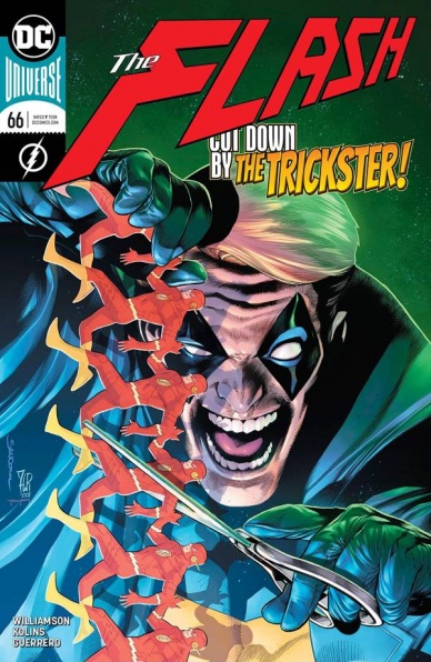
Written by Joshua Williamson
Illustrated by Scott Kolins
Colored by Luis Guerrero
Lettered by Steve Wands
Reviewed by David Craig
“The Flash” #66 serves as a primer for Joshua Williamson’s next arc, refreshing readers on the origin of long-time nemesis the Trickster, while also answering the question of what exactly he’s been up to lately. As far as superhero comics go, this is about as basic as it gets. Those who already possess a working knowledge of this villain have absolutely no reason to pick this issue up, while those who don’t are likely to find it a boring read regardless.
From the first appearance of Trickster’s neglectful parents, it becomes quite clear the level that Williamson is aiming for. The pair are devoid of any nuance or depth, written with such inexcusable laziness that it robs the story of an emotional punch. Every single line and gesture is one of cartoonish cruelty, ultimately leading to a contrived life lesson delivered with all the subtlety of a derailing freight train. One-note villains are nothing new, but this is fundamentally a story about child abuse, a topic which is arguably inappropriate to explore in such a juvenile tone.
The art is just as uninspired. Scott Kolins’s illustrations are competent, but there isn’t a single panel or page in the book worthy of any particular praise. Page layouts are bland and lacking in style, with Luis Guerrero’s colors sharing a similarly workman-like efficiency. They aren’t offensively bad, but the book has no striking images across its twenty pages.
This issue of “The Flash” is a colossal failure on all counts. The story is completely uninteresting and inhabited by characters who speak exclusively in clumsy melodramatic clichés. Whatever Williamson has planned for the Trickster in his upcoming arc, it can’t possibly be much worse than this.
Final Verdict: 3.3 – “The Flash” #66 feels like an assembly line production from a factory that manufactures generic origin stories.
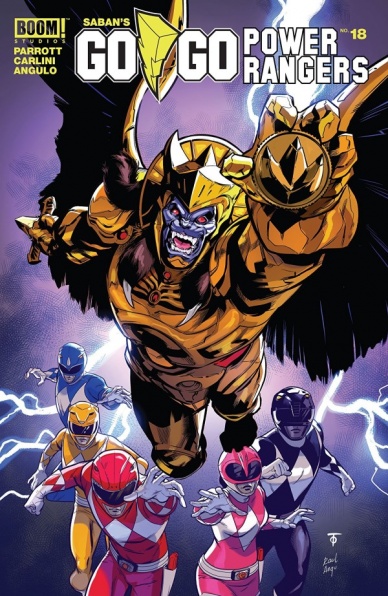
Written by Ryan Parrott
Illustrated by Eleonora Carlini
Ink Assistance by Simona Di Gianfelice
Colored by Raúl Angulo
Lettered by Ed Dukeshire
Reviewed by Matt Ligeti
“Saban’s Go Go Power Rangers” reimagines this first group of Power Rangers, before the movies, before the Dino Thunder and the Mystic Force and all the other iterations that have come out since. It’s like Haim Saban himself remade that first season with the same heart, but with updated styles, a much higher production budget, and writing that’s in it for the long game.
Ryan Parrott has several pots boiling at once, plot-wise: each group of characters has their own wants and needs and motivations. In “Saban’s Go Go Power Rangers” #18 alone, we get a rich, war-themed backstory for Zordon when he had his body, the heroic origin of the first Alpha, and a tale of evil Rita and how her evil ways disappointed her saintly mother. Strangely, the present-day Power Rangers are the least interesting part of the title.
Eleonora Carlini’s line art style is mostly down-to-earth and true-to-life, with the exception of the monsters. It has a slight edge to it to be attractive to a younger audience. Her character designs have that Sailor Moon quality: button noses and bright eyes. The most impressive part of the art is the body language, which is theatric, even larger than life during the Power Rangers’ fight scenes and more grounded and subtle when it’s the teens as normal kids. Carlini truly captures the tone and spirit of the original programming.
Continued belowRaúl Angulo’s challenge is taking the five very different colors so essential to that original Power Rangers TV show, plus the colors of everything else in the panels, and making sure none of it clashes and it all looks cohesive and aesthetically pleasing. It’s harder than he makes it look. Angulo is versatile, showing he can easily go from scenes with a cosmic or mystic quality to the sterile mundanity of an average high school.
Ed Dukeshire’s lettering also shows versatility, as well as a thought for emotion, story beats, characterization, and high octane sound effects. Dukeshire’s varied effects take the comic to that next level, underlining key moments in a way no other media can. Without them, not only would reading “Saban’s Go Go Power Rangers” be much less fun, it wouldn’t nail the tone of the original show as well as it does.
Final Verdict: 7.5 – “Saban’s Go Go Power Rangers” #18 captures the heart of the original series and surpasses it’s quality easily. May it go on another 25 years!

Written by John Layman
Illustrated and Colored by Afu Chan
Lettered by Pat Brosseau
Reviewed by Elias Rosner
Math wizards, space demons, and treacherous crewmates haunt the space ship, Charon, as we enter the penultimate issue of “Outer Darkness’” first arc. Up until now, the problems facing the crew have been getting steadily worse, but always seems to work out to some degree thanks to the captain’s competency and leadership style, for better or for worse. This slow build of despair and worry is only further cemented by issue #5’s opening scene.
While it not quite clear WHY we’re seeing into the future, with a series that is playing with space as much as this one is, it’s clear that there is a purpose to watching the horror and the crushing of hope unfold. Chan’s artwork and coloring balance the two modes, bright, adventurous space opera and claustrophobic horror tale ala Sunshine or Alien, and do a fantastic job of melding the two together. Chan’s character designs have a soft, thin bordered look to them and so do the monsters, with saturated, vibrant colors making everything pop.
This same brightness and softness then make the copious amount of blood and the violence of the monsters all more unsettling. It also makes the dismemberment of a man and the crushing of a skull of a child easier to fully show, centered in their respective panels. It’s gruesome but somehow palpable because of the slight separation from reality Chan’s artwork gives it.
“Outer Darkness” does, however, indulge a bit too much in telegraphing Corporal Shin’s inevitable betrayal, making his coy whisper at Elox come across as eye-rollingly out of place instead of tension building. Much like Sunshine, his scenery-chewing nature in this issue breaks the tension of a universe out to get them. However, unlike that movie, his presence is not out of place and fits a natural function of the narrative, imbuing the story with a different set of worries, namely, WHEN, not if, is he going to betray them, and how. It still hampers and slows the issue unnecessarily but the greater mysteries balance that out.
Final Verdict: 8.0 – “Outer Darkness” #5 solidifies that nagging worry in the pit of your stomach, making certain that something terrible is coming to this adventure, and that we can only watch from afar. It is equal parts terrifying and engrossing and something not to be missed.

Written and illustrated by Mateus Santolouco
Colored by Marcelo Costa
Lettered by Shaw Lee
Reviewed by Tom Shapira
The latest chapter in the massive saga that is the IDW “Teenage Mutant Ninja Turtles” series sees Shredder goes to a journey his own version of an afterlife. Though named ‘Shredder in Hell’ this is rather far from the traditional fire and brimstone depictions, though dangers abound to satisfy the action-scenes demand, this is a journey into the self; maybe for Shredder, a man who knew and did only evil throughout his existence, there is nothing worse than coming to terms what he is?
Continued belowMuch of that stuff said throughout the issue, and it is very much a conversation piece, is meaningless to me – not heaving followed close on this incarnation of the title for quite a while; yet despite being mostly detached from the continuity this story still manages to hold well enough on its own. The emotional beats are understandable even if the characters themselves are not (though a lot of that is surely down to being familiarized with other versions of the same characters throughout the years); much of that is down to Mateus Santolouco as a storyteller: his style is melodramatic, overtly-bold even, but it works with the themes and characters in questions.
There are some very good action scenes here, and Santolouco proves able of depicting the character’s mood through body language: even as blows are being traded you can see who is taking as exercise, who is being focused and who is being consumed by rage; it’s just strong work throughout. More important than anything – just buy Santolouco’s idea of Shredder as a figure who constantly rebukes being told not to do, even as he realizes, deep inside, that this is for his own good. Shredder seems to crave conflict, this is his mind we are seeing after all, as an excuse to avoid having to gaze inwardly.
Final verdict : 7.5 – Whether in Earth or in Hell, “Teenage Mutant Ninja Turtles” continues to impress.

Written by Kirsten Beyer & Mike Johnson
Illustrated by Angel Hernandez
Colored by J.L. Rio & Valentine Pinto
Lettered by Chase Marotz
Reviewed by Chris Egan
At the end of season one, the U.S.S. Discovery is left without a captain and its future mission is left completely up in the air. Prior to the arrival of the Enterprise at the very end of the season finale, the Discovery’s crew is thrown into one last rescue mission. Co-written by Star Trek Discovery staff writer and long-time author of “Star Trek” tie-in novels and comics, Kirsten Beyer, and IDW’s “Star Trek” veteran writer, Mike Johnson, “Captain Saru” #1 is in the best hands possible.
They have made this one-shot truly feel like a lost episode of the new hit t.v. series with perfectly suited dialogue and plot threads. This hefty 50-page comic adds important character development for Saru and getting readers from season one to two. Left with their entire universe shaken, seeing Saru, Michael Burnham, and the rest of the crew re-establishing their place, not only in the Federation but in their personal lives is extremely satisfying. It is a wonderful blend of down-time soul searching and a small scale ship adventure that “Star Trek” is so well-known for. This annual is steeped in current Trek continuity so it definitely will not be appreciated by the casual reader. While the mission portion is more or less a stand-alone adventure, it heavily references the first season of the series, as well as two different Discovery novels, though the latter are minor inclusions, this comic is really only for constant fans. Fans will hear Doug Jones and Sonequa Martin-Green’s voices come through in Beyer and Johnson’s dialogue. Too often “Star Trek” comics are nothing more than extremely dry and bland sci-fi stories set within the universe that when a great one comes around it’s hard for fans to not be excited by it, this one is for them.
Hernandez’s pencils are nicely detailed and he perfectly captures the actors’ likenesses and the greater Star Trek Discovery design. The color team of Rio and Pinto do a nice job of getting the colors and the extremely high contrast lighting of the series correct. As the story jumps from Earth, to the Discovery, and the science ship – the Garrod, the combined talent on display makes for one of the best looking “Star Trek” comics currently on stands.
Final Verdict: 8.0, A well crafted “Discovery” tale that builds on Saru and his character’s trajectory and serves as an excellent bridge between the two t.v. seasons. Though not for the casual reader, it is an absolute treat for the faithful Trekkie.
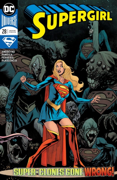
Supergirl #28
Written by Marc Andreyko
Illustrated by Eduardo Pansica
Inked by Julio Ferreira
Colored by FCO Plascencia & Chris Sotomayor
Lettered by Tom Napolitano
Cover Illustrated & Colored by Yanick Paquette & Nathan Fairbairn
Reviewed by Chris Egan
Wrapping up the ‘Clone Wars’ arc, “Supergirl” #28 sees our hero in the midst of the horrific creations of Hokum as she and the Omega Men must fight to escape their lair. Andreyko does well with Kara’s banter with her allies and heroic dialogue, even in the face the terrible sites throughout. And as with every leading Kryptonian, their internal guilt is a prevailing factor. Kara must power through a lot of guilt, facing tasks that she must do, as awful as it all seems. Action and B-horror movie moments flow very nicely. The only time the issue really falters is when it jumps to a sub-plot connected to the series’s greater arc, causing the story to slam to a halt. As powerful as Supergirl and Superman are, it is still enjoyable, at the right time, to see them overly charged with solar energy and Supergirl has a moment in the sun, so to speak.
Eduardo Pansica takes great care with the scarier moments and creations. His close-up moments are perfectly grotesque and wonderfully dynamic. Unfortunately, as the scope gets bigger in various panels, it’s tougher for him to capture grander scenes with great detail. The issue’s color work is split down the middle by Plascencia and Fairbairn. Upon a brief glance, there seems to be no real purpose for the sharing of work, aside from a scheduling conflict, but look closer and there is just enough of a change and it looks to be based on a change of setting. The first half of the story has a more muted palette, with only a few items and details standing out boldly. Once the heroes leave the world of the monsters, the lighting, and tonal scope changes. Everything is brighter and looks fully fleshed out. Higher contrast as a result of deeper colors and darker shadows gives the second half of the story a more traditionally modern DC comics look.
Final Verdict: 7.5, An exciting monster-mash with all the expected super-heroics of Kara Zor-El. A crucial finale and jumping off point for regular readers, but newcomers will be lost.

Written by Kyle Higgins
Illustrated by Rod Reis
Lettered by VC’s Clayton Cowles
Reviewed by Michael Govan
It feels like there isn’t that much Winter Soldier in “Winter Soldier” #4. Bucky Barnes takes a backseat here, the story revolving around RJ’s reunion with his father instead. The shift in focus didn’t really work for me. It’s not bad but it isn’t great either. I have to say that I’m not all that invested in RJ. I don’t dislike him, I just feel indifferent towards him. Over time that could change but for now, RJ doesn’t feel distinctive to me.
I also never bought that his father was on the up and up. Years of television and movies have taught me that things rarely pan out when an absent father shows up out of the blue. If it seems too good to be true, it is. It didn’t work for Will on The Fresh Prince of Bel-Air or Star-Lord in Guardians of the Galaxy Vol. 2. Time and time again, we’ve seen it doesn’t work.
Rod Reis handles all the art for this issue, the line art, and the coloring. He does an amazing job too, the artwork has been beautiful for this entire mini-series. There’s never a dull moment from a visual perspective. Every choice Reis makes feel deliberate, from the background colors to outlining a gun in red so that it stands out on the page. There are a lot of small touches that you might not think about that help improve the comic overall.
Verdict: 6.0 – Reunited and it feels so good…at least at first.

Written by Ed Brisson
Illustrated by Dylan Burnett
Colored by Jesus Aburtov
Lettered by VC’s Cory Petit
Continued below
Reviewed by Gustavo S. Lodi
With its fourth issue, “X-Force” wraps its inaugural arc, ‘Sins of the Past.’ This series itself is a continuation of some plot elements writer Ed Brisson had first introduced on the ‘Extermination’ event, but it is handled really well, so those elements should not be amiss, even for readers picking up this finishing entry.
Artist Dylan Burnett may not be an obvious choice for a mainstream comic like “X-Force,” but casting him aside would be a sore mistake. His angular, stylish line works really well with a more gritty and dirty environment like those presented on a black ops book like “X-Force,” and also one with some many characters with deformities, mutations and very specific physical features. Ahab, Deathlok and president Constantin are just some of the examples where Burnett’s style reinforces key elements very effectively.
Colors by Aburtov follow suit, remaining mostly within the darker spectrum of the palette. It does look foreboding and oppressive – to the point, it gets a bit tough on the eye – but it does so in service of the plot and the setting the story leans on. To do it otherwise, even if visually more appealing, would detract from the imposed narrative.
Brisson is doing some things really well, even if he hasn’t fully hit his stride just yet. There are familiar themes in “X-Force” that are welcomed for a team book of this nature (the secret agendas, multiple characters with ulterior reasons). The links to past events and plot lines are not overly indulgent, and feel more like an engrossing drama rather than bogged down continuity. However, the writer does seem to linger a bit too much on some discussion points, like Kid’s Cable bravado and the unwillingness of X-Force to follow him, which could be curbed down a bit.
Regardless of that, “X-Force” #4 ends this first arc on a high note, with enough surprises, segways into new storylines going forward and an excellent couple of final pages (which shall not be spoiled here).
Final Verdict: 7.5 – Despite some smaller flaws one could associate with a series still on its formative issues, “X-Force” delivers on mutant drama and unique art.


