
There is a lot to cover on Wednesdays. We should know, as collectively, we read an insane amount of comics. Even with a large review staff, it’s hard to get to everything. With that in mind, we’re back with Wrapping Wednesday, where we look at some of the books we missed in what was another great week of comics.
Let’s get this party started.
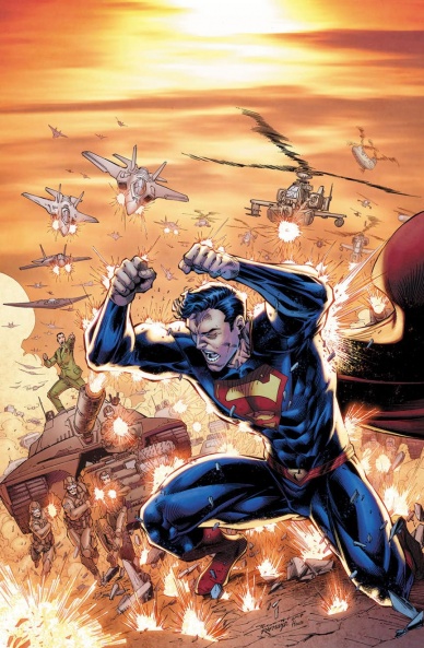
Action Comics #999
Written by Dan Jurgens
Illustrated by Will Conrad
Colored by Juan Nunes
Lettered by Rob Leigh
Reviewed by Gregory Ellner
Feelings of conclusion are palpable in Dan Jurgens’s writing on “Action Comics” #999. As the famed series approaches a new era with the four-digit numbering to come, Jurgens takes the time to look back and reflect, to rely on a feeling of family over conflict. This distinction is apparent in both the handling of Cyborg Superman and Samuel Lane. Rather than go into yet another fight with either of them (in deliberate contrast to the cover), Jurgens has Superman find peace of a sort with them both, allow them both to have happier memories and try to become better. After all, that’s what Superman is about; not just fighting down the bad guys, but helping people to be better even if the attempt often fails. The sign of the House of El means “hope” in many continuities, after all.
Will Conrad and Juan Nunes work together, on the pencils and the colors respectively, to help convey the scenes, whether it be from the palette or the organization of characters in the panels. Of particular note is how the shadows on Samuel Lane seem to change depending on how he is perceived, from darker when he is overly rude or menacing to much brighter when the mood shifts to happier times. Also, the placement of Jon Kent in panels helps to keep focus on him even when the scene involves a conflict between Lois and the general, mostly by placing him front-and-center as opposed to them being on the sides. This decision helps to keep the mood of said scenes as sad or disappointing against Samuel Lane by taking Jon’s innocent side of things, and makes the finale all the more happy.
While Jurgens, Conrad, and Nunes might be done with this run, it ended on a high note, one that can leave readers with a smile, as fleeting as it may end up being.
Final Verdict: 7.0- Dan Jurgens’s run on “Action Comics” closes with a feeling of hope for the future.

American Gods: My Ainsel #1
Plotted by Neil Gaiman
Scripted by P. Craig Russell
Illustrated and Colored by Scott Hampton
Lettered by Rick Parker
Reviewed By Kate Kosturski
Shadow’s story continues in the icy depths of the Upper Midwest. Wednesday and Shadow have left the House of the Rock, and traveling back roads, plan their next moves. It’s Christmas Day, but neither is feeling the spirit of the season. Over dinner in a roadside diner, Wednesday reminisces over cons gone by, flirts with a waitress, and sends Shadow off to an apartment a few hours away while he continues his quest of rallying the gods. Traveling as “Mike Ainsel,” Shadow’s dreams continue to torture him, with him realizing he has to give up more of himself in order to save his beloved Laura. What adventures will he find next in the charming, straight out of A Prairie Home Companion Lakeside?
If I had one word to sum up the feeling I had from this book it is: cold. That could well be the late December in the Midwest setting, with quiet snow and crystal clear skies. It’s a complement to the fire and brimstone of the previous series arc that works well when paired with this narrative that’s a pause of sorts in the overall action, a breather in between the sensation of what has been and what is to come. Even Scott Hampton’s pen and ink work takes a pause; it’s simpler in facial expression and throughout settings that push forward the plot (the diner, the bus station, the drive through Lakeside). It can be disappointing to those that read the first series just to see Gaiman’s rich worlds come to life in the visual arts medium to see things dialed down from a 10 to, say a 6, but at the place where we are plot-wise in this tale, it fits. Hampton spares no expense in line and color during the flashback scenes and Shadow’s dreams; even with the overall m muted color palette, you can still sense Shadow’s mental torture in these moments. There are times the narrative does feel unnecessary and insignificant – – do we really need to see several pages devoted to an entire tour of Lakeside? However, this is a Neil Gaiman work, and it’s important to remember what can be the most insignificant detail now could become quite significant later, so pay attention to everything and leave no detail untouched.
Continued belowWelcome back, Shadow Moon. I’ve missed you.
Final Verdict: 7.7 – A fine start to the second half of Shadow’s journey, taking the necessary pause to regroup and set things in place for the larger battle to come.
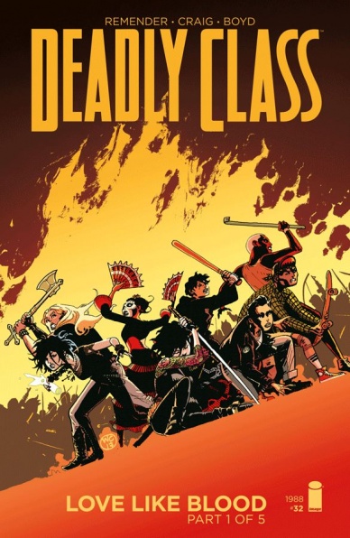
Deadly Class #32
Written by Rick Remender
Illustrated by Wes Craig
Colored by Justin Boyd
Lettered by Rus Wooton
Reviewed by Alex Curtis
I’m exhausted just reading Rick Remender’s first issue of “Love Like Blood.” As per usual, Remender opens his “Deadly Class” arcs with immense and intense explosions of visceral violence. While it’s entertaining on one level by leaving you breathless, it’s pretty convoluted.
It’s comical how much action is present and how many characters are running around Mexico. But instead of focusing on character dynamics, Remender and Wes Craig are having more fun throwing hundreds of disposable yakuza in front of our cast’s blades and bullets. It’s a dizzying first chapter, but one that rings hollow with the exception of a heartfelt intro that catches us up to speed with all that Marcus and company have gone through. “Love Like Blood” Part 1 is a celebration of excess—but not in a great way.
However, the indulgent nature of the issue lends itself well to Craig’s unconventional, blocky art. Craig pulls out all the visual stops, utilizing an impressive, slanted panel grid, gargantuan two-page spreads of sheer mayhem, and enough motion lines to give you vertigo. This is a pulsating piece of pure action, and Craig excels with issues like these. Justin Boyd deserves just as much credit for utilizing color combinations that could be ugly or mismatched, but are stunning under his use.
Unfortunately, there are so many characters and set pieces, it can be confusing as to what’s happening. I had to reread many pages and panels to grasp where our leads were going and who was shooting what.
As previously mentioned, for all the explosive bravado this issue conjures, it feels strangely lacking. Instead of reveling in a massacre of faceless baddies and in admittedly amusing Frank Miller and Monty Python gags, Remender should have emphasized the characters more. Bigger does not equal better. For instance: wouldn’t this issue be so much more powerful if Kenji was the one the students were fighting instead of his hordes of henchmen? Watching Marcus and Viktor work together was a nice twist, but it’s just padding to push their actual confrontation into the next issue.
Final Verdict: 4.9 – Even Rick Remender can fall into the misguided belief that “bigger equals better.” “Deadly Class” is best when it focuses on its cast, but this issue is jumbled overkill.
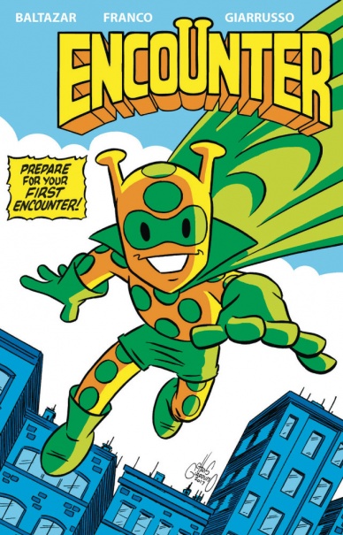
Encounter #1
Written by Art Baltazar, Franco, and Chris Giarrusso
Illustrated, Colored, and Lettered by Chris Giarrusso
Reviewed by Alan Buxbaum
“Encounter” #1 is a new comic geared towards kids that jam-packs a number of events and an origin story into it’s first issue. The story’s plot is engaging enough, but has too many twists and turns, as if it was putting a Tarantino-like spin on the order of events. It follows your average hero story, somewhat akin to Martian Manhunter’s and extremely watered down to suit younger folks. Our protagonist’s motivations are both naive and sincere with no actual defining trait that separates it from any other hero-type character. While this is true, the story does begins to set up a world which has the potential to turn into a great backdrop for someone’s first comic book experience. That being said, it also tries to put too many events into its first comic. More development and less origin would have enhanced the story and character in a much more engaging way.
While the story is lacking, the artwork is fun and entertaining. Giarrusso uses an abundance of bright and lively colors combined with dense backgrounds to give an upbeat aesthetic. The comic never gets dark in content, and the art is reflective of this. There are plenty of pop-culture references which are made solely by Giarrusso’s art, which he executes wonderfully and in a playful matter. The art was by far the more interesting part of the comic.
Final Verdict: 5.5 – “Encounter” #1 is a well-drawn kid’s comic which tries to put too much content into its first issue. Though the comic book has some potential, its first stab makes for a mediocre experience.
Continued below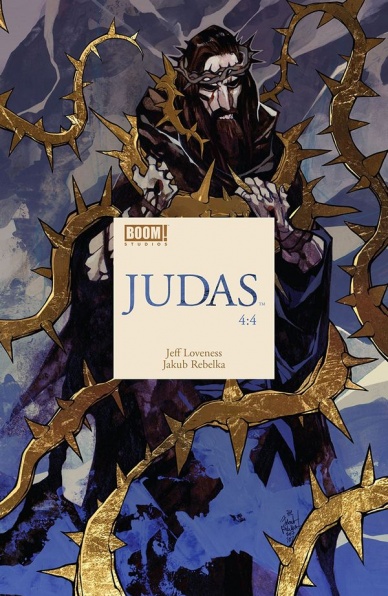
Judas #4
Written by Jeff Loveness
Illustrated by Jakub Rebelka
Colored by Jakub Rebelka
Lettered by Colin Bell
Reviewed by Gustavo S. Lodi
“Judas” #4 marks the end of the mini-series retelling the story of Judas Iscariot, especially focused on the moments leading up – and following – Jesus’ death and his own. What Loveness and Rebelka have now crafted is an instigating story, filled with emotional gravitas and meaning.
For a topic so well-known and discussed, with so many iconic imagery developed throughout the centuries, it is hard to imagine the thought process going on in an artist’s mind to make it once again unique. Rebelka, on this issue and on the series as a whole, has used mostly stylised depictions of both human and otherworldly characters, making them unreal and almost fluid-like on his drawings. These are characters that are changing before the reader’s eyes, in a backdrop that is so unfamiliar that it leaves no space for any sense of normalcy.
It is on colors that Rebelka really shines, though. Choices are most certainly thematic, with deep reds depicting moments on anguish and anxiety, with brighter tones of yellow and orange framing grace and hope, with blues reinforcing calmer situations – both before and after the proverbial storms.
Loveness’s decisions on how to finish Judas story may not be received well by some readers, but that is hardly the point of this narrative. What the writer does – brilliantly – is to ask the question of “what would you do if you’ve learned that your role in history is that of villainy?” The moral issue around how even a man whose name will never be used to christen a child again can be a force for good, is a compelling debate that should keep readers invested and revisiting this issues and series many times over
Final Verdict: 8.9 – A noteworthy ending to an unusual series, “Judas” #4 uses the strengths of comics’s visual storytelling to ask ages-old questions of despair, hope and how anyone can transcend any pre-ordained behaviour destiny frames reality in.

Paradiso #4
Written by Ram V
Illustrated by Devmalya Pramanik
Colored by Dearbhla Kelly
Lettered by Aditya Bidikar
Reviewed by Matt Sadowski
As foreshadowed by the cover, this issue belongs to Mr. Honeybad, the steel-jawed, silent Guardian of Paradiso. The showdown in Arbuck settlements is the violent culmination of various conflicts, and it’s certainly the most action-packed sequence we’ve yet seen in “Paradiso.” The pneumas is used to stunning effect, sword-wielding Honeybad shreds flesh and steel, and Mr. Dandy “serves the function.”
Each issue of “Paradiso” is lengthier than most single issues on the stands (#4 is 32 pages), and Ram V always makes each page count. It’s not a breezy read; V has spun a complex tale, one with a deep history and complicated web of relationships–all of which aren’t yet clear. Rereading may be required for the passive reader. This issue unveils more of Jack’s past than ever before and a surprising connection to one-half of Hazard. Answers and connections are slowly parsed out, giving readers mere morsels to sustain them until the series returns in July. But with the journey this spectacular, the destination’s delay stings a little less.
Devmaly Pramanik’s character designs never fail to impress. Most of the major players make an appearance here, but the robot Guardians make the most impact. Despite Honeybad’s uncanny appearance and lack of speaking, Pramanik is able to lace his expressions with subtle, surprising emotion. Dearbhla Kelly’s colors are also a large part of why the art works as well as it does. The preternatural green glow of the pneumas showcases its mysterious power. The dusty brown ambiance of Arbuck provides a unique backdrop for the issue’s showcase action scene.
Pramanik, V, and Kelly are well and truly synchronized now, delivering another strong chapter in their mysterious dystopia series. “Paradiso” is not to be missed.
Final Verdict: 8.2 – “Paradiso” receives a refreshing jolt of action and surprising characterizations while slowly revealing the mysteries of the sentient city.
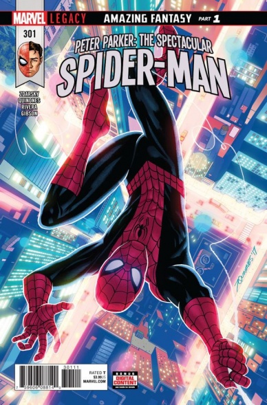
Peter Parker: The Spectacular Spider-Man #301
Written by Chip Zdarksy
Continued below
illustrated by Joe Quinones
Inked by Joe Rivera
Colored by Jordan Gibson
Lettered by VC’s Travis Lanham
Reviewed by Alexander Jones
I think at this point it is safe to say that I have absolutely no idea what kind of comic I am going to read whenever I open up the pages of Chip Zdarky’s run on “Peter Parker: The Spectacular Spider-Man”. However, after the seeing the “Howard the Duck” creative team return I couldn’t help but get excited to check back in on the series. Thankfully, the madcap energy of the run is expertly deployed in this installment and the series exudes a level of quality only seen prior to this installment in “Peter Parker: The Spectacular Spider-Man” #6.
Switching artists to Joe Quinones is wonderful, as the retro-tinged Spider-fueled art of Quinones is perfect for this older-themed story titled Amazing Fantasy. Zdarsky has a great time mixing up the narrative, offering Quinones the leeway for some comedic timing and silly elements. Quinones is a perfect artist for Spider-Man as he evokes both the Steve Ditko horror elements and the John Romita Jr. romance of the time period. In the “Amazing Spider-Man” title, author Dan Slott isn’t having quite as much fun which also makes Quinones the best option for this script. With more rounded lines and lots of smiles, it sure is a lot of fun to look at the issue. The stark reds and blues from Jordan Gibson stick out in my mind long after closing the comic.
With the formalities and rigid tone of what a “Spider-Man” issue has to be dumped in the trash, Zdarksy embraces the strange elements of the character in his script and finally turns in material better exemplifying his strengths as a creator. With the generic and occasionally silly tone of the first couple issues washed away, Zdarsky can finally have some magical character elements of J. Jonah Jameson’s new outlook on Spider-Man or even the character explore an alternate reality. With the newfound freedom the creators possess, “Peter Parker: The Spectacular Spider-Man” #301 feels liberated and full a potent renewed interest in having fun.
The time period and subject matter of the story also allow for some faster and looser continuity which still has the background of the original series. Parker and company seem to be developing a consistent core cast only for this book as well with Teresa and Jameson finally getting some screen time. The idea that the Parker luck is finally back with the new status quo update should also make room for continued silliness in the pages of “Peter Parker: The Spectacular Spider-Man” going forward and I wouldn’t have it any other way!
Final Verdict: 8.3 – “Peter Parker: The Spectacular Spider-Man” #301 is boldly irreverent and irresistibly beautiful.
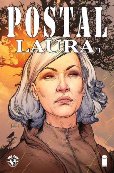
Postal: Laura
Written by Bryan Hill
Illustrated by Isaac Goodhart
Colored by K. Michael Russell
Lettered by Troy Peteri
Reviewed by Michael Mazzacane
The epilogue to “Postal” continues with another one shot, “Laura.” With Hill’s running monologue and Goodhart’s measured art, the series creative team nail what makes for a good epilogue. “Laura” finds Eden in the aftermath of the main story, but like the best epilogues uses it to realize that is just the beginning of another story.
Goodhart’s art in this issue slows everything down. It isn’t ultra-decompressed, he just inserts a panel that breaks a character down to their job or what is important to them. It visually ques the reader into this being a slice of life issue. This pace gives this issue a bit of an episodic approach as they pop in on characters throughout the day. That doesn’t mean this issue lacks thematic heft or structure, Mark begins his day one way and ends it another. It’s a journey that is nicely expressed in a couple of scenes. With the series running internal monologue it can seem like “Postal” is tell instead of showing. However, here Hill uses Goodhart’s staging and his dialog to maximize the turn Mark is going through during a crucial sequence. That ability to show and tell at the same time makes this one of the series better issues.
Continued belowIt’s interesting to note how Goodhart treats the violence of this issue. This is a comic that is done in a fairly realist tradition, but the violence of this issue is treated in graphic fashion, literally. Once Maggie sees what has happened in the wake of bath salts, Goodhart’s art becomes more stylized. Being able to draw streaks of blood tends to add a sense of energy to an image, and colorist K. Michael Russell picks about the most evocative shade of red that would still fit in the overall pallet. It is the other little touches like tighter framing and slightly canted angles that create a palpable sense of energy. Until it explodes into a literal graphic onomatopoeia. The one short coming in this sequence is how callus Maggie is drawn. Mark being a bit of a cipher makes sense, but this experience requires something than bigger subtle shifts in her lips. It’s a noticeable disconnect between how the sequence is being presented and how those figures are also being presented.
Final Verdict: 7.5 – “Postal” and it’s creative team finally come to rest after spending one more day with the cast.

The Wild Storm: Michael Cray #6
Written by Bryan Hill
Laid out by Larry Hama
Penciled by N. Steven Harris
Inked by Dexter Vines
Colored by Dearbhla Kelly
Lettered by Simon Bowland
Reviewed by Elias Rosner
The first, and currently only, spin-off title in the new Wildstorm imprint, “Michael Cray” should be a tightly focused character piece about Cray and his ongoing developments after leaving the main “Wild Storm” title. As it stands, here at issue 6, we’ve had maybe one issue of that and five issues of him hunting this universe’s version of the Justice League. It’s not very interesting, and we don’t get much in the way of development for Cray. More answers, maybe, but nothing more than a rehash of what we’ve already seen.
Such is the case here. This issue sees him hunting down Aquaman, erm, Arthur Curry, and taking him out much like he’s done to every other Lleaguer equivalent: with prejudice…and then a healthy dose of righteous indignation towards his employer for making him do the thing he seems to enjoy doing. Again, same old, same old.
What isn’t the same is the art. I don’t know if it’s just the break between issues or not but the art seems to have dropped quite a bit in quality. Cray and everyone else looks like they were drawn in MS Paint and there is a distinct lack of backgrounds. The character’s faces are flat and melting, their posing is stiff or limp depending on the page and nothing is consistent about any of them. Page 9 is especially egregious for this. It takes place entirely in a cream-orange void and is devoid of any of the tension that should be present in the start of a battle with a “mysterious” enemy that’s been built up for two issues.
Combine this with the serviceable, simple paneling, the inconstant character motivations, in that it’s never made apparent what Cray is or is not willing to do or why he changes his mind, and the teaser for yet another main universe doppelganger to make an appearance instead of, you know, furthering Cray’s actual internal dilemma, and you have an issue that feels entirely superfluous. Were we to have spent more time with Cray being Cray, Human Being, instead of Cray, Monster Hunter, then this might have made me stay invested. The end gives me a glimmer of hope the character issues might get sussed out.
As is, though, this issue may have gotten me to finally drop this spin-off. I’ll see if the month off helps tighten the story and clean up the artwork. Hopefully it finds its footing. If not, well, it’s half-way over.
Final Verdict: 3.2. A thoroughly skippable issue that amounts to exactly what you thought would happen at the end of issue #5. No twists, no interesting dialogue, and certainly no good art.

VS #2
Written by Ivan Brandon
Illustrated by Esad Ribic
Colored by Nic Klein
Continued below
Lettered by Aditya Bidikar
Reviewed by Jonathan O’Neal
“VS” is an ambitious book, mirroring the information overload of our digital age and presenting a vision of a future that seems less foreign with each passing day, like an episode of “Black Mirror” crossed with “Blade Runner.” The title’s hero, for lack of a better term, is a cybernetically enhanced humanoid named Satta Flynn, a warrior on the downhilll side of a decorated career as a professional war dog and participant in televised war games with real casualties. These are no Saturday paint ball tournaments.
Brandon’s scripting evokes Frank Miller’s “Dark Knight Returns” cadences minus the pulp noir trappings but with the divergent voices ratcheted up beyond just talking heads and Robert Altman-like overlapping dialogue to include futuristic sponsored notifications. Tom Muller’s design and Aditya Bidiker’s lettering help keep everything straight, but VS can still prove a challenging read if you’re not paying close attention. Brandon’s script doesn’t pander. If you’re looking for rich exposition, you’re going to have to glean it from the what the characters are saying and what the broadcasters provide, like jumping into a river midstream and letting it carry you. It’s truly in medius res storytelling.
Esad Ribic’s artwork is really the star of the show here. It has a decidedly thin-lined and elegant Euro feel coupled with superhero kineticism, and Nic Klein’s painterly coloring gives it a rich dimensionality that should have fans salivating for an oversized collection. The only criticism might come from the staging of the battle sequences. While it certainly evokes the chaos of war, there are times when more visual cues might have been helpful to understand what’s happening. It can get a bit confusing, and to be honest, there are still questions after several passes through the fight pages.
The battle’s aftermath carries the emotional beats of the issue. The grizzled veteran has been eclipsed by the skills of a younger teammate. Age and wear seem to have taken their final toll. The future of someone who doesn’t know anything else but how to fight seems uncertain until the issue’s story punchline reverses his prospects. While we don’t yet know what that means, it certainly appears to be a positive sign for our hero. The question in the early going of this series is why should we care?
Final Verdict: 7.5 – “VS” continues to be a beautiful and imaginative high concept book, throwing information at the reader at a breathless pace. Ultimately, we’re not sure yet what it has to say.


