
There’s a lot to cover on Wednesdays. We should know, as collectively, we read an insane amount of comics. Even with a large review staff, it’s hard to get to everything. With that in mind, we’re back with Wrapping Wednesday, where we look at some of the books we missed in what was another great week of comics.
Let’s get this party started.

Carnage #1
Written by Ram V, David Micheline, and Ty Templeton
Penciled by Francesco Manna, Ron Lim, and Ty Templeton
Inked by Roberto Poggi
Colored by Dijjo Lima and Israel Silva
Lettered by Joe Sabino
Reviewed by Quinn Tassin
What a great idea “Carnage” #1 is! A story following a symbiote without a host (or a need for one) as it plans to achieve some mysterious, surely horrifying goal is naturally going to skew a little insane. To balance that out, the creative team lays the most grounded, creepy foundation that it can. Now, the last pages, showing the transformation of Hydro-Man into a giant glowing blood orb clearly demonstrate that we’re about to go into absolutely insane territory. Still, though, framing the issue around a detective hunting a serial killer makes this as easy an entry point as it can be.
Carnage can be a tough character to pin down and Ram V makes the wise decision to make him a secondary character in his own series’s first issue. With the desperate serial killer obsessed with making art out of crime scenes, we get a well-written, horrifying character. Immediately we understand his motives and he makes for the perfect audience conduit to see what Carnage is up to. In Detective Shayde, readers get a much more palatable pair of eyes to see through. He’s an easy hero to root for because, well, he’s trying to stop a serial killer. Plus, “guy pulled into a conflict far beyond his pay grade” is a tried and true structure for a story.
The artwork is excellent, oscillating from creepy to horrifying to trippy and often pulling off all at once. The initial crime scene is a display of real talent with its skin-crawling level of detail and copious amounts of blood. The Hydro-Man torture warehouse is a setting illustrated with a degree of creativity and care that really shines (and scares). The setup is like something out of a nightmare and it’s genuinely jaw-dropping. That the art is so evocative can also be attributed to the effective illustration of faces and body language. Every time a character is disgusted or in pain, you can see it and understand it more.
The backup stories are easily the weak link in “Carnage” #1. While “child in juvie learns that murder won’t get him anywhere after teaming up with Carnage” is certainly an idea any writer would be excited by for a second, it just isn’t easy to execute. Honestly, this would’ve been a better story if it resulted in the boy becoming evil and planting a seed for something to come up down the line. Instead it ends by trying to make a character called Carnage seem sympathetic.
The Peanuts parody page is cute, brief, and inoffensive. Carnage in a Snoopy role killing bar patrons is chuckle-worthy, as is the punch line of those panels. The “Watcher of If” doesn’t have any particularly funny bits but again, it’s so fleeting as to escape any demand for real criticism.
Final Verdict: 7.9- A well paced, well scripted, genuinely creepy mystery

Eternals: The Heretic #1
Written by Kieron Gillen
Illustrated by Ryan Bodenheim and Edgar Salazar
Colored by Chris O’Halloran
Lettered by VC’s Clayton Cowles
Reviewed by Alexander Jones
“Eternals: The Heretic” #1 contains some of the last published interior work from artist Ryan Bodenheim. “Eternals: The Heretic” #1 also happens to be just a small piece of Kieron Gillen and Esad Ribic’s “Eternals” series that is currently firing on all cylinders. Gillen is able to utilize Bodenheim’s non-traditional comics work to tell a story with a slightly different tone than the core “Eternals” series. Gillen’s use of humor and exploration of the dark mind of Thanos is suited incredibly well for Bodenheim’s cartoonish artwork that exposes the contradictions within Thanos’ personality. Bodenheim draws Thanos taking a violent action with a hilarious sense of irony. Thanos is reduced to physical comedy which brings out a lighter side of the mass-murdering villain. Bodenheim seems to understand Gillen’s complicated script really well here.
Continued belowBodenheim draws extremely heady alien species with grace. Bodenheim’s subtle facial expressions with Thanos and Druig hint that there is a deeper subtext beyond the prose that Gillen is trying to draw out with the script. Bodenheim really runs with these suggestions thanks to lingering camera shots and great comedic timing. Bodenheim draws an incredibly dark story filled with antagonists that have bad intentions here. Uranos, Thanos, and Druig trade lines into the issue and delve deeper into science fiction concepts. The mysterious origins of Uranos are also depicted with majesty from artwork by “Eternals: The Heretic.” The science concepts are so in-depth here and Bodenheim never seems to lose the plot or the flashy output in the execution. Bodenheim was an incredibly special artist that was able to draw so much emotion on the page. Bodenheim’s last page evokes the beauty from Gillen’s script to culminate in a climactic moment.
”Eternals: The Heretic” #1 is loaded with solid character beats that inform the main series. While ”Eternals: The Heretic” #1 is a side story to the main series, I have no doubt that story elements from this issue will return in the main series. Gillen and Bodenheim really bask in the politics of this story. Are Druig’s seedy motivations worse than Thanos’? This is the kind of story-heavy writing that readers are going to be able to return to after this series is done and pick up on nuances they didn’t notice last time. I’m horrified that we will not be getting any more work from Bodenheim and want to commend Bodenheim and the entire creative team of Gillen, Edgar Salazar, Chris O’Halloran, VC’s Clayton Cowles, and cover artist Andrea Sorrentino for making this issue and series achieve such a vast level of quality.
Please consider donating to the Hero Initiative if you would like to help support Bodenheim and other comic book creators.
Final Verdict: 9.0 – “Eternals: The Heretic” #1 enriches the main story with additional context and vivid art.
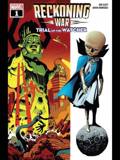
Reckoning War: Trial of the Watcher
Written by Dan Slott
Illustrated & Colored by Javier Rodriguez
Lettered by VC’s Joe Caramagna
Reviewed by Alexander Manzo
“Trial of the Watcher” is both a one-shot by Dan Slott and a bridge for an event that has been building for years. This story has Uatu as the main character of what is happening but still in his usual position of watching. However, he’s forced to view an event that he does not desire to. He sees The Fantastic Four deal with Galactus’ first time coming to Earth without his warning and thus unprepared. Slott finds a way to balance it being a campy story that the reader may or may not be familiar with but adds some twists that give it a more innovative feel that old-school comics did not have. What helps with the story is that by the end of this What If… tale, each member of The FF has lasting scars that generally would have been forgotten or fixed in the golden age of comic story-telling.
Slott creates this self-contained story with no real sense of danger that the heroes will lose. Ikor’s, Uatu’s father, constant questioning as Uatu freaks out seeing this unfold like someone who has seen a movie multiple times and trying to keep the other person from flipping out too much. The reader is aware it will be alright in the end; it’s just a matter of how it will happen.
Javier Rodriguez’s art is the key element to this story feeling like the golden age due to the thick line and bright coloring during the What If… part of the story. It does not have this darker element that newer modern Marvel stories have that keeps the reader engaged because it feels refreshing and fun. It’s another balancing act as Rodriguez pays homage to Jack Kirby’s work from the past but adds current elements such as more detailed expressive looks on the characters when they are battling Galactus. Rodriguez also creates this interesting courtroom in that Ikor takes Uatu where there are giant-size versions of Marvel characters from the What If… storylines of the past, such as Spider Man joining The FF and Silver Surfer with the infinity gauntlet.
Continued belowFinal Verdict: 8.0 It’s a fun campy story that feels like it loses its main point at times, but since it’s a one-shot and contained, it still maintains the entertaining aspect of it.

Stillwater the Escape #1
Written by Chip Zdarsky, Jason Loo, Andrew Wheeler, Ethan Young
Illustrated by Ramón Perez, Jason Loo, Soo Lee, Ethan Young
Colored by Mike Spicer, Dee Cunniffe
Lettered by Rus Wooton
Reviewed by Henry Finn
“Stillwater the Escape” #1 is a one-shot book that apparently shines light on burning questions that fans of the series might have about specific characters. If you haven’t been following the series, or don’t know the general premise of the book, nothing will really make sense to you. To an avid reader it probably serves as an insightful addition to the canon; and to someone picking up a Stillwater book for the first time this would probably serve more as a moody anthology that allude to themes more than plot.
Creator and writer Chip Zdarsky sets up the book with a brief intro to the general theme of the book by using the dichotomy of fire as a metaphor for the dichotomies within us. He points out fire destroys us but also brings out stories that leave us to wonder. He also reminds us that stories themselves are at times simply a form of escapism.
The idea of escaping serves as the primary thematic driver for each story that follows. Writer and illustrator Jason Loo starts off with ‘The prisoner’ -an ode to a man who suffers torture and mutilation over and over again because he loves his wife and child and will do anything to be with them. This shows that he is inability to escape his own love for his family that compels him to try and try again.. Thereby trapping him in a hell of his own making. He is a prisoner of his own love. The most common thread of all three stories in the book is that Stillwater is a town that turns hope despair, time and time again.
Illustrators Jason Loo, Adrew Wheeler, and Ethan Young compliment each other well. Aesthetically their styles work together in a way that has the least interruption in visual continuity. All three artists render backgrounds with little detail that allows colorist Mike Spicer to apply his unifying touch. In each story we see a similar pattern of shifting orange, blue, and green colors filling the sky and buildings behind the characters. This allows you to feel like you are centered in one reality.
Final Verdict: 7.0 – Fun if you follow the series, but confusing if you don’t.


