
There’s a lot to cover on Wednesdays. We should know, as collectively, we read an insane amount of comics. Even with a large review staff, it’s hard to get to everything. With that in mind, we’re back with Wrapping Wednesday, where we look at some of the books we missed in what was another great week of comics.
Let’s get this party started.

Black Knight: Curse of the Ebony Blade #1
Written by Simon Spurrier
Illustrated by Sergio Dávila
Colored by Arif Prianto
Lettered by Cory Petit
Reviewed by Gregory Ellner
Admittedly, some readers may not know much about the Black Knight (or at least the Marvel version). The idea of “everyone hates him” may be odder for some readers than others. It doesn’t seem to really take into account the idea of psychological stress as faced by other characters on a daily basis, or of people liking versus not liking a character in general. However, that on its own isn’t all that important as Simon Spurrier tells his new tale of the character.
What is, is the ridiculous assumption by Simon Spurrier’s take on the character of Dane Whitman that people would refuse to believe that Camelot exists. A story that is based in a world where the Norse gods travel around on a daily basis, where the famous Hercules is far more than a mere story (and is in fact an Avenger), where countless other pantheons exist in various forms… doesn’t believe that Arthurian legend has any factual basis? Yes, this is just a new take on the character, and changes can be made, but the idea that an adult who have lived in this world wouldn’t believe in its validity, or would take said valid concepts to the point of parody (as in the case of Whitman’s dialogue itself) seems to almost disrespect the story it tries to tell. If it were told in any other universe, perhaps it would have a point, but in the Marvel Universe (and to a degree if it were at DC), that kind of experience stretches beyond the point of reason.
While the characters are more than a bit ridiculous, Sergio Dávila’s artwork helps to make the story worth reading on its own. Whitman’s pain-wrought face, the anger or annoyance of his “coworkers,” and the massive carnage brought forth by the Ebony Blade itself, all make ample use of raw, palpable emotion, especially in the case of the latter. While the eponymous “curse” is not readily evident in full by this debut, the representation of its power does help a fair bit, especially when viewed either in a wider view or in close inspection.
The use of color is interesting, taking brighter tones for Camelot itself, and darker ones around the Ebony Blade and its destruction. The colors indicate not only wonder, but also fear and mysticism in and of itself. There is a lot of emphasis on the darker side of things, apparently carrying over from the Black Knight’s one-shot in ‘King in Black,’ and Arif Prianto definitely helps bring that to the fore.
Final Verdict: 7.0– While the story of this take on the Black Knight has some degrees of implausibility, the artwork and colors help to make up for what it lacks.
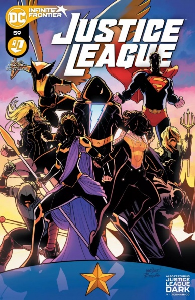
Justice League #59
Written by Brian Michael Bendis
Illustrated by David Marquez
Colors by Tamra Bonvillain
Lettered by Josh Reed
Reviewed by Quinn Tassin
Brian Michael Bendis and David Marquez are one of those duos in comics who have a hard time missing. When they team up, you just know that you’re in for an absolute riot. And on a book like “Justice League,” that is an absolute blessing. Together, the pair deliver a joyful, energetic debut on what seems to be, at the very least, a very fun run on DC’s most famous team book.
Bendis is at just about his strongest here- he brings fun action, strong character beats, and paces the book perfectly. The fight scene that takes up the bulk of the issue gives the spotlight to each and every character and he captures their voices well. Particularly exciting, though, is that Aquaman gets the biggest moment in the battle. Opening up a Justice League series and allowing the most joked about character on the team have the coolest scene is a good sign of where Bendis’s priorities are as a writer. This isn’t a comic about Batman, Superman, and Wonder Woman and company, it’s about the whole Justice League. The brief scene at the Hall of Justice, too, exemplifies this dedication to every character. Green Arrow and Black Canary get strong beats where that don’t just put them in a good light, but actively allow them to be leaders for the rest of the league.
Continued belowDavid Marquez is a superstar artist and he’s doing some of his best work on this issue with a great boost from Tamra Bonvillain’s colors. Marquez is a perfect fit for DC’s house art style, bringing a crisp, clear aesthetic to things but with a unique sense of energy. Nearly every page that Marquez illustrates is something that you want to put up on your wall. He captures small moments like Superman taking a thoughtful glance and big ones like Aquaman’s shark attack with equal quality. Marquez isn’t an artist who usually gets much attention for his layout designs but there’s some really inventive work being done here. The Aquaman/Brutuss confrontation is a highlight here; the way that water is used to divide the page into crazily shaped panels that still clearly communicate each beat is really great.
The team that Bendis and Marquez have assembled here is really intriguing, with a great mix of high and low profile and human and superhuman characters who all come at being heroes from really different perspectives. The inclusion of Naomi and Black Adam is an especially fun and it’s exciting to see where both of those characters are going to be taken in this series. Let’s hope it all stays as strong as this issue was.
Final Verdict: 7.9- “Justice League” #59 is a strong, fun debut for Brian Michael Bendis and David Marquez that bodes well for the future of DC’s premiere team

Radiant Black #2
Written by Kyle Higgins
Illustrated and colored by Marcelo Costa
Lettered by Becca Carey
Reviewed by Alexander Manzo
“Radiant Black” #1 was a good set-up for the origin of Nathan’s powers and stumbling to use them; issue #2 was a great step forward by Kyle Higgins, as it forces Nathan to ask himself if he is going to continue to use them, and why he should. The book team addresses the question plainly by having his father pushing him for information on his financial status and to look for work that’ll pay well, followed by the police knocking on his door about the events from the prior night. Nathan’s ultimate decision of finding a way to combine the two are the perfect baby steps into finding a way to make amends on his financial front with his father and his personal life of finding a way to use his powers to help the community.
Marcelo Costa does another excellent job of having tight and crisp linework throughout the issue. The entire issue seems to take place during one day and the panel choices with the conversations between Nathan and his father mirror the fight scene in building small tension while making sure the reader doesn’t miss a beat. Costa also relies on natural light that works well with the story as the parts where Nathan is out of his suit are much more vibrant due to the use of yellows and oranges. The driving/interviewing customers page was done particularly well because of the ever-changing sun in the back to show Nathan asking questions all day long in hopes of gaining information.
The dream sequence of Nathan inside the suit and it reaching at him is a fantastic frightening note that does not come up in any other moment in the book. It works particularly well because of the pure blackness of the page except for two slits of light similar to the eyeholes on the helmet.
Final Verdict 8.9 – “Radiant Black” #2 takes a good step towards an interesting new series.

S.W.O.R.D. #4
Written by Al Ewing
Illustrated by Valerio Schiti
Colored by Marte Gracia
Lettered by VC’s Ariana Maher
Reviewed by Luke Cornelius
After a scenic detour with Manifold in #3, “S.W.O.R.D.” #4 tackles its ‘King in Black’ connections directly and Al Ewing does a great job of keeping the issue unencumbered by it. He glides over the larger end-of-the-world nature of the event and ensures that #4 is as much an issue of “S.W.O.R.D.” as it is a ‘King in Black’ tie-in. Manifold continues as the standout character, with the audience seeing him use his powers in combat by jumping through portals while a Knull-controlled Cable does the same, chasing him. For readers who weren’t familiar with the character, it does a great job of showcasing his abilities further and making us want to see more of him. Other characters such as Wiz-Kid, Abigail Brand, and Frenzy get their moments to shine too and Ewing makes room for some very intriguing proposals, using the ‘King in Black’ event as a prompt: Brand suggests setting up backup hatcheries off-world and Magneto requests a Quiet Council meeting to amend the second law of mutantdom. Both will have a huge impact on the other X-books and give further credit to “S.W.O.R.D.” as the crown jewel of the ‘Reign of X.’
Continued belowValerio Schiti’s artwork throughout “S.W.O.R.D.” #4 is great too, supporting Ewing’s effortless script with some equally slick visuals. Each panel feels dynamic and energized due to Schiti’s camera angles. The page layouts are all unique too, bar one pairing, and, while the designs themselves don’t feature dramatically different shapes, the inventiveness to make each page so different does not go unnoticed. As for the pair of pages that match, they are a skewed nine-panel grid, depicting Manifold’s portal fight with Knull/Cable, successfully depicting the frantic pace of the scene.
Marte Gracia’s colorwork is continually influential and dictates the atmosphere throughout “S.W.O.R.D.” #4. This is mostly seen with the cold blue tones that dominate the Anti-Krakoa landscape, but is evident in the color coding for the Peak too, with Abigail Brand’s scenes washed in green. Gracia’s detailed use of red, orange, yellow, and white to depict Manifold’s powers look incredibly powerful as well.
Ariana Maher’s lettering is positioned well across “S.W.O.R.D.” #4 and is the final part of a very, very good collaborative effort.
Final Verdict: 8.5 – “S.W.O.R.D.” #4 is an issue with great visuals that bends its ‘King in Black’ connections to its will.

X-Force #18
Written by Benjamin Percy
Illustrated by Garry Brown
Colored by Guru-eFX
Lettered by VC’s Joe Caramagna
Reviewed by Matt Sherman
“X-Force” #18 follows up after Quentin and Phoebe’s mission in the last issue. Upon their return a new threat arises on Krakoa; a new psychic threat to the mutants. The issue as a whole wasn’t too exciting.
The story was not bad, but it did not bring any new developments to the series, aside from the new threat. For a team with many members, there were not many characters present. Quentin Quire has been on a journey of trying to be a better person, but this issue didn’t really follow up with that. With Quentin being one of the main characters of this issue, it felt like a lot was missing. The dialogue between him and Phoebe felt robotic and not real. It leaves their relationship feeling stale and forgettable. The issue felt slow, but with potential that Benjamin Percy is trying to build up from this new threat. With a new plot point starting, Percy doesn’t do the best job to create a want for more in the series. He has a lot of room to play around the mutant island, Krakoa, and a team with diverse members; however he doesn’t use that to his full advantage.
The art didn’t help with this issue either. Garry Brown’s art felt a little messy in the line work. Faces and other body proportions seemed off in some panels. The movement throughout the issue also felt stiff. Brown also lacks texture within the environment and in the characters themselves. He seems to leave the texture to Guru-eFX, but the color style just didn’t seem to fit and match to the linework. The art as a whole really didn’t help boost up this plot, and just felt off.
This issue really had a lot of potential. The new threat has interesting connections to past plots in the series, and can be a start for a well put together art. From the dry dialogue to the sloppy art, this issue definitely is the lower point of the current “X-Force” run. Percy did a poor job picking up from where the previous issue left off. It felt like the creative team had to rush to put this issue together.
Final Verdict 4.3 – Just not a solid issue. There is to be a lot missing and nothing exciting.


