
There’s a lot to cover on Wednesdays. We should know, as collectively, we read an insane amount of comics. Even with a large review staff, it’s hard to get to everything. With that in mind, we’re back with Wrapping Wednesday, where we look at some of the books we missed in what was another great week of comics.
Let’s get this party started.
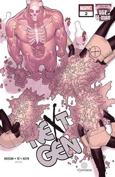
Written by Ed Brisson
Illustrated by Marcus To
Colored by Jason Keith
Lettered by VC’s Clayton Cowles
Reviewed by Alexander Jones
At this point, there are certain aspects of the Age of X-Man crossovers that feel downright tedious. The idea of Nathaniel Grey’s psychic utopia still feels novel but the familiar pattern of the X-Men seeing through his lies without taking any action is starting to become derivative. However, “Age of X-Man: Nextgen” #2 excels where other installments of the crossover are stilted. The new X-Men students start to see through Grey’s world and notice the way the Universe was like prior to their arrival.
It is incredibly refreshing to see the younger generation of X-Men start to take action against Grey. We see characters like Rockslide doing research and investigating how Grey is censoring information during his regime. While the Age of X-Man story remains intriguing, the title lacked the proper build-up. Author Ed Brisson has the complicated task of telling the story and setting up the pieces of “Nextgen” during the crossover.
Artist Marcus To’s pencils are perfectly suited to the more youthful setting with this cast of characters. His streamlined approach to the art is a welcomed addition to the full roster of impressive Age of X-Man artists. Each title has it’s own fascinating visual representation of Grey’s Utopia and “Nextgen” is no exception. The book also has a classic approach to the original X-Men formula with a reinterpreted version of the mansion that first stemmed from the ‘60s. The title is a throwback to a different era of X-Men harnessed through the script from Brisson. It is still great to see the younger heroes have such expressive artwork and bright colors depicted throughout the issue.
Age of X-Man is a welcomed focus on how some of the younger students are resisting the regime of Grey. This group of characters have been spotlighted throughout the main X-Men run and getting this title to follow-up on the cast members keeps a sense of unity across the X-Men line. Aside from welcome thematic elements, this issue does some solid showing instead of telling. Readers are finally shown how the X-Men are breaking past psychic barriers to stop Grey’s dictatorship.
Final Verdict: 7.9 – “Age of X-Man: Nextgen” #2 is a welcomed turning point for the formulaic Age of X-Man crossovers.
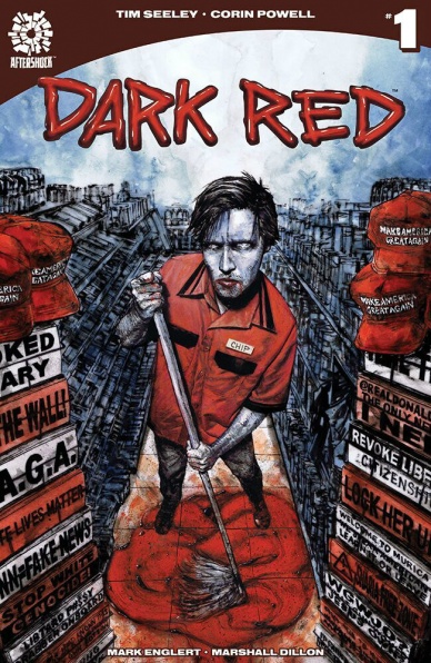
Written by Tim Seeley
Illustrated by Corin Howell
Colored by Mark Englert
Lettered by Marshall Dillon
Reviewed by Gregory Ellner
In truth, the very concept of “Dark Red” is enough to get many irritated. Hearing about the “red” states (those primarily voting for Republicans) day in and day out for years on end, especially those who would rant the very things on the cover of the debut issue, would normally be enough to get some readers to just drop this comic before even giving it a chance in the first place. And in truth, it’s hard to blame them.
However, to do so would be a mistake. Much like his other works, Tim Seeley manages to eke some new life (or unlife, as the case may be) out of the vampire genre with “Dark Red” #1, putting a common man from rural middle America in the protagonist’s point of view with the slight issue of him happening to be a vampire, and not the only one of his kind either. Chip is not a perfect person, kept away from all prejudice or beholden to ideals of other areas of the world. He has his flaws, his fears, and there isn’t much of a fuss made over how that is bad or good except from an in-character perspective, and never to the point of something that could honestly be placed within another vampire story anyway, such as jealousy of those who do not have to fight to survive. There is a multitude of other perspectives, from racists in town to the open-minded, city-eying Evie, a voluntary “blood bank” of sorts on account of her polycythemia vera, a real-life disorder in which her bone marrow produces far too many red blood cells. While the story may have wallowed in its own focus on rural life, the addition of extra, at times very amusing people like her help to clear things out.
Continued belowCorin Howell’s artwork works very well to the trappings of the story itself. The action is dynamic and nearly cartoonish, but not without a dose of horror. The faces are very expressive, ranging from anger to a feral nature to joy or feigned attraction.
The color palette supplied by Mark Englert is, as always, very appropriate and well handled. Much like his other horror work with Tim Seeley, Englert is exceptionally good with applying tone to colors, from a darker hue for the night, and a brighter one for the day, along with well-done shading of said colors to give a three-dimensional appearance. Even as the colors, like the artwork from Howell, may seem a bit cartoonish, it never interferes with the story itself.
Final Verdict: 8.0 – Though its premise may seem to be tiresome after years of hearing about that area of the United States, “Dark Red” #1 manages to trickle out some new blood from an old genre through its own self-awareness.
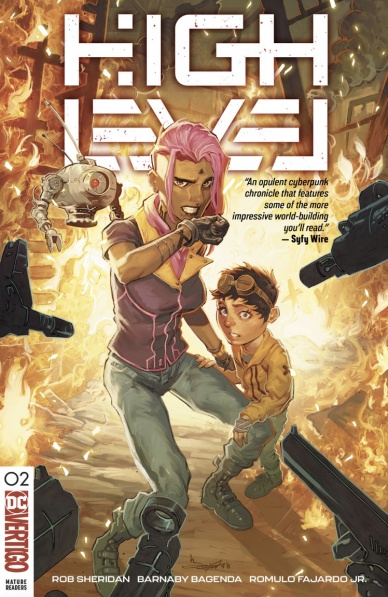
Written by Rob Sheridan
Illustrated by Barnaby Bagenda
Colored by Romulo Fajardo, Jr.
Lettered by Nate Piekos
Reviewed by Christa Harader
Issue #1 stumbled under the weight of its own world-building, so it’s nice to get some action going in issue #2. That said, Thirteen and Akan’s continued relationship drama isn’t interesting, and the issue only really picks up when Minnow and Thirteen are fleeing in the truck chase. Bagenda draws action nicely in this scene, and Sheridan knows what action high spots go together to make an interesting page. Sheridan’s backgrounds are beautiful, and Fajardo’s work adds softness to a brutal landscape without sacrificing a broad, sumptuous palette. Piekos makes a smart choice with irregular, borderless balloons and a bold font with just enough twitches and tweaks to make it blend into a world teetering on the brink of chaos.
There are a lot of bones tossed to my particular identity in this comic, from character design to dialogue choices, and they don’t feel earned. Minnow trying on the dress is a nod to current gender binary stresses that does nothing to enhance the story because the contrast between Thirteen’s free community and the unknown terrors of the wastes is already clear. The moment feels tacked onto the more urgent plot tangle, which is what we should, and do, care about. There were a few spots in issue #1 that suffered from the same superfluous feel (Akan’s sexism, Thirteen’s coded queerness,) and it’s unfortunate to see another one here.
So far, Thirteen isn’t too distinct from a host of other badass sci-fi apocalyptic chicks with a side shave. There’s not a lot of vulnerability or interiority on the page to balance the quippiness or aesthetic care with which she’s depicted, and in a comics landscape that’s brimming with cyberpunk stories, it’s a bit of a misstep. There was one good moment in issue #1 that had to do with the status quo, but my sense is that her emotional growth will come with Minnow. Two issues in, however, that’s not enough to keep me reading.
Final Verdict: 6.5 – Despite good art and design, “High Level” #2 doesn’t distinguish itself from its cyberpunk peers in plot or character development.

Written by Al Ewing
Penciled by Joe Bennett
Inked by Ruy José
Colored by Paul Mounts
Lettered by VC’s Cory Petit
Reviewed by Gustavo S. Lodi
There are some series that find a special place on the roster of stories for a certain character. Defining runs, defining adventures that help reshape the audience’s understanding of where that titular lead can go, the metaphors that can be drawn from it. Al Ewing’s and Joe Bennett’s run on the “Immortal Hulk” is one such experience.
With issue #15, the creative team takes further steps into defining what the jade giant can be, without losing sight of his rich past tapestry. Actually, this has been a key component of this series: when reintroducing Sasquatch, Absorbing Man and even Banner’s father figure, Ewing’s scripts have always built on what came before, rather than discarding it as heavy continuity. They do the same with Samson here.
Continued belowBennett’s art walks a very thin line between the deformed and the comprehensible, and he walks that line masterfully. His character design is inspired, especially when the Hulk and Samson side-by-side. Both are larger than life, but Hulk is an aberration, a distortion on the world, while Samson is still very much of the world he inhabits. Inks by José reinforce those notions, with different thickness applied to different characters, making them stand out more when desired.
Colors by Mounts are another highlight. Examine, for instance, the sequence set in the Severin Memorial Cemetery: there are so many shades of green (from the Hulk’s skin to Samson’s hair to the tree line to the ground and grass) and nothing looks the same or flat. Even better, the entire package feels eerie, fully attuned with the narrative.
And what to say of Ewing’s “hero?” This is a destroyed creature and a destroyer of worlds. But not in the sense of “smashing all that is,” but rather being so adamant in purpose that it leaves little space to anything else to exist. From opening page to nail-biting cliffhanger, Ewing is at his best setting a haunting mood, where nothing is what it seems and intentions are anything but clear.
Final Verdict: 8.5 – Another character-defining issue of an already seminal run, “The Immortal Hulk” #15 is one more entry of one of Marvel’s best series

Story by Andy Diggle and Alex Paknadel
Script by Alex Paknadel
Penciled by Doug Braithwaite
Colored by Diego Rodriguez
Lettered by Marshall Dillon
Reviewed by Elias Rosner
It may seem odd to begin with a comment on the lack of an inker credit, but, if such is the case, then I commend Braithwaite and Rodriguez, for the colors and pencils meld to create a world that is soft, cruel and undeniably vivid. You can almost picture yourself standing alongside Gilad and Doctor Mirage as they converse about the deadside, the details are so lush and the environments fully realized. Everything in the comic has weight and scale to it, even in static panels, which goes a long way to making this world feel alive, even as it dies thanks to the events of issue #1.
In terms of the plot, while “Incursion” #1 set up a whole host of playing pieces, “Incursion” #2 is content to spend much of its time on a side quest, one that will ultimately pay off outside of this event, making its presence odd. Odd but not unwanted. The detour we spend with Amy does provide us with some much-needed exposition and characterizes Gilad for those who are unfamiliar with him. It also makes this story a part of the grander universe, having repercussions for future stories, and breaks the action up so as not to rush his future conversation with Syntilla.
It also provides the framework for Gilad’s journey to the castle, because there is always a castle in quests like these. Paknadel’s scripting gives clear voices to all the characters, bolstered by Dillon’s lettering and distinct balloons between the various types of speakers. It’s hard to strike a balance between grand and natural dialogue and Paknadel manages to hit that sweet spot perfectly.
The one problem is that the lettering and sound effects are so clearly added after the fact digitally, while the art has a very distinct analog look. It is jarring and while Dillion does his best to co-mingle the two, the dissonance is noticeable, particularly thanks to the heavier outlines of the balloons and the stark whiteness within them. That said, Amy and the other demons, as well as the narrative captions, blend better with the art and the Imperatrix and Syntilla’s balloons unnaturally benefit their characters.
“Incursion” #2 is certainly an interstitial issue in terms of plotting but the story grabs the attention, with just the right amount of complexity to not lose anyone but also not boring, and the characters are so strong, you just have to read on.
Final Verdict: 6.9 – Suffering from a detour that is equal parts important and wasteful, as well as the dissonance between art and lettering, “Incursion” #2 remains strong thanks to its individual components and the simplicity of its narrative.
Continued below
Written & illustrated by Zander Cannon
Colors assists by Jason Fischer
Reviewed by Tom Shapira
Reading “Kaijumax” in single issues is sometimes a despairing experience. Not because of the usual problems with ongoing series, such as pacing the series to the trade (Zander Cannon makes sure that every issue is worth your while in terms of events on the page), but because at this point the story is so complex, in terms of the characters and their relations to one another (who’s betraying who is question asked in pretty much every issue) that I get the urge to re-read the full series all-over again just to familiarize myself with what’s been going on. It’s one of these problems that are common to many prison dramas, but this is not helped by the semi-monthly pacing of a comic-book series.
And yet, despite me feeling a bit behind the curve, “Kaijumax” continues to be a winner, in this issue just as any other. It’s not just that the concept is such an obvious winner, it’s in the way Cannon manages to bring this world into life, thinking through all the little implications of mixing and matching all these monstrosities with the world of human bureaucracy — and he does it all without turning the thing into a boring exercise in world building.
The art’s another clear strong suit, with cartoonish designs, many of the characters are a step away from being the chibi version of themselves, clashing intentionally with the horrible events that happen all over the prison. It’s weird enough to be funny and serious enough to actually dramatic. Every issue tends to leave you with the mouth open. And it’s not a matter of twist just for twist’s sake (you can pretty much see it all coming), rather it’s the emotional impact of the events. I never quite know where this series is going to, and that’s exactly why I love it so.
Final verdict : 8.4 – fun to read in single issues, and probably even better when re-read as a whole.
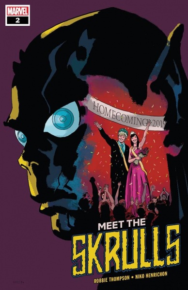
Written by Robbie Thompson
Illustrated by Niko Henrichon
Colored by Laurent Grossat
Lettered by VC’s Travis Lanham
Reviewed by David Craig
“Meet The Skrulls” might be a little derivative of FX’s criminally under-watched The Americans, but if you’re going to copy from someone it may as well be the best. While it can’t be awarded a ton of points for originality, this miniseries is shaping up very well regardless. The pressure on the Warner family grows this issue, with youngest daughter Alice still not measuring up to expectations and a mysterious Skrull hitman closing in.
Writer Robbie Thompson does a good job at balancing focus between every member of the clan, resulting in a story with plenty of variety. Parents Carl and Gloria are war-hardened, with the latter providing this issue’s major action sequence, while daughters Alice and Jennifer bring a wildly different teen drama dynamic. This mix works remarkably well for the most part, although some of the high school characters do feel a little shallow.
The art team made up of Niko Henrichon and Laurent Grossat is firing on all cylinders. “Meet The Skrulls” #2 kicks off with a visually stunning sequence set during a battle on the Skrull planet of Throneworld. There’s a palpable sense of chaos and destruction in these panels which goes a long way to humanizing the abrasive persona of a family patriarch, Carl. Grossat utilizes a muted color palette which maintains the look and feel of a spy thriller, even when more traditionally sci-fi elements are brought into the fray.
“Meet The Skrulls” is one of the most promising Marvel miniseries of the year so far. It’s an interesting new take on an iconic alien race, which doesn’t require any knowledge of recent continuity to enjoy. It’s not perfect but it’s a fun read, which should please any reader looking for a small-scale thriller.
Final Verdict: 7.9 – “Meet The Skrulls” is a solidly entertaining Marvel spy story, with some stellar artwork and brisk pacing.
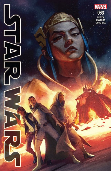
Star Wars #63
Written by Kieron Gillen
Illustrated by Angel Unzueta
Lettered by VC’s Clayton Cowles
Colored by Guru-eFX
Reviewed by Michael Govan
It feels like Disney is overdoing it with Star Wars. If the public is given too much of a good thing, eventually they will sour on it. We didn’t need Solo. Honestly, we don’t really need this comic either. “Star Wars” #63 feels unnecessary. It isn’t horrible but it isn’t especially good either. This whole ‘The Scourging of Shu-Torun’ story arc feels unnecessary.
The whole issue revolves around another Rebel plan but only the first stage or so. They need to get the plans to blow up Shu-Torun’s marveled spike. You don’t really need to know what it does. Remember in A New Hope when they blew up the Death Star? Or how about the Death Star II in The Return of the Jedi? Okay, what about the Starkiller in The Force Awakens? The spike is basically another one of those big bad devices. Star Wars can be all done with these, we don’t need to see any more.
They kidnap and impersonate a Senator to get close to Queen Trios. Leia chooses to tip her hand and hint at her plan just to rub it in the queen’s face. That’s just bad military strategy. Why are you leaving clues? You can brag when you’re all done if you want but you’ve barely just begun.
The only character to get some sort of focus is Queen Trios in the opening few pages. She betrayed Leia and the Rebels to keep her people safe from the Empire. All I’m saying is Lando did it better. The artwork is still in the photo-realistic style that tries to get everyone’s faces just like in the movies. It’s unnecessary and really detracts from an already suffering title.
Final Verdict: 4.5 – A long time ago in a galaxy far, far away…some unimportant stuff happens between the movies.
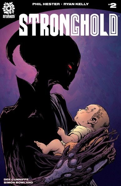
Written by Phil Hester
Illustrated by Ryan Kelly
Colored by Dee Cunniffe
Lettered by Simon Bowland
Reviewed by Matt Ligeti
An omnipotent, supremely powerful force trapped in the body of a human, with no memory of who he really is. His dwindling but devout worshipers devoted to keeping the secret of his powers hidden out of fear that he will destroy the world. A potent, alien adversary determined to locate him and get him to realize who he is. A love story that should never have been allowed to come to pass.
Phil Hester and Ryan Kelly spin a complicated tale in “Stronghold.” Not simply in the telling, though if you pick up this second issue without reading the first, you will almost assuredly feel lost. But every plot point, every character, and each relationship between those characters isn’t black or white. Even the main character’s last name is “Grey,” both a nod to this extended metaphor and a wink-and-a-nod to Grey aliens, the extraterrestrial beings many think of when they hear “alien,” with large heads and black eyes. The lovers are star-crossed; it’s truly them against the world. “The Adversary,” as the antagonist is named, has a particularly revealing moment that shows he or she isn’t entirely terrible. And the people of the “Stronghold”? Let’s just say they’re no angels, themselves.
Simon Bowland leads the reader’s eye across the page well, using the heavy dialogue and internal narrative as a tool to display Ryan Kelly’s evocative art. So many of the locations in “Stronghold” #2 are mundane: a village, a minor league baseball stadium, a convenience store. Kelly’s drawings of alien beings could easily seem out of place and comical, but instead, you feel as the characters do, like what you’re seeing could not possibly exist in our world.
Dee Cunniffe’s expert colors help to make the real surreal, washing a portentous scene in red, or using grays and purples for the more alien aspects of “Stronghold.” The more down-to-earth, normal parts of the comic, like the aforementioned stadium, store, and village, Cunniffe colors as they would be, grounding them in reality. The effect it creates between the alien and the commonplace makes Kelly’s concept that much more powerful.
Continued belowThe beauty of “Stronghold” lies in its shades of gray, painted masterfully by the entire creative team in this tale of romance and horror, high science-fiction and simple humanity.
Final Verdict: 8.5 – A sleeper hit, “Stronghold” spins a tangled web that’s so captivating, you won’t want to escape it.
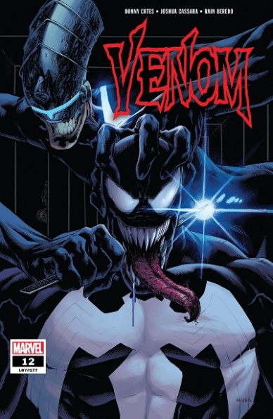
Written by Donny Cates
Illustrated by Joshua Cassara
Colored by Rain Beredo
Lettered by VC’s Clayton Cowles
Covered Illustrated & Colored by Ryan Stegman & Frank Martin
Reviewed by Chris Egan
A choppy memory trail through Eddie’s mind that focuses on his estranged son, deadbeat dad and his connection to the symbiote. This series continues to up-end what Eddie knows about his life and ultimately what we know, retroactively changing continuity to allow for new storytelling routes. When writers play around with canon in this manner it can be quite rewarding in many ways, but most of the time it just feels like a cheap ploy and is more likely to go against the grain with fans. With “Venom” it’s starting to feel tired; even with a great writer like Cates. After so many years of using this symbiote and expanding its mythology, the threads are wearing thin.
Cassara and Beredo’s art plays nicely to the settings of the story. The dark, smooth, and futuristic look of the ancient symbiote and its world is a nice antithesis to the rough, dirty, and harsh look at Eddie’s memories. Competently illustrated and colored. It’s a good looking book. Definitely one of the best things about this particular issue.
The ultimate changes and feeling of turning a corner in the narrative works as far as moving this current series forward, but in the grand scheme of Marvel Comics and Venom, will anyone care in the long run? Hopefully, the ending of this issue does lead to great stories.
Final Verdict: 6.0 – An OK, and truthfully, jarring change to Eddie and the Venom symbiote’s lives. Cates is doing his best with the story being told, it just isn’t that interesting.


