
There is a lot to cover on Wednesdays. We should know, as collectively, we read an insane amount of comics. Even with a large review staff, it’s hard to get to everything. With that in mind, we’re back with Wrapping Wednesday, where we look at some of the books we missed in what was another great week of comics.
Let’s get this party started.
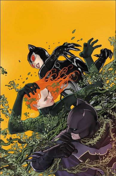
Batman #43
Written by Tom King
Illustrated by Mikel Janin and Hugo Petrus
Colored by June Chung
Lettered by Clayton Cowles
Reviewed by Alex Curtis
Batman finally confronts Poison Ivy in this final issue of the “Everybody Loves Ivy” arc. Tom King’s effort to delve into Ivy’s psyche is commendable—but it’s a rush job of pop-psychology and pacing.
Poison Ivy’s plan and mind-set make very little sense upon examination. Why did Poison Ivy wait so many years to suddenly take over the world? She’s been functioning as an anti-hero for years, but now she suddenly has PTSD about a crime she committed years ago. How are we supposed to understand or empathize with her if her motivational logic isn’t, well, logical?
Even more problematic is the resolution to her reign. I highly doubt a person who’s powerful and committed enough to take over the entire world so there can be peace would just give up because Harley Quinn hugged her and Batman told her the equivalent of, “It’s not your fault.” This is a prime example of a rushed conclusion and a simplified psychological examination. Ivy taking away all of the earth’s agency is a serious problem, but this complicated dilemma and a bevy of others aren’t properly addressed or resolved.
Mikel Janin and Hugo Petrus’s art is decent. While their digital, sterilized style isn’t my cup of tea, they pull off some impressive layouts, utilizing Carmine Infantino inspired spreads where we see multiple versions of a character leap around the page. Janin has an almost photo-realistic style that is suited perfectly to facial expressions, which makes the characters believable—even if the script isn’t. June Chung’s colors bring Ivy’s jungle to lush life, but the other locations and scenes are fairly generic.
Despite the fact that Ivy took over the entire world, there’s no time to show the fallout. Do people remember what happened to them? If so, how much? There must be some kind of chaos after every human on earth was taken over and forced to do the bidding of an unstable superhuman. She’s not even punished for her actions; she’s just put in some safe house.
Final Verdict: 4.0 – Tom King doesn’t even attempt to address the complex thematic, social, and psychological issues he uses in a willy-nilly manner.

The Brave and the Bold: Batman and Wonder Woman #2
Written and Illustrated by Liam Sharp
Colored by Romulo Fajardo Jr.
Lettered by Troy Peteri
Reviewed by Alan Buxbaum
“The Brave and the Bold: Batman and Wonder Woman” is one of the most captivating comics that is currently being released within the DC landscape. Liam Sharp’s expertise and craft on combining dense writing with lavish and fantastical art shines brightly throughout the second of this six part mini-series. In addition to this, Sharp is able to portray a different view on these two over-written DC heroes while keeping us grounded by using the classic aspects that everyone knows and loves about them.
From the opening page, the tone of the series is reestablished with colorful, Tolkien-esque bordering. The paneling is extremely well done, as it communicates much of each realms’ aesthetic without words or illustration. For example, if one were to look at all of the Tir Na Nóg panels, they would find that each page has a different formation. This makes for a more foreign experience for the reader, as they cannot read the panels in any standard order. It is exactly like what one would imagine if they were to enter a place like Middle-earth, or any other land of fantasy and wonder. One will find paneling of places like Gotham or the bat cave less irregular and therefore more standard and familiar.
Sharp’s portrayal of Wonder Woman is actually most relevant to this particular issue, as the reader follows her more than Batman. She seems to be the mainstream Diana, exercising great control of her emotions while putting her foot down when necessary. Her presence commands respect from almost every character she comes in contact with. Given her origin and history, she is the perfect character for a story that combines present-day Earth with a mythical realm. Sharp’s representation of her strikes a great balance of showing the princess’ uncontested beauty while not giving it too much attention.
Continued belowOne of the best parts about this comic is seeing Batman in a story that involves magic. This is different than stories where he fights some villain harnessing magic, as the entire mini-series revolves around Tir Na Nóg and the magical creatures that lie in it (making its aesthetic follow suit). Liam Sharp’s magnificent drawing of the bat cave is a great example of this, which makes the background look and feel like a forest of technology. Another example is of a flashback to when Batman was in possession of the Mobius chair. Sharp’s rendition of this period in Batman’s career is flourished with smoke and other wavy-lined figures that fit the magical aesthetic perfectly.
Final Verdict: 8.5 – Whether you’re looking for a spin on the classics or art that won’t let you turn to the next page for fear of missing anything, “The Brave and the Bold” will fulfill all of these needs and more.

Cable #155
Written by Zac Thompson & Lonnie Nadler
Illustrated by Germán Peralta
Colored by Jesus Aburtov
Lettered by VC’s Travis Lanham
Reviewed by Gustavo S. Lodi
The writing pair of Thompson & Nadler (“The Dregs,” “Come Into Me”) bring their own special narrative style and familiarity with horror sci-fi to Cable. But is this approach something that works for the gun-totting, time-displaced soldier, or is it a mix that fails to connect? If this first issue is any indication, it could be a combination of the two, but it succeeds more often than it fails.
Cable is one of Marvel’s characters with the most convoluted back-story, so knowing which components of his history to use, which ones to discard and others to simply omit is a key element of a good plot. Here, Thompson & Nadler chose to focus on two threads: Cable’s constant battle with his techno-organic virus (and a villain associated with it) and his fatherly ties with mutant heroine Hope. That succinct approach is a welcome one, bringing new readers in, while acknowledging those more familiar with the Askani-Son.
The scrip and art gel the most during the fighting sequences. Readers familiar with past collaborations of the writers (“Come Into Me” being a prime example) will recognise the reliance on the supernatural-esque and technology gone awry. Peralta and Aburtov deliver on these scenes, with creative monster designs, disturbing mixes of the human and the deformed, generating some horrific villains for Cable to dispatch.
On the latter, though, where Nathan and Hope meet again, the script feels a bit stilled, with dialogues being somewhat predictable. Maybe it is a choice to present Cable as the ever-stoic tough guy and Hope as the fearless young mutant, but these are father and daughter, so a bit more on the emotional spectrum would be appreciated. The art on these moments do most of the heavy lifting, especially around facial expressions and conveying feelings by eye expressions alone: some sequences towards the end of the issue really showcase Peralta’s skills.
Final Verdict: 7.0 – “Cable” #155 is off to a good start on this new run, relying on two elements of Nathan’s story that are compelling and worth exploring. If the script can better balance the tough-guy genes of the character on future issues, this could become a very strong arc.
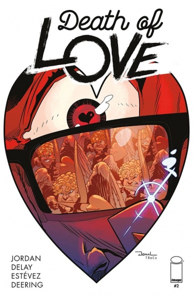
Death of Love #2
Written by Justin Jordan
Illustrated by Donal Delay
Colored by Omar Estévez
Lettered by Rachel Deering
Reviewed by Devon Browning
In this day and age, nothing seems more relatable than the struggle of relationships with the now accumulated scene of online dating, and a general internet presence laughing in the face of current dating in general. You can find it all over the place, and it’s hard not to laugh at when a stranger’s troubles turn out to be your own, whether once in the past, or currently. It’s the gag joke of the century, it seems, when behaviors for both men and women are constantly called out for those all over the world to either agree or disagree on powerful platforms such as Instagram. Death of Love joins this very scene, without the overkill of what the internet swells our brains with. Justin Jordan does well to present us a protagonist that is everything BUT that. He is exactly the butt end of the joke, the ‘nice guy’ trying to get the girl, when everyone except him sees that he is far from being what he believes to be.
Continued belowIn the second addition of Jordan’s series, Harris, our ‘nice guy’ who is incredibly desperate to not only win over a certain girl he thinks he deserves, but to win over ANY girl, finds himself willing to do just about anything to feed his craving. That includes taking pills from a stranger at a bar, and worse– kidnapping a Cupid that these pills allow one to see. And yes, I did say a Cupid, for we learn that there isn’t just one. There’s no certainty if the same can be said for Santa or the Easter Bunny, but there is an army of Cupid that are apparently in charge of pushing folks in the right direction of one another, just as we’ve always been told as children. Although we’ve never really been told that these… for lack of a better description, naked baby archers, could cuss you up and down and truly fight back if the need calls for it. And boy, does it.
Jordan doesn’t hold back and in no way protects Harris who is arguably quite the antagonist he pretends not to be. The ever so desperate man is willing to kidnap and interrogate a Cupid who claims, perhaps out of pettiness, that Harris is meant to be forever alone. Obviously, Harris isn’t for that piece of information, and after failing at convincing his best friend and potential future lover, he takes things into his own hands in attempt to find the answer to his loneliness. It’s quite obvious what it is, even without kidnapping a Cupid and letting the meeting fall into violence. And that is exactly why this story is so captivating.
Without seemingly attractive characters and sporting a lack of entwining storylines, Jordan allows the reader to focus solely on the protagonist and does not confuse the audience on what to feel for them. The script is both easy to follow and humorous– straight to the point and easy for any kind of reader to pick up and enjoy. Donal Delay proves this with an art style that is certainly cartoonish, and something you might see in the newspaper. Easy on the eyes and straight forward. A style that is absolutely appreciated in a story with a tone and visual journey such as this one.
The art and journey of the story go hand in hand. The attention is without a doubt, meant to be on the lesson and the words on the page, rather than the art aiding it. Because of this, one could understand the story without any verbal help, and just as well, without any visual help. So far both issues have proved this to be the case, and we can only cross our fingers in hopes that the creative team keeps up the same formula for future additions to the series.
Final Verdict: 7.5 – An addition to a refreshingly original story with popping art that is almost as addicting as the script itself. A worthy candidate to add to subscriptions, with a lot of potential to concrete itself among the top charts.
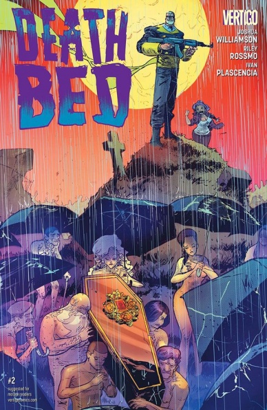
Deathbed #2
Written by Joshua Williamson
Illustrated by Ivan Plascencia
Lettered by Deron Bennett
Reviewed by Matt Sadowski
After agreeing to ghostwrite Antonio Luna’s autobiography, Valentine Richards gallivants to Paris, where death and mayhem follow. “Deathbed” is a story about legacy. So when a mysterious killer threatens Luna’s legacy by eliminating his past associates, it’s only his transcendent narcissism that motivates him to investigate. This is mostly Luna’s issue, with Val tagging along to keep Luna’s lunacy in check.
The pace of “Deathbed” matches Luna’s high-octane life. The issue starts in media res and doesn’t let up. Even when the action hits a lull during the funeral, Luna spices it up with exhilarating tales of his past with the deceased. A full-bleed splash page highlights the brief partnership of Luna and Maggie Mars (a mere chapter in the greater Antonio Luna story). It’s a collage of chaos: they dual-wield guns and scimitars against alien mutants at Area 51 and make love in the desert. Another double page spread quickly highlights panels of Luna’s past lives as a baseball player, painter, private eye, and spy. Monotone panels of murder victims are interspersed with Luna’s previous professions. Smart coloring choices lend the proper period feel to each one like the sepia-toned 80s or the psychedelic hues of the 60s.
Continued belowPlascencia’s art and page layouts match the dynamism of the script. Panels are almost never parallel to each other or perpendicular to the page. Instead, the canted angles and rotated panels suit the topsy-turvy nature of Luna’s life. Character expressions are rendered in a hyperbolic way to lend a humorous touch. Luna’s expressions mostly range from arrogant to snide, a holier-than-thou attitude which permeates his every action.
“Deathbed” remains a fun adventure story of the ultimate narcissist and his ghostwriting companion, while touching on greater themes of legacy. How do you want to be remembered after you die?
Final Verdict: 7.8 – “Deathbed” #2 continues Luna and Val’s madcap adventure with enough humor and action to keep readers coming back for more.

Doctor Strange: Damnation #3
Written by Donny Cates and Nick Spencer
illustrated by Szymon Kudranski
Colored by Dan Brown
Lettered by VC’s Travis Lanham
Reviewed by Alexander Jones
With the Doctor Strange franchise reaching a great prominence at Marvel, it is a wise call for the publisher to bring in the second stringers to try and flesh out potential spin-off opportunities for other media and further ventures. However, Marvel has tried numerous attempts at fleshing out the core cast but thanks to the small scope and focus of “Doctor Strange: Damnation,” it has never been more fun to read some of these characters. Wong has a strong sense of charisma in this chapter as writers Nick Spencer and Donny Cates have lots of fun in revelling in the adventures of the different cast members. Spencer channels his writing style akin to the “Superior Foes of Spider-Man” and “The Fix” to forge a snarky shorthand for the cast members that doesn’t drown out the different personalities he and Cates are working with here.
The creative team starts the book moving fast now that the setup of the series is finally out of the way. With a focused team going up against a familiar Marvel Universe baddie, the goals seem clear and present within the story itself. While the clarity in the narrative is really nicely explored, the series could benefit from some additional screen time, as the moving cast members and baddies have lots of different facets to them and I’m not so sure Spencer and Cates will be able to explore every ounce intrigue the story has to offer in just four issues despite there being lots of tie-ins.
Szymon Kudranski’s art can get shaky in the issue. Kudranski has a more minimalistic sense of style and the consistency for each character and panel can start to fade slightly. Some of the coloring on the issue can also be distracting especially with how Wong is depicted with so much strange blue shadow draped across his face. When Kudranski adds less details to faces and color artist Dan Brown step away from the odd skin tones in the series the issue starts to look good with big action scenes like Ghost Rider’s debut really showing off everything Kudranski has to offer as an artist to the series.
Despite the inconsistent art, the irreverent tone seen within “Doctor Strange: Damnation” #3 is worth celebrating. The different heroes in the book have odd personalities and demeanors and it is fun to see them interact with each other and the morose group of villains spearheaded by Marvel Universe baddie, Mephisto. Using Doctor Strange and the second stringers of the Marvel Universe in a story like this is a great deal of fun.
Final Verdict: 7.2 – Despite troubled art, “Doctor Strange: Damnation” #3 is a fun chapter providing plenty of insight into Marvel’s resident oddballs.
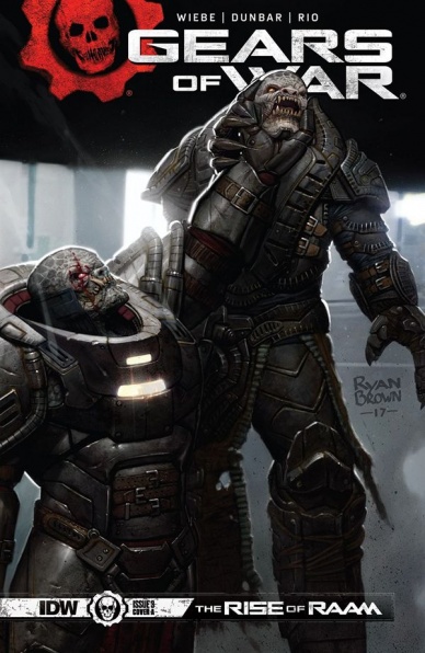
Gears of War: The Rise of RAAM #3
Written by Kurtis Wiebe
Illustrated by Max Dunbar
Colored by Jose Luis Rio
Lettered by Gilberto Lazcano
Reviewed by Gregory Ellner
With the third issue of this miniseries, Kurtis Wiebe brings the audience to the moment they’ve been waiting for, that which is stated on the name of it all in the first place. However, the fact that it is a foregone conclusion does not detract from how it is portrayed. Wiebe weaves in many nods to the series, mostly involving Karn, the main villain of Gears of War: Judgment, which took place shortly after this story.
Continued belowAside from these nods, Wiebe also manages to give every major character a moment to shine, including the seemingly manipulated Queen Myrrah, even if that meant tearing them down in the process. In addition, Wiebe presents his take on the Gearsverse black comedy very well, most notably with Karn and Myrrah discussing the former bleeding on the latter’s nice table mid-conversation.
Much like earlier issues, Max Dunbar is very good at showcasing the light and dark in the Hollow. The sickening glow of the Lambent plays well against the shadows of the majority of the area and the more natural lighting of the fire based lamps. This is best shown during the all-out assault on the Ketor’s sanctum, where Dunbar also shows his prowess in making wide, sweeping battlefields, at least when one side is pretty faceless. The masses of Lambent are utterly horrific, making RAAM’s introduction to the scene all the more, dare we say, heroic, especially with how his battle prowess is so easily shown in a way that the games have yet to capture.
The colors of the piece are very well lain as well, courtesy of Jose Luis Rio. From the disgusting, diseased yellows of the Lambent and the related Imulsion-based weaponry and technology to the soft green glow of a hologram, to the harsher reds and shocking orange iridescent eyes of certain creatures, the colors of the piece really help to demonstrate the diversity of the Locust Horde, while still keeping within similar color schemes to the source material.
In all, “Gears of War: The Rise of RAAM” #3 is well developed, though perhaps not very newcomer-friendly, as is to be expected from the third part of a four-piece miniseries.
Final Verdict: 7.5- All of the plotting and planning comes to a head in this climactic issue of the miniseries, without bringing in too much that non-players would feel lost by, albeit perhaps at the expense of any incoming readers.

Ice Cream Man #3
Written by W. Maxwell Prince
Illustrated by Martin Morazzo
Colored by Chris O’Halloran
Lettered by Good Old Neon
Reviewed By Kate Kosturski
It’s only rock and roll but I like it. We flash back to (presumably) the 1950/early 1960s, the early years of rock and roll, as a band (looking suspiciously like Bill Haley and the Comets but just different enough to avoid a lawsuit) is playing their smash hit “Rock All the Time.” Bud Hickey and his Rockets are a runaway success but any attempt to re-create that success fall flat. In present day, Bud is broke, depressed, and still living in the past, spending his days reminiscing in a diner to anyone who would listen (pretty much the wait staff). As our titular Ice Cream Man comes in and indulges our former rock star in a treat – – a vanilla ice cream cone. This leads Bud to a trip an otherworldly realm with a who’s who of rock and roll . . . but we’re not talking Elvis or Prince here. This team needs Bud’s help, and the only way to do it is the one thing he couldn’t do: create another hit.
Praise is due to Chris O’Halloran for color work that sets mood perfectly: from muted tones of “then” and “now” to a pastel psychedelic dreamworld where Bud does battle. The latter makes it clear that this in fact a dream, and elevates just how out of place Bud is in contemporary music . . . he’s too “vanilla” just like the ice cream cone our Ice Cream Man offers him. Morazzo and O’Halloran must have had glorious fun putting together a dinner party of fictional rock and roll superstars (you can see this panel in this week’s Saturday Morning Panels), from Eleanor Rigby with her face in the jar to Ruby Tuesday with a literal ruby on her forehead, sprinkling their iconic lyrics throughout (“ground control to Major Tom” from an astronaut as the crew completes their recovery mission, for example). It’s corny, but not overly so. The enemy that they’re up against has very little corporeal form, looking much like melted ice cream. What an apt metaphor for the real demon – – Bud’s hard fall from the early years of success, where the world changed around him and he couldn’t keep up. One wonders if our classic rockstar perhaps has some new found pep in his step after this encounter and will find a life playing cruise ships and public television specials.
Continued belowThis particular tale, like the previous issue, runs more towards morality play than true horror or supernatural. As this series seems to still be trying to figure out what it wants to be, this is an effort done rather well.
Final Verdict: 7.5 – A fine homage to The Twilight Zone, a series that blended that moral commentary with the macabre.

Infinity 8 #1
Written by Lewis Trondheim and Zep
Illustrated by Dominique Bertail
Lettered by Aditya Bidikar
Design Direction by Olivier Vatine
Reviewed by Jonathan O’Neal
Presented as part of Lion Forge’s Magnetic Collection, “Infinity 8” is a translation of a 2016 French comic “Romance at Macchabées,” and issue #1 is the first of three in a series that will include eight interlocking arcs focusing on parallel narratives of eight different agents tasked with keeping the peace on a city-sized space freighter bound for the Andromeda galaxy. It’s an ambitious project, the kind the multi-award-winning creator Lewis Trondheim is known for.
Trondheim immediately disarms readers when presenting the hero of this first arc, ‘Love and Mummies.’ Agent Yoko Keren wants to get pregnant, and she uses advanced and privileged tech to scan potential mates for procreation suitability among 880,000 passengers, representing 257 alien races and 1583 humans (half of them male). Suffice it to say that Agent Keren is pretty open-minded about the father of her child and the feedback her device gives her yields many of the numerous comic beats in the first half of this plus-sized 30-page issue.
Per the solicitation information for “Infitity 8,” the series takes inspiration from type of stories that pervaded the heyday of America’s “Heavy Metal” magazine series. It’s tone is certainly lighter than the hard dystopian science fiction titles that currently rule comic stands, and the dialogue has a quippy and deadpan quality that keeps the severity of the crisis that develops in the final pages of this issue on the level of comedic space opera. In that sense, the sexy and subversive tone of the issue is pitch perfect, and as far as mature reader titles go, this is definitely more “Barbarella” than “Alien.”
Bertail’s art style helps maintain the tone as well. It’s certainly of the Moebius school both in line and low-chroma color palette, but the line is a bit thicker and there’s a bit more caricature to the whimsical character designs. The whole affair has a subversive underground comic feel with higher production value with nice pacing dictated by an effective variety of both intimate and cinematic panel layouts.
Readers looking for a window into a series with a European flair could do worse than checking out “Infinity 8,” a series that has the added bonus of being able to tell a complete story over 24 issues, and it’s a testament to the editorial leadership at Lion Forge that they have been able to present this series by creators whose work deserves to be available more widely in English translations for American audiences.
Final Verdict: 7.5 – “Infinity 8” #1 has the makings of a fun and sexy space opera, a welcome diversion from heavier science fiction fare.
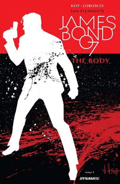
James Bond: The Body #3
Written by Aleš Kot
Illustrated by Rapha Lobosco
Colored by Chris O’Hallroan
Lettered by Thomas Napolitano
Reviewed by Elias Rosner
The third in Aleš Kot’s James Bond series brings us a tale a little different than the previous two issues. Instead of holding a mirror up James Bond and asking us to rethink Bond’s actions, this time Kot asks us to watch Bond go undercover with White Supremacists and Neo-Nazi’s for an issue. One bit of writing that was very smart was opening the issue with the caption “I was advised to never play with food;”
it sets up the relationship between him and the giant, tattooed Neo-Nazi in the sauna with him right away and how much Bond doesn’t care for these people.
That being said, this issue is not as strong as the previous two. It spends a lot of its page length repeating itself in a stationary location which, while true of issue #2 as well, is less interesting here. We learn nothing new during it and all it serves to do is to reinforce how scummy these people are which we gathered from the opening and the fact that, well, they’re Nazis.
Continued belowOn the other hand, Lobosco manages to keep the scenes visually engaging through his varied framing and ability to find new ways to show the lead Neo-Nazi being menacing. The best panel in the piece, other than the pages of Bond beating the living daylights out of the Neo-Nazis, is one midway through the issue. The lead Neo-Nazi is large on the page, his face colored in reds and sea-greens and heavy shadows, his eyes wide and threatening, his mouth scowling and filled with teeth like a dog about to bite. He is terrifying in his rage and anger, making his words even more hateful.
Unfortunately, this doesn’t follow over to his people who when recessed into the background tend to lose some of their consistency, with faces that look like they’ve been smudged. Lobosco’s strength seems to be in his use of shadows and reflections which isn’t taken advantage of here. It is instead sacrificed for more sauna. Although it does make the second half battle all the more satisfying and Bond’s comments more thought-provoking.
Final Verdict: 6.9. The weakest of the issues so far with somewhat inconsistent art and a story that hovers too much near the start.

The Spider King #2
Written by Josh Vann
Illustrated by Simone D’Armini
Colored by Adrian Bloch
Lettered by Nic J Shaw
Reviewed by Reed Hinckley-Barnes
While it was difficult in the first issue to tell that “The Spider King” was originally published as one long graphic novel, in “The Spider King” #2, the seams start to show a little bit. While the issue itself is paced pretty well, giving a good amount of time to all the different plot threads, the ending to this issue is a bit abrupt, coming in what appears to be the middle of a scene. It’s something I’m sure can’t be helped when a graphic novel up like this, but it makes me wonder whether reading it in its original form might be a better experience.
That ending, though, is pretty much my only complaint in the entire issue. Josh Vann’s script does a great job combining the disparate elements of Vikings and aliens. All of the characters feel fully formed, and the relationship between the different clans and the people within those clans would be interesting in its own right, even without the alien’s attack. Of course, with the aliens, it’s even more thrilling.
The art work, from Simone D’Armini and Adrian Bloch, is fantastic. D’Armini’s illustrations are cartoony in the best way possible, both clean and understandable while still giving the feeling of a very messy world. There is a dream sequence, where a character’s hopes and dreams are portrayed in a series of overlapping and connecting stained-glass like illustrations that are beautiful and disturbing in equal measure. On top of all that, Bloch’s colors do a great job separating the icy world of the Vikings and the green technological one of the aliens, bringing life to D’Armini’s illustrations.
Final Verdict: 8.5 – While not as seamlessly pulled from the full graphic novel as the first chapter, “The Spider King” #2 still continues the excellence that was on display in the first issue.


