
There’s a lot to cover on Wednesdays. We should know, as collectively, we read an insane amount of comics. Even with a large review staff, it’s hard to get to everything. With that in mind, we’re back with Wrapping Wednesday, where we look at some of the books we missed in what was another great week of comics.
Let’s get this party started.
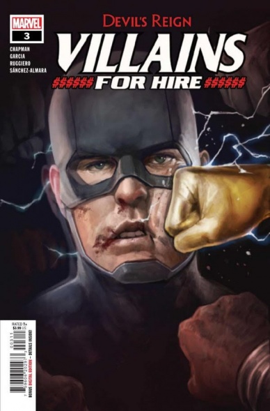
Devil’s Reign: Villains for Hire #3
Written by Clay McLeod Chapman
Penciled by Manuel Garcia
Inked by Lorenzo Ruggiero
Colored by Protobunker’s Dono Sanchez-Almara
Lettered by V.C.’s Joe Sabino
Reviewed by Alexander Manzo
“Villains For Hire” finally blatantly confirms that U.S. Agent has been working with the D.A. to try and bring Fisk down from the inside out, but thankfully it’s not the only thing that comes out of this issue. Clay McLeod Chapman gives the reader some more insight into other team members to show that they’re not just cold-blooded villains and that they do have some depth to them. Agony gets to have John Walker’s back when they come face-to-face with Conviction, who possesses people trying to get to Fisk. McLeod throws out her motive in one panel, which certainly does the trick to explain what she’s doing, but it feels like a hail mary as she’s gone as quickly as the panel finishes.
The final few pages of this issue feel rushed to get to the main storyline of finding the purple children to get to the New York superheroes, so all of the build-up with Fisk finding out about the D.A. and Conviction almost seemed pointless. Once U.S. Agent is possessed by Fisk’s suggestion powers, it becomes a reminder of his character constantly being a puppet instead of having any real sense of direction of his own.
What sells this issue is the art by Manuel Garcia and Lorenzo Ruggio. A solid mix of clean and messy linework can keep the reader’s attention during pivotal moments. One of the key scenes is when Agony and Conviction are going toe-to-toe, and there’s a page filled with the messiness of the symbiote’s hair when attacked by the poison. It’s both eerie and beautiful at the same time because there’s so much pain surging through the symbiote, yet the reader can see how hard she is fighting to keep it at bay.
The colors by Dono Sanchez-Almara have to be mentioned as well because they create this murky and almost dirty viewpoint of all the events that have unfolded with these villains and anti-heroes that are attempting to do right. Even when Walker is trying to save people, there is this unsettling vibe that something will go horribly wrong. It gets up-played once he becomes possessed, and it puts the reader in the driver’s seat and how little control of his body he has.
Final Verdict: 8.5 – While the story feels rushed in the latter issue, the art keeps the issue worth checking out and a peek into the point of view of some of the villains in the latest Marvel event.

Godzilla vs Mighty Morphin Power Rangers #1
Written by Cullen Bunn
Illustrated by Freddie Williams II
Colored by Andrew Dalhouse
Lettered by Johanna Nattalie
Reviewed by Gregory Ellner
On the one hand, Cullen Bunn does not provide much, if anything, in the way of explaining the two franchises composing the crossover of “Godzilla vs. Mighty Morphin Power Rangers” #1. Characters like the Green Ranger, Rita Repulsa, and the atomic monster himself are simply a part of the story. On the other hand, Bunn’s lack of exposition somehow works its way back around to being an effective means of examining these characters through their words and actions in the present. For example, Rita is immensely entertaining in a “Saturday morning cartoon” villain type of way, fitting nicely into the world of kaiju without skipping a beat, and while outmatched, the Power Rangers’ ability to adapt helps them fit into new circumstances in a way that allows readers to understand them at least on a surface level for the purposes of the miniseries.
The artwork of Freddie Williams II is familiar as that of another inter-franchise crossover: “Injustice vs. Masters of the Universe.” As in that miniseries, Williams excels at high-flying action and relatively cartoonish expressions. The characters seem more exaggerated than they may be under other artists, adding to the somewhat comedic, over-the-top nature of the entire enterprise. Furthermore, all of the characters appear to be somewhat younger than they likely are, and in the process livelier than they may otherwise be.
Continued belowAndrew Dalhouse’s colors are rather smooth, bringing bright light to the potentially dire situations. The use of a flowing gradient allows for the shadows to react naturally, making the harsh light of certain powers stand out against the shadows that some of the villains, or even the heroes, may inhabit at any given point.
Final Verdict: 7.0- Even though it does not give much exposition, this start of a new crossover is rather exciting for newcomers.
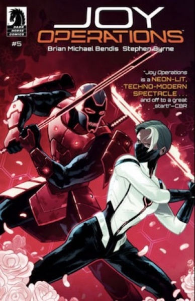
Joy Operations #5
Written by Brian Michael Bendis
Illustrated by Stephen Byrne
Colored by Stephen Byrne
Lettered by Joshua Reed
Reviewed by Ryan Fitzmartin
“Joy Operations #5” concludes Brian Michael Bendis and Stephen Byrne’s stylish cyberpunk tale on a high note. An intriguing plot combines with sharp, kinetic visuals to create an exciting finale. Bendis’ futuristic world is fascinating and complex, but doesn’t neglect character for the sake of plot. The mythology Bendis has built is a little dense, but his strong character work prevents it from becoming alienting. The writing sticks the emotional landing and leaves the reader wanting more.
Byrne’s art has ample flair, with neat character designs and clean action. A few splash pages displaying phenomenal action sequences make the comic really stand out. The action is clear and smooth but has weight and power. Glancing over the action once isn’t enough. The detailed and clean character designs are unique and flashy. The reader is invited to sink their teeth into the splash panels and study every character and movement. Byrne’s bright, inviting coloring emphasises the techno-future vibes in classic cyberpunk style. Overall this is a comic that just looks great, Byrne’s work is classic sci-fi cool.
Bendis and Byrne have put together a solid conclusion for their new book “Joy Operations #5” and it will be exciting to see where they go next. The future of Jinxworld comics at Dark Horse seems bright.
Final Verdict: 8.5 – Bendis and Byrne conclude their first “Joy Operations” arc with flair.

Saga #57
Written by Brian K. Vaughan
Illustrated and Colored by Fiona Staples
Lettered by Fonografiks
Reviewed by Quinn Tassin
With “Saga” #57, we get a slowed down issue; when it comes to this series, though, the slow ones are where the magic happens even if they aren’t filled with crazy moments. Here, we get some important insight into the way that Alana, Hazel, Squire, and Bombazine’s relationships function and how they’ve learned to survive. Alana having coded phrases for each and every person in the crew is a great way to demonstrate how much they’ve all been through in the time jump and any longtime Saga reader is bound to be touched by love that Alana shows Squire.
We also get to know some of this pirate crew who seem chill and potentially menacing at once. One of the best parts of “Saga” is its ability to portray characters as many things at once. We get a smidge more insight into Bombazine who has been a dopey, kind character so far and also may or may not have been a dangerous killer at one point in his life. On the other hang we have a group of clearly dangerous pirates who also love to make rock music, one of whom is going to teach Hazel to play guitar. It’s is an excellent way to make these characters feel full rather than easy heroes or villains. Speaking of villains, there is some moving of chess pieces in The Will’s storyline. What, exactly he’s planning is yet to be seen but every time he shows off Marko’s skull, it’s genuinely chilling.
Fiona Staples has never not done incredible work on the art in this series. By nature of the way this issue functions, “Saga” #57 doesn’t have all that many insane visuals but it’s as gorgeous as ever. The opening flashback is a perfect portrayal of a tranquil moment after tragedy, both refreshingly calm and poignantly muted in its aesthetic. Staples has a way of illustrating these characters, many of whom have something nonhuman about them, in a way that feels not only plausible but like you could see it in day to day life. A giant koala man, a stout frog chef, and a little boy with a tv head all receive varying degrees of focus here and none feel like they’re done for spectacle. These are just the types of characters inhabiting this universe.
Mostly, this was a table-setting issue for the series. Since that’s where we really get to know characters and we have a whole lot of context to learn about the last couple of years of their lives, that’s a welcome decision. And let us not forget the most important part of “Saga” #57. Ghüs makes an appearance. And a Ghüs appearance means a better day for all.
Final Verdict: 8.5- A thoughtful, characteristically great issue gives space to take in all of the new characters and information that’s been thrown our way


