
There’s a lot to cover on Wednesdays. We should know, as collectively, we read an insane amount of comics. Even with a large review staff, it’s hard to get to everything. With that in mind, we’re back with Wrapping Wednesday, where we look at some of the books we missed in what was another great week of comics.
Let’s get this party started.
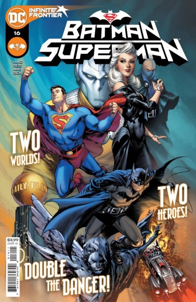
Batman/Superman #16
Written by Gene Luen Yang
Penciled by Ivan Reis
Inked by Danny Miki
Colored by Sabine Rich
Lettered by Saida Temofonte
Reviewed by Elias Rosner
Gene Luen Yang continues to cement his DC legacy as one of fun, innovative ideas that turn issues from short, one-time reads into revistiable pieces of art. While his previous issues of “Batman/Superman” were stuck dealing with Future State Gotham, issue #16 throws that away in favor of focusing on two narratives that seemingly have nothing doing with each other, set in a bygone era of comics that is also modern. Aping golden and silver age tones with a modern approach is often fraught but Yang, Reis, Miki, Rich & Temofonte absolutely nail it.
The central conceit of “Batman/Superman” #16 is that we’re looking at two film strips, one focusing on Superman and the other on Batman. It soon becomes clear that these are not the current day Supes and Bats but throwbacks instead. It’s an excuse to indulge in some classic superhero antics, the big bombastic sci-fi action of Superman and the gangster/detective stories of Batman, without having to worry about fitting continuity or telling some wildly decompressed narrative. This simplicity is refreshing and relaxing, even if the stories themselves are exciting and full of that good, good complicated silver age nonsense.
The entire issue is rendered in splash pages, save for the opening and closing pages, and you can follow either story or both as you go. It’s been done before, sure, but Reis wasn’t touted as the premiere Superman artist at the start of Bendis’ run for nothing, and Yang excels at making these kinds of twisty issues work. Combine that with Miki’s always exceptional inks & Rich’s dynamic coloring and you’ve got an issue that looks great, feels classic, yet reads as modern. If I had one major criticism, it’s that the straightforward story & its “twist” are well-trodden ground and a less charitable reading might find that , even if the execution is excellent and includes enough variations to differentiate it.
It’s clear that Yang & co. are making the most of the Infinite Frontier and I cannot recommend enough getting in on the ground floor. This may not be a run that shatters the notions of what a comic book can be but it is one that celebrates and understands the legacy within which they’re working. It knows exactly what it wants to be and is doing its damndest to be the best version of that story it can be.
Final Verdict: 9.2. I cannot stress enough how perfect a starting point this is for any comics reader. New, old, lapsed, whoever, you need to pick this book up. You won’t come away disappointed and you might even find yourself having a little fun along the way.
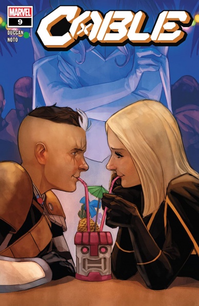
Cable #9
Written by Gerry Duggan
Illustrated by Phil Noto
Lettered by VC’s Joe Sabino
Reviewed by Luke Cornelius
A more cynical reviewer than this one would dismiss “Cable” #9 as a ‘filler’ issue, and, while in terms of the overall story progression it’s hard to argue against that, Duggan, Noto, and Sabino still make the issue an enjoyable and very smooth read.
Opening with Cable and Esme disguised as A.I.M. agents on a submarine that’s very close to Krakoan waters, we get to see them mess with the “beekeepers” and then fire themselves out of the torpedo tube. It’s a fun sequence and nice to see the pair unburdened for a moment. It really is only a moment though, with Cable choosing to leave Esme, Emma Frost, and Cyclops immediately after to continue searching for Stryfe. Cable feels responsible for Stryfe and the issue does a great job of showing his tunnel-vision determination to deal with him.
Continued belowThe rest of the issue follows Cable seeking out different mutants for help and information. Each scene is punchy and lively, while Duggan’s dialogue is consistently strong, capturing a host of voices with ease and frequently injecting humor to keep the issue light.
Noto’s artwork in “Cable” #9 is an absolute breeze and might be some of his smoothest work on the series so far. There’s a great sense of subtle eye-direction in each panel and movements are presented in clear intervals. His colors might just be even better, though, with each scene underpinned by a particular color ranging from a cool blue onboard the boat, to a red glow in the Japanese bar, to a dusty orange in Limbo. For an issue that jumps between settings quickly, Noto does a great job of making the transitions feel incredibly cohesive. The most satisfying of all the moments in the issue colorwise is when Cable and Esme are returning to the surface of the water. Noto fills the moment with calmness, muting the previously vibrant yellow of their A.I.M. suits, with them both partially highlighted by the sun through the water.
At the end of the journey, Cable comes to the conclusion that the best way to find and stop Stryfe is to bring “the other guy back,” establishing a solid and exciting direction for the series as it heads into its final three issues.
Final Verdict: 7.0 – What “Cable” #9 lacks in story progression, it makes up for with high quality in every other department.
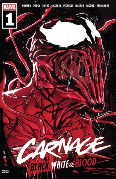
Carnage: Red, White, and Blood #1
Written by Tini Howard, Benjamin Percy, & Al Ewing
Illustrated by Ken Lashley, Sara Pichelli, & John McCrea
Colored by Juan Fernandez & Mattia Iacono
Lettered by VC’s Joe Sabino
Reviewed by Alexander Manzo
“Carnage Red, White, & Blood” #1 is an anthology issue where three different writers and illustrators get a chance to tell a short story with Carnage as the main character. The first story by Tini Howard is the only one that seems a bit out of place, not because of the subject of a romantic story between Carnage and Shriek, but due to the fact it seems like a glimpse into an issue rather than an entire story on its own. Carnage telling the love story to Cloak gives the reader the knowledge of jumping back-and-forth time wise, however once it converges at the end it can be confusing. Then the fight between Carnage’s team of villains and other known superheroes seems more open-ended than probably intended.
Ken Lashley is the artist for this story and does a great job of the complex lifework that comes with a symbiote like Carnage. One thing that really stuck out was his adaption of the lone human in it where he actually has these grizzled cuts on his face that are reminiscent of the symbiote’s movement.
Benjamin Percy’s story, “End of the Trail,” is right in his element of story-telling with a Western feel of a sheriff hunting Carnage. This story is told with the Sheriff’s voice explaining all of the crimes and destruction Carnage cause paired with Sara Pichelli’s artwork really brings this one home. She is able to help utilize the slow build up Percy loves by utilizing the multiple panels of one character to slow the moment down.
The final story, “You Are Carnage” is an interesting pick-and-choose your own adventure Carnage story that Al Ewing & John McCrea did really well. The storyline follows Carnage and if he can “be good” and not go too far to stop some thieves but with the reader in charge it takes it to another level. The panel work is great because McCrea utilizes every square inch with details and probably uses white the best than the previous two stories. The blankness from the backgrounds give the rest of the punching, bullets, and glass-shattering to really take charge like a proper Carnage story.
Final Verdict: 8.0 – “Carnage Red, White, & Blood” #1 is a fun collection of different Carnage stories that’ll keep the readers entertained.
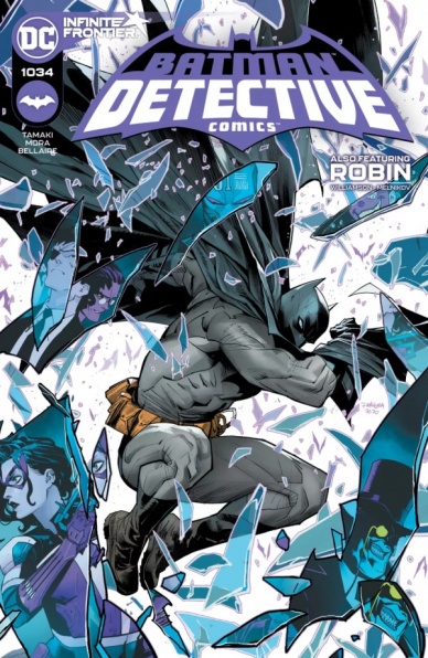
Detective Comics #1034
Written by Mariko Tamaki
Continued below
Illustrated by Dan Mora
Colors by Jordie Bellaire
Lettered by Aditya Bidikar
Reviewed by Quinn Tassin
Who would’ve thought that becoming a mere millionaire would be one of the best narrative developments that Bruce Wayne has experienced in a long time? “Detective Comics” #1034 is good for a host of reasons- it’s well scripted, wonderfully paced, has gorgeous art- but the biggest one is making Bruce Wayne a man of the (wealthy, well-connected) people. Often, Bruce lives in isolation, whether he’s on a globe-trotting adventure, holing up in his mansion, or broken down and defeated in some way. Mariko Tamaki dares to surround him with people that aren’t the Bat-family, asking us to consider what it’s like when Gotham’s most famous man lives in a neighborhood. The result is a really great issue that features a lot more Man than Bat, quickly establishes an interesting status quo, and invests itself in the city of Gotham in a more genuine way than any Batman comic has in a long while.
Dan Mora’s art is the absolute perfect fit for this series, beautifully balancing a vaguely realist style and a classic comics feel. He brings a dynamism to action sequences that’s just about impossible to match and his style is just awesome for Batman (his cape physics are a particular highlight. The one real fight scene we get captures him strikingly well as a hero, using smart layouts and a strong sense of body language to communicate his whole vibe in remarkably few pages. Jordie Bellaire’s colors are always stellar and this is some of her finest work. Together, she and Mora bring a life to “Detective Comics” #1034 that I don’t know I’ve ever seen in a Batman series. The backyard party at Bruce’s neighbor’s is a real highlight in the issue- Mora illustrates the characters and setting with care, making them feel almost tangible and Bellaire imbues the scene with an undeniable warmth.
“Detective Comics” #1034 is a great new start for Bruce Wayne and a superlative debut for Tamaki, Mora, and Bellaire. This could be the a sleeper hit in the Batman line if it lives up to the promise of this issue.
Joshua Williamson and Gleb Menikiov’s backup story is interesting enough as a setup for the new “Robin” series. It lays the narrative groundwork for the series perfectly well, delivering some exposition about the League of Lazarus and a mysterious tournament that are certainly intriguing. But still, it’s hard to really latch onto a backup story that just should’ve been part of the first issue of the series. It’s economical to cover some of the classic first issue material early and the Connor Hawke appearance is very cool but this backup just doesn’t justify its own existence.
Final Verdict: 8.5- “Detective Comics” #1034 is a ridiculously good first issue of the most grounded Batman comic we’ve ever read (even if it’s background story leaves a lot to be desired)
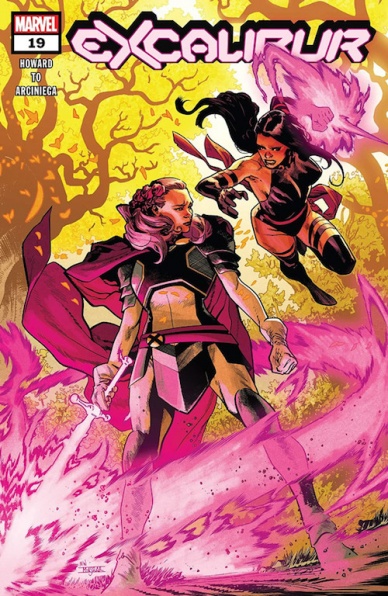
Excalibur #19
Written By Tini Howard
Illustrated By Marcus To
Colored By Erick Arciniega
Lettered By VC’s Arianna Maher
Reviewed By Matt Sherman
Continuing the rescue of Betsy Braddock, “Excalibur” #19 gives us a fun and emotional issue. The issue dives straight into the Captain Britain Corps, which has been a really interesting addition to the Excalibur series since the ‘X of Swords’ event. Seeing the way they united and stood up to Saturnyne was really compelling. Unfortunately, that’s all we got from them in this issue. It was a missed opportunity for Tini Howard to dig deeper into the new Corps.
Nevertheless, Howard continues the story trailing the team and the search to restore Betsy Braddock to her normal self. Howard tells the story without over-using action scenes. The dialogue between the characters was golden, perfectly exploring each one’s reactions in diverse ways. The dialogues felt real and powerful without having to make the pages too wordy.
The art expressed the characters’ emotions very well. Marcus To illustrates body language convincingly and adds to the emotions within the scenes. Every panel flows well, making the dialogue feel natural to readers. Erick Arciniega’s colors are really interesting as well, with his palette based off neutral and green colors. Arciniega sneaks in pinks and purples that give the art a sense and tone revolving around Psylocke and Betsy Braddock’s telepathic links.
Continued belowThis issue was a very entertaining read. The creative team does a fantastic job telling the story without being overly dramatic and without overdoing the action. The issue really shows the trust and love the teammates of Excalibur have for each other.
Final Verdict 8.4 – Emotional, yet fun, issue that really expands on the team’s friendship.
Firefly: Brand New ‘Verse #1
Written by Josh Lee Gordon
Illustrated by Fabiana Mascolo
Colored by Lucia DiGiamarino
Lettered by Jim Campbell
Reviewed by Alexander Jones
I always thought “Firefly” functioned best as a television show that required no sequel. However, the writing and artwork in “Firefly: Brand New ‘Verse” #1 convinced me that I was wrong. Author Josh Lee Gordon picks up years after the show left off making readers delightfully confused about the new cast and setting. Gordon depicts the relationship with all the new characters with a shocking sense of honesty. We meet a surprising new couple in two different but very interesting settings within the first few pages. Half the fun of the series so far is decoding the different relationships between the comic book continuity and original television cast. Fabiana Mascolo’s art allows for this property to be interpreted in a completely different context as well. There’s a new crew aboard Serenity but their mission statement is the same as Captain Malcolm Reynold’s crew.
Mascolo’s work continually gets better as the issue progresses. The page layouts become more intricate towards the end of the issue. There are some impressive techniques like panel bleeds that evoke the tension of the original show. I appreciate the level of detail Mascolo renders to the anatomy of characters. The deadpan humor was an essential aspect of the property that Mascolo brings to “Firefly: Brand New ‘Verse” #1 with nuance. There’s a particular scene where Zoe is introduced to an old friend that is filled with carefully planned out timing and a sharp sense of humor. Mascolo also lends an impressive sense of design towards the ships and technology that also echoes the acclaimed television show. The biggest downside to the art is the pages lacking detail. At times, there are pages with so few elements that I feel like something is missing.
It is shocking to see just how much this creative team is able to accomplish in a few pages. Gordon and Mascolo quickly introduce readers to a brand new cast of characters and get them started on their first mission. The question of decompressed comic books does not apply to the tight script from Gordon. I’m really happy to see more representation in this series as well. Gordon and Mascolo make the new line-up of characters feel at home in this setting. I never thought a team of creators would be able to use this property to say something new but the younger cast members of “Firefly: Brand New ‘Verse” #1 are incredibly charming. “Firefly” fans should find something novel here with the struggle of the new team members and connections to old friends. For years I have been particularly fond of the “Serenity Float Out” #1 one-shot that this title references and expands upon with nuance. “Firefly: Brand New ‘Verse” #1 feels more like a fresh start than an endless comic book continuation of a television show.
Final Verdict: 8.5 – “Firefly: Brand New Verse” #1 expands the world of a beloved property in a whole new context.
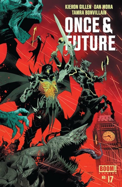
Once and Future #17
Written by Kieron Gillen
Illustrated by Dan Mora
Colored by Tamra Bonvillain
Lettered by Ed Dukeshire
Reviewed by Matthew Blair
“Once and Future” #17 presents us with a world where the legend of King Arthur is real, but it turns out things are a lot more dangerous, violent, and lethal to the British isles than the myths would have you believe. The legends are making a comeback, and humanity is doomed unless they can stop it.
Kieron Gillen is the writer in “Once and Future” #17, and although this particular issue isn’t the best introduction to the series, it builds a fast paced, complex, and very engaging story off of its established characters and setting. The human characters are the right blend of capable and intelligent while appearing to be just helpless and overwhelmed enough to give the story tension. Meanwhile, the mythical figures of characters like Merlin and Galahad are given a strange and twisted take while combining just enough familiarity to anyone who knows the myths to be intriguing and fun.
Continued belowThe art on “Once and Future” #17 comes from Dan Mora, and is a tremendous source of fun. Mora’s angular, highly detailed, and expressive style of art allows the action to be fun and dynamic and while the human characters are beautifully expressive and exaggerated, the character designs for the monsters and fantasy characters combine heavy metal fantasy with just enough bizarre otherworldly design to give the book a unique and awesome design. The artwork is complimented by Tamra Bonvillain’s beautiful colours to create a one of a kind book that is an absolute treat for the eyes.
“Once and Future” #17 is a unique twist on a classic story that combines heavy metal fantasy with insane action in order to be exciting with just enough familiar tropes and story beats to be familiar and engaging.
Final Verdict: 8.5- While you will probably want to start from the beginning, it’s a fun take on Arthurian lore.
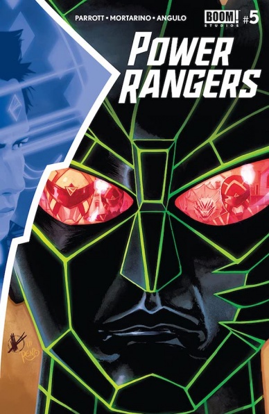
Power Rangers #5
Written by Ryan Parrot
Illustrated by Francesco Montarino, with iinking assistance by Simona Di Gianfeilce
Colored by Raul Anulo, with assistance by Jose Enrique Fernandez
Lettered by Ed Dukeshire
Reviewed by Conor Spielberg
Every issue of BOOM! Studios’ “Power Rangers” continues to offer the artist the opportunity to show off their talent with dynamic action, breathtaking landscapes and interesting enemies for the trio of Power Rangers to face, all while telling a compelling story in each issue that gradually builds on the last, and this issue is no exception.
The three Rangers, their robot companion Xi, and their prisoner Drakkon are established on a Wild West type of planet seen briefly in the last issue, and make it clear to the reader they notice how peculiar that is for them as it is for us.
One of the main strengths of the storytelling is that it breaks things down for newcomers to the Power Rangers Universe while also alluding to the source material when they can. Another balancing act they manage to walk quite well is the serialised format of a longform series. This issue has a conflict that is resolved but leads to another obstacle the Rangers must overcome. To tell a complete story in a single issue while making the reader clamour for more is an increasingly rare thing to come by in the modern comic book industry.
This ‘leave them wanting more’ style of storytelling is further elevated by the stellar artwork. This issue in particular allows Alex and Zack (The Red and Black Ranger respectively) to go undercover into an alien saloon, undercover, in remarkably well designed space-cowboy outfits. The action is accented with a “Ayy Ya!” that rings out every time I see it written on the page. There is also a lot to unpack in the more tender moments with Mortarino’s artwork carrying the emotional weight of the scenes written by Parrot.
The issue, like many others, makes sure to fire on all cylinders, leaving time for compelling exchanges of dialogue, impressive settings, fun action scenes,all the while, inching the overarching story forward towards some sort of conclusion.
Final Verdict: 7.4 If you’re looking for a weekly serialised comic, this is definitely worth checking out.


