
There is a lot to cover on Wednesdays. We should know, as collectively, we read an insane amount of comics. Even with a large review staff, it’s hard to get to everything. With that in mind, we’re back with Wrapping Wednesday, where we look at some of the books we missed in what was another great week of comics.
Let’s get this party started.
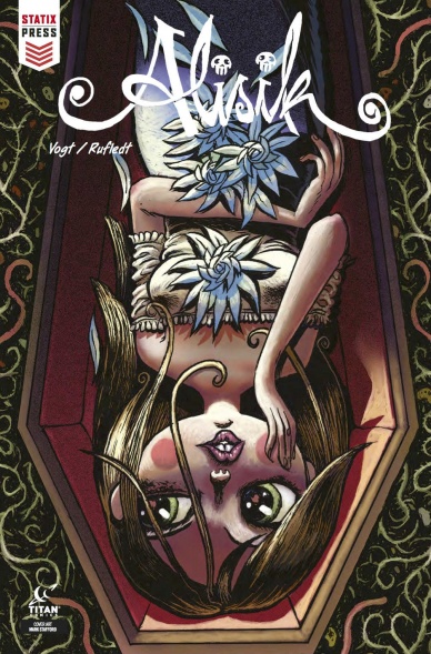
Alisik #2
Written by Hubertus Rufledt and Helge Vogt
Illustrated by Helge Vogt
Colored by Helge Vogt
Lettered by Cat Connery
Reviewed by Alan Buxbaum
In “Alisik” #2, Rufledt and Vogt continue to bring us deeper into this creepy yet heart-warming story about a dead girl whose romantic dreams bring her closer to a living boy named Ruben. The story develops as the reader is introduced to various plot points and led to still wonder why Alisik is dead (something she is also curious about). If the writing and story continue to grow in the matter that it has been, this could turn into a fantastic story. Whether or not this happens though, the art and story-telling through it is worth the read alone.
Vogt’s drawing is nothing short of stunning. His illustrations are fluid yet stop you in your tracks almost every page with its detail and beauty. The word “beauty” is generally not used to describe a gothic tale that takes place in a graveyard, and yet there is so much of it throughout its pages. One interesting and effective technique that Vogt uses is drawing large landscapes with characters moving around in them. In order to make it feel like time is passing, Vogt encompasses the figure(s) within boxes. Its also worth mentioning the opening prelude to the story, which is a flashback of one of Alisik’s fellow ghosts and how she ended up in purgatory. Its set in what looks like a very sunny Victorian-age. The contrast from the general feel of the issue is refreshing and gives Vogt the chance to show how beautiful his drawing can be, especially when not in such a dark setting.
The structure of the issue is well done. I appreciate the use of a prelude story, three interlude pages which are integral to the main story, and various pages that interject Alisik’s own feelings in diary-form. All of these elements add up to the reader having a well-rounded perspective on what is going on in the story.
Final Verdict: 7.9 – “Alisik” #2 continues to awe its readers with its brilliant art. The only aspect this comic needs to prove before becoming a must-read is how the story will develop, which gets stronger with each issue!
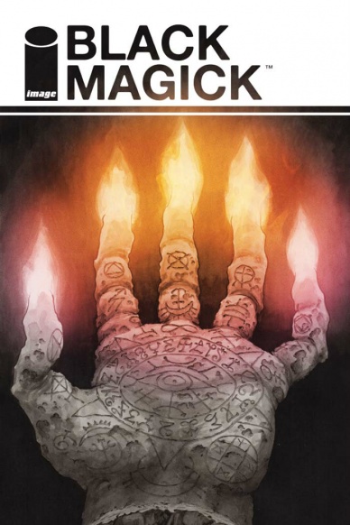
Written by Greg Rucka
Illustrated by Nicola Scott
Colored by Chiara Arena
Lettered by Jodi Wynne
Reviewed by Michael Mazzacane
Nicola Scott’s inkwash work in this series gives it a distinct look, and if I read physically I’d imagine feel as well. This singular force in the books aesthetic creates a baseline “realism” for things to truly read as magical when it begins to go down. “Black Magick” has played in the “Sin City” spotlight color aesthetic before, but with issue #11 the culmination of the books second arc, magick becomes even more prominent via coloring assistant Chiara Arena. It isn’t just that bits of Rowan are suddenly highlighted by color, it’s how foreign, supernatural, it appears. Magical energies seem to radiate with a neon iridescent spectrum that both feels one and a part of Scott’s illustrations. With Rowan having something of a astral projection fight, there are plenty of big bold images for Chiara Arena to work her magic. The most effective instance may be the bottom right panel on page 8, a close up of Rowan’s face as she’s pinned in the corner. It isn’t much, but how Arena uses the pallet to just fill in Rowan’s eyes, showing them to be bloodshot with a little purple sun dog ray, is a beautiful little magical highlight. It gives the already nicely composed image by Scott just a little extra oomph and emotional impact as readers turns the page.
Continued belowIssue #11 marks the end of ‘Awakening,” and magic is certainly more alive than ever. However, Scott’s page work and figures throughout the issue, root and remind everyone “Black Magick” is an excellent relationship drama first and foremost. At the centers of these relationships is trust, a motif that is mirrored between Rowan, Alex, and the men in their lives. At one end of town Alex is trying to build trust buy giving self-righteous Brimstone Bro her name. On the end, Rowan is trying to keep what she had with Morgan. Scott shows the bind that trust creates through mirroring, either by breaking panels up or showing couples in medium sized shots. There’s a 4 panel sequence towards the end of the issue between Rowan and Morgan that is composed entirely through dual imaging. From tight closes ups on their eyes, yet another reminder that Scott draws the best emotive eyes. To them in medium shots and using the negative space of where speech bubbles used to be to say everything. “Magick” use of the supernatural is fairly novel, but how Scott and Rucka construct and narrate relationships between characters is the real magic of this series.
Final Verdict: 7.5 – “Black Magick” ends it’s second arc on a high note, but that doesn’t mean it’s a happy one for those involved.
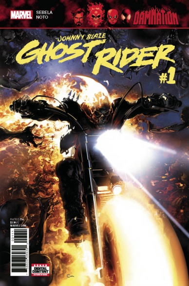
Written by Christopher Sebela
Illustrated by Phil Noto
Colored by Phil Noto
Lettered by VC’s Travis Lanham
Reviewed by Gustavo S. Lodi
The Johnny Blaze one-shot within the ‘Damnation’ event manages to avoid being a hermetic offering, only understood within the confines of a cross-over, thanks to a sharp script and end-game presented by Sebela. While readers will appreciate the issue further with a broader understanding of Mephisto’s takeover of Las Vegas, this entry stands surprisingly well on its own.
Before going into the plot itself, it is worthy to comment on Noto’s complete art package – pencils, inks and colors. Usually when an artist takes full rein, the final package is either very good or very bad. Not so here, where the results are a mixed bag, with very strong designs and pencils, but with colors as a setback, given how monochromatic they are.
Noto understands the nature of Johnny Blaze and of the Spirit of Vengeance: not only are they creatures of the supernatural, they are also creatures of the road, of speed. So when panel layout, movement lines and action scenes convey that sort of ‘Mad Max’ style, the issues screams with excitement. At the same quality, Noto’s creature designs and landscapes are solid, contributing to a sense of environment that frames the underworld into believable structures.
Back on colors, Noto feels constrained. It is not unusual for colouring artists to have this challenge when depicting smoke and brimstone. But as opposed to Rebelka’s work on “Judas,” for example, the colors here fail to contribute to the different story beats and changes of scenario. Everything just “feels” the same.
What really makes this issue unique is Sebela’s plot, which understands Johnny’s carny soul and the Spirit’s of Vengeance drive. The banter between those two entities and how they clash against one another is certainly a high-point. And, without getting into spoilers, the resolution of this one-shot, if played well on the ‘Damnation’ event and on the Marvel Universe, could make this a must-read for old and new fans of the Ghost Rider mythos.
Final Verdict: 7.5 – A surprisingly concise and relevant one-shot in the middle of an event, “Damnation Johnny Blaze” has some shortcomings in the colouring department, more than offset by strong suits on the overall art and story beats.

Doomsday Clock #4
Written by Geoff Johns
Illustrated by Gary Frank
Colored by Brad Anderson
Lettered by Rob Leigh
Reviewed by Jonathan O’Neal
It’s no mystery that “Doomsday Clock” is not running like a Swiss watch in terms of schedule, but now that DC has tempered expectations on that front, we imagine that the company hopes that the marquee value of the creators, the 32 pages packed mostly with nine-panel grids, and novelty of bringing the Watchmen universe formally into DC continuity will engender enough goodwill to keep readers buying the $4.99 title.
Continued belowIssue 4 might be a bridge too far for many as it presses pause to develop Rorschach II’s back story. While it’s an interesting read full of tragic and dramatic story beats, readers have reached the 1/3 mark in the “Doomsday Clock” story, and it still feels like exposition. The inclusion of characters from DC continuity has been tangential at best. The criss-crossing narratives and flashbacks overlapped by the news and something on Turner Classic Movies, seem to be building to something, but at this point the story is groaning under the weight of these elements with no payoffs.
Fan favorite writer Johns has perhaps earned the benefit of the doubt, but the storytelling here seems to mirror the portentous bloat of the Zach Snyder DC films where dramatically heavy scenes are piled upon each other, creating a patchwork narrative without a singular voice other than faithfully trying to ape Alan Moore’s darkly prophetic tone, an exercise in futility for even the best writers. This is another instance where imitation may have been the sincerest form of flattery, but it certainly feels like ground that has been tread before, especially when an entire issue serves the primary purpose of showing this new Rorschach as a figure just as tragic and compromised as the original.
Conversely, Gary Frank’s artwork continues to be mesmerizing even as he follows in Dave Gibbons’s footsteps. There is a depth and degree of shading in Frank’s work that was not attempted in the original series, and a subtle cinematic quality creeps in at the edges in slight adjustments to the typical page layout. Frank’s artwork only suffers where the script seems less sure-footed and more contrived (e.g. a missing puzzle piece = a metaphorical missing puzzle piece). And what could have been a nice reveal at the end of the issue is undercut by a script that didn’t develop enough for the idea of Batman incognito to matter.
“Doomsday Clock” #4 is still a high-quality comic that looks and feels like an important work. It’s ambitious and epic in scope, but in the end it feels like an attempt at literature when a ripping yarn would do. Fairly or not, each installment in this series will be compared to its predecessor, a reality that the creators would do better to subvert than embrace so reverently.
Final Verdict: 6.5 – “Doomsday Clock” #4 is a good looking comic that attempts to humanize a central character, but it feels like we’ve been here before.

Hungry Ghosts #3
Written by Anthony Bourdain
Illustrated by Sebastian Cabrol and Paul Pope
Colored by José Villarrubia
Lettered by Sal Cipiarno
Reviewed by Reed Hinckley-Barnes
While the first issue of “Hungry Ghosts” spent much of its time setting up the frame all the short stories within this series exist in, since that first issue, the series hasn’t referred back to that frame much at all. Which is fine, all you really need to know coming into “Hungry Ghosts” #3 is that there are going to be short stories, they’re going to be spooky, and they will, in some way, involve food.
The one thing that really works for this issue pretty much all around is the art. Both Sebastian Cabrol and Paul Pope are good fits for the stories they are telling. The story Cabrol worked on, ‘Deep,’ has more realist style allows the body languages of it’s characters tell much of the story. Since the story is most about the interplay and power dynamics between two characters, this works really well. Similarly, Pope’s slightly rough and expressive style makes the story he worked on, ‘Boil in the Belly,’ gruesome and a little funny. His exaggerated facial expressions bring a bit of humor into an otherwise grim story.
Between the stories, the colors by José Villarrubia bring a bit of continuity to the issue. While he changes a little bit between the stories, his colors all have a similar tone a feel to them that keep the stories in this issue from feeling completely disconnected from one another.
Unfortunately, the stories themselves are not quite up to snuff with the art. The first story, ‘Deep,’ has a twist ending that comes out of nowhere and is completely unsatisfying. ‘Boil in the Belly,’ the second story, has a twist that also doesn’t quite land, though it at least has a bit more build up to it than the first. A good twist is both surprising, and something that when you look back at the story seem completely obvious. Neither of these stories are able to accomplish that. What’s more, while the first story may make the reader a bit uneasy, and the second might make you a little squeamish, since their twist endings don’t land, mostly these stories just leave a reader feeling like they’ve wasted your time.
Continued belowFinal Verdict 5.5 – “Hungry Ghosts” #3 has good visuals, but it’s stories aren’t able to follow through on their promise.
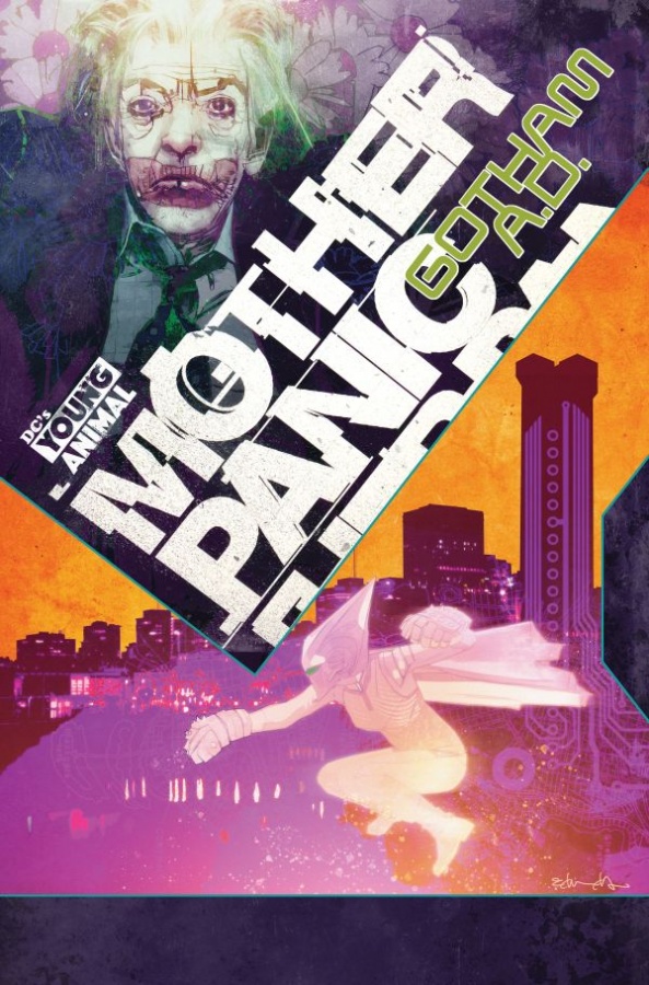
Mother Panic: Gotham A.D. #1
Written by Jody Houser
Illustrated by Ibrahim Moustafa and Paulina Ganucheau
Colored by Jordan Boyd and Marissa Louise
Letters by John Workman
Reviewed by Alexander Jones
Up to this point, “Mother Panic” is an amorphous title that has always been slightly hard to follow. While my interest quickly subsided in the main series after only a few issues, I figured “Mother Panic: Gotham A.D.” #1 was as good a place as any to start with any with the main book. However, after reading and trying to comprehend the plot further, the mysticism and poetry of the Young Animal line only further held me at arm’s length regarding the issue. To start things off, the book jumps into the future of Gotham, which doesn’t quite redirect the book towards a greater sense of focus. There are lots of unwieldy scenes of violence as well as lines of dialogue that are both written well but are overshadowed by the lack of focus and direction from creator Jody Houser.
Ibrahim Moustafa does a wonderful job adapting to the art of creator Tommy Lee Edwards while not aping or copying him. The visual clarity straight-forward nature of the creator really helps the issue as a whole not become bogged down in any information that would have made the narrative more confusing. Moustafa’s jagged linework in the background but the very tame command of the page and the pencils for each individual character is another strong aspect of the series that helps the script and overall package of the comic.
The issue seems to be a meditation on violence, studying some of the reasons why kids resort to these kinds of tropes and how they start to become adults. Unfortunately, some of the acts of violence committed by Violet herself as a civilian make it more difficult to empathize with her subjecting the reading to a deeper shade of grey. While the series has always existed in a gray area, Violet’s quick impulse towards violence is a harsh representation of the character that becomes difficult to relate too. Without a strong force utilized for good and protagonist lacking any deep personality, the issue is an incredibly muddy reintroduction to the world of Mother Panic.
“Mother Panic: Gotham A.D.” #1 feels like a missed opportunity, as titles like “Cave Carson has an Interstellar Eye” and “Shade, the Changing Woman” both took the return of Young Animal to strongly redefine the basis for each book and show readers what sets Young Animal part from the rest of DC’s line of comics. With a crowded comics market, it is difficult to find what Mother Panic does to set itself apart from different titles on the shelf.
Final Verdict: 5.2 – Rather than being the fresh start the series needed, “Mother Panic: Gotham A.D.” #1 continues to be a vague but well-drawn alternative-flavored superhero series.

Motherlands #3
Written by Si Spurrier
Illustrated by Rachael Stott
Colored by Felipe Sobreiro
Lettered by Simon Bowland
Reviewed by Matt Sadowski
The hunt for Bubba continues, but first? A little R&R at an amoeba hospital on String 38221001. Si Spurrier and Rachael Stott’s combined zany imaginations are again on full display. Stott makes a welcome return after her curious absence last issue. Every issue reveals the infinite rabbit hole of new dimensions and the wacky places within. The fleshy shudderbooth, jellycocks, braintrust, and the true nature of neuroboosted placentamorphs are wonderfully disgusting to behold. “Motherlands” routinely traffics in filth and disgust, and issue three is no exception. Although the gross-out humor leans more toward the juvenile side, it’s still worth a few chuckles, but it’s always visually entertaining.
The reason Tab and her mother’s fractured relationship is so entertaining to watch is in large part due to Stott’s mastery of facial expressions: Tab’s eye-roll as her annoyed face sinks into the tub, Selena’s smug satisfaction when she learns Tab watched her show, Tab’s bashful demeanor as she asks her mother a carnal question, or the self-aware, melodramatic expressions when Selena is behind the camera. Flashbacks are still employed to further show how ill-suited Selena is at motherhood, though it’s hitting the same beats as the previous two issues. Selena’s stardom comes first, always at the expense to her daughter’s well-being.
Continued belowThe action scenes are brief but effective. Tab and Selena’s duke-out with Oona unfolds over a couple pages as they tumble through strings. Each “panel” indicates a dimensional shift with floating cubist portals trailing behind. The background is cut out, replaced by simple color gradients so as not to interfere with the action’s flow. Another action highlight takes place as Tab fights the Braintrust in her skivvies within the meaty walls of the shudderbooth. Both scenes are fun and frenetic with an added dose of humor that makes “Motherlands” work so well.
Final Verdict: 7.3 – The strained mother/daughter relationship at the core of “Motherlands” is further explored in #3 of this whimsical parallel dimensional world.

Old Man Hawkeye #3
Written by Ethan Sacks
Illustrated by Marko Checchetto
Colored by Andres Mossa
Lettered by VC’s Joe Caramagna
Reviewed by Alex Curtis
Even though we’ve finally learned what Clint’s mission is, “Old Man Hawkeye” #3 still suffers from the same old problems. The dialogue continues to be as stilted as a cheesy ’90s comic, with characters telling each other information they already know and belting out adventure movie clichés.
The pacing feels rushed, and characters randomly appear merely for plot convenience. For instance, Red Skull video calls Bullseye just so he can tell the audience he’s Bullseye’s boss. Reading “Old Man Hawkeye” is a tiring experience, because it’s as if Ethan Sacks is constantly flagging important details and leading you because he’s afraid you might not pick up on them. Thus, this issue feels more like a list of bullet points than an engaging narrative you can lose yourself in.
This story attempts to humanize a troubled, jaded Clint from not being overtaken by revenge. But we’ve seen this plot done to death, and so far, Sacks hasn’t proven he can elevate the tired trope.
However, Sacks puts his imagination to good use in further building the ruined future world Mark Millar established years ago. A parade of familiar characters run through this issue, but they feel genuinely fresh and reinvigorated through their post-apocalyptic makeover.
Marko Checchetto does a spectacular job in the art department, which glimmers with a steely polish. If there were no text in this issue, you would still get a clear grasp on the emotions that Clint is going through (anger, disappointment, guilt). But that’s not to say Checchetto can’t excite and excel with colossal action scenes and scale. Unfortunately, his art doesn’t quite fit the grimy, Western feel this book should have. In contrast, Steve McNiven’s textured work perfectly fit the original “Old Man Logan” while Checchetto’s polished veneer is better suited for slicker projects. The disconnect is furthered because of Andres Mossa’s appropriately gritty and rustic color work.
Final Verdict: 5.6 – This creative team has good intentions and some good ideas but they aren’t the best fit for this story, which needs a lot more work to succeed.
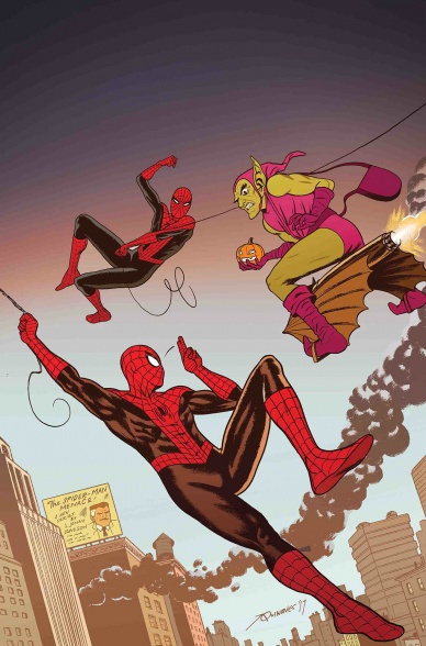
Peter Parker: The Spectacular Spider-man #302
Written by Chip Zdarsky
Penciled by Joe Quinones
Inked by Joe Rivera
Colored by Jordan Gibson
Lettered by VC’s Travis Lanham
Reviewed by Elias Rosner
The ‘Amazing Fantasy’ arc continues with the ramifications of Peter, Jonah, and Theresa’s jaunt into the past, providing us with some deep cuts and some re-explorations of modern retcons. For someone who has really only read one spider-run, J. Michael Straczynski’s, Zdarsky has done an excellent job of tying in these older elements into the current story. I feel connected to the history of Spider-man (or is it Spiderman) while not needing to have read the original issues.
This connection goes beyond the superficial. Zdarsky embraces the pathos of Spidey’s stories, past and present, and uses this to much better effect here than in the last arc. To do this, he takes the time to slow down and let us sink into each of our focal characters and their problems while also surrounding them with a classic style of Marvel superheroics. It’s expertly constructed to be thrilling, tragic and as old-school comic booky as can be.
Take the pages where Norman Osborn storms into the Daily Bugle offices as the green goblin. Quinones and Rivera have Osborn mug for the camera in almost every panel, being as over-the-top as ever. There is nothing subtle about him yet he is juxtaposed against a morally conflicted Past J. Jonah Jameson, who inadvertently outs Peter as Spider-man. We see the regret and fear and sadness in Jonah’s eyes as he mirrors Future Jonah’s words… “He’s just a child.”
Continued belowThere is no such regret in Osborn’s eyes. Only rage and the delicious desire for revenge.
I would be remiss if I didn’t also touch on Gibson’s coloring. Gibson bathes the above scene in deep neon greens and pinks, once again balancing the old-school with the new. Additionally, one page, near the end, with Osborn standing in the doorway, is almost Francavilla-esque in its composition. The whole page is bathed in blues, everyone is silhouetted and framed in a dutch angle, and it feels like a poster for some new thriller.
While there are many fantastic, dramatic pages in this issue that are balanced by Zdarsky’s humor, there are some pages that feel less composed. Backgrounds feel empty during the school scenes and some of the pages, like the Fury/Theresa conversation, are quite dialogue heavy in ways that aren’t necessary. These are nitpicks but they do stand out when placed next to the other, fantastic pages.
Final Verdict: 8.5. While issue #6 might still be my highlight of Zdarsky’s run still, this issue makes me hopeful that ‘Amazing Fantasy’ will be a much better arc than the previous one.
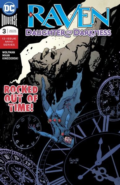
Raven: Daughter of Darkness #3
Written by Marv Wolfman
Penciled by Pop Mhan
Inked by Pop Mhan
Colored by Lovern Kindzierski
Lettered by Saida Temofonte
Reviewed by Devon Browning
Such as the name of the very series, the newest addition of “Raven, Daughter of Darkness,” bleeds black from page to page, and it is absolutely glorious. While I’d say that it is obvious the character itself would be in good hands with their very creator writing them, it isn’t promised, especially after years of different universes, styles, arcs that vary drastically. Wolfman peels back the dark layers of Raven and her world with a satisfyingly familiar chemistry of story and art that brings you back to the golden years of The New Teen Titans while remaining modern and relevant decades later.
In regards to respecting a comic’s origins while also working to reinvent and revolutionize a character, what really drives this comic to a near perfect balance is the art. Without question, Pop Mhan somehow manages a style that is an impressive mix of old school line art and a modern ruggedness in inking that gives the reader the best of both worlds. The style takes you through each page and panel without confusion, consisting of a comfortably imperfect background to the main focus as Raven’s powers side with distortion if anything. With a story heavily sated with magic, which is historically unstable in most literature, the art needs to speak to that. Heck, Raven’s speech bubbles aren’t even the standard ovals– and so the ink, nor the panels should be the standard either. Mhan’s imperfect style is what makes the art in this issue perfect.
But that’s not without the muted colors complimenting the twisted style. Colors you would also find in a comic from the ’80s. Lovern Kindzierski is to thank for that. But the colors chosen for the comic as a whole doesn’t compare to how they’re actually used. What Wolfman, Mhan, and Kindzierski are able to pull off in this issue is the visual representation of emotions within the confines of the pages. Raven is notorious for the relationship between her powers and emotions. One always affects the other, and so while we watch Raven struggling to keep the power from being drained out of her from the very first page, to the family reunion she has on the last, there is a wide range of emotion that the reader watches her go through.
So, if one were to erase inner monologue and script, the art could speak for itself. There you could see pain, desperation, confusion, hope, all without Raven or anyone else explaining it. Take away the ink that traps the color, and what you will see is the very core of emotion. Sadness, anger, and even frustration. A story doesn’t just come from words and that is no lesson needed for this series’ creative team.
We get a glimpse at a few familiar faces with this issue, and Wolfman proves himself a writer loyal to the character and keeps them on the ever teetering scale of heroism. Raven is challenged both physically and mentally this time around, and while the story encourages us to root for the Daughter of Darkness, there is also a subtle yearning of what could possibly top current events that look to see her fail. Pulling the reader in all different directions? A true Raven story.
Final Verdict: 8.3 – The continuation of a refreshing rebirth to a fan favorite Titan that will leave long time readers pleased, and new readers aching for more.


