
There’s a lot to cover on Wednesdays. We should know, as collectively, we read an insane amount of comics. Even with a large review staff, it’s hard to get to everything. With that in mind, we’re back with Wrapping Wednesday, where we look at some of the books we missed in what was another great week of comics.
Let’s get this party started.

Avengers: Curse of the Man-Thing #1
Written by Steve Orlando
Illustrated by Francesco Mobili
Colored by Guru-eFX
Lettered by Clayton Cowles
Reviewed by Gregory Ellner
To call “Avengers: Curse of the Man-Thing” #1 a one-shot is rather inaccurate. Rather, Steve Orlando tells the first part of his multi-stage ‘Curse of the Man-Thing’ story arc, which is to take place across multiple titles. As such, while each one may focus on specific individuals and teams, they all coalesce around the eponymous magic-meets-science entity that became of Ted Sallis. In this first installment, Orlando does a rather good job of setting the scene. People unfamiliar with the Man-Thing get a quick crash course in who he (or rather it) is, how the entity came to be, and why it is important. The story also introduces its antagonist, who, while having a rather stereotypical goal, has an interesting way of showing how to go about achieving it. Altogether, this first part of the ‘Curse of the Man-Thing’ story arc is written well for incoming readers, and also helps to tie together different parts of the wider Marvel Universe in the process without needing a massive crossover event.
Francesco Mobili’s artwork is rather expressive, especially when it comes to emotion. Pride, anger, and especially fear are on clear display across the entire issue, all coming together as a cohesive unit very well in the face of such a fear-centric threat. The close-ups are detailed, but also softly penciled at the same time, making for an intense, but in some ways relaxed, art style. This effect works especially well around calmer scenes, but also functions well in the midst of a fight.
Guru-eFX does a marvelous job (no pun intended) with the colors, his smooth, soft coloring style working well with the light pencils to tell a story that feels at once delicate and horrifying. Rather than solely relying on dark colors or brilliant greens, the colors provided are a wide swathe, the utilization of shading enabling a very three-dimensional image that goes beyond most other artwork that may have harsher edges. Together, this “relaxed” coloring actually makes it all feel more real, and so makes it all appear more terrifying in the process.
Final Verdict: 7.5– Not quite an Avengers story, the first part of ‘Curse of the Man-Thing’ does a very good job of introducing the threat alongside reintroducing eponymous character for a potentially new audience.
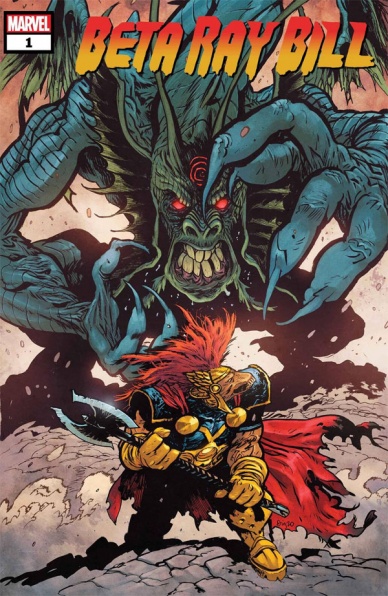
Beta Ray Bill #1
Written and illustrated by Daniel Warren Johnson
Colored by Mike Spicer
Lettered by VC’s Joe Sabino & Daniel Warren Johnson
Reviewed by Alexander Manzo
“Beta Ray Bill” is a great opening to a new series, as well as a good introduction to the character if anyone is not familiar with him. By starting the issue off with a paragraph of exposition it really helped put the mindset Bill may be throughout the issue and contextualize what is happening. The monster attack from one of Knull’s creatures comes early and Bill is struggling until Thor comes to administer the final hit. By not only failing to defeat the monster and facing personal issues from his re-ignited romance with Lady Sif, Bill is hurting on many different fronts. The story itself is going to be about Bill accepting himself without his strongest weapon, Stormbreaker, and finding out how to help those around him.
Daniel Warren Johnson’s art is interesting in how he’s able to use crisp line work but also give it this thick layer with the help of shadows and color choices. It has this almost unfinished look to it, but upon further inspection it’s incredibly detailed. The battle scenes with the monster are great examples especially with the perspective changes during the fight.
Final verdict 9.0 – Great intro issue to not only the series, but to a character that a reader may not be fully versed in.
Continued below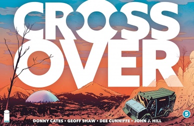
Crossover #5
Written By Donny Cates
Art By Geoff Shaw
Colored By Dee Cunniffe
Lettered By John J. Hill
Review By Henry Finn
Fans of the series will require (more) patience when reading issue number five.The stakes are raised in multiple ways and yet it is hard to find a reason to care.mIt could be because the “villains” are voiceless caricatures inspired by characters you may have seen appearing in dollar bin comics from the 90s. Often a hero’s journey is defined by the villains they encounter, and there is not a single interesting antagonist in the five issues thus far.
It might be because if you haven’t read any of Cates past work, much of the context will be lost and you won’t know why you should care what is happening to specific characters, specifically Dee. Even the appearance of Madman in the previous issue, which seemed like a tantalizing sneak peek into the world of “Crossover,” now seems like a bit of a gimmick as he has no real impact on the plot. Speaking of plot, it seems like our protagonists simply move from MacGuffin to MacGuffin and much of what happened in five issues could have been told in three.
Geoff Shaw is exemplary as usual but also feels as if he is simply making do until issue six, where some sort of mini-climax will happen leading into the second arc written by Chip Zdarsky. Almost every page feels like a recap or a summary of action versus allowing scenes to play through with nuanced dialogue or “acting.”
All in all, the problem with this series so far is that it isn’t a “crossover event” like Marvel or DC does (the way it was promoted before launch) because there isn’t a sense that these characters are fully real within each other’s world. Madman feels like a sherpa, just taking you from scene to scene while allowing for exposition to try and make you care.
Final Verdict 4.0 – only read it if you’re committed to seeing where the rabbit hole goes.

The Flash #768
Written by Jeremy Adams
Illustrated by Brandon Peterson, Marco Santucci, and David Lafuente
Colors by Mike Atiyeh, Arif Prianto, and Luis Guerrero
Lettered by Steve Wands
Reviewed by Quinn Tassin
Wally West is finally back to being Central City’s one and only Flash! Except he’s retiring! Except he’s a caveman. Except actually now he’s…Bart Allen. Listen, Jeremy Adams’s “The Flash” #768 is fine. He clearly has a fondness for Wally as a character and if this issue is any indication, we’re in for a run of wacky Flash adventures which is a more than welcome change for Wally’s life after a couple of years of angst. Still, as far as exciting returns go, this one was frustrating.
There’s an emotional honestly to Wally wanting to hang up his suit that’s difficult to debate and Adams deserves credit for not making a guy who’s built up some real trauma just jump right into normal superhero life again. It’s just not clear that Quantum Leap-ing his way around for a couple of issue is the best way for him to realize that he should be the Flash. Again, it’s better than the grim life we’d been seeing but that isn’t the only option and this premise feels too thin to send up being at all resonant.
The issue is weakened by the three sets of art teams. Illustrators Brandon Peterson, Marco Santucci, and David Lafuente, and Colorists Mike Atiyeh, Arif Prianto, and Luis Guerrero all do good work in their respective sections of the comic. Peterson and Atiyeh capture the heroes as icons in a way that few artists do. They bring an especially great energy to Wally and Barry’s race which exudes joy and bursts with color and life. Santucci and Prianto are arguably the best fit for a Flash comic of the trio of pairs. The bring the perfect balance of wonder and groundedness that comics need and they deliver the platonic ideal of super speed illustration. Lafuente and Guerrero only get a couple of pages but their more stylized, cartoonish aesthetic is a great fit for the 31st century, which is clearly going to be a great to look at trip to the future. It makes some sense to give all of these artists chances to shine given that they all have such strengths in their sections; all together though, it makes the book feel dissonant and harder to totally latch onto when there are such shifts going on with such frequency.
Continued belowJeremy Adams may be starting a refreshingly fun, creative, lighthearted Wally West run with “The Flash” #768 and it will be rightly celebrated if he is. It’s got heart and there’s a sense of adventure that a lot of comics lack these days. But as a new starting point for one of DC’s most beloved characters, it leaves quite a bit to be desired.
Final Verdict: 6.7- “The Flash” #768 is a fun but slightly too shallow debut for Jeremy Adams.

Mann’s World #3
Written By Victor Gischler
Illustrated By Niko Walter
Colored by Snakebite Cortez
Reviewed By Matt Sherman
The series seemed to have potential in the beginning, but this third issue seems to be a dead end. Victor Gischler writes very plain dialogue; every word balloon says nothing interesting. The conversations between characters feel generic., the characters have no personality and no character developments to even make them slightly interesting. There are no surprises within the panels, leaving every page easily predictable.
As for the art, the characters seem emotionless and their movements were stiff. Niko Walter’s characters don’t seem to have any features to make them look different; if it wasn’t for different colored outfits, you wouldn’t be able to tell them apart. With that being said, Walter would also benefit if someone else was coloring for him. Snakebite Cortez’s colors were muted and nothing stood out. The tones were too smooth, and didn’t work well with the line work. As for the environment, it was too basic. The jungle looked so boring and empty. There was a lack of greenery and details in the background. There was also a lack of word lettering effects that added to the action feeling stiff.
As for this issue within the series, nothing new happened. It’s the same story of these friends on the run, lost in the woods, getting nowhere. It really feels like this series could have been done in an issue or two; this issue was nothing but a filler to and already overstretched series. This plot really seemed to have potential, but with issue #3 especially, it seems nothing is being planned right. With a lack of interesting plot points and poorly drawn art, this comic seems to be nothing special.
Final Verdict 1.1 – With the ending seeming to be obvious, it raises the question if the final issue will even be worth it.

Witchblood #1
Written by Mathew Erman
Illustrated by Lisa Sterle
Colored by Gab Contreras
Lettered by Jim Campbell
Reviewed by Conor Spielbrg
“Witchblood” starts things off right by firmly establishing itself in a small town, “third to last stop from nowhere,” called Carlos, Texas. The desert roads and night sky transitioning into dawn sets the scene quite well. While establishing the setting, we are given a strong impression of our main character Yonna, an immortal witch on a motorcycle with bright blue hair a yellow bandanna, and a hot pink shirt; which seems all the more vibrant when contrasted with the dull brown pants and black leather jacket. This peculiar get up suits the character well who is charmingly verbose with the expressive features and vibrant outfit of a cartoon character despite the mostly adult tone of the issue.
While there is very little plot in the first issue, the art team gets the opportunity to show what they can do. There is a one page monologue in particular that really brings the whole team’s strengths to light with Jim Campbell managing to find the necessary space for Yonna’s long winded speech while Lisa Sterle changes her pose, evoking an exaggerated sense of movement; all of which pairs excellently with Gab Contreras’ colour scheme.
The unnamed Hex Hunter, on the other hand, is a woman of few words in comparison which highlights how the light carefree tone brought into focus by Yonna and the simple but vivid art style in conflict with the more traditionally Southern Gothic world we encounter so far. The issue alludes to a larger world that it has yet to reveal in full but the unique pairing of the main character and the external world so leaves the series in an interesting place.
Continued belowFinal Verdict: 7.5 – A familiar concept with a unique approach executed well

X-Men #19
Written by Jonathan Hickman
Illustrated by Mahmud Asrar
Lettered by VC’s Clayton Cowles
Colored by Sunny Gho
Reviewed by Michael Govan
Synch, Wolverine and Darwin spent centuries in the Vault and it feels like we’ve been waiting centuries for them to get out. Over a year since that plot line kicked off, with “X-Men” #19 we arrive (more or less) at the conclusion. So how is the conclusion?
It’s definitely good but not completely without flaws. Let me just get it out of the way; I do not care for how Darwin was treated in this issue. It might be my personal bias, one of my earliest comics was Armando’s first appearance. At the same time, with just three mutants, he couldn’t get more focus? Armando says two words and a sound effect the whole time, he’s just used as a plot device, by the good guys and bad guys, they’re literally hacking off his limbs for the mission…I’m disappointed on that front.
I also have mixed feelings about Synch’s love story with Wolverine. The story does end on a hopeful note but at the start of the mission, Everett wasn’t in the best mental space and I’m not entirely sure this new wrinkle improves things. That being said, it is a fascinating look on the different perspective mutants have now that they’ve seceded from humanity and, theoretically, have eternity.
At the same time though, it is a good issue. The story’s about mutants on the run in a technologically evolving City over centuries, how could it not be? It’s a fascinating story built on a fascinating premise. X-Men #19 feels epic, in no small part thanks to the artwork. We’re treated to more timeline data pages a la “House Of X/Powers Of X”, same design and everything so readers immediately feel its significance.
Asrar treats us to some cool uses of Darwin’s powers and effectively shows the passage of time with different designs for the characters. I love the page showing the Children of the Vault evolving and changing over the years as well as the futuristic dystopian look on Synch. That beard is impressive, I must say. Also, readers likely wouldn’t feel attached to Synch/Wolverine at all if not for the tender moments drawn by Asrar. With just one issue, you feel the depth of the connection formed during their time in the Vault. Overall a fitting ‘end’ to the Vault mission.
Final Verdict: 7.5 – It was a long time for Synch and a long time for us but we finally got a solid ending to the Vault mission storyline.


