
There’s a lot to cover on Wednesdays. We should know, as collectively, we read an insane amount of comics. Even with a large review staff, it’s hard to get to everything. With that in mind, we’re back with Wrapping Wednesday, where we look at some of the books we missed in what was another great week of comics.
Let’s get this party started.

Written by Brian Clevinger
illustrated by Scott Wegner
Colored by Shannon Murphy
Lettered by Jeff Powell
Reviewed by Tom Shapira
Things are coming to a head as the Tesaldyne crew discover what exactly Robo is hiding in the basement while Bernie is either going through a mental breakdown or reaches a deeper understanding of the universe (as if there’s a difference between the two). One thing to appreciate about this new era of Atomic Robo comics is the way Brian Clevinger shifts from the more straightforward and plot-based storytelling of the early to a character-based model – there are a dozen characters (Robo, ALAN, Jenkins, Foley, Lang, the new interns, etc.) engaging in a dozen different things and this issue gives them all equal space and time to breath. That’s just great.
It harkens back to the 1980’s type of team-based comics (be it G.I.Joe or the Uncanny X-Men) that knew of utilizing the large cast to make every issue feel like a worthwhile experience by itself while advancing plots both major and minor. I love that this issue ends in a discussion that’s actually interesting and that everyone who participates gets to make valid points – nobody gets painted as a villain. And I like that I can’t be sure where all these strands are going – this series can still surprise me.
What I don’t really like is the art. Which is Weird because it’s still Scott Wegner utilizing the style he had throughout all previous “Atomic Robo” stories – very straightforward storytelling with a strong focus on readability. Wegner can do character stuff, he can do big monsters, he can do action. But throughout “Dawn of a New Era” something just doesn’t click for me – the art feels rushed here, character-acting is more stiff than usual, bodies are sometimes oddly proportioned. It’s not ‘bad,’ but it’s not ‘good’ either. There are still standout bits – when Robo’s secret is revealed we get a shout the literally shocks the page, which is a very nice touch.
Final verdict : 7.7 – strong storytelling trumps not-as-strong art.

Written by Jim Zub, Mark Waid and Al Ewing
Penciled by Carlo Barberi
Colored by Jesus Aburtov
Lettered by VC’s Joe Sabino
Reviewed by Alexander Jones
“Avengers: No Road Home” is about to wind down for a big finale and issue #8 still lacks the stakes and definition an Avengers story needs. Despite the full writing team for the series going back and fleshing out characters like Nyx and the rest of the Olympians, the ancillary characters don’t have a clear sense of characterization. The narrative has felt like an excuse for a hunt for secret artifacts with the Avengers and Olympians caught in the middle.
The dialogue in the issue is a major disappointment. Characters like Hawkeye and Rocket Raccoon trade obvious quips making the writing and story come off as dull. The issue still packs a few interesting surprises with Nyx and the remainder of the villains. Plus, the twists towards the end of the issue involving the Hulk echo some of the recent events from “Immortal Hulk” with a subtle horror tone. “Avengers: No Road Home” #8 places relatively new hero Voyager in a few interesting situations as well. The small beats with the Avengers cast can be pleasing, but the main plot of the issue is obtuse and generic.
Carlo Barberi lends disappointing pencils to the issue. Barberi’s pedestrian line work and approach to the narrative detract from the aesthetic of the series cultivated by artists like Pepe Larraz. Barberi shows potential in some of his surprisingly dynamic page layouts. Barberi’s art appears lacking when it comes to the strange anatomy of his figures and the stilted opening pages for the issue. The anatomy of Hercules continually changes from panel-to-panel. Sometimes Hercules build is really big and other times his body appears less pronounced.
Continued below“Avengers: No Road Home” has great characters and ideas like Oizys whose presence becomes more interesting as the issue goes on. However, the casual, uninspired dialogue and lack of urgency from the plot hold the mini-series back from greatness. The plot for the title feels even more skeletal than the original “Avengers: No Surrender” weekly title. Way, Zub and Ewing still have the chance to better define some of the conflicts for the last few installments of the series.
Final Verdict: 5.7 – “Avengers No Road Home” #8 is a bland middle chapter of the weekly event series.

Written by Charles Soule
Illustrated by Mike Norton
Colored by Addison Duke
Lettered by Chris Crank
Reviewed by Matt Ligeti
In between each trade paperback’s worth of issues, Curse Words releases a seasonally inspired one-shot revealing backstory important to the overall plot. Each one of these gives the series artist, Ryan Browne, a break for the issue and showcases the work of a different artist. Mike Norton’s the special guest artist on “Curse Words Spring Has Sprung Special” #1, which reveals Margaret’s origin story, the reason for the comic’s title, and why Wizord and Ruby spend so much of the series at each other’s throats.
Even with a guest artist, the overall tone of “Curse Words” and its aesthetic is cohesive with the rest of the series. This is partially because the rest of the creative team doesn’t switch out, but also because the paneling style is rigid, never straying from its thick, white borders and the line art that never goes beyond them. But compared to Browne, Norton’s version of the characters are a little softer, happier, true-to-life. It matches Wizord and Ruby’s human joy as it contrasts strongly against Sizzajee and the rest of the Nine’s crueler dispositions.
Because it’s backstory, the entire issue takes place in the Hole World, where our main characters are from. Norton defines it with craggy rock that colorist Addison Duke brings a warm palette to. Wizord and Ruby’s colors almost feel swallowed up by it, potentially alluding to the story’s events. But don’t worry, long-time fans anxious to see Duke’s fireworks show of color in every issue of “Curse Words”: the “Spring Has Sprung Special” still represents the usual color spectrum in its bright style, the rogues’ gallery of the Nine, and Sizzajee’s oil slick self.
Charles Soule writes the “Curse Words Spring Has Sprung Special” at the peak of Wizord and Ruby’s relationship, when they’re together and happy and seem like they could take on the world. Letterer Chris Crank underlines this best when he combines Wizord’s blue and Ruby’s red magics in his sound effects as they work together.
While “Curse Words Spring Has Sprung Special” #1 is emotionally heavier than the rest of the series, Soule makes time for some laugh-out-loud funny moments that keep it on-brand. However, it’s the serious moments that will hold you in suspense and make you want to re-read the entire series.
Final Verdict: 8.0 – While it may be confusing for readers new to the title, the “Spring Has Sprung Special” is the absolute crux of the “Curse Words” series and lives up to the high standards set by every issue before it.
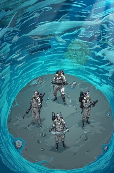
Written by Erik Burnham
Illustrated by Dan Schoening
Colored by Luis Antonio Delgado
Lettered by Neil Uyetake
Reviewed by Chris Egan
Kicking off a four-week miniseries of one-shots following different iterations of the titular heroes, the first-anniversary comic sees the Ghostbusters from the Prime Universe (as in the original film versions) facing off a slew of supernatural baddies from the lost city of Atlantis. Burnham continues his heavy involvement in the IDW “Ghostbusters” universe and does a really wonderful job of capturing the right attitude and character beats of each ‘buster. The story is simple and very similar to something we have seen a few times over, from The Real Ghostbusters, Ghostbusters: The Video Game, and previously released comics. An ancient artifact ends up at the museum, the boys go over to check it out and all hell breaks loose.
Continued belowI, unfortunately, have never been a fan of Dan Schoening’s take on the boys in gray, but he is a tremendous talent and he has an eye for fully realizing the Ecto-1, the Firehouse, New York City, and any setting they find themselves in from issue to issue. And while I may not love his version of their likenesses, he does capture something about each actor, immortalizing them in yet another medium. Delgado’s colors are outstanding and he is not only perfectly matched with Schoening’s style, but he does fit right in, blending the look and vibe of both the original films and the animated series.
There are only so many paths a Ghostbusters story can take and this one fits comfortably into the canon. Plenty of action, humor, and heart make this a solid GB story through and through. It’s not the best thing to come out of the comic books, but it is definitely a fun read, and any reason to have more enjoyable “Ghostbusters” adventures is cause for celebration.
Final Verdict: 7.0 – A faithful and fun “Ghostbusters” adventure, with plenty of talent on display, but falls a little flat in originality.

Written by Mario Mentasti
Illustrated by Ben Hererra
Colored by Emmanuel Ordaz Torres
Lettered by Justin Birch
Reviewed by Christa Harader
“Obey Me” #1 is a tough read because the book sinks immediately into ‘tropey’ storytelling and lackluster dialogue. Vanessa has very little discernible personality, aside from being cranky at Monty for crashing through her bedroom door, and the demon fight at the end of the issue ends up flat and quippy in all the wrong ways. Monty’s dialect is groan-worthy, the profanity is trying to force grit that’s just not there in the story, and Rory’s use of “lassie” twice in the same page is annoying without building character. Even Monty’s transformation seems abrupt and out of context in terms of potential consequences, and the issue cuts off immediately after.
“Obey Me” also suffers from lackluster art. Hererra’s line is basic and the inking sub-par, with some flat blacks from weak light sources and a shaky, pen-and-ink style in places that doesn’t seem intentional. Torres’s colors aren’t blended well or textured in any meaningful way, and the lack of unity or consideration in the color palette gives the book an amateurish feel. The reds, oranges, and yellows are brassy and loud, and the cooler tones fade into the background. Layouts are standard, but the action angles Hererra chooses for the majority of the issue feel slightly off.
There’s also not enough attention paid to backgrounds, which means a panel or series of panels in the middle of a fight scene will suddenly be set against an untextured gradient. Done well, this can highlight a particular moment, but in “Obey Me” they blend too much with the cityscape details elsewhere on the page or dislocate the eye in interior scenes. Birch’s lettering is decent, with some nice styling on Monty’s balloons and a different font choice for human and canine companions, but it does little to surmount the color and art issues on the page.
Final Verdict: 5.0 – “Obey Me” #1 suffers from significant plot and craft issues that give the book an amateur vibe.

Written by Matthew Rosenberg
Illustrated by Szymon Kudranski
Colored by Antonio Fabela
Lettered by VC’s Cory Petit
Reviewed by Gustavo S. Lodi
“The Punisher” is a series about a one-man crusade against crime, corruption, and violence, solving these problems with even more, over-the-top, carnage. It deals on serious topics like mental illness, political dictatorship, corporation dominance. And, yet, despite all of this, it is an extremely funny series.
Yes, one of Rosenberg’s most unusual and unsung credits during his run on “The Punisher” is how well-oiled his comedic timing is. Usually, at the expense of one of Frank’s enemies, the situations at play, while at absolutely high stakes, manage to find some levity, far from an easy laugh, but rather because the occasion is so well set-up and the reactions and dialogues are so sharp. Readers cannot help themselves but to pause… and laugh.
Continued belowThis is not to say that the plot is a comedy, far from it. The visuals delivered by Kudranski and Fabela remain as sharp, brutal, and visceral as ever, with Frank Castle makings their foes find their demise in incredible fashion. Castle is rarely shown as a person, his face usually hidden amid the chaos, making him even more of a presence than his actions already make him out to be. Colors are certainly a highlight as well, with explosions in dimly lit tunnels offering all of the impact intended by the script, without ruining the sense of dirtiness and grittiness required of those places. And letters by Petit, especially around the sound effects – loud or subdued – further add to the composition of each page.
Back to Rosenberg’s plot, this issue is one of the latter entries o the ‘War in Bagalia’ arc, one dealing with political coup after political coup, and how the Punisher deals with it with extreme prejudice. It works incredibly well, as it is absolutely unapologetic of how it wants to convey this story, how it wants to portray these villains (pathetic, arrogant monsters) and exciting as it drives to its home stretch. An excellent entry, on a dramatic run by this creative team.
Final Verdict: 8.2 – Explosive, brutal, unrelenting. The creative team behind “The Punisher” continues to deliver his tour-de-force across Bagalia.
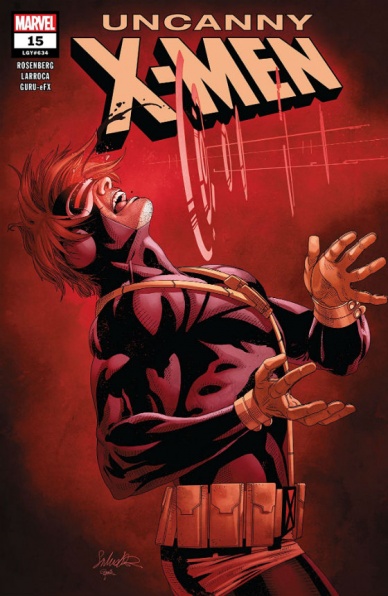
Written by Matthew Rosenberg
Illustrated by Salvador Larocca
Lettered by Joe Caramanga
Colored by Guru-eFX
Reviewed by Michael Govan
The X-Men have kind of been all over the place in recent history, at least from where I’m standing. There was the Age of Bendis then Jeff Lemire had the reins for a bit post-Secret Wars. Something something Terrigen Mists are poison, Cyclops died, something-something Emma’s a bad guy again, Jean’s back now. Age of X-Man has felt underwhelming so far. I’m trying to get behind “Uncanny X-Men” but it feels underwhelming to me too.
The title isn’t without its positives. I’m glad that Cyclops is leading the X-Men again and the team includes some of my favorites like Danielle Moonstar, Karma and Chamber. Scott’s interactions with Wolverine and Havok are always a highlight. Captain America acknowledging that Cyclops knows better than him on matters concerning mutants is a step in the right direction. Salvador Larocca is a great X-Men artist and I’m glad that he’s drawing mutants again. I can definitely understand why he was put on the book. His work evokes some nostalgia and “Uncanny X-Men” has not been shy about doing that at all.
At the same time though, this issue feels…gratuitous. That’s the best word I can think of. #15 piles on the dystopian elements and the X-Men have seen far more interesting dystopias. It gives me the same feeling I had when the X-Men were suffering from M-Pox and literally living in Limbo during Lemire’s run. Mutants will probably always suffer to some degree but I do think there’s such a thing as too much. There’s the zombie Banshee and Dark Beast working for the team. A Multiple Man dupe getting infected with the Transmode Virus. Wolverine gets his entire face blown off and Hope gets stabbed. Cyclops loses an eye which really gave me pause. Is that even possible? Even if it is, it doesn’t explain why using his powers now threatens to break his skull. Isn’t he just projecting concussive force from another dimension? It’s just too much.
Final Verdict: 5.5 – ‘Uncanny’ might be too strong a word…

Written by Aleksandra Motyka with Travis Currit
Illustrated by Marianna Strychowska
Colored by Lauren Affe
Lettered by Steve Dutro
Reviewed by Gregory Ellner
Even from the perspective of one who has minimal experience with the franchise of The Witcher in any of its various media, the plot laid out by Aleksandra Motyka (with translation by Travis Currit) is easy enough to follow. It is a tale of a monster hunter as much as one of political intrigue, of killing as much as personal, very human problems. As such, this accessibility leads to a very well handled story all around, from the trickery utilized by Geralt of Rivia to the equally important input of his ally Dandelion, alongside enemies and other supporting characters alike, along with some insights into how exactly the Witcherverse functions on a mystical level, at least so far as the creature as seen in the story would behave.
Continued belowMarianna Strychowska’s artwork utilizes thin pencil lines, thereby allowing for intricate facial expressions while varied perspective shots allow for close-ups or wider establishing shots to give imposing illustrations each in their own way. The manner through which Geralt’s mystical “signs” are drawn, using the symbol floating before the hands and flash of whatever the right effect should be cast over it, gives a small but effective manner of demonstrating the magical nature of the world even without too much emphasis on said features (even with magical creatures around).
Lauren Affe’s colors give an equally important effect, as the colors on the various magical spells, along with varied shading and differences in coloration depending upon closeness to the action, helps to draw readers’ eyes in particularly well. Magic has an effect that is far more noticeable in the colors, from the aforementioned “signs” to the magic of a villainous sorceress, each having a particularly potent glow that adds to their otherworldly nature.
Final Verdict: 8.0- “The Witcher: Of Flesh and Flame” #4 concludes another tale in its ongoing saga with enough room for newcomers to jump in without feeling too lost.

Written by Brian Michael Bendis
Illustrated by Patrick Gleason & John Timms
Colored by Alejandro Sanchez & Alex Sinclair
Lettered by Wes Abbott
Reviewed by Elias Rosner
The problem with decompressed storytelling is that the whole of a first arc, which usually ends up taking around six months to complete, is that it is only upon reaching that end that the story actually starts. This is the case with issue #4 of “Young Justice.” Far enough into the series that we should be getting some forwards motion, we instead spend much of the issue remaining in place, in flashback or expositing in ways that obfuscate the truth behind what has happened to all these heroes.
Were we moving at a faster pace, with, say, this being the final issue in a mini-arc, instead of what seems to be the final confrontation between Opal and Amethyst in two issues, it would be easy to forgive the lack of motion as we would be reaching a narrative endpoint, ready to begin anew, with new questions thanks to new answers. As it stands, the information we enter the issue with is remarkably similar to the information we leave it with.
We knew Opal was evil and that the other houses were working with him. We still don’t know how Amethyst got captured, only that she was with Robin, which explains where he was. Conner’s predicament is still a mystery but there, we know enough about his situation that delaying those answers is OK.
That said, the whole team makes spending time with these heroes fun. Every “current” page is imbued with youthful energy, one made all the more infectious by Bart Allen’s presence, while all the “earlier” pages are brimming with that sword and sorcery glow, of bright colors, intense action, and political drama.
The lettering is fairly standard DC fare, intermingling logos for important character introductions, and making sure that Bendis’ text doesn’t overwhelm the rest of the art, which is an art in and of itself. Seeing all these heroes again, interacting on a world that hasn’t been seen since “New 52: Futures End”/“Amethyst, Princess of Gemworld” makes it all worth it, though. The weird, energetic and fun parts of the DCU have been missing for years and titles like these remind us why they need to be around.
This issue will almost certainly work better in the trade, which is a shame because, were we not saddled with the larger story of Gemworld & the splintering of the characters’ stories, thereby chopping up the focus, this creative team could make the characters sitting around and talking about a trip to the beach exciting. As it stands, while the characters are perfect, they are drowned out by the events they have found themselves dropped into.
Final Verdict: 6.1 – “Young Justice” #4 spends too much time circling in place and dramatizing events that could easily have been summarized. Character voices may be strong but the larger narrative needs to get a move on soon.


