
There’s a lot to cover on Wednesdays. We should know, as collectively, we read an insane amount of comics. Even with a large review staff, it’s hard to get to everything. With that in mind, we’re back with Wrapping Wednesday, where we look at some of the books we missed in what was another great week of comics.
Let’s get this party started.

Written by Tim Seeley
Illustrated by Salva Espin
Colored by Israel Silva
Lettered by Travis Lanham
Reviewed by Gregory Ellner
Tim Seeley’s script on “Age of X-Man: Apocalypse and the X-Tracts” #2 does a lot of things at once, as is to be expected for a tie-in storyline to the ‘Age of X-Man’ arc. However, in spite of creating and quickly disassembling conflict, in spite of following multiple different concurrent plots, none of it seems to really be poorly done. The Siberian and his forces aren’t really expanded on significantly, but they seem to be more of a means to move the Omega Red plot forward. Kitty Pryde’s membership in the X-Tracts is a major focus, but despite being something of a cold open (no pun on the Siberian intended), it doesn’t take up too much space. Even the contact with the X-Men, while something of a side note in practice, enables the further development of Kitty and Murshid’s connection while simultaneously showcasing the latter’s manipulative nature.
The artwork from Salva Espin is highly dynamic, with a special focus on the movement within the issue in battle or by a more stationary use of powers such as the dissolution of an illusion. However, the only real downside is that Espin isn’t quite as good at faces from a distance. The look in the eyes of individual people can be rather hard to notice, which might even be part of the reason for several of the prominent protagonists to wear eye-concealing glasses of one sort or another. It isn’t enough to truly break the story, but the difference is notable regardless.
Israel Silva’s colors are, to be frank, psychedelic. The hallucinatory effects of Unveil’s mist are portrayed in vivid detail that sets her apart from any rational, somewhat calmer coloration. The other color choices are varied, but nonetheless interesting color palette, with stained glass gradients on window panes and cool colors meshing well with warmer lights to create an overall feeling of a kinder world for the X-Tracts, in deliberate contrast to the Siberian’s group with the clash of black on yellow and, in the case of the Siberian himself, blue.
Final Verdict: 8.0 – A fun story with phenomenal coloring is only held back a small amount by some less detailed distance shots on the illustration.
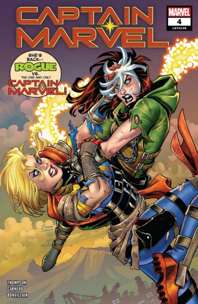
Written by Kelly Thompson
Illustrated by Carmen Carnero
Lettered by VC’s Clayton Cowles
Colored by Tamra Bonvillain
Reviewed by Michael Govan
Some comic book characters get more attention than others, simple and plain. I may have a deep love for an obscure character like Rocket Racer, the skateboarding occasional Spider-Man rogue, but I don’t see him getting a Tom King twelve issue maxi-series anytime in the near future. For the past decade or so, the sun has shined on Carol Danvers as she’s been pushed to the forefront of the Marvel Universe. A snazzy new costume, member of both the Avengers and Guardians of the Galaxy, major player in Civil War II, four of five comic book relaunches and an MCU film. Marvel has clearly been determined to make her work.
Personally, it hasn’t all worked for me. My passionate belief that Monica Rambeau should have been the Captain Marvel to get the ‘big push’ aside, I don’t actually dislike Carol. It’s just that the relaunches, complicated history and whatever the heck Civil War II was has made it hard to get into the character for me. Fortunately, the latest “Captain Marvel” run by Kelly Thompson works.
The story has just been really fun so far. Kelly Thompson has a strong handle on Carol Danvers’s character. The radically different setting has been a refreshing change of pace. I’m all for Mad Max meets Marvel. The spotlight on some of those characters that have been neglected like Echo and Hazmat is more than welcome. This issue continues the engaging story and gets a lot of things right.
Continued belowWe see some more of the villain, Nuclear Man who…well, he’s a villain alright. Can’t wait to see Carol sock him right in the face. There’s more of Carol’s very interesting resistance as they go to take the fight to Nuclear Man. The main event is definitely the arena battle royale with none other than the X-Men’s southern belle Rogue. Carol has a pretty convoluted history that often bogs the character down, but one of the most interesting tidbits of her past (that isn’t discussed all that much) is that Rogue totally whooped her before she joined the X-Men. Stole her memories and powers, left Danvers messed up. This isn’t just a random arena fight, it’s deeply personal for Carol. This issue does a fine job exploring the fear and anger that bubbles back to the surface when Captain Marvel has to face Rogue again. Carol doesn’t let it beat her though and even finds a clever way to win.
The arena battle and comic as a whole is better thanks to the contributions of Carmen Carnero. The artist does a solid job on the artwork throughout this comic, drawing epic fight scenes and an intriguing post-apocalyptic world and resistance. It all has me very interested to see what comes next in this comic.
Final Verdict: 8.0 – Higher, further, faster, baby.

Written by Robert Venditti
Illustrated by Bryan Hitch
Inked by Andrew Currie
Colored by Jeremiah Skipper
Lettered by Starkings and Comicraft
Reviewed by Alexander Jones
Carter Hall is a hero who has lived a number of different lives across multiple continuities. Instead of starting fresh yet again with the hero, writer Robert Venditti and artist Bryan Hitch are celebrating all of Hall’s past lives and incarnations in their “Hawkman” ongoing series. Venditti’s has done an excellent job setting up a huge confrontation between Idaam, Hall and all of Hall’s past lives. The way “Hawkman” #11 establishes a plot and coalesces into one massive confrontation and pays off every installment that came before is a staggering achievement for the title.
Artist Bryan Hitch’s approach to the artwork is a refreshing change of pace for the penciler who scales back his incredibly detailed style. Hitch lends a more versatile and dynamic approach to his line in “Hawkman.” Seeing Hitch’s pencils in a less formal style is an incredibly evocative and refreshing context for his art. The battle sequences and sense of scale are exemplified beautifully with the Deathbringers looking particularly daunting. The figures and anatomy throughout the issue have an impressive sense of scale. Hitch’s realistic depiction of the figures doesn’t cancel out his more fluid approach to the fight scenes in the issue.
The issue has a sense of finality as it serves as one the final installments for the big storyline. Venditti feels like he is in complete control of the script and has a great narrative structure for his run on “Hawkman.” The title reads like one big story and the issue even ratchets up the tension as one of the final entries into this huge storyline. Venditti’s focus adds a great sense of confidence in the writing. Readers know that there is a personal vendetta against Carter, Idaam and the additional Hawks added to the storyline are another excellent touch.
“Hawkman” #11 is an excellent entry into the series capitalizing on everything that has made the last 10 issues of the series so enjoyable. Readers get to see the Hawkmen of different eras teaming up against a bombastic threat that could only be utilized in the space of comic books. Instead of restarting the narrative from the ground-up, Venditti capitalizes on nearly everything about Carter Hall that made him great. Hitch’s concise and focused line work is a great addition to Venditti’s precise and emotional script. “Hawkman” #11 offers pay-off for an endearing, long-running storyline.
Final Verdict: 8.0 – “Hawkman” #11’s strong writing and art allows for potent emotional beats gearing up for the end of a long-running storyline.

Written by Chip Zdarsky
Illustrated by Carlos Magno & Butch Guice
Colored by Alex Guimarães
Lettered by VC’s Travis Lanham
Continued below
Reviewed by Gustavo S. Lodi
By issue four, “Invaders” further sediments itself as an almost solo series for Prince Namor, and this is as big as a complement to the creative team for having come up with a storyline that is at the same time compelling for one of comic’s oldest characters and still feels contemporary.
A lot of that sensation must be credited to the aesthetics that Magno, Guice, and Guimarães. Looking at these pages and panels feel like revising an old photo album from the time of the great wars. It feels like revisiting memories that belong to someone else, which is precisely what Zdarsky’s plot is asking for.
Character portrayals follow the same style and tone. There is a certain melancholy on the main character’s eyes, even in the middle of the fewer moments where the action takes over. Especially for Namor and Xavier, the sense of missed opportunities and the feeling of inevitable disaster, that is present on every encounter.
Back to Zdarsky’s plot, it walks that thin balance of introducing retcons without feeling disrespectful for the original, source material, and yet showing something that is actually new and that builds on top of that past mythology. Observing how Xavier and Namor are interacting around that time not only makes sense to what was happening to both of them during that age, but it also connects to certain events that would help to both mutants years in the future (but already shown on other series and volumes).
Perhaps the problem with the issue, and even that is a minor one, is around pacing. For all of its pitch-perfect tone, its beautiful art, and how well the main characters behave… there is little that actually happens. Yes, readers will get some finality as to how Namor and Xavier eventually parted ways and some hints to what is coming up next, but that is pretty much it. As it progresses, the series seems poised to be a better read on a collected volume, even at the expense of some of the stand-alone.
Final Verdict: 7.0 – A very interesting character study that manages to avoid all the negative tropes of retcons, “Invaders” #4 suffers a bit on pacing, but still delivers.

Written by Greg Pak
illustrated by Giannis Milonogiannis
Colored by Irma Kniivila
Lettered by Simon Bowland
Reviewed by Tom Shapira
In this issue we get more of everything – a little bit more exploration of the Island society, a little more discussion of the nature of the cataclysm the created this new world, a little more of the current threat and a lot more of the relations between Hana and Kenichi. These relations seem to the bedrock of the series, a way for the creators the explore the way different societies and different classes interact; and while Greg Pak does a yeoman’s work in digging into these issues the couple still ends up feeling slightly generic: he’s prideful and brash, she’s more practical but resentful of his status; there’s more there for the series to explore in future issue but so far I end up wanting more.
Giannis Milonogiannis is always an artist I’ve got a lot of time for – from his creator-owned “Old City Blues” to his short stint on “G.I.Joe” his style is rough and unique-looking, with great focus on action and movement. Milonogiannis knows the importance of an action scene is not in the big moment but in breaking-down movements and understanding the space they take place in; he shows this understanding well here in a couple of multiple participant brawls with people using different weapons for different aims; I only hope the script gives him a little more space to run wild in the following issues. The art here feels a bit more soft-edged, in-line with the Boom! esthetic for young-adult readers. While I prefer his early stuff you can understand shifting mood a bit here and it works well in tandem with Irma Kniivila’s darker colors that gives a slightly moody sense to the issue as a whole (a nice contrast to the brighter scenery of previous month).
Final Verdict: 6.6 – it’s well-made enough, especially on the art’s side, but the story feels more a like promise for something better to come.
Continued below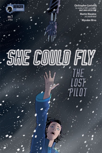
Written by Christopher Cantwell
Illustrated by Martín Morazzo
Colored by Miroslav Mrva
Lettered by Clem Robins
Reviewed by Elias Rosner
“She Could Fly” was a miniseries that took a rote concept and transformed it into a story that understands the mess that is the human brain and gave it form. It heaped on the pressure and the tension until something in the characters gave, leaving us with an empty silence where once there was the constant hum of steam. In “She Could Fly: The Lost Pilot” #1, the whistle of the cooker begins anew, quieter, more dispersed, but there nonetheless.
Cantwell, Morazzo, Mrva, and Robins are a powerhouse team, each working off each other to truly build the tension necessary to make this series work. Every character has their own baggage and the intersection of these, and the ways they are made manifest is what sets the pace and the feel of the comic. We open on a calm page, relatively speaking. The panels are large and the colors bright & rich. The art is distinct and clear, keeping us at mostly a distance, while the lettering is balanced but shaky as if it were always on the verge of being lost in itself.
From there, structurally, the comic is presented in widescreen, organized mostly around the 4-5 rows, although this is not presented with any regularity. However, as the pressure mounts and Luna begins to slip back into old habits, old coping mechanism, old, poorer, mental health, so too does the comic reflect this. In the long run-on sentences compacted into boxes to the increase in panels and extreme reactions. The page where Luna’s father thinks he sees his mom is the climax of the issue and one feels it in the volley of words and emotions in the characters. It’s a cacophony of action and despair and fear, leading us into the denouement, which is perhaps the most revelatory part of the issue.
While the larger number of plot threads at play may be, at times, hard to follow, “She Could Fly: The Lost Pilot” #1 stays focused on what is important and is everything one could want from the first issue to a sequel. It raises the stakes while continuing the narrative and complicating the old characters. It is a personal tale, one that shows just how messy humans are, couched in a narrative about spies, jetpacks, and the promise of flying away from the life that is dragging you down.
Final Verdict: 9.0 – Exactly what one could hope for from the follow-up to “She Could Fly.” If you slept on the original, get in on this now.
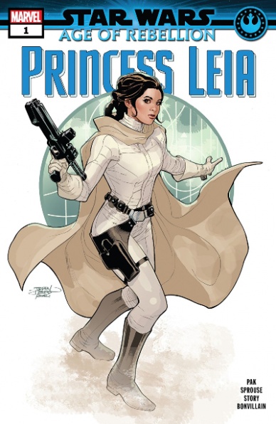
Written by Greg Pak
Illustrated by Chris Sprouse, Karl Story, Will Sliney, and Marc Deering
Colored by Tamra Bonvillain
Lettered by VC’s Travis Lanham
Cover Illustrated & Colored by Terry and Rachel Dodson
Reviewed by Chris Egan
Venturing into territory that has yet to be explored in the new Marvel “Star Wars” comics, Greg Pak takes us into the year between The Empire Strikes Back and Return of the Jedi. As the issue opens, we find Leia, Lando, and Chewbacca in various parts of the galaxy seeking out the best possible way to infiltrate the bounty hunter underground to free Han from Jabba the Hutt. Pak’s writing touches on recognizable lines and character beats from the original films, comfortably easing this story into the canon. With the daunting task of writing a story that will be part of the new stories to effectively remove the fan favorite novel “Shadows of the Empire” from the continuity, Pak is up to the challenge. Giving fans a plausible and fun adventure story that feels right for all characters involved, “Princess Scoundrel” works on all levels.
Even with a larger art team, this issue’s illustrations seamlessly flow and if you didn’t have the knowledge that four artists worked on this book, there are no telling factors. All the artists work in unison to perfectly recreate all actor and alien likenesses and never step on each others’ toes in their attempt to complete this issue. Bonvillain has become a pro at coloring various “Star Wars” books and this issue is no different. Her work is beautiful and impeccable. This feels like Star Wars in the best way possible.
Continued belowFinal Verdict: 8.0 – A key story showing an evolution in Princess Leia’s character that we’ve always understood, but have only seen first hand a few times. Fast paced and perfectly executed, this is the Leia fans have always loved.

Written by Frank Tieri
Illustrated by Danilo S. Beyruth
Colored by Andres Mossa
Lettered by Clayton Cowles
Reviewed by Matt Ligeti
“Web of Venom: Cult Of Carnage” #1 is a horror/mystery in the vein of True Detective season 1 or the “Gideon Falls” comic book series. Misty Knight and John Jameson, J. Jonah Jameson’s son, explore strange happenings in a town still recovering from being taken over by Carnage years ago.
Andres Mossa’s dark and moody color palette sets the tone for “Web of Venom: Cult Of Carnage.” Even in daylight hours, the sun shines a sickly yellow, like it can’t quite pierce through whatever’s plaguing this town. Small pops of red stand out against the greyscale environs, hinting at the shadow of Carnage that hangs over Doverton.
The line art starts at “ominous and foreboding” and works its way up to “terrifying and hellish.” Danilo S. Beyruth uses the symbol of Knull to foreshadow future events. Even readers who aren’t in-the-know about Knull can sense danger in those red, jagged spirals. Beyruth walks right up to the line that would make “Web of Venom: Cult Of Carnage” a Mature-rated comic and takes a half-step back. Still, there’s plenty of “carnage” to be had inside.
Playing up that aforementioned “terrifying and hellish” tone is letterer Clayton Cowles’s representation of chanting, large and orange and looming in the panels in the issue’s climax. More massive than the word balloons, their constant thrumming makes the already tense scene intimidating, even overwhelming.
At its open, “Web of Venom: Cult Of Carnage” feels like a familiar detective story in a strange and devastated place. Frank Tieri hooks readers with mystery after mystery, setting the audience up for a slow-burn before sucker-punching them with events of a more terrifying nature.
Tieri writes a story of Carnage at his most haunting. Not AXIS-affected and cartoonishly-unhinged. Not a slightly more violent Venom who’s red and extra-bad. This is a sadistic, violent psychopath, leading a cult and acting as a herald for a dark god even worse than he is. Together with Beyruth and Mossa’s haunting visuals, “Web of Venom: Cult Of Carnage” is a story that will stick with you long after you’ve finished reading it.
Final Verdict: 8.2 – This isn’t your friendly neighborhood Spider-Man story. Once you’re done reading the first issue of “Web of Venom: Cult Of Carnage,” you’ll be dying to read more.


