There’s a lot to cover on Wednesdays. We should know, as collectively, we read an insane amount of comics. Even with a large review staff, it’s hard to get to everything. With that in mind, we’re back with Wrapping Wednesday, where we look at some of the books we missed in what was another great week of comics.
Let’s get this party started.

Written by Nick Spencer
Illustrated by Chris Bachalo
Lettered by VC’s Joe Caramagna
Colored by Erick Arciniega
Reviewed by Michael Govan
Spider-Man has a LOT of enemies. It’s definitely a good-sized rogues gallery, right up there with Batman’s. Spidey’s got the top dogs like Green Goblin and enemies near the bottom of the barrel like…I don’t know, Molten Man. In terms of popularity, I’d put the Lizard somewhere in the middle. He was the main villain of The Amazing Spider-Man movie for what it’s worth. In terms of quality, I’d put him somewhere near the bottom.
In all fairness, the character does look impressive in this issue. Chris Bachalo has a unique style and the Lizard looks properly creepy, scaly, alien and predatory. In some panels, he looks like a dinosaur, in others like a giant iguana. The cold red eyes are downright unsettling. It’s all a marvel to look at but not enough to make me root for the guy.
Basically, if you didn’t know, Curt Connors tried to grow his arm back and transformed into a Lizard. That’s got to be some sort of record for worst comic book science screw-up. In everything I’ve read or seen with the guy, he keeps screwing up too. In the aforementioned Spider-Man film, his plan is to turn everyone into lizards for reasons that are beyond me. Over in the Ultimate Universe, he unleashed that reality’s version of Carnage. In the main universe, he’s constantly reverting back into the Lizard. In recent history, he’s apparently turned his wife and son into lizards as well and has them living in the sewers.
Understandably, his son Billy had a problem with that and ended up getting abducted by Taskmaster and Black Ant. Another screw-up that Curt Connors gets a good deal of the blame for. In this issue, Connors mentions that he killed his own son as the Lizard. I was previously unaware of this development but it only furthers my dislike for the character. Curt as a supporting character or antagonist is one thing but I don’t think he works as the protagonist. While I have plenty of sympathy for his son, Billy, I can’t stir up any for Curt. If the Lizard is one of the characters that meets his end in this ‘Hunted’ story arc, I doubt many would be distraught.
Final Verdict: 5.5 – If he dies, he dies.

Written by Jonathan Hickman
Art by Nick Dragotta
Colored by Frank Martin
Lettered by Russ Wooton
Reviewed by Matt Garza
“East of West” has had a sporadic publishing schedule, to say the least. If it was not on my pull list, I wouldn’t know when the title would be released. Because of the long delays and sporadic schedule, it’s been hard to keep track of the storyline, especially since the main narrative has so many subplots. For instance, Hickman and company spend this entire issue within a flashback, though the beginning teases the showdown to come.
It’s great to finally see a plot thread that was planted way back in the first issue come to fruition, however, if you haven’t kept up with the series, you’ll be entirely lost. For those who are up to date, I believe the issue is extremely rewarding. There has always been some animosity between War and Death and here we learn why. We see how Death parts way with his then compatriots further providing characterizations of our hero and villains. Although the issue has some action, It’s small character moments such as War’s reaction to Death’s love affair with Xiaolian that truly make this issue special.
Nick Dragotta and Frank Martin continue to give this apocalyptic dystopian wasteland to a beautiful life. Dragotta’s characters are sharp and what action is given, is delivered with graceful blood and gore. Specifically, Dragotta shows just how formidable Death is as a fighter( as if we needed more proof of his ruthlessness). Frank Martin does a masterful job distinguishing the past from the present giving a washed out look in sequences in the past.
Continued belowAs “East of West” draws ever closer to its conclusion, many loose plot threads remain. Hickman is known for meticulously plotting his stories so I expect that everything moving forward will work to tie those loose ends up. Only time will tell.
Final Verdict: 8.0 – With only five more issues to go and a slew of dangling plot threads, Hickman and Dragotta have a lot to do to draw this story to a satisfying conclusion. Though the art is on point thanks to Dragotta’s line work and Martin’s mood-setting colors, this issue felt a little stagnant, almost like the set up for the maelstrom to come. Having said that, I have no doubt that the creative team will ultimately stick their landing.
Written by Steve Orlando
Illustrated by Travel Foreman
Colored by Hi-Fi
Lettered by Travis Lanham
Reviewed by Gustavo S. Lodi
Similar to other recent series by Steve Orlando, “Electric Warriors” has been a burst of creativity and imagination, filling corners and nooks of the DC universe that had been unexplored for a while – if ever. With this sixth and final issues, the series wraps its plot and thematic elements really well and, hopefully, pave the way for more adventures of this group and others in the future.
Travel Foreman continues to do a fantastic job of bringing these characters and environments to life, without losing a sense of realism and of being grounded that so often get lost in sci-fi tropes. the thing is that, as outlandish as these situations are, Foreman makes them real, a visual extrapolation of the today, set into the distant future. Both the more action-heavy moments and the dominant character interaction pieces are well-designed, paced and offer tons of details for eagle-eyed readers.
Orlando manages to wrap all of the open elements on this final issue, from the core emotional tale of two brothers, to the big reveals surrounding this version of Firestorm, to the broader social implications and discussions around prevailing classes and sacrifice. This is very much a story of internal revolution, be it on the personal side (as family ties are discussed) and political (as the inner struggle of a social regime is disputed). It is clever and timely without feeling like a personal preach.
On its conclusion, “Electric Warriors” succeeds better than it did on its middle chapters on telling a cohesive story, without worrying so much on introducing crazy new concept after the other. One of the best chapters of a very good mini-series, “Electric Warriors” closes on a high note and on a final page that will have readers anticipating more.
Final Verdict: 7.5 – Imaginative, beautiful, timely. “Electric Warriors” #6 is a worthy cap to this complex mini-series.

Written by Darcy Von Poelgeest
Illustrated by Ian Bertram
Colored by Matt Hollingsworth
Lettered by Aditya Bidikar
Reviewed by Tom Shapira
The second issue of this science-fiction-fantasy miniseries continues in the same vein as the first: strong visuals, a strong sense of commitment by all the creators involved, but a story that rather fails to rise above itself. We get more pieces of this future-world in this issue, as well as more of the backstory of Little Bird and her family history; but all of them are made from previously-made familiar bits – it’s all very much been-here done-that in terms of plotting.
Which is a shame because the way this overly-familiar story is presented is nothing less than fantastic – Ian Bertram channels his inner Frank Quietly (design and visceral atmosphere) and Geof Darrow (kinetic sense) for a personal creation that simply delights in itself. It seems like whatever he is drawing, the action scenes, the set pieces, the quite talky bits, he’s having fun doing them; which means this books always feel forward-moving even it basically spends most its page counts on various shades of infodump. If Bertram wasn’t a star before he’ll be one once this series wraps-up.
He’s not alone in doing the heavy lifting – Matt Hollingsworth typically fantastic work compliments the twisted lines and shifting page layouts while Aditya Bidikar plays with different styles for different settings and characters without calling too much attention to itself.
Continued belowBut all of this artistic splendor hangs above a story-Skelton that feels half-made. Sure, these are unsubtle times but that does not mean the art claiming to represent them has to be so unsubtle: for all the world-building flourishes Darcy Von Poelgeest throws out throughout this issue to give the series more personality it never quite reaches its destination.
Final verdict: 7.5 – I wish this series was as deep as it was fun to look at.

Written by Dennis “Hopeless” Hallum
Illustrated by Michele Bandini
Colored by David Curiel
Lettered by Travis Lanham
Reviewed by Gregory Ellner
“Marvel’s Spider-Man: City at War” #2 is not a Spider-Man story.
Well, technically it is, but not in the way readers might expect. While using the debut issue of this miniseries to essentially run through some plot elements from the source material displayed in Insomniac Games’S video game for the PlayStation 4, Dennis Hopeless instead uses his second issue to completely shift focus in order to put a spotlight on another key character in the story: Miles Morales. By using an alternate viewpoint (albeit with some looks back to what Peter Parker is doing around the same time), Hopeless manages to both utilize the script available and expand on existing characters. He takes what he has and, rather than just do a rote game-to-panel translation, shows the same events from other perspectives to give an added dimension to all that goes on. And hey, we get a look at this game universe’s take on Swarm (a Nazi composed of bees; no joke), so what’s not to like there?
Michele Bandini’s artwork handles the dynamism of the world very well. Views of Spider-Man in action are extremely fluid, befitting the wall-crawler’s high-flying adventures. Meanwhile, faces are shown in heavy detail, but backgrounds aren’t allowed to fall by the wayside either. On the whole, it comes across as a fun art style that works well with the style of the game.
David Curiel’s colors, however, are what really make the art come together as well as it does. From realistic lighting sources to bright, diverse palettes, everything feels very much alive and a part of the real world, despite obviously being one of the comic book characters and supernatural powers. In effect, Curiel’s colors help to make the tale of the Morales family feel real.
Final Verdict: 8.5 – A very well done adaptation of the hit Insomniac Games video game that makes use of an alternative viewpoint to great effect.

Written by Katie Cook
Illustrated by Monica Cataland, Rosa La Barbera, and Eduard Petrovich
Colored by Vita Efremova and Ekaterina Myshalova
Lettered by Chris Dickey
Reviewed by Matt Ligeti
“Tangled The Series Hair And Now” #1 is the premiere issue in a new all-ages comic book series based on the popular 2010 Disney film, Tangled. Though it launches the series, it reads more like a self-contained one-shot issue, wrapping events up neatly by the end. Though it technically has two separate stories inside, the main story takes up most of the issue while the second story is more of a brief, comedic vignette.
The character designs are based on those from the film, but a little more cartoonish and simplified from their 4K, digitally rendered counterparts. The characters’ body language is exaggerated and theatrical, and the comic leans on it more than the lettering to deliver a tone. It’s an unorthodox choice for comics targeted at adults, but makes sense for an all-ages title like “Tangled The Series Hair And Now,” where kids might understand body language more easily than lettering effects.
The rest of the issue feels similarly crafted with this all-ages mindset. Cataland, Barbera, and Petrovich often set up the panels thematically on the page, matching the scenery or an important plot point, often resulting in the borders being filled in fun and textured ways aimed at keeping kids interested in turning the page. Captions in “Tangled The Series Hair And Now” are used rarely, only for dialogue from a character off-panel. Rather than a plain box, Chris Dickey uses the character’s face, so young readers know who’s speaking. As colorists, Efremova and Myshalova deliver bright, buoyant environments based on the Tangled film’s summery palette, capturing the eye and making that mental link to the movie.
Continued belowThe main story’s mystery uses the world and its characters well, giving a sense that Katie Cook is confident with the original subject matter enough to incorporate specific locations, characters, and those characters’ unique personality traits into her narrative. Pages can feel a little dialogue-heavy at times or, in others, a little too reliant on young readers catching key plot points shown in the art rather than in the dialogue.
All in all, “Tangled The Series Hair And Now” #1 is a solid, approachable choice for young Tangled fans looking for more stories in-universe.
Final Verdict: 7.0 – With a fun, light-hearted story and bright, detailed art, reading “Tangled The Series Hair And Now” #1 is anything but a hair-raising experience.
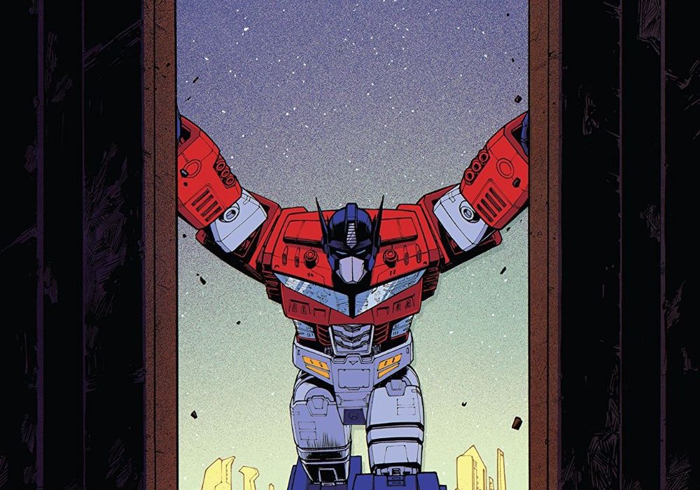
Written by Brian Ruckley
Illustrated by Angel Hernandez & Cachet Whitman
Colored by Joana Lafuente
Lettered by Tom B. Long
Reviewed by Chris Egan
As the rebooted “Transformers” universe continues to roll out its new continuity, writer Brian Ruckley continues to play it safe, more or less. While die-hard aficionados will pick up on the changes to the intricate reasons behind the rift between Autobots and Decepticons, casual readers will feel as though they have seen this all before. Political and social differences between the two factions are ripping their people apart resulting in a path to war and casualties. Issue #3 is heavy in exposition, both catching readers up on current events and drowning us in systematic wartime discussions as well as emotions running high on both sides. This new versions’ strength lies in showing that neither side, at this point in the story, is undeserving of sympathy on certain levels. It’s a good story, but being text heavy it slows everything to a crawl, even with some great sequences with action and emotions running high.
The artwork throughout by Hernandez and Whitman is “Transformers” through and through. They beautifully recreate the aesthetic of both the original 80s cartoon and the previous comic book run while giving it a sleek 2019 style. Fans should be more than happy with these characters being in such great hands. Staying true to designs with just enough of an update is exactly what this series needs. Lafuente does the same great work with her colors. Giving this entire book a bright, gorgeous palette, every page and panel is open and easy to follow. Never overcompensating to push an updated style, the colors are full, solid, if not a little purposely flat to capture the retro animated style without paling in comparison to more modern versions.
This new mythology feels right for the characters but relevant for today’s political climate without ever being preachy or moving out of its lane. The artwork throughout is fantastic, but with these two illustrators, there are moments that feel like they are competing for how this book should look.
Final Verdict: 7.0 – A very good continuation that slows down a little more than it should at this point. However, beautiful art will keep you turning the page.

Written by Jason Aaron
Illustrated by Russell Dauterman
Colored by Matthew Wilson
Lettered by VC’s Joe Sabino
Reviewed by Alexander Jones
Crafting debuts for event series can be difficult to execute. Creative teams are tasked with reintroducing the concept and ideas behind large-scale storylines that can cause debut issues to be underwhelming. Marvel’s latest event, “War of the Realms” suffered the same problems but manages to course-correct significantly in the follow-up issue. Marvel rogue Malekith has been making alliances with villains across the Realms preparing to invade Midgard. With the Odinson trapped in Jotunheim, the supporting Thor cast is left to pick up the pieces and fight back against Malekith and his forces in a desperate bid to protect Earth.
“War of the Realms” #2 is a dire installment that continually amplifies the tension until the issue comes to a conclusion that will bear consequences for Asgard. The issue splits the various characters into groups and shows how the members are fighting off Malekith’s forces. Author Jason Aaron does a solid job giving the narrative a sense of weight while imbuing the title with humor. The issue can be slightly problematic in terms of some of the dialogue sequences. While the dose of humor is appreciated, Aaron’s characterization of Iron Man and Doctor Strange are two examples of over-the-top humor that don’t match the tone or situation exactly right.
Continued belowArtist Russell Dauterman is a great asset to Marvel and contributes shockingly beautiful pencils to “War of the Realms” #2. Frequent collaborator Matthew Wilson adds vibrant colors to the issue that highlight some of the best aspects of Dauterman’s pencils. The issue is loaded with insane layouts and some of the same styles and techniques Dauterman refined during the course of his time drawing “Thor.” The big difference with “War of the Realms” is the scale and scope of how large the narrative has become. Dauterman is drawing heroes across the Marvel Universe in the story and depicting villains throughout The Nine Realms.
With all of Asgard trapped in a battle between The Nine Realms, Aaron has finally begun constructing a script containing a sense of scale. The series cliffhanger has already opened up a fascinating narrative opportunity. I hope Aaron will continue to expand and broaden the stakes of the event going forward. While readers are aware of how deadly some of Malekith’s forces can be, I want Aaron and Dauterman to continue making “War of the Realms” more personal for Thor and The Marvel Universe at large. Aaron, Dauterman and Wilson’s second installment in “War of the Realms” sets the stage for what comes next while making the war even more dire for Asgard.
Final Verdict: 8.0 – “War of the Realms” #2 carries a majestic art direction and script filled with the tension of Malekith’s war.


