
There is a lot to cover on Wednesdays. We should know, as collectively, we read an insane amount of comics. Even with a large review staff, it’s hard to get to everything. With that in mind, we’re back with Wrapping Wednesday, where we look at some of the books we missed in what was another great week of comics.
Let’s get this party started.
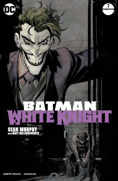
Batman: White Knight #7
Written and Illustrated by Sean Murphy
Colored by Matt Hollingsworth
Lettered by Todd Klein
Reviewed by Alex Curtis
I’ve enjoyed this series so far because Sean Murphy had the moxie to make Batman the foe and Joker redeemable—but this issue signals a troubling 180.
Murphy’s sharp yet gritty art fits Batman and Gotham like a glove. His incredible attention to detail sucks you in each page, and his splash pages deserve to be hung up above fireplaces. As far as Batman stories go, “White Knight” is fairly grounded and sobering, so the meticulous art adds to the experience.
Unfortunately, Murphy has backtracked and redeems Batman and vilifies Jack for the upcoming finale. This flies straight in the face of the previous issues and brings what’s been a complex and fascinating glimpse into the morality of Batman into a more generic redemption/team-up story. This whole arc has been showing us how dangerous a jaded, unsupervised Batman would be, but through a series of long-winded monologues, everybody apologizes and all wrongs are righted. Murphy rejects the more compelling idea of good Joker versus bad Batman in favor of making Neo-Joker the “real” villain, which is a very tired superhero trope.
Aside from Neo-Joker being a wretched name for a villain, she remains uninteresting. Her devastating freeze attack still lacks a human impact, other than seeing some frozen bodies, and she just doesn’t seem that intimidating or deranged.
Murphy’s awkward dialogue is one of the biggest problems. It’s understandable seeing how Murphy has an ambitious story and themes and he’s a relatively new writer, but this dialogue saps any subtlety from the book. Granted, spelling out the themes and character motivations wouldn’t be terrible if it felt natural, but these speeches are delivered in massive blocks of text when they could be easily cut down and not lose any impact.
Final Verdict: 6.0 – Sean Murphy spoils a fascinating story with unwieldly dialogue and a sudden redemption for Batman.

Black Bolt #12
Written by Saladin Ahmed
Illustrated by Christian Ward
Lettered by VC’s Clayton Cowles
Reviewed by Matt Sadowski
So ends the first run on the Midnight King. After crafting the definitive “Black Bolt” run over 12 issues, Saladin Ahmed and Christian Ward bring the Inhuman King’s tale to a satisfying close.
Ward’s phantasmagoric art has given “Black Bolt” a distinct visual identity over the series, so it’s no surprise that #12 is chock full of exceptional scenes. Panels and gutters swirl like a vortex of paint as Black Bolt’s adult and child selves merge in the center. The Jailer is stripped of his essence in a cosmic torrent of color. Ahura and Blinky journey through the protean dreamscapes of Black Bolt’s mind. Smart page layouts only enhance the art further. One such page is paneled in such a way as to form a facsimile of Black Bolt’s iconic arrow above his lips before he releases two cataclysmic words. Another subtler panel highlights an infant Blackagar’s first cries that vibrate the very panel borders.
The resurrection of Crusher Creel at the end of last issue may undercut any sense of tragedy or real stakes, but it’s hard to complain when “Wishbone” and Creel get to share more panel time together. “Black Bolt” has shown the power of friendship, teamwork, and the importance of understanding others—whether friend or foe. These themes coalesce for a relatively sunny conclusion. The climactic sequence purveys an optimistic and hopeful message of finding strength in your friends and accepting their aid when you need it most.
Fans of “Black Bolt” can check out Ahmed’s creator-owned work on “Abbott” or “Exiles” and Ward’s upcoming work on “Thor” #1 in June.
Final Verdict: 8.5 – “It’s over.” Soulfully written and illustrated with psychotropic energy, Black Bolt wages a final battle with a little help from his friends.
Continued below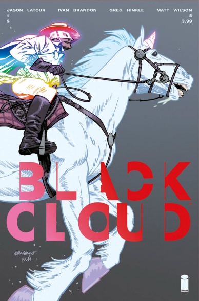
Black Cloud #8
Written by Jason Latour and Ivan Brandon
Illustrated by Greg Hinkle
Colored by Matt Wilson and Greg Hinkle
Lettered by Aditya Bidikar
Review by Reed Hinckley-Barnes
Every time I read “Black Cloud” it feels like I’ve missed an issue. I haven’t, but every time it comes out I check just to make sure because it always seems like the plot has jumped in some strange way that doesn’t quite lead from the issue before. There is a constant veil of mystery over the series and while it feels like there is some kind of inner logic to what is going on, that logic has never been properly explained to me in a way that I understand. All of that is to say, I don’t really know what is going on in the story of “Black Cloud” #8, and I can say for certain I have no idea where it’s going.
The reason I keep coming back to the series is the art. The world of “Black Cloud” is bizarre in ways that I don’t understand, and while that’s frustrating from a story perspective, it’s great when it comes to the design of the series. In this issue alone, we have a weird insect/wolf hybrid and what looks like a fairy tale prince version of Zorro. Greg Hinkle brings these creatures and images to life in ways that are wonderful to behold. Matt Wilson on colors also helps all these characters and creatures feel out of place and other worldly. There is a scene in the back half of the issue involving a unicorn’s horn that is just strange, a bit gross, and just the right sort of unexpected.
It’s a shame that these design elements don’t pull together in the story. We get a little bit more of a hint at the back story of magic and the world in this issue, but it’s just a hint. Not enough to make sense of what is going on, but another piece of an already complex puzzle. “Black Cloud” #8 is a joy to look at, I just wish I understood what was going on.
Final Verdict: 6.0 – While the art of “Black Cloud” #8 is magical, it’s story continues to be confusing and difficult.

Demi-God #1
Written by Ron Marz
Illustrated by Andy Smith
Colored by Michael Atiyeh
Lettered by Steve Dutro
Reviewed by Gustavo S. Lodi
“Demi-God” #1 introduces readers to Jason McAndros, a typical young adult struggling with his work, love interest, and low self-esteem, who comes across an item of power that forever changes his life. Heard this before? Yes, and this issue, hard as it tries, fails to dispel that notion.
In the art department, there is nothing inherently bad with Smith’s work: his attention to detail helps the issue present to its audience a number of new characters by showing, rather than telling. One can only glance at Jason’s messy bedroom to know more about him. Facial expressions are equally strong and the issue’s lead and his supporting cast are all given distinct features. He does, however, make some strange choices on panel design, with most pages being cluttered, which was particularly low-key for the big introduction of Demi-God’s alter ego as the story wrapped.
Marz’s script is where the shortcomings of this issue are more apparent. The writer does try to bring to the table a number of features to make this series special. Demi-God is an omniscient narrator, fully grasping he is within a comic book. The “item of power” that grants Jason’s his power is anything but obvious. And the transformation into Demi-God is not without loss and consequence.
However, the problem is that it does not all come together in the areas where it had to the most. Jason feels like a generic lead, who seems will behave like every irresponsible super-hero presented before. His supporting cast are know archetypes (“the girl,” “the jock”), with little in terms of nuances. And the attempts to look and feel unique actually make this debut issue feel unfocused and a bit of a mixed bag.
Final Verdict: 6.0 – “Demi-God” #1 fails to be a compelling first issues for a series that clearly has a lot of ideas. Perhaps there is more under the hood that readers will appreciate more on future issues, but here those expectations fall short.
Continued below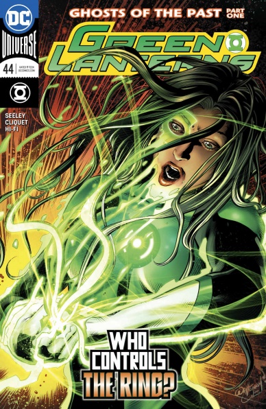
Green Lanterns #44
Written by Tim Seeley
Illustrated by Ronan Cliquet
Colored by Romulo Fajardo Jr.
Lettered by Dave Sharpe
Reviewed by Alan Buxbaum
“Green Lanterns” #44 is a decent addition to the Jessica Cruz/Simon Bazz mythos, with some average art and story-telling. The themes about mental health that Seeley explores are interesting and easy to connect with (at least for those of us with some form of anxiety). This seems to be brought up in most Jessica Cruz stories, as its a big issue for her. Just the idea of having a Green Lantern who battles with mental issues is a great message. However, I don’t think that “Green Lanterns” 44 added much to her mythos. In some ways, this issue is a missed opportunity for Seeley to develop and explore other themes for this character.
One specific aspect of the writing that seemed off was the usage of Post Traumatic Stress Disorder. The first panels we see are those of Jessica Cruz discussing this with her therapist, which is something we would expect. Fast-forward several pages and we all of a sudden come across a deranged robot who’s firing nuclear blasts at Simon and claims to have PTSD as well. What are the chances that Jessica leaves her doctor’s appointment where she’s talking about this, and then several star-systems later there’s a robot who has the same problem? This sounds a bit too coincidental.
The art comes off as average super-hero fare. It accomplishes all it sets out to and stops there. The action scenes are nothing special and many of the panels are static in nature. Overall, nothing to write home about.
Final Verdict: 5.0 – While you won’t necessarily be wasting your time reading this, there are plenty of other comics you should check out before “Green Lanterns” 44.
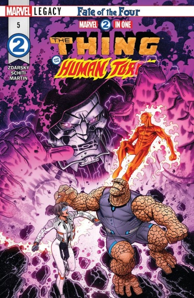
Written by Chip Zdarsky
Illustrated by Valerio Schiti
Colored by Frank Martin
Lettered by VC’s Joe Caramagna
Reviewed by Alexander Jones
As Marvel’s summer lineup inches closer, readers finally have a better idea of what is next for the Fantastic Four. Writer Chip Zdarsky has also finally uncovered a more focused direction for the two Fantastic Four members making up the core cast of “Marvel Two-in-One.” Valerio Schiti’s artwork retains the artist’s reputation for bearing some of the most polished and vibrant line art Marvel’s current roster of talent has to offer.
The previous issue of “Marvel Two-in-One” gave readers a good idea of some of the character beats present in the latest issue, but this installment already brings some payoff to the table. Fans get to know the alternate Reed Richards particularly well and also start to understand some of the decisions that led him down his current path. While the plotting does suffer through harsh decompression, the overall tone and direction of the storyline finally start to take better shape here. This issue is ultimately a diversion, presenting a filler plot for the overall series but Zdarsky brings a bevy of strong character beats which ring true thanks to the fleshed out backstory and high-stakes storytelling introduced in the previous installment of the comic.
Schiti’s artwork in the story is a vivid and action-packed contribution to the storytelling. Schiti’s talents are perfectly captured by the odd shapes Reed Richards contorts his body with. The strong facial work delivered by Schiti for Ben Grimm and Richards is another case of the concise storytelling making the story an immersive read. Schiti’s facial expressions are tense and his scene with Grimm is a particular powerfully and emotional moment that is captured by manic nature of the artwork thanks to the page layout colors from Frank Martin.
While the plot’s limited scope does detract from the overall nature of the arc, reading this title in collected form would likely not pose the same problem and the content within the story is also carefully written and drawn with such precision and passion that this comic has finally come to a more cohesive whole. I do hope Zdarsky will start to consider pacing in his scripts more carefully and make sure to continue to deliver the eclectic emotional moments going forward, “Marvel Two-in-One” #5 is a marked improvement over past installments.
Continued belowFinal Verdict: 7.7 – “Marvel Two-in-One” #5 is an enjoyable diversion into an odd, unwieldy alternative Universe with an expertly illustrated level of polish.

New Mutants: Dead Souls #2
Written by Matthew Rosenberg
Illustrated by Adam Gorham
Colored by Michael Gorland
Lettered by VC’s Clayton Cowles
Reviewed by Elias Rosner
The second issue of “New Mutants” does a lot to be a decent self-contained adventure with flavors of a larger arc in the background, much like issue one, but still hasn’t managed to keep me engaged in its story or characters so far. As opposed to Jacob last month, I found the first issue a bore. Too many jokes failed to land and the art being both a boon and a detriment to the overall tone of the comic.
The same is true for issue two unfortunately. It’s hard to pinpoint the exact failings because on the surface, it all works. The team dynamics are solid, every character feels distinct from each other in visual design and personality. Gorham imbues everyone with life and charm, such as getting Boom-Boom’s smugness across with every panel she’s in.
Yet reading a page is such a chore. Panels constantly change angles in distracting ways, breaking the flow of a page and actively make it difficult to follow the action. The best way I can put it is that instead of the angles being intentional and necessary, they are there simply for the sake of variety. Another gripe I have with the artwork is that while the characters are distinct and emotive, their faces are oftentimes…off when at a distance. Features blur in unnatural ways and Gorham’s scratchy, minimalistic style makes it so that at certain angles, the crosshatching ages and morphs them.
Tonally, too, it seems like Rosenberg doesn’t know what he wants. Does he want horror-comedy? Straight up horror? Or your basic X-heroics? The only thing that is keeping me invested at this point are the two-page stingers at the end. Tense, dark, creepy and infinitely more engaging than the frost giant in the arctic. These are where the tones coalesce and Gorham’s art and pacing shine. The three-panel lead in, building tension, before the full-page reveal was fantastic.
There is much to like here but it’s too buried in a fairly standard adventure with characters I have not connected with. Maybe that’s because this is one of the first X-books I’ve actually read but, as a standalone mini, that shouldn’t be an issue. It could be that this comic isn’t for me. It could also be the character writing is resting too much on prior knowledge and not enough on in-comic development and interaction. Oh and if someone could identify Rahne’s accent, that’d be super helpful.
Final Verdict: 5.5. A comic that has the makings of something great but needs to find its footing. Older fans will probably get more millage out of this than new fans.

Nightwing #42
Written by Jackson Lanzing & Collin Kelly
Penciled by Jorge Corona
Inked by Jorge Corona
Colored by Mat Lopes
Lettered by Carlos M. Mangual
Reviewed by Devon Browning
When was the last time you heard the saying ‘never judge a book by its cover’? Wether it waxs recent or not, it’s a string of words that are hardly unfamiliar. Figurative or literal, it’s almost always good advice. In the scenario of Nightwing #42, you have every excuse to throw that golden rule away. While I will not yet breach the topic of art in this weeks addition, the issue does NOT disappoint in regards to what is very much promised on the cover. Yes, Nightwing. YES katanas. And YES action that is complimented by a style of art that is a breath of fresh air to this Rebirth series.
To be clear, the issue acts as a one shot story. It isn’t part of any ongoing arc or related to anything happening presently in Nightwing’s circle. Heck, it isn’t even narrated by Dick and that may just be the best part. Since the beginning of Rebirth, most of the stories circulating around this character have been heavy in emotion, whether in regards to romantic relationships or family ones. It is only recent that we’ve got to see our Boy Wonder really take to action and prove himself worthy among DC giants. This issue is quite frankly the cherry on top of that progress, and a practical balance between both takes. A simple story of a brother fighting to save his brother. And if we know anything about Nightwing, it’s that his whole existence was built on the love for his family. What drives him now is that same love, only for a different kind of family.
Continued belowAs shown on the cover, crafted by the ever impressive Jorge Jimenez and Alejandro Sanchez, the whole story is in a Japanese-like style which only makes sense considering this… ‘alternate universe’ takes place in Tokyo. While Lanzing and Kelly write a beautiful piece on the brotherhood of the Batfamily, the biggest compliment to the short story is the art in which Corona takes the reins. We practically watch Nightwing take on each ‘boss’ while adapting to their specific style. Whether it is firearms, swords, or a dragon, Corona develops a play by play for Dick that makes his fighting and tactics unique only to Dick Grayson himself. While reading and looking at the art, you know that with every move or position the gymnast is put in, it is made clear that no one else could pull it off.
In the sense that the style is unique to the story, and the journey from the very first page is an adventure to the end– Corona gets the kudos. Lopes, who does well to fit the theme of each ‘level’ in the story through vibrant color, is a perfect match for this style. And to no real fault, the only flaw that felt obvious at times was the absence of this art taking up the whole page. For this story to be successful, it was absolutely not necessary for the team to ink up every page from corner to corner. However, with the powerhouse team of creatives that worked on this issue, doing so would have made this story a home run.
Final Verdict: 8.3 – This one shot may just be the best issue of Nightwing Rebirth thus far, with both the writing and art team introducing an innocent story that pleases die hard Batfamily fans, and those looking for a reason to enjoy them more.

ROM: Tales of the Solstar Order #1 Special Edition
Written by Chris Ryall and Christos Gage
Illustrated by Guy Dorian Sr. and Sal Buscema
Colored by Alessandra Alexakis
Lettered by Shawn Lee
Reviewed by Jonathan O’Neal
Full disclosure: Marvel’s “ROM” #7 was the first comic I ever purchased with my own money back in 1980. I had the Parker Brothers toy too, and it worked great until I plugged a cord with the incorrect voltage into it.
When IDW finally got the rights to publish new ROM stories, there was cautious optimism from many like me who grew up reading the character’s original Marvel adventures. While IDW’s short-lived standalone and crossover titles have failed to give the character the triumphant return ROM enthusiasts might have wanted, it’s undeniable that they come from people who love the character.
“ROM: Tales of the Solstar Order” is dripping with this earnest nostalgia. Co-written by Chris Ryall, former IDW CCO and EIC and probably ROM’s greatest cheerleader, and inked by Sal Buscema, the man who pencilled the bulk of the character’s Marvel run, the book has a throwback charm.
Reprinting backup stories that appeared in issues 10-14 of IDW’s “ROM,” the story does read like compressed backup material, but there is clearly an effort to create some gravitas from the titular hero’s largely solitary crusade. ROM always played best as a tragic figure faced with having to do terrible things or make great sacrifices for the greater good in the war against the Dire Wraiths, and this story taps into that time-honored hook succinctly and effectively.
And ROM looks good in this storyline, the rendering of his helmet and armor straddling the classic Marvel version and the somewhat more organic and rounded IDW version. There are some truly beautiful panels here, and the aesthetic has more of an indie vibe that might at first blush seem a bit sophomoric but has an endearingly handmade quality that runs counter to the usual digital gloss of the previous IDW incarnations.
Ultimately, the only real sin this book commits is in its marketing. The book seems like a missed opportunity to offer previously published material (that die-hard ROM fans have already read) for a low price point to introduce new readers to the character. At only 18 pages of story for $4.99. this one-shot feels a bit like a shameless cash grab, and that actually is a shame.
Continued belowFinal Verdict: 6.0 – “Tales of the Solstar Order” succinctly tells a somewhat paint-by-number but reverential sci-fi tale. At its heart, it’s ROM at his best, but the book itself feels extraneous. Who is it for?
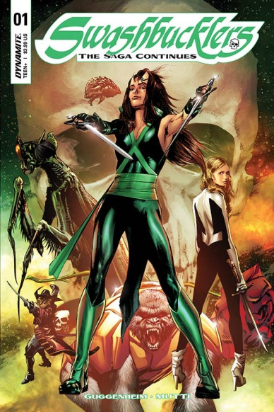
Swashbucklers: The Saga Continues #1
Written by Marc Guggenheim
Illustrated by Andrea Mutti
Colored by Chris Sotomayor
Lettered by Taylor Esposito
Reviewed by Michael Mazzacane
As the name implies, “Swashbucklers: The Saga Continues” is a continuation of the Bill Mantlo and Jackson Guice “Swashbucklers” series, now under the creative team of Marc Guggenheim and Andrea Mutti. As far as first issues go, “The Saga Continues” follows the recipe one should expect for a first issue that reboots a property. Guggenheim bridges the gap between older readers and those who have never heard of this before fairly well. As someone who is unfamiliar with the original series, it would’ve nice for this issue to give new readers a better indication of what this new saga would be about emotionally and its characters, instead of using pages to show the state of things.
With its bold parchment styled narration from Taylor Esposito, this new “Swashbucklers” clearly evokes the pulpy roots of the original series. Those roots also mean the continues of sexist tropes by having Raader’s, the female lead, nude body “artfully” covered for the first half of the book after she is pulled in from the cold vacuum of space. Meanwhile, her hairy, alien, and male, crewmate Servitor is no worse for wear after the planet they were one exploded. Formal choices like the use of narration boxes and colorist Chris Sotomayor’s pallet evokes the type used in the original series. These choices understandably create a pulpy veneer and charm to “Swashbucklers,” it’s a book about space pirates after all. But the depiction of Raader is one of those things that made “sense” at the time, that doesn’t really play now. Just because the property is evoking a specific era doesn’t mean this new rendition shouldn’t be reflective updating elements for this new series.
Looking over some of the art from the original series, Guggenheim and artist Andrea Mutti don’t immediately replicate the sense of dynamism. The character designs and aesthetic are there but the imagery has staid quality. Some minor action is also awkwardly sequenced when it comes to objects coming in and out of panel. The page where Raader swings down to the wreck of her old ship, Starshadow, and finds the remains of her crew is the best in the issue. Mutti has Raader beautifully swinging through panels in a way that guides the eye.
Final Verdict: 6.5 – The “Swashbucklers” are back and overall things aren’t off to a bad start. I just hope it shows a bit more introspection as it goes forward for new readers and the story it tells.

The Walking Dead #178
Written by Robert Kirkman
Illustrated by Charlie Adlard
Colored by Cliff Rathburn
Lettered by Rus Wooton
Reviewed by Gregory Ellner
Different discussions of family take the forefront in “The Walking Dead” #178, from the confused arguments of Sophia Peletier to the calm, rational discussions of Carl Grimes, Elodie, and Michonne. The overall theme of family helps Robert Kirkman to shed further light on the differences between characters’ personalities, readying them for any upcoming conflict.
As with many group introductions in “The Walking Dead,” Kirkman deals with the continued revelation of the Commonwealth with a decidedly mixed hand, leaving to the reader’s imagination what is going to happen without making things too blatant. The use of a dictatorial framework for how Sebastian Milton can do whatever he wants contrasts well against the reasonable, rational military hand of Officer Mercer and the relatively kind hand of Pamela Milton, the latter of which may be a front.
Paneling works particularly well in this issue, especially in the talk between Michonne and Elodie. Charlie Adlard and Cliff Rathburn work together to craft a calm discussion between mother and daughter that focuses in on changing facial expressions as the quick cuts between the two women demonstrate how similar they are, how they are truly a family. The closing page of that discussion, with only two panels, shows how important their reconciliation truly is, with Michonne’s open arms in a very large panel, and their hug in a smaller one just below it.
Though the issue doesn’t actually have any of the eponymous walking dead, it still remains a good issue, one that allows for a breather before possible upcoming conflict to come.
Final Verdict: 7.0 – A good issue that deals heavily with character relationships, “The Walking Dead” #178 helps set the stage for storylines to come.


