
There’s a lot to cover on Wednesdays. We should know, as collectively, we read an insane amount of comics. Even with a large review staff, it’s hard to get to everything. With that in mind, we’re back with Wrapping Wednesday, where we look at some of the books we missed in what was another great week of comics.
Let’s get this party started.

Deep Beyond #3
Written by David Goy & Mirka Andlfo
Art by Andrea Broccardo
Colored by Barbara Nosenzo
Lettered by Fabio Amelia
Reviewed by Alexander Manzo
“Deep Beyond” continues to move forward in the main story and pushing forward to hopefully finding Pamela, the missing scientist. The story picks up immediately after the previous issue and the main characters are not only running from the government officials chasing them, but on edge after losing a close member of their crew trying to escape. The main character, Paul, gets to step up in this issue due to feeling responsible for the death, which really helps fuel the issue through the confidence that was not really portrayed previously. There is still hesitation, but he finds a way to help the remaining crew members get closer to finding the abandoned submarine.
Andrea Broccado does a great job of allowing his panel work to fit so many different details and settings on each page. Broaccado does a good job of balancing the settings of the unknown creatures in the water, but also the details in the ship as the crew decides on how to move forward. When the story shifts to Paul and the others exploring outside, the close up details of the monsters fighting alongside the intricacies of the suits they wear really show the reader how intense the moments are.
Barbara Nosenzo’s color palette also fits in perfectly throughout the exploration with the unknown tones that come through with the choice of dark purples and greens. It also creates a bit of suspense with what could happen next.
Final Verdict 8.5 – The story is moving towards the end of the first arc, but still has a lot of questions to answer.

The Impure #1
Written & Colored by Ralf Singh
Illustrated by Hannes Radke
Lettered by Marc Schmitz & Ralf Singh
Reviewed by Christa Harader
“The Impure” #1 is set in a far-flung future featuring a sci-fi apocalypse, siblings on opposite sides of a galactic conflict and enough emotional backstory to counterbalance the tech-heavy universe introduced in this first issue.
Singh and Radke do conflict-heavy world-building that flings us right into the middle of a battle, with flashbacks to establish Minerva and Nero’s characters and some of the world’s fascist underpinnings. There is a lot of action, so the flashback scenes are a welcome respite from the sometimes-confusing dynamic action on the page. Nero deflects gunshots with his sword, which occasionally looks a bit awkward, but the blend of Western and manga-influenced cartooning generally works even when we’re searching for a bit more clarity. There is one scene right before everything pops off in Nero’s flashback that features too much cartooning to suit the tension in the moment, but it passes quickly and the book’s generally better for that bit of flair. The lettering features a font that needs to be a bit bolder to compete with Radke’s line. It’s a bit too smooth and modern for the anime tech-inspired backdrop, and Singh makes use of enough bold colors that we need to be able to pick out the text with ease.
Overall, “The Impure” #1 is an interesting, if dense, first issue with style and some narrative promise.
Final Verdict: 7.0 – “The Impure” #1 drops us into a somewhat confusing but compelling sci-fi future, with familial strife and fascist revelations on the horizon.

Marauders #19
Written by Gerry Duggan
Illustrated by Stefano Caselli
Colored by Edgar Delgado
Lettered by VC’s Cory Petit
Reviewed by Luke Cornelius
The clashes between the Marauders and Homines Verendi continue in “Marauders” #19, with a host of Reavers charging through Lowtown, ordered to destroy it and make way for new high rises buildings. With the team unable to intervene for fear of damaging Krakoa’s international reputation, they have to find another way. Now, does this issue drastically change the larger scheme of things? No, not really. Is it a good, fun ride that shows the mutants saving the day? Yes, and sometimes that’s all that’s needed.
Continued belowDuggan crafts a fast paced story for the issue and never leaves much time between moments of humor, which keeps the issue light, despite the Reavers’ dark intentions. This is most clearly seen with Iceman and Pyro working together, calling themselves “The Two,” and making a pyrotechnic ice sculpture. It’s the longest scene that’s played for humor, but, after building to a reveal of the sculpture following a neighbouring Naval crew’s reaction to it, the audience is denied a glimpse at it, and the punchline feels absent. Misstep aside, Duggan’s writing is good, and each character feels like they get a moment to shine in the scuppering of Verendi’s plans. There’s a final tense sequence as Bishop confronts one of the organization’s members which delivers the final feel-good moment of the issue and brings the Verendi rivalry to a close, at least until after the ‘Hellfire Gala.’
Caselli’s artwork across “Marauders” #19 does a great job of presenting everything clearly, though there are noticeable errors; perspective seems slightly skewed in a couple of the panels, which distorts the depth of a scene and a character’s legs in another, and there is a continuity error between pages where Hump and Brute have swapped places despite not moving. On the whole, though, these moments aren’t too disruptive to the audience. When presenting each of the Morlocks’ moments to shine in combat, Caselli does a great job of keeping the rotating focus fluid and makes each member’s triumph feel very satisfying. This is aided by Petit’s sound effects. The standout is with a silhouetted panel depicting a Reaver being severed in two by a launched sewer grating, that is accompanied by a red “splakk.”
Final Verdict: 6.8 – “Marauders” #19 is a simple and effective story which puts a pause on the clashes with Verendi ahead of the ‘Hellfire Gala.’
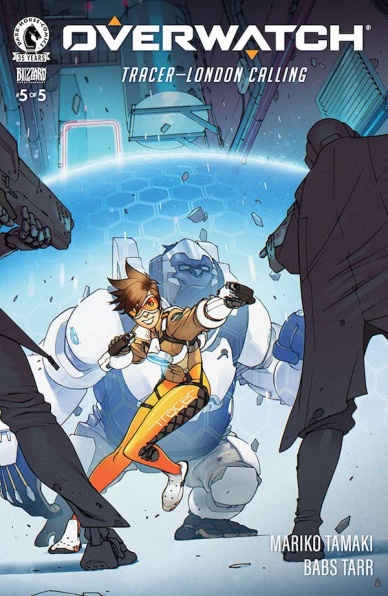
Overwatch Tracer: London Calling #5
Written by Mariko Tamaki
Illustrated by Babs Tarr and Heather Danforth
Laid Out by Hunter Clark
Colored by Rachael Cohen
Lettered by Deron Bennet
Reviewed by Conor Spielbrg
While the finale of “Tacer: London Calling” brings all the characters and themes to a satisfactory conclusion, there are some elements that don’t work well overall. The most pressing issue is that the main antagonist of the miniseries, Kace, doesn’t measure up. The more radical Omnic loses all sympathy in this final issue and fails to compensate as he remains one-note. It doesn’t help that, at no point, does he feels like a credible threat to Tracer, even with a small army at his back.
Despite this underlying problem, the action is well sequenced with jagged panels evoking a sense of each moment of action blurring into one another seamlessly and hectically at the same time. Tracer’s powers still work very well in the comic book format in a manner similar to the Flash.
The art team built on the Overwatch style to great effect, utilizing the distinct, semi-realistic character designs from the video game. The Omnics manage to evoke a lot of personality, but the story remaining in the Underworld (the ghettoised area for the Omnics) leaves the background in dull drab tones. While this is unavoidable, it is all the more noticeable when Tracer is elsewhere in the final pages.
The final issue does manage to wrap itself up nicely calling back to Tracer teleporting out of the bullet that killed Mondatta in a way that gives a sense of closure to the miniseries. The mediocre antagonist is not as debilitating to the story as it normally would be in a superhero comic, since Tracer’s mission is to act as a peacemaker rather than just ‘kill the bad guys.’
Final Verdict: 5.8 – Some underlying flaws keep it from being great but a good story non the less.

Project Patron #1
Written by Steve Orlando
Illustrated by Patrick Piazzalunga
Colors by Carlos Lopez
Lettered by Thomas Mauer
Reviewed by Quinn Tassin
Welcome to another comic that tells the story of a Superman analogue that twists a classic Man of Steel story. The big selling point of this one? It’s actually an interesting hypothetical that relies on something other than saying “What if Superman but [Russian, evil, an antihero, less interesting, what have you]?” Steve Orlando’s “Project Patron” #1 tells the story of a group that pilots a “reploid” of The Patron, this world’s greatest (and very dead after a fight with not-Doomsday) hero. The big positive of the issue is that this is a novel concept with a lot of inherent intrigue. The stress of being the stand-ins for an icon and deceiving the world while you protect it has plenty of dramatic potential. The characters themselves are interesting on paper- each with a fun, immediately recognizable little archetype and the new guy being a spy is a solid wrinkle.
Continued belowAnd yet, this isn’t nearly as interesting a comic as it can be. Orlando gives a great premise but he delivers an oddly thin first issue. Its exposition lacks any kind of grace which makes the fun of its tropes something you have to dig for. It also makes the story hard to fully invest in. That’s not a good thing when the whole issue seems to bank on us Commander Kone so the rug can be pulled out from under us when he meets his untimely demise. While the twist is most definitely interesting, the issue has been so surface level up to that point that it doesn’t have any kind of emotional impact.
Patrick Piazzalunga and Carlos Lopez do solid work on the art. They bring a rough around the edges feeling to the book at all times and ably swapping between a more bright, classically super heroic tone in the first quarter of the issue and a properly dark, desaturated one to the Project Patron Hangar. That being said, the art never truly sings. The opening sequence is good but not great. The hangar definitely has a real atmosphere though it feels a bit nondescript at the same time. The real high point probably comes from the character design, especially for David Deir. As underdeveloped as so much of the issue is, these characters really do feel like people of their own and David is a Big Boy with Big Muscles who this writer is willing to bet gives good hugs (which will be helpful when the whole squad is mourning).
Final Verdict: 6.2- “Project Patron” #1 is a lot of promise and very little fulfillment

The Resistance: Uprising #1
Written by J. Michael Straczynski
Illustrated by C. P. Smith
Colored by Snakebite Cortez
Lettered by Sal Cipriano
Reviewed by Elias Rosner
For a first issue, “The Resistance: Uprising” #1 is surprisingly slow. Depending on your interest in the world Straczynski has built, this will either be a big turn off or, as it was for me, a nice breather after the cascading, expansive events of the first series. The focus on the characters as they figure out where to go from here, after the death of their leader at the end of issue #6 of “The Resistance,” and what the new status quo of the world is. While new readers might find themselves lost at first, the team does an admirable job of catching everyone up to speed on the important points so they can follow along. Unfortunately, Smith’s artwork harms the coherence of the issue.
In terms of visual consistency across the series, Smith is a solid choice to follow up Deodato’s work. Both are digital with a heavy emphasis on photorealism and moody shadows. However, where Deodato’s art worked and Smith’s doesn’t is in creating recognizable characters. Part of this is because Smith and Cortez overdo it with the shadows, masking faces when regardless of the mood of the scene and obfuscating details so that it becomes difficult to tell what anyone looks like. Connecting names to faces is another issue this series struggles with but that was less of an issue before when the characters were more distinct and visually striking.
Take the General, Raleigh, from the previous series. While I could easily identify him by his dialog, were you to strip that away I would be hard pressed to point him out in any scene. The same was true of President Ed Harris! Smith’s faces are flat due to the photorealism and Cortez’s highly processed coloring style does not do it any favors, masking details like Raleigh’s moustache or making characters look doll-like in the light, flattening their faces. When a comic is relying on a large cast and recurring characters that don’t say their names every other panel, this becomes a major problem for building a long running narrative which “The Resistance” seems interested in doing.
Hopefully this was just a problem of finding their footing while trying to keep a consistent visual tone and will be alleviated in future issues. The underlying story is meaty and the characters are well-rounded albeit a bit thin, since there are so many of them to juggle, and Smith’s sequential work is clear and suits the moods of the scenes well. The same is true of Cortez’s coloring, which mirrors the dreary, dirty, difficult world of “The Resistance” in his palettes. For those who wanted more from “The Resistance,” “Uprising” #1 is a fantastic re-entry into the world, even if it might take four re-reads to re-associate the faces with the names.
Continued belowFinal Verdict: 7.0 – A worthy continuation of the story of volume one and the strength of the story ups the score but the art is lacking in character clarity and facial expressiveness. Here’s hoping that it’s fixed in future issues.
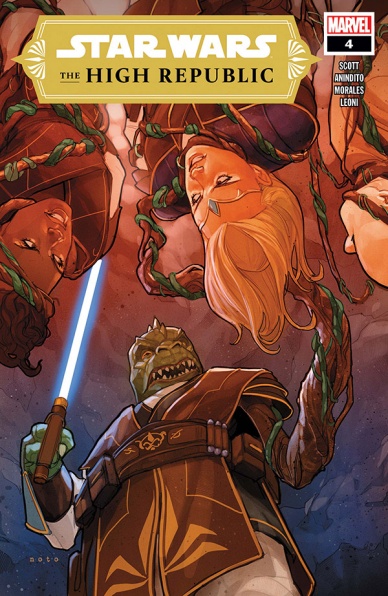
Star Wars: The High Republic #4
Written by Cavan Scott
Illustrated by Ario Anindito
Inked by Mark Morales
Colored by Annalisa Leoni
Lettered by VC’s Ariana Maher
Reviewed by Matt Sherman
“Star Wars: The High Republic” #4 brings readers closer to the conclusion of its current story. Cavan Scott wrote some beautiful moments throughout this issue, starting with a heartwarming flashback of young Jedi Knight Keeve Trennis and her former Master, Sskeer. The flashback shares more of their relationship as padawan and master, as that was only briefly explored in the prior issues. This scene does an excellent job establishing the trust they have for one another.
Scott tends to get a little too wordy on some pages, but he does do a great job expressing what is going on. The flashback helped set up moments between Jedi Trennis and Master Sskeer that expressed true friendship and trust. The way Keeve Trennis wouldn’t give up on her master was powerful and really lovely to read. Scott does a great job exploring other characters as well, without making the issue feel there was too much going on at once. With so much going on throughout this issue, the pacing was still perfect.
The art helped make the pacing work as well. Ario Anindito illustrates each panel flowing into one another flawlessly. Mark Morales’s inks really compliment it, and is able to clean up the line work to look crisp without making things feel flat and still. Annalisa Lenoi’s colors were lacking a little though. Leoni established glows and reflecting light really well however, some of the background colors felt basic and made the scenes lack depth. Nevertheless, the art as a whole worked really well with Scott’s story.
This series had a bit of a slow start, but this issue really raised the bar. This issue explored so many common Star Wars themes, such as the struggles with temptation and moral dilemmas, but with a new twist. This issue really displayed the potential this creative team has and what can come in this series in the long run.
Final Verdict 8.1 – A really well planned issue that really brings out old and new Star Wars themes in exciting ways.

Suicide Squad #2
Written by Robbie Thompson
Penciled by Eduardo Pansica
Inked by Julio Ferreira
Colored by Marcelo Maiolo
Lettered by Wes Abbott
Reviewed by Alexander Jones
Robbie Thompson and Eduardo Pansica’s take on “Suicide Squad” was one of the most pleasant surprises from DC’s ‘Infinite Frontier’ initiative. The first issue of the series was an espionage-filled look into Amanda Waller’s new “Suicide Squad” team soaked in violence. This property has been explored so much recently that a traditional take on the team should feel redundant. However, the high-stakes set pieces and surprise character reveals elevated the quality of the first issue. I’m happy to point out this bombastic presentation is still on display in the second installment. The tension feels palpable thanks to the opening page featuring Peacemaker fight off a vast amount of Joker toxin infected criminals. Thompson continues the trend from the last issue by fusing the entire cast together in an unconventional way while mixing in other high-profile DC heroes.
“Suicide Squad” #2 has to keep a quick pace with a lot of characters on-panel in certain scenes. Eduardo Pansica deserves a special shout-out here with his attention to page layout and action. The choreography on sequences like the first page is a sight to behold. When Peacemaker throws a punch or gets tricked into a headlock the staging of the pencils gave me a visceral reaction. Pansica’s art has a great sense of physicality as well. Some figures are larger than life while other heroes are much smaller. You won’t ever have difficulty following the action or getting one character confused with another. Thompson’s script continues the trend of the first issue with tons of plot and action. Pansica keeps up with this dense script with stirring visuals that will captivate with an unprecedented level of grit. The visuals in “Suicide Squad” #2 deserve accolades for the risk a mainstream series like this is taking.
“Suicide Squad” #2 has a great script, a wonderful cliffhanger, and beautiful visuals. Of all the titles DC is publishing this is one of the brightest sitting next to the greatness of “The Swamp Thing.” If you want to get to meet some of the characters before the upcoming film right now is a great time to start reading the new “Suicide Squad.” Both new and old readers should be able to follow the action despite how ambitious the series is. Thompson and Pansica’s impressive collaboration leads “Suicide Squad” #2 to greatness.
Final Verdict: 8.8 – The cutthroat violence of “Suicide Squad” #2 will haunt my nightmares until the next issue comes out.


