
There is a lot to cover on Wednesdays. We should know, as collectively, we read an insane amount of comics. Even with a large review staff, it’s hard to get to everything. With that in mind, we’re back with Wrapping Wednesday, where we look at some of the books we missed in what was another great week of comics.
Let’s get this party started.

Animosity: Evolution #5
Written by Marguerite Bennett
Illustrated by Eric Gapstur
Colored by Rob Schwager
Lettered by Marshall Dillon
Reviewed by Elias Rosner
“Animosity: Evolution” is a complicated story, with weaving plots and multiple central characters. It doesn’t always balance them well but each plot on their own is compelling. This issue is a prime example of that. It opens on the farm, prepping us to see the continuation of a war between the Wintermute’s animals and the farm humans but then cuts back to Adam trying to find Octavia and from there we jump to Octavia’s sisters torturing Mya. There’s more but you get the gist.
It’s a lot in one issue and while I can see the reason for each of the pieces, it still is a bit much to cram into one 22-page issue. This isn’t helped by Gapstur’s art. Gapstur’s art excels in the shadows and on the splash pages but on pages that require a lot of smaller panels, it falters. Characters lose pupils, the panel layout often feels jumbled and, while not hard to follow, it isn’t the most pleasant of reading experiences.
That being said, when the art hits, it hits hard. Some of the best pages in this issue are when Gapstur gets to draw the Leopard and the Hyena (at least I think it’s a Hyena). The Hyena is bathed, thanks to Schwager, in these contrasting greens and reds that turn an already unsettling page into one that’s haunting to look at. Gapstur has the Hyena bleed into the shadows, as if he was transforming from them. One eye is twitching as blood drips from his jaws.
It’s a beautiful page.
The other one is of the Leopard. It’s an extreme close-up and it’s rendered in such high detail that you’d think you were genuinely face to face with this leopard. That you were the size of a rat, looking up at a creature that without a second thought could snatch you up and eat you.
Other than these stand out pages, the rest of the issue is pretty normal, save for the cramped feel of the story. The character writing is still just as top notch as “Animosity” and though this issue does a lot, it doesn’t go very far. Hopefully the next one is a bit tighter.
Final Verdict: 6.8. A decent issue with some stellar pages and the same writing you’d expect from Bennett. A tighter focus would really benefit the comic though.
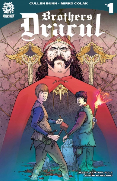
Brothers Dracul #1
Written by Cullen Bunn
Illustrated by Mirko Colak
Colored by Maria Santaolalla
Lettered by Simon Bowland
Reviewed by Michael Mazzcane
Another month, another new series from writer Cullen Bunn. This time it is a historical fantasy riffing on one of the genres most well-worn characters: Vlad Dracula. This is yet another untold story of Dracula, this time reimagining fictional royal captivity within the Ottoman Empire and subsequent training in vampire slaying as informing the actions that gave him the cognomen “the Impaler.” Technically, the first issue of “Brothers Dracul” is solidly made as it goes through the first issue motions and manages to dramatize character well. It is the other aspects of this book, from being yet another to Dracula riff, to the vague orientalism involved in it’s depiction of the Middle East as a realm of supernatural occurrences that give me some pause.
Twisting the Dracula myth and turning the historical root for the European literary vampire into the slayer of vampires and not one of the greats, is on it’s face novel. This twist creates a generic space for Bunn to operate in as he tells the story of two brothers, which gives the series a clear emotional anchor. As Radu arrives home for the first time in a long while artist Mirko Colak beautifully captures his shock and saddens at what has become of Vlad. Their brotherly dynamic informs their scenes as royal hostages where they are trained. Radu is the inquisitive one while Vlad is cynical and only sees how everything is an expression of control and power.
Continued belowMirko Colak and colorist Maria Santaolalla make for an interesting pairing. With this book taking place during two time periods, they do a good job of creating differing aesthetics. The present is much darker with Colak blotting the terrain with black and Santaolalla using darker shades. In the past images are much clearer, Colak’s thin lines and mostly open page design give Santaolalla plenty of space to fill it with a mixture of pastels and harsh blood reds. The issue is awash with color but Colak never loses track for where the important dramatic element is in a panel. That clarity contrasts with the earlier scenes of carnage in this issue. These scenes are somewhat hard to read in a strictly sequential kind of way. They’re just so big and messy, but bursting with color. The sense of chaos is well made and more important than informing the reader of who is winning.
Final Verdict: 6.75 – Cullen Bunn finds something of an interesting twist on Dracula as he tells a story of two brothers, but it’s still another Dracula historical fantasy.
Captain America #700
Written by Mark Waid
Illustrated by Chris Samnee
Colored by Matthew Wilson
Lettered by VC’s Joe Caramagna
Reviewed by Gustavo S. Lodi
“Captain America” #700 marks not only a major milestone in terms of the legacy of this series, but also the end of the short, but much appreciated, run by Waid and Samnee. And in the same way that their run focused less on plot twists and “never will Cap be the same” shenanigans, this issue is firmly set where Captain’s America heart is.
Visually, Chris Samnee and Matthew Wilson have been pitch-perfect choices for this book, as the clear lines (that almost feel like animation cell at times), combined with realistic proportions and scenarios (which distance it from a cartoony look) result in a very iconic representation of Captain America. On this particular issue, Wilson’s colors go the extra mile showing how the seasons of the year roll by as Steve Rogers continues to salvage what we can from the barren America he is found in. And one particular moment towards the end of the book, where Cap is almost literally disassembled and is then put back together, uses reds, whites and blue poetically.
Waid’s script asks a fundamental question: when does hope become stubbornness? When not giving up is actually the most selfish of decisions? Steve Rogers is a man always out of time: out of the time age he should be in, out of time to save those he must. But, at the end of the day, he is a man unwilling not to do his absolute best to save others and to uphold the values of an America he once knew, no matter how distance from it he is, physically or conceptually. Waid understands that conundrum and how Steve’s stories will outlive him as a writer and probably even the readers as an audience. So here, at the end of a short run, with a story about the end of hope in the world, Waid choses wisely to hand over the series with a clear canvas in such a positive light that readers won’t be able not to feel optimistic for once.
Final Verdict: 8.2 – A great ending to a run that hasn’t over-stayed its welcome, “Captain America” #700 tells a timeless story, about a timeless hero on a timeless battle for hope.

The Dead Hand #1
Written by Kyle Higgins
Penciled by Stephen Mooney
Inked by Stephen Mooney
Colored by Jordie Bellaire
Lettered by Clayton Cowles
Reviewed by Devon Browning
As a long term fan of Kyle Higgins’ work, I was eager to see what original creation he’s concocted after “Nightwing: The New Order.” While I should kick myself for first doubting him after the first few pages, where strong vibes of a Captain America-like story could be felt through both character art and story setting, I was pleasantly surprised to find that I ended the issue eager for more of what is clearly nothing like we’ve seen. Well, I suppose I can’t say that just yet– but Higgins delivers in all of the ways that count, and completely knock out the idea that this is following any sort of mainstream universe.
Continued belowWhile the first portion of this issue was very much telling the tale of a special ops soldier part of a hand picked team balancing on the line of good and evil, the boring familiarity dies fairly quick. And thank god for it. While I commend both Mooney and Bellaire for painting the overused plot perfectly, it had me dangerously close to being sucked in to a story we’ve all seen a hundred times before. And just like that the gears shift. The color becomes more vibrant, our ‘hero’ (and boy do I use that term lightly) suddenly with wrinkles at his eyes and donning a uniform fit for a mall cop, and an introduction of character that quite frankly mean nothing to the audience just yet.
Yeah, what I’m saying is: this badass warfare type introduction nearly had the soul sucked out of it instantly, and YET it’s exactly what gave it life. It gave the reader just enough information to later not be left completely parched when the second half of the issue, taken place in the future, hand over only crumbs. With all transparency, it will leave you parched. And sure, while the landslide of the story may not convince every reader to stick around for the next issue, Mooney and Bellaire’s work sure will. I applaud any creative team that speak with both character action and color. Any great visual story should be able to speak without the crutch of a script.
There are a few illustrative nods to both Marvel and DC Comics that will make you smile along the way, and they’re fun easter eggs that don’t at all draw you away from the story. The voice of the inner monologue seems almost self aware which allows for the panels to be created in such a fashion that you might find fit for a show or movie. And while the whole ‘soldier at war’ front only lasts a few pages, the theme of heavy and grunge like inking is steady throughout. Keeping the theme of something still lurking from that very past that will follow the protagonist– of which we can yet identify.
Final Verdict: 8.0 – A good mix of familiar conflicts and new adaptation to the ‘complex soldier’ story where art beats text this time around. Lots of potential, but satisfies readers all the same. Worth an addition to subscriptions.

Deadly Class #33
Written by Rick Remender
Illustrated by Wes Craig
Colored by Jordan Boyd
Lettered by Russ Wooton
Reviewed by Jonathan O’Neal
Thirty-three issues in, what else can be said about the gleeful anarchy that is “Deadly Class?” Perhaps it’s that Remender and Craig can still find ways to surprise us. Amid the continuation of the chaotic Yakuza raid ordered by Saya’s brother to expose her for not killing Marcus and as part of a larger plan to seize and keep control of the family business, Remender weaves more rewarding character beats into the chaos. And it’s in these moments that the book rises above its violent premise and oftentimes startlingly visceral and high wire plot twists.
Readers are shown both the extent of Kenji’s hatred and resentment of his sister Saya and the depths of his sadistic nature. Petra and Helmut are even allowed a moment to connect more deeply while a member of the Mexican police force expires nearby, a victim of one of Petra’s caustic smoke bombs. And in a character development hat trick, Zenzele finally reveals how she came to be a student at King’s Dominion, and it’s heartbreaking. Wes Craig and Jordan Boyd’s watercolor treatment of Zenzele’s flashback is beautifully rendered in warm sepia tones while revealing a chilling truth about Zenzele that should change her character forever.
The frenetic pacing of this issue show no signs of Remender and Craig letting their feet of the gas, and while the ultra violence of “Deadly Class” may be alienating for some, Craig’s artwork is again a tour de force in sequential storytelling, as effective in Viktor and Marcus’s relentless cliffhanger brawl as it is in the utopian beauty of the opening page. The page designs continue to be as flawless as our heroes are flawed.
Continued below“Deadly Class” is ultimately about damaged people, and issue 33 reminds readers that underneath all the mayhem that the story is about young people just trying to find their way. It’s about characters retaining a shred of humanity in a world that expects the worst of them. Sometimes the punk platitudes uttered by Remender’s characters can elicit a groan, but at each turn Remender reminds readers of the commonality of adolescence, the thing we share with these preternatural assassins. There may not be profundity in everything they say, but there is often a kind of gutter poetry wisdom that strikes a chord. We remember what it was like to figure things out too.
As the scattered kids cling to survival, one wonders how long they can endure this relentless violence, and by extension how long we can enjoy watching these characters prevail and fail? It’s a testament to Remender that he has made these killers sympathetic. We hope for their redemption while they burn everything down.
Final Verdict: 8.0 – It might be easy to overlook the standard of comic book excellence that “Deadly Class” has maintained throughout its run, but issue 33 makes it difficult.
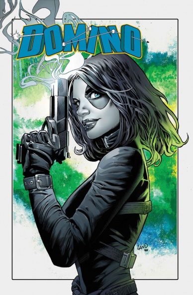
Domino #1
Written by Gail Simone
Illustrated by David Baldeon
Colored by Jesus Aburtov
Lettered by VC’s Clayton Cowles
Reviewed by Alex Curtis
Even though I knew virtually nothing about Domino up until this point, Gail Simone does a great job of introducing the sassy antihero, even if the storytelling is uneven.
The issue opens with a fairly average, uninteresting encounter with Russian gangsters and a ravenous mutant. When a writer begins a story, much less a new series or arc, the opening adventure should be exciting and grab the reader, but the action and story aren’t terribly compelling. This first scene is saved by Simone’s solid inner monologue for Domino. Luckily, by the end, I was much more invested in the main character and the mysterious story that started to unfold (even if it has a lazy cliffhanger).
Simone actually delves into the very nature of Domino’s “luck based” powers and how the heroine feels like they’re running out. This grounds an otherwise overpowered character and brings stakes and vulnerability into the narrative.
Simone gives us insight into this mercenary character, giving Domino a bold personality, as revealed by her inner monologues and antihero edge. While I’m not sure if this issue will please established Domino fans, it charmed me to no end.
I wasn’t as impressed by the side characters, who didn’t seem to be fully developed or interesting. Not that B-characters always have to be spectacular, but these particular ones are around for a good amount of the issue, and I couldn’t wait for the story to get back to just Domino and her problems.
David Baldeon’s art is a mixed bag that tips more in favor of negative. His faces are delightfully expressive and there’s something to be said about the sleekness of his pens. However, the backgrounds are frustratingly simplistic and digital, and every scene comes across as static because of the lack of artistic dynamism or composition. The flat nature of the illustrations especially slows down the opening scene, which is primarily action.
Final Verdict: 6.4 – While I’m now intrigued about Domino in a way I’ve never been before, the average story and bland art hinder the experience.

Dry County #2
Written & Illustrated by Rich Tommaso
Reviewed by Matt Sadowski
Lou Rossi’s life as a cartoonist grows decidedly more complicated as his new squeeze is kidnapped. If the first issue felt like too much of an indie romance, “Dry County” #2 creeps closer to its initial Miami noir premise.
Rich Tomasso’s simple cartooning is breezy and lighthearted in contrast with the severity of the situation. Though it’s this humorous tone that makes “Dry County” original despite its noir genre trappings. Lou finds Janet’s things scattered, her mirror tellingly cracked over a reflection of Lou’s crotch. He’s got some work cut out for him if he wants to get laid in this town. Unlike most leading men in his position, Lou is truly a fish out of water in dealing with this debacle. His reaction to the ransom note is split up into six panels across an entire page—all equally sweaty. Two squiggly lines of confusion emanate from his head, great beads of perspiration pour down his face, and his beady black eyes are wide with panic. Philip Marlowe he is not.
Continued belowEach chapter heading and narration box takes the form of Rossi’s journal scrawled out on a yellow legal pad. This choice adds a personal touch to the proceedings. Rather than a vacuous caption box, Lou’s actual notebook writing is incorporated onto the page, which draws you right in to his world.
Tommaso’s soft-hued coloring lends itself to a neon Florida feel. Setting is certainly the greatest strength of “Dry County,” and Tommaso’s heavy use of pink, turquoise, and pale yellow evokes an eighties Miami aesthetic. Lou and Rob’s investigation is, if nothing else, a way to present the greater Floridian landscape of blacktop roads lined with palm trees, orange-tinted nightclubs, and pastel buildings.
Final Verdict: 7.3 – A lighthearted pastel noir with a comic strip aesthetic, “Dry County” #2 sets up a missing person mystery in 80s Miami.

The Flash #44
Written by Joshua Williamson
Illustrated by Carmine Di Giandomenico
Colored by Ivan Plascencia
Lettered by Steve Wands
Reviewed by Alan Buxbaum
“The Flash” #44 is a great addition to the The Flash mythos. Joshua Williamson delivers on the plot (although I felt there were some issues), and Carmine Di Giandomenico’s art is absolutely incredible. They make a great team together, as I find Di Giandomenico’s art compliment’s Williamson’s amazing story telling in some of the most descriptive ways. For instance, Grodd’s look was perfect. It took the best parts of the character’s looks throughout the ages and didn’t try to make him look too different. The story’s plot also included a nostalgic nod to Crisis on Infinite Earth’s, except this time having a spin where we didn’t have to say goodbye to Barry Allen. Instead, they ended up having a similar message to Metal: those who work together are inevitably stronger.
Williamson’s ability to tie together threads in a grandiose fashion comes through in a big way in this issue. The scope of the event feels proportional to the story and what a finale of a Flash story should feel like. It was a lot of fun to see Barry duke it out with Grodd amid armageddon-like surroundings. The Flash Family also gave the story heartfelt and diverse feel to the ending. I will say that I was disappointed that all of them walked away from diffusing the negative speed storm unscathed. Williamson built the risk up in a way that felt like some sort of sacrifice was needed. It certainly did not ruin the ending, as it set up various plot points that will be developed in the future, but it did feel like a let-down.
What is lacking in Williamson’s story is by far made up by Di Giandomenico’s art. I have nothing against Neil Googe’s run on “The Flash”, but it just does not compare to the original team. The style by itself is enough to engage the audience, but Di Giandomenico’s use of it is what makes him stand out as an artist. His speed force-fight scenes make it feel as if you can’t keep track of the speedsters. This is exemplified on almost every page. One of my favorite panels is when Wally West (ginger) is looking for Iris in various parts of Central City, including a building. We see all of the various locations that Wally checks, and his speed is represented in usual fashion. One subtle touch to this is that the speed force shadows are different sizes, making it feel as if we’re seeing Wally at different distances and times. Its amazing, and only one of many great moments by Di Giandomenico.
b>Final Verdict: 7.9 – While not necessarily a book-of-the-week contender, “The Flash” #44 is an excellent read and a strong end to the current arc.

The October Faction: Supernatural Dreams #2
Written by Steve Niles
Illustrated and Colored by Damien Worm
Lettered by Shawn Lee
Reviewed By Kate Kosturski
The paterfamilias of the Allan family sure picked a good time to retire – – just when some dang kids played with a Ouija board and summoned a goat demon to their dimension, who is taking a stroll/rampage through town, immolating some townspeople and an entire church along the way. The younger Allans confront Mr. Billy Goat Gruff in a graveyard but the kids’ powers are no match for this demon, and they return home with Vivian seriously injured. Even in her impaired state, Vivian’s visions foretell more damage to innocents from the Goat Man, which sends the rest of the family off to save Gristlewood. Will there be strength in numbers?
Continued belowThis series is a vision of what Supernatural would be if Sam and Dean had a somewhat normal (by demon hunting standards) nuclear family. We don’t know much about our Demon Goat Man, though solicits for the next two issues promise that he has an ally with one of the October Faction’s oldest foes. If four issues is all we’re due of this series, Steve Niles has quite a bit of worldbuilding to do. Luckily, he can tell a story with minimal text that lets the art and colors of Damien Worm tell the rest of the narrative. We see the power of our antagonist in a full page panel of demon crows with blood red eyes, a fun and appropriately creepy homage to Hitchcock’s The Birds. Unlike the debut issue, itself bathed in dark, inky tones, this second issue uses a varied palette of tones and brightness to set mood. The colors themselves retain some of that Gothic inkiness from the first issue, but they are turned up a bit – – a metaphor to the impending good vs. evil showdown. Save for the fire in a church and scenes with Fred Allan present, the scope remains mostly cool, with purple as the base – – the color that combines red for passion and blue for stability, that symbolizes spirituality and power. The teal colors of the Allan kids’ powers also has its own deeper meaning, that of the power to heal. It’s clear Damien Worm is using color to add a level of subtext to what on the surface appears to be the standard demon fighting story.
I haven’t read the original “October Faction” series, but color me intrigued now to check it out, especially when several other interactions between characters hint at other plot threads that would be fun to explore.
Final Verdict: 7.3 – The self contained nature of this story helps introduce new fans like myself to the series, and I hope that the next two issues don’t dive too much into backstory that I missed by not reading the predecessor. The star of this show is the coloring, chosen deliberately to heighten the supernatural symbolism.

Thanos #18
Written by Donny Cates
Illustrated by Geoff Shaw
Colored by Antonio Fabela
Lettered by VC’s Clayton Cowles
Reviewed by Alexander Jones
Let’s face it, runs over at either major publisher don’t typically last very long. However, it is still disappointing when a series like “Thanos” by Donny Cates and Geoff Shaw comes around and only receives six issues. The story had so many ideas and charm naturally baked into the premise that the title should have been filled with from the very first page, to begin with. Even though the book is filled with an undeniable charm and infectious sense of humor, the story has a restrained plot with a beginning, middle, and end. Thanks to the smaller scope and direction of the comic overall, Cates and Shaw nail the landing here.
The groundwork of Thanos as a character has already been well established by Jim Starlin throughout decades of Marvel history. Cates has done a phenomenal job synthesizing the aspects that make Thanos and integrating them into a sci-fi story. Cates’s narrative as a whole wisely starts to weave together elements through the history of the hero and introduce them to the story in a dramatic, nuanced fashion. For those just interested in the character, looking for a more simplistic and engaging comic introducing you to Thanos, this is another exceptional choice.
Shaw’s pencils are full of lively action and animated characters. Some of acting from a surprise character, in particular, is especially notable and expressive. The fight scene at the end of the issue is beautifully depicted and is staged in such a way to make it feel harsh and dangerous for both parties. The final brawl also has a winner and a loser, which is a choice that a younger Marvel may not have made. The expression and level of detail on the page starts to make me wonder if Shaw is one of the rising stars at the publisher.
Continued belowAside from an impressive level of detail, the sense of violence really stands out and brings the issue to another brutal finish. Switching up the tone towards the end and closing out all of the different threads included in the story makes for a satisfying resolution to the narrative. Cates and Shaw both went out of there way to make the issue seem authentic, brutal and devilishly smart.
Final Verdict: 8.3 – Thanos” #18 Smartly closes out a wonderful arc of the series and the Thanos ongoing title. This is a fairly essential read if you interested in this character.

Tomb Raider: Survivor’s Crusade #4
Written by Jackson Lanzing and Collin Kelly
Illustrated by Ashley A. Woods
Colored by Michael Atiyeh
Lettered by Michael Heisler
Reviewed by Gregory Ellner
One of the most interesting parts of this finale to the “Survivor’s Crusade” arc is the use of an antagonist’s perspective. By focusing in on the commanding officer attacking Lara Croft during her mundane travels to one of her favorite spots to be with her father, Jackson Lanzing and Collin Kelly provide more emphasis on the heroine’s resourcefulness and ability to survive. Furthermore, by avoiding looking into her own thought process directly, readers are more capable of seeing Ms. Croft’s intellect, not unlike a Sherlock Holmes story.
As always, Ashley A. Woods provides excellent illustration, her firm, thin pencils giving an added life to the action around Trinity and Lara. Though some of Lara’s faces are a bit blank, that can be easily excused by the story focusing in on the Trinity troops instead. They would see her as some kind of emotionless killer, someone who fights to survive and nothing more, so having her give little in the way of facial expression makes perfect sense.
The colors provided by Michael Atiyeh are, as is typical of him, very expressive. From the technologically-focused green of a sniper scope to the brilliant, heroic light of Lara’s masterstroke, the focus in on the color helps to balance out some of the less-than-stellar facial expressions, even emphasizing them in a way that provides a further understanding of Trinity’s point of view.
Together, this finale is very well developed, and leaves readers waiting for the next arc, “Inferno,” in June.
Final Verdict: 8.0- An interesting finale to the “Survivor’s Crusade” arc that takes the perspective of its villains.


