
There is a lot to cover on Wednesdays. We should know, as collectively, we read an insane amount of comics. Even with a large review staff, it’s hard to get to everything. With that in mind, we’re back with Wrapping Wednesday, where we look at some of the books we missed in what was another great week of comics.
Let’s get this party started.

Action Comics #977
Written by Dan Jurgens
Illustrated by Ian Churchill
Colored by Hi-Fi
Reviewed by Gregory Ellner
Dan Jurgens’s aftermath to his ‘Superman Reborn’ arc works as a very poignant reassertion of the status quo for Superman. From Perry White at the Daily Planet to Clark Kent’s time at home with his wife and son, the overall feel of the issue seems to be one of joy and hope in spite of the sadness of Superman’s origins.
On the other hand, Jurgens shows that not all is well for the House of El, nor its successor, the Kent household. With brief scenes, he brings back older villains of Superman in their pre-Flashpoint incarnations. In doing so, he helps along the storylines first brought about in the dawn of the “DC Rebirth” era.
Ian Churchill’s artistry, mixed with Hi-Fi’s coloring, showcases the differing tone between the two types of scenarios. The reestablishment of Superman’s past is shown in full light of day, emphasizing the revelatory nature of the information after the confusion of the past. On the other hand, the elusive stranger gathering various villains has his own scenes primarily cloaked in shadow, giving an air of mystery and foreboding, allowing readers to be aware that although the past may have been reestablished, the future remains fraught with danger nonetheless.
As a whole, this issue works very well at establishing what Superman truly is: a light of hope, even if darkness may attempt to loom behind the scenes.
Final Verdict: 7.0 – An intriguing, succinct look into Superman’s history that provides an emotional jumping-off point both for established fans and for new readers.

Detective Comics #954
Written by James Tynion IV
Illustrated by Marcio Takara
Colors by Marcelo Maiolo
Letters by Sal Cipriano
Reviewed by Alexander Jones
“Detective Comics” has always been bleak, but the past few issues have integrated the Bat Family into a particularly harrowing new story laced with assassins and betrayal. This issue in particular ups the stakes of the storyline by introducing a new factor of the mythology of Gotham that changes how Batman perceives his surroundings. This new arc of “Detective Comics” has kept the series grounded and tonally intact, but still seems to be telling an ongoing serialized storyline with all the previous arcs building on top of each other. There aren’t many series today that are truly embracing serialized storytelling from issue-to-issue and seeing this comic take elements of each story-arc and roll them up into one is part of what has made “Detective Comics” one of the best books on the stands.
While the tone of this issue overall is pitch perfect, there’s a few things here about the plot itself that tests the serious nature of this comic to the limit. The Jacob Kane moment in particular doesn’t quite ring true, as a duo of new characters make the comic feel bizzare. This story is in the middle of trying to find a balance between the numerous factions in Gotham City, but eventually needs to establish who each of these characters are. There has been a major new plot development in the last few issues of the series, with so many plot issues converging in this issue, I’m not convinced James Tynion will be able to flesh out all of these individual characters when this arc of the book comes to an end.
Marcio Takara’s looser pencils are a little odd for the flow of this book that has had more strict DC house style pencilling up to this point. Takara’s style is a bit more exaggerated than pencillers of the past on this series, making the comic looser than it has in the past. While the flashback scenes in this issue retread some ground that has already been well established with Batman in the past, Takara utilizes a different style in these scenes, making them incredibly visually engaging. Takara is able to draw action well despite some of the sparse backgrounds. Even with an artistic twist in style, this issue still reads like a standard “Detective Comics” issue with the added bonus of lots of light colors juxtaposing the dark Bat Family costumes.
Continued below“Detective Comics” #954 establishes great, really tense scenes in the opening sequence and final page, but spends too much time aligning plot threads for future issues. This installment of the comic will read just fine in a collected format or for readers who are binging the series, but the odd way that the supporting cast is shuffled around and absent team members make this particular issue less than the sum of its parts. The series as a whole still seems to be on the right track with next issue promising stronger payoff with these characters. The next big moment for the Bat Family could be right around the corner here.
Final Verdict: 6.0: Browse. Tynion seems almost ready to pump the gas towards a big conflict with the current League of Shadows storyline.
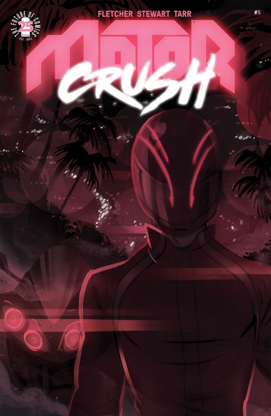
Motor Crush #5
Written by Brenden Fletcher and Cameron Stewart
Illustrated by Babs Tarr
Colored by Heather Danforth
Lettered by Aditya Bidikar
Reviewed by Nicholas Palmieri
This issue of “Motor Crush” is the most frustrating blend of creative and conventional that a comic could be.
In terms of the creative, the book has an aesthetic all its own. In this issue, Danforth’s colors in particular push the book into a visual feast as neon lights glow everywhere, eventually leading up to a trippy light-show later in the book as Domino downs multiple vials of Crush. The entire concept of the racing league is fully fleshed out too, as we see here with the officials investigating Domino’s breaking a rule. There’s plenty of creativity in the world and the art to keep me reading.
Sadly, though, then there’s the story. We move from one cliche to another, from the mysterious geometric shape wreaking havoc (maybe?) to the dark secrets kept from family members, to the tacked on, overdone trope of a last-page reveal. It’s a huge testament to the art team that they are able to take this cliche filled plot and make something so visually interesting out of it.
I honestly wonder if this book is suffering from trying to hew too close to the Image Comics formula. There are five issues in the first arc, even if it should have been shorter or longer, so the trade can sell for $9.99. It introduces just enough mysterious characters, whether they belong there or not, to pique the readers’ interest and make them come back for more. It also includes an outrageous end-of-arc reveal, no matter how unnecessary, to raise interest in the next volume. The creators seem to be following all of this closely, and I wonder if it’s preventing the story from playing out naturally. All I know for certain is that this final issue of the arc feels way too formulaic, and these creators can do — and have done — way better.
“Motor Crush,” as a concept, has great potential. The creators have invented a visually stunning world. It’s unfortunate, then, that issues like this one provide so little story-wise to get excited about.
Final Verdict: 6.0 – A great aesthetic can only take you so far when your story is this formulaic.

Rat Queens #2
Written by Kurtis Wiebe
Illustrated by Owen Gieni
Lettered by Ryan Ferrier
Reviewed by Kent Falkenberg
“Hmmm, yes. I see you’ve accomplished half a plan here. What’s next,” asks Betty, double-fisting her daggers to carve an emergency exit through the bowel lining of a winged beast that ingested her, only to find her compatriots – after a misguided and ill-executed attempt at rescue – clinging desperately to said beast as it soars higher and further from safety on the ground.
Translation: Business as usual for the Rat Queens.
Kurtis Wiebe and Owen Gieni follow through on their “Rat Queens” relaunch with another rowdy and raucous blast from Betty, Dee, Braga and the gang. And while it’s great to see Wiebe slip so effortlessly back into the rhythm and humor and camaraderie of these women, it’s Gieni who’s becoming the real monster here.
Seriously, it’s unbelievable how quickly he’s jumped into this world to make the surroundings so familiar, yet undeniably his own. With an almost painterly wash to his work, Gieni captures the essence of all the Queens, but not just in their character design. It comes across through their acting and sense of motion. From the glee on Betty’s face at her bloody escape, to the uncertainty on Dee’s face as she waves her healing charms over the gaping wound on Braga’s side, there’s always some aspect of personality coming across through the characters movement.
Continued belowAll across “Rat Queens” #2, Gieni seems equally adept at balancing nuance and scale. There’s broad sweeping panels that deliver the immensity of that beast in flight, the debris left in the wake of its crash, and a night’s drunken revelry at the tavern afterwards. But then he can zero in on the nitty, gritty like Milton’s cracked, rotting teeth and the multiple skin lesions whorling across his pasty body that make the only kind of sense for a smidgen who’s been living in the literal belly of a beast for god knows how long.
Although Wiebe’s script gives him all manner of high fantasy insanity to dabble in — zombies included —Gieni’s aesthetic never comes across as typical swords and sorcery fare. For that matter, it never comes across as straight comedy either. It’s look is just off-kilter enough to match the tone of the writing. I’m not sure if “Rat Queens” #2 is a funny little adventure or an adventure that’s a little funny. But I’m damn sure that Wiebe can write great action. And when he brings the funny, it comes with heart and a wicked sense of humor.
So let’s close with that. Because for as great as this book looks, it just rollicking fun from one set piece to another. There’s tactical cowardice from the leader of the Cat Kings, gut economics, and an unprecedented success rate in the drunken raising of the dead.
Translation: Business as usual for the Rat Queens.
Final Verdict: 8.0 – Please let this be the year that fucktart makes it into the dictionary.
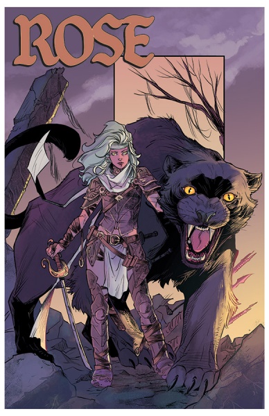
Rose #1
Written by Meredith Finch
Illustrated by Ig Guara
Colored by Triona Farrell
Lettered by Cardinal Rae
Reviewed by Matt Lune
“Rose” #1 feels exactly like the first chapter of a fantasy should. That’s not to say it’s predictable or that it’s all been done before. Sure, there are some familiar fantasy beats that are struck: the setting is a world where magic has been wiped out and darkness has fallen on the land; a lead character who is more than she seems; the villains on a hunt for the protagonist in order to eliminate her magical potential; a tragedy that sets the hero on her journey; dashing rogues and a hopeful rebellion. Yet there’s a heart and a spirit to this first issue that makes any leaning on tropes instantly forgivable.
Protagonist Rose has the powers of a Guardian (those that, along with the mythical Khats, were the embodiment of magical justice in the land) and her journey will be to unlock her true potential and to overcome Drucilla, her polar opposite and central villain of “Rose” #1. To further accentuate this opposition, themes of family and of upbringing come into play; the only person we see Rose interact with at first is her mother, and their bond is evident, whereas Drucilla talks to the corpse of her father, almost taunting him with how much she has achieved despite his lack of faith in her when he was alive. It’s this dichotomy between these two women that will be intriguing in this book moving forward, and especially Drucilla’s motivations (it’s telling that Drucilla and Rose are the only characters to get text boxes exploring their thoughts.) In fact, there are a wealth of fascinating characters in “Rose” #1, and if this first issue is anything to go by, the development of the cast, their motivations, and purpose, will be the engine that drives this book.
It’s easy to say that the art is gorgeous, but Guara and Farrell have taken every effort to build a world around Finch’s words, investing the time and detail to make this a fantasy world that lives and breathes. The colors throughout are vivid and clean, yet there’s a scene in the forest where it brings the page to life, the shadows of the leaves in trees above almost dancing off the character’s forms.What’s more impressive, however, is the character design. Every main member of the cast has a distinctive look that tells its own story. It’s not unusual for female villains to ooze sexuality, and while this could be true of Drucilla under a lesser art team, here she’s portrayed as fully in control, with a frightening edge and powerful aura that extends beyond the norm. Her second in command, Sir Dante, is a man clearly used to being the most powerful man in the room, his outfit one of a hardened warrior, yet in the presence of his queen, he is reduced to a helpless puppet.
Continued belowThere’s a sense of the familiar about “Rose” #1, but scratch the surface and there’s a depth of character and an engaging potential that will make this an enjoyable book to follow along with. There’s enough here to tease the greater whole, especially with the supporting cast, to set this apart from its peers, and a sumptuous dedication to both design and world-building to keep you coming back for more.
Final Verdict: 7.0 – An engaging, traditional fantasy with the promise of an epic in the making.

Seven to Eternity #5
Written by Rick Remender
Illustrated by Jerome Opena
Colored by Matt Hollingsworth
Lettered by Rus Wooton
Reviewed by Michael Mazzacane
While not the best place to jump on to, “Seven to Eternity” #5 sets the book on to the next arc with strong footing. Despite their serialized, episodic, production it can be hard to find a single issue that reads like a satisfying unit of storytelling. Yes, the obligatory cliff hanger can end the experience with a jolt and issue 5 ends with quite the splash page. But, it isn’t a shocking moment that is supposed to make you question what comes next, instead it is the answer to the thematic question of the issue: will this crew work together when the chips are down? Rick Remender and the art team of Jerome Opena and Matt Hollingsworth do a perfect job hanging this issue on that question.
On the lonely road with the God of Whispers in chains, that would make Hannibal Lecter squirm, the tensions and little instances of discord that generally occur on road trips become amplified … and that’s before their prisoner’s daughter shows up. That slow ratcheting of tension, partly driven by Adam’s own internal questions about his own actions and desires, becomes a forum through which to question the overall efficacy and potential righteousness of this motley crew Mosak Knights. Remender isn’t letting anyone off the hook, allowing Adam and company some level of comforting discomfort at the death of an enemy they barely knew and old friends.
That state of ambivalence is a tough emotion to crack, it relies on body language, gestures, a general sense of naturalism. Which is perhaps, a bit, oxymoronic given the supernatural setting of “Eternity.” Opena’s art, however, does an excellent job of hitting those beats. He renders Adam in a continual pensive stare as they travel down the road. Opena fits in so many little lines that emphasize and lead the eye to the right emotional spot. His designs continue to be a refreshing take on fantasy that read like golden age sci-fi with modern sensibility. In particular, the “montage page” with its use of maps and creatures providing another brief glimpse of the world as well as lean into the pulpy sensibilities, Remender’s independent work tends to play in. Matt Hollingsworth’s earthy color pallet and color blending is the secret glue that ties the design together. His blends give everything a sense of depth and wholeness as shades slowly blend to one another depending on the light source.
Letterer Rus Wooton deserves recognition for their contribution this issue. There is the differing fonts used to represent the dislocating powers of Penelope and the ability to use lettering to make some gallows humor out of experiences. Both of which are a nice touch for an issue that could otherwise be a bit dour without them.
Final Verdict: 8.0 – “Seven to Eternity” continues its journey with an engrossing first issue to their next arc.


