
There’s a lot to cover on Wednesdays. We should know, as collectively, we read an insane amount of comics. Even with a large review staff, it’s hard to get to everything. With that in mind, we’re back with Wrapping Wednesday, where we look at some of the books we missed in what was another great week of comics.
Let’s get this party started.
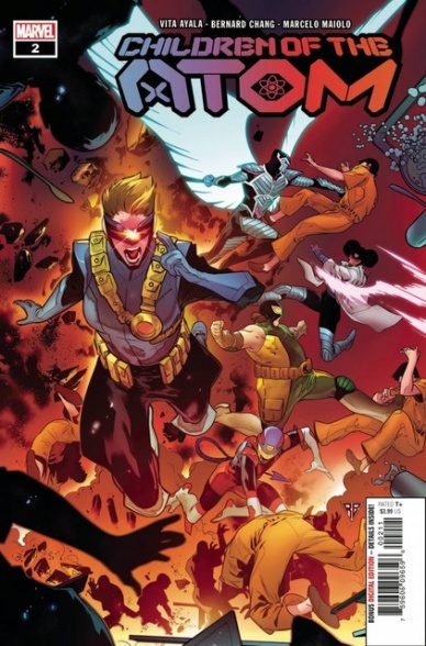
Children of the Atom #2
Written by Vita Ayala
Illustrated by Bernard Chang
Colored by Marcelo Maiolo
Lettered by VC’s Travis Lanham
Reviewed by Alexander Manzo
“Children of the Atom” continues its story of a collection of young teenagers not only trying to find their way in life, but in this new world where most mutants go to Krakoa but they are unable to. Vita Ayala tells a story that really highlights the emotions and thought behind their small band of misfits and trying to help protect their city. There is an underlining tone for these teenagers just trying to do their best with the very few items they have, along with their powers, and emulating their heroes of the X-Men teams.
Ayala juxtaposes a teenage life trying to see a concert and teenage vigilante life helping others. There’s a really fun quality of trial-and-error that brings a refreshing quality to a normal superhero storyline where the reader questions why the hero is not beating the villain. In this story, the reader knows why they won’t succeed but still roots whole-heartedly, especially given that they not only do not have anyone to really teach them the ropes but would rather stumble than accept a helping hand.
Bernard Chang draws crisp lines for the characters and settings, sparing no detail on the plants from Krakoa to the attacks during the fight scenes. However, the perspective during the fight did seem confusing: are people avoiding attacks or actually being hit? Even after several reads and looking closely, it can be unclear.
Final Verdict 7.9 – This issue continues to build on the emotions and motivation of the characters, but follows a very similar formula as the first issue.
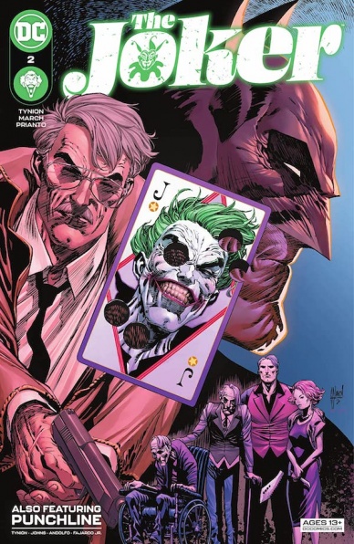
The Joker #2
Written by James Tynion IV
Illustrated by Guillem March and Mirka Andolfo
Colored by Arif Prianto and Romulo Fajardo Jr.
Lettered by Tom Napolitano and Ariana Maher
Reviewed by Gregory Ellner
Not unlike the similarly Joker-related “The Batman Who Laughs” miniseries, while there is focus on the Joker in “The Joker” #2, James Tynion IV seems content to leave most of the storytelling to the world at large in Gotham. Instead, he concentrates most of the focus (barring a few pages) on Jim Gordon. The result is rather interesting, but perhaps is close enough to him that it could be construed as a James Gordon comic, rather than one centered around the Clown Prince of Crime. Tynion focuses on Gordon’s moral quandary, as well as his relationship with several important people in the Batman franchise, all while giving the Joker some spotlight, albeit not an extensive amount. Similarly, Tynion’s writing on the backup story for Punchline alongside co-writer Sam Johns concentrated on various people, but the villainess herself did not even do anything on-panel (in the present day), with the focus instead on several other people, including those who fans of Scott Snyder’s run on the “Batman” comics may find familiar. The result is a story that may not be what people came in to find, but isn’t exactly worse for it either.
Guillem March has some extensive work under his belt, and the pencils on “The Joker” #2’s main story show he is not losing his touch. The pained expressions on Jim Gordon’s face, the maniacal grins of the Joker himself, shock from various other characters including the normally stoic Batman, all make the dark grit of such a story work better. At the same time, the smoothness of the art works well with the grit, enabling a similar style to function in a holiday resort or the streets of Gotham City.
Meanwhile, Mirka Andolfo’s style is a lot more animated for the backup story. As various people try to hunt down Punchline, the wild waving and quick movement are shown quite clearly by all comers, the fact that most of the issue is in broad daylight enabling it to be all the more entertaining and different from the usual “Batman” fare.
Continued belowThe colors on the main story provided by Arif Prianto further emphasize the two different locales without detracting from the art on either. Much of the palette is dark, with dim greens, blues, and the like, giving the overall feeling of a Gotham night be it indoors or outside. Other parts are much brighter, those around the Joker especially. The eponymous villain himself is colored in a pale, uncanny style that almost feels inhuman, furthering the idea of him being some kind of monster that needs to be taken down.
On the other hand, Romulo Fajardo Jr.’s colors on the backup story are much livelier. Even when the action is in the dark, it feels brighter, and the various characters all are given far brighter palettes over all. The effect is that the characters, and the story, feel more like a story is just fun, rather than horrific or hectic.
Final Verdict: 7.5 – While not a story centered on the Joker as its protagonist, there is enough to entertain many Batman fans, especially those from the Scott Snyder era.

Locke and Key Sandman Universe #1
Written by Joe Hill
Art by Gabriel Rodríguez
Colored by Jay Fotos
Lettered by Shawn Lee
Reviewed by Conor Spielbrg
When a comic book series combines two popular two pre-existing properties into one story; its greatest strength and selling point is also its greatest weakness. It almost goes without saying that the story is more enjoyable if you have read “Locke & Key” or “Sandman” or ideally, both.
That being said, the first issue doesn’t let that fact get in the way of telling their own story in the parameters they have. Set in 1927, Gabriel Rodriguez makes use of the period through his artwork before we are whisked away to the land of Dream. In the land of Dream, there is an established sense of the fantastical and the horrific permeated throughout. Everything we see in the land of Dream evokes a sense of wonder or terror if not both.
Joe Hill adds to these visuals by injecting a dark sense of humour with these gothic elements or a dramatic moment in the more character focused parts of the issue. The fantasy/horror artwork by Rodriguez paired with the comedy/drama of Hill’s script leaves the issue feeling reminiscent of Dante’s Inferno, Alice’s Adventures in Wonderland, or a good Tim Burton movie in a way neither “Locke and Key” and “Sandman” never did.
While somewhat comfortable for Morpheus to inhabit, the main character Mary Locke makes it clear that she is out of her depth in this strange place.This gives new readers an easier time to figure out everything while she does with them. Rodriguez does a masterful job at distracting the reader with beautiful visuals that elevates the necessary exposition Joe Hill must get through to catch people up with the premise
The sense of mystery and intrigue is what made both series so great is present in the crossover; but there is too much for the creative team to establish to get that same sense of mystery found in “Locke and Key”.
There is dark humour to be found and reference points for fans, but what’s impressive is that it never loses sight of the elements of horror that made “Locke and Key” so compelling. “Sandman” as a property is simple yet complex and therefore makes a good dancing partner for a cross over. But putting an unknown member of the Locke family in the land of Dream brings out the best of both IPs in a strange but welcome story.
Final Verdict: 7.6 A strangely coherent crossover with tons of potential to build on in the following issues.

Scout’s Honor #4
Written By David Pepose
Illustrated By Luca Casalanguida
Colored By Matt Milla
Lettered By Carlos M. Mangual
Review By Henry Finn
After three solid issues of world building and character development, the fourth installment of “Scout’s Honor” takes an upward trajectory in both dynamic action and philosophical musings. David Pepose does a great job of packing plot twists throughout the 22 pages with ample character development as well. The political and religious undertones that permeate the entire series never wanders into the territory of being preachy. Rather, these things are essential to the character development of our protagonist Kit. Who, by the way, is a total badass.
Continued belowThe series is a magnificent blend of politics, religion, science fiction, and action-adventure. Scout and Dez are (now) former best friends and confidants turned mortal enemies by way of opposing interpretations of the same ideology. The deeper meaning of the entire series is verbalized by the end of the book and the sense of Kit’s eventual destiny is down-right biblical and on par with real-life figures Joan of Arc, Marcus Aurelius, or William Wallace. Despite the fact Kit exists in a totally imagined sci-fi world, the plot and character motivations feel deeply motivated by events that have happened in our past.
Luca Casalanguida textures almost every page with striking shadows and tasteful splashes of ink. He excels at packing each panel with clearly motivated body language and facial expressions. This has the effect of sucking readers into the action and also the drama whether caught in acidic rain or battling a terrifying wasteland creature with a make-shift bow.
Casalanguida and colorist Mike Milla make for a powerful pair. Milla’s simple but tasteful approach to hues adds striking emotions to Casalanguida’s negative space and bare-bones backgrounds. The lettering in the series also deserves a spotlight for perfectly matching Casalanguida’s brush style and is dynamically placed to add scale and motion to the action.
All in all, the writing and art marry together beautifully to serve readers an epic story of faith and redemption with modern sensibilities unlike any other we’ve seen in a while.
Final Verdict: 9.5 – “Scout’s Honor” is one of AfterShock’s best titles and deserves a follow until the end.

Spider-Man: Spider’s Shadow #1
Written by Chip Zdarsky
Illustrated by Pasqual Ferry
Colors by Matt Hollingsworth
Lettered by Joe Caramagna
Reviewed by Quinn Tassin
“What If?” Is back and better than ever with Chip Zdarsky and Pasqual Ferry’s “Spider-Man: Spider’s Shadow” #1. Rather than retelling origins or classic arcs in the span of a one-shot, Zdarsky and co. are opting for a miniseries which already seems to be paying off. In this debut, we get a thoughtful introduction to a world in which Peter Parker ends up being corrupted by the symbiote that became Venom in Earth-616. Zdarsky makes a smart choice in not making the symbiote’s power so alluring as to turn Peter bad. Instead, he just makes Peter hold on to it a little too long. He goes a little too far in a fight against Hobgoblin and Aunt May’s life ends up being the cost. Peter isn’t driven by righteousness but by fear and that’s innately compelling. Peter losing touch with his humanity is a deeply destructive coping mechanism, not just a hypothetical where he likes being powerful.
Pasqual Ferrry and Matt Hollingsworth do broadly good work together. The parts that land really land but there are lots of smaller moments that leave something to be desired. By far the weakest aspect comes when the colors seem to just be splotches across people’s faces and not, y’know, lighting effects. The whole scene with Peter and Mary Jane in Peter’s apartment is just a mess in that department and it’s just plain weird to look at. There are also moments where the symbiote suit just lacks any kind of definition and it looks like Spider-Man doesn’t have a neck…or even a lower half of his head. That being said, there are plenty of beats that are great, particularly the two encounters with Hobgoblin, for instance, really shine. They’re lively and you can feel every punch and explosion through the page. The second fight in particular uses body language and visual pacing masterfully.
“Spider-Man: Spider’s Shadow” #1 is a confident, intriguing start to a new kind of “What If?” comic. Zdarsky has proven that he can write Spider-Man well and it all signs point to a grounded, thoughtful story being told. Seeing how it plays out is sure to be a treat.
Final Verdict: 7.6- “Spider-Man: Spider’s Shadow” #1 is a promising, dark, and very coolness beginning for “What If?”


