
There’s a lot to cover on Wednesdays. We should know, as collectively, we read an insane amount of comics. Even with a large review staff, it’s hard to get to everything. With that in mind, we’re back with Wrapping Wednesday, where we look at some of the books we missed in what was another great week of comics.
Let’s get this party started.

Written and Illustrated by Michael Avon Oeming
Colored by Taki Soma
Lettered by Shawn Lee
Reviewed by Alexander Jones
Comics have a long history with pulp heroes and seeing a seasoned creator like Michael Avon Oeming pay homage to a pop culture icon like noir hero Dick Tracy is a novel idea. In “Dick Tracy Forever” #1, Oeming uses his talents as a comic book writer and illustrator to portray a fascinating vision of his version of the character. Tracy is the same archetypal noir hero the average reader would expect, but Oeming utilizes his relationships and various genre elements to capture engaging sequences with the hero.
Oeming is able to perfectly meld the writing with his art and capture the most interesting layouts and ways to frame a scene. At times, writers who illustrate have a bad habit of adding too much dialogue to the entries. Oeming does an excellent job adding just enough information to get a scene started. The most perplexing aspect of the narrative is how the comic book is framed. It is odd seeing three different chapters integrated into one issue. However, getting shorter stories with the character is a clever idea to play to Tracy’s strengths. I still wish these stories were better connected or had a stronger reason for the odd structure.
Oeming has an excellent grasp on the visuals of Dick Tracy. Oeming almost makes each page look effortless with his rigid linework, but when you break apart the page, the technical aspects of the illustrations start to shine through. Certain panels and sequences are dimly lit, obscuring details of the page and drawing mystery to the reader. Taki Soma’s vibrant colors fill in the detail left by Oeming’s pencils as well. Arguably the most thrilling artistic chances of the issue are taken in the puzzle sequences. The crosswords and mazes show off just how wild Oeming can possibly interpret his pencils on the page while maintaining a sense of logic with the story.
Lots of comic book writers aspire to tell stories about pulp heroes and few are as memorable as “Dick Tracy Forever” #1. “Dick Tracy Forever” #1 contains a classic, nostalgia-fueled Tracy stories full of memorable supporting cast members. Fans of the property will be treated to an honest, yet original take on the hero. Oeming’s pencils and script show an impressive level of cohesion and clarity across several different stories.
Final Verdict: 8.0 – “Dick Tracy Forever” #1 is an expertly written and drawn adventure into the world of a noir icon.
Written by Ryan O’Sullivan
Illustrated by Andrea Mutti
Colored by Vladimir Popov
Lettered by Andworld Design
Reviewed by Gregory Ellner
As a disclaimer, when “the writer” is noted, it means Henry Henry, not Ryan O’Sullivan.
O’Sullivan’s writing reaches into the depths of dissociation with “Fearscape” #5, drudging the depths of an unreliable narration to the point of, rather than just dishonesty, outright delusion. Henry Henry’s actions are painted as “justified” or “heroic” in the words, but the writer’s own behavior belies the truth, making for such a disconnect between the “voiceover” and the images that the comic itself seems to suffer from mental illness. In demanding that the reader accept that the writer’s nemeses are merely acting for an unseen audience, what was once a mere trick of a thoroughly despicable person instead delves straight into utter psychosis.
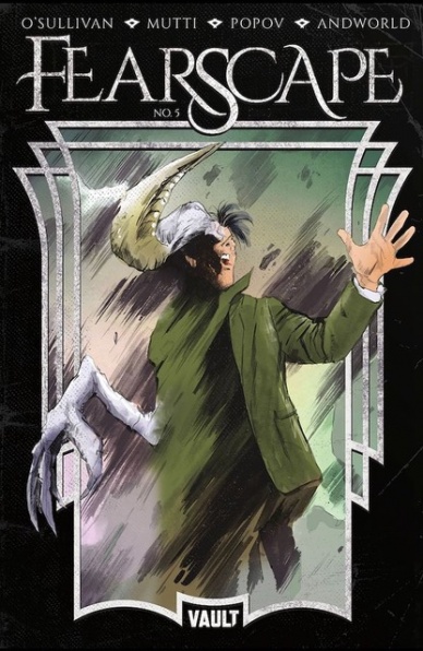
Andrea Mutti’s artwork helps to sell the air of a psychotic comic book, with his imagery acting in such contrast to the narration that it appears to be experiencing a civil war against itself. On the one hand, we have denial versus reality, in how explanations are drawn out physically while O’Sullivan’s script denies their existence. The art also utilizes a blurring effect rather well to make for an effect of being separate from reality, on top of using it to make an even more realistic imagery from the sharper lines more prominent in Mutti’s artwork.
Continued belowVladimir Popov’s colors help to complete the image. A discoloration of wet blood versus more solid surfaces is made all the more notable by the varying gradients on different amounts of said substance, on top of effective use of shading. A bright yellow is used for the Muse, whereas darker tones are used in the Fearscape. The colors are all the more prominent in the climax, where a dark shading on Henry Henry helps to highlight his utter madness in contrast against near-silhouettes coming behind him and other, brighter images near even those.
Final Verdict: 8.5 – “Fearscape” #5 brings the first arc to a close with intriguing, literally psychotic storytelling.
Written by Tini Howard
Illustrated by Amilcar Pinna
Lettered by Jeff Powell
Colored by Ulises Arreola
Reviewed by Christa Harader
“Forgotten Queen” #3 continues this mini’s trend of too much, too fast in terms of plot and some strange art choices.
Howard’s writing is too chaotic to make this and the previous issues come together. As we cut back and forth between the sinking ship and the conflict with Unity and Vlad, Howard’s dialogue doesn’t track well and the plot blurs together. Taking a few points out of the script and dialing in the drama in chosen scenes would help sell Vexana as a formidable character because there’s almost too much evidence of how destructive she is to take it seriously. Gilad calling Vexana a witch doesn’t seem out of the ordinary, as it’s repeated often in previous issues, but for some reason, this is the one that sticks. We can chalk it up to her finally losing her temper, perhaps, but the seeds of this climax are buried too deep under other plot points to really pop.
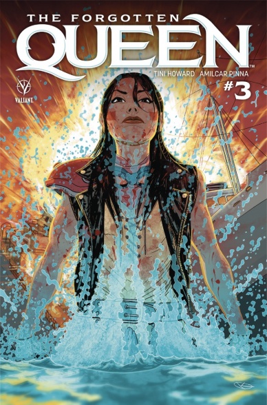
Pinna uses an unpleasant fisheye effect to fit in intricate backgrounds and large spaces. Facial details in insets are beautiful but appear stretched or weirdly elongated in other panels. A few more head-on shots would serve “Forgotten Queen” well because the angles used are far too extreme. Pinna’s line is fine and precise, which means these perspective issues rub more against the grain of the comic than if the style trended toward cartoonish. A little more grit and a rougher line would serve the chaos and make it seem more intentional and stylized. Arreola’s colors are solid, with some nice details in character costumes and some attention paid to texturing in the simpler backgrounds. There’s also some nice watercolor detailing in the ocean scenes.
Powell’s lettering is standard, with minimal padding in the balloons and a readable font. Whether the choice lies with Howard or editorial to censor the cursing, the effect becomes annoying given how often it pops up. Powell does a good job in smoothing the edges and integrating the symbols into the rest of the text, but it stands out nonetheless.
Overall, “Forgotten Queen” #3 moves at a fast pace through its action, at the expense of some real character development or a breath to take in the breadth of Vexana’s experiences or her loneliness. The book is thematically cluttered and confusing, and with some craft issues on the page, it’s a disappointing read.
Final Verdict: 5.0 – “Forgotten Queen” #3 struggles with art issues and fast-paced plotting that ultimately leaves readers behind.

Written by Bobby Curnow
Illustrated by Simon Gane
Colored by Ian Herring with Becka Kinzie
Lettered by Chris Mowry
Consulted by Takuma Okada
Reviewed by Tom Shapira
IDW’s publishing line continued to be as erratic as ever with the lunch of this new horror mini-series. I guess it makes sense, “Locke and Key” it probably still their strongest property that isn’t on a lease from Hasbro, but these days you’d expect it to be part of some sub-imprint like Black Crown; yet here it stands – alone.
When I call it a ‘horror’ series I mean more in trappings of the genre than in actual feelings it evokes – there are ghosts (as in the title), there’s a creepy tree (also in the title) and a mysterious robed figure (on the cover, not in the title). The actual goings-on are rather milquetoast – half-Japanese Brandt returns from America to his grandfather’s house ten years to the day the old man has died, partly out of a half-forgotten promise and partly to escape his marital issues. There he meets old relatives (alive) and even older relatives (dead, but still chatty).
Continued belowI am grateful that book doesn’t push the Japanese-horror-is-mad-weird-bro button too much, it takes the characters and setting in face-value without trying to make them feel ‘exotic;’ but in the attempt to avoid the expected J-horror clichés “Ghost Tree” swings too much to the other extreme. Not only is it not scary, it’s pretty boring. It doesn’t really help that the last third of the issue spells out the metaphor of ghosts and old homes in a way that rather sucks the mystery from the story.
Simon Gane proves rather apt at the family-drama and character-acting aspects of the story, there’s a nice silent short exchange on the plane involving peanut packets. But his work, and also that of colorists Ian Herring with Becka Kinzie, is rather like furnish here: finishing this issue I just don’t get the urge to read-on anymore.
Final verdict: 5.0 – been here, done that.
Written by Tom King
Illustrated by Mitch Gerads & Travis Moore
Colored by Mitch Gerads
Lettered by Clayton Cowles
Reviewed by Elias Rosner
Spoilers
“Heroes in Crisis” #8 is not good comics. There is little about the narrative, the characterization and the events that pass any kind of muster when it comes to being an effective realization of the themes of “HiC.” We learn, rather abruptly, finally, who caused the massacre at Sanctuary, how it was done, and why. We learn why it was that Wally’s body was five days older than the rest.
We learn why Wally West killed all the heroes he was with.
The details of how he made Harley & Booster, as well as us, see events differently are unimportant, as it’s waved away with a bit of technical jargon with the hope that we won’t question it too hard. But that is not what makes “Heroes in Crisis” #8 fall apart under the weight of its own narrative; what makes it collapse is the insistence on stripping every characterization and personality away from these characters OTHER than trauma as well as the choice to tell it all in narration over a repetitive panel structure, thereby sucking the power out of each snapshot.
Replace the personal details, and every line of dialog Wally West says could have come from any of the heroes shown in the Moore drawn montage or even the trinity in previous issues. It is a lifeless explanation that feels rote, trying to be deeper than it is, and trying hard to explain Wally’s trauma, rather than show it, thereby lessening the eventual tragedy that results of him finally succumbing to the weight placed upon him by the other heroes and us, the audience. We were treated to a distraction in the form of a murder mystery that wasn’t, as lampshaded by Wally himself.
It’s insulting and shows a contempt for the audience that does not feel intentional but is there nevertheless. It excavates King’s larger misunderstanding of who Wally is and what motivates him as well as bringing into relief just how little we know about how Sanctuary was supposed to work.
Moreover, the structure of the series made certain that there was never a chance to get a grasp on who these characters were before their untimely death, cheapening it all, and making each new repetition of us watching them get killed all the more gratuitous and unearned. This moment was unearned and try as Cowles, Gerads, and Moore might, their contributions cannot save a narrative that has not earned the powerful presentation that’s been rendered.
Final Verdict: 2.0. – One more issue to go.
Written by G. Willow Wilson
Illustrated by Christian Ward
Colored by Christian Ward
Lettered by Sal Cipriano
Reviewed by Gustavo S. Lodi
Fantastic science-fiction stories are a very hard act to juggle. On one hand, the genre lends itself, and expects, new setting situations and mysteries to unravel under a believable set of rules, often offering parallels to actual current day topics. On the other hand, it must also feel alive with characters the audience can relate to, and act as narrative threads to the new world and plot being presented.
Continued belowBased on its sophomore issue, “Invisible Kingdom” #2 succeeds on the first portion of this equation but fails on the second one. The concepts, settings, and visuals it presents are certainly complex and compelling, but the manner the characters go through all of it leave little space for emotional connection and clarity.
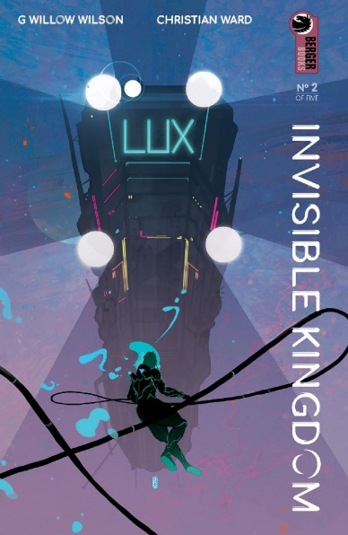
Getting the obviously positive out of the way first. Christian Ward is absolutely at home with this story, and it shows. His visuals – which readers might recall from the great work done for Marvel’s “Black Bolt” – shine on every page, be it on the portrayal of new worlds, character designs or imaginative use of the color palette. No place looks the place, and yet this universe feels cohesive on its larger canvas.
In terms of world-building, it is interesting to see where Wilson is taking broader themes forward. There is plenty of internal politics, discussion of one’s place in the world, and of rebelling against a set destiny for the heart’s true desire.
However, it is on this complexity, and on the lack of stronger characters to anchor the audience that “Invisible Kingdom” falls short. Instead of experiencing the story through the leads, it rather seems this series forces the plot upon them, and then watches their reaction to it. While a valid approach, it does not come across as particularly strong on this second issue. Comparing this to “Saga,” for instance, could be a manner of explaining how ‘characters first’ sometimes is better.
Final Verdict: 6.9 – Despite a complex world and gorgeous visual, “Invisible Kingdom” #2 fails to become truly compelling due to the lack of focus on characters and their emotional reactions, instead of moving the pieces incessantly from place to place.

Written by Kelly Thompson
Illustrated by Oscar Bazaldua
Lettered by VC’s Joe Sabino
Colored by Frank D’Armata
Reviewed by Michael Govan
The X-Men may be hated and feared inside the Marvel Universe but outside, we love them. Each of the gifted youngsters are astonishing in their own way. I truly do love Rogue and Remy both…but not so much this series.
I don’t exactly know where the disconnect is. Maybe it’s the featured characters. I like Mojo as a comedic character but there isn’t much room for comedy here. As a villain, he could really have been replaced with anyone else this issue. Spiral has a lot of arms, I’ve never gotten anything from her beyond that.
The titular Mr. and Mrs. X are great in team books, it’s always great to see them on a roster and interacting with their fellow X-people. However, the characters revisit very familiar territory in this issue. Rogue’s powers have gone through yet another change, something we’ve seen several times in the comics and other media. The southern belle took Carol Danvers’s powers, she’s lost her powers, increased her control, etc. In two or three years, it’ll be something else. The end of the issue reveals that Remy has to return to his New Orleans home and is up to some more shady business with his father popping up. Again, nothing we haven’t seen before.
Maybe it’s the creative team. Oscar Bazaldua draws very dynamic action sequences but there are some inconsistencies. The expressions and proportions are odd in some panels. In one particular panel, Gambit and Rogue kiss and their lips literally seem melded together. It gets weirder the more you look at it, seriously. On one hand, writer Kelly Thompson pens the couple as very much in love, which is nice. On the other, the flirty banter leans toward the annoying side in this issue. Kelly Thompson is a great writer (her fantastic take on Jessica Jones has been my favorite since Bendis’s original run on “Alias”) but her Rogue and Remy isn’t for me.
Final Verdict: 5.0 – The southern belle and swamp rat fall flat.
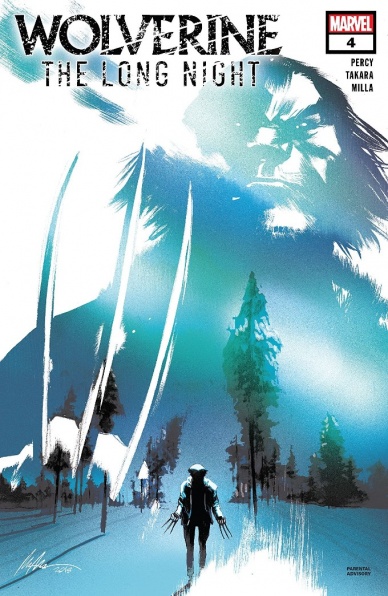
Written by Benjamin Percy
Illustrated by Marcio Takara
Colored by Matt Milla
Lettered by Joe Caramagna
Reviewed by Matt Ligeti
“Wolverine: The Long Night” is an adaptation of an audio drama podcast based around the beloved Marvel character, Wolverine. It’s uncertain if this takes place in the main universe or in its own continuity since it’s a standalone story without any of the traditional milestones, like which “Wolverine” suit he’s wearing (with the exception of a brief glimpse of the past), to act as a guide.
Continued belowWriter Benjamin Percy takes a fairly strict approach to the adaptation from the audio drama script. In some ways, the comic is better, adding visuals to match the narrative and making up for the podcast’s uneven voice acting. But, in other ways, this adaptation suffers. Things best left to the imagination built off sound as the only stimulus, feel less impactful and more contained.
We lose a little of the “noir” tone the podcast had, too, which helped give it its unique voice. Colorist Matt Milla brings a bit of that moody genre attitude in “Wolverine: The Long Night Adaptation” #4 by casting the world an overcast light and a dark palette. If Joe Caramagna had a little more room to draw out the longer character monologue, it would help match the noir-style pace of character speech captured by the podcast, but Marcio Takara leaves too much room for dialogue in some panels and too little in others.
You get the point. As an adaptation, it loses a lot of the source material’s magic in translation. But what about as a comic? What if you just picked up this issue without realizing it was a podcast in the first place? Well, “Wolverine: The Long Night Adaptation” #4 is the penultimate issue in the 5-issue miniseries, so this isn’t the best place to start. So many plot points lose their gravity or meaning without the context of the previous issues as lead-up. Even with the description on the credits page, readers will likely feel lost picking up the series with this issue.
All that being said, Benjamin Percy makes an already set-in-stone story fit a 5-issue miniseries. Takara’s line art brings a dramatic essence to the page. Milla brings tension and sadness to the book’s tone with its heavy, borderline eerie color work and Joe Caramagna finds elegant caption and bubble solutions to make sure no reader gets lost with the comic’s heavy dialogue and multiple speakers. That should count for something. “Wolverine: The Long Night Adaptation” #4 isn’t a poorly made comic, but it’s far from compelling.
Final Verdict: 5.0 – A mediocre adaptation of a moderately interesting podcast makes for a Wolverine comic that feels as if it’s been declawed.


