
There is a lot to cover on Wednesdays. We should know, as collectively, we read an insane amount of comics. Even with a large review staff, it’s hard to get to everything. With that in mind, we’re back with Wrapping Wednesday, where we look at some of the books we missed in what was another great week of comics.
Let’s get this party started.

Batman and the Signal #3
Written by Scott Snyder and Tony Patrick
Illustrated by Cully Hamner
Colored by Laura Martin
Lettered by Deron Bennett
Reviewed by Gregory Ellner
As the Signal’s debut miniseries as a hero in his own right concludes, Scott Snyder and Tony Patrick create a fun story, but one held back by a pretty significant cliché.
The Signal himself proves to be effective and distinct from other heroes in Gotham of late, focused in on metahumans instead of those who are the subject of some kind of accident or another (as in, focused in only on those with a mutant genome of some sort), but his final opponent, the mysterious Gnomon, falls prey to a specific problem that renders our hero cheapened as a result. The revelations about Gnomon’s more direct connection to Duke Thomas suddenly make the conflict lose all suspense, all sense of urgency, due to it all just turning into a beat-by-beat replay of an age-old story, and not even in a particularly interesting way.
On the other hand, the artwork is pretty well done. Dynamic artistry allows Cully Hamner to turn a rather stereotypical story into a more fun fight for survival that plays out in a traditional “Year One” hero scenario. Where Gnomon is kind of boring in his powers and connections, he is nonetheless intriguing in his menacing presence despite the deliberately daytime scenario.
Adding to that presence and the overall action-movie feel of the whole story is Laura Martin’s coloring, which emphasizes yellows, sky blues, and soft oranges to contrast against the oppressive nighttime atmosphere of Gotham City while not directly taking away from the seriousness of the scenario either.
Final Verdict: 6.5- While the artwork and colors are lively, “Batman and the Signal” #3 hinges on a particular cliché that drags the whole issue down and was largely unnecessary.
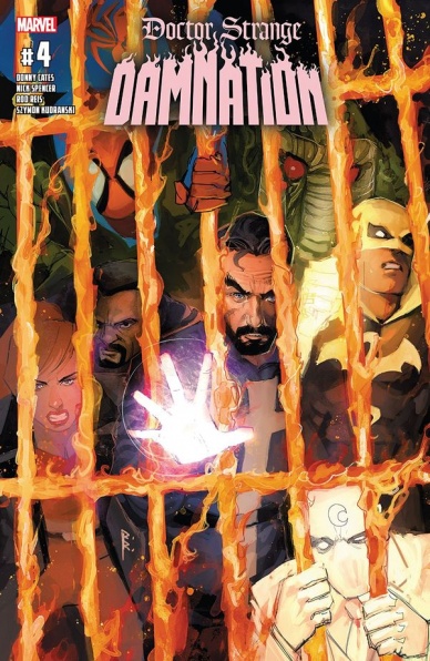
Dr. Strange Damnation #4
Written by Donny Cates and Nick Spencer
Illustrated by Rod Reis and Szymon Kudranski
Colored by Rod Reis and Dan Brown
Lettered by VC’s Travis Lanham
Reviewed by Alexander Jones
The most unlikely heroes of the Marvel Universe have teamed up to take on one of the deadliest antagonists around, Mephisto. Unfortunately, the heavy-hitters are out of commission prompting the team oddballs making up the ranks of Damnation dubbed The Midnight Sons which are called into action. Unlike most Marvel events and crossovers, “Dr. Strange Damnation” only happens to be four issues long, so the tale comes to a really fast conclusion but seeing the final fight between Marvel’s resident dark magic weirdos team up against Mephisto and his final ranks still makes for a highly entertaining comic.
With the tense narration boxes and a large number of heroes on the roster, the story still carries a fairly epic scope. Wong definitely exudes a strong personality in the narrative which is perpetuated his motivations leading towards assembling the team in the first place. The chapter does not push the hero back to the status quo, as readers will likely to start to understand what makes Wong interesting outside of the context of Dr. Strange. Writers Donny Cates and Nick Spencer also mix-up the status quo a number of times with a few fascinating twists and hints at humor as well as an unexpected sense of heart despite the story’s dreary setting.
Artist Rod Reis is an acquired taste with his abstract linework and unique brand of colors. His art translates well to the dark, supernatural hellscape of “Dr. Strange Damnation.” Seeing the blend of art and colors on the page in such a manner is experience readers can only get from Reis’s work and the fill-in pencilers that come in later on in the title try their best to evoke the same feel to the point where distinguishing the different artwork is difficult. The work presented here is very minimalistic to the point where it can be difficult to discern some of the smaller figures and details in the crowd. Thankfully, the heroes do have strong expressions making for an interesting reading experience.
Continued belowGetting the chance to heroes like Moon Knight, Iron Fist, Brother Voodoo and more unite under Wong’s leadership to take down one of Marvel’s best villains made for a tense and dynamic Marvel event. Reading such a large story in a scale which was contained within just a few issues and tie-ins also made for a different kind of event reading experience for Marvel the publisher would be wise to experiment with going forward.
Final Verdict: 7.7 – “Dr. Strange Damnation” #4 is a formidable finale to one of Marvel’s more risky and condensed crossover series!
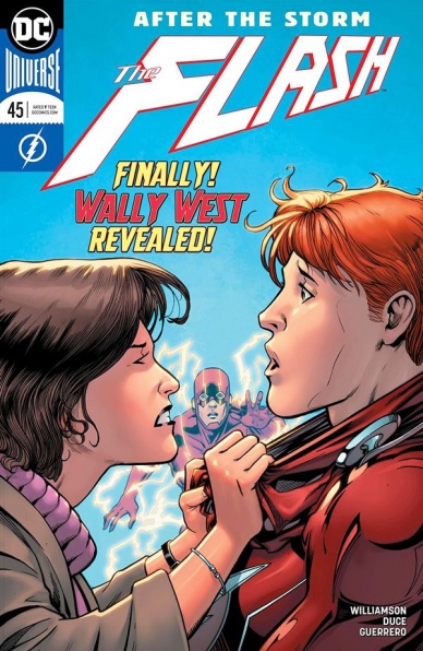
The Flash #45
Written by Joshua Williamson
Illustrated by Christian Duce
Colored by Luis Gurrero
Lettered by Steve Wands
Reviewed by Alan Buxbaum
“The Flash” #45 is a satisfying and enticing read that delivers on the long awaited moment of Iris finally meeting ginger Wally West. Given that this is the first issue of the new arc, Williamson also sets up new plot points in a way that does not feel overdrawn (as many first issues can). Overall, the two things I walked away thinking the most about were the Iris/Wally meeting and Christian Duce’s exceptional drawing.
Although Di Giandomenico’s work on the Rebirth Flash run so far has been incedible, I was suprpsied by how much I enjoyed the change that came in the form of Mr. Christian Duce’s work. Duce’s drawing is incredibly detailed, especially when it comes to characters’ faces and textures of varoius costumes/clothing. This is quite the opposite of Di Giandomenico’s style, so it comes off as refreshing more than anything. My single favorite page of Duce’s was by far the one of Godspeed. It looks absolutely incredible with the intensity of lightening, the more shadowed and sinister look, and even the golden lines of metallic-looking lightening that run across his costume. It almost looks as if he was re-envisioned as a manga character (I mean that in the best way possible). A close second is the shot of Damian perched on a rooftop while talking to Kid Flash Wally West. Again, the detail in the shadows on his face combined with the pale moonlight make it some fantastic artwork that compliments the story at hand. Anyone who had their doubts can justly lay them to rest.
Moving on to the main event of the story, I could not imagine Williamson doing a better job on the meeting of Iris and Wally West. It’s heartfelt, emotional, and just makes you feel so damn happy that it finally happened! Even though it took us long enough to get here, I think Williamson waited the right amount of time. The tension and emotion of it all was perfect. Wally looked as if another piece of him had finally arrived home. I was also happy that they showed Barry crying, as it reminded you of the weight of the situation. It’s exciting to think about future issues where Wally now has another major leg of support back in his life. It’s especially so when thinking about the Flash War event and what craziness that will bring with it. At least we know Iris will be there to help both Wally and Barry, and of course whoever else she can.
b>Final Verdict: 7.5 – As per usual, “The Flash’s” latest issue delivers with a great start to the new arc. You’ll be sure to welcome Christian’s Duce’s spectatular art, as it puts a new spin on the series before heading into the highly-anticipated Flash War.
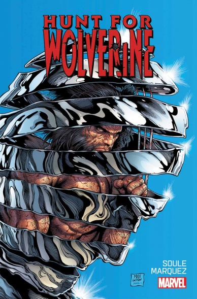
Hunt for Wolverine #1
Written by Charles Soule
Illustrated by David Marquez (main story), Paulo Siquiera, Walden Wong (back-up story)
Colored by Rachelle Rosenberg (main story), Ruth Redmond (back-up story)
Lettered by VC’s Joe Sabino
Reviewed by Gustavo S. Lodi
For an issue that kicks-off a number of series on Wolverine and his resurrection, there is very little of the old canuck on this book, which is a wise decision. By focusing on the impact that Wolverine has on his family and foes, readers are pulled into his mythology, further building anticipation. A small note: this issue had a back-up epilogue story, largely focused on the four mini-series spinning out of this issue. This review will be about the main story.
Continued belowCharles Soule is a mainstay on the x-books and, being the writer responsible for Logan’s demise, it is only fair that he pens this issue. This is one of Soule’s strongest books as of late: he balances action and character moments, actually using battles as means to advance the plot at the same time he is showing true characterisation of X-Men and the Reavers. These are friends and enemies with years of relationship: their conversation and battle strategies speak of that and are very gratifying for old fans.
Soule also paces the events of how Wolverine returned to life (or at least part of that) very well: these reveals are believable and make sense within the context these characters exist. Readers should not feel cheated: hopefully that respect will continue as the story progresses.
Over at art, David Marquez once again shows his knack for explosive action: one particular splash page showing the X-Men team jumping into battle brought back memories of the mutants heydays. While not very imaginative given the confines of the script (most of it is spent outside of a cabin in snowy Canada), this is surely a visually appealing issue.
Colorist Rachelle Rosenberg uses very different motifs to distinguish places and moments. The main confrontation is all whites and purples, the reveals in the past largely done in bright yellows. It works, alleviating what could have been more jarring transitions.
Final Verdict: 8.0 – “Hunt for Wolverine” #1 delivers on its primary goals of getting readers excited for Logan’s return. Beautiful art and a plot line that is respectful for fans, old and new.

The Mighty Thor #706
Written by Jason Aaron
Illustrated by Russell Dauterman
Colored by Matthew Wilson
Lettered by VC’s Joe Sabino
Reviewed by Alex Curtis
Jason Aaron may not be done with Thor, but Jane Foster is done being the god of Thunder. After battling the Mangog, Jane Foster finds herself faced with a moral dilemma, and Aaron writes it with a winning sentimentality, despite some reservations.
I wasn’t bowled over by emotions. The whole issue is centered on Jane Foster refusing to lay down her hammer in Valhalla and wishing to remain on earth, convinced her story isn’t over yet. While that makes for a nice, quaint ending, it wasn’t nearly as impactful as I was hoping for. It’s unclear what Jane means by her story not being over yet, and the idea of a heroine unwilling to lay down in peace has been explored in more eloquent ways before.
Jane is brought back by Thor and Odin by channeling a monstrous cyclone, The God Tempest, but Aaron has used so many supposedly “world ending beings,” it’s old hat. Jane is quickly revived in a few short pages, which comes across as rushed and a cheap plot device, especially since death has no meaning in comics (especially nowadays).
On the flip side, the relationship between Jane and Odinson is tender and a great way to cap the issue and her story. They bid farewell by saying they love each other, but it’s not sexual. There’s a mutual respect present that’s been built up, and Aaron knows how to capitalize on that with solid character writing. Odin is also a strong, defined presence whose cold heart is warmed by Jane’s mortal sacrifice. The trope of the grumpy father-figure realizing how special a young whipper-snapper is feels genuine and earned in this instance, which points to how well Aaron can deliver arcs and craft fulfilling tales.
Russell Dauterman delivers dazzling illustrations, his characters look practically carved from marble, his faces explode with raw emotion, and his digital effects drip with gloriously chaotic fervor. While the storm rages, the panels reflect this by taking the shape of torn cloth in contrast to scenes of Valhalla, which are bordered by hazy, white gutters.
Likewise, Matthew Wilson’s colors contrast bold, fiery purple and red on the battlefield with glowing white and gold for the Norse equivalent of heaven. His palettes synchronize beautifully with Dauterman’s sleek lines and the jagged, ferociously energetic lettering.
Final Verdict: 6.8 – A quaint, predictable, yet satisfying farewell to Lady Jane Thor. An important issue worth the price of admission.
Continued below
Moon Knight #194
Written by Max Bemis
Illustrated by Ty Templeton
Colored by Keiren Smith
Lettered by VC’s Cory Petit
Reviewed by Jonathan O’Neal
After a rousing six-issue arc that got Moon Knight out of his own head and into a bit of adventure and actual fisticuffs, Max Bemis tells the story of an episode from Mark Spector’s youth that may have contributed to the origin of his other personalities and his super hero alter ego.
So far, Bemis’s narrative has been more conventional and straightforward than Lemire’s previous run that was largely applauded for tackling the realities of mental illness head-on, but that’s not to say that Bemis’s scripts have been without their surprises or emotional wallops. Issue 194 is a gut punch that is equal parts bizarre and believable as it plays out at first like an innocuous childhood memory before it turns into a harrowing account of pure terror. At this point in the “Moon Knight” game, it seems like a strange time to spring a story with a title like ‘Origins’ on readers. At first blush it also seems like a stretch that a story this important would have lain dormant for so long, but fatherhood does cause men to re-evaluate their lives, so maybe it is believable that something would trigger this memory after all. The final pages with his daughter are undeniably moving if you’ve been following Marc Spector’s story for the last couple of years.
Ty Templeton, perhaps best known for his contributions to the Batman Animated Series-inspired books from DC, is a far cry from the meticulous thin-lined work from Jacen Burrows in the previous arc, but he seems to be somewhat aping Greg Smallwood’s style from the Lemire run albeit with a less textured line. Even the panel layouts feel similar to Smallwood’s. There’s not a lot for Templeton to really sink his teeth in here so his work comes across as a bit of a workmanlike and even hurried effort. Overall though, the renderings get the job done, and the sequential pacing is flawless.
Ultimately, the issue feels like an excuse for Bemis to add another wrinkle to the Marc Spector psyche and even a footnote to his Moon Knight origin story. It’s not bad stuff, but it feels like backpedaling after the action-packed previous arc.
Final Verdict: 7.0 – On the surface, ‘Origins’ is pretty effective storytelling. Underneath, it feels like a bit of balderdash—earnest balderdash, but still balderdash.
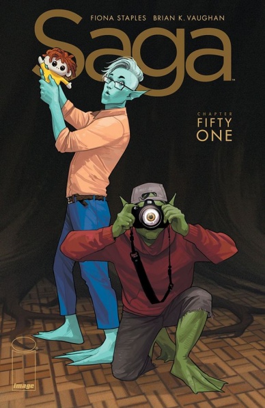
Saga #51
Written by Brian K. Vaughn
Illustrated and Colored by Fiona Staples
Lettered by Fonografiks
Reviewed by Devon Browning
Uncomfortable conversations, panels of pleasure, and absolute tragedy are but the essential ingredients of a “Saga” issue. It doesn’t hold back visually or verbally, and this addition to the series is no exception. And while the recipe does change, not much else does. Perhaps that is why the series leaves no room for disappointment, you generally always know what you’re going to get. You know there will be new worlds to learn about, themes characters converse about that are relatable, and a complete catastrophe caused by one of the characters we’ve fallen in love with, whether from recent introduction or day one.
We also know that as soon as we open to the first page, we need to brace ourselves. Fiona Staples does NOT hold back when conveying the beautifully twisted world Vaughn has created. Often times it is a powerful and relevant image that leads smoothly into the very theme of the issue. This time around we see into the mind of Squire and learn of his nightmares. A subtle theme that Vaughn may not have intended (doubtful), but is stitched into the script throughout. It’s expected, and it works.
Staples’s consistency in style is also expected and appreciated. Watching the story unfold is easy on the eyes, and is an absolute pleasure when tense moments play out. And in this issue alone, there are a lot. With character position, expression, and movement alone, Staples does a flawless job in bringing the story to life. While there are times that heavy script seems to take over the panels, her frequent one page pieces make up for it. What is most impressive, is that the color merely compliments the ink and line work. With the tethered worlds of story and art so in sync with one another, the reader is very much lured to the actions of the characters. To the responses and engagement of one another so much so that color is not much of a factor.
Continued belowColor in this issue, and the series itself, comes second. It’s that voice in your head saying “WOW” when your eyes land on the page. While it comes second, it is absolutely what takes the cake. It almost feels as if even coloring the series at all is a gift to the readers, and not entirely necessary. There is one moment in this issue that will keep you lingering upon it, and it is most certainly not the meaty bit that will keep you there– simply the visual.
“Saga” has been a widely popular series, and for good reason. Consistent story and art that never gets old or boring. It’s a series you can depend on to entertain and take you through worlds away from our own. However, where it falls short are the bits in the short issues that don’t push much of the story along. This issue happens to be one of them, and can leave you a little unsatisfied with a lack of significant progress. In no way should that deter anyone from reading this addition, but instead forewarn readers into not expecting anything groundbreaking.
Final Verdict: 7.6 – A solid issue that doesn’t progress much of the current story, but is worth a read with the art alone.

Strangers in Paradise XXV #3
Written, Illustrated, and Lettered by Terry Moore
Reviewed by Elias Rosner
Terry Moore’s return to the world of Katchoo and Francine and reintroduction to the crew of “Rachel Rising” these last two issues has been wonderful but so far, it’s felt like just that, a reintroduction. Now, with issue three, it feels as if true progress is being made with the overall plot and moving beyond simply bein a reminder of who these people are and what their deal is.
As always, Moore’s art is impeccable. His panels flow easily across the pages, building tension or emotion or even just transitioning from action to action. Every panel is brimming with details, all of which act to characterize the people and places within them. His characters are fully realized within the pages of the issue simply by virtue of their actions and posing.
Take these pieces of the comic. Katchoo is sitting in an airport and looks at a message left by Francine and their children. It starts with a mid-shot of Katchoo staring down at her phone, sighing a tiny sigh, with a contented look on her face. The next panel is of the aforementioned children and Francine being cute. The final panel of the first page has Katchoo posed on the couch, her feet tucked to her chest as she continues to look at the phone. She is placed far away and her expressions cannot be made out, creating the effect that she is distant and lonely.
Two pages later, Francine, in another three-panel sequence, is reading in bed and looks over to the empty pillow beside her. It is a wide-shot, again reflecting her loneliness and underscoring the emptiness in the house without Katchoo. Over the next two panels, the camera pulls in closer as Francine pulls the pillow over and holds it, her face a mix of sadness and longing. Not all the comic is this melancholic; parts of it are funny, darkly so, as personalities clash and Katchoo drives a car through a gate in the snow.
The pacing of this issue did have me wishing it were one page, or even one panel, longer but if that’s the biggest complaint to have, I hope to get more comics like this one.
Final Verdict: 8.9 – Moore’s talent for crafting a compelling narrative, rich in visual emotions, continues here. If you haven’t read anything by him, pick this series up or read any of his previous ones.
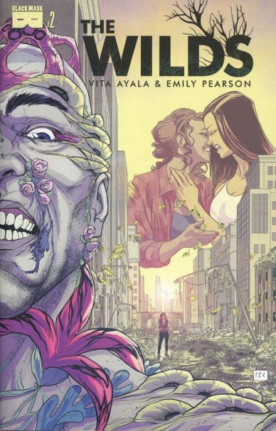
The Wilds #2
Written by Vita Ayala
Illustrated by Emily Pearson and Jessi Jordan
Colored by Marissa Louise
Lettered by Jim Campbell
Reviewed by Kate Kosturski
The world of “The Wilds” blooms. (Pun intended.) If the debut planted the seeds for the disease that led to this blossoming apocalypse, “The Wilds” #2 is the fruit of those plantings. (Okay, I’ll stop with the puns now.) Within this issue we learn more about the specifics of the disease and how it manifests. We also learn more about the compound itself and its internal politics: how runners come to work for the compound, job requirements (random testing to ensure you don’t have the disease), formal and informal dos and don’ts of being a runner. There’s also some tension within the runner camp, with Daisy perceived as a favorite with management over others. All this is backseat to Daisy’s revelation to the team of a horde of “abominations” attacking her car, something never seen with this disease before. But Heather’s in a double dose of trouble in the final pages, as the captured turns to captor, and her medical file seems to have something concerning in it.
Continued belowIn terms of narrative, this issue does a fine job of world-building, and setting up a climax with Heather and Teddy when captured turns to captor, as tired as that trope can be. The story of the horde finding Daisy felt more like an afterthought, but sets up the abominations as the secondary enemy: the real enemy is the compound and the people within it. It’s a fine riff on the often asked question in post-apocalyptic movies, “do the living envy the dead?” The art team deserves high praise for making this one of the more richly colorful end of days scenarios, taking expected convention with this kind of story (dark, gritty, and disturbed) and turning it on its head. The “best run” story at the end has the feel of a post-credits scene in a movie, letting us peek in to another side of the world without disrupting the main narrative, and use of a different artist distinguishes it from that as well. But is it really necessary?
This is the end of the world the likes of which hasn’t been seen before, and while the execution of concept is creative, I still feel like something’s being held back.
Final Verdict: 7.0 – Well-done setup to conflict, with art that makes the end times look actually pretty. But this is still a very tentative story, and I know that the talent here can push creative boundaries further. Hopefully that’s coming.

X-O Manowar #14
Written by Matt Kindt
Illustrated by Ariel Olivetti
Lettered by Dave Sharpe
Reviewed by Michael Mazzacane
While certain broad structures of “X-O Manowar” by writer Matt Kindt with various artists, issue #14 features Ariel Olivetti, feel slightly rushed; Kindt’s writing shows what makes a series like “X-O” work. For all the space operatics and other science fantasy, Kindt has emphasized the emotional story of a man. This issue answers some questions that have been hanging over the series since the relaunch, and those answers actually matter now because of the emotional work leading up to their reveal. Aric of Urth was a man running away because he killed his child. That emotional trauma on top of what he accrued on Gorin puts him in a very interesting space as “Harbinger Wars 2” looms.
Kindt provides artist Ariel Olivetti a perfectly comic book scenario to visually represent this trip into Aric’s psyche. While traveling through a singularity things get appropriately 2001. Olivetti’s cold digital aesthetic was the right choice for this kind of issue. The setting of space is cold but strangely luminous colors mix and radiate off of the armor in ways that give a real sense of motion. That full spectrum contrasts with the more muted tones representing Aric’s memories of Rome and his time with Saana. Olivetti’s page designs as Aric travels through space and the singularity are surreal but still readable and well crafted. Panels melt and fold into one another but their reading order is never in doubt.
For all the big picture stuff, Olivetti works in some excellent expression with Aric. Other artists, partly due to story and scripting, gave Aric this thousand yard stare stoic expression. Olivetti’s texturing gives Aric a sense of age and mixes that with a range of expressions. There is a limit when it comes to depicting a body flying through out of space, but the body language Olivetti evokes during the whale sequence and how that contrasts with the conversation he has with Shanhara, gives this issue a real Michael Mann vibe. Issue #14 marks the end of a chapter in “X-O Manowar,” Aric has traveled lightyears and been through a lot, but no matter where he goes he cannot outrun what he and the armor are good at.
Final Verdict: 8.0 – “X-O Manowar” #14 is an example of what works about Valiant’s comic line and this brand of storytelling in general, telling intimate emotional stories on the baroque canvas of space.


