
There is a lot to cover on Wednesdays. We should know, as collectively, we read an insane amount of comics. Even with a large review staff, it’s hard to get to everything. With that in mind, we’re back with Wrapping Wednesday, where we look at some of the books we missed in what was another great week of comics.
Let’s get this party started.

Archangel #4
Written by William Gibson
Penciled by Butch Guice & Alejandro Barrionuevo
Inked by Tom Palmer
Colored by Wes Dzioba
Lettered by Shawn Lee
Reviewed by Forrest Sayrs
After a pretty hefty delay, “Archangel” is back, continuing the narrative of the megalomaniacal politician jumping back in time to ensure the sequence of events that brings his father to power. #4 picks up after an explosive climax in the last issue, to offer some much-needed context going into the finale.
On the run from Junior and his time-displaced thugs, Pilot starts to lay out the shape of the endgame: a new ending for World War II, triggered by redirecting the second atomic bomb. Calling William Gibson a prescient author is kind of pointless these days, but I can’t help but be a little amazed that this issue, originally slated for release in August of 2016, features so many nods to our present day. The strength of Gibson’s exposition lies in these plausibilities. “Archangel’s” vision of 2016 is nothing short of chilling and, simultaneously, deeply engaging.
Gibson’s players help to keep the action moving in spite of the heavier exposition. Naomi has a Mulder-esque willingness to believe in anything that helps to offset the roadblocks of other, more skeptical characters. Pilot’s Marine attitude also cuts down what could be long slogs of text, in favor of getting to the next piece of action. Other characters, such as Vince, don’t feel as developed. The secondary cast is colorful enough, but lacks substance. Vince is the only other protagonist likely to show up in issue #5, so it would be better if we cared, or even knew more about him in particular.
Bruce Guice’s high-res art style compliments this bleak narrative perfectly, so the addition of Alejandro Barrionuevo for this issue is a little distracting. Barrionuevo’s panels feature a noticeable style shift, away from the heavily etched faces of Guice’s style, and towards something that makes many characters seem younger, or less weathered. The change is most noticeable in character renderings, while the backgrounds do keep closer to Guice’s aesthetic. The most jarring shift is of Pilot’s design, going from extremely weathered to almost baby-faced across four pages. These changes aren’t harmful enough to bring down the overall quality of the book, but they do change the visual tone of the work to something that feels more heroic than was probably intended.
Final Verdict: 7.5 – While the shift in art is distracting, it shouldn’t keep anyone from enjoying the book. Gibson and his co-creator, Michael St. John Smith, have built an impressive world to play with and the only thing I’m worried about is what comes after the limited run wraps up next issue.

Batman/The Shadow #1
Written by Scott Snyder and Steve Orlando
Illustrated by Riley Rossmo
Colored by FCO Placencia
Lettered by Clem Robins
Reviewed by Kent Falkenberg
Who knows what lurks in the heart of Riley Rossmo?
For my money, it’s Scott Snyder and Steve Orlando who must have a pretty good idea. Their script to “Batman/The Shadow” #1 feeds directly into his strengths and finds him channeling that moody, atmospheric style into some next-level artistry that easily rivals any other Bat title that’s sitting on the rack. There’s action and bombast, mood and mystery, emotion and commotion. And for as obvious as Bruce Wayne and Lamont Cranston’s alter-egos are for a crossover, it’s equally obvious that Rossmo should be the one to bring it all to life.
Snyder and Orlando give plenty of room to work. From a fortress high atop the French Alps, where delicate line work seems to dissipate into the cool hues and washed out color tones of FCO Planscencia that just make the air feel thinner up there, to the manned elevators and clean straight lines of an art deco hotel nestled into an old part of Gotham that looks untouched since the heyday of radio plays and prohibition, to the grim visage of Arkham Asylum that consumes an entire page with its gothic grandeur, there’s an effective merging of aesthetic signposts from both characters’ worlds.
Continued belowBut that’s just set dressing for “Batman/The Shadow” #1. Capes and scarves writhe and weave in the nighttime leading the eye from panel to panel as two leads cat-and-mouse across the page. Every blow is impactful as necks snap back and red mists spray from busted noses and knife wounds. An early murder victim is bequeathed a brief moment of pathos, delivered with brutal efficiency, with nothing more than a bottle of beer held in one hand, an open container of Chinese takeout in the other, and a faint, contented smirk across his face, before the guillotine drops. And the impression of a most violent end is given by the the blood splattered container spilling open to the floor.
The integration of The Shadow and Batman into the same world is handled quite cleverly by Orlando and Snyder. And while the reveal of just how Lamont Cranston fits into the Batman mythos – I won’t spoil it here – might seem a bit obvious, it only seems that way because it’s the natural choice. And it still leaves options open for whether this series will actually pay off as a team-up book or a versus one. And that ambiguity is a damn clever hook.
Rossmo’s art sings throughout “Batman/The Shadow” #1. This could be a silent issue, and it would still be well worth it. The parallels between the two characters are ripe enough for good pulpy fun, or could mine more psychological depths of fear, hate, obsession and darkest urges. “I got old”, Margo Lane says halfway through the book, “All of his agents got old. He didn’t. His hate kept him young. He was obsessed with crime. There was a cruel power in him”. I’ll leave it to you to decide who she’s talking about.
Final Verdict: 8.0 – Off to a great start. Tune in next month to see where it goes – same Shadow time, same Shadow channel.

Ben Reilly The Scarlet Spider #1
Written by Peter David
Illustrated by Mark Bagley
Inked by John Dell
Colored by Jason Keith
Lettered by VC’s Joe Caramagna
Reviewed by Matt Lune
If you try to describe this issue to someone, and you say it’s a Ben Reilly ongoing where he’s a bit of an anti-hero, written by Peter David and drawn by Mark Bagley, chances are they’d know exactly what they’d be getting. If that statement feels like a bit of a backhanded compliment, you’d be right.
The good news is that the creative team provide exactly what you’d want from this debut issue. “Ben Reilly The Scarlet Spider” is all about setting up the new status quo for the titular character following the events of the last big Spider-Man event, ‘The Clone Conspiracy.’ David portrays Ben as a slightly dangerous, slightly unpredictable, choosing to shoot a petty crook in the kneecap rather than web him up, and throughout the issue he’s plagued by visions of alternate versions of himself wearing various costumes from his past, to depict a man struggling to find his identity. I guess when you’re a clone of a clone of a hero you were just indirectly killed by, an identity crisis is par for the course.
David’s script has his trademark humor and drama, and his voice is still as sharp and unmistakable as ever. Similarly, Bagley’s art is solid and back to a form that he’s seemingly lost of late. His lines feel tighter and it overall looks a lot less rushed than some previous work of his. The design of the Scarlet Spider’s new costume is strong, and it borrows the hooded cowl aspect from SpiderGwen which, along the black and red – sorry, scarlet – color scheme, makes this a distinctive look in an ever increasing Spider-Verse of similar looking characters. Bagley also gets to draw some of Reilly’s more classic looks thanks to the narrative conceit mentioned above, and while the action scenes are fluid and well paced, Bagley adds an edge to Reilly’s movement that gives him that dangerous edge over Spider-Man.
The bad news is that “Ben Reilly The Scarlet Spider” is exactly what you’d expect from this creative team, in the sense that there’s no new ground being broken. In a lot of ways this issue could have been released ten years ago, even twenty, and it’d be almost exactly the same. The landscape of superhero comics is becoming ever more diverse in terms of style, structure and design, and there’s a sense that books like this will get lost in the shuffle and inevitably not last long enough to make any real impact.
Continued belowThere’s definitely a fan base for this book. Between Peter David, Mark Bagley and the titular character himself, there will be plenty of long term fans that will pick up “Ben Reilly The Scarlet Spider” #1. The issue itself, however, feels fairly generic and, while entertaining enough, doesn’t feel like it’s providing anything new to the franchise. As such, unless something drastic and unique alters the status quo, it doesn’t feel like a book that will last.
Final verdict: 6.5 – A fairly by-the-numbers story from the extended Spidey universe. One for true fans of Ben Reilly only, really.
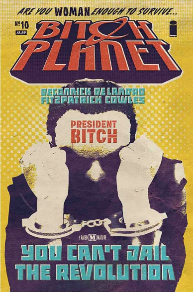
Bitch Planet #10
Written by Kelly Sue DeConnick
Illustrated by Valentine De Landro
Colored by Kelly Fitzpatrick
Lettered by Clayton Cowles
Reviewed by John Schaidler
Nineteen long months after concluding “Bitch Planet’s” first arc with the unexpected death of popular core character, Meiko Maki, co-creators Kelly Sue DeConnick and Valentine De Landro expertly bring the second arc to a close with another brilliant twist.
Over the last four issues Meiko’s death has remained unavenged as the tension slowly builds. Slowly. Thankfully, in “Bitch Planet” #10, things finally explode, all hell breaks loose, and this book feels vital again.
Driven by a cheeky, retro-futuristic visual style that often seems to barely contain the dramatic action within De Landro’s thick black lines, DeConnick’s tightly written script artfully interweaves the raw violence and sheer chaos of the prison break with the self-congratulatory grandstanding of the High Father’s political rally – subtly mixing both strands with the furtive awakening of a rebellious sleeper cell.
Shit is going down.
This is the tension we’ve craved. This is the catharsis we’ve longed for.
And colorist Kelly Fitzpatrick is right there with us, mirroring our frenzied emotions as she deftly switches between heavily pixilated, weathered looking backgrounds of orange, red, blue and green. The entire book has a gorgeous, yellowy look and feel that instantly evokes Golden Age newsprint comics – during the action sequences, even more so. Not even the blacks are black. They’re smudged, imperfect, blotchy, creating an effect that’s simultaneously eerie and unsettling, yet incredibly satisfying on a purely artistic level. There’s something almost lurid about it. You dare not look away.
From the very start, “Bitch Planet” as a concept has been one of the most intriguing books in recent memory. It’s a deliberately high concept take on low-brow popular culture that riffs unforgivingly on the well-worn themes and tropes of the exploitation flick aesthetic while shrewdly deconstructing the women-in-prison sub-genre.
In many ways, in fact, “Bitch Planet” is more than a mere comic book. It’s social commentary. It’s critique. It’s art. (Rian Hughes’s consistently stellar covers, for example, would be at home on a Chelsea gallery wall and the always intriguing back matter, chock full of hilarious satirical ads and whip-smart social commentary, could be a stand-alone zine.) With issue #10, DeConnick and De Landro return to the book’s dramatic action, fully recapturing the seemingly unstoppable momentum and palpable sense of urgency that wowed critics and readers in the first place.
Final Verdict: 8.2 – Dramatic action explodes across the page in a retro-futuristic visual feast, bringing “Bitch Planet’s” second arc to a satisfying conclusion.

Elektra #3
Written by Matt Owens
Illustrated by Juann Cabal
Colored by Antonio Fabela and Jordan Boyd
Lettered by Vc’s Cory Petit
Reviewed by Gregory Ellner
One of the most interesting things about this issue is the parallelism. The main events of the issue’s present day, the Murderworld competition forced on our heroine by Arcade, creates a very similar situation to the case she was on with Daredevil in the past. Together, Matt Owens and Juann Cabal create identical dialogues and mirrored panel structures that give a feeling of déjà vu that Elektra herself may have been feeling. At times, the parallels seem heavy-handed and bizarre in how the dialogue is exactly the same across different eras, but on the whole, they appear to be an intriguing way of handling the story.
The artwork is the other draw. Between Cabal’s pencil and the colors of both Antonio Fabela and Jordan Boyd, each of the eras, between the flashbacks and the modern day, are distinct. The colors on the modern era are downright cartoonish, befitting the aesthetic that Arcade seems to go for. The varied color palette creates an intentional dissonance from the acts of murder that are going on, giving the same feeling of it all not mattering that the viewers of the competition may have had. On the other hand, the flashbacks use only blacks, greys, and red, emphasizing Daredevil and Elektra while also showing the inhumanity of the murders going on.
Continued belowIn all, the artwork and the writing work together well to create a narrative of helplessness for Elektra, one that seems interesting to follow moving forward.
Final Verdict: 7.5- Interesting parallel structure and artwork create a variety of feelings in readers, but don’t do much to create a story to go forward.

The Magdalena #2
Written by Tini Howards and Ryan Cady
Illustrated by Christian DiBari
Colored by Mike Spicer
Lettered by Troy Peteri
Reviewed by Michael Mazzacane
The most reforesting aspect of this new “Magdalena” series is the dynamic between Patience and Maya. Writers Tini Howard and Ryan Cady upended the traditional master-student dynamic as Patience and Maya train, along with the latter going on her first real mission. In general, and if the genders were reversed, by this point in the arc we would’ve already gotten the hints of recklessness and arrogance on the part of the students as they try to obtain the symbolic phallus before the master wants. The old master would be stern and no real fun and not at all down with their inevitable castration. Instead, Howard and Cady develop a relationship built on understanding and respect between the pair. Patience isn’t vainly trying to hold on to power, and even without the spear (and still injured) is still shown to be a highly capable demon hunter. Amazingly, Maya isn’t over eager and thinks she knows all there is about the world of angels and demons. Shockingly, she even tries not to repeat her mistake from the last issue! While some of the functional magic stuff is a bit muddy in presentation, the character work is the star here.
With Christian DiBari’s use of heavy, chalky, black lines and the overall flat effect of Mike Spicer’s colors, it would not be hard to confuse the art teams style with “Mother Panic” artist Tommy Lee Edwards. Their similarities are, however, purely stylistic with both books using it to set differing tonalities for each series. Edwards scratchy, flat, cartoon style evoked the gritty crime books of Frank Miller. In “Magdalena” the cartooned aesthetic stands as an alternative one to the ornate detail (and cheesecake quality) that comes to mind when thinking of Top Cow and their Artifacts line in the 90s and early 00s. While I wouldn’t call this book “punk” – with everything that is involved in this series production – it has that attitude. DiBari and Spicer’s work is a fitting representation for the overall motif of the series thus far of questioning the traditions and practice from the series.
Final Verdict: 7.0 – Even as Top Cow moves more into the realm of science-crime “Magdalena” continues to show plenty of room for fresh takes in their Artifacts line.
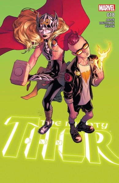
The Mighty Thor #18
Written by Jason Aaron
Illustrated by Russell Dauterman
Colored by Matthew Wilson
Lettered by VC’s Joe Sabino
Reviewed by Alexander Jones
While “The Mighty Thor” has set an incredibly high bar for the current team of artists this far, this issue in particular is a sheer artistic delight. Russell Dauterman is one of the very best artists currently working at Marvel and the way he shows command of “Wolverine and the X-Men” alumni Quentin Quire is delightful. The personality radiating from every single page in which he is featured is unmatched. Dauterman chooses a subtle and mysterious way to introduce the character leading up to one of the very best splash pages in the series so far. Dauterman still capitalizes on Thor, depicting some beautifully elegant fight scenes but whenever Quire is added to the mix this issue is elevated to a whole new level of quality.
Playing off of the dynamic of Thor, Aaron ramps up Quire’s personality to the max. This gives the issue a really nice tone, making the comic incredibly accessible even though the book is in the middle of a big story. The remarkable aspect about this issue is that there is still a really, really huge surprise tucked in here. One of the most infamous characters in the Marvel Universe returns in a very surprising way here. There’s also a great ensemble cast that all get a very small moment shine throughout this story. Quire has a lot of dialogue and things to say and Aaron is able to mine for content without making his presence feel overbearing–a little bit of this character can go a long way.
Continued belowWhen many readers think of Thor, they typically disregard the series’ ensemble cast yet Marvel has maintained a sense of continuity among Thor’s supporting cast in a surprising way. Newer characters like Cul, Shadrak and Kid Gladiator are mixed with some returning favorites which is an excellent way to keep the supporting cast of Thor varied in these issues. Even though there’s a lot of fun to be had in this comic, the issue ends on a very dramatic moment. Thor remembers all the trouble she’s faced on the road to becoming a hero. She even remembers how she came to grab the hammer in the first place. The last page even teases a dramatic finale to the storyline mixed with the absurdness teaming from the pink-haired telepathic Quire.
Dauterman is the undisputed star of this issue making sure to dial up the huge, dramatic moments to the max while delivering on the mannerisms and absurdity of Quentin Quire. This story is set in space and has a huge, epic scope that Dauterman also adds to the plate here. As hinted at earlier, there are a ton of character in this issue and each is given lots of detail and personality. This is a big event storyline for the book and years into the life of the new Thor, Jason Aaron and Russell Dauterman still feel like they are bursting with life and stories for this incredible addition to the Marvel Universe. Marvel’s Legacy can wait a little longer as far as I’m concerned.
Final Verdict: 8.0: “The Mighty Thor” #18 is still an effortlessly fantastic series made stronger (and stranger) this week with the epic scope and inclusion of Quentin Quire.
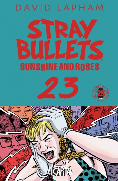
Stray Bullets: Sunshine and Roses #23
Written, Illustrated, and Lettered by David Lapham
Reviewed by CLA Bindery
The beauty of Stray Bullets is that each monthly issue of the series is an all-inclusive story told from the perspective one individual, while still pushing the main narrative forward. This issue focuses on Annie, who has been involved in clandestine activity and is now struggling to take culpability for past events. Lapham presents the story in four parts, each effectively putting the character into a situation of self-crisis that challenges her to come to terms with her life.
The art of the issue is a fairly simple black & white with no grey tones. The lack of color dulls the potency of the violence and helps detach the reader from what they are witnessing. However Lapham’s true art form is how he presents his story using a typical 8 panel per page layout that allows readers to feel the emotions of his characters by using their imagination when connecting each panel.
The most impactful scene in the story is one page that shows Annie crying about the destruction of her house and the murder of her boyfriend. While this scene could be shown in a multitude of ways, Lapham expertly presented imagery in such an order that it allows the reader to understand how the character felt while also giving insight into the situation. Lapham used long shots of the destruction to show the reader what had happened to the house. He used two flash back scenes of very specific moments of past events to give contexts to the background of what happened. He used close up shots of Annie crying to make the reader feel her emotion. Most importantly Lapham used minimal dialogue and let the imagery speak for itself.
Final Verdict 8.5: A beautiful story of a flawed woman’s journey misstepping her way into fully understanding the consequences of her actions. Something a true lover of the comic medium would enjoy.

Supergirl: Being Super #3
Written by Mariko Tamaki
Illustrated by Joëlle Jones
Colored by Kelly Fitzpatrick
Lettered by Saida Temofonte
Reviewed by Nicholas Palmieri
Whoever thought to put this writer and artist together for this character deserves as much recognition as the creators themselves. This is one of the most fluid collaborations I’ve seen on a modern superhero book.
I’ve always appreciated the somber tone of much of Tamaki’s work, and it fits this story perfectly. In examining a pre-Supergirl Kara as a modern teenager, Tamaki is able to examine the alienation a teenager feels. This issue in particular features an opening about dealing with the death of a loved one. Later, it even examines the situation where refusing to out a certain detail of yourself causes more of a rift than the actual revelation would. These are essential tough topics for people at that age, and anyone who has been through these things can relate thanks to Tamaki’s spot-on writing.
Continued belowJones has a tendency towards using a few large panels on each page, as opposed to many smaller ones, and the space in each panel gives each moment room to breathe. It’s not enough to show a family sitting at a dinner table: Jones makes sure to frame the panel from the doorway as Kara looks in, and everything from the drapes to the chandelier to the grain of wood on the table evokes a definite sense of place. This could only be achieved with detail through larger panes. Jones also uses a thick inking style for the edges of characters, with other slightly less thick lines detailing the many folds of, say, a fabric. Her inks contribute to “Super: Being Super”’s strong sense of place as much as the paneling does.
As the book progresses, we get something more closely resembling a superhero plot. Still, Tamaki and Jones keep the focus on the characters and emotions, so it never feels quite like a superhero book.
In all, this issue of “Supergirl: Being Super” continues the book’s trend of focusing more on the “being” than on the “super,” and the results are stellar. Only one more issue left, so if you enjoy slower character dramas, check this book out while you can.
Final Verdict: 8.5 – Tamaki and Jones keep bringing their slow indie drama style to a hero who deserves it. If you like stories that focus on emotion and character over plot and superheroics, check this out


