There’s a lot to cover on Wednesdays. We should know, as collectively, we read an insane amount of comics. Even with a large review staff, it’s hard to get to everything. With that in mind, we’re back with Wrapping Wednesday, where we look at some of the books we missed in what was another great week of comics.
Let’s get this party started.

Doctor Strange #2
Written by Jed MacKay
Illustrated by Pasqual Ferry
Colored by Matt Hollingsworth
Lettered by VC’s Cory Petit
Reviewed by Alexander Jones
Doctor Strange and his wife Clea have recently been united again in the pages of “Doctor Strange.” Author Jed MacKay is splitting his time across the dual protagonists. In “Doctor Strange” #2 MacKay is introducing Moon Knight as a guest star. Will Marc Spector make the new Marvel series lose focus or push it in some interesting directions?
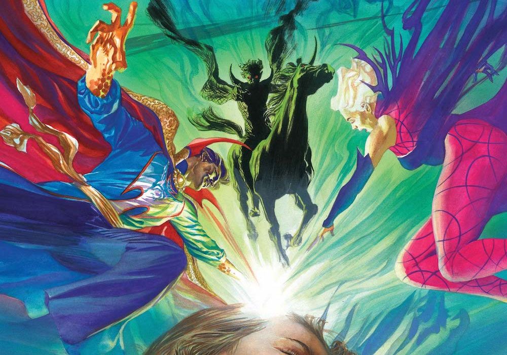
In the pages of ”Doctor Strange” #2, Clea, Stephen and Marc make a house call to try and find the astral form of a young girl. Watching Stephen and Clea fight through the Realm of Nightmares to save this young girl is a really compelling plot beat. The deeper ”Doctor Strange” #2 goes, the more odd some of the visuals in the issue become. Another excellent aspect of this story is how self-contained it is. There are ongoing plot threads from previous issues but you can jump into this story cold as long as you are familiar with Moon Knight, Clea and Stephen. MacKay’s tone for the series feels just right with strange visuals and strong dialogue.
Artist Pasqual Ferry is a great fit for the pages of “Doctor Strange” thanks to the ethereal and curvy line used in the issue. Ferry does a great job depicting the Realm of Nightmare as a cavernous, scary space that goes on seemingly forever. Ferry captures great subdued facial expressions for Strange and Clea in the issue as well. Despite the fact that Moon Knight is wearing a mask, it even seemed like Ferry was able to show some emotions from Moon Knight as well. Late in the issue, Ferry depicts a page with a nine-panel grid where Stephen is outside that looks breathtaking! MacKay and Ferry should continue exploring non-traditional page layouts for this series.
Final Verdict: 8.0 – ”Doctor Strange” #2 tells an intriguing, self-contained story featuring Moon Knight!

Invincible Iron-Man #5
Written by Gerry Duggan
Illustrated by Juan Frigeri
Colored by Bryan Valenza
Lettered by Joe Caramagna
Reviewed by Quinn Tassin
“Invincible Iron-Man” #5 feels a lot like a song you used to love but got bored with coming on for the first time in a while. The familiarity is nice but you still know there’s something greater that you’d like to feel. See, the whole hero pushed to the brink gets a bit of a break and important information in a different corner of Marvel comics is a reliable, fun trope; it’s exactly the type of thing that makes this such a fun medium. And to be sure, there’s fun to be had seeing Tony ride horses with Emma Frost and talk to Sunfire. But the execution here just makes it hard for it to feel like more than a note that’s getting hit because it’s supposed to. When they’re hitting obvious beats, the best stories make these moments feel necessary or inevitable. Here, it’s just a thing that’s happening. The same problem comes at the end of the issue, when Tony meets a seemingly unstoppable force in a Stark Sentinel that’s built so that he can’t stop it. Sure, it makes him even more desperate and sure, this could lead to something interesting down the road but right now it’s more likely to leave you feeling cold.
Then there’s Feilong’s plot to find everything hidden within Stark Unlimited which just leads to that scene from Iron-Man 2 with the old tapes leading Tony to create a new element but with a villain watching them instead. It’s actually jarring how derivative it is to see the videos here hit similar emotional beats to those from the movie and lead to a similar end— a metal that nobody else has discovered.
The artwork is generally strong, though the team isn’t given all that much to work with. A large portion of the issue is spend on people having pretty normal conversations against relatively simple backgrounds. We spend our moments on Krakoa on a beach with sand and sky as the primary scenery and Feilong moves from a generic looking office to a less generic warehouse. It’s not that this stuff isn’t well illustrated; characters are plenty expressive and their physicality is strikingly well communicated. The coloring is strong, with a consistent, relatively bright palette that easily controls tone with minor shifts. That last sequence with the Stark Sentinel is pretty excellent, too. From the way that the team uses coloring when the sentinel hits Tony with a repulsor blast to the force that they imbue in the panel where the sentinel crashes through the warehouse wall in a single step, it’s clear what a threat this invention is. They do strong work at selling Tony’s desperation even with a mere one panel spent seeing his real face and Feilong looks incredibly menacing. This issue levels up thanks to artwork that makes a mediocre story land much better.
Final Verdict: 6.5- A decent read that lacks a strong sense of excitement or tension


