
There’s a lot to cover on Wednesdays. We should know, as collectively, we read an insane amount of comics. Even with a large review staff, it’s hard to get to everything. With that in mind, we’re back with Wrapping Wednesday, where we look at some of the books we missed in what was another great week of comics.
Let’s get this party started.

The Amazing Spider-Man #1
Written by Zeb Wells
Penciled by John Romita Jr.
Inked by Scott Hanna
Colored by Marcio Menyz
Lettered by Joe Caramagna
Reviewed by Quinn Tassin
Big swings should be appreciated and “The Amazing Spider-Man” #1 is nothing if not a big swing. The sheer act of bringing Peter Parker to his lowest point since Doctor Octopus took over his body without telling the audience what got him there is a brave decision for a relaunch of a title. Plus, as far as tropes go, time jumps are awesome. Treating audiences like they’re smart enough to handle some blanks while settling into storyline that takes place post-time jump is especially awesome. Appreciating a big swing doesn’t mean liking what it produces, though. And while it’s no out-and-out failure, this isn’t an issue quite works either.
See, where a well-employed time jump thrusts you into a new, interesting status quo, it doesn’t quite work when what happened in the time period we don’t know about is more intriguing that what’s going on in the present. It’s not that there shouldn’t be mystery, just that the mystery shouldn’t overshadow the story being told like it does here. Sure, Peter being even more broke than usual, going off the grid for months, and on the outs with all of his friends, Mary Jane, and Aunt May is a good hook. But whatever it is that justifies the distance from everyone in his life is infinitely more interesting than him being distant from everyone in his life which is kind of a problem.
To be fair, we’re not 100% oblivious to what’s happened. It’s clear that Peter got pushed to some dark places, failed in a big way, and is payed consequences emotionally, and didn’t know how to deal with it. Then there’s Mary Jane seemingly being in a relationship with two kids and whatever’s going on with an imprisoned Doc Ock. It’s also clear that the people in Peter’s life haven’t entirely given up on him even if they’re struggling with him. Still, the crumbs that “The Amazing Spider-Man” #1 gives aren’t enough for it to overcome its weaknesses. Promise that the whole of a storyline will come together isn’t a justification for its first chapter being this disorienting.
The artwork doesn’t help either. While tone is certainly well-communicated with dark hues and overcast skies, most everything else leaves something to be desired. While he’s a legendary Spider artist, John Romita Jr. draws some of the ugliest faces in comics and in an issue heavy on dialogue and low on action, that really hurts. Plus, the one real action sequence we get is underwhelming. Things feel more static that any Spider-Man comic should. Even Spider-Man dodging bullets, swinging through the air, and jumping on cars feels stiff.
Now, to be clear, “The Amazing Spider-Man” #1 doesn’t disqualify this from being a good overall take on the character in any way. The voices of the characters are well captured and there’s a confidence to the issue that makes it clear that Zeb Wells isn’t just throwing together some haphazard story in the name of being bold. But as far as first chapters go, it’s hard to see “The Amazing Spider-Man” #1 as much of a success.
Final Verdict: 5.9- Bold storytelling decisions produce middling results
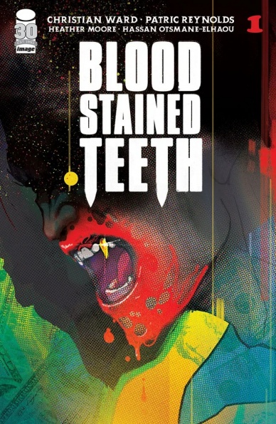
Blood Stained Teeth #1
Written by Christian Ward
Illustrated by Patric Reynolds
Colored by Heather Moore
Lettered by Hassan Ottsmane-Elhaou
Reviewed by Alexander Manzo
Christian Ward brings a fresh telling of vampire lore with his story, “Blood Stained Teeth.” It follows a vampire named Atticus Sloane and how he fits being a vampire in today’s day and age. Ward hints at this underground hierarchy of rules and guidelines that comes with being a vampire, and it’s the opposite of the beliefs of our protagonist, who seems to only be worried about his pocket of cash. Sloane doesn’t come off as a loner to the reader, but he certainly keeps people at a distance, and in this issue, his only close “familiar” already gets killed, so Ward makes sure to start this series off with him on his island. Now he’s being forced to go back and fix the mistakes of vampires he’s created for money, or else he will be the next one killed. Ward brings this underground lifestyle that mixes traditional ranks of “pure-bred” vampires and the gritty underworld of nightlife that combines well enough to hook a reader to see what other businesses they’ll be mixed into. Ward’s secondary storyline of a doctor riddled with stress from the health of a loved one combined with an encounter with a vampire disappearing from a hospital bed leaves plenty of questions on how these two characters are involved with one another.
Continued belowPatric Reynold’s artwork is top-notch due to his attention to detail in both the main characters but also the grittiness of the city and backgrounds throughout the story. From the very beginning of the story, the reader is shown a viewpoint of the dirty underworld lifestyle filled with prostitutes, homeless, and drugs, with Sloane’s crisp club-like suit standing out to show his role in it all. Heather Moore’s colors are a crucial point in bringing this story to life. This vibe is similar to Oliver Stone’s movies like Savages where there’s this profound exaggeration of bright colors that grasp the audience’s attention. The bright pinks in the darker scenes and large amounts of white used in the hospital bring it all to life.
Final Verdict: 8.2 – While the creative team gives the mission at hand for Sloane, the bigger question of why is still up in the air.

Carnage #2
Written by Ram V
Illustrated by Francesco Manna
Colored by Dijjo Lima
Lettered by VC’s Joe Sabino
Reviewed by Alexander Jones
Carnage is a tricky character who directly clashes with the wholesome tone of Spider-Man. “Carnage” #2 writer Ram V and artist Francesco Manna are teasing a different kind of direction for this new “Carnage” series. However, V and Manna only hinted at a brainy take on “Carnage” last issue. Does this second chapter provide readers with the brain-teasing Spidey villain readers are craving?
“Carnage” has an opening sequence filled with mist and symbiote dust. When Manna pulls the rug out from underneath readers and shows a conventional hospital setting, Manna is able to make this tone switch effective. Manna and colorist Dijjo Lima pair the colors down when the scene shifts to the hospital. Manna and Lima continue to tease the Symbiotes throughout the issue thanks to harrowing flashbacks. The juxtaposition between reality and Carnage’s sinister symbiote world is in conflict up until the final pages of the series.
Manna’s facial expressions also capture so much emotion which allows the series to feel more grounded. Manna’s characters have great body language and secondary acting as well. Manna always seems to be looking for the most interesting way to tell a story. In one moment Shayde sits backward on a chair in a sequence that matches V’s playful dialogue well. The creative relationship between V and Manna increases the quality of “Carnage” immensely.
“Carnage” #2 starts carefully setting the building blocks of what appears to be a confident series. Ram V is shifting character dynamics between Detective Jonathan Shayde and The Artist. V hasn’t quite laid all of the cards between these two factions of characters on the table yet. While The Artist still appears to be a villain, readers are not quite sure who Shayde is involved with Carnage and The Symbiote. I have the confidence that V will take the queue from his run on “The Swamp Thing” with Mike Perkins to ensure the mystery ties into the plot to make the story deeper. “Carnage” #2 prepares to take this series in the unconventional direction that Marvel is teasing with strong characterization and spooky aesthetics.
Final Verdict: 7.7 – “Carnage” #2 begins subverting character tropes to tease curious plot developments.

Naughty List #1
Written by Nick Santora
Illustrated by Lee Ferguson
Colored by Pippa Bowland & Juancho!
Lettered by Simon Bowland
Reviewed by Henry Finn
Good ole’ Saint Nick gets a dark and somewhat predictable overhaul in “Naughty List” #1. Writer Nick Santora sets up a world in which Santa Claus is physically possible but emotionally improbable. Santora misses a few opportunities to explore the more interesting pathos that might come with being an immortal in favor of turning him into a Dexter or John Wick character of vengeance.
The challenge here is that most everything seems like the most obvious ways to subvert the character and the world. Santora sets us up by having our lead character Nicholas Sinter-Klass, hinting at the sin that this version of Saint Nick will do. He has elves that curse and do drugs, as well as magical reindeer that are powered by.. Magic. This is where the narrative starts to falter, as Santora takes the time to explain the reason for how he can haul 350,000 tons of gifts into one truck and be pulled by reindeer in the sky is.. magic. I mean what else could it be. That was already the explanation, which didn’t need any to begin with. The problem is Santora attempts to explain the plot holes in the logic of Santa Claus with things like wishing on a star that cursed him to make gifts for kids for eternity, but does not sufficiently address them all in a way that actually makes sense.
Illustrator Lee Ferguson does their best with the material, without much texture or visual context. Most panels feature gaping backgrounds with little detail or sense of character. The work is rendered in a semi-realistic manner but combines techniques that clash in subtle ways. This is exemplified in a semi-splash page featuring Nicholas flipping off the sky. He is lit by the moon off panel, and the shadows are rendered with a mix of hard contrast, light cross-hatching, and duotone. This works out not so well together because of the sparse nature of the lines and lack of overall texture in the illustrations throughout the book.
Final Verdict 4.0 – A bland reimagining of a character that takes a full issue to explain things that could have been skipped so we could get straight to the action.


