
There’s a lot to cover on Wednesdays. We should know, as collectively, we read an insane amount of comics. Even with a large review staff, it’s hard to get to everything. With that in mind, we’re back with Wrapping Wednesday, where we look at some of the books we missed in what was another great week of comics.
Let’s get this party started.
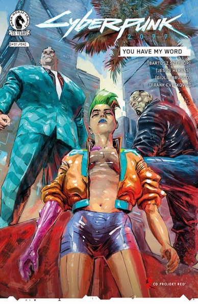
Cyberpunk 2077: You Have My Word #1
Written by Bartosz Sztybor
Illustrated by Jesús Hervás
Colored by Giulia Brusco
Lettered by Mattia de Iulis
Reviewed by Conor Spielberg
The most impressive thing about “Cyberpunk 2077: You Have My Word” from a writing standpoint is that Bartosz Sztybor manages to create a real strong sense of socio-political infrastructure of Night City by merely grounding it in two realistic characters. This job is made easier by the stellar artwork by Jesús Hervás, which manages to have its cake and eat it too, with a strong sense of style paired with a degree of realism in the characters’ designs.
The neon coloring of the world is used to great effect by Giulia Brusco, allowing for a strong sense of tone in every page thanks to the variety of choice at Brusco’s disposal. In fact, what makes this comic feel like it’s the start of something stellar is the fact that each page feels like it was treated as a work of art unto itself. Personality oozes from each page, with well sequenced panels and expressively drawn characters evoking such a strong emotional tone throughout.
There is very little plot to speak of thus far, but that is somewhat expected when there is world building and characters that need to be introduced. The overall enjoyment of the series will be dependent on how well this neo-noir crime drama plot unfolds, but I trust that Bartosz Sztybor has something good planned based on the fact that the first issue was such a blast to read.
Final Verdict: 8.4 – Stellar Artwork in service to what looks to be a promising story.

The Marvels #1
Written by Kurt Busiek
Illustrated by Yildiray Cinar
Colors by Richard Isanove
Lettered by Simon Bowland
Reviewed by Quinn Tassin
Something about reading Kurt Busiek’s superhero comics feels like great journalism. There’s this sense of cultural, historical, and political context to much of his writing but it’s all extremely well-focused on its subjects, who feel not just real but normal (for superheroes, at least). That’s essentially the whole point of Marvel Comics so it comes as no shock that he captures this world just as well as he always has. He writes Carol Danvers and Steve Rogers hanging out in Prospect Park and having a normal person conversation. Steve is reading the Lord of the Rings books- all 3 in a week and half no less! Normal people go on a flying car tour of New York City to see heroes in action! It’s a plain delight.
The story he’s chosen to tell here is sprawling, featuring characters from all corners of the Marvel universe, some of whom are more obviously connected than others (and a couple who this writer has never even seen). It’s exciting to read a book like this- one whose purpose isn’t to rock the whole Marvel line to its core but rather to tell a really interesting story that features a lot of types of smaller pieces.“The Marvels #1” feels like a model for the types of swings comics should be taking more often.
Yildiray Cinar and Richard Isanove compliment all of this with the platonic ideal of Marvel Comics art. It’s clean and clear and moves seamlessly between action and regular day to day actions. There are more than a few highlights; Cap’s leap from the stratosphere, Spider-Man and Vulture’s fight, and Punisher’s Little Sin-Cong fight are all stunning, as is the Prince cameo.
Final Verdict: 8.3- “The Marvels” is a damn good debut for the kind of comic everyone should be trying to make.
Nuclear Family #3
Written by Stephanie Phillips
Illustrated by Tony Shasteen
Colored by JD Mettler
Lettered by Troy Peteri
Continued below
Reviewed by Christa Harader
“Nuclear Family” #3 sees the McCleans undergoing various forms of interrogation, and the kids get loose and discover a ghoulish secret.
Phillips keeps the action moving in this comic – sometimes too quickly – but the period nuclear threat lends itself to a snappy kind of storytelling. Shasteen’s art retains its cellophane-wrapped interest, but facial details continue to break down in profile, when characters move quickly and in expressions of alarm or outrage. The unreality ticks up to a level that can push us out of the story at times. Mettler’s colors are a curious blend of deep textures and smooth, digital swaths. Sometimes the art appears unfinished, as with Shasteen’s detail choices, and other times it hits the right balance of pop weirdness. Peteri’s lettering is spare, with a wide font and almost no balloon padding.
Overall, “Nuclear Family” #3 continues the story’s breakneck pace without digging too deep into unnecessary backstory or plot dumps, and we get about as much as we’d expect from a ‘60s sci-fi jaunt. However, given that this comic’s based on a Dick story, we expect a little more weirdness and less linear nuclear threat than we’ve gotten so far. We might have some of it in store beyond the mystery, as we’re still waiting on that radio hint from issue #1.
Final Verdict: 7.0 – “Nuclear Family” #3 keeps the story moving with decent, if irregular, craft from the whole team.
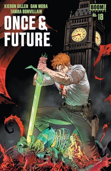
Once & Future #18
Written by Kieron Gillen
Illustrated by Dan Mora
Colored by Tamra Bonvillain
Lettered by Ed Dukeshire
Reviewed by Luke Cornelius
With “Once & Future” #18, the creative team bring the dramatic third arc to a close. It’s been an ambitious arc which has pushed the boundaries of the story further, revealing the parliamentary connections to Otherworld and making the world of the story feel that little bit bigger. By the end of issue #18, Otherworld has gotten a lot, lot bigger.
Gillen’s script for “Once & Future” #18 packs in plenty of action and swiftly rounds up the Grail storyline in its first half, before setting up the future of the series in the second, ending with a great cliffhanger ahead of its four month hiatus. There are multiple pay-offs in the issue which makes the read very satisfying as well as give the status quo a dramatic change. Gillen doesn’t neglect to mention the looming fate with the Green Knight either, reminding us of another tantalizing thread still to be concluded that only serves “Once & Future” with even greater longevity, which, given its consistent quality, is a very good thing. There are points where Gillen pushes the pace hard and threatens to rush the events of issue #18, though it ultimately feels like each scene has just enough room to breathe, even so much as making the page count feel longer than it actually is.
On the first readthrough of the issue, this reviewer found Mora’s artwork on the opening few pages to be unusually too busy in their detailing and compositions and it made for a disorienting read. On the second readthrough it was significantly better, though one pivotal moment still seemed slightly incomprehensible. For the record, the watermark on the review copy didn’t help the clarity of the pages, though this reviewer feels that the panel depicting the pivotal moment would still be somewhat difficult to comprehend without it. Clarity quickly returns and the remainder of “Once & Future” #18 is detailed and dynamic, without being disorienting. Bonvillain’s colorwork is as vibrant and as definingly Otherwordly as ever in this issue, though as to be expected, when paired with the already confusing pages, the contrasting neon green and pink hues become a little overwhelming. Bonvillain makes up for it in later Otherworld scenes where sumptuous foliage are contrasted with the horrific and disfigured characters covered in vivid red blood.
Final Verdict: 7.4 – “Once & Future” #18 is a good finale to the third arc of the series, though it is marred by the disorienting opening pages.
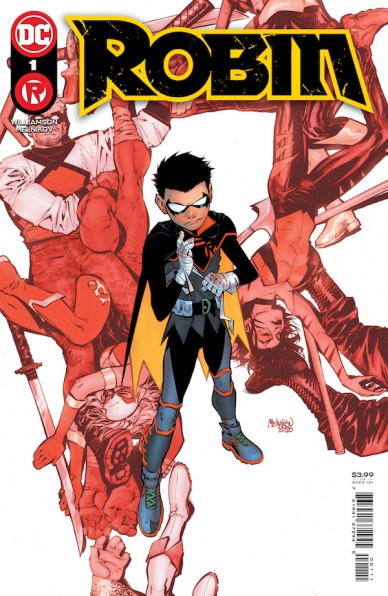
Robin #1
Written by Joshua Williamson
Illustrated and colored by Gleb Melnikov
Continued below
Lettered by Troy Peteri
Reviewed by Gregory Ellner
On the whole, Joshua Williamson’s writing on “Robin” #1 is very entertaining. Yes, Damian Wayne, the eponymous Robin, is arrogant. He is awful to be around, and on his best days, he still can grate on people. However, Williamson makes sure to show that while Damian is the protagonist of this comic, he is not necessarily right. Others characters in the story can be better at interpersonal interactions, and some may even be better at combat than him, despite his insistence that he is the best around. As such, while he is the focus, there is a good showing by other members of the Batman family, as well as of other characters that are likely to be villains or otherwise supporting characters for the series to come. Of course, not everything is perfect: some of the characters mentioned are cheapened by being beaten off-panel despite their impressive histories, but nothing that seems to make much difference to the primary plot.
While the story is pretty good, it is Gleb Melnikov’s illustration and colors that really make this series debut pop. With “Robin” #1, Melnikov shows just how animated and expressive the art can be, with what seems to be motion blur, silhouetted figures, and highly detailed facial expressions. Backgrounds either are given focus or none at all depending upon how intense the scene is, and the color blends in perfectly with the illustrations themselves, owing to how both are made by the same person. The fight with “Flatline” is especially intense, as speed and color are both at the forefront, emphasizing both parties’ skill while also never downplaying the brutality of the violence they inflict one another in this contest.
Final Verdict: 7.0 – Energetic and entertaining, there is a lot to look forward to in Robin’s latest series.

Shadecraft #2
Written By Joe Henderson
Illustrated By Lee Garbett
Colored By Antonio Fabela
Lettered By Simon Bowland
Review By Henry Finn
With the premise set in issue #1, the second issue of “Shadecraft” dives deep into the relationships of protagonist Zadie Lu. She ducks and dives her way through everything life is throwing at her, whether it be parents, boys, or her brother…who by the way is a talking shadow. This is peculiar considering her brother is also in a coma, creating a strong hook to make you want to follow long enough to understand the meaning behind all of this.
Joe Henderson deftly handles the minutia in the life of a high school girl and every page moves the plot forward without sacrificing any character development. He alternates between plot development, relationship development, and exposition every three or four pages. This creates a brisk rhythm across the issue, and by the cliffhanger you are ready for “Shadecraft” #3. He excels at crafting original voices that bring each and every character to life.
Similarly, Lee Garbett focuses on the fine details of body language and facial expressions to ensure every panel of dialogue lands emotionally. When Zadie is exacerbated doesn’t just scrunch her eyes, she throws her hands up and twists her head slightly. When her mother is giving her comatose son a sponge bath, the creases on her face change panel to panel, relaying her guilt, fear, and uncertainty. Garbett’s layouts are simple but effective, opting for mostly medium and closeup shots, which keeps you close to the emotions of the characters.
Needless to say, in a series featuring talking shadows, the color and shading is extremely important to get right, and Antonio Fabela matches Garbett shot for shot. He creates volume by bending light around bodies, and atmosphere through the addition of backlighting and haze that doesn’t exist in the inked version. He also brings watercolor-like textures to the shadows that adds a spiritual element to the otherwise crisp and clean artwork. This is revealed by the three supplemental pages of original art included at the end of the comic, which is a fascinating study on the marriage of artist and colorist.
Issue #2 brings us clever uses of shadow play and another hook to the plot, but most importantly a deeper emotional investment as we get to know more about Zadie’s relationship with her brother. When a loved one leaves us, all we are left is with the memories and the stories we tell ourselves about them. But what happens when they can talk back?
Continued belowFinal Verdict 8.5 – “Shadecraft” succeeds at bringing together interesting characters with a fun premise.

U.S. Agent #5
Written by Priest
Illustrated by Georges Jeanty
Colored by Matt Milla
Lettered by Karl Story
Reviewed by Ryan Fitzmartin
As U.S. Agent concludes his television debut last week, Christopher Priest and Georges Jeanty wrap up their five issue arc focusing on John Walker’s solo adventures. Priest and Jeanty’s finale has an epic scale, with John Walker and his rival The Saint locked in a brutal fight aboard a crashing helicarrier. Add a giant dragon to the melee, and you have a recipe for one action packed finale. The battle is exciting, and well drawn by Jeanty who has a real talent for composition. The fight feels raw, with terrific use of closeups and backdrops to emphasize the intensity. Overall the action is superb.
Unfortunately, the political and emotional message the creators are trying to sell gets a little lost in the chaos. There’s a cutaway to a police traffic stop gone wrong, which serves to explain The Saint’s origins. The point about police violence against Black America is mildly undercut when we return to dragons and helicarriers in the sky. Jeanty draws it in a harrowing way, with grimly monotone color work from Matt Milla, which contrasts hard with the vibrance of the main story. The flashback is effective in delivering it’s message, it’s simply an odd tonal shift that doesn’t entirely work. The traffic stop flashback scene is jarring and raw, and it feels flat out absurd to return to a superhero aerial battle after it.
Overall, U.S. Agent #5 is very strong, but is a frustrating flawed issue at its core. The elements are all top notch, but the tonal shift takes the reader out of the narrative.
Final Verdict: 7.4 – A slightly uneven, action packed, epic finale.
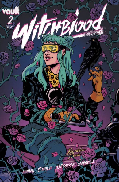
Witchblood #2
Written by Matthew Erman
Illustrated by Lisa Sterle
Colored by Gab Contreras
Lettered by Jim Campbell
Reviewed by Alexander Manzo
“Witchblood” #2 steps up the story by giving the motivation of Paxton Labelle and his Hounds of Love. Matthew Erman uses the antagonist similar to a classic 80’s villain by having a character that delivers a speech while the rest of the goons do the killing. Paxton comes off as a homicidal vampire with a spoonful of charming attitude. Erman continues the beat for Yonna being the reluctant hero not wanting to be involved whatsoever, especially after nearly dying in the previous issue. It is not until her final moments of the issue that she sees the true power of The Hounds that forces her to ask what she can do to stop them.
The art throughout the issue was a problem due to the inconsistency. Lisa Sterle is able to put a lot of detail into the character when they are by themselves in a panel and even if it’s one-on-one with another character. However anytime there is a broader panel or simply more than two characters the rest suffer with either dots for eyes or even just blank faces. There is also a moment towards the end of the issue when the Paxton Labelle kills Amaya that has a perspective issue that took several reads to fully understand how he attacked her. The following panel then has The Hounds feasting on a mannequin looking corpse that has no real detail other than the leader on the far right side.
Gab Contreras saves a lot of these panels with her bright color choices that can bring about the fantasy element of “Witchblood.” Yonna’s blue hair and bright pink shirt help her stand out in any panel she’s featured. The Hounds bar scene had a great choice of colors for the hole-in-the-wall vibe dimly lit that helped bring an uncertainty of what they would do next.
Final Verdict: 6.9 – The story is coming together but the art has some hiccups that can deter the reader.


