There’s a lot to cover on Wednesdays. We should know, as collectively, we read an insane amount of comics. Even with a large review staff, it’s hard to get to everything. With that in mind, we’re back with Wrapping Wednesday, where we look at some of the books we missed in what was another great week of comics.
Let’s get this party started.

Written by Jeff Lemire
Illustrated by Dustin Nguyen
Lettered by Steve Wands
Reviewed by Niklynn Dunn
The first thing you should know about “Ascender” is that it is one of the most beautiful comics on the shelves right now. Dustin Nguyen is really bringing it to a new level artwise so far. You can just tell by the detail from the cover to the interior work, that “Ascender” is a labor of love. Storywise, Jeff Lemire leads us in a direction that is sure to be a beautiful, sad, strange space adventure like “Descender” was. Issue one set the tone of the series and in this issue, “Ascender” #2, the plot escalates quickly in exciting ways. We learn that Andy still knows how to fight and it’s clear that Mila has her parents’ spirit of rebellion.
And I can’t stress this enough, the artwork in this is beautiful. There really isn’t anything like “Ascender” on the shelves right now. Nguyen’s painted style fits very well with the story. In Lemire’s stories, his characters always have a sadness to them while also being hopeful in a way. Nguyen’s art and colors do a great job of capturing that. The world has a melancholy, cold feel to it, but yet so much wonder. Take, for instance, Bandit. Nguyen’s art brings so much personality to him that you almost forget that he is a robot. Steve Wands’s lettering and the noises Bandit makes bring him to life too. All in all, it’s masterful work by all. You really are stepping into another world with “Ascender.”
What more can I say? “Ascender” #2 is a great continuing issue of what is just the beginning of more sci-fi goodness from Lemire and Nguyen and you should be reading this series.
Final Verdict: 8.5 – “Ascender” #2 is a great action-packed continuing issue.

Written by Rick Remender
Illustrated by Matteo Scalera
Colored by Moreno Dinisio
Lettered by Rus Wooton
Reviewed by Vanessa Boney
“Black Science” #40, is yet another testament as to why Remender is one of the best in the business. Remender delivers a story that includes a sizable leading cast, without it being overwhelming, as every character gets a chance to display who they are and what they bring to the team. He created a character who is self-aware and not so wrapped up in his own righteousness that he is blind to his own faults. It’s impossible not to root for Grant as he continuously apologizes to his loved ones for his mistakes, and is doing any and everything to right his wrongs. Most impressively though is how “Black Science” #40 manages to avoid becoming too dark by flawlessly injecting comedic moments in a story that centers around the apocalypse.
The visuals team of “Black Science” #40 does a fantastic job showcasing the collapsing world around our heroes. Scalera’s lines are clean, and his Illustrations remain consistent throughout the comic. He draws facial expressions that channel emotions well. The art also plays a part in keeping a lighter, less serious tone by being exaggerated at some points, such as in the case of Grant’s beak-like nose, and tears that more resemble streams. Dinisio’s use of harsh, muddy colors and darker tones accentuate the chaos and destruction of the apocalyptic doom and gloom. Wooton’s long and thin font is the icing on the cake, as it reflects the eerie setting of “Black Science” #40.
Final Verdict: 9.0 – Solid art and perfect comedic timing add a good balance to the apocalypse going down in “Black Science” #40, making this comic an enjoyable literary cocktail.

Written by Eliot Rahal
Illustrated by Rags Morales, Alessandro Micelli, CrissCross with Jordi Tarragona, Diego Yapur, Grey Williamson
Continued below
Colored by Andrew Dalhouse
Lettered by Simon Bowland
Reviewed by Matthew Blair
“Bloodshot Rising Spirit” #7 is a story about the people trying to contain and stop one of the most powerful characters in the Valiant Universe from going on a murder spree. Writer Eliot Rahal does a good job of giving the reader the perspective of the little people such as the guards, the lab assistants, and the other cannon fodder who normally act as background characters in these kinds of stories. The panic they feel as they desperately try, and fail, to stop an unstoppable killing machine is palpable and the violence is visceral and savagely beautiful.
Unfortunately, while the writing is good, the artwork of “Bloodshot Rising Spirit” #7 is a mess. A whopping six artists worked on this issue all at once. This wouldn’t be so bad if they stuck to a specific art style, but they don’t so the art changes every couple of pages. That’s not to say the art itself is awful, the action and geography of each scene are clear, the blood and gore are properly visceral, and aside from a few minor proportion hiccups, the characters are well drawn. It’s just incredibly distracting to see five different artistic visions in the same comic.
“Bloodshot Rising Spirit” #7 is a good story and is made by people who are clearly very passionate and very good at making comics. Unfortunately, this is a case of too much of a good thing as the plethora of art styles proves to be a massive distraction from the book.
Final Verdict: 4.9 – An unfortunate case of too many cooks spoiling the broth as a decent story is crippled by too many artists on the same book.

Written by Cullen Bunn
Illustrated by Laura Braga
Lettered by Jack Morelli
Colored by Mat Herms
Reviewed by Michael Govan
Riverdale is full of nice people. Moose, Milton, the list goes on and on. The list of jerks in Riverdale, on the other hand, is pretty short. There’s Reggie Mantle and Cheryl and Jason Blossom. For my money, the Blossoms are the worst. Entitled, self-centered, bullying brats…they are some of the worst, most stereotypical popular kids there are. They feel like evil incarnate.
I like how Cullen Bunn takes it a step further and literally makes the Blossoms evil incarnate. While I’ve enjoyed the mini-series so far, this issue didn’t do it for me. It isn’t without its positives. The visuals in “Blossoms: 666” #4 are great. Jughead actually looks a little like Cole Sprouse, who plays the character on Riverdale. I like Laura Braga’s visual storytelling in the opening pages especially, the panels contrasting Julian’s horrid upbringing with his privileged siblings. The smirks on the Blossom siblings faces are both chilling and irritating at the same time. I don’t like them at all, which is probably the point.
I don’t love the inclusion of Julian though. He serves as a common foe for Cheryl and Jason but he isn’t a particularly interesting one. His upbringing aside, in this issue he acts exactly the same as his siblings. I do mean ‘exactly’ too, there’s literally no difference. He isn’t really bringing anything new to the table at the moment. What really took me out of the issue was that Cheryl’s scheme somehow manages to come back around to the worn out Archie/Betty/Veronica love triangle…again. Archie isn’t even the focus of this mini-series and somehow his love life takes center stage for the umpteenth time. Even the demonic twist can’t make the love triangle interesting.
Final Verdict: 5.5 – The Blossoms interfere in Archie’s boring love life.
Written by Simon Spurrier
Illustrated by Matias Bergara
Colored by Michael Doig
Lettered by Jim Campbell
Reviewed by Jhoan Suriel
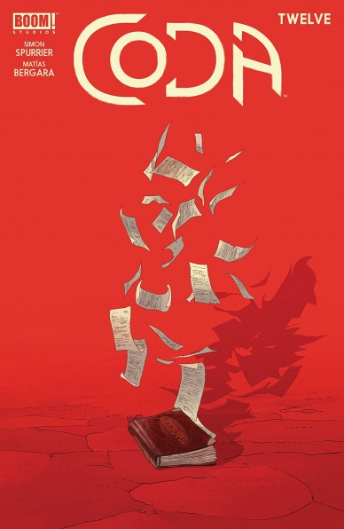
“Coda” #12 written by Simon Spurrier, illustrated by Matias Bergara, colored by Michael Doig, and lettered by Jim Campbell concludes on a high note. Indeed from the start of the comic, we can sense it’s the beginning of the end because Bergara illustrates an excellent and epic battle. Additionally, Bergara makes use of creative panels in this issue such as a series of triangular panels that take up two pages. Overall, Bergara outputs some of his best work yet with “Coda” #12 with striking silhouettes and bombastic action panels.
Continued belowThe color assists by Michael Doig is a delight to witness. Doig takes us on a journey from various color palettes such as orange, red, and green in a climactic splash page. Later, in pages twenty-three and twenty-four, Doig renders a beautiful yellow and sepia tone scene. In short, “Coda” #12 features some of the best color work in the comics industry. The colors are an absolute treat to behold so it’s sad to see one of the most visually appealing comics end. Campbell’s letter work blends panels together with letters that travel panels such as “AAAAAAAH” sound effects on page eighteen.
Of course, no comic is complete without some humor to break up the chaos that ensues in “Coda” #12. Some of the funniest lines that Spurrier conjures up in this issue comes from a dragon who provides comic relief. The recurring favor that the dragon asks of Hum is to “Scratch [his] arse” and it feels satisfying to watch it come full circle in this last issue. While Spurrier plays it safe with the hopeful tone, there’s no denying that it is quite charming.
With “Coda” #12 Spurrier and Bergara deliver a well-paced issue that wraps up the series on a neat and poignant note. The themes of love and accepting people for who they resonate quite well. “Coda” #12 is easily one of BOOM! Studios best comic. If you haven’t it before, “Coda” is an easy recommendation.
Final Verdict: 9.6 – Spurrier and Bergarara’s post-apocalyptic fantasy series comes to a poignant conclusion, placing it among Boom Studio’s best comics.

Written by Chip Zdarsky
Illustrated by Lalit Kumar Sharma
Colored by Java Tartaglia
Lettered by Clayton Cowles
Reviewed by Gregory Ellner
What do we do with a world without Daredevil? From Matt Murdock to Cole North to Wilson Fisk, this question takes the center stage at the start of the new “Daredevil” volume’s first arc. Chip Zdarsky uses “Daredevil” #6 to set up a new situation for the Devil of Hell’s Kitchen, all without having any outright “Daredevil” action in and of itself. Zdarsky pulls the focus off of Daredevil, and more onto the society he involves himself with, from the police to the criminal enterprises such as the Owl to Mayor Fisk. Zdarsky handles this shift very well, demonstrating Daredevil’s impact without ever actually showing him fighting, along with showing a relatively happy life for Murdock.
Through the illustrations, Lalit Kumar Sharma casts an odd, but well-done combination of realistic faces with cartoonish poses, putting a heavy emphasis on Wilson Fisk’s hulking physique while not straying away from highly emotional facial expressions ranging from embarrassment to fear to rage and more.
Java Tartaglia’s colors air on the side of a darker shade befitting the relatively dark nature of a Daredevil story, from Fisk’s routine workout session fighting “rented” criminals to other deepened shadows around progressively obsessed Detective North. On the other hand, some elements do have a lighter hue, especially with Matt Murdock living out in the daylight. His (rather humorous) interactions with a bookstore owner are rather colorful and bright, with even the brief look at his “radar sense” seeming relatively light when contrasted against other parts of the tale. By contrast, another visit to a different store is given a somewhat darker color to showcase the horrors of an emergent criminal enterprise, helping to separate the nature of life without Daredevil for the general populace from the freedom derived by Murdock trying to leave that life behind him.
Final Verdict: 7.0- Even without Daredevil himself appearing in costume, Zdarsky, Sharma, and Tartaglia tell a very good story revolving around his absence.
Written by Collin Kelley & Jackson Lanzing, Joshua Williamson, G. Willow Wilson, Andrew Marino, Phillip Kennedy Johnson, Kenny Porter, Dan Didio, and Mariko Tamaki
Illustrated by Cully Hamner, Kyle Hotz, Stjepan Sějić, James Harren, Christian Duce, Tom Raney, and Cian Tormey
Penciled by Paul Fry
Inked by Mick Gray
Colored by Dave McCaig, David Baron, Stjepan Sějić, Dave Stewart, Luis Guerrero, Ivan Plascencia, Hi-Fi, and John Kalisz
Lettered by Andworld Design, Tom Napolitano, Steve Wands, Clayton Cowles, Travis Lanham, and Rob Leigh
Continued below
Reviewed by Elias Rosner
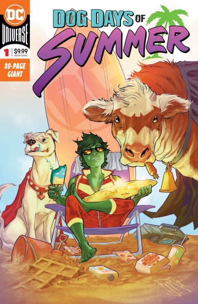
These seasonal DC anthologies have become something of a tradition and for good reason. They’re a lot of fun, giving creators a short space with which to tell a story around a central theme, and acts as a showcase of new and old talent. “Dog Days of Summer” focuses on the animals and animal themed heroes of the DCU and while the quality of the stories varies, as is the case with most anthologies, the cumulative effect of the book is well worth your time.
Some highlights of “Dog Days” includes the return of Mariko Tamaki and Stjepan Sějić to the DCU, each paired with the perfect collaborators to bring us stories of Ferdinand and Beast Boy that are funny and contemplative. Sějić, in particular, was a perfect choice as his art and coloring is soft and details and can run the gamut from sexy to horrifying with striking character designs. Complemented by Steve Wands’ lettering and G. Willow Wilson’s dialog, the whole team really knocked it out of the park.
While I didn’t particularly enjoy “Panic at the Midnight Rodeo,” the Batcow centered story succeeds at embracing the inherent ridiculousness of the concept and gives us a story with over-the-top dialog and a patently absurd narrative that takes itself so seriously that it can only be read as a farce. It’s even drawn in the style of an early New 52 issue, wherein Batcow was last really used, with a slightly washed out palette. In contrast, “Rio Celeste” is a horror story with a bittersweet ending, filled with majestic colors that pop, as befits an Animal Man tale. I particularly love the way Christian Duce draws and Luis Guerrero colors the water. It’s a small detail but it really went a long way to making the location feel more alive and thus, scarier.
Williamson also returned to his horror roots with “Citizen Croc,” rendered by Hotz and Baron with heavily inked art and dark foreboding colors, joined together with Napolitano’s thick, jagged lettering, all of it working together to create the oppressive atmosphere of the deep swamps. You’d almost be remiss in thinking it was a Swamp Thing story.
“Crisis on Earth-26” might be my favorite of the anthology, however, simply because it features the return of the Multiversal Justice League as drawn & colored by James Harren & Dave Stewart, who bring a manic and powerful energy to the cartoon world of Captain Carrot. It’s also got more of Napolitano’s lettering, which is integrated beautifully into the art, guiding the eye when the art does not and weaving between Harren’s figures so as not to obscure while still bringing out the best of it.
“Tourist Season” and “The Crucible,” are OK, fairly standard stories that, while getting the characters, don’t have the same level heart or humor of the others to really make them stand out. “The Crucible” being held back by an overabundance of narration over splash pages while “Tourist Season’s” narrative is predictable, despite featuring, essentially, the revenge of the Ewoks as lead by a blood vomiting cat. But, for an anthology of eight, two OK stories is an acceptable margin of error.
Final Verdict: 7.0 – From beach bods and terror in the water, “Dog Days of Summer” has something for everyone in this fun anthology. Plus, the line “I cannot serve fungus burgers to the Justice League!” is spoken. ‘Nuff said.
Written by Saladin Ahmed
Penciled by Minkyu Jung
Inked by Juan Vlasco
Colored by Ian Herring
Lettered by VC’s Joe Caramagna
Reviewed by Gustavo S. Lodi
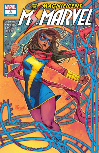
Fables and comics can walk hand-in-hand. They both dwell on versions of mythology, they explore strong characters and utilize analogies to discuss actual themes through the lenses of the fantastic. “Magnificent Ms. Marvel” #3 is just the latest comic book to attempt to mash these two narrative styles together, but it has certain shortcomings that prevent it from being great.
Starting with the positive first, the art by Jung and Vlasco is perfectly suited to this story. Lines and design share a minimalistic style, which should automatically take readers back to fable books of old, crammed with drawings and details. Even if nothing jumps out of the page, it is the overall cohesion that makes it work. More than that, character expressions, especially those for Kamala and her parents are very effective and conveying the roller-coaster they are going through.
Continued belowOver at Ahmed’s plot, it harkens back to the tried-and-true trope of the chosen one, which is actually played for laughs on this very story. The tale of the far-flung hero, destined to travel to a remote location and become it’s people’s savior. Ms. Marvel really adapts to this situation, her own character having gone through many adventures and maturing since her origin, not that many years ago. It works on the charm of its protagonist alone.
However, there is not much else than this. This issue misses a lot of opportunities, like exploring Kamala’s reaction, emotionally, to her new environment and role. The surprise her parent would normally face on such a different situation, in addition to adapting to learning more about their child. Also, the archetypes of the other characters they meet are too ordinary, too familiar for readers to really cause an impact.
By choosing to dare too little, and seemingly content on just rehashing tropes of the past, “Magnificent Ms. Marvel” #3 fails to generate true excitement.
Final Verdict: 6.9 – Beautiful, yet shallow, “Magnificent Ms. Marvel” #3 loses too many opportunities for its own good.

Written by Jackson Lanzing & Collin Kelly
Illustrated by Stephen Thompson
Colored by Charlie Kirchoff
Lettered by Neil Uyetake
Reviewed by Chris Egan
As the first issue drew in readers with pulse-pounding space action and expansion of the canon, issue #2 is filled with the repercussions of the premiere. Lanzing and Kelly move heavily into classic Trek territory. They fill many pages of dialogue between the ship’s bridge crew attempting to find the proper way to move forward in their unwanted conflict with the Tholians. This mysterious and technically advanced species continues to be one of the greatest threats the original Enterprise has faced (at this point in their journey). The inter-crew relationships are on full display and perfectly written.
Thompson illustrations are a real treat. He continues to not only make one of the best looking Star Trek books ever put on shelves, but he also gets the likenesses of the actors perfectly and knows how to effectively keep them as the character, even if the artistic license requires him to move even slightly away from the actors’s likenesses. Kirchoff’s colors meet the exact palette used on the original t.v. series all while keeping things a little more modern for today’s readers. The colors are brighter and pop a bit more than did on the show.
This book is a must for Star Trek fans and I hope it continues far past the Tholian problem and shows us many more missions. This creative team truly understands how to keep things fresh and exciting while sticking to the original continuity. Fans of all ages should be very pleased.
Final Verdict: 8.0 – Keep on Trekkin’.

Written by Brian Bendis, Matt Fraction, Greg Rucka and Marc Andreyko
Penciled by Yanick Paquette, Steve Lieber, Mike Perkins, Eduardo Pansica and Julio Ferreira
Colored by Nathan Fairbairn, Paul Mounts, and FCO Plascencia
Lettered by Dave Sharpe, Simon Bowland, Clayton Cowles, Tom Napolitano, and ALW’s Troy Peter
Reviewed by Alexander Jones
Brian Bendis has big things coming for the Superman line of comic books with “Event Leviathan” #1 shipping in a few short weeks. DC is addressing the state of the Superman franchise with an impending expansion of the line while foreshadowing the upcoming event. “Superman: Leviathan Rising” #1 is a huge issue loaded with exciting content that covers a lot of ground.
Due to the sprawling nature of the writing and different creators contributing to the issue, “Superman: Leviathan Rising” #1 doesn’t feel cohesive. Even with all the different segments creating chaos and vastly different tones, each contribution to the story feels unique and interesting. The writing team does a great job establishing a conflict for each segment of the issue. While every chapter had a great hook, the oddball plot for the Jimmy Olsen segment of the title was particularly noteworthy. The subtle resolution for the story comes in a later chapter of the issue and the writing team did an excellent job introducing a familiar DC in a sneaky new context.
Continued belowOne of the core problems with the incohesive nature of the “Superman: Leviathan Rising” one-shot is the scattershot nature of the art within the story. While Yanick Paquette and Steve Leiber complement each other well, the remaining three artists clash with the tone of the rest of the story. Mike Perkins, Eduardo Pansica and Julio Ferreira are adequate artists that render their pages with a solid, but forgettable sense line. Leiber’s Olsen sequences hit the greatest highs with his creative use of the medium and interesting choice of visuals called for in the script.
The “Superman: Leviathan Rising” #1 one-shot sets up the incoming event with a really strong tease at what is to come in the franchise. Seeing the mysterious cast of characters in Leviathan makes for a tense issue. The teases at both of the upcoming “Jimmy Olsen” and “Lois Lane” comic books appear clever as well. The conflict Superman faces in the issue itself is also quite interesting and carries a resolution that introduces intriguing new questions.
Final Verdict: 7.5 – “Superman: Leviathan Rising” #1 is a fascinating prelude to what is coming next for “Event Leviathan” and the “Superman” line of comics.


