
There’s a lot to cover on Wednesdays. We should know, as collectively, we read an insane amount of comics. Even with a large review staff, it’s hard to get to everything. With that in mind, we’re back with Wrapping Wednesday, where we look at some of the books we missed in what was another great week of comics.
Let’s get this party started.
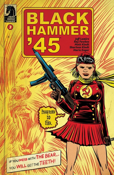
Written by Jeff Lemire
Illustrated by Ray Fawkes
Colored by Matt Kindt & Sharlene Kindt
Lettered by Marie Enger
Reviewed by Chris Egan
Lemire’s strength for writing deep and emotionally present characters is on full display as the narrative jumps between present day and World War II. As the surviving members of the Black Hammer Squadron reflect on the events that ended their time in the war, tying them to their current status. We get more fun Russian mech and Nazi superhuman action, as well as taut racial and super-being tension. It all makes for an interesting and thought-provoking read. For not overly lengthy issues, Lemire chooses to go fairly text heavy with each chapter and this one is no exception. We are getting a lot of info from this story, but it is paced out nicely.
Ray Fawkes’s style works and comes at us for a proper reason, but it isn’t my favorite for this series. Sketchy and looking rushed, there is a distinct feeling of looking through the fog of the past to reach to days past and it absolutely works on that level, but the unfinished feeling works less as we move the moments of the present day. If they wanted to keep a similar tone, while keeping things a bit more clear and distinct, Lemire’s own art style would have worked as a perfect counterpart. The Kindts do an outstanding job filling out each page with their color work. They use more muted tones to keep in with the 1945 era, making most of the issue look like faded color photographs (not that those existed in that year). Their work makes this series look that much better.
As this world continues to expand, writer/mastermind Jeff Lemire continues to play with various concepts and ideas of what exactly makes a “Black Hammer” comic. “Black Hammer ’45” puts a new spin on how the title is used and makes for an interesting divergence from the rest of this universe.
Final Verdict: 7.0 – As a midway point, “Black Hammer ’45” #3 is still a well done and mostly emotionally satisfying read but has yet to prove itself as one of the stronger spin-offs.

Written by Paul Scheer & Nick Giovannetti
Illustrated by Nathan Stockman
Colored by Antonio Fabela & Rachelle Rosenberg
Lettered by VC’s Travis Lanham
Reviewed by Gustavo S. Lodi
Some characters appear once or twice every decade, with either a unique concept or a strong editorial push (often both) and manage to catapult themselves into a level of presence and spotlight domination that seems surprising. Since appearing on the pages of the “Thanos” series by Donny Cates, Cosmic Ghost Rider has captured some of that thunder, to varying degrees of success.
This current mini-series, upon which Frank Castle (that’s the Punisher, mixed with two layers of cosmic powers) go around showing his meddling of Marvel history, is something of a mixed bag. It seems to take for granted that it is a funny concept on its own, and fails to really ignite comedy gold with its execution.
The art by Stockman, Fabela, and Rosenberg is spot-on. They offer a blend of cartoony and gritty realism that suits the Cosmic Ghost Rider concept well, and the group has managed to revisit classic moments of Marvel history (this issue focused on the X-Men) and make them new and quirky. Character expressions, absurd situations, they all look like a very well-done pastiche on their original selves, with added dimensions and strong narrative pacing.
The script by Scheer and Giovannetti, on the other hand, is uneven. It seems that the duo tried to pack as much as possible on their maximum pages of the mini, to the side effect that none of these moments look and feel truly special. At times, it seems that the Cosmic Ghost Rider simply wrecked the entire continuum, but, since it is all played as a joke, it comes across as empty and uneventful.
Continued belowSurprisingly, the strongest moments happen on the anchor portion of the story (that of Frank Castle narrating his exploits to his unsuspecting family, under the guise of a long-lost uncle). Those are absolutely heartfelt, connecting with the main character and actually moving the story forward. Too bad they get lost in the shuffle.
Final Verdict: 6.5 – Despite its beautiful, dynamic art, “Cosmic Ghost Rider” #3 seems to linger on surprise, rather than development, to move the mini-series forward.

Written, Illustrated and Lettered by Terry Moore
Reviewed by Elias Rosner
“Five Years” opens in Terry Moore’s standard way: with an epigraph followed by a full-page spread, showing off his drafting ability and establishing a peaceful tone, one which clashes beautifully with the narration laid overtop. This serenity does not last long as the visuals soon morph, from idyllic beach time with the family to a nuclear hellscape, once again showing off Moore’s artwork, although this time in a much more gruesome way. It’s an arresting scene from the artwork alone but the narration makes sure to frame it so we know just how terrifying this possibility is to Katchoo and, more importantly, why.
What I appreciate most about this opening, and about this first issue of “Five Years” in general, is that Moore wastes no time getting to the heart of the series in a way that is satisfying for old readers and newcomers alike. The stakes are high and well established while keeping the emotional core solid, bolstered by the realism he imbues all of his characters with; from their posture to their expressions, to their personalities & and even their dress, the people in Moore’s work always feel and act alive, like they could be living next door.
This is supported by his lettering, hand-written, captures the warmth and the chill of each character, subtly, and not-so-subtly, changing along with the inflections in the characters’ voices. A gasp can either be in the regular font, a slightly larger, more jagged version, or one which completely reshapes the balloon, taking up half a panel, filled with as much detail as the burning sky.
It is a slow issue, for those who were hoping for more action along the lines of “SiP XXV,” but by opening slow, Moore has allowed himself space to set the tones of the comic, between witty & sharp humor and introspective, existential terror, and to take the time to let newcomers get up to speed. In fact, pages 8-12 (11-15 if you count the cover, verso & epigraph pages) are a masterclass in scene creation and tone control. That is where his strength lies, in crafting a narrative that comes from the characters, that is internal to their actions vs put upon them by “the plot.”
The care that goes into this comic worth more than any of the similarly priced comics from the Big 2, or even many of the other creator-owned companies. It’s clear that “Five Years” is a product of a deft storyteller and an artist who has mastered the fundamentals of the craft, building a story that will be expansive, as evidenced by the shifting narrative position at the end, yet still remain intimate and focused on the people, and their wants & fears & desires, at the center of it all.
Final Verdict: 9.2 – A return to form and a strong debut for Moore’s newest series. Even if you have never read a previous Terry Moore comic, pick this one up…and then check out the rest of them.
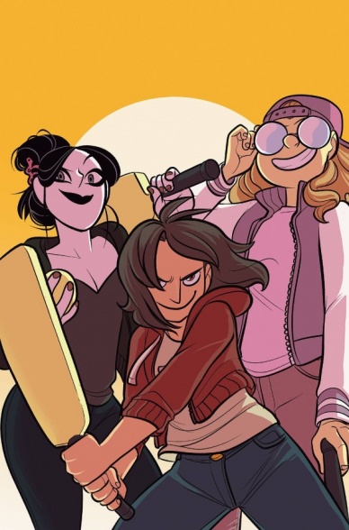
Written by John Allison
Illustrated by Max Sarin
Lettered by Jim Campbell
Colored by Whitney Cogar
Reviewed by Christa Harader
“Giant Days” is a delight, and remains a delight. Issue #50 has almost the entire gang bent on cricket destruction, with a happy outcome and a sobering last page that demonstrates why Allison is such a good slice-of-life storyteller. Sorrow and joy happen in equal measure, with a good deal of wild and wacky fun in between.
Sarin’s work on this series is seminal, and issue #50 is no exception. Susan’s diagrammed narration of how cricket works is adorable and chaotic (just like her,) Daisy’s obsession with the definitely-not-professional cricket player on the opposite team comes out in lovely dreamy visuals, and Esther’s magical girl approach is spot-on for her character. Cogar’s colors stay bright and cheerful, and gradient or stylized backgrounds in accent panels are deployed very nicely to punch up the page and tone things down at the end with the reveal. Campbell’s letters are great, as usual, with a nice wide font and economical balloons to manage all of the issue’s speakers as efficiently as possible. The addition of each player’s score at the bottom of their panels is a nice touch as well.
Continued belowMaintaining quality and interest while allowing character growth in a long-running comic is a tall order. “Giant Days” #50 is yet another example of a fine issue, with an excellent craft and all of the heart and humor that makes the book so good. Allison’s announced that #55 will be our last jaunt with Susan, Esther, Daisy, and the crew, so that makes this one all the more sweet for getting this far.
Final Verdict: 9.0 – “Giant Days” #50 is another great entry into the series, with a fun ensemble story that showcases everything that makes this book a must-read.

Written by Grant Morrison
Illustrated by Liam Sharp
Lettered by Tom Orzechowski
Reviewed by Alexander Jones
If every superhero comic was as ambitious and inventive as “The Green Lantern” #7, the medium would be considered in a different context. Author Grant Morrison does an excellent job introducing readers to new characters and protagonists before folding everyman Hal Jordan into the mix. “The Green Lantern” #7 is a title that withholds the greater plot and information from the reader on purpose. The issue strives to disorient and confuse readers based on previous chapters. While the title is in danger of being aggravating or annoying, “The Green Lantern” #7 is wonderfully paced and exciting to read. The title shares answers to plenty of questions at the end of the installment.
Comic books have absurd levels of science fiction and high-concept ideas. Sometimes, these ideas can be used in abundance to the point where they no longer seem novel. “The Green Lantern” #7 establishes a mystery and then slowly weaves in the remaining pieces before establishing what the issue’s actual plot is. “The Green Lantern” has used this technique an abundance of times in previous issues but the twist still comes off as inventive.
Morrison’s script for the issue is complicated and full of dense prose. Artist Liam Sharp has a lot of heavy lifting to do in order to make sure that the pieces of the comic fit together appropriately. Thankfully, his introduction of Jordan back into the main plot has a great aesthetic providing a cathartic moment early on in the comic. The seedy look of the Green Lantern Universe is crafted really well from Sharp. Alien creatures always carry inspired designs and shapes. Sharp’s work at DC has always been special but the alien worlds and locations carry particularly strange and arresting page compositions. The layouts towards the beginning of the issue also take huge chances with the narrative.
Each and every month, “The Green Lantern” has kept readers on their toes. This month’s installment has a huge sci-fi concept delving deep into the mythology of the franchise that will delight patient readers. Morrison and Sharp imbue the issue with an impressive level of craft demanding your hard-earned dollar.
Final Verdict: 8.9 – “The Green Lantern” #7 delves deep into a heady sci-fi concept with spooky aliens and beautiful art.
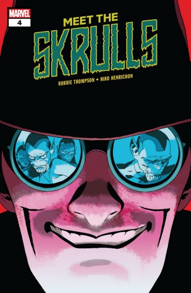
Written by Robbie Thompson
Illustrated by Niko Henrichon
Lettered by VC’s Travis Lanham
Reviewed by Michael Govan
Just like in Captain Marvel, it turns out the Skrulls in “Meet The Skrulls” aren’t really the bad guys. Same twist twice in just a few months and I was surprised both times. It’s not my fault, I mean, have you read a Marvel comic featuring the Skrulls? Everyone in the Marvel Universe thinks the worst of their entire species. Remember when Mr. Fantastic turned some into cows? Wild times.
Anyway, as it turns out, all of the Warner family’s espionage and scheming has been to rescue Ivy, their captured daughter/sister. The Warners have proven to be compelling, well-rounded characters and though Ivy hasn’t physically been present, her loss has been felt in the previous issues. This revelation hits hard and paints the family’s actions in a new light.
At the same time, I can’t help but wish the issue focused on Alice a bit more. All of the Warners are main characters but she’s sort of the ‘main’ main character. Her struggle to try and adapt to the Skrull mindset while having been raised in human culture makes her a very intriguing character. While her shocking actions from the last issue are central to the plot, her mental state and her perspective on the matter is just glanced at. It’s just a nitpick though and I’m probably biased since she’s my favorite.
Continued belowThe story is strong and the comic is great on the art side of things as well. Niko Henrichon’s Skrulls definitely feel…well, alien, for lack of a better term. Still, their expressions make them feel relatable. You feel the emotion when the Warner family fights as well as when they are reunited. “Meet the Skrulls” #4 makes for another compelling issue of the mini-series and has me anxiously awaiting the finale.
Final Verdict: 8.0 – What will happen to our beloved Warners?! Tune in next issue to find out! Same Skrull-time, same Skrull-channel!

Written by Christopher Hastings
Illustrated by David Hahn
Colored by Roshan Kurichiyanil
Lettered by Ariana Maher
Reviewed by Matt Ligeti
Based on the classic TV show of the same name, “The Six Million Dollar Man” follows Steve Austin, the world’s first bionic man. For anyone who hasn’t been exposed to the show or the waves it made in pop culture since, the credits page catches readers up on the basic premise and offers a brief sentence offering context for the issue: Steve is in Japan. He’s being chased by KGB agents. The battery running his robot parts? Dead.
These are all things we can glean from the book’s context, though the plot’s bigger picture might be lost on readers picking this issue up as their first foray into the series. Page one drops readers directly into an action sequence laden with immersive sound effects that play out like a portfolio piece for letterer, Ariana Maher. The sound effects look three-dimensional, with Steve being blasted through the “O” of a “KKBOOM” (a suggestion Maher credits to series colorist, Roshan Kurichiyanil), and other “BOOMs” and “TSSSs” angled and layered atop one another to add a depth of sound as it falls around Niko, Steve’s partner in “The Six Million Dollar Man” #3.
That kind of trust and willingness to work together shown by Maher and Kurichiyanil extends to the rest of the comic, making for an issue that feels cohesive and well put-together. Several places in “The Six Million Dollar Man” #3 involve characters speaking Japanese, with no translation offered. Writer Christopher Hastings relies on David Hahn, as illustrator, to use body language and other context clues to deliver that meaning. It especially pays off in a humorous moment, when several people show their surprise with word balloons featuring the same Japanese letters many times. You don’t have to speak their language to see how confused they are.
Kurichiyanil delivers colors that are bright and warm, pairing well with the humorous, action-packed yet family-friendly tone set forth by Hastings. Hahn’s style in “The Six Million Dollar Man” is mostly true-to-life, but with a polish to it, rather than a grit. Everything is a little cleaner. A little rounder. A little stylized. And Maher’s letters make the big moments bigger and the quiet moments more intimate. It all makes for a fun and approachable comic for everyone.
Final Verdict: 7.0 – “The Six Million Dollar Man” #3 makes it clear the Bionic Man is back and better than ever. Also stronger. And faster.

Written by Michael Moreci
Illustrated by Arianna Florean
Colored by Mattia Iacono with Sara Martinelli
Lettered by Tom B. Long
Reviewed by Gregory Ellner
As shown with the likes of “Wasted Space” and Black Star Renegades among other projects, Michael Moreci is a pro with the “space western outlaw” archetype, especially those that are not even remotely sophisticated. With “Star Wars Adventures: Flight of the Falcon,” he continues to spread his wings as he drives readers on a fun, at times silly path through the misadventures of Mahjo and her partner and superior Hondo Ohnaka as the latter causes a great deal of more trouble than is strictly necessary (such is his particular idiom). The story is simple but fun, both an interesting piece for newcomers to the Star Wars franchise that does not require any additional information and a companion story that gives those who do have knowledge of the plot something more to see of the workings of the galaxy.
Continued belowOn a related note, “Flight of the Falcon” serves as an unintended yet fitting tribute to Chewbacca, whose actor Peter Mayhew passed away this past Tuesday (April 30, 2019), his appearance allowing Moreci to give Mayhew’s characterization an amusing run to help pull away from the tragedy of his passing.
Arianna Florean’s artwork is appropriately cartoonish, with very animated figures and varied facial expressions. Even Chewbacca, the least humanoid of the named characters present, is given enough overt definition to easily see his personality without needing additional information, though Hondo does provide it anyway. In all, the focus on the reactions helps to draw readers into the world, creating rather hilarious situations based around common archetypes.
Mattia Iacono, aided by Sara Martinelli, helps the overall lighthearted feel of the story with either cool or warm color palettes depending on the situation without drawing too much attention. Furthermore, soft shadows help to calm readers down all the more, allowing them to enjoy the story without any real stress.
Final Verdict: 8.0 – “Flight of the Falcon” delivers a lighthearted story that simultaneously acts as a fitting tribute to Peter Mayhew’s famous Wookie.
Written by Brian Ruckley
Illustrated by Sara Pitre-Durocher, Angel Hernandez and Andrew Griffith
Colored by Joana Lafuente and Josh Burcham
Lettered by Tom B. Long
Reviewed by Tom Shapira
IDW’s recent run of “Transformers” comics seems designed with the long-time fan in mind. I have no idea what newcomers would do with all the characters and concept thrown around with wild abandon, I’m enjoying the ride but it’s undeniable that a lot of it is just seeding stuff that makes sense if you the way they are playing with familiar archetypes: One of the traditional ‘goodie’ characters wishes for the return of Starscream who fans know as a schemer and betrayer from previous continuities, so obviously these hooks are meant to keep us interested even though very little actually happens.
Four issues is quite a long time for just seeding hints and the series should probably shift mode and explain some things – the “Lost” model of storytelling has been out of fashion for a reason. The fortnightly scheduled does help with the pacing, if this same story was spread over four months it would be a slog, but it does mean a certain rashness with the art (there are three credited illustrators for this issue, only one of which is part of the regular art team); it’s not the art is bad here, bad the three artists trying to keep to a single style means it feels rather bland – professionally done but never more than that (though I will complement the use of open spaces, previous “Transformers” stories by IDW tended to be overcrowded with character bits lost in the mechanical backgrounds).
Final verdict: 6.5 – Fine so far, but if this series wants to be more than meets the eye it should transform its pacing a bit.

Written by Jason Aaron
Illustrated by Russell Dauterman
Colored by Matthew Wilson
Reviewed by Matthew Garza
Marvel’s big event reaches its halfway point this week with some exciting developments. The creative team is firing on all cylinders with this issue, continuing to make the comic feel like the major event it is. Nothing in Aaron’s script feels forced and every character feels like they have an important role to play. I cannot stress how natural the story feels. Instead of crafting a story out of an event, Aaron has seamlessly woven this natural culmination of story into something special. With the frequency of event comics, this is a nice refreshing look at how one should be.
Aaron finds several characters voices easily (and has a lot to pick from), but one of the most important characters Aaron plays around with is Daredevil. The major change Daredevil undergoes in this issue feels exciting and may have some serious ramifications in his own title. Though we don’t know if this change is permanent, it’s surely one of the most fun character arcs in the series so far.
Russell Dauterman and Matthew Wilson continue to work together in a beautiful harmony of art and color. Daredevils scenes and change in design is particularly beautiful and captures the cosmic weight that is being thrust upon this blind mortal. Dauterman’s pacing is fantastic, he shines with smaller heavier character moments and also breathes kinetic life into the many action scenes. Each panel feels so detailed, even in the larger set pieces. Dauterman’s art enhances the vast scope of this war. We are shown several teams of Avengers across Midgard, across the realms, really. Wilson’s colors only bring life into these locales, giving a unique feel to all of them. The last splash page is something I’ve been waiting to see since Thor was captured in the first issue. It’ll leave readers clamoring for more.
Final Verdict: 8.5 – “War of the Realms” #3 continues to be a shining example of what an event comic should be like: the culmination of six years worth of story with some major surprises and great payoffs. Thanks to Russell Dauterman and Matthew Wilson, the comic proves to be one of the most beautiful looking books on shelves today.


