
There is a lot to cover on Wednesdays. We should know, as collectively, we read an insane amount of comics. Even with a large review staff, it’s hard to get to everything. With that in mind, we’re back with Wrapping Wednesday, where we look at some of the books we missed in what was another great week of comics.
Let’s get this party started.

“Batman” #22
Written by Joshua Williamson
Illustrated by Jason Fabok
Colored by Brad Anderson
Lettered by Deron Bennet
We all knew that ‘The Button’ was going to be an unpredictable storyline, but even so King and Williamson are taking this book to some strange places. Who’d have thought that this issue would be a semi-sequel, semi-epilogue to the 2010/11 ‘Flashpoint’ storyline? The titular Comedian’s button from “Watchmen” has dragged our heroes through the timestream to the dying ‘Flashpoint’ world and the Batman from that universe, Thomas Wayne.
There is a lot of timey-wimey exposition in this issue that is best treated as if you yourself were the Cosmic Treadmill: if you slow down to consider what’s around you even slightly, things will stop making sense. Instead, just strap in and keep moving forward and it’ll all be fine. Yes, there are plot shenanigans that are best not thought about too hard, and questions raised that will hopefully have answers that make a little more sense, yet the spirit of the issue is still fun and kept very much in the superheroic. There’s still a keen eye on continuity, although obviously it’s focused primarily on ‘Flashpoint,’ so while this is an enjoyable read it’s still best kept out of the hands of brand new readers. The first few pages are classic ‘Flashpoint’ grim and gritty, which is a little jarring now that we’ve been exposed to the inherent optimism of ‘Rebirth.’ If anything, it’s interesting to see how far we’ve come in such a short space of time, even if ‘Flashpoint’ was a little extreme even for the time it was printed.
“Batman” #22, much like the previous part of this storyline, “Flash” #21, takes us further away from the “Watchmen” references, which admittedly was great for one issue but may have been a little much three issues in, but both writers are juggling the focus between Batman and Flash for their respective stories well. There’s no real way you can just read the “Batman” issues and still know what’s going on, but seeing their individual storylines develop in their own comics is a nice touch. Here we get closure on the letter that Thomas Wayne wrote for his son Bruce, while also teasing the possible direction of King’s “Batman” series with Wayne senior’s ominous final words.
Fabok’s art is as wild and bombastic as the story requires and, along with the previous “Batman” issue, may be his best work yet. He captures the look and feel of ‘Flashpoint’ well, even if Thomas and Bruce look a little too much like each other at times, especially wearing their cowls. Still, it’s clear Fabok enjoyed illustrating father and son charging into battle together, which is a highlight of the issue. There’s a strong use of full page panels to really push the action beats, and the framing of the bittersweet goodbye is handled really well, giving some authentic weight to what must be one of the most bizarrely devastating moments in Bruce’s life.
Overall this issue continues ‘The Button’ well, even if it does feel like it’s taking things a little far from the implied promises made at the start of the storyline. There’s one issue left to answer any “Watchmen” questions we might have, but it’s becoming more likely this will ask as many questions as it answers.
Final verdict: 6.5 – An unexpected epilogue to ‘Flashpoint’ rather than a progression of the overarching ‘Rebirth’ story, but one that nevertheless raises some interesting issues for Bruce Wayne moving forward.
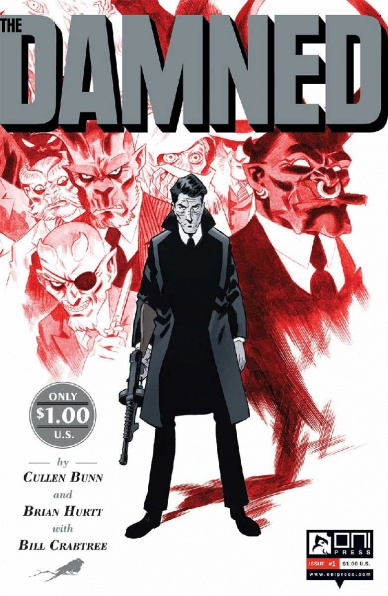
The Damned #1
Written by Cullen Bunn
Illustrated by Brian Hurtt
Colored by Bill Crabtree
Lettered by Crank!
Reviewed by Kent Falkenberg
Damn – Brian Hurtt’s art is smooth. We’re talking single-malt whiskey smooth. Aged twenty years, smooth. Smooth as the way Eddie deals with the flappers and daddies that tip back a few and dance and throw cabbage around the Gehenna room like it’s going out of style. I mean it, this looks fantastic. And luckily, the story to go with it is more than copacetic.
Continued below“The Damned” #1 is a return to Cullen Bunn and Brian Hurtt’s world of speakeasies and grifters, egg-and-butter men and soul-trafficking demons that walk, talk and wield a shiv like dapper-looking gangsters. Bunn begins the story in media res, which gives us all a quick window into both the time period and Eddie’s characterization as a hard-luck gentlemen – a slit throat is known as an “Eddie necktie” on account of its frequent occurrence to our narrator and star of the show. It’s a sly choice on Bunn’s part. It necessitates tracing back Eddie’s actions to what ultimately leaves him slumped in an alley and bleeding out from the neck. And by tracing back that history, Bunn can seamlessly feather in the context and backstory that might be lost on any reader who missed out on this series it’s first go around the sun.
All in all, it does lean a bit heavily on the dialog. But that’s in no way a bad thing. Cullen Bunn hits a rhythm in the narration and the way people speak that swings like an old jazz standard. Words bounce with a lyrical lilt, and conversations bank and volley between characters. The appearance of an old colleague leads Eddie away from his ritzy club and back to his old haunts. “Way I heard, you moved out of your flat and straight into a room with a view,” says an old friend. “The view’s not so grand as you might expect”, he lobs back.
Language is key in “The Damned” #1; it’s steeped in the slang of the ‘20s and ‘30s. But it never seems like snake oil being used to sell the time period. It’s natural, not a crutch. Part of this, of course, is Bunn’s gift with words and speech patterns. But when paired with Brian Hurtt’s knack for pinstripe suits and fur-lined trench coats, it comes across as living, breathing authenticity.
Hurtt keeps his paneling tight and orderly – giving the art a classy, put-together aspect that pairs nicely with Eddie’s perspective, right or wrong, that he’s got the right bead on things and has all the angles figured out. But there’s one image that captures the scope and allure of the Gehenna Room by sprawling out across the top of two pages. With nary a wasted line, Hurtt details the vibrancy of the joint with unique mannerisms and distinct expressions on all the revelers, whether they’re standing center frame, beside our protagonist, or relegated to the periphery. And there’s the little touches, like a statue of chained Prometheus, with liver pecked at by a vulture, that makes the whole scene sit a little uneasy and makes for a subtle thematic complement to Eddie himself.
Faces are emotive. And the emotions themselves are all sold through the eyes – which makes perfect sense, since we all know what eyes are a window to. Given that the goat-horned demons in “The Damned” #1 trade, swindle and deal in those very same souls like black market hooch, it’s perfect piece of sympatico.
There’s something of a revelation right now in demon-led comics. “Lucifer” has been going strong as the most consistent Vertigo title and “Darkness Visible” is viewing demonic possession through a lens of political separatism. But they both can go right back to hell, because Cullen Bunn and Brian Hurtt’s series burns brightest on the pyre.
Final Verdict: 9.0 – Honestly, nothing against “Lucifer” or “Darkness Visible,” but when Bunn and Hurtt get together, there’s just something that’s so damned special.

The Dregs #3
Written by Zac Thompson & Lonnie Nadler
Illustrate and lettered by Eric Zawadzki
Colored by Dee Cunniffe
Reviewed by CLA Bindery
Thompson and Nadler present an intriguing story about Marlowe, a homeless man who is investigating the disappearance of his missing friends and its connection to a bigger conspiracy pushing the gentrification of the homeless neighborhood called ‘the Dregs.” At first look the Marlowe character is absorbed in his “investigation” and struggling from drug addiction. He has an over heightened sense of importance in his role to stop this conspiracy, and is paranoid that “they” are on to him and trying to stop him.
Continued belowZawadzki presents each panel from Marlowe’s perspective in either a first-person view with visuals of Marlowe’s hands, a view of his back, or frontal close-ups of him. All panels include visuals of the cityscape around Marlowe with beautiful line art. The presentation of these panels is done to allow the reader to see what the protagonist is seeing and also to accentuate Marlowe’s paranoia and drug withdrawals throughout the story. This presentation also gives a perception of time loss as every panel shows Marlowe walking around with an ever-changing background giving the feeling that time is bleeding together into one cohesive moment.
Even more stunning are the mixture of Cunniffe’s colors with the art. The buildings, background, and Marlowe himself are shown in duller pale colors, while pedestrians walking around Marlowe are wearing vibrant blue, purple, etc. The differentiation of color pulls the reader’s eye to the pedestrians who are shown to be either ambivalent to the homeless man walking next to them or demonstrating offense to Marlowe’s very existence.
Based on what I have seen in issue #3 I am completely hooked on this story. We know from previous issues that many clandestine things are happening to the homeless people of Vancouver, however due to Marlowe’s skewed perception of reality it is hard to know how much of what is going on is real or fiction. I am certainly looking forward to seeing how this story unfolds.
Final Verdict: 9.0 – Buy this book. The art is phenomenal and collaborates with the story in such a way that it exacerbates the plight of the protagonist. Seriously buy this book.
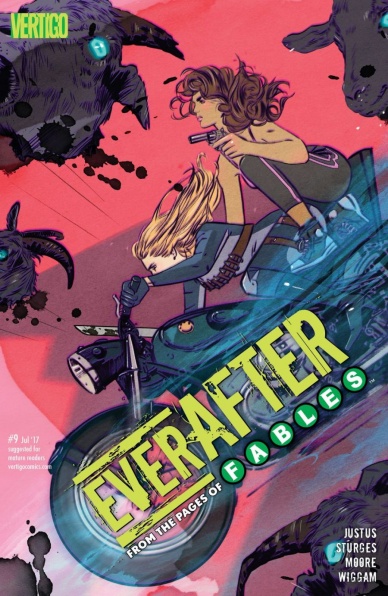
Everafter: From the Pages of Fables #9
Written by Dave Justus and Lilah Sturges
Illustrated by Travis Moore
Colored by Michael Wiggum
Lettered by Todd Klein
Reviewed by Gregory Ellner
The tale of the Shadow Players continues to impress in ways that the original stories of “Fables” may not have grabbed readers. Dispensing with much of the politicking involved in those stories, this one is far more concerned with spy and cop dramas. For example, we have the emergence of new Fables with the “Everaftering.” Some are fun takes on existing urban legends, much like how the novel “American Gods” deals with storytelling, but there are also new arrivals, such as the magical potential of former “Mundies.” The dichotomy between the stories and the emergent magic of others in the “Mundy” world, having broken the masquerade, keeps the entire thing intriguing.
Travis Moore’s artistry combines with Michael Wiggam’s coloration to create fascinating images, such as the mass of hircine Fables and others that assault a town being drawn as a menacing horde, or the very interesting picture of a high-speed chase between some Fables down a major road. Their work can also combine to haunting images, such as one Fable that seems to be La Llorana of Spanish American folklore.
On the whole, this series seems to definitely be fit for fans of the mundane mashing into the fantastic, as a more action-focused version of something like the modern day portions of the American Gods TV series, but this issue may be difficult to get into for new arrivals.
Final Verdict: 7.5- Fun, ridiculous story in the post-Fables world, but might be hard to get into for new adopters.

Extremity #3
Written & Illustrated by Daniel Warren Johnson
Colored by Mike Spicer
Lettered by Rus Wooton
Reviewed by John Schaidler
After three issues of “Extremity,” one thing is crystal clear: creator Daniel Warren Johnson and the rest of his team absolutely excel at crafting epic battle scenes that explode across the page, practically grabbing you by the throat and refusing to let go. But this book isn’t mere eye candy.
Or at least it’s not only that.
The characters are real and complex. They grapple with loss and longing. They search for a sense of identity. They strive to make sense of it all.
No wonder, then, that many of this issue’s best moments unfold at an unhurried pace that gives us plenty of time to get to know the characters and savor the nuanced details of Warren Johnson’s intriguing world.
Continued belowIn an extraordinarily well executed series of simple yet powerful scenes (Thea is given her true name by the Great Mother in a flashback; Rollo repairs his robot companion Shiloh, inadvertently discovering the robot’s “terminate” button; and Brynjar is seen lost in quiet introspection as he savagely dispatches a plains wolf with his bare hands), Warren Johnson’s loose, understated line work is both incredibly efficient and potent, spontaneous and immediate, as though Warren Johnson’s pen is there to capture each moment, right as it’s unfolding. Similarly, the characters’ expressions speak volumes, instantly communicating anger, anxiety, sadness, stoicism – or rarely – even fleeting optimism and warmth.
In stark contrast to Warren Johnson’s subtly evocative inks, Mike Spicer’s vibrant color palette – dominated by otherworldly pinks, purples, and oranges – is relentlessly bold and forceful, bathing the entire book in a twilight fever-dream that borders on nightmarish. You can almost smell the choking pollution and acrid smoke of burnt insulation and fried circuitry. Not to mention the relentless, ear-splitting screech of metal on metal and the god forsaken cries of the dying, which always seem to be lurking mere moments away.
Yes, this issue too, like the others before it, hinges on a larger-than-life, epic battle scene. It’s important to note, however, as amazing as the battle scene is, it’s made all the more powerful because it’s subtly framed by quiet moments of human emotion (whether the character in question is actually human or not). For every massive explosion, for every bullet and blade, for every oversized sound effect that stretches across the page in mammoth letters three stories high, there’s an emotional counterpoint that gives the scene weight and depth.
Without a doubt, at its core “Extremity” is governed by a very simple dynamic. Violence begets violence and no death can be left unavenged. Things may be about to change, however, as Warren Johnson suggests by posing a simple question through an unlikely character: “…What have I done?”
Final Verdict: 7.6 – A gorgeously rendered epic battle scene is subtly framed by quiet moments of introspection, giving the battle scene unexpected depth and heft.

Faith #11
Written by Jody Houser
Illustrated by Joe Eisma
Colored by Andrew Dalhouse
Lettered by Lauren Hitzhusen
Fantasy Sequences by Marguerite Sauvage
Reviewed by Michael Mazzacane
The Faithless plan to defame Faith goes to its next logical step: make the residents of Los Angeles fear their Superwoman. Now, this move isn’t a new one. It is, quintessential super villain planning 101. Jody Houser is riffing on ‘Knighfall’ with this arc, and even as this cabal of villainy layout their easily understood plan it doesn’t feel like a tired trope but logical endpoint for this run of “Faith” as a whole.
There is how fantasy sequence artist Marguerite Sauvage accompanies Houser’s dialog, in a single page surrealist nightmare that symbolically displaces the villains with shadowy representations of each step in their not-‘Knightfall’ stratagem. Faith’s depiction in this projection is interesting, I can’t quite make up my mind if it’s somewhat subversive or a lampshade maneuver to highlight the stereotypical vision of damseled, defeated, woman. Even in defeat women can’t look beaten down like Batman? Nebulous symbolism aside, it really balances the page.
Jumping out of the realm of art, some of the freshness for a plan that helped define a couple years in the 90s comes from Faith’s unique position in the Valiant U. She’s their only (traditional) superhero. The rest of the community are shadowy State operatives or damaged individuals trying to not damage the world around them. And in a world, that’s still dealing with the presence of Vine Saplings (something introduced 5 years ago) and events like “Armor Hunters,” the ease at which they’d turn on their extra-legal protector makes a lot more sense compared to yet another round of Batman gets framed and people don’t believe him.
It’s unfortunate than, the methods the creative team goes about telling that moment of public discord isn’t consistent with their excellent storytelling that setup this moment. When Joe Eima sets up a doppelganger Faith, he and colorist Andrew Dalhouse draw her differently. This version of Faith is more angular, she looks down and is framed at varying degrees of low angles making her appear more imposing. This perspective mixed with uncharacteristically triangle defined eyes immediately tell the reader that something is off. This is the geometric opposite of how Faith has been depicted pages prior. The decision to have Sydney Pierce that veil as she ruins Faith’s public image is just an unnecessary, redundant, reveal. The art and pacing in this book is all around excellent, which makes this choice just standout like a sore thumb.
Continued belowFinal Verdict: 7.5 – The final arc of “Faith” continues down a referential rode that shows you don’t need absurdist humor and lack of a fourth wall to tell these kinds of stories.

Freelance #2
Written by Andrew Wheeler and Jim Zub
Illustrated and colored by Vaneda Vireak and Cindy Leong
Lettered by Andrew A. Thomas
Reviewed by Forrest Sayrs
Freelace, or just Lance, is a 1940s Canadian superhero revived for Chapter House Publishing’s new superhero universe. Only now he’s queer, reasonably proportioned and saving the world from a nebulous mystical threat.
In a period where a lot of companies seem to be testing the waters of unified superhero universes, “Freelance” feels very isolated from the rest of its cannon. Wheeler and Zub are spinning a story that barely touches on the greater ‘Chapterverse,’ in spite of the high stakes of the issue. The narrative also spends a lot of time following the villain for a book that’s barely off the ground. As a result, the storytelling feels a little unfocused, shifting between narratives frequently and never quite letting the reader get comfortable with the heroes.
Andrew Wheeler brings some considerable experience writing about LGBTQ comic characters to the table, so it’s kind of surprising that Lance Valiant is written so uninterestingly. One part of the problem is that Wheeler is trying to establish the dynamics of a longer relationship without showing it to us. The result is just awkward. On the other hand, the characters outside of their poorly defined relationships are much more interesting. While the title character is an amnesiac, and therefore incredibly dull, both of his teammates are much more three dimensional, and Apollyon, the villain, is just wonderful to read and to look at.
Vaneda Vireak, lead artist of the webcomic “51Hundred,” has a decidedly anime-esque style that really works with Apollyon’s design. Other elements aren’t as strong, notably the consistency of faces from panel to panel. Another problem is the noticeable style shift in the last few pages. The panels of the climax and cliffhanger are significantly more ‘sketchy’ in places, though the effect is inconsistent. This might be the result of the addition of Cindy Leong to the art team, but it’s hard to say with certainty.
In spite of its flaws, I found myself enjoying the plot and direction of “Freelance.” There is definitely potential in a lot of the individual elements. The actual superhero plotline, in particular, is quite good, and I think Wheeler could definitely do some interesting things with the team dynamic once the characters are better established.
Final Verdict: 6.2 – An intriguing venture into something new, but needs a lot more polish before it’s ready to shine.

Hawkeye #6
Written by Kelly Thompson
Illustrated by Michael Walsh
Colored by Jordie Bellaire
Lettered by VC’s Joe Sabino with Travis Lanham
Reviewed by Alexander Jones
“Hawkeye” #6 continues to use the fun new dynamic between Jessica Jones and Kate Bishop. However, the book mishandles the extraordinary Michael Walsh by setting him up for the same kind of story that previous artist Leonardo Romero would have drawn with a noir setting and lots of static moments in throughout the script. Walsh’s lines and overall direction differ from Romero’s strengths and Thompson doesn’t utilize the opportunity until the very end of the comic. Thompson instead tells a similar story as the previous batch of issues with shadowy lines and lots characters interacting with each other.
This chapter feels like “Hawkeye” operating at a static pace for a simple setup chapter until the mystery that Bishop is working on starts to open up halfway through the comic. This issue also has a nice non-linear storytelling trick that should get the attention of readers right from the jump as a more pedestrian exposition scene directly follows from there. Thompson does a great job getting deeper into the paranoia coursing through Hawkeye’s mind later on in this comic when the case starts to consume her.
Continued belowThis new series bears a resemblance to the original “Alias” series published by Marvel and bringing in Jessica Jones is an interesting character study to see how Kate and Jessica are different in personality from each other. There’s a few spotty lines of dialogue here and there that is trumped by the charm and excitement coursing through these pages. One scene that drowned out Jones’ personality to a fault was when she said goodbye towards the end of the issue, Jones’ dialogue didn’t ring true with the rest of her personality.
There are moments where Walsh gets the chance to depict a couple of supernatural aspects, but seeing him draw the same hallway and talking scenes as seen in previous issues isn’t the best use of the talent. Although the lines are less precise that Romero’s, Walsh gets in some great detail and shows off strong emotion in these scenes with heavy exposition. Lots of cast members hold some more interesting body language and there are a few panels with additional effects that make this comic more interesting in the second half of the story.
“Hawkeye” #6 takes a few pages before pumping the gas but once the series revs up the engine and Michael Walsh gets the chance to stretch his legs this comic comes alive. While this story may be pretty simple, it carries enough twists and personal touches to keep readers interested all the way through. The tease at the next issue of the comic is just vague enough to keep me coming back for more. Hawkeye fans of the Matt Fraction and David Aja’s series owe it to themselves to follow Kate Bishop’s adventures as a private eye in this series that has retained a fantastic sense of quality even following the first arc.
Final Verdict: 7.5 – After a slow first half, “Hawkeye” #6 gets into gear with an interesting supernatural mystery from Thompson and Walsh.
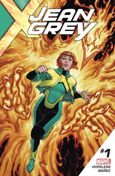
Jean Grey #1
Written by Dennis Hopeless
Illustrated by Victor Ibanez
Colored by Jay David Ramos
Lettered by VC’s Travis Lanham
Reviewed by Jake Hill
I’m not sure which iteration of Jean Grey made me a fan of the character. It could have been Famke Jansen’s memorable turn in the movies, or the badass, in-control version in Grant Morrison’s “New X-Men,” or maybe it was just that she was so fun to play as in the original “X-Men Legends” video game. It certainly wasn’t the fragile Jean of the 90s cartoon. I’ve been ready for Jean to go on her own adventures for a long time and finally, Dennis Hopeless, Victor Ibanez and co are giving her a solo adventure.
It starts out solidly enough. Jean, who Ibanez has given a hip and modern haircut to, is eating noodles in Kyoto. She reflects on all the iterations of Jean Grey that aren’t her, hitting highlights of the original Jean’s history. This is not the Jean we’ve known for decades, this is the younger Jean from an alternate universe. She knows what happened to the original Jean, and desperately wants to avert her fate.
That should be a strong basis for an ongoing series, but for the bulk of the issue, that doesn’t really play out. Hopeless is an excellent writer, and his voice for Jean is strong. (“I love these guys, but they’re still guys,” she says of her fellow time-displaced X-Men. “Imagine sharing an apartment with four filthy weirdo brothers.” Accurate.) The plot though is slow as molasses. It’s the same set up you’ve seen in half the superhero solo books on the stands.
After ruminating on her status quo for a bit, Jean’s noodle break is interrupted by three-quarters of the Wrecking Crew, who are robbing something non-specific. This gives Hopeless and Ibanez a chance to demonstrate Jean’s powers and limitations. Ibanez draws the scene fairly well, I’m particularly impressed with the different angles he frames his panels from, which give us neat views of Jean’s telekinesis in action. He also does well at the pink force fields that traditionally represent Jean’s telekinetic power, which for my money is one of the coolest power effects in comics.
The whole thing feels, to use a word I feel like I’ve been using a lot to describe Marvel comics lately, inconsequential. The real hook (which you won’t be surprised to learn, has to do with the Phoenix) comes in the last couple of pages. I really like Jean Grey, and I have a lot of trust in this creative team, but this first issue doesn’t do a lot to draw me in. There are too many new Marvel #1s coming out every week to spend an entire issue doing setup without telling me what your book is about. I’d give this one a couple of issues before deciding to drop the series, but it’s going to be an uphill battle from here.
Final Verdict: 6.8 – A well crafted issue that doesn’t work all that hard to justify its existence.


