
There’s a lot to cover on Wednesdays. We should know, as collectively, we read an insane amount of comics. Even with a large review staff, it’s hard to get to everything. With that in mind, we’re back with Wrapping Wednesday, where we look at some of the books we missed in what was another great week of comics.
Let’s get this party started.

Dogs of London #1
Written by Peter Milligan
Illustrated by Artecida
Colored by Valentina Bianconi
Lettered by Rob Steen
Reviewed by Alexander Manzo
Peter Milligan’s “Dogs of London” is a story mainly exposition for the main character, Frank Babbs. Despite being in the front passenger seat of one of the most prominent crime organizations in London, the protagonist is a man who has bigger aspirations and wants to be more legit and methodical. While Milligan explains the rough upbringing and a personal affair with a rival gang member’s little sister, there is still a lot left to be answered. With the information provided, the story feels very clustered and jumps around a lot, making the reader feel disorientated at times. The final reveal doesn’t quite hit on the shock meter due to the bodies being essentially unknown men. This first issue feels like the first hour of a two-hour premiere of a new show, but the reader doesn’t get that second half that clarifies the information. Unfortunately, the details Milligan may have wanted the reader to pay attention to didn’t quite land, but his new wife and child’s thoughts on their past and current state seem much more interesting.
The art by Artecida is a solid hook for this story as they draw with thick lines and no sparing of details when it comes to backgrounds to help pull the reader into this new world. The couple pages of explosions when The Dogs are showing their teeth, so to speak, with explosions destroying their rival’s businesses, is Artecida’s chance to shine, such as the car dealership being obliterated in the background with a man fearing for his life. The reader can see the linework in the front grill of the car while seeing the lines on the man’s face and the ring on his finger. The crew that Frank runs with does have a uniform of a black suit that, when they get into fights, does seem too familiar and can confuse the reader on who exactly is being punched and who to root for in other sequences. Valentina Bianconi’s colors go hand-in-hand with Artecida’s art to help make it vibrant and pop right off the page. Even with the black suits that The Dogs all wear inside of the club, they never blend in, and the backgrounds are a contrast of brighter color to keep the linework prominent and distinguishable. There’s a scene where Frank enters a more hippie-like store off the streets, and there’s a considerable shift of bright oranges and yellows that showcase how odd he sticks out with his black hair and suit. This is an important scene because the reader can tell the lengths Frank is willing to go to protect someone he cares about.
Final Verdict: 7.0 This introduction floods the reader with so much information is difficult to remember who is who and the main plot to follow. The artwork is the leading hook to keep the reader coming back.

Flashpoint Beyond #1
Written by Geoff Johns, Jeremy Adams, and Tim Sheridan
Illustrated by Xermánico and Mikel Janin
Colored by Romulo Fajardo Jr. and Jordie Bellaire
Lettered by Rob Leigh
Reviewed by Henry Finn
“Flashpoint Beyond” #1 is a masterclass in repurposing derivative content and squeezing out a new storyline that successfully expands upon the derivative IP in a way that entertains without pandering. Writers Geoff Johns, Jeremy Adams, and Tim Sheridan work together to weave a seamless and dense story of the next adventures of Thomas Wayne. This issue is filled with many dense pages and the writing takes over the pacing of the book for the most part. This is exemplified in the opening pages as Thomas Wayne sits and recounts how we got here, one single page has 22 separate narration bubbles.
Continued belowThere is heavy pathos written into the narration that focuses on Thomas and his drive to undo the murder of his child Bruce. In many ways this is actually more sympathetic than the original Batman’s source of motivation, because everyone understands the pain of a parent losing a child is worse than a child losing a parent.
Illustrator Xermánico does 99% of the heavy lifting with Mikel Janin filling in with a few pages to add an alternate reality texture to the last two pages, which I won’t spoil here.
The art is clearly laid out with moments of grand destruction stuffed tastefully into the panels dense with narration. This is exemplified when King Arthur of Atlantis goes on the offense, drowning the UK and capturing Wonder Woman. Xermánico manages to get Big Ben, the Ferris wheel, and multiple Atlantean soldiers in one long horizontal panel that belies his thoughtful use of mise en scène so to speak.
Colorist does a lot of amplification of the emotions that permeate each page by adding a lot of glowing effects and nostalgic lighting to the book. It’s appropriate and totally enhances the experience of reading the book.
Final Verdict 8.0 – A great first issue for an intriguing mystery that pits Batman against someone completely unexpected.

Metal Society #1
Written by Zack Kaplan
Illustrated by Guilherme Balbi
Colored by Marco Lesko
Lettered by Troy Peteri
Reviewed by Gregory Ellner
On its face, Zack Kaplan’s writing on “Metal Society” #1 does not appear to be anything special. It is the tried-and-true tale of racism and taking a stand, any stand, against oppression. However, it is the way in which Kaplan utilizes his story, the relatively minor differences that shape the entire narrative, which make it into more than a rote, familiar plot line. Rather than putting one ethnicity against another, Kaplan instead crafts a world in which, centuries in the future, humanity has been supplanted by machines, forced to do menial labor and mostly grown artificially. In all, this introduction helps a great deal toward bringing readers into the world, while still feeling both distinct from other stories and somewhat relatable just the same.
Guilherme Balbi’s artwork is rather detailed an expressive. While the robots are, by and large, visually emotionless due to most of them lacking faces, their contempt for humans follows in body language as much as their detached mannerisms. Meanwhile, humans are given a lot of room to show their despair, anger, and hatred on their faces, especially when Balbi concentrates on our human protagonist.
Marco Lesko is, as ever, an amazing source of vivid colors. Dark hues help set the tone, with the shine of the metal giving rise to a feeling of humans, with their grit and grime, not belonging on their own planet any longer. In all, the colors help portray a feeling of a ray of hope amidst despair, especially when it comes to our human champion.
Final Verdict: 7.5– An intriguing world blooms forth through steel with this new science fiction dystopia.
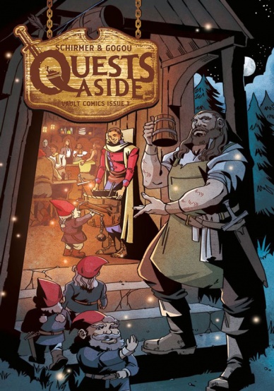
Quests Aside #1
Written by Brian Schirmer
Illustrated by Elena Gogou
Colored by Rebecca Nalty
Lettered by Andworld Design
Reviewed by Quinn Tassin
As far as premises go, workplace comedy about a tavern in a fantasy world is woefully under-explored. Luckily, “Quests Aside” #1 is here and it’s a more than worthy debut. This would be a relatively difficult issue to totally screw up- big fantasy worlds like this are rife with material that’s innately weird and funny when you consider its day to day implications. This issue, of course, tackles some of the obvious stuff- a bard follows adventurers around and sings of their greatness just walking to get a drink; a giant accidentally crushes someone while on a regular stroll for at least the second time; the former-hero tavern owner, Barrow, has memorabilia from his quests set up all over the place. This is also an incredibly easy premise to half-ass, though, and the creative team does great work at filling this comic with not only enjoyable characters and generic observations about living in a fantasy world but with some real dramatic intrigue. Plus, it takes some of these smaller funny premises and makes them into real gems, a particular highlight being the ballad-battle between the Quests Aside bard and the king’s bard.
Continued belowA lot of credit is owed to the art team, who do great work at crafting a world that feels evocative of fantasy tropes and normal enough to feel recognizable. With a premise like this, you need readers to buy that they’re reading something fantastical, silly, and normal all at once. That’s a difficult balance to strike but it’s absolutely successful here. The character designs are just exaggerated enough as to feel cartoonish but not so much so as to feel wholly unreal. The background is populated with classic medieval fantasy items and weird creatures but nothing feels so glamorous or otherworldly. Somehow, they manage to build what seems like a more intimate version of Planet Hollywood for a fantasy world. The only thing the team really leaves to be desired is a little extra bit of kinetic energy. Where the scenes that really count like the ballad-battle area full of life, there’s a bit of a tendency for frames to feel static throughout the issue. It’s all beautiful, detailed work but it could use that added oomph to be even stronger.
Best of all, “Quests Aside” #1 plants the seeds for a story with clear stakes that are easy to feel invested in and without some massive implications. The king, an old friend and questing partner of Barrow’s, want’s to turn Quests Aside into barracks for his army. Barrow’s employee, Vail, a funny, easy to love character, wants to kill the king for taking everything from her (what that means, we’ve yet to hear). Then there’s the mob on Barrow’s back trying to collect taxes for his and the tavern’s safety. Oh, and that weird ghost is a very intriguing mystery. The stakes are intensely personal, relatively low stakes, and it’s easy to see how the book will balance drama, humor, and strong characterization as it goes.
Final Verdict: 7.7- A confident debut for a funny, creative idea

The Rocketeer: The Great Race #2
Written by Stephen Mooney
Illustrated by Stephen Mooney
Colored by Len O’Grady
Lettered by Shawn Lee
Reviewed by Ryan Fitzmartin
Cliff Secord, aka The Rocketeer returns for another adventure, racing in an experimental plane against a Nazi pilot known as the Iron Baron. The plane is provided by the brilliant professor Nkosi, and Secord is backed by his faithful mechanic Peevy and his steady girl Bettie. Mild hijinks and muted mayhem ensue, in a mostly serviceable plot which contains more hyping up than actual period action. There’s a few plane crashes and some sabotage, but the comic is a little too dialogue heavy, there’s too much talking about being ready to race and not enough actual racing. The wordplay itself isn’t strong enough to generate any excitement.
The art isn’t entirely that strong either. The character’s faces are static, and the action isn’t fluid at all. Everyone feels as if they’ve been animated in wax. The eyes are often hidden or closed in a lot of panels, making emotions hard to read. At times it’s rather grim to even look at. The planes are drawn in better detail, so the rare actual action is a nice break. Len O’Grady’s colors provide some saving grace, as the clothes and environments are bright, pleasant and high contrast.
Unfortunately, this latest Rocketeer adventure is somewhat dull. Despite the good coloring and some fun aviation action, the energy is low and the art doesn’t pop.
Final Verdict: 4.3 – An underwhelming issue that fails to get off the ground.


