
There’s a lot to cover on Wednesdays. We should know, as collectively, we read an insane amount of comics. Even with a large review staff, it’s hard to get to everything. With that in mind, we’re back with Wrapping Wednesday, where we look at some of the books we missed in what was another great week of comics.
Let’s get this party started.

Batman/Fortnite: Zero Point #2
Written by Christos Gage
Illustrated by Reilly Brown & Nelson Fard Decastro
Colored by John Kalisz
Lettered by Andworld Design
Reviewed by Ryan Fitzmartin
Branded crossover books can be a challenge, but the comic creators have excelled in their task and made something great. Christos Gage’s script plays as a blend of time loop and amnesia films, a cross between Edge of Tomorrow and Memento. Batman and Catwoman are trapped in ever repeating Fortnite rounds, losing their memory every time but leaving notes for themselves and each other. Notably, the comic does this entirely without dialogue, staying faithful to the wordless world of Fortnite. Relying entirely on Batman’s inner monologue is a bold storytelling choice, which leads to some real emotional heft. The narrative here is compelling and even poignant, with a knockout final few pages.
Gage’s excellent script is well paired with vivid and exciting art. Reilly Brown’s clean penciling provides both kinetic character action and luscious backdrops. Brown faithfully translates iconic Fortnite characters and locations to the page, making them feel a part of Batman’s world while retaining their wild cartoonish uniqueness. Brown does strong character facial work too, which is important for a comic with no dialogue. John Kalisz’s coloring is vibrant and covers the whole spectrum of the rainbow, effectively capturing Fortnite’s aesthetic. Kalisz’s characters and background both pop, but are also distinct from each other, so the action is never confused. Overall the art in “Batman/Fortnite: Zero Point” #2 is really quite spectacular and just nice to look at. The story is very well told visually.
Final Verdict: 8.9 – A homerun crossover comic book.
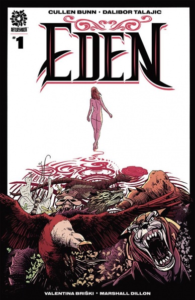
Eden #1
Written by Cullen Bunn
Illustrated by Balibor Talajic
Colored by Valentina Briski
Lettered by Marshall Dillon
Reviewed by Conor Spielberg
The premise Of “Eden” is that a tattoo artist, Niles, is in an emotional and creative rut until he meets a mysterious girl named Eden, who asks him to give her a tattoo of a butterfly. What starts off as a very simple premise sprawls into a romantic, sad, and intimate story about the two characters interacting with one another.
The artwork by Talajic lacks detail or a strong sense of style to compensate when it comes to the character design, but where Talajic does work well is in the panelling, emotive faces, scenery, and coloring by Valentina Briski. When Eden is getting tattooed by Niles there is a serious romantic chemistry that is being conveyed well and this ability carries over to other scenes that require a similar emotional weight to them.
What makes this a comic something absolutely worth picking up is the story by Cullen Bunn. Unlike your standard issue, there is no need to end on a cliff hanger or leave enough plot for the next issue. As a result the story is wonderfully paced in a way you rarely see if your comic reading is mostly just monthly comics.
What really strikes me about “Eden” is the concept of a tattoo artist being made to feel like a part of the creative process in a way he rarely gets to and the responsibility Niles feels towards Eden is eerily similar to the relationship an artist might feel towards a script writer. This dynamic playing out in the story makes it almost perfect for the comic book medium.
Final Verdict: 7.8 – Decent pencilling, fantastic story.
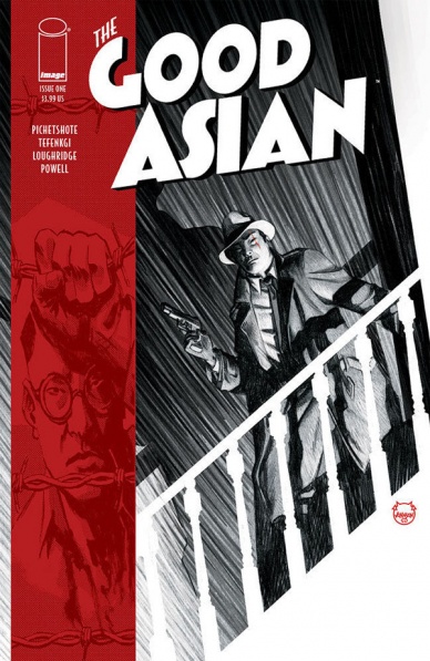
The Good Asian #1
Written by Pornsak Pichetshote
Illustrated by Alexandre Tefenkgi
Colored by Lee Loughridge
Lettered by Jeff Powell
Reviewed by Alexander Manzo
“The Good Asian” is a story that sets the tone immediately by not only giving the year but the historical context of the story with the ban of Chinese immigrants into the U.S. Pornsak Pichetshote does a great job of following that tone using the description boxes as a narrator’s voice. The first few pages are more exposition, but once Edison Hark is introduced the voice changes to a more personal tone. Those pages show the reader Hark does have a heart, but there are rules to his role as a Chinese detective; he’s looked at as a traitor to the Chinese he interacts with in the streets and simply “useful” to his Caucasian coworkers.
Continued belowThe case that Edison is hired for is presented in the second half and on his first lead he stumbles onto a rotting corpse and a young boy who just wanted to help. His moral compass is put the test in the final panels: will he help the young boy or let a white detective throw him in jail for being at the wrong place at the wrong time?
The art team does a great job in this issue, Alexandre Tefenkgi draws with such great details and creates the perfect mood to search for clues. Every character is given unique distinctions, from forehead wrinkles to bags under the eyes, to illustrate the importance of every person shown. Lee Loughridge works well with Tefenkgi by using lots of muted colors to create a black and white vibe for the story. The two do such a great job that reading on either digital or physical can still create the sense of reading it in a newspaper or old detective novel.
Final Verdict: 8.5 – A great introduction that finishes with a solid hook to check out #2.
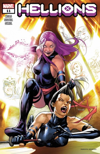
Hellions #11
Written by Zeb Wells
Illustrated by Stephen Segovia
Colored by David Curiel
Lettered by VC’s Ariana Maher
Reviewed by Alexander Jones
Lately, Marvel’s “Hellions” are starting to realize they may not be the most appreciated team in Krakoa. The Quiet Council has voted villain Mister Sinister to lead the team whose affiliations with Arcade kicked off this latest arc of the series. Psylocke, Greycrow and the rest of the Hellions are attempting to survive an encounter with Arcade while dealing with the difficulty that comes with having a leader who isn’t quite on the same page with the rest of the team. Author Zeb Wells continues to find profound character beats while pushing “Hellions” #11 into a dark tone in line with the greater series. Artist Stephen Segovia also brings a sense of tension with his realistic artwork.
Segovia’s work in “Hellions” #11 captures the tone adequately but doesn’t quite match the ambition of the script. I would have liked to see greater visual details in the Arcade sequences here. I wish there was more of a focus from color artist David Curiel to differentiate those scenes. The beginning sequence here is colored in a really desolate and empty manner. Segovia captures a lot of details as well such as solid page layouts and character expressions. When the cast in this issue start officially losing their minds, readers can clearly tell from the facial expressions in the art. Segovia draws detailed anatomy and can juggle lots of heroes on the page at once. Segovia’s sleek art has always been a great fit to match the dark tone of the script. I wish Segovia’s art could become more abstract and lean harder into the really unique scripts from Wells at times.
Overall, “Hellions” #11 is a thrilling continuation of a great series. To make the title even better It would be great to see Segovia’s art become even more experimental in future issues. Also, I would like to see Wells change the status quo of the series and push the book forward in the next couple of chapters. Wells is able to characterize the villains of this series incredibly well but I wish he would take the time to ensure the other cast members are as interesting as Mister Sinister. “Hellions” continues to have a different tone than the rest of the Krakoa-era titles. Thanks to the hyper-dark nature of the series and sleek art, “Hellions” has become Marvel’s best Mutant team series.
Final Verdict: 7.9 – “Hellions” #11 deconstructs the mind of Mister Sinister with a terrifying sense of glee.

Jenny Zero #1
Written by Dave Dwonch and Brockton McKinney
Illustrated by Magenta King
Colored by Megan Huang
Lettered by Dave Dwonch
Reviewed by Luke Cornelius
With “Jenny Zero” #1 it feels impossible to start reviewing it by discussing anything but its visuals. Magenta King’s style, which feels undeniably hand drawn (in the best way), informs so much of the book. Struggling in the shadow of her father, protagonist Jenny lives in a world that has a raw and unpolished feel thanks to King’s style, which acts a visual manifestation of the disarray in Jenny’s life. A ruler may have been used to define the panel shapes, but inside of them, all the straight lines wave and wobble and settings often feel distorted and skewed in their proportions. There’s a singular definition to the linework too that presents everything plainly and, often, in a way that obscures the depth of a scene. This works well throughout but is highlighted by the claustrophobic and intense feel it adds to the nightclub scenes.
Continued belowKing’s designs don’t fail the monsters either. The first design is seen when Jenny reunites with her robot/alien fish weapon/companion, Nemo. King manages to give a sense of endearment to Nemo, despite its host of wires and tubes wrapping around Jenny whilst in use. It’s the sort of design that makes the reader really wish it wasn’t fictional. Later, the reveal of the Remoras and the Jagokai‘s menacing visuals indicate why they’re such a problem for humanity.
Megan Huang’s colorwork elevates King’s linework and conveys the strange sense of normality and the lingering of the past that exists within “Jenny Zero” #1. This is best demonstrated with the opening pages that are washed with muted blue tones and juxtaposed with the yellow sepia filtered A.S.P. commercials. It is only with Nemo’s appearance that a vibrant, though still dusty, orange tone enters the book. It’s jarring for the readers, and contrasts the surprised reaction of the audience with Jenny’s lack of one because of her familiarity with it.
For the script, Dave Dwonch and Brockton McKinney keep things simple to understand, which is good because it jumps around narratively a little, with the miniseries’ key characters being introduced and a good sense of their relationships with Jenny being established.
Overall, “Jenny Zero” #1 is a hugely entertaining debut issue, which introduces a protagonist who you’ll want to continue to follow, with designs that will capture your imagination.
Final Verdict: 8.5 – “Jenny Zero” #1 combines fantastic visuals with an intriguing story for a promising debut issue.
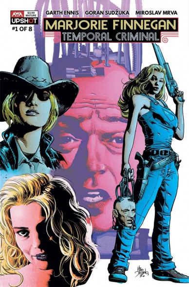
Marjorie Finnegan: Temporal Criminal #1
Written by Garth Ennis
Illustrated by Goran Sudzuka
Colored by Miroslav Mrva
Reviewed by Matthew Blair
What is there to say about “Marjorie Finnegan: Temporal Criminal” #1 that can’t be figured out from the title? There’s a girl named Marjorie Finnegan, she steals stuff across time, hilarity and hijinks ensue.
“Marjorie Finnegan: Temporal Criminal” #1 comes from the twisted mind of industry heavyweight Garth Ennis, who takes his usual load of swearing and ultraviolence and throws in a mix of temporal shenanigans that create the usual headaches that come with the territory of time travel stories. Ennis isn’t afraid to go all out with this story. Seeing shotgun wielding blondes in ancient Egypt or WW2 era artillery being deployed in the Viking age is pretty hilarious but it’s tempered by Ennis providing effective world building and knowing how to lay down the rules of his world in a fairly understandable manner. It’s not the most over the top thing Ennis has ever done, but he packs it with enough violence and swearing for it to be entertaining.
The art for “Marjorie Finnegan: Temporal Criminal” #1 is provided by Croatian artist Goran Sudzuka, who has a very clean European style that does its job admirably. There are some pretty large critiques for the art. Sometimes, it feels a bit too clean, there are some moments where the characters feel a bit stiff, and it all comes together to feel like this should be a book for a younger audience. Still, Sudzuka has a good eye for action and emotion and when he is able to let his imagination fly, there’s some really cool and zany imagery that lends a huge hand to the creative world building and insane story.
“Marjorie Finnegan: Temporal Criminal” #1 is a bonkers introduction to a world of temporal crime imagined by one of the best modern comic book writers with an eye for violence and foul language. It’s a great story that promises to be a lot of fun.
Final Verdict: 8.9 – It’s a story that won’t change the world, but you’ll have a lot of fun reading it.
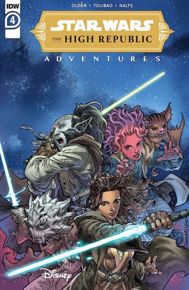
Star Wars: The High Republic Adventures #4
Written by Daniel José Older
Illustrated by Harvey Tolibao
Colored by Rebecca Nalty
Lettered by Jake M. Wood
Reviewed by Matthew Sherman
“Star Wars: The High Republic Adventures” #4 opens up with a heartwarming moment between young Jedi Padawan Lula teaching Zeen about the force. The colors created a glimmering sunrise over these two characters that really set the tone. The opening scene then takes readers to an alarming call on the Starlight Beacon of another skirmish with the Nihil. Harvey Tolibao does a great job illustrating the concerns on the young Padawan’s face. But this is also where his art starts to fall behind, with some of the scenes that have a large depth of background appearing flat. This hinders the art a lot when it comes to scenes that show large hallways, or big environmental spaces.
Continued belowDaniel José Older’s dialogue was hit and miss throughout the story. He writes very sympathetic conversations between the concerned Padawans and Zeen that creates a sense of innocence within these characters. Yet, when it comes to our Jedi Masters and Knights, the dialogue feels bland. Even Star Wars fan favorite Jedi Master, Yoda, was very boring in this issue. Older misses the opportunity to write Yoda as his wise and inspiring self. Our beloved Jedi Master just feels like your average leader taking the Jedi through this comic’s battle.
As for this issue’s action scenes, they weren’t bad but could have been better. For a comic written for young readers, the space battle was still explosive and fun but the pacing was too quick. Again, Tolibao’s style seemed to make these battles a little flat, though his ship designs were strong and he illustrated their motion for fluently. This issue a whole felt really rushed.
Final Verdict 5.7 – An average comic that has the potential to be building up to something more.

Star Wars: War of the Bounty Hunters Alpha #1
Written By Charles Soule
Illustrated By Steve McNiven
Colored By Laura Martin
Lettered By Travis Lanham
Reviewed By Henry Finn
“Star Wars: War of the Bounty Hunters Alpha” #1, is a one-shot issue to kick off a massive six-month long Star Wars crossover event. In it we find out what happened to Han Solo between the film installments of The Empire Strikes Back and Return of the Jedi, or more precisely what happened to Bobba Fett.
The issue is light on character development, as Soule relies on our presumed familiarity with the characters to pack the pages with action and adventure. There is a pleasant blend of humor, drama, and intrigue. The pacing is brisk, with every three to four pages ending with a punchline or a plot twist that creates an episodic feel to the storytelling within a single issue. Soule manages to perfectly thread the needle of staying true to the characters while increasing the canon’s scope in several directions at once.
Steve McNiven’s linework is intricate and textured in nuanced ways. He matches Fett’s gritty style with tiny cross-hatching and thin lines on every surface to give you a sense of texture that almost feels like a character in and of itself. His layouts are exquisitely paced as he sticks to balanced 4-5 panel layouts during the setup and switches to uneven and subtly canted panels during the battle scenes to create dynamic motion through time. There is a beautiful two-page spread crammed with small and large panels that end up bleeding over the edges to imply a harrowing break-neck paced journey as Fett carves his way through his enemies.
Laura Martin brings the issue to life with her colors, but mostly takes a backseat to McNiven’s illustration because his linework is so dense. She tastefully sticks to mostly red, brown, and blue color tones that permeate the films this issue is supposed to be couched between and finds a few moments to add her own flair in the way she renders speed lines and explosions.
Final Verdict: 8.4 – An excellent first issue that demands you read on to find out what happens next.

Suicide Squad #3
Written by Robbie Thompson
Penciled by Eduardo Pansica
Inked by Julio Ferreira
Colored by Marcelo Maiolo
Lettered by Wes Abbot
Reviewed by Quinn Tassin
Robbie Thompson has put together a fun, interesting lineup without any of the characters that have served as the stars of every “Suicide Squad” series since the ‘New 52’ days. Better yet, he captures each of their voices effectively and they play off of one another There are some intriguing mysteries, particularly what’s up with Superboy and what, exactly, Amanda Waller’s plans are. But so far, this series doesn’t feel like it’s going anywhere. Issue 3 is the closest we’ve gotten to any kind of meaningful momentum but even that feels lacking, since only 2 things actually happen. The Suicide Squad wonders what Waller is up to and then they go and try to kidnap Bolt but get intercepted by Red X. Plus the issue’s story is being completed in “Teen Titans Academy” later this month. Now, being connected to the broader DC Universe is all well and good but there’s not enough going on within this comic to make the story feel all that compelling overall.
Continued belowOn the more positive side, Eduardo Pansica, Julio Ferreira, and Marcelo Maiolo are a very good art team. About 2/3 of “Sucide Squad” #3 feature absolutely no action, but the pages don’t seem even a little bit dull. That’s probably helped quite a bit by the fact that we’re watching characters like Nocturna and Peacemaker do normal people things but still, the team deserves credit for making all of that visually interesting. And then there’s the fact that the action is actively great. In TV and movies, there are some actors that are particularly good at doing character work through their physicality in fight scenes. Basically every superhero is meant to have some type of distinctive physical traits but when it comes to raw portrayal of action, Pansica its particularly good at conveying a character in the way they move. Peacemaker dropping from a rooftop, Superboy just floating there, arms crossed, and Red X’s swift, precise brutality are all great. This is an artist who really knows how to do combat.
All of the right pieces are present in “Suicide Squad” #3 and there are moments when they come together. This is a very competently made comic but it would be much nicer to read a confident, strong comic. The potential its most definitely there but it’s unclear how much longer we can wait for it to find its legs.
Final Verdict: 6.0- “Suicide Squad” #3 is a decent read but when will this series become the standout it can be?


