
There is a lot to cover on Wednesdays. We should know, as collectively, we read an insane amount of comics. Even with a large review staff, it’s hard to get to everything. With that in mind, we’re back with Wrapping Wednesday, where we look at some of the books we missed in what was another great week of comics.
Let’s get this party started.
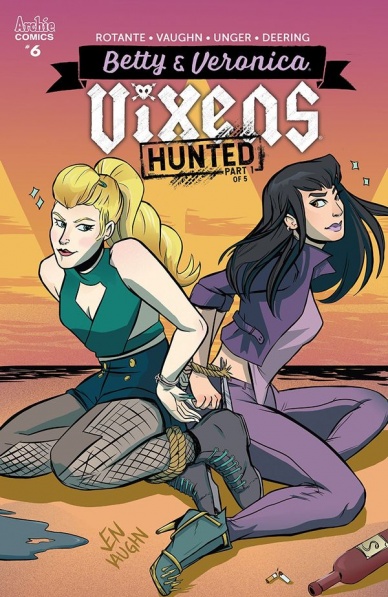
Betty & Veronica: Vixens #6
Written by Jamie Lee Rotante
Illustrated by Jen Vaughan
Colored by Elaina Unger
Lettered by Rachel Deering
Reviewed by Tom Baker
We’ve seen the previously squeaky-clean young denizens of Riverdale tackle hordes of zombies, get into sexy Twin Peaks-esque televised escapades, and now we have a version where Archie’s warring suitors form a roller derby team-turned-vigilante motorcycle club. In “Betty & Veronica: Vixens” #6 the nascent girl gang have made a name for themselves by meting out vigilante justice against awful men, something which has ironically and inadvertently landed them on the radar of some Very Bad Dudes.
The first part of the ‘Hunted’ arc picks up immediately from where issue five left off. When last we saw the titular Vixens, they had rescued a woman who was being harassed by a group of street punks, with help from feisty new recruit Cheryl Blossom. In the flashback that opens this issue, we find out that poor girl was immediately kidnapped by another shady group. Not only that, but the team’s activities — which have so far also involved taking down local ruffians the Serpents and dealing restorative justice against one of their number’s abusive ex — has got the attention of Doc, a biker gang leader from neighbouring Greendale.
Having established this riot grrl-tinged spin on the “Archie” universe and the MO of its titular characters, this second arc dives right into the consequences of the group’s actions. Almost everything that happens in this issue is as the result of something the Vixens did in the five preceding it. As such, the plot developments feel organic and flow smoothly, as opposed to being edicts from an unseen writer pushing leather coat-clad chess pieces around a board. This fluidity is helped by Vaughan’s clear and clean art, although there is some puzzling foreshortening and layouts in places.
There is a clear coterie of influences Jen Vaughan’s art is drawing from, including girl gang films like Heathers and the work of Russ Meyer. It can therefore be a little jarring in places where the book doesn’t match the subversive, boldly anti-establishment style of these inspirations (as, for instance, Katie Skelly’s “Operation Margarine” does), but overall this is an entertaining, compelling start to a second arc that welcomes new readers but imbues the events of the first with real weight.
Final Verdict: 6.5 – Entertaining start to a new arc despite a couple of foibles in the art and storytelling
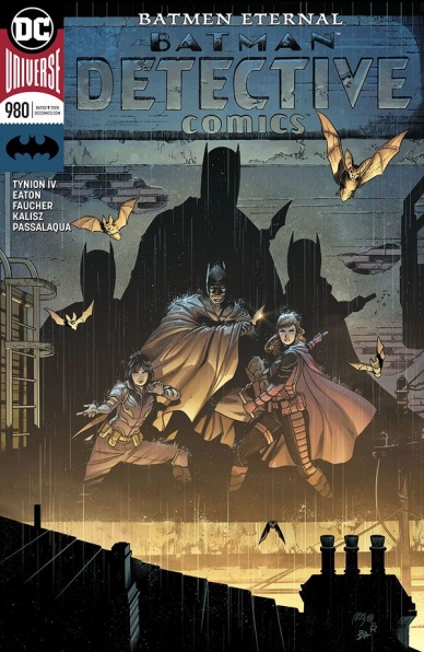
Detective Comics #980
Written by James Tynion IV
Illustrated by Scot Eaton
Colored by John Kalisz and Allen Passalaqua
Lettered by Sal Cipriano
Reviewed by Gregory Ellner
Following the increasingly dark nature of last issue, James Tynion IV begins to gear up toward his big finale. With the rise of the General, Tynion takes the time to go into not only the verbal deconstruction of our heroes, but also their attempts to rebuild themselves from the ground up, no matter their affiliation. In a sense, this issue has a central theme all its own: just because the Gotham Knights and the Colony are extremely flawed does not mean that they are incapable of rising above their failures, of becoming something that may not be exactly the same as they were before Flashpoint, but perhaps their own kind of newer heroes.
Scot Eaton’s artwork is very dynamic, focusing in on violent strikes and explosions as much as slow, menacing walks or intense facial expressions. The OMAC suits are particularly interesting, as they are drawn in such a way as to seem, through their translucence, utterly alien on top of being formed of nanites, emphasizing their out-of-place nature in comparison to the present timeline.
A particular highlight is the use of colors by the dual talents of John Kalisz and Allen Passalaqua. Dark tones make up some flashbacks, but are put in stark contrast against lighter ones in the same scenes to showcase holograms. The shine of Spoiler’s eyes is portrayed exceptionally realistically, contrasted against the more menacing glow of the OMACs and OMAC-possessed. Most notably, the faint blue glow around the OMAC-possessed Tim Drake gives an added artificial feel to him, especially when contrasted against the darker shadows around him, even directly in front of him.
Continued belowTogether, this creative team is turning out a very good story, one that acts as a great culmination toward the conclusion of the James Tynion IV run on “Detective Comics.”
Final Verdict: 7.5- Merging several different stories of this comic run together, “Detective Comics” #980 shapes up to be a fun, classic tale of colliding forces.

Exiles #3
Written by Saladin Ahmed
Penciled by Javier Rodríguez
Inked by Álvaro López
Colored by Chris O’Halloran
Lettered by VC’s Joe Caramagna
Reviewed by Elias Rosner
Bouncing from world to world, aimless and stuck together, the Exiles are a true rag tag bunch of underdogs and this issue hammers home just how out of their league these “heroes” are. Much of this issue is devoted to deepening the connection between the Exiles as well as introducing new worlds that are quickly devoured by the Time Eater. While the first couple issues were all about set-up, i.e. (re)introducing us to Blink and the Talus as well as the Unseen and the Time Eater, this issue is all about pushing these characters farther and farther into peril.
Everything about this series so far works wonders. There was a possibility that, come this issue, the group would have started to show its seams and one or two characters would have begun to grate on my nerves. This isn’t the case.
Ahmed’s characterizations are pitch perfect and the dynamic of the group is filled with the right balance of conflict, comradery and ego. Cuddly, flat, naïve Wolvie is contrasted with grizzled, battle-weary Kahn, who in turn is contrasted with the battle hungry yet fancy free Young Thor-esque Valkyrie and it all comes together to make the group entertaining to watch and worth investing time into. Every conflict is earned and borne out of the clashing personalities instead of something forced.
Plus, the book is just damn funny. Much of that is from the art. Rodríguez and López are killing it on the book, pushing the paneling to reflect the warping of reality and while keeping the rest of the cast expressive and filled with life. Plus, the sheer density of movement per page is incredible. For a series entirely about movement between dimensions and timelines, this is imperative.
One of the best pages of the book, in terms of utilizing the page, is the final page. I won’t reveal what happens on it but it is a 25-panel grid and it is a thing of beauty, slowing down the events into a series of staccato beats and letting the atmosphere settle into the to be continued.
We open on a stasis, on the Unseen, chained to the moon and we end on stasis, of many panels that show more of the same moment in time with each movement. A reflection of our heroes’ journey so far. Soon, though, that stasis will turn into true momentum.
Final Verdict: 8.9. Another Marvel cosmic book hitting it out of the park with writing and art seamlessly intertwined to provide a host of worlds and an adventure with true stakes. Three issues in and Ahmed has me hooked in full once again.

The Highest House #4
Written by Mike Carey
Illustrated and Lettered by Peter Gross
Colored by Fabien Alquier
Reviewed by Matt Sadowski
After Moth discovered the Lady of his desire was spoken for, he gains an unexpected gift in return for his silence. Meanwhile, the Aldercrest clan faces its first truly existential threat as a coup stirs among the Consistory. “Highest House” remains a dense read, packed with highly detailed panels and medieval dialogue that consistently drive the story forward.
Magic is more prominent in ‘Obsidian’s Bargain, Part 4,’ manifesting in great swirling ellipses or panel-warping word balloon hexes. The action isn’t limited to spellcasting, however. Several tense sequences unfold over the issue, with Moth affecting the outcomes of all. A wild hunt in the forest, an evening assassination attempt, and an all-out battle in the courtyard provide “Highest House” the intense spectacle it’s worked toward with the last few issues.
Peter Gross uses every panel to grow the world of Highest House, detailing the backgrounds with gorgeous architecture. Even outside of the castle proper, forests are drawn with an equal eye for detail. Gross also makes it easier to keep track of the story’s ever-growing cast of characters by imbuing them with identifiable physical traits, expressions, and postures. Fabien Alquier enhances the overall look, giving the forest an autumnal glow or the castle grounds a dusty aura. Shadows and darkness are drawn and colored in a photonegative style, giving the night a dreamy twilight feel.
Continued belowLettering remains important as ever given the swaths of text. The text size grows larger with a battle cry or shrinks with conspiratorial whispers. Though Obsidian has yet to physically appear, we know him based on his gray, monster movie title font. In this issue, we see Obsidian panic for the first time, and this is due to the lettering alone. Obsidian’s words rise and fall like a wave, fluctuating with dread.
Final Verdict: 8.0 – Obsidian and Highest House face an existential threat in another exquisitely detailed and engrossing issue.
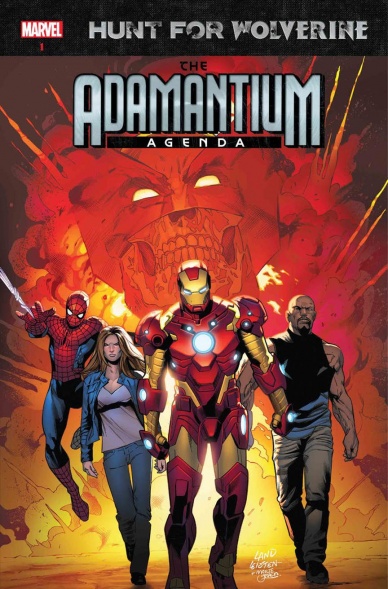
Hunt for Wolverine: Adamantium Agenda #1
Written by Tom Taylor
Penciled by R.B. Silva
Inked by Adriano Di Benedetto and R.B. Silva
Colored by Jesus Aburtov
Lettered by VC’s Joe Sabino
Reviewed by Alexander Jones
While every issue involving the “Hunt for Wolverine” story has retained a high quality thus far, it must bear the asterisk that “Hunt for Wolverine” should not be involving characters outside of the X-Men cast. “Hunt for Wolverine: Adamantium Agenda” #1 thankfully continues the tradition of these titles being better than they have any right to be. With a script from rising Marvel star Tom Taylor and the fantastic artist, R.B. Silva, the issue bears a creative team with an impressive pedigree for quality comics which is perfectly realized with the entertaining script and gorgeous artwork the talent contributes to the issue.
Absence makes the heart grow fonder, which is exactly why seeing Wolverine, Spider-Man, Luke Cage and Jessica Jones together on an Avengers team is absolutely thrilling. Taylor follows up on the plot from the Hunt for Wolverine one-shot and tosses Tony Stark back into the mix. Even with a status quo so restrictive and limiting, it is impressive to see Taylor’s sheer charisma that he lends to characters make me start to buy into the premise and the tense, violent situations he quickly surrounds the Avengers team in. Most of the issue sets up the ideas behind the story, meaning the plot doesn’t get as much of a chance to progress as readers may have liked. Fortunately, once the story gets going, Taylor quickly sets up a nice situation and throws a twist or two at the audience along the way.
R.B. Silva’s artwork is a fantastic contribution to the issue. The artist pulls off a Stuart Immonen-influenced style that recalls some of the great work from the original “New Avengers” series. Silva has a great sense of panel composition. One particular page where Tony Stark’s armor is scattered about and Spider-Man is dangling from the top of a ledge perfectly encapsulates the personality of each character while giving readers something interesting to look at along the way. The final action pages also have a great bit of detail with lots of little details added along the way to keep the comic interesting. If I had to lob one odd criticism at Silva it would be the strange artistic choice of Wolverine’s protruding mask eyebrows which are extreme in length and downright comical. Silva’s strengths don’t tend to lie in embellishment or the grandiosity of superhero comics making some details like this feel distracting.
“Hunt for Wolverine: Adamantium Agenda” #1 should be a dull, uninteresting and forced story putting together a team that has no real connection to Wolverine. This issue tries to connect some of the dots between Wolverine and the other Avengers, and while a strong personal connection between Logan and the rest of the cast is not shown off very well, the issue quickly heads into some fun territory and has a great script and strong artwork making readers pine for a Tom Taylor and R.B. Silva “New Avengers” comic.
Final Verdict: 7.4 – “Hunt for Wolverine: Adamantium Agenda” #1 is a light and enjoyable contribution to the “Hunt for Wolverine” storyline.
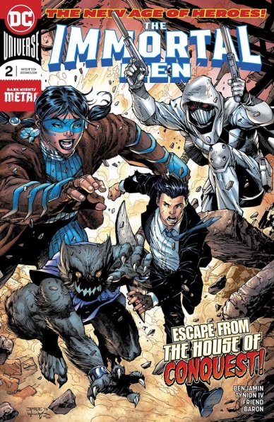
The Immortal Men #2
Written by James Tynion IV
Penciled by Ryan Benjamin
Inked by Richard Friend
Colored by David Baron
Lettered by Carlos M. Mangual
Reviewed by Alan Buxbaum
There’s much to like about “Immortal Men” #2, such as the characters, general plot, illustration, and much of the writing. That beings said, the course of the plot is dragging all of those things down in both its inaugural and second issue. Let’s start off with what works.
Continued belowThe characters in this “New Age of Heroes” series are great. They each bring personality and peculiar skillsets that we’re not used to. An example of this is Reload, who has the ability to “subtract time from an object in his direct sphere of influence.” This somehow allows him to fire off one bullet one hundred times. I’m not quite with them on the logic there, but this ability is awesome nonetheless! Especially when considering what you can do with things aside from bullets (although that seems to be his MO).
In addition to Reload, Timber, Stray, and Ghost Fist all have lots of potential when it comes to their powers and personalities. I’m also a huge fan of the diversity/gender equality that makes up the group. It feels more real than seeing four more white dudes added to the list of DC heroes.
Onto what didn’t work for me: progression of plot. This issue felt like a jerky roller coaster ride all the way to the top. Once you made it down, you were thankful the ride had some thrills, but would appreciate if your neck didn’t suffer from whiplash. I’m not sure why they had to have Caden Park escape from the action right when it was getting good in order for him to get into a….taxi. Yes, what a riveting turn of events. And after that, he had a simple conversation (that albeit was a necessary one for the plot to advance). The action started again pretty quickly, but I felt that the interruption really took away from the flow of the comic. After reading the first issue, I was geared up for this one to full-speed-ahead when it came to a big first battle. I could’ve used much more in this department.
The writing itself is great, although some of the dialogue feels off at times. In general, I’m a big fan of it switching to the narrator’s perspective. This writing style feels mystical, as it should when a story is about a group of immortals.
b>Final Verdict: 6.9 – Although this series has a lot of potential, its being dragged down by lack of flow and direction in this issue. Hopefully the series will capitalize on its strengths in the future so it can turn into a mainstay of DC Comics.

Isola #2
Written by Brenden Fletcher and Karl Kerschl
Illustrated and Colored by Karl Kerschl and MSassyK
Lettered by Aditya Bidikar
Reviewed by Michael Mazzacane
Two issues in and the generic aspects for “Isola” do not seem all that detrimental to the book. The beats in the second issue are expected as Rook searches ruins of a city for supplies and the Queen hides away and deals with waking dreams. The familiarity of these beats, and familiarity in general, are not detrimental because they are executed by illustrator Karl Kerschl and colorist MSassyK, both credited with “art.” Brendan Fletcher and Karl Kerschl’s scripting isn’t bad either, the writing is pretty good overall, but like the dramatic beats therein, it is more about how this unseen script is realized through collaborative process that gives “Isola” the sense of being more than the sum of it’s parts.
Everything working together comes through in the issues opening pages as Rook and the Queen travel along a mountain pass. Rook is singing what seems to be the series theme song about the titular island. Queen is following her but interspersed in these pages are harsh injections of pink and white accents. The blue and the pink aren’t opposed to one another, they’re pretty analogues actually, but the intensity of the pink is jarring. It slowly builds until Queen is down. The amount of expression Kerschl and MSassyK get out of Queen is astounding; she looks not despondent, but just kind of sad, how a cat does when its owner is leaving, as Rook goes off into the ruined city. That emotion is counterweighted by the look of curiosity as Queen explores the mountains jungle like region while Rook is away. Special note is needed for how MSassyK handles the sun rising during these pages, both in tracking the light source across various panels and how that tracking unites several pages overall in time.
Continued belowThe art team’s ability to narrate emotion and the sense of history works wonders on the character of Bendix, a sort of friend of Rook’s. As the character continues to be a presence in the issue, he slowly gets more and more depressed and lonely. That’s a note that doesn’t come through in the dialog. It’s a note that makes a somewhat heelish turn and bad ending land all the more by the sheer feeling of fright they produce in that series of images.
Final Verdict: 8.0 – “Isola” has a rep for being an art book, and that’s well earned, but how well everything works in concert with one another makes it one of the more evocative comics being published. The beats maybe familiar, but their execution isn’t.
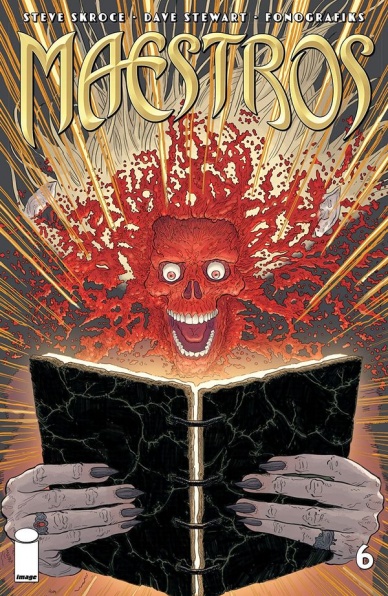
Maestros #6
Written and Illustrated by Steve Skroce
Colored by Dave Stewart
Lettered by Fonografiks
Reviewed by Alex Curtis
Steve Skroce shoots for the stars with this penultimate issue where things go completely over-the-top—for better or worse.
This issue in particular is a fantasy fanatic’s dream. Thousands of leviathan creatures led by a crusty wizard clash with hordes of demons against the backdrop of an obliterated earth. Imagine the most unforgettable Dungeons and Dragons match come to life on the page. It’s as wild and gargantuan as it sounds, and Skroce isn’t giving himself an easy time being the writer and artist. Yes, the immense skirmish is the main attraction here, but little details stick out and impress the most. For all the epic scenery, Skroce doesn’t skimp on the details, giving ample attention to each character’s intricate designs. You could laser-focus in on any panel and you’d be amazed at the wealth of specific touches put in to make the world more believable.
Repeat reads are practically a necessity to fully catch and revel in the wealth of excitement and enormous spectacle. Who says comics can’t be as visually stunning as the biggest blockbusters? Shout-out to Fonografiks, whose garish colors further reinforce the pulpy aesthetic.
However, the dialogue remains a problem in “Maestros.” It’s hard to take even a fantasy too seriously with silly, retrograde talk that’s cringe-worthy and not fitting of such grandiose characters. You could argue this is the book’s style and particular sense of humor, but that doesn’t mean it’s effective, and it cheapens scenes that should be more tense or have a sliver of gravitas.
The characters don’t stand apart either in their dialogue or actions. It’s hard to care about the heroes beyond the fact that they’re the “good guys” and we’re supposed to root for them. To have successful protagonists (or even antagonists), the audience must be given ample reason to empathize and/or understand the cast. Great ways to do this are to give them strong personalities or to make them sympathetic. The “Maestros” characters aren’t necessarily bad or bereft of personality, but it’s not capitalized at this crucial moment in the series.
Final Verdict 6.3 – This is definitely worth a read for the bombastic carnage, but for all the razzmatazz, #6 feels rather hollow for being the climactic battle.

Pumpkinhead #3
Written by Cullen Bunn
Illustrated by Blacky Shepherd
Colored by Arancia Studio
Lettered by Troy Peteri
Backup Story Illustrated by Kyle Strahm
Reviewed by Chris Egan
Writer Cullen Bunn (“Harrow County”) knows his way around rural settings and characters and he understands the Appalachian setting of “Pumpkinhead,” but outside of some decent monster moments and backstory, the plot drags with more expositive dialogue than is necessary in a tale such as this. To have Ernst’s motives be so like those of the lead character in the film is a bit of a letdown. It would have been great to see a different plot device bring forth Pumpkinhead’s wrath. Luckily the rest of the plot is a step in a different direction.
An element introduced here is bringing new demons into the story. As both the film and this series tell us, “For each of man’s evils a special demon exists…” We are then introduced to the demons of gluttony, lust and a few others. This is a fun addition to the lore that is reminiscent of the works of Clive Barker, but most of the creature designs end up being more H.P. Lovecraft than Stan Winston and do not fit into a similar design palette with the titular character. That’s more a design flaw so I won’t hold that over Mr. Bunn’s head.
Continued belowTouching more on the art of the book, comic book veteran Blacky Shepherd is illustrating the whole series and he absolutely nails the look, expressions and movements of Pumpkinhead. My biggest problem is that the final product is just OK. Most of it falls flat. It is what I have come to expect from most Dynamite Comics; it’s decent, moves the story along, but is ultimately forgettable. I have seen Shepherd’s original black and white inks and they work much better than the finished boards. This issue was colored by Arancia Studio, and they do work throughout the entire industry, but have a more mass-produced, than labor of love look to their stuff. I would not mind more black and white horror comics in the world. Shepherd’s heavy, inky contrast would look especially nice in a nightmarish fairy tale like this.
A nice bonus at the end of each issue is a mini story giving background to Haggis’ experience with the other demons of man’s evils. Illustrated by Kyle Strahm, these pages have a nice cartoonish yet creepy tone to them that adds a little to the series.
Final Verdict: 5.5, A moderately fun tale of horror and monsters, with some nice gore, but does not have enough strength to pull in most readers outside of long-time Pumpkinhead fans.

RoboCop: Citizens Arrest #2
Written by Brian Wood
Illustrated by Jorge Coelho
Colored by Doug Garbark
Lettered by Ed Dukeshire
Reviewed by Jonathan O’Neal
Continuing immediately where the premier issue left off, “Citizens Arrest” #2 wastes no time getting down to brass tacks. There are a few more bitingly satirical bits worked into the narrative, but Wood’s script is mainly concerned with getting Alex Murphy off the sidelines. It turns out that’s more difficult than it might have initially seemed as the head of OCP still takes a very close and personal interest in the former RoboCop’s whereabouts, in particular his firearm.
Wood develops a nice dynamic between Leo Reza and Alex Murphy in this issue that extends to the residents of The Shore, an area or Detroit not slated for immediate redevelopment by OCP, but may soon be if the things don’t develop to the nameless head of OCP’s liking. So while the first issue felt like world building, this second issue makes the conflict more intimate, touching on the heart of peacekeeping in this futuristic world where AI runs rampant. It’s a prescient notion where a small band of those living in this new world order refuse to let their lives be governed and resist in small but meaningful ways.
Once again, Coelho’s art effectively sets a mood that is not overly oppressive, depicting an almost benign totalitarianism. It portrays this latest rebellion in an almost routine manner, but by the time the actions come to a head in the issue’s climax, Garbark’s color pallet and Coehlo’s linework take on a more apocalyptic quality. By the time Murphy utters one of his trademark cinematic lines, all bets are off, and the actions of the series stakeholders are getting ready to come to a head.
In the raft of socio-political books hitting the stands, “Robocop: Citizens Arrest” feels more nuanced, not because it is not bombastic, but because it shows how quickly and easily things can escalate if the right buttons are pressed. On the surface, Murphy’s RoboCop is completely outgunned, both literally and metaphorically. It will be interesting to see how he can enlist those in the community of which he has been a part to resist tearing itself apart and fight back in a way that doesn’t serve the interests of their corporate overlords. Through clever narration on the nature of heroism in the early part of this issue, Wood is setting up RoboCop as not just an instrument of salvation but also as a symbol for others to follow.
Final Verdict: 7.5 – While readers might be clamoring for RoboCop to start kicking some OCP ass, Wood and Company are content to play a longer narrative game, perhaps showing how Murphy’s brand of heroism must change to be effective.
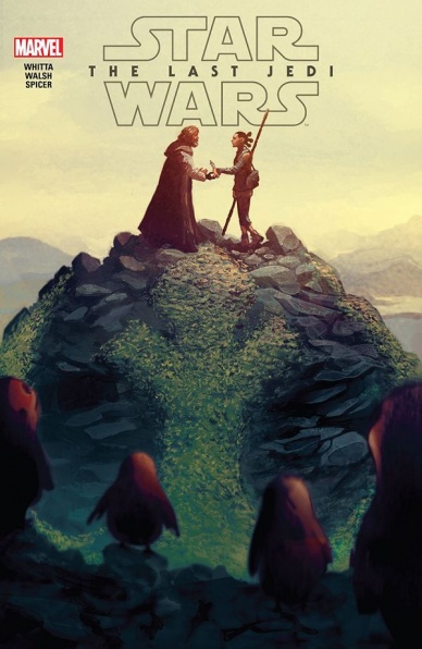
Star Wars: The Last Jedi Adaptation #1
Continued below
Written by Gary Whitta
Illustrated by Michael Walsh
Colored by Mike Spicer
Lettered by Clayton Cowles
Reviewed by Gustavo S. Lodi
Kicking off the 6-issue mini-series adapting “Star Wars: The Last Jedi”, this adaptation by Whitta, Walsh and team tries to convert to comic book form the popular and polarizing episode eight. But does it bring anything new to the table or is it more of the same?
Taken as an individual piece, this issue is solid, if not ground breaking, especially on Walsh’s art. His panel design walks that thin line between covering a lot of plot in as few pages as pages as possible and not becoming cluttered. His style is also very suited to install a sense of kinetic energy to the page, especially during the aerial and outer space dog fights between the Resistance and New Order. On more subdued moments, where character expression takes centre stage, there is a bit of exaggeration: readers will note that in the beginning with Luke Skywalker and towards the ending with Finn, where the artist seems to overdo surprise and fear.
Spicer on colors seems to be woking restricted to a palette familiar to the “Star Wars” mythology (from costumes, to ships and even planet environment design), but he makes the most of it. Even if not surprising, the issue does have a very consistent tone to what fans would expect of this universe.
Whitta had a tough job in front of him, that of adapt a three-arc story in the shape of six-issue segments. The break on this issue (when Rey is still getting to know Luke, Finn has just awoken and the New Order gives chase to the Resistance) feels unnatural, cutting a dramatic moment short. And, despite being a six-issue offering, most of the deeper moments feel rushed. A very good exception to that occurs early on, where a bit more of a backstory to Luke’s current predicament actually expands from the movie script in an area most in need for that.
Final Verdict: 7.0 – A good adaptation of the source material that deviates little from the original – for better or worse. With a competent art package, this will appeal to fans of the movie who want a bit more out of it.

SuperMansion #2
Written by Barry Hutchison
Illustrated by Jake Elphick
Colored by Tracy Bailey
Lettered by Simon Bowland
Reviewed by Reed Hinckley-Barnes
In “SuperMansion” #2, the League takes an exchange trip to Europe, trading places with their European superhero counterparts, which provides an excuse for a bunch of lazy, uninspired jokes about the most basic European stereotypes. Reading this issue, I don’t think there was a single joke that actually landed. Even the ones that aren’t focused on basic stereotypes like the French eating frogs or Germans being Nazis just don’t land. Maybe it’s because the comic is lacking the delivery that the all-star voice cast brought to the animated series, but so much of the dialogue, even the part that might have counted as decent jokes, fall flat.
The art for the issue presents an almost caricatured version of the world that is presented in the show. Most of the characters don’t look all that much like their animated counterparts, but the art makes up for it with a very fun, cartoony aesthetic. I actually really enjoyed the flat, bright coloring of the book, which lends itself to the exaggerated facial expressions and body movements of the characters. Unfortunately, the lack of laughs in this issue mean that even an art style I enjoyed can’t alleviate the negative aspects of “SuperMansion” #2. On the most basic level, it’s a book that just isn’t funny.
Final Verdict: 4.0 – While the art is enjoyable, “SuperMansion” #2 relies on outdated stereotypes for jokes that don’t land.


