
There is a lot to cover on Wednesdays. We should know, as collectively, we read an insane amount of comics. Even with a large review staff, it’s hard to get to everything. With that in mind, we’re back with Wrapping Wednesday, where we look at some of the books we missed in what was another great week of comics.
Let’s get this party started.
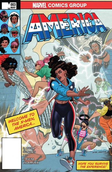
America #3
Written by Gabby Rivera
Penciled by Joe Quinones with Stacy Lee
Inked by Joe Rivera with Stacy Lee
Colored by José Villarrubia with Jordan Gibson
Lettered by Travis Lanham
Reviewed by Forrest Sayrs
My experience of reading “America” has been decidedly mixed. Here is a great character headlining her own book to punch her way through whatever obstacle is in her way. But the story has been getting bogged down by a sincere effort to develop America’s backstory and tie her to our world. That being said, Issue #3 is fantastic, puling everything together and crystalizing this interpretation of America, while keeping things crazy, and above all, stylish.
Readers who got to know America during Kieron Gillen and Jamie McKelvie’s “Young Avengers” book experienced her as a taciturn but passionate bruiser with a lot more experience than her age would let on. In “America,” Ms. Chavez is a lot less sure of herself and a lot more talkative. While an argument could be made for the events of “Ultimates” and “Ulitmates 2” undermining her confidence, this America reads very differently than other versions of herself. I’m not completely in love with this interpretation, but if “America” is the book where we are starting to see pieces of her personal life, then it makes sense that America’s vulnerabilities are more on display.
Thankfully, issue #3 starts to pay dividends on the book’s work establishing America’s Latinx background. Previous issues have felt like Gabby Rivera was just kitbashing as much Latinx culture as she could, with decidedly mixed results. But we see a real shift this issue in a sequence detailing America’s first weeks on Earth 616. It is a piece of incredibly successful character work that capitalizes on a lot of the elements Rivera has been setting up. The book is still aggressively Latinx and queer, but now it feels much more warranted.
Prior to this issue, America’s background has been incredibly vague, involving growing up with experiences from all over the multiverse. That ‘ultimate melting-pot’ background served to take the edges off of Marvel’s first non-white, queer heroine; a choice that “America” seems intent on correcting. These changes could frustrate fans of America’s earlier depictions, but this issue finally makes them feel necessary, as opposed to the mashup of diversity for diversity’s sake that characterized the first two issues.
Joe Quinones continues his impressive run as lead pencils. America’s not-a-costume is always a highlight, but his take on Storm’s ’80s punk design is really delightful. Quinones’s true strength is in his facial work. Expressions pop, even at a significant distance and when he has a full panel to show off, the close-ups are full of great, emotional detail. The out-of-this-world fashion elements are also on full display in the Maltixian Chavez fangirls, and the ongoing antics of the Leelumultipass Phi Theta Betas. I mean, what’s not to love about a girl who’s dyed her hair into a Captain America shield. José Villarrubia’s colors look great in Quinones’s clean lines and do a great job of distinguishing the varied skin tones of the cast.
Final Verdict: 8.8 – This might be issue that will bring you on board if you’ve been skeptical of America’s solo outing so far.
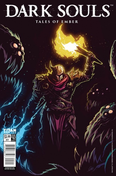
Dark Souls: Tales of Ember #2
Written by George Mann, Dan Watters, Cassandra Khav, and Tom Williams
Illustrated by Piotr Kowalski, Caspar Wijngaard, Andrea Olimpieri, and Alan Quah
Colored by Brad Simpson, Caspar Wijngaard, Mattia Iacono, and Komikaki Studio
Lettered by Tom Williams
Reviewed by Gregory Ellner
So far as Bandai Namco’s Dark Souls video game series is concerned, an anthology style does fit very well. The entire franchise is based upon a breadcrumb style of storytelling, so giving out bits of narrative without much context works well to the authors’ favor.
Continued below“The Shrine Pt. 4” is an interesting framing device by Tom Williams, with the apparent anti-Humanity feline giving the perspective of the Fire to the captive human. Alan Quah and Komikaki Studio’s dark artwork contrasts well with the glow of the flames, giving the entire story a good feeling of the dueling forces of dark and light, divorced from any talk of good and evil.
“Behold, Townsfolk!” gives a “Goosebumps!” style of horror, with an interesting conclusion by George Mann that fits very well into the overall narrative of the series without being overly complicated. The lighter artwork by Piotr Kowalski and Brad Simpson makes the story feel more lighthearted, making the twist seem all the more shocking yet appropriate.
Dan Watters’s “Shattered Mirror” is written exceptionally well, with the mirrored monologue fitting well to the fight of the knight with the mirrored shield. Caspar Wijngaard’s art portrays the reflections in the eponymous mirror well in keeping with the endless battle that encompasses the structure of the story itself, as well as the slight, but important differences between the two ceaseless combatants.
With “Pound of Flesh,” Cassandra Khaw’s writing portrays two cursed sisters in a tragic, but nonetheless unsympathetic manner, as well as giving a nameless knight’s perspective on the entire thing without a word. Andrea Olimpieri and Mattia Iacono work together to craft two mutated, monstrous individuals in contrast to humanity as a whole, giving a good impression of the failings of a world so deeply ingrained to the dark.
In spite of the horrors portrayed, all of these authors and artists collaborate toward an essential theme of the entire series, summarizing it all rather simply: despite the dark, for better or for worse, humans will not quit, even if this determination shall be their downfall.
Final Verdict: 7.0- An interesting collection of stories in the Dark Souls world, though the collaboration does leave readers wanting more.

Detective Comics #956
Written by James Tynion IV
Illustrated by Marcio Takara
Colored by Marcelo Maiolo
Lettered by Sal Cipriano
Reviewed by Michael Mazzacane
“Detective Comics” has been one of the most consistent reading experiences I’ve had since the Rebirth branding started. While not as flashy as other titles, Tynion and the rotating group of artists have made for an excellent series of comics. Which makes my appraisal of #956, and ‘League of Shadows’ in general, as just “fine” and not “I can go write a term paper off this” somewhat (egotistically) disappointing. Personal taste regarding Marcio Takara’s art aside, there is nothing fundamentally broken about this comic. I just wish it had been a little tighter, a little longer, with a cleaner end.
‘League of Shadows’ is the third big arc in “Detective” and a pattern has developed for Tynion. A mysterious, shadowy, cabal of ne’er-do-wells wreak havoc on Gotham City and the Bat-Family must stop them. With those mystery groups often acting as some externalization of a core motif for the arc that challenge the central character. ‘League’ has focused squarely on the much beloved Cassandra Cain, and her cathartic moment of actualization is an excellent page. However, once that moment passes, Tynion doesn’t follow through on it and show just how much Cassandra has grown outside being vigilante, unlike previous arcs. He teases it, and instead uses the final pages to setup vague illusions for the future and recognize that this is a book in an overall constellation of books. The lack of a worthwhile denouement is a frustrating moment of tension between individual storytelling and the requirements of the story universe. Tynion gets some fun and little moments in this issue that I wish were allowed more room to breathe.
Marcio Takara and colorist Marcello Maiolo have come together to make an aesthetic that is a departure from the previous art teams. Previous teams made elaborately paneled spreads with soft colors, here their aesthetic is the opposite. Takara’s page layouts are strictly paneled, their figures are flattened and cartooned using copious amounts of ink for definition. Maiolo’s pallet is an exercise in using exploring the shades of a single color, this book is dominated by reds. This all creates for an aesthetic that reminds me of contemporary Frank Miller, and in both cases, there is a kind of garish simplicity to it. In the spread where Cassandra shows her mother how different she is, this aesthetic artistic sense because it is a bold, melodramatic, moment. It is the in-between moments that feel underserved by this art team, they feel static and visually uninteresting. Like the writing, I wish it all just came together better.
Continued belowFinal Verdict: 7.0 – ‘League of Shadows’ is over and it’s fine, thankfully we won’t have to wait very long for new, hopefully, more interesting stories to be told.
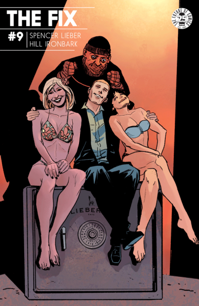
The Fix #9
Written by Nick Spencer
Illustrated by Steve Lieber
Colored by Ryan Hill
Letters/Design by Ironbark
Reviewed by John Schaidler
After the publication of two trade paperbacks, “The Fix” #9 kicks off a brand new story arc – or does it?
To be honest, there’s nothing particularly new here. All we really get is a brief but serviceable recap that kicks things off; a dream sequence that seems purely designed to remind us that there’s a dog; a series of crude sexual sight gags (complete with cheesy laugh track) that introduce the infamous Horny Grandma; and a near death experience in which Roy is barely but fortuitously saved. Again.
Which is definitely not to say that on a purely technical level – as with previous issues – the work is anything short of outstanding, because it absolutely is.
First off, the writing is consistently clever (though often a bit gratuitous) and endlessly entertaining. Roy’s self-deprecating internal monologues ingeniously straddle the line between likability and punchability, tearing us between secretly rooting for Roy’s half-assed plans to work and excitedly holding our breath, cheering for the moment when everything explodes in a glitzy, technicolor fireball. Not coincidentally the exact visual mood that Steve Lieber’s and Ryan Hill’s artwork evokes.
Hill’s gaudy, almost sleazy colors – whether rendered in sun-drenched golds and yellows, dreamlike magentas and oranges, or the deep blues and purples of yet another drug-addled twilight – lacquer every scene a with a thin, post-glamour Hollywood sheen that doesn’t fool anyone but the most gullible or most jaded stooges. In other words, pretty much the entire cast of “The Fix. Which is exactly where Lieber comes in, perfectly rendering facial expressions and body language that instantly tell the story with a knowing glance, a shrug, or a head thrown back in raucous laughter. Not to mention Ironbark’s expert design and lettering, which subtly and seamlessly interweaves an inordinate amount of text into the story without ever crowding the characters or impeding the action. No easy task in a piece so dominated by interior monologue and dialogue scenes.
So why do these exceedingly well-constructed pieces not add up to a greater whole? I think it hinges on the difference between timing and pace.
The story’s timing is nearly flawless, with each set-up and punchline (quite literally, at the beginning) coming at the perfect moment, but the pace is just plain sluggish. A one panel moment is shown in three. A scene worthy of a single page drags into two or three pages. At the end of the day, “The Fix” #9 has its moments – bold, hilarious, offensive, exceptionally well constructed – but it doesn’t move the narrative forward in any meaningful way. It’s simply more of the same, peppered with the same old punchlines.
Final Verdict: 7.3 If you’re not already a fan of Spencer and Lieber’s always-on-the-make anti-heroes and the hopelessly debauched L.A. that they inhabit, there’s nothing new here to win you over.
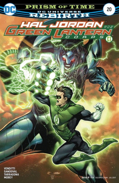
Hal Jordan and the Green Lantern Corp #20
Written by Robert Venditti
Penciled by Rafa Sandoval
Inked by Jordi Tarragona
Colored by Tomeu Morey
Lettered by Dave Sharpe
Reviewed by Jake Hill
Most people would agree that Geoff Johns was the savior of the “Green Lantern” books, creating some of the most memorable space-faring characters in DC. What would come of the books after he left was always a big question mark, but now that other creators are getting a chance to play with the toys that Johns brought to the table, the “Lantern” books have never been better.
“Hal Jordan and the Green Lantern Corps” is a perfect example. It’s a fast moving superhero police story, featuring all of the famous members of the Corps in one book. Separating out the newer characters to give them room to grow was a great idea, and leaves this book to play with the dynamics of Hal, John, Kyle, Guy, Kilowog, Mogo, and all of the familiar characters from decades of the book. It’s content to stick with its status quo, shaking up characters rather than the larger mythology, and feeling like a traditional superhero book in the best possible way.
Continued belowThat all being said “Hal Jordan and the Green Lantern Corps” #20 suffers a bit from being the middle book of a story. It’s a big action set piece, and it adequately has its share of character beats and desperate gambles, but it doesn’t leave too much of a lasting impression. I enjoyed it while I was reading it, but I’d be hard pressed to recall a particular panel or beat without going back to the book. The issue lacks a spectacular moment like the fist fight between Guy Gardner and Arkillo a few issues back, which was one of the rawest and most brutal throwdowns in recent GL history.
Speaking of those two, they don’t feature nearly enough in this issue. The tension between the different Lantern Corps has been a highlight and the love/hate bromance between the two nastiest boys in their respective organizations has been the most fun relationship to result in that. Instead, this issue focuses on a space-bound dogfight, in which John has to lead his Lanterns to fight some freaky construct thingies. I’m a sucker for a good dogfight, and this one was alright. More of a focus on the tensions between the newly partnered Green Lanterns and Sinestro Corp would have done a lot to keep the action grounded in character conflict.
This arc also adds the wrinkle of featuring time-traveling TV darling Rip Hunter, looking much more like the old comic book version of the character than the Legends of Tomorrow take on the character. The time travel gives the story some momentum, and it helps keep the mystery moving, but beyond assembling all our players in fun ways, it doesn’t really have a lasting narrative impact.
“Green Lantern” books always have the chance to do wild things with the light constructs, and this issue leaned a bit towards the more obvious side. Lasers a shot, Hal pilots a green-light jet fighter, Guy makes a big ‘ol baseball bat. Some of it is cool, but it feels like stuff we’ve seen before. Sandoval’s art is very good DC house style, but he never clears my important threshold for a “Green Lantern” comic: I need to see one construct that I wouldn’t have thought of. The artwork is fine but doesn’t take the opportunity to blow my mind.
I’m still a big booster of the current pair of “Green Lantern” books, but this issue came at an unfortunate point in the arc. It felt a bit obligatory and was missing some of the anything-goes joyfulness of previous issues. I’d write that off to being an isolated incident. While this was a slow installment, I’m sure the story will read great in the trade.
Final Verdict: 6.8 – A big fight scene in the middle of a good story sure is something to do, but is somewhat forgettable when executed here.
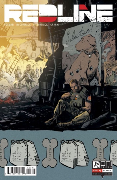
Redline #3
Written by Neal Holman
Illustrated by Clayton McCormack
Colored by Kelly Fitzpatrick
Lettered by Crank!
Reviewed by CLA Bindery
At first look, there is very little action in this issue and hardly any new information is given about the main characters or surrounding the mysterious alien necklaces until the last page of the story. This issue comes off as filler used to set the stage for future events.
Holman presents Coyle, Kim, and Peck in the same three-person comedy routine as we have seen before with no character development. While we learn a little more about Coyle’s experiences in past events, Peck and Kim remain stagnant and continue to only be included for comic relief and locker room humor. At no time during this issue does Holman show any of the characters grow or give anything that could allow the reader to identify with the characters or feel anything for them. A good example is the Kim character where all we see in this issue are his antics. In one scene we see Kim futilely attempt to open a magnetically locked door until the lock is released and he falls to the floor. In a second scene, we find out that Peck has been promoted to Commanding Officer over Kim and for the next two pages Kim berates Peck by calling him names out of frustration. While these types of situations were funny in the first two issues, here they are just status quo humor and add no substance to the characters or the story.
Continued belowMcCormack’s line art of each character and of the scenery on Mars has a scratchy feel that gives a grain to the art. This is contrasted with the line art used for the inside of the marine base and office of Vantage Corp where he uses smoother lines giving a cleaner feel of the human facilities. Otherwise, the line art for this issue is fairly typical. One achievement was McCormack’s display of waveform to simulate music in the final scene of the issue. Here the waveform organically moves through the background and around the characters to effectively display the sound of music going through a room.
Final Verdict: 6.5 – While the story sets the stage for future issues, nothing really happens and the same crude humor ensues.

Rock Candy Mountain #2
Written, Illustrated, and Lettered by Kyle Starks
Colored by Chris Schweizer
Reviewed by Kent Falkenberg
Admittedly, I ran a little cool on the first issue of Kyle Starks’ new hobo opus. It crackled with a ridiculous premise obscuring whip-smart ideas and cracked heads with kinetic art, but something about it just didn’t quite click for me. I had a hard time connecting with any of the characters. Starks must have just needed a bit of a tune-up, though, because “Rock Candy Mountain” #2 has the pistons all firing in rhythm.
By handling most of the graphic storytelling duties himself, Kyle Starks is able to control the pace of this issue incredibly well. It’s something of a masterclass in packing world-building, a self-contained narrative – or objective, might be a better word – and seeds of grand-scale mystery into the sardine-can-tight confines of a 24-page comic. There’s a transition from hobo stew-making to a bare-knuckle fight club that happens so smoothly that even though it’s easy to get lost in the lingo and zaniness of the world, it feels completely natural to have shifted from the one place to the other. Through the language used and the mannerisms captured in both locales, Starks captures an innate sense that, populated as they may be by outcasts and miscreants, these are communities of kindred spirits if you look hard enough. The emotional connection that was lacking before comes to a head in a scene as simple as a group all pitching whatever they can into the communal mulligan.
There’s also a six panel sequence during where Jackson throws on a quick disguise while his new protege sounds off on how alien the whole hobo life feels to him. But it’s all obfuscated just enough in the background that we don’t really notice Jackson’s transformation into the bandana-wearing Dog Nuts until we see a poster with his face on it that points out he’s actually banned from the club. “Rock Candy Mountain” #2 just shows how effortlessly one person’s control over layout, action, positioning of words, and the words themselves can work to a unified purpose.
That being said, credit must be given to Chris Schweizer for the earthy brown and faded rouge pallet that does wonders to evoke both the time period and the downtrodden reality of these railyard denizens. But what’s even more evocative is the gentle shade of blue given to the suit jacket of Jackson’s new compatriot. It sticks out in such a wonderful way – partly because the vibrant quality is natural for someone so new to the life and partly because it evokes a person who, in all likelihood, is not bred to survive in this kind of jungle.
At times, “Rock Candy Mountain” #2 seems stuffed to the point of bursting. Not so much in terms of detail – artwise, the bold lines capture a balance of minimalism and classic cartooning akin to Rich Tommaso, albeit rubbed raw with a tough grit sandpaper – but in terms of content. Starks isn’t afraid of a cramming five faces, each with reactive dialog, into a tight horizontal panel just so he can capture the punchline of a whupped prizefighter delighting in the fact his bloody nose finally stopped bleeding.
Something much grander is at play in this series – Jackson’s goal of hiring a cat-burglar from the throngs of would-be pugilists is bookended by the FBI on his tail and Ol’ Scratch hunting down his friends. That Starks is able to balance the brawling and hobo shenanigans with an authentic sense of community and camaraderie gives the issue that added dose of heart that was missing from the first. If the mythical Rock Candy Mountain turns out to be nothing more than a song, I’ll still listen to Kyle Starks sing it all night long.
Continued belowFinal Verdict: 8.5 – Oh, it’s damn funny too. Did I mention it’s funny?

Shade, the Changing Girl #8
Written by Cecil Castellucci
Penciled by Marley Zarcone
Inked by Marley Zarcone and Andre Parks
Colored by Kelly Fitzpatrick
Lettered by Saida Temofonte
Reviewed by Nicholas Palmieri
This creative team has a way of capturing the feeling of being lost, aimless, drifting around with no purpose. With this issue, we start an arc where Shade really is traveling, aimlessly exploring and experiencing whatever she can. It’s a smart move for “Shade, the Changing Girl,” given that it allows the book to highlight its most striking quality.
As aimless as the plot is, Shade’s evolving experiences give it a purpose. While the journey doesn’t have a clear driving force, that doesn’t matter as long as we can feel what Shade is going through. Like in previous issues, Shade moves through the world with her own stray thoughts co-existing with stray lines of Rac Shade’s poetry, giving some thematic context to the actions we see. We also get small insights into the lives of previous supporting characters — a panel here, a page there — which ground the story enough that it has a clear context. Castellucci knows how to represent this lost feeling without completely losing the reader.
Zarcone and Fitzpatrick are also essential to creating this feeling. Zarcone draws Shade literally floating through some panels, peeking out behind in objects in others, and taking a leading position through crowds of people in others. She can be everywhere, anywhere, always observing, always taking things in, always operating at her own pace which others might follow.
Adding to this are Fitzpatrick’s wonderful colors. Most situations and characters have either flat coloring or a specific uniform texture under the colors. As Shade moves through the world, though, a rainbow haze comes over everything, changing as she interacts with it. These coloring choices clearly define both the world of “Shade, the Changing Girl” and the effect Shade can have on it.
In all, the creative team goes for something much less straightforward than typical Western comic book storytelling, and they succeed. They expertly capture the feeling of drifting through life, and here we have a plot that services those strengths, taking the reader along for the ride without losing them. That’s a rare skill, and one that will keep me coming back to “Shade, the Changing Girl.”
Final Verdict: 8.0 – More about the feeling than the plot, the journey rather than the reason, and expertly portrayed by every member of the creative team.
Transformers: Lost Light #5
Written by James Roberts
Illustrated by Jack Lawrence
Colored by Joana Lafuente
Lettered by Tom B. Long
Reviewed by Alexander Jones
It took “Transformers: Lost Light” a few issues before the series started to rev up the engines, but we’re finally back to the comic being one of the most rewarding ongoing comic book series being published today. This comic is notorious for playing the long game and an interesting mystery is finally revealed here. This issue works on multiple levels as each subplot finally adds something dynamic to the story which is a welcome departure from previous installments that had too much or too little narrative without having any big answers. Even the new Lost Light crew members finally get some material that justifies Roberts’ intense focus on the duo.
There are few comics as clearly invested in sci-fi as “Transformers: Lost Light” and while this story devoted to an alternate Universe seemed rather extraneous at first, there are just enough elements tying it back to the overall Universe to keep this storyline feeling fresh. This issue pulls the spotlight towards Rung, a supporting cast member who has been overlooked for dozens of issues. Seeing Roberts get the chance to pay off some of the plot threads involving this character and showing how this new storyline has really changed his outlook on the Universe is a very interesting new way to look at the character. These individual moments stand to justify the existence of the character very well.
Continued belowJack Lawrence’s art style is still taking some getting used too, but it’s impossible not to acknowledge the high level of craft the artist uses in this issue. While the art may not be extremely detailed and a huge shift as compared to other “Transformers: More than Meets the Eye” artists, Lawrence has started to visually define what his work on this book will look like. Due to the epic, serious nature of this series, Lawrence still does seem like a strange fit for the book. Lawrence utilizes fewer details and conveys a generally lighter tone doesn’t quite give the big-budget, sprawling feel that past series artists and covers have previously evoked.
The characterization added to Rung in this chapter, in particular, is an unforgettable new way to add something new to the series, as mysterious surrounding his alt-mode are revealed. Watching him so determined to take down the villains of this issue give a remarkable depth to his character. There are several other members in the supporting cast that have gotten their chance to take center stage. Roberts splits his attention to action scenes and character moments with a very well orchestrated balance.
“Transformers: Lost Light” has finally found the secret formula to make the series debut arc interesting. The comic even features excellent payoff and character work regarding the underestimated Rung and other Transformers mainstays. This issue finally shows the potential of what this comic can be going forward if Roberts can continue to deliver on the complex relationships and attitudes of a bunch of robots on a ship together.
Final Verdict: 8.0: “Transformers: Lost Light” #5 brings action, great character moments and answers all in the span of one issue in the series thanks to the talent of James Roberts and Jack Lawrence.


