
There’s a lot to cover on Wednesdays. We should know, as collectively, we read an insane amount of comics. Even with a large review staff, it’s hard to get to everything. With that in mind, we’re back with Wrapping Wednesday, where we look at some of the books we missed in what was another great week of comics.
Let’s get this party started.
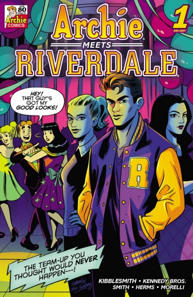
Archie Meets Riverdale #1
Written by Daniel Kibblesmith
Penciled by Pat & Tim Kennedy
Inked by Bob Smith
Colored by Matt Herms
Lettered by Jack Morelli
Reviewed by Quinn Tassin
Ever since Riverdale graced The CW with its presence there’s been a natural question: “how could this possibly come from the comics?” While this comic doesn’t go quite so far as to reconcile the many differences between the comics and television versions of this world, it’s a funny, self-aware and surprisingly sweet issue. Rather than focus on the insanity of Riverdale, this issue focuses on the way that a simpler life really would be nice for the CW versions of Archie and the gang. The biggest conflict in the issue (other than the whole tv universe group being brought into the comic universe thing) is the whole town being totally enamored with CW Archie, Reggie, Veronica, and Betty.
Daniel Kibbelsmith has a clear affection for Archie comics and at the very least an appreciation of the hilarious intensity of the CW characters. Throughout “Archie Meets Riverdale” there’s a clear, funny contrast between the über-hot, cool Riverdale characters and their buttoned-up innocent Archie counterparts. Comic Archie’s jealousy of CW Archie is especially funny here, as comic Betty and Veronica shift all of their affections onto the latter. The dialogue, too is excellent, especially in the early pages of the CW universe (Veronica hyping up Archie as twice any man she knows is particularly incredible). Making Jughead the only comic character to go to the CW universe is just perfect. With his dry humor and go-with-the-flow disposition, it’s great to see him react to the volatile life of television Riverdale. And in maybe the best moment of the whole issue we get a characteristic Jughead burger reaction (he can only eat 3 in the CW world).
The artwork is largely solid, though it leaves a bit to be desired. The classic Archie style is captured perfectly with extremely cartoonish features, and clean, simple designs abound. The Riverdale artwork, though, is just missing a certain expressiveness. Of course these characters are designed in a way that provides excellent contrast with the classic characters. Still, though, the CW characters just feel a bit emotionless which is a shame. The clear highlight of the issue comes when comics Jughead summons a multiversal group of Sabrinas the Teenage Witch to the Riverdale High football field. It’s a really beautiful display of a whole slew of designs and art styles and provides a nice twist in the issue.
“Archie Meets Riverdale” is most successful in its simple last pages. Before being whisked back to their home universe, the CW gang decides to stick around for a school dance. It’s just the kind of simple fun that they never get to have on television and it’s surprisingly touching to see them have it here.
Final Verdict: 7.8- A funny, self-aware issue with surprising heart
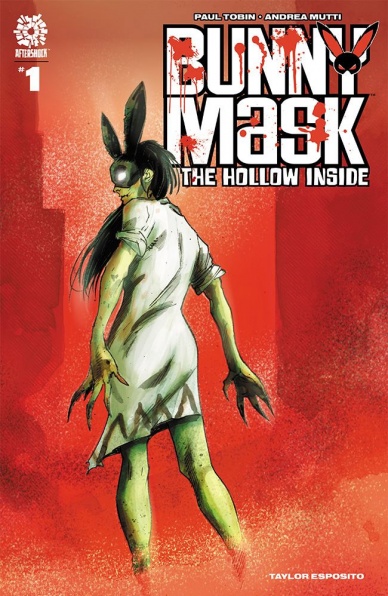
Bunny Mask: The Hollow Inside #1
Written by Paul Tobin
Illustrated by Andrea Mutti
Colored by Andrea Mutti
Lettered by Taylor Esposito
Reviewed by Ryan Fitzmartin
Surreal, grim, and vicious, “Bunny Mask: The Hollow Inside” #1 is a dark new chapter in the tale of the mysterious vigilante Bunny Mask. Bunny Mask rights the world’s wrongs, usually through violent and brutal methods. A strong streak of dark humor pervades the comic as Bunny Mask punishes animal abusers, neglectful caregivers, and sexual abusers with her special brand of creative violence. Paul Tobin has a delightfully sick sense of humor, and this comic isn’t for the faint of heart. This anti-heroine with a mean streak meets her match in the otherworldly entity known as The Hollow, who not just kills his victims, but removes them from existence entirely. Tobin sets up the threat of The Hollow well in issue one, and seeing the conflict play out in the rest of the series should be interesting.
Continued belowAndrea Mutti brings the same dark energy he displayed so well in “Maniac of New York” to “Bunny Mask”. Bunny Mask: The Hollow Inside” #1 contains the same scratchy, feverish art and coloring which feels less like reality and more like a fever dream. The hazy, loosely envisioned backgrounds feel as if they’ve emerged half-formed from a fog. It’s dreamlike and dark and all together very atmospheric. Mutti has the perfect art style for a horror comic, and it works splendidly. The lettering is good too, with different colors for humans and supernatural beings for giving an extra surreal edge.
Overall, “Bunny Mask: The Hollow Inside” #1 is an edgy and creepy horror comic with a fun little mean streak. If there’s any flaw, it might be an overdose of exposition, but it’s hardly noticeable given the quality of the art and the freakyness of the story.
Final Verdict: 8.7 A creepy, thrilling and darkly comedic comic

Captain America Symbol of Truth #1
Written by Tochi Onyebuchi
Illustrated by R.B. Silva
Colored by Jesus Aburtov
Lettered by VC’s Joe Caramagna
Reviewed by Henry Finn
“Captain America Symbol of Truth” #1 is an action-packed first issue that brings an international mystery to the adventures of Sam Wilson, aka Captain America. Writer Tochi Onyebuchi shapes the identity of Cap in a way that helps him take a step away from the legacy of Captain America in a good way. Often Sam’s adventures of Cap have him constantly judging his own actions through the lens of Steve Roger’s Captain America. Onyebuchi uses Sam’s relationship with the new Falcon as a great illustration of Sam’s confidence. As they attempt to stop a runaway train with armored goons with rocket launchers and machine guns hot on their tails, Sam gives decisive instructions to Falcon, all while kicking ass as efficiently as Steve Rogers himself. Furthermore, Sam Wilson as a man is fleshed out well with his budding romantic relationship with Misty as well as his clear values while watching a Wakanda Forever protest together. He is clearly cut from the same cloth as Steve Rogers as he tells her the point of the country is to make it a place where everyone can live and thrive together. With this, Onyebuchi does a good job of reminding us that there is more than one way to stand for the country you believe in.
Illustrator R.B. Silva brings his usual precision to his compositions and placement of characters. There are many moments where he shines and his attention to detail is most prevalent in the way he renders the details in action scenes. When guns are being fired on solid matter, he makes sure to draw extra pieces of shrapnel and particles in the air. When Falcon crash-dives into two deadly drones, Silva makes sure to draw extra speed lines and switches up between silhouettes of broken pieces along with crisply rendered lines that show the shape and detail of the wreckage. One thing he does exceedingly well is to create depth through adding foreground elements to even simple shots. When Cap stands with his back to the camera, showing his shield, Silva adds a valley of wreckage and people in the foreground to help direct our eyes to the silhouette of our hero.
Final Verdict: 8.0 – A fun action-packed start to a series that promises to give us what we expect from a good action-adventure and more.
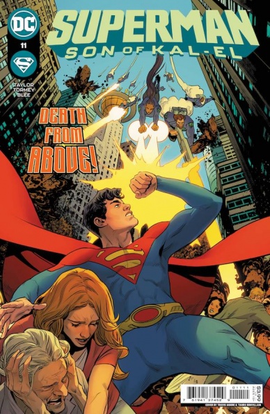
Superman: Son of Kal-El #11
Written by Tom Taylor
Illustrated by Cian Tormey
Colored by Federico Blee and Matt Herms
Lettered by Dave Sharpe
Reviewed by Alexander Jones
Tom Taylor intentionally narrows the scope of his plot at the beginning of ”Superman: Son of Kal-El” #11. This specialized approach allows Taylor and artist Cian Tormey to focus on the characterization of this younger Superman hero. Taylor wears his heart on his sleeve in the script for ”Superman: Son of Kal-El” #11. Taylor’s script shows an empathic Jon Kent giving the human perspective that Batman is sorely out of touch with. In the second half of the issue, Taylor changes gears to focus on the impending threats to Metropolis.
Continued belowArtist Cian Tormey continues the futuristic approach that other illustrators like John Timms have been contributing to this story. Tormey contributes a nimble line that captures lots of emotion. Getting a more animated set of illustrations is perfect for a book like ”Superman: Son of Kal-El” #11 that doesn’t need DC’s traditional house style. Tormey is even able to get Batman to emote in a believable way here. My favorite detail that Tormey adds to this issue is making sure that each character is emoting no matter what scene they are in. Tormey does not capture all the details in the second half of the issue. Henry Bendix and Lex Luthor are even difficult to distinguish in some panels.
In the second half of the series, Taylor continues to bring the plot of ”Superman: Son of Kal-El” #11 into more prominence. There are small developments here with villains like Lex Luthor that have me really intrigued in the next couple of issues. Taylor has notably taken a long time getting to a big battle between Henry Bendix and Jon Kent. Taylor’s revelations with Jay Nakamura will make close readers incredibly happy. ”Superman: Son of Kal-El” #11 is a solid comic book bursting with new ideas for new and old readers.
Final Verdict: 7.9 – ”Superman: Son of Kal-El” #11 balances plotting and characterization with the utmost care.


