
There’s a lot to cover on Wednesdays. We should know, as collectively, we read an insane amount of comics. Even with a large review staff, it’s hard to get to everything. With that in mind, we’re back with Wrapping Wednesday, where we look at some of the books we missed in what was another great week of comics.
Let’s get this party started.
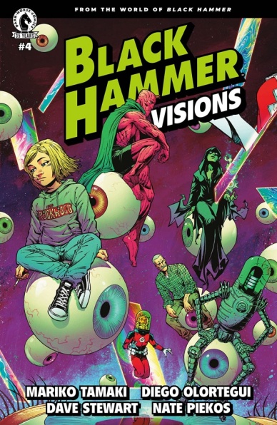
Black Hammer: Visions #4
Written by Mariko Tamaki
Illustrated by Diego Olortegui
Colored by Dave Stewart
Lettered by Nate Piekos
Reviewed by Elias Rosner
There’s something absolutely magical about “Black Hammer: Visions” #4’s celebration and exploration of the “Black Hammer” universe. Without ever dipping into thumb-nosing pretension or cynical satire, Tamaki & Olortegui takes us outside the frame of the original world and recasts the characters as members of both a Dark Shadows-esque soap-opera & a sci-fi family drama. It’s a clever conceit that allows us to experience these conflicting narrative drives – the over-the-top pulp of traditional superheroes and the more naturalistic, personal drama of a modern dysfunctional family – without being weighed down by our actual knowledge of the characters in the “real world.” They are, for all intents and purposes, archetypes and archetypes alone.
This, however, is a strength of the work. Tamaki’s writing is wonderful, bringing a depth to the characters in a short amount of time, and crafts a verisimilitude to each shift in setting such that each version of the characters feels unique to these varying modes. Olortegui’s art is perfect for this story, his backgrounds are lush and full, his figure work expressive and dramatic, perfect for balancing the melodrama of Castle Black with the raucous relatability of Spaceship Hammer and the more grounded, familiar behind the scenes of it all. His approach to people reminds me of modern Greg Capulo, with a reliance more on square/pointed outlines rather than round/soft ones, and inking lines to define faces & folds in clothes rather than leaving that to the colorist to shade. It gives everything and everyone a more textured feel, something I absolutely adore.
Stewart, as per usual, kills it, drenching the gothic scenes in warm yet foreboding oranges & off-whites, emphasizing the shadows while in the sci-fi scenes utilize a greater variety of colors, highlighting the greens and purples often associated with the future while Piekos’s work blends into the background while ensuring the flow of the book remains uninterrupted. I love the small touches he puts in that complement and enhance Olortegui’s panels, like when Space Gail is yelling at Space Madame Butterfly to get out of her room
While the whole issue may feel superfluous for long-time readers of the “Black Hammer” universe, as this is less a look at a character or a time & place and has an ambiguous ending which either ties the two stories together more tightly or bridges the gap between the main BHU and this tangential universe, it hit every right note for me as an “Astro City” fan. It tells a singular story and while there were some moments of confusion – I was curious why Talkie-Walkie was given “he” pronouns rather than her usual “she” pronouns but I suspect that was one change made to fit the “TV” nature of that scene – on the whole, the ideas being explored are interesting enough to look past those moments.
“Black Hammer: Visions” #4 asks us to contemplate our relationship with media, and specifically “Black Hammer’s” approach to the genre. It asks about the clash between the dramatic and the melodramatic that is found in it and charges us to better understand why we love it so that we can appreciate the work in all its amazing, moving, contradictory wonder. I can’t think of a better way to celebrate and explore this universe than that.
Final Verdict: 8.6 – Tamaki & Olortegui’s exploration of the “Black Hammer” universe is as considered and textured as one could hope for, crafting a tale that is thoughtful and engaging with only a few confusing moments tucked away inside. If you ever want an example of why anthology works are special, look no further than this issue.

Children Of The Atom #3
Written by Vita Ayala
Illustrated by Paco Medina
Lettered by VC’s Travis Lanham
Colored by David Curiel
Reviewed by Michael Govan
Hey there! Do you know what’s going on in “Children of the Atom”?
Because I’m not sure I do.
I know that they dress up like the X-Men’s sidekicks. In this issue, we learn they ended up on some abandoned spaceship and crash-landing back on Earth. We’ve learned more about Beatrice, Gabe and Carmen as people…
What is going on though? How did they get their powers? Was it in space like the Fantastic Four, I just…I understand that it is a mystery. I understand that we are only three issues in but maybe I need more hints or for the story to be better-paced…was a spaceship mentioned in any of the previous issues? I swear it comes out of nowhere.
The ‘Real Unity’ reveal (who I believe are another villain group?) was too casual and the whole dinner scene seemed like a weird, awkward info-dump. This love triangle mess is not my cup of tea at all, and aside from the crash there wasn’t much action.
Artist Paco Medina, a departure from Bernard Chang on the last two issues, draws distinct, expressive faces that make the teenagers come alive. They really seem youthful and three-dimensional here. I don’t necessarily prefer it to Chang, it’s just different while still being a good fit for this issue.
The entire issue is reminiscent of issues of “Excalibur” where Apocalypse’s plans and machinations weren’t crystal clear but you could kind of guess and figure out where it was headed. Here, the reader can’t even do that. Vita Ayala is a talented writer, and they have the ability to make great X-comics; they definitely turned “New Mutants” around. There’s probably a great comic here…on the other side of this opening arc.
Final Verdict: 6.0 – “Children of the Atom” #3 is a so-so issue featuring our newest team of…well, whatever they are.
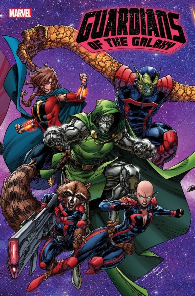
Guardians of the Galaxy #14
Written by Al Ewing
Illustrated by Juan Frigeri
Colored by Federico Blee
Lettered by Cory Petit
Reviewed by Quinn Tassin
That Al Ewing is a creative genius isn’t news but somehow he constantly comes up with fresh ideas that are not only delightful but surprising. With “Guardians of the Galaxy” #14, he’s come up with what may be his greatest creation: Doctor Doom in Rocket Raccoon’s body. This is a great issue from just about every angle. The A plot (which happens to follow Team A), with Doom, is more fun than it is deep but ends up with a twist that is hilarious and will prove meaningful in the coming issues. The B plot, meanwhile, moves the plot involving the Skull death cult forward while planting the seeds for a larger threat down the line (Ego being the herald of a greater power is trés intriguing). It’s perfectly paced and an absolute blast to read which is the ideal when it comes to just about any story.
Juan Frigeri does solid, if simple, on the pencils this issue with great colors from Federico Blee. He’s a totally engaging artist but never really gets much further than the basic level of quality. His rendering of Ego is plenty cool and the layouts are strong enough that they keep the issue very well paced. When it comes to the action things are a bit lower quality. The flights are totally fine and easy enough to follow. There are nice details like Doom protecting back of his body with a magic shield while punching Groot on the front end. The images feel somewhat static, though, and they’re framed in a way that makes it all feel a bit small. Frigeri seems more well suited to a moment like Moondragon orchestrating a body swap than he does a fight between a high tech sorcerer and a bunch of cosmic heroes.
Final Verdict: 8.0- “Guardians of the Galaxy” is a great issue with decent art and sets up the long game admirably.

Heroes Reborn: Peter Parker, The Amazing Shutterbug #1
Continued below
Written by Marc Bernardin
Penciled by Rafael de Latorre and Ron Lim
Inked by Rafael de Latorre and Scott Hanna
Colored by Jim Campbell
Lettered by VC’s Ariana Maher
Reviewed by Luke Cornelius
‘Heroes Reborn,’ while not being followed by this reviewer, presents an opportunity for creative teams to really have fun with alternative stories for Marvel’s biggest characters and Marc Bernardin packs “Heroes Reborn: Peter Parker, The Amazing Shutterbug” #1 with ambition. The one-shot opens with Peter on his fateful field trip, but, instead of being bitten by a genetically modified spider, Flash Thompson thumps the “nerd” down and unintentionally squishes the spider, changing Peter’s future drastically. This being the cause for Peter’s alternate future works really well because of its simplicity and by extension, its plausibility. It also emphasizes the impact of the butterfly effect that follows it. The impact includes a couple of interesting twists on Peter’s usual origins which play with the concept of destiny and inevitability, as well as keep the story feeling somewhat familiar. The main problem with the one-shot’s script is its ending; it’s intended as a moment of redemption for Peter but its sudden dive into dark and horrific territory detracts from the heroics, with the final panel presenting a really tragic end that is too much at odds with its positive narration.
With Rafael de Latorre providing the artwork for the High School sequences and Ron Lim & Scott Hanna providing it for the University and beyond sections of the one-shot, there’s a neat distinction between the tones of the story. De Latorre brings a rounded bounciness that really encourages the youthful energy in the sequences, while Lim’s pencils, with Hanna’s inks, in the latter give greater texture as Peter grows older and a little more world-weary. Both halves of the one-shot feel fairly fluid and easy to read, though there was one jarring flaw; the scaling of one of the Hive of Annihilation aliens looks like a larger ship looming over the city skyline in one panel, when it is in fact much smaller and following Peter into a building, and made the alien’s attack initially quite confusing.
Jim Campbell’s colorwork is consistently vibrant in the one-shot. This enthusiastic use of color works in many of the scenes, particularly on de Latorre’s pages, but the unchanging nature of Campbell’s colors undermines a key funeral scene and a confrontation scene because of their continued vibrancy.
Ariana Maher’s letterwork through “Heroes Reborn: Peter Parker, The Amazing Shutterbug” #1 is solid.
Final Verdict: 6.9 – “Heroes Reborn: Peter Parker, The Amazing Shutterbug” #1 is an ambitious alternate take on a classic character, though the misfires in its ending and artwork hold it back.
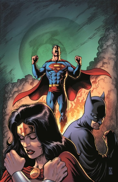
Justice League: Last Ride #1
Written by Chip Zdarsky
Illustrated by Miguel Mendonça
Colored by Enrica Angiolini
Lettered by Andworld Design
Reviewed by Gregory Ellner
Chip Zdarsky has had a pretty good run with a variety of recent comics. However, his work on “Justice League: Last Ride” #1 leaves something to be desired. While the characterizations are interesting and feel natural, they also appear to be presented in a void. Rather than providing an easy entry point, Zdarsky sets up a story that feels far more like a sequel to another tale, one that does not appear to actually exist, than a true introduction. Yes, the story is written in an interesting way, with the character interactions feeling very organic and intriguing across a wide breadth of the DC Universe, but when push comes to shove, Zdarsky relies too heavily on preexisting knowledge to really draw in a new audience, exposition requires extensive inferences at the start. Despite being the start of a new story, ‘Last Ride’ seems to require prior reading just to fully understand why things are happening, and on that note it fails to deliver.
Miguel Mendonça helps to keep the interest high, even with the difficulty understanding certain elements on the script side. His pencils are gritty and detailed, helping to sell the sheer brutality that the DC Universe apparently went through in the unnamed crisis. Shadows are lain on heavily, as are sources of light, leaving an overall feel of a world that is still more or less thriving, but nonetheless steeped in pain and suffering, in a sense “used” and tired of an endless fight to protect everyone ever.
Continued belowEnrica Angiolini furthers this “used” nature, while still staying true to the characters as they are. Superman’s bright costume and Batman’s darker suit, along with the varied colorful outfits around, all feel just a bit darker, but not to the degree of it being grating. Instead, it all just feels somber and tired, not quite hopeless, but still definitely worn out. In general, the color scheme, be it bright or dark, sets a stressed tone to the entire piece.
Final Verdict: 6.5 – While well illustrated, the story of ‘Last Ride’ feels a bit too much like a sequel to a nonexistent tale than one that provides a good jumping-on point.

Magic #2
Written by Jed MacKay
Illustrated by Ig Guara
Colored by Arianna Consonni
Lettered by Ed Dukeshire
Reviewed by Conor Spielberg
The Second issue of “Magic” continues the whodunnit mystery, allocating more time to exploring our three main character’s personalities by letting them clash with one another in a buddy cop dynamic. Each of the three Guildsmasters we follow are charming and likable yet Jed MacKay manages to convey why they find each other so unlikable.
What is more impressive is MacKay grounds the world in these three characters while doing necessary world building exposition; all the while maintaining a sense of mystery without making the reader feel like they aren’t aware of something they might need to know about.
Exploring the various Guildmasters in Ravnica is a joy as each one is visually striking enough that their mere presence is a joy to see realized by the art team. Ig Guara manages to make an impression with each Guildmaster he draws, helped by the striking colour scheme of Arianna Consonni. This leaves MacKay to merely have them express their point of view on how the situation is unfolding which efficiently rounds out the world building needed for those unfamiliar with the world of Ravnica.
Guara seems to revel in the opportunity to set the scene with an imposing landscape or piece of architecture which makes you almost wish you were there were it not for the terrible events unfolding in the story.
Final Verdict: 7.7 – Interesting Characters and World being explored through the story and artwork.

Scout’s Honor #5
Written by David Pepose
Illustrated by Luca Casalanguida
Colored by Matt Milla
Lettered by Carlos M. Mangual
Reviewed by Henry Finn
“Scout’s Honor” #5 wraps up it’s themes of religion, humanity, family, destiny, and fate with a thrilling and surprisingly hopeful conclusion. David Pepose gives us just enough to understand the rules of the world, then strips away all artifice to focus on development through emotional decisions that not only propel the plot forward, but bring our characters into new plateaus of existence. Even in the final issue, there is a shocking amount of growth of not just our hero Kit, but her foil, Dez. This speaks volumes to Pepose’s ability to construct characters that are three-dimensional, complex, and flawed in a way that invokes empathy and understanding.
Because Luca Casalanguida runs double-duty on pencils and inks, he is able to intimately control the textures in the book to enhance the emotion of the action. Crisp lines are mixed in with rugged brush strokes and splatters of ink depending on what is called for. His use of shadows especially on closeups adds an ominous tone or emotional weight to silent panels. He avoids fully rendering any object or background and tends to strip down each panel to the bare necessities, which allows us to focus more on the weight of each moment.
Matt Milla is the perfect partner to Casalanguida as he never attempts to fill in negative space with unmotivated gradients and for the most part sticks to flat colors within a blue, red, and brown color palette. You can tell he does have his fun when rendering explosions or fire, but for the most part he allows the inking to provide the majority of textures and motion.
From the beginning this series has magnificently used a post-apocalyptic setting as a lens in which to view the fall (and rise) of man. While it is set in the future, the themes within are ones humans have struggled with throughout history, and the last issue reminds us that hope can be stronger than fear.
Continued belowFinal Verdict: 9.0 – “Scout’s Honor” is a great series with solid writing and art.

The Silver Coin #2
Written by Kelly Thompson
Illustrated, colored, and lettered by Michael Walsh
Reviewed by Alexander Manzo
“The Silver Coin” #2 is the second entry into the horror anthology series that feels like a combination of Friday The 13th and Halloween 4. Kelly Thompson creates this campy horror story of a a young girl who finds the coin and she ends up killing all the girls who bullied her. The issue falls into 80s movies tropes, but with no emotional connection. Thompson uses very little dialogue and no narration to give an idea of how the protagonist, Fiona, feels or what is she thinking. The bullies are also very one-dimensional so once they’re killed, very quickly, there’s nothing to make the reader feel sorry or even shocked at what is happening.
The art in “The Silver Coin,” by Michael Walsh, is pretty confusing, even for a horror story. Fiona is the best drawn character throughout the story however whenever there is a close-up of her it’s usually making the same unsure or fearful face. There are moments when she is practicing her bow and arrow, fishing, or making a tie-dye shirt that we see her almost content, but because the panels are drawn from a distance the art is not detailed. The backgrounds in the panels often have the correct shape and most details to help the reader, but are missing something, giving it an unfinished look to it. During the scene when Fiona is running into the woods the trees upon closer inspection look similar to scribbles rather than bark. Those missing details can take the reader out of the moment in the story.
Although this is a horror story with an old-school camp vibe to it, the shadows throughout the issue feel overly used. For example, The antagonist’s bangs throughout the story make her face either half or completely black despite her being a normal teenage girl. The similar tones of blues used during the second half of the story are so similar it’s difficult to distinguish what should matter and what doesn’t. Creating a dark atmosphere due to it being at night is one thing, but making everything nearly the same color just ruins the fear and creates confusion.
Final Verdict: 4.9 – If you wanna see some bloody camp kills, check it out.

Wonder Woman #772
Written by Michael W. Conrad & Becky Cloonan
Illustrated by Travis Moore
Colored by Tamra Bonvillain
Lettered by Pat Brosseau
Reviewed by Ryan Fitzmartin
Norse Mythology is more traditionally the realm of Marvel Comics, but the most recent “Wonder Woman” arc makes a valiant attempt to give the Scandanavian gods a DC style spin. The comic picks up with Princess Diana of Themyscria trapped inside the gullet of the legendary Serpent known as the Nidhogg, lacking her memory and in search of an ancient key. This exciting and gruesome opening leads to a lengthy journey where Diana crosses paths with both DC icons and Norse gods. Michael W. Conrad and Becky Cloonan’s story is a tad convoluted, but the individual moments are interesting. Diana’s encounters with giant crabs and shadow warriors are exciting, but their purpose is a little unclear. The details of the larger quest get muddled in the mix of DC and Norse Mythology. So while what Diana is doing is fun to follow, the why of it remains elusive.
The art is the strength of the issue, and what makes most of “Wonder Woman” #722″ entertaining. Travis Moore sketches battles with great skill, lending a unique and interesting comic book vision to ancient characters. His command of action is superb, and the fights in this book are just a glory to behold. They have intensity and weight, and are punctuated by some wonderfully lettered sound effects. Pat Brosseau’s kracks, clangs, and schwaks are among the most delightful and outstanding I’ve seen in a comic in recent memory. Tamra Bonvillain’s coloring is gorgeous, and she makes great use of different colors for different norse lands. Deep blues and greens for a snowy forest, burning reds and lush magenta for a fiery hell. Moore and Bonvillain have done a wonderful job with Wonder Woman’s Norse costume, which is sure to become an iconic look. The art in the comic is overall some of the best I’ve seen all year.
Final Verdict: 7.5 – Lush visuals outweigh a discombobulated story to make an issue worth reading.


