
amount of comics. Even with a large review staff, it’s hard to get to everything. With that in mind, we’re back with Wrapping Wednesday, where we look at some of the books we missed in what was another great week of comics.
Let’s get this party started.

Barrier #3
Written by Brian K. Vaughn
Illustrated by Marcos Martin
Colored by Muntsa Vicente
Lettered by Marcos Martin
Reviewed by Devon Browning
By far, this was the most frustrating read to date. And if you can believe it, it turned out to be a good thing. You know what, I’ll go as far as saying an ‘amazing’ thing. Full disclosure, I went into this issue without having read the first two of the series just to see what it was about. You know that thing we all do, opening a comic to see if you’d be interested, and the art alone is what made me go back to page one and start reading. Oh yeah, and PLOT TWIST: there is nothing to read. Nothing. This issue is a ‘silent read’ and it is exactly what it sounds like. No text, not even a POW, SNAP, or BAM.
And boy, I was excited because the art, that is best described as ‘trippy’, was in no need of any immediate text. The tones and colors are muted which is only fitting considering the issue itself is mute. Every few pages or so the story shifts from one character to another, and the transition of color alone is fluid while keeping the reader in check of what is happening. While the story itself is worth speaking to, the battle between Martin’s style and Vicente’s splash of colors somehow help drain the issue of sound. A silent war from page to page that is admittedly both annoying and unique when having to turn your head or the issue itself constantly. That being said, unless reading through an adjusted guided view, the issue isn’t entirely digital friendly.
I digress, the frustration came from trying to understand the story itself. I gave it one read through with no knowledge of the series and was totally on board for what I thought were the nightmares of separate people. Dreams coming alive, or rather what felt like being sucked into someone’s head. I got that second part right after about halfway through the next round when I knew I had to read the first two parts for me to gather any real information. There was so much that I had overlooked when I realized that the undistinguished monsters tormenting both the character and reader by this terrifying silence and worlds swallowing any feeling of courage or confidence was no alternate reality at all. It’s one far too many people are living every single day.
By the third read, with information gathered by the previous two issues as well as the interview of Vaughn you can find at the end of all additions, I was amazed just how quickly my interpretation of this story turned around. Frustrated by the layout, amazed by art that felt like fear and impending doom was gripping me the whole time, and oblivious to any other story other than the one I was making up in my head– it felt like a much needed slap in the face at the realization that this was no interstellar journey and a happy go lucky ‘drug trip’ the illustrations may make it out to be.
This might be the first and only issue that I’d advise is read first of all in the series. I’m not sure I would have gone through that rollercoaster of emotions if I didn’t start off with this silent issue, and it was an experience in reading that I’ve never faced before. It was refreshing and almost relieving as most things in the comic world are generic and expected, however not at all a bad thing, this issue alone stands out among a sea of stories that could take a few notes from this creative team.
Final Verdict: 8.0 – You’ll have to fight to really appreciate the ins and outs of this issue, but it is absolutely worth it.
Continued below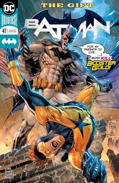
Batman #47
Written by Tom King
Illustrated by Tony S. Daniel
Inked by Tony S. Daniel, Danny Miki, & Sandu Florea
Colored by Tomeu Morey
Lettered by Clayton Cowles
Reviewed by Elias Rosner
Tom King’s “Batman” is a divisive run. Some love it, some hate it. His character work is impeccable but whether or not that character work is paired with the right characters is up for debate. The art and stories lean dark and this arc might have been the darkest so far. It doesn’t relish the dark but instead utilizes it for effective emotional manipulation. The conclusion to ‘The Gift’ solidifies this and I have no idea how to feel about it.
Booster Gold is one of my favorite DC character (thank you “52”) and had been criminally underused in The New 52. Now he’s back and has been put through what can only be described as an ordeal. Tony S. Daniel was the perfect artist for this arc, capturing the closeness and intensity of the characters’ emotions and establishing the rhythm of the issue. His art is a clean rendition of the DC house style, yet he keeps the camera in close on events, on faces, on images. It draws you in, forcing the emotions into the forefront so that, by the end, when he pulls out to a wide shot of Booster, Batman, and Catwoman on the roof, you feel as Booster feels. Empty, sad, and broken.
Therein lie the strengths of this arc, and all of Tom King’s run. It’s rhythmic, musical, and it moves at its own pace, dancing from arc to arc, playing on the tragedies of life embedded within a grander superhero opera.
The weakness of this is that, much like here, it necessitates characters being changed to fit this vision of the DCU. It opens up character questions that shouldn’t be, such as why Booster thought any of this was a good idea at all, and the leaves motivations ambiguous. Why is this the future that came out of Booster saving Batman’s parents? Why was Booster kept chained up after last issue and where? King’s dialogue leaves a lot unsaid, to the detriment to the plot, and such is the case with Booster and Bruce here.
Much like with ‘Everyone Loves Ivy,’ this arc did not have enough time to give depth to the central focus character, Ivy/Alt-present Bruce, leaving them to be vehicles for the grander, emotional punch but ultimately, empty themselves.
Final Verdict: 6.8. The ending to an arc that is deeply sad and effective yet hard to classify. Not everyone will find this arc engaging, especially if you find King’s dialogue trite, but for those invested, this won’t disappoint, just merely confuse.

Bubba Ho-Tep and The Cosmic Blood-Suckers #1
Written by Joshua Jabcuga
Illustrated by Tadd Galusha
Colored by Ryan Hill
Lettered by Tom B. Long
Reviewed by Jonathan O’Neal
Even if they aren’t a fan of the cult B-movie from 2002 (featuring a hilarious script and great performances by Bruce Campbell and Ossie Davis), readers will go into this book knowing it’s going to be odd, and in that sense it delivers. It is most definitely strange and packed with lurid visuals akin to pre-code EC Comics thanks to Tadd Galusha and Ryan Hill. Readers are almost immediately treated to some sordid imagery as well, a characteristic this book does not share with the eponymous film. But the intentionally garish artwork is this book’s best quality even it it doesn’t sync with the film’s autumn-colored gonzo elegy tone. More importantly, the art clashes with the scattershot script that zigzags pointlessly from setting to setting where readers talk about things that make little to no sense in the most unsavory and confusing way possible.
Perhaps comparisons to the the film are unwarranted, but since IDW is intent to trade on the film’s name even though it refers to a character that we will almost certainly not see in this story, it welcomes criticism for presenting a narrative that shares almost none of the the film’s qualities save for its outlandishness. In fact, it seems like a willfully brazen editorial move by IDW when compounded with the inclusion of Joe Lansdale’s name in the solicitation, the writer of the short story on which the film was based. Instead, the scripting by Joshua Jabcuga is a bit of a disjointed mess that seems to pride itself on being trippy and ghoulish over being intelligible and fun. While it does convey a certain B-movie horror aesthetic along with the devil-may-care artwork, it feels like a mixed gris gris bag filled with too many half-formed ideas and missed opportunities. Jabcuga tries to expand too much too fast on the premise that spirals out of a bit of character background from the movie, namely that Elvis Aaron Presley had an impostor take his place so he could live in anonymity. The issue’s narrative keeps getting in the way of the exposition and vice versa.
Continued belowIn a book that features a group of monster hunters led by Colonel Tom Parker and featuring Elvis Presley (who exhibits none of the King of Rock and Roll’s charisma, despite it being his source of power, as explained by a fellow monster hunter in the issue’s closing pages), you would have expected more fun, like a southern-fried version of “League of Extraordinary Gentlemen.” Instead, readers get a concept that tastes half-baked, and for now, “Bubba Ho-Tep” is way too salty, even for junk food.
Final Verdict: 5.0 – “Bubba Ho-Tep and The Cosmic Blood-Suckers” #1 trips over its trippy concept in this first issue. It should be more fun than it is.

Crude #2
Written by Steve Orlando
Illustrated by Garry Brown
Colored by Lee Loughridge
Lettered by Thomas Mauer
Reviewed by Matt Sadowski
Piotr Petrovich arrives in Blackstone, ready to inflict crude retribution on his son’s killers. But Blackstone is already embroiled in conflict between three gangs: Petropinnacle, Meshe Adam, and Prava. Petrovich mostly operates in the periphery this issue as the world of Blackstone steals the spotlight. It’s a world unto itself, a microcosm of society at large—and the perfect hunting ground for a vengeful father.
The refinery’s docks are introduced via splashpage. In all of its dull grayness, it isn’t much to look at: smokestack effluvium, crisscrossing telephone wires, makeshift markets, an indistinguishable throng. A pair openly having sex is most indicative of the debauchery and vice this refinery city is known for. Garry Brown and Lee Loughridge create an appropriately grimy world, chaotic with scratchy lines and murky in color. The illustrations wallow in the ugly details, the weathered faces, and general decay. Every panel is steeped in a medley of browns, grays, and blacks.
From a puddle of self-deprecating oil bleeding into the shadows, Petrovich transforms into an unstoppable dynamo of blind rage. He makes a superhero-esque introduction to the criminals of Blackstone, worthy of some vigilante moniker. Having slathered himself with crude oil, he proceeds to use his bare fists in a swift and brutal sequence in what will surely be a mere appetizer to the violence to come. The buildup to this moment is just as excellent as an insult rings out through his empty petrol can of a head. And the glance he shoots the reader above his scar-riddled back is one of immense shame and resentment, but also fierce determination. To answer Petrovich’s initial question: no, Blackstone is not ready for his crude brand of justice.
Final Verdict: 7.5 – The revenge tale of “Crude” expands with Blackstone, a backdrop of moral decay fitting for Petrovich’s kamikaze trajectory.
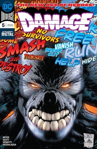
Damage #5
Written by Robert Venditti
Illustrated by Didgen Neves
Colored by Allen Passalaqua
Lettered by Tom Napolitano
Reviewed by Alan Buxbaum
In “Damage” #5, we continue to see Ethan Avery’s struggles with his new alter-ego. This issue doesn’t move much of the plot forward, but we do get a bit of character development in learning an underwhelming amount about his past. All in all, it came off as boring compared to the first three issues.
Venditti’s strategy with this series seems to be the following: throw every hard-hitter that DC has in Damage’s way in order to show how strong he is. This formula worked well against the Suicide Squad or Wonder Woman, but its hard to stay interested when you go from the latter to Poison Ivy. Don’t get me wrong, I have nothing against the Ms. Ivy, I just think that she falls flat next to Diana Prince. Regardless, it would be nice to see an issue that doesn’t revolve around this kind of story.
Also, what is with Damage losing to Poison Ivy and not Wonder Woman? This seemed to be driven more by what Venditti needed for the plot rather than what would be consistent with past comics. Plot-wise, I would’ve been much more content if they moved things forward instead of having Damage go into hiding again. And then to be met by Jose, who decides he should encourage Ethan to let the monster out after seeing what he could do on the news? This just didn’t make sense to me. I’m usually a big fan of Venditti, but I wish he would not let this sort of thing bog down the story.
Continued belowI’m enjoying the background that we’re getting on Damage each issue. We unfortunately didn’t learn too much more about Damage’s origins in this one, or about Colonel Jonas’ true intent. I’m very curious to see how the events of Dark Nights: Metal, which they still haven’t linked yet. Hopefully by the next few issues, we’ll have more answers on that.
The art in this issue was also underwhelming. I was especially disappointed with how Grodd looks at the very end of the issue. In fact, I was wondering if it even was Grodd, or perhaps a skinnier, weaker relative of his. Again, it feels adds to the feeling that they’re jamming too many DC characters into this issue. In some ways, it feels like overcompensating for a story that isn’t strong enough to carry itself.
Final Verdict: 4.5 – This was a step down from the first three issues of the series. While “Damage” has potential to be a thrilling series, issues like this make me less hopeful about where he’ll end up by the end of it.

Fence #6
Written by C.S. Pacat
Illustrated by Johanna the Mad
Colored by Joana Lafuente
Lettered by Jim Campbell
Reviewed by Michael Mazzacane
Another issue of “Fence,” and another issue where I wonder Johanna the Mad has been all my life. Writer C.S. Pacat deserves credit for the structure of this issue, but the amount of clean evocative design work that comes from the Mad one is still surprising and enticing. This issue features one of the most effective page turn moments I’ve ever read. The page in question is page 9, as Nicholas and Jay begin their match. Everything on the previous page is setting up how this is a impossible match for Nicholas, Jay is tall and has a decisive reach advantage. Everyone has that single large sweat tear running down their face as they realize the odds and hardly anyone is looking straight ahead. Everything is telling you, this isn’t going to go well.
And then you turn the page. There’s Nicholas stabbing at the reader taking up over half of the page. Mad’s use of foreshortening on the saber is spot on, giving the image a sense of energy and movement that the actions lines feel a tad superfluous. It is the classical version of the kinds of things you find in early Image books. What makes the page work though isn’t just that image, Mad makes it work sequentially. The perspective actually causes the saber point to be off panel, but it pops up through the bottom of the second panel hitting Jay and earning Nicholas one point. Mad manages to work in the extreme height difference into the fight, even when both figures are picture more or less the same size. That page and the one leading up to it are just excellent comics craftmanship, which is to say nothing of the montage, explanation, fight choreography that follows as Nicholas wins and finds himself tied with Seji.
Like any sports story, it’s all about the melodrama and that is a range of emotion the book captures quite well. With Mad’s fan art background and the overall anime/manga inspiration the series art isn’t strictly set in to the representational style it normally operates in. There’s actually a page that reduces everything down to chibi art, and instead of feeling let down or “lazy,” it reads as the proper style to convey the emotions of the page. Nicholas breaks down in shock, his eyes get small everything gets simplified because it’s so hard to imagine: he has the same score as Seji.
Final Verdict: 8.0 – “Fence” continues to be a supremely confidant book that just goes for it artistically on top of fantastic character work.

Gideon Falls #3
Written by Jeff Lemire
Illustrated by Andrea Sorrentino
Colored by Dave Stewart
Lettered by Steve Wands
Reviewed by Alex Curtis
Although this new Image series from Jeff Lemire and Andrea Sorrentino remains a fascinating read, this particular issue isn’t the most enthralling out of the current issues.
Sorrentino’s shadowy, grimy style remains exceptionally gripping. It makes sense that since the two have been collaborating since ‘The New 52,’ they’d be well synced. His unconventional, impressive layouts and minimalist style meld with Lemire’s character-driven, yet atmospheric, tale. Even though Sorrentino isn’t going for realism and leans more toward expressionism, the faces of his characters brim with vulnerability and attitude. Dave Stewart paints Sorrentino’s work in dusty and blaring colors to illustrate how desolate and unsettling this world is.
Continued belowThe issue’s biggest fault is simply that it’s not a knockout. It’s perfectly serviceable and a solid read, but not necessarily the issue a new reader should jump into. Lemire uses this issue more to further the plot and scatter clues than blow us away with unsettling imagery and Stephen King willies. Lemire’s career is peppered with stories of sordid small towns, and he plays into a slow-burn pacing with #3, setting up events to come.
“Gideon Falls” revolves around two main characters, and Norton (a possibly OCD afflicted man) has the most compelling material to work with. It’s hard not to empathize with his plight and understand his paranoia, in part because we’re privy to the visions he sees). But at the same time, we’re meant to pity him, because beyond whether his visions are true or not, he’s a troubled young man all the same, who’s dragging his psychologist into his dark path. While Father Wilfred isn’t given as much significant development, he remains an equally conflicted and sorrowful presence. His very identity, a depressed, drunken priest, demands a reaction from us.
Final Verdict: 7.6 – While not the most exciting or tense issue, “Gideon Falls” remains one of Lemire’s most haunting and ambitious projects to date.

Green Lanterns #47
Written by Tim Seeley
Illustrated by V Ken Marion
Colored by Dinei Ribeiro
Lettered by Dave Sharpe
Reviewed by Gregory Ellner
Closing out the arc, Tim Seeley’s writing is all about major character development. Turning attention on Jessica Cruz, Seeley uses Simon Baz and the various guests to tell a tale of redemption and overcoming one’s faults, in addition to finally explaining some key elements of Jessica’s powers. Furthermore, Seeley takes the time to use some pretty comedic moments, such as having to move Simon’s underwear before recharging the rings.
V Ken Marion’s artwork is fun and lively. From the outset, bemused or otherwise humorous expressions are able to fully show the comedy of certain moments, while horrified or determined ones help to sell the more dramatic instances. Perspective is key in this issue, and Marion does not disappoint, showcasing the ways in which Jessica is unable to see her once-captors’ faces. At the same time, the thoroughly eldritch appearance of Singularity Jain helps to give a more alien look at this ancient being, in contrast to the more human looks of the heroes.
Dinei Ribeiro’s coloring is a standout, as it always is for “Green Lanterns.” Various different shades of green are readily evident, as are poignant splotches of purple, dark blue, and others for more nightmarish scenarios.
The end of the arc closes a lot of doors, but opens up many more to come, with this creative team doing a very good job at showcasing a variety of emotional extremes.
Final Verdict: 7.5- With all of its myriad pieces, “Green Lanterns” #47 acts as a great way to pull together the ‘Ghosts of the Past’ arc in a fun, interesting way.

Infinity Countdown: Daredevil #1
Written by Gerry Duggan
Penciled by Chris Sprouse, Lee Ferguson and Phil Noto
Inked by Scott Hanna, Karl Story, Lee Ferguson and Phil Noto
Colored by Matt Yackey
Lettered by VC’s Clayton Cowles
Reviewed by Alexander Jones
“Infinity Countdown: Daredevil” #1 appears to be one of the stranger stories tying into the “Infinity Countdown” storyline and concept. Thankfully, the series establishes a fairly solid reason for existence relatively soon as readers get the chance to learn more about Matt Murdock’s recent life in New York City. Author Gerry Duggan wisely takes the opportunity to split up moments between Murdock’s time in the courtroom and as a superhero. The script tackles lots of the traditional Daredevil elements while tying in the greater Marvel Universe with a relative ease in the issue.
Duggan wisely orients the issue towards a more condensed, linear narrative that only involves major New York City Daredevil supporting cast members. Thankfully, this issue carves a piece out of “Infinity Countdown” that could be extremely interesting to follow-up on in the future of the title. The comic also ends with a very intriguing, open-ended nature which could also serve the series at a later date. Duggan plays into Murdock’s paranoia well and makes a couple strong references to other stories. Duggan feels directly influenced with Mark Waid and Chris Samnee run on the character when he makes the hero face off against someone with strange powers triggering the anxieties of The Man Without Fear.
Continued belowWhile the script of “Infinity Countdown: Daredevil” #1 is solid, the art can be a mixed bag. Getting to see artist Chris Sprouse’s sporadic pencils is a treat but the bright, overbearing colors from Matt Yackey clash with the art at times. The overly simplistic flashback pencils also detract from the overall quality of the story. The final page features a great reveal and the return of a character who has been absent from Daredevil for quite a long time. With the different pencils and inkers on the series, it is incredibly difficult to see where one artist ends and the other begins. The overall tone of the story from an art perspective is an inconsistent one.
While the intimate, intense nature of “Infinity Countdown: Daredevil” #1 does make for a solid story, this may not be an entirely complete package. Considering there are threads that will definitely lead towards other titles, the comic finds a fairly solid point to draw towards a conclusion and the extended length of the comic doesn’t get in the way of the script either.
Final Verdict: 7.4 – “Infinity Countdown: Daredevil” #1 is an oddly endearing Infinity Countdown rabbit hole starring someone who will likely not play much of a role in the series’ larger context.

James Bond: The Body #5
Written by Ales Kot
Illustrated by Hayden Sherman
Colored by Valentina Pinto
Lettered by Thomas Napolitano
Reviewed by Tom Baker
Dynamite’s James Bond comics have run the gamut of faithful adaptations of Ian Fleming’s novels (as with Van Jensen and Dennis Calero’s recent Casino Royale) and modern-day updates that remain faithful to the author’s style (as with Jason Masters and Warren Ellis’s more-PC, but no less misanthropic, early outings). Writer Ales Kot, meanwhile, has diverted significantly from the 007 canon in a lot of ways, which will not surprise those familiar with his often-iconoclastic comics work. His and artist Hayden Sherman’s “The Body” has proven to be simultaneously a globetrotting espionage escapade, and an investigation of how Bond’s trademark violence and womanising are tied up in toxic ideas of masculine identity.
Not themes that Shirley Bassey would necessarily find easy to sing about, but ones which are unusual and gratifying to find in a mainstream, fully licensed and legit Bond property. The fifth issue of “The Body” opens with 007 plummeting from a rooftop and considering his potential demise at the hands of not a sexy Russian assassin or a laser beam, but simple concrete. It’s probably not spoiling anything to reveal that James Bond does not die two pages into this comic, and instead continues to pursue a gang of international ne’er-do-wells intent on releasing a toxic virus. Sherman’s energetic, somewhat loose and abstract figure work — reminiscent of both Paul Grist and Ashley Wood — are perfect for this extended chase sequence.
Kot’s narration, with Bond addressing his targets in the second person, goes beyond the surface-level ruminations of Fleming’s novel and considers 007 as a body occupying a crowded space, his body as a tool of the state, and the impossibility of his body ever being used for anything but as a spy with a license to kill. It’s all very high falutin’, and not unlike themes the writer has previously tackled in his creator-owned series “Zero.” The stream-of-consciousness Bond narration is unusual (especially when one of the motifs is a self-conscious riff on the “This would be a good death…Good enough” line from “The Dark Knight Returns”), but one which is placed in engaging parallel with a classic 007 action sequence whose own fluidity matches that of the writing thanks to Sherman’s ink-splattered, European-influenced artwork.
Final Verdict: 7.6 – A self-aware, non-traditional Bond story that still delivers the thrills you expect.
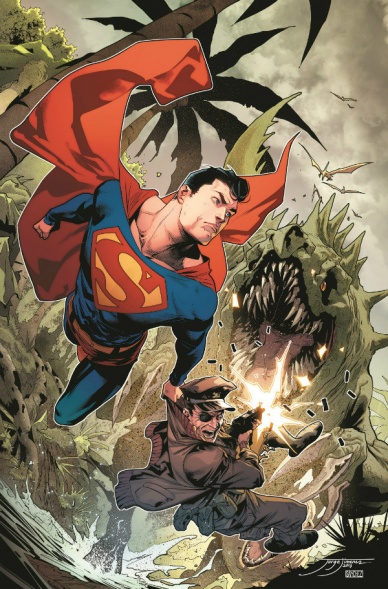
Superman Special #1
Written by Peter J. Tomisi, Patrick Gleason, Mark Russell and Ian Flynn
Illustrated by Scott Godlewski, Bryan Hitch and Kaare Andrews
Colored by Gabe Eltaeb, Alex Sinclair and Kaare Andrews
Lettered by Rob Leigh and Tom Napolitano
Reviewed by Chris Egan
The first “Superman” Special of the year offers up three new tales. First up, ‘For Those Who Serve’ fills most of the book and is an exciting pulp-style adventure. Continuing from a previous arc with Superman and Superboy jumping through space and time to rescue the last surviving member of The Losers. Tomisi and Gleason do a decent job of filling in the blanks for new readers, but some may still feel a little left out. While focusing on fun B-movie action that owes everything to King Kong’s Skull Island and Sir Arthur Conan Doyle’s “The Lost World”, the story goes on to explore some serious subjects like survivor’s guilt, soldiers who are lost and those displaced once they come home. Tough material, to be sure, but done in a way that adults will appreciate and kids will understand in some capacity – especially through Superboy’s eyes. A well-told story with some deeper themes just in time for Memorial Day. Scott Godlewski and Gabe Eltaeb’s art is similar to the majority of DC Comics, especially the New 52 and Rebirth eras. Playing it safe with clean lines, perfect proportions and bright, gorgeous colors.
Continued belowThe second story, ‘Strays and Strangers’ delves into Superman’s thoughts and motivations while dealing with a list of problems. In desperate need of a re-charge under our yellow sun upon returning from deep space, he recalls childhood lessons learned from Pa Kent while tackling the issues at hand. A feel-good story by writer Mark Russell. Bryan Hitch’s illustrations paired with Alex Sinclair’s colors have a great heavy, inky look that is reminiscent of both modern and 90s Superman books.
Last is ‘Split Decision’ by Ian Flynn. Atomic Skull teams up with Superman to battle his old partner-in-crime, Shockwave. Skull wants to remain reformed, but his paranoia, loyalty to his old partner and past discretions with Superman are making it difficult for him. Kaare Andrews uses thick, sketchy lines to bring dream-like movement to the pages and covers it all in beautifully painted colors that are akin to Darwyn Cooke & Tim Sale’s ‘Kryptonite.’ Andrews’ barrel-chested Supes is a great retro callback and his take on Atomic Skull is fantastic as well. Great style and colors used in this fast paced short story.
Final Verdict: 7.5 A fun over-sized issue with good writing and great art filled with Superman adventures that both avid readers and casual fans can pick up and enjoy.
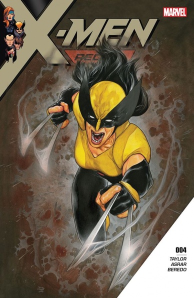
X-Men Red #4
Written by Tom Taylor
Illustrated by Mahmud Asrar
Colored by Rain Beredo
Lettered by VC’s Cory Petit
Reviewed by Gustavo S. Lodi
Comic fans usually say that a good X-Men book needs to strike a balance between its action and soap opera elements, all the while investing on main and sub-plot evolution. It seems that the team behind “X-Men Red” #4 fully agrees and delivers one of the series’s best yet.
The current narrative spends less time dealing with Jean Grey’s return per se (thankfully), but rather on the impact she wants to make for mutants in the world and society, and the challenges that will try to stop her. Adversaries and themes are very much aligned with today’s current real-world atmosphere of intolerance, but taken to the super-scientific world of comics and mutants. It works, especially thanks to Taylor’s restrain on not making this a direct social debate, but rather an analogy that readers can chose to analyse or not.
Asrar seems to grow on each issue of this series. While he still retains the more fluid quality to his linework – perfect for fast-paced moments – there are some quieter places here that shine, always coherent to past character portrayals. Pay close attention to a page where Gentle is protecting Storm, and how the artist was able to not over-sexualise a pose that, in less able-hands, would come short of that. Beredo’s colors add to the full package, especially around a display of electric power early on and on how a submerged Atlantis is shown.
The best parts of the issue remain on Taylor’s hands, though. Above all else, character interactions are very well done, among old pairings (Storm, Jean) and new alike (Gentle and Storm). Gabby and Laura certainly steal the show and Taylor’s care for them from his recently wrapped run on “All New Wolverine” is obvious. Threat, surprise reveals and that sense of forward movement all add to a very god issue.
Final Verdict: 8.2 – One of (if not the) strongest book of the line, “X-Men Red” #4 borrows from the best the mutants can offer: meaningful character moment, compelling plot threads and just enough soap opera for fans to smile.


