
There is a lot to cover on Wednesdays. We should know, as collectively, we read an insane amount of comics. Even with a large review staff, it’s hard to get to everything. With that in mind, we’re back with Wrapping Wednesday, where we look at some of the books we missed in what was another great week of comics.
Let’s get this party started.

The Archies One-Shot
Written by Alex Segura and Matthew Rosenberg
Illustrated by Joe Eisma
Colored by Matt Herms
Lettered by Jack Morelli
Reviewed by Matt Lune
Set firmly in the world of ‘New Riverdale,’ “The Archies” introduces the familiar band in a way that feels fresh and natural while still capturing the essence of the original stories; something that the reboot has been managing really well for the most part. Segura and Rosenberg also manage to make a double-sized one-shot feel like a swift, fun read, a testament to the pacing of the issue.
The structure of “The Archies” is an almost textbook example of an Archie story, down to the drama at the end of act two. Centered around Archie Andrews putting a band together to play at a local club, his general ‘Archie-ness’ gets in the way (as it so often does) and his bandmates leave him and take up with new lead singer/guitarist, Reggie Mantle. There’s something about the band name ‘Reggie and The Reggies’ that feels exponentially more narcissistic than a band called “The Archies,” despite the fact that it’s essentially the same thing. Maybe it’s just because it’s Reggie, but either way, it’s an example of the pitch perfect (pun intended) characterisations captured so well by the writers. This cast is decades old at this point, but thanks to the new TV series Riverdale, there’s a renewed interest in Archie and the gang. This issue would satisfy fans both old and new by distilling the characters down in a way that presents them in a relatable, engaging and altogether familiar way.
Joe Eisma’s art fully embraces the ‘New Riverdale’ aesthetic. Having pencilled a number of issues from the main series at this point, he’s firmly established his style in this universe, and that familiarity shows. Each character has a body language all their own, and often it’s how they react or what they are doing when others are talking that paints a better portrait of their character. Stand-outs are Veronica, who’s either on her phone or silently casting judgment on her surroundings, and Reggie, whose constant smug expression will never not be frustrating. Being an issue about a band means there will ultimately need to be a portrayal of music on the page, which is always a challenge in a silent medium. However, Eisma neatly utilises a couple of full-page and double-page spreads to illustrate the musical attempts of “The Archies”. The first is arguably the best, as Archie auditions numerous musicians in his garage before the band is fully formed. Eisma opts for a double-page montage of characters mid-session surrounded by musical notes, some of which are strong and some notes which are wobbly and unformed, a classic way of showing just how good the performer is. The second example bookends the issue, both shots being of the “The Archies” all together performing at their best. Rather than attempt to capture their musical output, Eisma instead chooses to focus on a snapshot of the band in action, showing the strength of the group of bandmates and friends, suggesting that what they’re playing isn’t as important as the fact that they’re all together.
Once again, Archie Andrews is the dumbest person in the room, but it’s his clueless mistakes that drive the plot forward and introduces the most drama (of course he’d have both Betty and Veronica in the same band. Of course he’d try and micromanage his friends.) There are lessons learned along the way, the greatest one being that friendship trumps all, and this one-shot is a perfect example of the wholesome, colorful, engaging narrative that people have come to know and love from Archie comics.
Final Verdict: 8.0 – An enjoyable, engaging story that feels entirely familiar yet rewardingly fresh. A stand-alone book that’s easy to pick-up and recommend to others.
Continued below
East of West #33
Written by Jonathan Hickman
Illustrated by Nick Dragotta
Colored by Frank Martin
Lettered by Rus Wooton
Reviewed by Forrest Sayrs
Jonathan Hickman has an impressive sense of scale. As the myriad pieces of his alternate future epic continue spinning around and towards each other, he still has time to craft powerful personal stories that blossom like flowers in the midst of an explosion.
The issue highlights what Hickman has proven himself to be so adept at the juxtaposition of the epic and the personal. While the most important event of issue #33 is ostensibly the fall of the Union, it’s the culmination of the love story between Doma Lux and the unnamed Widowmaker that take center stage. Told as the final report of the Widowmaker, over panels depicting the daring rescue from a besieged White Tower, it is an aside that puts events in perspective. A human narrative in a story that is occurring on an epic scale.
Hickman’s senses of timing and scale pervade the issue, collecting a lot of the loose threads of the story arc and bringing them nicely to a close. From the bookended deaths of major players to the not-so-subtle nod to the series’ tagline on the final, fiery page, this is the kind of issue that “East of West” thrives on.
Nick Dragotta is also in fine form, showing off some impressive action scenes alongside equally impressive perspective shots of huge armies or cities alight with combat. Even his details work seems to be above average, as shown in the excruciating decline of President Antonia LeVay over the issue. Her face fades from merely aged to rat-like and haggard in a way that is both satisfying, and disturbing.
Final Verdict: 9.5 Exactly the kind of issue that sets “East of West” head and shoulders above the crowd.

Mass Effect: Discovery #1
Written by John Dombrow and Jeremy Barlow
Illustrated by Gabriel Guzmán
Colored by Michael Atiyeh
Lettered by Michael Heisler
Reviewed by Gregory Ellner
John Dombrow and Jeremy Barlow craft a traditional story of xenophobia and collaboration that is common of Mass Effect tales, letting newcomers see the basic idea of the franchise, including the militant turian hierarchy, without being too overbearing about it. As there is not much in the way of new information given, barring some facts about Kandros himself, the writers focus in on the new ideas, such as the mystery that is being slowly unearthed in this series.
Unfortunately, this focus in on just telling the story may leave newcomers to the franchise confused, as certain elements of the galaxy are not explained at all.
Gabriel Guzmán is very good at showing emotion in even the more alien of faces, with extra focus in on the eyes. He also uses this emotional focus to show alien and inhuman pieces, such as demonic-looking cybernetics that can unnerve due to their placement. Unfortunately, the backgrounds are less interesting, but that may be due to players being familiar with these kinds of settings.
Michael Atiyeh’s coloring really gives life to the world, with especially vibrant colors on the characters, such as the markings on turians or the striking colors of some people’s clothing. Where the background may seem uninteresting, the characters are far more of a focus, not unlike the source material.
“Mass Effect: Discovery” crafts an interesting beginning to a story, but perhaps one that could be passed over by longtime fans without much lost.
Final Verdict: 7.0- Intriguing introduction to the story, but nothing earth-shattering from the perspective of those knowledgeable about the Mass Effect franchise nor those without that information.

Old Guard #4
Written by Greg Rucka
Illustrated by Leandro Fernandez
Colored by Daniela Miwa
Lettered by Jodi Wynne
Reviewed by Christopher Lewis
Things keep getting interesting for immortals Andy, Booker, and Nile as they continue to look for their kidnapped immortal friends Joe and Nicky. Rucka uses this issue to give more depth to the group leader Andy by showing us her most recent “human” experience in the Australian outback during the 1800’s. Apparently, Andy isn’t just a hard, angry, 5,000-year-old woman, but has vulnerabilities and was at her happiest living a normal, married life. In contrast, the antagonist of the series becomes shallower than in previous issues as Rucka reveals his motivations for wanting to kidnap the immortals. At the end of the issue, an unexpected turn occurs that sets the stage for the next issue.
Continued belowFernandez’s line art is very simple and unique. There is very little detail, but he captures the emotion of the characters well, especially that of Andy’s joy and sadness in her flashback scene. Miwa’s colors breathe life into each page showing most as solid colors and sometimes layering them to give depth. The key to Miwa art form is her use of white and light colors to highlight aspects of characters’ face, hair, clothing, etc. In one fantastic scene, there is a partial profile of Andy’s husband in cowboy gear and the background is all white. The white bleeds into the perimeter of the character, erasing the defined outline, making it look like the sun is directly behind him and as if the reader is being blinded.
With one issue left in the arc, it will interesting to see how this story closes.
Final Verdict: 7.0 – Action packed issue with that set the scene for the climactic end to this arc.
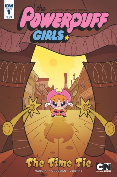
Powerpuff Girls: The Time Tie #1
Written by Haley Mancini and Jake Goldman
Illustrated and Colored by Philip Murphy
Lettered by Andworld Productions
Reviewed by Nicholas Palmieri
The first few seasons of the original Powerpuff Girls show had a certain aesthetic and odd sense of humor that resulted in a wide appeal. I picked up this comic, based on the rebooted TV series that I haven’t seen, to see if it could recapture that magic. Put simply, it doesn’t.
“Powerpuff Girls: The Time Tie” has a few of its own charms. There are puns aplenty if that’s your thing. A few of the jokes make me laugh. And Murphy’s art does justice to the material, closely mirroring that of the new show. He has a nice way of revealing bits of the characters’ personalities in every panel, and his visual pacing is a large part of why many of the successful jokes worked.
Most of the comic, though, is just serviceable. Mancini and Goldman have created a clear, understandable plot which doesn’t do much beyond that. While technically a spotlight on Blossom, nothing here reveals anything about her personality. The Old West theme of the issue uses the tropes of the genre without saying anything about them.
It’s not a bad comic at all. I’m sure kids will enjoy it, especially if they’re fans of the new show. But when looked at in the grand scheme of comics storytelling, very little about “Powerpuff Girls: The Time Tie” sets it apart from any other standard all-ages book.
Final Verdict: 5.5 – Fine for its target audience, not so much for anyone else.

Redneck #2
Written by Donny Cates
Illustrated by Lisandro Estherren
Colored by Dee Cunniffe
Lettered by Joe Sabino
Reviewed by John Schaidler
One of the great joys of reading a brand new series with an ensemble cast is slowly figuring out exactly whose story is being told. In the hands of a great creative team – with the right pacing, tone and style – it isn’t always immediately obvious, and that can be a really good thing. In “Redneck” #2, writer Donny Cates and artist Lisandro Estherren skillfully exploit intentional narrative ambiguity to detail the world in which their characters live, while simultaneously fleshing out their backstory and rapidly heightening the tension.
Through a series of shifting perspectives that give the reader time and space to connect with each of the players, the artwork on every page is gorgeously infused with a haunting interplay of light and shadow. Estherren’s character work may be a bit of an acquired taste, perhaps, but the paneling is spot on, flowing from one to the next with ease, allowing you to savor the many details (a vampire tooth reflected in mirror shades, for example) without ever getting bogged down. There are some really great angles, too. One moment, we’re looking up from the pit of a grave at a pair figures above us, the next we’re at the top of the stairs, staring down into the dingy basement where three of the Bowman men – vampires all – find themselves imprisoned.
Yet somehow the script is flipped. Just look at the brilliant covers of the first two issues.
Continued belowCover #1: following Estherren’s heavily blacked, high contrast inks that feature the half-concealed, scruffy face of a hickish vampire tearing bloody flesh from a bone with his bright white teeth, colorist Dee Cunniffe renders the scene in gorgeous midnight blues, blacks, and a deep gory red. But cover #2 hits you in the face with a blinding blast of pale yellow sunlight, starkly silhouetting an off-kilter bell tower eerily encircled by buzzards. The dark of night may be creepy, but the harsh, unrelenting light of day – “with the sun falling out of the sky like an atom bomb” – is truly terrifying.
These vampires might be hayseeds, but they’re no less vulnerable to the fatal effects of the sun than their archetypal counterparts. Nor are they any less bloodthirsty, they’ve just worked out a better system. For now.
“Once upon a time,” the narrator tells us, very early on, “if one of our own was killed, facts and reason be damned, we would ride in that town. And for fear of not killing the right one, we would just kill everyone.”
For the last generation or so, the Bowmans have been content to drink bottles of cow blood and run a BBQ joint, “feeding people, instead of on people.” Needless to say, after the death of one of their own, all of that is about to change. And it will be spectacular when it does.
Final Verdict: 8.4 – Cates’ powerfully understated writing and Estherren’s quirky artwork are completely in sync, perfectly setting the stage for what can only be explosive drama to come.

Samaritan: Vertias #1
Written by Matt Hawkins
Illustrated and Colored by Atilio Rojo
Lettered by Troy Peteri
Reviewed by Michael Mazzacane
Top Cow’s transition to an imprint focused on relationship stories and Matt Hawkins Crichton-esque thrillers continue with “Samaritan: Vertias”, a further expansion of the imprints Edenverse. “Samaritan” marks the beginning of season 3 according to the back matter, which is a good indication that there is a fair amount of pre-existing emotional baggage for some of the cast. How writer Matt Hawkins handles that baggage is in line with his works hardboiled quality; he cites the story being referenced and leaves it at that. This comic doesn’t expect me (someone who is half way through Edenverse mini “The Tithe”) or new readers, to really care on an emotional level ‘why’ hacker Samantha Copeland is trying to take down the all the Presidents men. It just wants us to know on a mechanical/plot level, and for a first issue that’s all you can really do. “Samaritan” does a good job balancing Samantha’s hardboiled internal monologue, introducing the rest of the cast, wrapped in a mostly effective episodic package.
Atilio Rojo pulls double duty as artist and colorist for the issue. His art is effective, if a little statuesque. His use of color is what makes his art really sing. His figures and facials are firm, with strong inks encapsulating them. This hard edge is balanced with a soft texture from the color pallet, giving objects an unexpected, somewhat playful, texture. When the book is in the realm of technology, it becomes dominated by the neon hues of neo-noir. Samantha becomes bathed in battling red-violet and cold blue monitor lights, creating an easily understood moral reference point for anyone regardless of how to read they are in the Edenverse. When the book is in the natural world, everything is brighter – almost cartoonish in comparison – and soft. An oblique reference to Blackhat aside, Rojo is accessing a similar aesthetic.
This first issue gives 24 vibes in terms of style and pace. There is a fun heightened quality with how it uses tech jargon but Rojo’s art keeps the book feeling coherent. The writing is stylistically consistent and efficient where it needs to be, and all around a good start to this series.
Final Verdict: 7.0 – Tech Thrillers aren’t a thing you really find in comics at the moment, Image is consistently dominated by fantasy, so this stands out in the crowd and is an all-around workmanlike start to things.
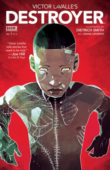
Victor Lavalle’s Destroyer #1
Written by Victor Lavalle
Continued below
Illustrated by Dietrich Smith
Colored by Joanna Lafuente
Lettered by Jim Campbell
Reviewed by Kent Falkenberg
You’d be hard-pressed to find a more confident comics debut than “Victor Lavalle’s Destroyer” #1. In this opening salvo, novelist Lavalle feels like an absolute natural in his bold rejuvenation of fiction’s original artificial intelligence. The initial jump from novels to comics can lead to a wobble or two – prose writers being understandably apt to lean heavily on the dialog or narration to carry the weight, instead of letting the art do its dirty work.
But Lavalle sticks the landing, in large part, because he has no problem getting out of the way of Dietrich Smith’s crisp visual storytelling. He seems more than comfortable using page after wordless page for Smith to deliver sleek, kinetic detail. Together, the creators give us a near silent introduction that serves as one of the most powerful openings to any book I’ve read this year.
The monster sits, perched high atop sheer icy cliffs that descend for what seemed like miles into frigid Antarctic waters. There’s an almost regal look, seabirds swirling in the distance, as his seat on the cliff’s edge takes on the quality of a throne. After a moment to survey all in his dominion, he dives into the ocean, only to witness a poacher’s harpoons shred a whale to bright red ribbons. The monster exacts his revenge – ripping the heart from a man’s chest – with Smith’s art conveying not just the ferocity and speed of the attack, but the shock on the dead man’s face that it could happen so fast and so unfeeling. Elsewhere in “Victor Lavalle’s Destroyer” #1, Smith captures the essence of carnage with just the right gritty nuances. And he never lets up on the menace, continually framing the monster from upward, imposing angles.
It feels like a prescient time to revisit the parable of Frankenstein’s creation, seeing as our own modern science sits upon the precipice of artificial intelligence. As Lavalle introduces us to Victor Frankenstein’s descendant, Dr, Baker, she’s continually conversing with a disembodied voice that carries an implication she’s mastered A.I. herself. The truth behind the voice is a bit more disturbing and will help to paint the moral dilemmas presented by the science here in a more intimate light.
And for as heavy as the thematics are in “Victor Lavalle’s Destroyer” #1, there’s still a playful quality running through it. “I’m just in the wrong line of work. I should have been a poet,” says one of the henchmen, either named George Byron or Percy Shelley, as he enters a bar to suss out Dr. Baker.
This is a very strong, very assured debut. Period. Lavalle and Smith set a monster on the warpath and tease just enough of the ethical ramifications that we’re never quite sure which of the two leads is actually being referenced as the titular destroyer.
Final Verdict: 9.0 – Wow.


