
There is a lot to cover on Wednesdays. We should know, as collectively, we read an insane amount of comics. Even with a large review staff, it’s hard to get to everything. With that in mind, we’re back with Wrapping Wednesday, where we look at some of the books we missed in what was another great week of comics.
Let’s get this party started.

Brothers Dracul #2
Written by Cullen Bunn
Illustrated by Mirko Colak
Colored by Maria Santaolalla
Lettered by Simon Bowland
Reviewed by Jonathan O’Neal
“Brothers Dracul” #2 continues the story of young Vlad—of impaler fame—and his brother, Radu, left behind by their father, Vlad Dracul, Sr., as fealty to a conquering sultan. This second issue picks up where the cliffhanger from issue one left us, with the brother’s first vampire encounter. The confrontation between the sultan’s son, the Dracul brothers, and the indigo-skinned bloodsucker is effective in developing the characterizations of the three boys, but while the character renderings in the book are very accomplished overall, the action here is a bit stiff, generally lacking the dynamism that such a scene requires. There are even panels where it’s difficult to tell what’s happening, and while the colors are vivid and lush, they don’t convey the dark dread you would expect from battling a vampire in a cave.
Beyond this protracted cave scene, Cullen Bunn’s script continues to efficiently flesh out the nature of these two young men. After their brush with the vampire, Radu seeks council with Esel while Vlad prefers to brood alone. So far, this much is also clear: Radu is principled while Vlad does what he needs to do to survive. Radu has faith in a god while Vlad is driven by self-determinism. It’s a dynamic that should provide nice dramatic tension between the brothers as the series continues.
The issue’s final pages present a wordless flash forward that seems unnecessary for those with even the most casual of Dracula knowledge, but they do provide another excuse for the art team to shine. It also makes for a perfect wrap-up to an issue that for all of its viscera, seems to be proceeding in a more-or-less clinical manner, hitting plot points rather than reeling readers into a bizarre foreign world where bloodsucking humanoids walk the earth. The series should be a bit crazier than it is, but for now, it feels more like Dracul’s Creek.
Final Verdict: 6.5 – “Brothers Dracul” is a nice-looking book written by a prolific comic book pro at the top of his craft, but it hasn’t set its teeth into readers just yet.

Hal Jordan and the Green Lantern #45
Written by Robert Venditti
Illustrated by Ethan Van Sciver
Colored by Jason Wright
Lettered by Dave Sharpe
Reviewed by Alan Buxbaum
“Hal Jordan and the Green Lantern Corps” #45 is a solid issue that gives GL fans much of what they’re looking for. From a character development perspective, I’m extremely happy with how Venditti is treating three out of the four Earth GL’s (as one would expect). Hal and John act as they always have. John is showed as a true force of integrity in the face of Zod while Hal does whatever is necessary to pull of the job, including teaming up with his longtime nemesis, Hector Hammond. Guy’s actions of joining the Darkstars are of course questionable, but I doubt that this is his true intent. If anything, I assume that Venditti will honor the trials we’ve seen him go through (Rise of the Third Army, his Vulgarian days, etc.) and will show him to have ulterior motives that will help the GL Corps in the end.
When it comes to the art, Van Sciver gives us his usual, stiff panels. Each one looks like a snapshot where everyone is holding a pose in either a dramatic or planned-out sort of way. I’m not entirely against it; in some ways, it feels very nostalgic, given how amazing the Geoff Johns’ GL run was. It’s kind of like knocking Ringo Starr for being a “bad drummer”; he’s no Neil Peart, but he sure as hell made some amazing music with The Beatles. Same goes for Van Sciver’s art: while it’s not close to the most riveting comic art I’ve seen, it serves its purpose in delivering that quintessential, Johns’ era GL feel.
Continued belowThe worst panels in the issue are by far the two that show Hammond letting go of his urge to kill Atomic Skull. They’re two identical close-ups of Hammond’s uncomfortable looking face, finally choosing the altruistic route. These panels take what is already a “corny” situation and do nothing to help alleviate the issue. Unlike Mitch Gerards’, who is a master at taking seemingly identical panels and putting the most minute differences in, this was a missed opportunity for Van Sciver to elevate the issue.
The jury isn’t out yet on the plot of this story, as its still in its beginning stages. Assuming the Darkstars saga is a solid addition to the GL mythos, I could see this issue being a successful building block within it. But we won’t find that out for a little while, so personally, I’m content in the meantime.
Final Verdict: 7.0 – As far as Green Lantern stories go, there’s nothing offensively wrong or off-putting about this issue. At the same time, it probably won’t be remembered much after the week is over. The best we can hope for is that it is helping to build a larger and more interesting story in the Darkstars saga.
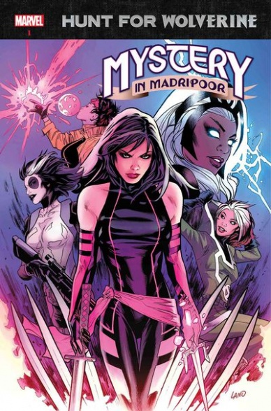
Hunt For Wolverine: Mystery In Madripoor #1
Written by Jim Zub
Illustrated by Thony Silas
Colored by Felipe Sobreiro
Lettered by VC’s Joe Sabino
Reviewed by Alexander Jones
The search for Logan continues this week with the core team of X-Men heroes banding together in
“Hunt For Wolverine Mystery In Madripoor” #1. The trend of ancillary, yet enjoyable tie-in comics continue for the title as the series offers a litany of enjoyable action scenes and fascinating connections to the main series. While the art can feel slightly rushed or too nostalgic at times, the one-shot strikes a balance in the second half of the issue between quality and consistency–it is a shame that it took the creative team that long for readers to get there.
“Hunt For Wolverine Mystery In Madripoor” #1 is at its worst when the title is draped in nostalgia for Wolverine. When each cast members recall certain key moments with the hero and wax poetically about their relationship with him, it feels like author Jim Zub is desperately trying to fill space in the comic which would have been better served with more action sequences or other types of character development–the first couple pages in particular feel like a big waste of space.
Artist Thony Silas’ figures and characters are imperfect, Silas has a couple moments where his figures look excellent and well-crafted, but there are only a few scenes where characters individual faces look distinctive and anatomically correct. The artist refines his craft towards the end of the issue when he begins to draw more characters on the page and gets in a better rhythm as the title progresses. Silas feels as though he is beginning to learn the craft of comics and future issues could provide for a more streamlined process.
It is fantastic to see a cast of female faces and it would have been great to see Marvel back up the representation of a female writer as well. While Zub does a serviceable job with the script in the title especially when the action kicks in towards the back half, this issue is largely geared around nostalgia and developing pre-established relationships in a shared Universe. At some point, readers are going to need to see something truly new and unique with the franchise or have fewer tie-ins that only slightly develop the plot forward. The tease towards the end and last action sequence clearly shows the title has potential that is not fully realized in the debut from the artist or writer.
Final Verdict: 4.9 – “Hunt For Wolverine Mystery In Madripoor” #1 is a slightly enjoyable but inconsequential next chapter in the “Hunt for Wolverine” event storyline.

The Incredible Hulk #717
Written by Greg Pak
Penciled by Carlos Barberi
Inked by Walden Wong
Colored by Frank D’Armata
Lettered by VC’s Cory Petit
Reviewed by Gustavo S. Lodi
Greg Pak wraps his second “The Incredible Hulk” run with issue 717, as Amadeus Cho struggles with his inner demons, while several Marvel heroes and close allies try to reign the monster in. And while the sense of closure is definitive, it offers very little that readers have not seen done better elsewhere.
Continued belowBarberi’s pencils do a fine job on showing all the multiple heroes that make up this book, even with the limited amount of time they take action on the story. They look very distinct, especially the facial expressions on some of the female characters. At one point, Silk, Ms. Marvel and Maddy all share a panel reacting to Amadeus and the way each one carry themselves really speak of their personalities. The action, although a bit generic with the usual “Hulk jumps and smashes,” is also aptly done.
Perhaps the biggest complain on the art department has to do with how Barberi and D’Armata chose to depict the two “realities” at play in this issue: the actual world and the mindscape where Cho battles his Hulk persona. They seem too similar, to the point that some of the narrative flow is hindered by the reader asking “where are we now?”. A more distinct color palette to each realm or even some artistic freedom on distortion could really improve the mental landscape.
Pak’s script borrows heavily from seminal runs on the Hulk, particularly Peter David’s classics. Some themes of acceptance, merged personalities and convergence will feel very familiar to anyone who’s read “The Incredible Hulk” #377, when Doc Samson attempted his famous Banner & Hulk therapy session. And while Pak does bring his own take on the story by having a broader supporting cast to Cho, the issue and run do end with an unsurprising feel.
Final Verdict: 6.8 – While not a bad issue or run unto itself, the creative team’s efforts are not innovative in any relevant way, leaving readers with a sense of missed opportunity as the story ends.

Infinity Countdown: Darkhawk #1
Written by Chris Sims & Chad Bowers
Illustrated and Colored by Gang Hyuk Lim
Lettered by VC’s Travis Lanham
Reviewed by Elias Rosner
After the success of last November’s one-shot, Darkhawk is back in another event-adjacent series. While not as tight an issue as that one-shot, this is another great starting point for new readers to the character. That being said, the issue itself is just OK. Not great, not bad, just OK. The story isn’t anything new and while there are a few C-list characters and groups that return (Death’s Head & Code: Blue), their presence is more easter egg than integral piece.
There is also an overreliance on wordy dialogue and narration throughout the issue which bogs down many of the pages, boxing in characters and turning panels into more dialogue balloon than art. Much of that dialogue is funny and character driven, even if some of it veers into being overly expository, but that doesn’t make it any less overwhelming. Some pages, when look at as a whole, swallow the art beneath the words.
On the visuals side, Lim’s art is sleek and clear. Characters are lively, the background work establishes the scenes and his transitions between quiet moments and heavy action are seamless. The page of Darkhawk flying is meditative yet for every page like this, or the introduction of Death’s Head, there is a page like the preceding ones, where the camera angle changes unnecessarily with every panel in ways that don’t serve the story.
Moreover, he has an overreliance on speed/action lines to convey the intensity of a panel. There are times, such as the panel with Darkhawk’s silhouette walking towards a getaway car, where the addition of speed lines had the opposite of its intended effect. Take them away and there are plenty of examples within this issue that show Lim’s capability when it comes to presenting the intensity of the action on the page, which, considering this seems to be his first big sequential comic (that I could find), goes a long way and makes me hopeful for the future.
For now, this was just a middling issue that engaged but failed to surprise.
Final Verdict: 5.8. A good reintroduction to the character and the start to something but ultimately nothing special. Lim’s art and the return of Death’s Head are the big draws.

Invader Zim #30
Written by Eric Trueheart
Illustrated by Maddie C.
Colored by Fred C. Stresing
Continued below
Lettered by Warren Wucinich
Reviewed by Chris Egan
“Invader Zim” #30 is an overtly silly story, even by Invader Zim standards. The humor is more grating than laugh-worthy; with the word “poop,” appearing in every other sentence, the story quickly becomes painfully dull and repetitious.
The high point of the book is Dib’s most recent dealings with Zim. The writing was closest to classic Invader Zim. The entire sequence is ridiculous, but actually worth a chuckle. With the creators of the show making this book, it still has the makings of what gives Zim and co. such a long-standing fan-base. Unfortunately, as with all things, not every story is going to be a hit.
The art by Maddie C. is another highlight. It has the essence of the t.v. show while changing its style only slightly from it. There is movement to it that a book based on an animated series should have and Stresing’s colors bring it fully to life. The moments that absolutely capture the action and comedic timing of the show are impressive. Too bad, it isn’t enough to save this story.
Final Verdict: 5.0 A mostly unfunny plot that tries too hard at the absurd that still has a few moments of what makes Invader Zim great in the first place.

Legenderry Red Sonja #4
Written by Marc Andreyko
Illustrated by Rodney Buchemi
Colored by Adriano Augusto
Lettered by Thomas Napolitano
Reviewed by Eric Goebelbecker
“Legenderry Red Sonja” #3 ended on cliffhanger, with Kulan Gath holding Tesla Thorne captive on the deck of the Nautilus. Issue #4 picks up where we left off and proceeds in a taut, action-packed, thriller, of a story. What could have been a predictable confrontation takes an interesting turn when Red appears to talk (and strip) her way out of the situation, fails, and is saved in the form of an almost forgotten enemy; Tesla’s father. Surprises, betrayals, and reversals make up this story, and it ends with Red reaching out for help from a surprising character pulled from the pages of history.
Fresh takes on Dynamite’s stable of licensed characters make up the ‘Legenderry’ universe, and steampunk Red Sonja is a perennial favorite. Like her Hyborian Age counterpart, she is almost as quick with a wisecrack as she is with her sword, and often does the right thing despite her own better judgement. Red got herself and her crew embroiled in this story after risking her own life to save Tesla from a reckless stunt.
Rodney Buchemi’s art is well-done, with several splash pages and some innovative panel layouts that add a sense of urgency to a fast-paced story. Red jumps between panels while Gatling guns are large enough to reach between them. The opening page is a close-up of Tesla with a knife at her throat and one of Kulan Gath’s clawlike hands cradling her face, an image that puts us back into the stand-off that concluded the previous issue. Later we’re treated to a 4-panel sequence of Red Sonja dropping off her ship, falling into a dive, retrieving something from the sea, and then throwing it back to her ship. It’s a remarkable sequence that I went back to several times.
After the confrontation on the ship, we see Kulan Gath without his iconic headgear and I was surprised and pleased at how human he looked. He’s been portrayed as something more or less than human several times over the years, and it was refreshing to see him this way in the steampunk world of ‘Legenderry,’ even if he’s still very very purple.
The colors in issue #4 are dark since most of the story takes place on the sea at night. While they are sharp and well-defined, which is something I have come to expect from Dynamite, the dark quality gets a little distracting.
I’m looking forward to the conclusion to this 5-part series. It’s already been a fun romp, and this issue added a few twists and turns. The new guest star, introduced on the last page, should prove very interesting.
Final Verdict: 7.0 – A thriller with plenty of twists and turns to keep you engaged.

Lumberjanes #50
Written by Shannon Waters and Kat Leyh
Illustrated by Dozerdraws and Brooklyn Allen
Colored by Maarta Laiho
Lettered by Aubrey Aiese
Reviewed by Tom Baker
Reaching fifty issues is a heck of an achievement, especially in today’s precarious comic market. Yet despite that, the “Lumberjanes” don’t do anything in particular to mark the occasion. Given this is a series Whose pre-teen heroes routinely face down monstrous cryptids, Greek deities and the emotional complications of encroaching adolescence, though, I’m not sure they could have found a way to kick things up a notch for this milestone instalment.
So it’s business as usual back at Miss Qiunzella Thiskwin Penniquiqul Thistle Crumpet’s Camp for Hardcore Lady Types, with the campers split into two groups. Above ground, Jo and Molly play against fellow scouts Hes, Barney and Diane in a hilariously convoluted boardgame that combines the resource management of Settlers of Catan with the land-stealing evil mastermindery necessary to prevail at Risk (and more than a little of the European game-mocking Cones of Dunshire from Parks and Recreation).
In real life the rules, structure and competition imposed when playing a board game can reveal hitherto unknown depths to you and your friends’ cunning, strategic thinking, and willingness to stab you in the back. Writers Shannon Waters and Kat Leyh use this set up to deliver a solidly entertaining A-story which allows us to see now-well-established characters in a new light, with a particularly delightful twist with regards to Diane’s underhanded dealings.
Artist Dozerdraws makes their “Lumberjanes” debut with this issue and immediately strikes the balance between fitting into the book’s established aesthetic and standing out from their predecessors. Their thick pencil lines are looser and more cartoon-y compared to some of the more slick, animation-inflected styles that have typified earlier storylines. All the better for the outsized overreactions of scandalised boardgame players and Diane’s baffled reaction to the addition of new game mechanics (most of which involve a camp supervisor pouring a selection of stuffed toys onto the board).
Meanwhile, below ground, the rest of the ‘Janes spend their activity time wandering the caverns below the woods, in search of “tall tales to tell everyone back at the Mess Hall.” Dozerdraws and colorist Maarta Lahiro are the MVPs of the B-story, too, as the trio wander through beautifully fuschia-tinged tunnels and happen across first a crop of glowing fungi (that’s good!) and then a huge red-eyed caterpillar who appears less-than-chill with being disturbed by three adventurous kids (that’s bad!). It’s also gratifying to see the older, broader-shouldered Mal, skinny youngster Ripley and shortest-yet-strongest member April depicted with distinctly diverse body shapes and sizes…even as they’re fleeing for their lives from a giant bug.
The fiftieth issue of “Lumberjanes” doesn’t reinvent the wheel. The book is still a breezy, fun all-ages comic with Waters and Leyh presiding over a set of well-realised, clearly defined characters and a deep mythology underpinning all the weirdness that occurs around the titular girl scouts. If anything, that that formula still works so well proves that there’s no need for any anniversary-adjacent gimmicks. The book is getting on just fine as it is.
Final Verdict: 7.8 – Proves the truism “if it ain’t broke, don’t fix it,” but suggests adding a new artist to the mix doesn’t hurt either
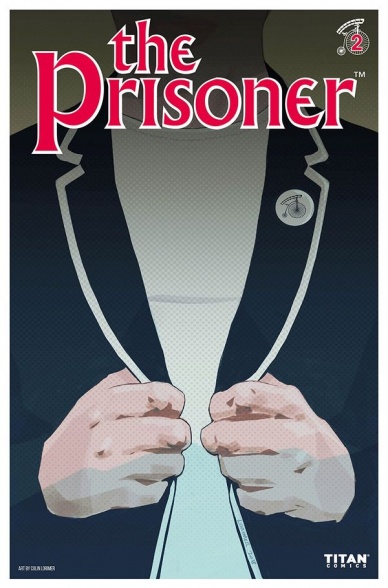
The Prisoner #2
Written by Peter Milligan
Illustrated by Colin Lorimer
Colored by Joana Lafluente
Lettered by Simon Bowland
Reviewed by Reed Hinckley-Barnes
With most of the set up taken care of in the first issue, “The Prisoner” #2 dives right into the psychedelic mind games that are going to be at the heart of this series. The issue does a good job keeping you on your toes as a reader, jumping from scene to scene in such a way that it leaves the you disoriented, but not confused. The pacing in the book is such that it gives you enough time to become comfortable in a particular location or setting before pulling the rug out from under you, and the twist at the end of the issue is particularly grabbing.
The art, which looks most times like something more suited to a standard noir story, is part of what lulls you into that sense of security. One second there is a boy playing with his dog in his kitchen, the next there is a man on a penny-farthing in the kitchen with him. The juxtaposition of this pretty realistic art style with these strange images gives the book an even deeper sense of unease. By bringing you into a world that, for the most part, looks normal, it brings the bits that aren’t into even sharper focus. Overall, the story comes together quite well. The tension between the art style and the story adding to the issue’s goal of leaving the reader on edge, and unsure of what is actually real.
Continued belowFinal Verdict 7.8 – “The Prisoner” #2 dives into the mind of its main character as the series really gets started.
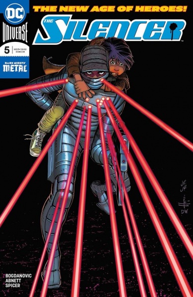
The Silencer #5
Written by Dan Abnett
Illustrated by Viktor Bogdanovic
Colored by Mike Spicer
Lettered by Tom Napolitano
Reviewed by Michael Mazzacane
With the current Deathstrokissance, having Slade Wilson show up as Honor continues to work out her work-life balance issues makes a lot of sense. He perfectly represents the point both he and Talia keep repeating to Honor: nobody ever really gets out. Yet, it’s still somewhat awkward to have their near half issue length dialog revolve around expositing plot events that the reader already understands. To some degree it makes sense coming from Deathstroke, he wants Honor to put the pieces back together and stop wrecking the underworld economy, but that doesn’t make it all that entertaining or fresh. Viktor Bogdanovic manages to elicit more pathos from a single panel of Slade’s bulging eye at the notion of a family, than all the cat and mouse games the sequence was rotely going through in the pages leading up to it. Deathstroke is always about the money, but not drawing the connection between the two assassins feels like a missed opportunity given the current run of “Deathstroke,” what this series is all about, and what was actually discussed between them.
Viktor Bogdanovic, for their part does a pretty good job in presenting this tête-à-tête of killers in visually interesting fashion. The fact that the scene is largely a standoff gives Bogdanovic plenty of space to work with a mirrored motif between the two. His inking gradient while featuring a fair amount of deep blacks never feels like it overwhelms the page and gives colorist Mike Spicer enough room to still give everything a calming pallet. The use of color gradient in the backgrounds is another fairly effective choice that accentuates the action beats. Visually Bogdanovic and Spicer create the right tone, the light line work gives the action beats a sense of momentum as well as allow for expressive facial designs. Bogdanovic’s facial designs go a long way in salvaging the issues inner monologue driven back half. His work with honors eyes tell the reader all they need to know, even if they already read it from Abnett’s script.
Of the New Age books, “The Silencer” continues to feel like one that has an underutilized potential and a chance to stand out from the pact of cape books. It is potential that has yet to be realized. Bogdanovic and Spicer give it the color pallet and style similar to John Wick not “John Wick” and the core emotional heart of it is both obvious and ripe for exploitation.
Final Verdict: 6.5 – “The Silencer” has all the pieces to be an engaging hitwoman saga in the DCU it just isn’t coming together yet.

Skyward #2
Written by Joe Henderson
Illustrated by Lee Garbett
Colored by Antonio Fabela
Lettered by Simon Bowland
Reviewed by Matt Sadowski
Willa goes to ground to seek her hermit father’s old friend and discovers a society that rejects humanity’s skyward trend in ‘My Low-G Life’ part 2. Joe Henderson takes his ridiculous sci-fi premise and completely commits to it, thinking through the manifold repercussions of a world without gravity. Magnetized hems keep dresses down, hairdos gain a more vertical dimension, and grav boots prevent people from levitating into the sky. We also see the ultimate fate of those who failed to keep themselves within Earth’s atmosphere on a stunning splash page that lands with the intended impact. Human detritus creates a ring around the earth, the accumulated casualties of Earth’s gravitational catastrophe. What goes up doesn’t always come down.
Lee Garbett has the unenviable task to ensure all details are in accordance with Earth’s new physics. Characters bend and float like Earthly astronauts—and their levitating motion stands out in stark contrast to the magnet-dependent ground dwellers. Willa’s gorgeous hair seems to enjoy gravity’s absence most of all as it acts like a lustrous separate organism upon her head. But most of all, Garbett draws Willa with a fun-loving vitality and youthful cheer that cuts through the tragic predicament humanity is in.
Continued belowWe finally see Chicago proper as Willa descends to the world below, where society is unwilling to accept that the world has changed. Here, Antonio Fabela’s neon colors bring Chicago streets to vibrant life with an assortment of ads peddling magnetic products. Henderson’s script finds humor in this groundward society as Willa truly walks for the first time or bodyguards console one of their own about sleeping in grav boots. With the creative team’s efforts combined, “Skyward” #2 expands its world with another fun and frenetic issue.
Final Verdict: 8.0 – “Skyward” continues to explore the repercussions of a zero-G world and the bifurcated society it’s created.
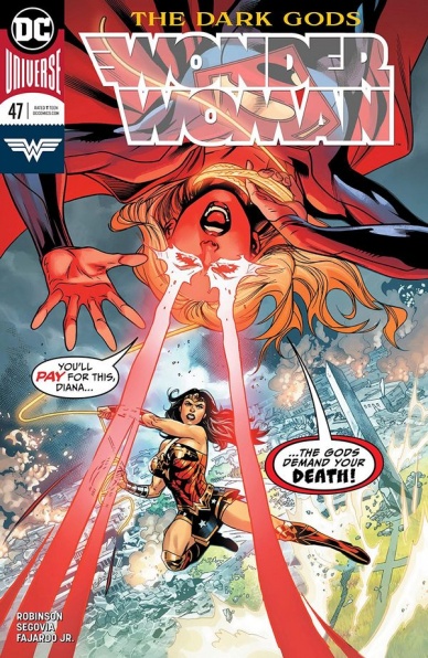
Wonder Woman #47
Written by James Robinson
Illustrated by Stephen Segovia
Colored by Romulo Fajardo Jr.
Lettered by Saida Temofonte
Reviewed by Gregory Ellner
As the ‘Dark Gods’ arc picks up steam, James Robinson has the job of balancing hard-hitting action against calm exposition. He does a pretty good job at both, keeping two simultaneous plot arcs running without either one seeming to be too underutilized.
While the eponymous character of this comic is in a rather common situation for the genre, the “fight a brainwashed hero” scene, Robinson uses the familiar surroundings of this type of scene to dive into some information regarding the Dark Gods themselves, or at least some of their possible capabilities, without needing to have the antagonists say a word themselves. While there is a weird hiccup in what Diana of Themyscira should know regarding having “summoned” the Dark Gods after the events of ‘Dark Nights: Metal,’ but it’s not too much of a problem.
Meanwhile, Robinson balances this intense fight scene against the exposition-heavy encounter for Jason, perhaps a method of showcasing what exactly he can do going forward. Jason is still a bit of an oddball in the mythos so far, not quite fitting in as his own character, but perhaps some time needing to fight on his own will help solve that problem.
Stephen Segovia’s artwork is intensely dynamic, from blurred heat vision across the Bracelets of Submission to the “many shots in one panel” version of a fast-paced fight across an entire city. Segovia shows that he is good at images beyond combat with the Jason-focused scene, where he instead focuses in on realistic facial expressions across a variety of different styles to showcase how alien the Fates truly can be due to their shapeshifting capabilities.
Romulo Fajardo Jr.’s colors definitely help make the scenes, with brilliant flashes of light showcasing the divinity of the protagonist, balanced against the dark, oppressive colors around the Dark Gods themselves. The colors also help to make the usually kind face of Supergirl appear truly menacing, the foreboding glow of her heat vision and at-times pupil-less eyes enhancing how alien she is when compared to people of Earth on account of her brainwashing.
The ‘Dark Gods’ arc is really picking up, fast-paced without being too disorienting.
Final Verdict: 7.5- The ‘Dark Gods’ arc continues to pick up, with dynamic artwork and well-handled exposition that leaves some information for readers to infer.


