
There’s a lot to cover on Wednesdays. We should know, as collectively, we read an insane amount of comics. Even with a large review staff, it’s hard to get to everything. With that in mind, we’re back with Wrapping Wednesday, where we look at some of the books we missed in what was another great week of comics.
Let’s get this party started.

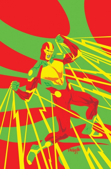
Beta Ray Bill #3
Written & Illustrated By Daniel Warren Johnson
Colored By Mike Spicer
Lettered By VC’s Joe Sabino with Johnson
Reviewed By Henry Finn
“Beta Ray Bill” #3 grows the legend of the titular hero by furthering Bill’s character development in subtle and important ways. Adding a supporting cast to play off of helps to further define Bill’s inner struggle through comparison and contrast. This is done most poignantly by reimagining Scuttlebutt, Bill’s ship. Scuttlebutt’s evolution brings a new dimension to Bill’s story through a shared pain that helps define Bill’s inner journey. Daniel Warren Johnson is firing on all cylinders, pulling off a comic full of heart, action, and intrigue.
What really stands out is the effort that went into the design that marries the words and art together. No two pages contain the same layout, and Johnson mixes grids with negative space and panels that go full bleed all within a single page. Every single panel is shaped vertically, horizontally, or slightly canted to maximize the composition and flow of the action. Sometimes an explosion breaks a panel, and sometimes it’s a sound effect racing across and out the frame. The action sequences are marvelous to behold as he alternates between big bold panels and smaller panels peppering readers with transitional details.
Spicer really completes the visuals with a signature that seems to be brought out primarily when working with Johnson. The book is bright and saturated with a color palette more usually found in the Sunday newspapers. The reds, blues, and yellows are deep and almost cartoonish, but this is avoided by the beautiful textures that give the book an emotional, poetic quality.
The lettering also stands out, mixing up the font styles and textures in surprising ways. They are truly a part of the design and flow of the action, so much so that to remove them would lose meaning in the panel. In fact, they fit so well with the art that it is hard to tell which texts were created by Johnson and which ones were created by Sabino can co. All in all, the dialogue, illustrations, coloring, and lettering work together harmoniously.
Final Verdict 8.0 – “Beta Ray Bill” is a special mini-series that deserves a full read-through whether you’re a fan of the Thorverse or not.

Heroes Reborn: Magneto & The Mutant Force #1
Written by Steven Orlando
Illustrated by Bernard Chang
Colored by David Curiel
Lettered by VC’s Clayton Cowles
Reviewed by Alexander Manzo
“Heroes Reborn: Magneto & The Mutant Force” is a ‘Heroes Reborn’ tie-in title set in a world where the Avengers were never formed and Squadron Supreme of America are Earth’s protectors. Steven Orlando depicts a story of Magneto essentially playing his role partnered with Professor X’s goals and hopes. Magento is not nearly as ruthless as usual due to mutants being seen not only as secondary citizens, but also something to ultimately hunt by law enforcement. Although it’s only mentioned at the beginning it does help contextualize the importance of what they need to do in this issue.
The main mission of this issue is going into Magneto’s head to save Xavier which felt like what Inception would be like with mutants. It certainly followed the same formula of ‘if you die in the dream then you wake up back in the normal world,’ there was also the back and forth of a huge action sequence happening right at the pinnacle moment of the dream mission. It is not done badly, but it can take them out of the story as they compare it to the movie. The final twist with Cassandra was something well done because despite a tough mission inside the dream it needed to not have the happy ending of Xavier’s return.
Continued belowThe art that Bernard Chang brings to this story helps take it to a new level. Magneto’s emotional arc in this story feels like it hangs on every detail when he flashes back to the fight in Washington in which Chang spares no detail from the linework on Professor X’s jacket, to the white house in the background catching fire. He also utilizes action panels that show the power and strength of the characters in their fight for freedom. The panel where Magneto’s chair turns into knives is a great example because once again you see the range of daggers, cleavers, and other types of knives as opposed to just making simple black lines.
One of the strongest art spots is the dream sequences where the linework has become bolder, like the original Instagram filters, where it adds a small hint of darker color without changing the photo greatly. It works well because whenever the story shifted to what was happening in the real world the linework was back to thin and sharp and the reader was never confused on what was happening. Throughout the story there was very little wasted space in the panels and really kept it grounded and involved.
Final Verdict 8.0 – If you liked Inception and you like X-Men, this is going to be right up your alley.
Mister Miracle: The Source of Freedom #1
Written by Brandon Easton
Illustrated by Fico Ossio
Colored by Rico Renzi
Lettered by Rob Leigh
Reviewed by Quinn Tassin
“Mister Miracle: The Source of Freedom” #1 is one of the oddest reading experiences I’ve had in a long time. Spinning out of DC’s ‘Future State,’ the comic follows Mister Miracle, Shilo Norman as he navigates fame and Blackness. This is a series with a decent amount of potential but what we actually get in a narrative that’s spread too thin and a tone that feels straight out of the mid-2000s. From the opening stunt jump from space to the precise way that Shilo carries himself as a celebrity to the way that the potential is romance is written, everything feels just a bit dated. It’s recognizable but of an era that we are not in. Now, the mid-2000s aren’t an inherently bad thing to emulate but in a story so clearly informed by current events, it’s probably not where you want to be.
More than anything, the issue suffers two from primary issues. First, the narrative that never really pulls you in. Shilo Norman is not somebody you really have a reason to root for. He isn’t particularly charming, he’s not much of a hero, and wanting to be famous isn’t a sympathetic goal in superhero comic. That means that when his fame is threatened and his date doesn’t work out because he’s an egotistical jerk, it just doesn’t land. So while there’s a certain fun to reading very specific parts of this issue (that is to say, the first five pages), it doesn’t really work on the whole. Second, the issue’s exploration of race lacks meaningful insight. White people being collectively unreliable when it comes to fighting anti-Black racism just isn’t a conclusion that carries that much weight in “Mister Miracle: The Source of Freedom.” It’s not that the message is wrong (it’s not) so much as it’s pretty mild but gets the presentation of a far more revelatory message. On a picky note, it also displays the marches and protests of 2020-21 but this very much takes place in the future so it’s an odd choice to treat those as immediately relevant to the story. Wasn’t Shilo, like, a baby when those happened?
Fico Ossio and Rico Renzi’s art is probably the high point of the issue, though it leaves something to be desired. The first few pages are a strong start; the stunt is beautifully rendered, particularly the concluding page which makes Renzi’s talent as a colorist abundantly clear. The rest of the issue, though, is filled with very basic art. The layouts are solid and easy to follow. The character design is decent. There’s just never another moment that sings the way the introduction is.
Final Verdict: 5.9- With its odd mid-2000s vibe and lack of focus, “Mister Miracle: The Source of Freedom” #1 is the definition of meh
Continued below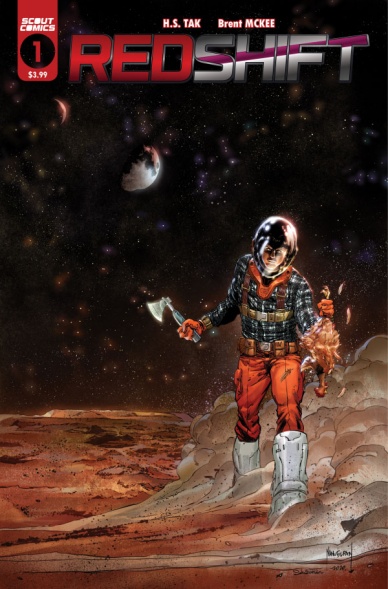
Redshift #1
Written by H.S. Tak
Illustrated by Brent Mckee
Colored by Sebastian Cheng
Lettered by Joel Rodriguez
Reviewed by Luke Cornelius
Any debut issue has a lot going on and “Redshift” #1 is no different; there are humans living on Mars, an as-yet unsuccessful Voyager exploration programme, and some sci-fi visuals that all vie for attention, but what “Redshift” #1 does so well, is, for the most part, push through all of this and focus on its characters.
At the center of “Redshift” #1 is Hellener Drake, the eldest of two brothers, who has been selected to be the next Voyager to seek a new Earth-like planet. H.S. Tak introduces us to Hellener along with his brother and father, as they travel across the Martian landscape. Tak weaves in little details through the script, informing the reader of Hellener’s mother’s absence, the greater reasoning for Hellener’s dislike for his job as an ice miner, and the story behind his quitting the Academy of Exploration in a shocking flashback sequence. It all gradually pieces together over the issue for a quietly compelling read, with the audience drawn in by the character of Hellener rather than the sci-fi concepts. There can be no accusations of style over substance here.
That isn’t to say its visuals lack style though. Brent Mckee’s linework gives “Redshift” #1 a midway blend of cartoony and detailed, with much of the linework having minimal weight and presenting a clean and sleek feel. Mars appears in all of its vastness, its tiring terrain naturally giving characters an aged and rugged appearance, marked through Mckee’s detailing. Mckee differentiates the flashback scenes well, utilising a heavier outline for characters and a much more generous amount of shadowing. The textures for the landscape really emphasise the dirtiness of the planet too. Sebastian Cheng’s coloring is good across the issue, though the highlighting provided pops a lot more when paired with Mckee’s heavier shadows in the flashback sequence.
Joel Rodriguez’s lettering in the issue is fluid and distinguishes the voices of the explorers’ computer well. The font for the captions adds a cinematic flourish to the debut too.
The only weak points of the issue come in the form of its dialogue momentarily being overly expository and the issue ending very abruptly.
Final Verdict: 7.5 – “Redshift” #1 focuses on a compelling central character amidst the sci-fi surroundings and is all the better for it.

Shadecraft #3
Written by Joe Henderson
Illustrated by Lee Garbett
Colored by Antonio Fabela
Lettered by Simon Bowland
Reviewed by Gregory Ellner
“Shadecraft” #3 is an interesting story, even if it has beats people have probably seen before. A teenager who cannot control her powers, but tries using them to help with her everyday life as a means of training? A mentor figure who advises against certain actions, but does not make any real attempts to prevent them? A “sidekick” who only the aforementioned empowered teenager can hear? All of this does not appear to be all that unique at first glance. However, it doesn’t need to be unique. Joe Henderson crafts a plot that is easily grasped by newcomers, fitting in exposition alongside fun characters to amass a cohesive whole that feels like a wider world, but also a good introduction on a smaller scale at the same time. The powers at play are simple, yet intriguing, the characters also not all that complex, but relatable.
Lee Garbett’s artwork helps to emphasize the otherworldliness of the powers at play, as well as the sheer normalcy of everything else. Shadows seem fluid and lively in their own way, but nonetheless monstrous, and never given too much focus. The placement of those shadows also helps a lot, as smaller ones seem harmless, while larger ones appear all the more threatening, the framing of the scenes themselves enhancing whatever emotion is wanted (as would be needed for something as perspective-based as shadow manipulation).
For colors, Antonio Fabela’s dim, dour palette helps to set the tone outside, with the deep blacks and darker colors overall making the shadows feel all the more menacing. Meanwhile, the brighter lights inside, especially in protective areas, lend themselves to a lighter set of hues, all of which come together to comfort not only the characters, but also the reader, letting them all know that they are, for the time being, out of danger.
Continued belowFinal Verdict: 7.5- Although perhaps not entirely unique, “Shadecraft” #3 is very newcomer friendly, and intriguing in its own right with its characters and setup.
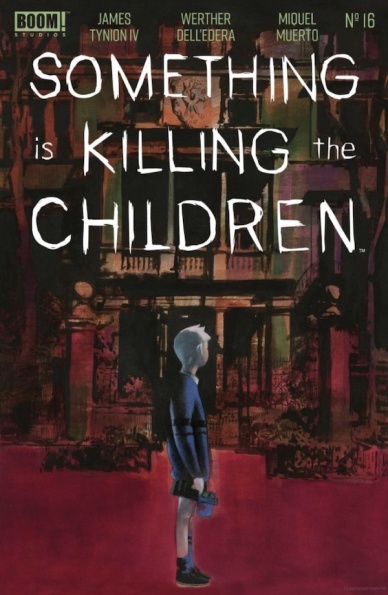
Something is Killing the Children #16
Written by James Tynion IV
Illustrated by Werther Dell’edera
Colored by Miquel Muerto
Lettered by Andworld Design
Reviewed by Ryan Fitzmartin
Visceral imagery, combined with a solid narrative make “Something is Killing The Children” #16 a superb comic. There’s solid echoes of Kingsman and Buffy in this story about a young girl inducted into a secret society of highly trained monster slayers. The narrative by James Tynion IV picks up with the girl, Erica, covered in blood and surrounded by the corpses of her friends and family. It’s a brutal intro, skillfully drawn by Werther Dell’edera and Miquel Muerto. The grim dark crimson shade of the blood and the unseeing eyes of the corpses are spectacularly unnerving. “Something is Killing the Children” #16 grabs from the first panel and doesn’t let go.
The layout work and composition is terrific, and packed pages are filled with expert use of closeups and angles. The character faces are immensely expressive, which is vital for an issue consisting largely of talking. In many panels Dell’edera focuses on just the eyes, mouth or half of a face, to convey specific emotion. The art is just superb, and this is one of those comics that could easily be filmed using the original panels as storyboards. It’s simply so visceral and real, it feels as if the characters are about to pop off the page.
A newcomer being inducted into an ancient order of monster slayers isn’t the most original plotline, but it is a reliably good one for a fantasy book. The dialogue that Tynion IV comes up with is engaging, heartfelt and feels real. A warm and genuine relationship develops over a few short pages between the young girl and her new mentor. Completed by extremely high quality art, the story feels far more engaging than many others of its ilk. For fans of horror or dark fantasy, there will be much here to enjoy.
Final Verdict: 8.1 – A visceral horror fantasy story with a nice dose of heart.

Star Wars Adventures: The Weapon of a Jedi #1
Based on the Novel by Jason Fry
Written by Alec Worley
Illustrated by Ruarí Coleman
Colored by Chris O’Halloran
Lettered & Designed by Amaurí Osoria & 49 Grad-Medienagentur
Reviewed by Conor Spielberg
Many of the issues that crop up in “The Weapon of a Jedi” stem from the fact that its an adaptation from a novel. There is an inciting incident that starts off the issue, but isn’t enough to carry the 40 page issue. The change in scenery every four or five pages feels like a change in chapter and suffers from this efficiency in the plotting.
The adaptation falls short because in a novel, a description of the scenery and the inner monologue of the character is given a near equal amount of words to the dialogue. This means that when one page worth of artwork is worthy of about 200 words description (as most pages are), is often crowded with dialogue. What is likely a page turner in Jason Fry’s novel, is a scripted page crowded by Alec Worley’s dialogue. What is so unfortunate is that it isn’t Worley’s fault, but does very much seem like too faithful of an adaptation. There are noticeable breaks in the comic that feel like they would be good ends to chapters but feel anticlimactic as ends to a comic. Even the very end of the issue feels like an empty promise that the next comic will be more interesting than this one was.
The fights in space are a welcomed exception, with relatively minimal dialogue and well panelled action sequences. Ruarí Coleman’s Luke Skywalker is worth noting as making him look even more boyish than Mark Hamil did while filming A New Hope. Coleman also manages to have a sense of wisdom about him while maintaining a childlike wonder or a gruff exterior when necessary. Unfortunately this cannot overcome the fundamental pacing issues that override the story.
Final Verdict: 5.0 – Despite strong fundamentals from the creative team, it shows roots as a novel by failing to adequately adapt to the form.


