There is a lot to cover on Wednesdays. We should know, as collectively, we read an insane amount of comics. Even with a large review staff, it’s hard to get to everything. With that in mind, we’re back with Wrapping Wednesday, where we look at some of the books we missed in what was another great week of comics.
Let’s get this party started.
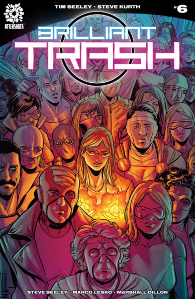
Brilliant Trash #6
Written by Tim Seely
Illustrated by Steve Kurth
Colored by Marco Lesko
Lettered by Marshall Dillion
Reviewed by Reed Hinckley-Barnes
“Brilliant Trash” #6 feels like both a beginning and an ending. The ending of the last issue, which had the main character, Kennedy, setting herself off like a bomb giving super powers to the people in the city around her, fundamentally changed the world of “Brilliant Trash.” This issue, which picks up where the last left off, has a series of character focused vignettes about the people who have been affected by those powers, acts as both an epilogue to the first five issues, and a spring board into something new.
Almost all the characters focused on in this story are brand new, completely unrelated to the first five issues except that they have been impacted by the distribution of super powers to so many people in the world. “Brilliant Trash” #6 reads like a bit like collection of short stories. Tim Seely does a good job spending just enough time to give a small sketch of these characters, and how they are dealing with the world. There isn’t really enough space to get into detail about these characters lives, but there is enough that each of these four-page vignettes are interesting.
Steve Kurth is new to the series, but his art works well for these stories. Up until this point, “Brilliant Trash” has had art from Priscilla Petraites, who had a very clean style that worked well for the series. Kurth’s lines are a little more rugged, but that works very well for the smaller, more character focus short stories that comprise this issue.
The real question that “Brilliant Trash” #6 leaves me with is whether the series is continuing. As far as I can tell, there have been no future issues of the series solicited, and the issue ends with a “The End” but I don’t know if that’s the end of a volume or a series. If this is just an epilogue to the series that has come before, it is interesting enough, though a slightly strange way to end things. But, if it the beginning of a completely different direction for the series, I think that is a bold move that “Brilliant Trash” would be smart to take. Either way, beginning or ending, “Brilliant Trash” #6 works as a good, one off issue.
Final Verdict: 7.0 – “Brilliant Trash” #6 is a small, character focused series of vignettes that works well as a both an ending and a beginning.

Daredevil #603
Written by Charles Soule
Illustrated by Mike Henderson
Colored by Matt Milla
Lettered by VC’s Clayton Cowles
Reviewed by Eric Goebelbecker
“Daredevil” #603 opens on New York’s City West Side Highway with Elektra is trying to get out of town as fast as she can. This scene sets the tone for the issue and continues the whirlwind that has been the aftermath of ‘Mayor Fisk’ and the Hand’s attack on New York City.
Charles Soule puts us in Murdock’s head for the first 7 pages of story, and we get a sense of the weight that Murdock is carrying during a crisis. At the same time his sense of humor in the face of adversity still seeps through even if it is still dry. He tells us that Elektra “lives for vendettas. Collects them. Hoards them deep in her soul like one of those poor old ladies drowning in ancient newspapers and dead cats.” We only see Elektra for a few pages, but Murdock convinces her to stick around, in a scene that establishes a plot thread in the ongoing story.
That’s much of what this brisk story is: scenes that asks questions, answers none, and leaves you clamoring for more. It’s great storytelling.
Continued belowWhy does Matt want Elektra to stay? As much as we like having her around, it never works out well for Murdock. Foggy even says “Elektra? Elektra doesn’t help. Elektra always makes things worse.” Foggy is our stand-in. He’s Soule’s Greek Chorus. He chides Matt for keeping Elektra around, for releasing the crime bosses from prison, (another question!) for not seeming to have a plan, and for bad taste in meeting places. The shift from Murdock’s narration to Foggy’s running commentary is seamless and grounds the story. We see the situation from a normal person’s viewpoint as a reminder of how insane things have become in New York City.
Foggy is round and rumpled and rough around the edges. Henderson makes him the guy I want to have a beer with instead of Murdock. He looks like a mensch that could give me tips on the best places to eat in Hell’s Kitchen, even though I’ve been working around there for 25 years myself.
The skirmish between Elektra, Daredevil, and the Hand, is quick, but there’s enough there to see that Henderson’s pencils can sell action. His Elektra is reminiscent of Miller’s, which is a good thing. After the battle Matt reaches out and touches her shoulder, and you can feel the look of discomfort on her face. It’s an example of showing rather than telling. No dialogue wanted or needed.
In the prison scene his Owl and Hammerhead leer at the speakerphone as they negotiate their release, and Hammerhead takes charge in the last panel in a wide screen close-up with no background. Most of the action in this story comes in the form of decisions, and Henderson conveys them well.
Final Verdict: 7.5 – “Daredevil” #603 is a solid issue by a team that meshes well together.
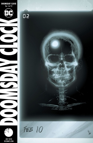
Doomsday Clock #5
Written by Geoff Johns
Illustrated by Gary Frank
Colored by Brad Anderson
Lettered by Rob Leigh
Reviewed by Alan Buxbaum
“Doomsday Clock” #5 continues to deliver on everything one would hope for: stellar artwork, carefully-crafted storytelling, and a symbiotic relationship between the two that makes you marvel at what comic books can do when in the hands of two masters. All in all, I don’t understand how one can read this issue without being somewhat in awe of how well put together this issue is.
Although I’m a huge Geoff Johns fan, I have to say that Gary Frank is the real star in this issue. The detail that goes into his work is second to none. From the first few panels and on, his use of movie-like imagery keeps the flow intact while making you want to stop to notice as many aspects of his art as possible. For example, the light that is shown in his skull on a x-ray morphs into that of a flashlight over the course of three panels. This is done by zooming in and then coming away from the image to show that we had transitioned to another. This is a classic move in movies/television, but done with such tact to start off the issue. The attention to detail continues as we zoom in on Adrian Veidt’s face before he awakes in a hospital bed.
The most chill-inspiring image in the entire issue has to be that of the Joker. In Frank’s hands, this over-drawn character looks as sadistic as ever. His stance is what did it for me: seemingly off-balanced, but crazy and out for blood. It also fits in to the style that Dave Gibbons, the original artist for “Watchmen”, set up. That’s been one of the most exciting parts about reading “Doomsday Clock”. Seeing Frank portray characters like Batman and the Joker in this style is a huge treat and takes the enjoyment of reading the story it that much further.
While I’m impressed with Johns’s ability to handle plot points, I must say that I’m a bit lost in the story. Johns’s use of transitions from various characters makes one unsure of what is important and not. Perhaps that is the point? Maybe we’re supposed to know? For example, towards the beginning of the series, I wasn’t sure if Johnny Thunder’s part would be important, given how he was weaved in and out of the story. As we continue forward, the importance of his part becomes more and more apparent. I can say the same of the detective and police officer featured in “Doomsday Clock” #5. At first, I thought that I shouldn’t pay them much attention, but they’re role in the issue itself was big enough to set up some key points. I guess this is just a long-winded way of saying that Johns’ gifts for weaving characters in and out of the narrative seamlessly can get difficult to follow at times. That being said, I have all the faith in the world that it will all come together by the end of “Doomsday Clock” #12.
Continued belowFinal Verdict: 9.0 – “Doomsday Clock” #5 is without a doubt one of the most well put-together issues out this month.
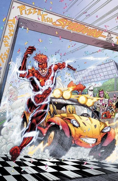
The Flash/Speed Buggy Special #1
Written by Scott Lobdell
Illustrated by Brett Booth
Colored by Andrew Dalhouse and Pete Pantazis
Lettered by Tom Napolitano
Reviewed by Gregory Ellner
Many stories can be dragged in one place or another by sadness or other emotional heartstrings. They can leave you guessing, wondering how anyone will make it out of their situation alive, or in one piece.
“The Flash/Speed Buggy Special” #1 is not one of those stories.
From the beginning to the end, Scott Lobdell’s story of Wally West’s Flash and the eponymous Speed Buggy is flat out fun and ridiculous, with nods not only to the existing Flash family and their assorted speedster rogues, but also to characters forgotten for years. The villains are ridiculous in all of the best ways, and the most “negative” emotion shown is some worry over the effects to the timestream by over-utilization of the Speed Force, with any other negativity working out very well in the end.
Brett Booth can clearly keep up with the fast pace of a speedster’s story, his use of lightning and varied perspectives adding to the idea of scope for the plot itself. Utilization of the background and foreground is key, with flashbacks being shown through their combination without pulling away from the pace of the story. Even with the speed, Booth isn’t afraid to slow down either, with the quiet moments between Wally and Linda Park showing the former’s vulnerability through his facial expressions, and Park’s devotion through hers.
Andrew Dalhouse and Pete Pantazis work seamlessly, their colors complementing one another and making for a good cohesive whole. Bright lights make for headlights or the Speed Force, while darker tones show darkness, depression, or quiet. Some of those colors are somewhat muted for flashbacks, but overall it allows for a very interesting art-and-color combination.
Much like the “DC Comics/Looney Tunes” crossovers before them, the “DC Comics/Hanna-Barbera” ones are shaping up to be absolutely wonderful in every way.
Final Verdict: 8.5 – Dynamic artwork, surprise appearances, and beautiful colors only further emphasize the sheer fun of this DC Comics/Hanna-Barbera crossover.
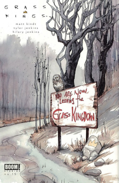
Grass Kings #15
Written by Matt Kindt
Illustrated by Tyler Jenkins
Colored by Hilary Jenkins
Lettered by Jim Campbell
Reviewed by Elias Rosner
And thus, another series comes to a close this month. “Grass Kings” was always a series that leaned hard into the bittersweet and, as such, the ending mirrors such a tone. Providing as many answers as can be while still leaving the story open and messy, as any true crime does, this final issue is all at once satisfying and an ending that has come too soon.
Stories should be told to their natural ends and, narrative-wise, “Grass Kings” has reached that point. However, there were more stories to be told in this kingdom, more time to be spent with the characters and their lives. Reflective of this is the contents of this issue; it is the villain’s plan exposed, monologued via typewriter, as well as the resolution and denouement to the thwarting of the villain’s schemes. Yet the conclusions to each of the character’s arcs is limited. A panel, maybe two, sometimes three, on where-are-they-nows. It feels as if we are being shuffled out of the Grass Kingdom, no longer welcomed by the king, who is now broken and battered by the knowledge and events of the series.
On the art side, Tyler Jenkins’s does a wonderful job of capturing the sinister nature of the thin-air killer and ambivalence with which we are asked to look at his victims. Throughout the first half of the issue, we are in the thin-air killer’s point of view and, as such, we see the world as he sees it – a world of bodies and the people those bodies break.
His art is sketchy, as it always has been, and there are panels where this can be distracting. The biggest offender are the four panels where Humbert Sr. confronts the thin-air killer. There is no background, only whiteness, and Humbert Sr. falls into an uncanny valley. His arm bends in impossible ways, his neck merges into his coat, as if they are one being, and he appears flatter than anywhere else in the comic. Making up for this is Jenkins’s control of the framing and paneling on each page, in particular towards the end, where he drastically cuts the number of panels per page, leaving much of it empty, closing in the world and heightening the tension and loss felt both on the page and beyond.
Continued belowFinal Verdict: 7.5. An ending that has come too soon but one which was executed well and delivered on the promises of the series. Mysteries were solved, stories resolved, and characters were forever changed. Maybe one day we will be able to revisit the kingdom.
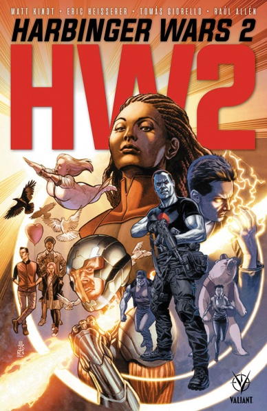
Harbinger Wars 2 #1
Written by Matt Kindt
Illustrated by Tomas Giorello
Colored by Diego Rodriguez
Lettered by Dave Sharpe
Reviewed by Michael Mazzacane
Tomas Giorello and Diego Rodriguez were an excellent choice to start of the relaunch of “X-O Manowar,” together their work is in line with old pulp covers. With “Harbinger Wars 2,” I wasn’t sure how that style would fit, there is a stiffness to Giorello’s figures. This first issue mostly threads the needle, weaving in dynamic single page images or dominating ones surrounded by smaller ones. While his facial designs can be a bit awkward at times, the texture Rodriguez makes with his color pallet and the strong poses Giorello goes for makes this first issue feel “big.” That sense of scale and style is why the opening page is probably Giorello and Rodriguez’s best character acting in this issue. It’s a simple page dominated by the interior of a church in Juarez, Mexico, as Peter Stanchek offers a young boy the choice between being activated or not. The character acting for Peter works not because of some hidden subtly in the art, but in his framing as a supernatural – given the setting messianic – figure. It’s bold and to the point, an efficient execution of symbolism.
That idea of bold, to the point, storytelling also helps to reveal the micro faults everyone is walking on as the battle lines are drawn. Amanda McKee’s more militant stance towards protecting her team and other Psiots is Nobel and the right thing to do, but also endangering countless innocent bystanders with her blackout. Aric of Dacia is also trying to protect his people and again caught in the quagmire of governance from his main series. It’s in these sequences, where both have extended conversations that the stiffness of Giorello’s facial work is a tad rough. From a paneling perspective everything works, but the emotion in the face doesn’t come through. The fault lines are much greater and more apparent for the U.S. Government and Omen, they’re the baddies and hypocrisy is the name of their game. In an issue where they’re literally hunting down children, their own citizens and foreign nationals, their claims of wishing to maintain security is extremely hollow, which makes the use of bold posturing with Ray Palmer satirically effective.
It’s still early goings for this event, and on its face “Harbinger Wars 2” offers a compelling escalation and continuation of the first event from this new Valiant Universe. This seems like the culmination of the monster metaphor much of Valiant’s books are built around. There’s just this nagging feeling that it’ll get needlessly complicated by outside actors (both in book and out of book) as Valiant comes to a transitional moment.
Final Verdict: – 7.0 – “Harbinger Wars 2” officially begins, and does what first issues need to do.
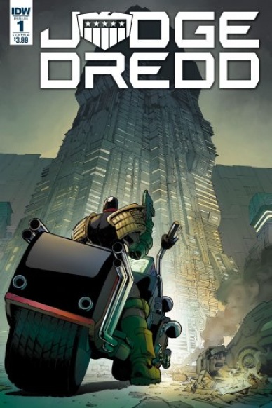
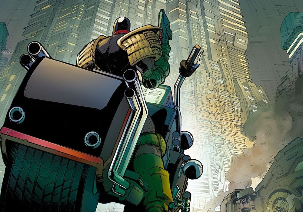
Judge Dredd: Under Siege #1
Written by Mark Russell
Illustrated by Max Dunbar
Colored by Jose Luis Rio
Lettered by Simon Bowland
Reviewed by Chris Egan
IDW’s kickoff of its latest “Judge Dredd” miniseries ‘Under Siege’ has all the biting social commentary, shoot-em-up action, and signature cynicism that long-time fans and newcomers alike could ask for. Mark Russell has a keen sense of balance that keeps the book quickly paced while still dishing out plenty of exposition. Like the best “Judge Dredd” stories, it never shies away from keeping it clear that our hero fully supports a governing system that is a nightmare for its citizens. Most readers will question Dredd’s decisions from time to time, but it is rare to see side characters that are not full-blown villains do it within the story. Executed in a perfectly subtle manner that should not be overlooked amidst the action; it adds a great layer to the narrative.
Max Dunbar’s art has a wonderful weight to it. The bulky, dense look of Dredd’s uniform and especially his Lawmaster motorbike are great callbacks to the classic “Judge Dredd” books. He does an excellent job of pairing heavy lines and intricate detail bring Mega City One to life. Motion and action are depicted in a way that lets your eye flow easily from panel to panel. Rio’s strong and bright colors art not typical for Judge Dredd’s world and some of it looks almost too good, especially for a story set in the slums. Otherwise, his style works great.
Continued belowFans of the 2012 film Dredd may note some initial similarities in plot, but this stands on its own well enough to push that criticism to the side.
Final Verdict: 8.5 – A must read for “Judge Dredd” fans that boasts an action-packed, but intelligent plot that will make readers beg for the next chapter. This is one of the best issues since IDW started their version in 2012.

Royal City #11
Written, Illustrated, and Colored by Jeff Lemire
Lettered by Steve Wands
Reviewed by Matt Sadowski
The past and present collide as “Royal City” kicks off its newest and final arc.
We start where we last left off, with Tommy and Clara’s fateful liaison from the pages of Tommy’s composition notebook. From Clara’s face, we transition to her daughter Olive, back to the present where the cataclysmic events of Tommy’s final night continue to ripple forward. It’s an effective introduction to this last batch of issues, setting the two strands of the “Royal City” narrative toward a dual climax.
#11 marks the first time the two timelines merge on the page. The flashback’s panel borders lose the solid black line for easier identification between the present and past. By directly juxtaposing the past and present, Lemire strengthens the impact of every decision made on that momentous day in ’93. Tommy’s non-diegetic narration further adds to the binary timeline tapestry, as he waxes poetic on “living in between.” Richie’s ghostly blue-collar construction of Tommy warps the real Tommy’s words, setting Richie on a path he’ll surely come to regret.
Jeff Lemire’s dreamy watercolors are perfectly suited to Tommy’s liminal state. The rough sketching and bleeding colors flow like an incomplete memory or forgotten dream. Compared to previous issues, #11 is relatively straightforward concerning panel layouts and experimentation, but its emotive characters and charged moments more than make up for any perceived simplicity.
As always, Lemire includes a playlist at the end, and the first track is especially thematically relevant. David Bowie’s “Slip Away” is the pitch perfect musical accompaniment to Tommy’s melancholic state of mind and his inevitable watery end. “Some of us will always stay behind” indeed.
Final Verdict: 8.0 – Previous arcs merge into a dual timeline, setting the endgame in motion. Dreamy and wistful, “Royal City” remains a must-read.

Star Wars: Lando Double or Nothing #1
Written by Rodney Barnes
Illustrated by Paolo Villanelli
Colored by Andres Mossa
Lettered by VC’s Joe Caramanga
Reviewed by Tom Baker
In a canny move befitting the eponymous space gambler himself, Marvel’s Solo: A Star Wars Story tie-in goes all in on what everyone broadly agrees worked from that film — Donald Glover’s Lando Calrissian and Phoebe Waller-Bridge’s scene-stealing droid L3-37 — and folds on the rest. Set some time before the film, “Star Wars: Lando Double or Nothing” #1 introduces us to Lando, Ellthree and the Millennium Falcon before they cross paths with Han Solo. Here, Calrissian gets dragged into a nascent rebel uprising on the promise of adventure, romance, and (mainly) filthy lucre.
While Villanelli’s Lando is undoubtedly modelled after Glover’s glorious visage, his pencils avoid the stylistic sarlacc pit of that John Cassaday and Salvador Larroca fell into with their work on the main Star Wars comic. Where they aimed for verisimilitude, to the point it often looks like they’d traced over Carrie Fisher or Harrison Ford’s faces, more often than not they achieve a creepy uncanny valley effect. The drawings almost resembled their real-life counterparts, but didn’t look quite right.
By comparison, Villanelli nails the correct level of caricature. His Glover-Lando is recognisable but appropriately cartoonish, with a bishounen manga-pretty-boy vibe to some of his close-ups. He is aided in this by the wonderful coloring of Andres Mossa. His work is genuinely painterly, both in the palette and the visible smears which, while obviously computer-generated, add a homemade touch and comic book-abstraction to the scenes of the Falcon evading attacks and leaping into hyperspace.
Where “Star Wars: Lando Double or Nothing” stumbles is with the lead himself who, despite having one of the sharpest costume designs of any figure in this far away galaxy, is also one of the more lightly-sketched in terms of his personality. Barnes tries his best but at times appears to struggle differentiating Lando’s particular brand of self-centred, roguish charm from that of Han. This is a problem inherited from the source material, admittedly. By the same token, Barnes nails the semi-flirtatious, semi-antagonistic banter between Lando and L3-37, and the overall lightness of tone that made Glover and Waller-Bridge’s scenes in the film stand out. As the starting point for a new story, it’s a fairly confident set up, albeit one that hints at a character arc — Lando learning to be less of a solipsistic jerk, and helping people with monetary gain — which, again, seems strangely familiar…
Continued belowFinal Verdict: 6.9 – If you liked his role in Solo, here’s more of the same! But it’s not going to reinvent the wheel. Or…the space wheel…?

Super Sons/Dynomutt and Blue Falcon Special #1
Written by Peter Tomasi
Penciled by Fernando Pasarin
Inked by Oclair Albert
Colored by Gabe Altaeb
Lettered by Rob Leigh
Reviewed by Alexander Jones
In the past writer, Peter Tomasi has expressed a fascination in merging incredibly dark material with younger and innocent protagonists. In previous storylines of “Superman” this combination has not presented the best mix of horror and superhero action, but Tomasi finally the strikes the right balance between horrifying and heartwarming in the “Super Sons/Dynomutt and Blue Falcon Special” #1. Thanks to Fernando Pasarin’s artwork, the comic oozes a creepy, yet endearing vibe that makes for an excellent read from start-to-finish.
Tomasi’s meditation on death and the darker side of the DC Universe makes a for a jarring juxtaposition when paired with the Super Sons. Tomasi does a great job striking the balance between Damian and Jon while introducing the themes of the story at the beginning of the issue. He also crafts the narrative for the Dynomutt and Blue Falcon from the ground-up in this story. Tomasi doesn’t waste any of the pages in the issue and the initial Blue Falcon story is also a joy to read as Tomasi grimly interrupted the odd relationship the characters have with each other.
Pasarin’s bleak, detailed artwork is fantastic at evoking the notes of horror littered throughout the issue. I never thought I would stay this, but there are a ton of moments where Blue Falcon looks terrifying. The extra detail in the Dynomutt’s loose wires is also cringe-worthy in certain panels. Watching the horror-tinged characters share the same pages and panels as the Super Sons is a delight and Pasarin makes sure to draw each individual differently. Pasarin’s work is extremely detailed here as well, the artist draws all of the bulging muscles from the Falcon and every wire on Dynomutt. He captures emotion incredibly well with a couple expressions being particularly grim and noteworthy coming from every cast member in the title.
“Super Sons/Dynomutt and Blue Falcon Special” #1 is delighted to distort your emotions and confuse you. The issue breaks new ground in establishing the relationship between the Hanna-Barbera characters and goes well with the editorial edicts from DC of distorting the characters and giving a bleak, fresh take on the mythology. This story goes into a surprisingly bleak direction and is certainly not for the faint of heart but it is fantastic to see Tomasi perfect the story he was trying to tell since the early days of his “Superman” run!
Final Verdict: 8.3 – “Super Sons/Dynomutt and Blue Falcon Special” #1 is equal parts heart-wrenching and horrifying yet always fascinating!

X-Men Red Annual #1
Written by Tom Taylor
Illustrated by Pascal Alixe
Colored by Chris Sotomayor
Lettered by VC’s Cory Petit
Reviewed by Gustavo S. Lodi
Ever since Jean Grey returned from the dead and “X-Men Red” launched, fans were wondering if they’d ever see the immediate reaction of Jean’s family and friends to this resurrection. And while the main series never went there, the Annual does just that, focusing on emotional gravitas and personal connection.
Pascal Alixe had the chance to portray not only a large cast of mutants, new and old, but also to showcase a number of locations around the Marvel universe. For the most part, his art is clear and effective, with much needed facial expressions taking centre stage of this character-driven piece. One particular moment between Jean and the king of Inhumans, Black Bolt, is particularly beautiful, with image juxtaposition becoming the visual representation of an understanding among leaders.
The art does look poorly designed on some panels, mainly in the way characters seem to be moving. There are some strange instances – two, around Nightcrawler and Kitty Pryde being more noticeable – where body poses just feel unnatural. Hard to say if it was played as some sort of comedic relief, but it does not work.
Taylor’s script and objective with the Annual, though, is pitch-perfect. This is not an issue to substantially move plot forward (and yet, it does with a surprise ending), but rather to reveal the nuances of having such a beloved person return to her friends and society. Jean’s conversations with long-time friends like Kurt, newer additions to the X-Men family like Laura and Gabby and even on the more politically-charged situation with Black Bolt: they all ring true and consistent. Beyond that, there is just enough debate around social topics to make it feel like a X-Men comic: it is relevant and timely, but the discussion does not overstays its welcome.
Final Verdict: 7.0 – A strong companion to its core series, “X-Men Red Annual” #1 bridges an important gap of Jean’s story by focusing on what makes it personal. And while the art can seem strangely designed at times, it does not take away materially from the overall package.


