
There is a lot to cover on Wednesdays. We should know, as collectively, we read an insane amount of comics. Even with a large review staff, it’s hard to get to everything. With that in mind, we’re back with Wrapping Wednesday, where we look at some of the books we missed in what was another great week of comics.
Let’s get this party started.

Cable #1
Written by James Robinson
Penciled by Carlos Pacheco
Inked by Rafael Fonteriz
Colored by Jes Aburtov
Lettered by Cory Petit
Reviewed by Michael Mazzacane
Buying comics can be something of a shot in the dark, which means the areas you can rely on become more important. Maybe I just expect more from “Cable” writer James Robinson, but nothing about the first issue of this new series sells me or entices me to pull the next one. Worse, it’s kind of boring. Carlos Pacheco and Rafael Fonteriz art provide a much-needed sense of style to the book, it is the structure of this issue overall that is lacking. This issue feels like half a thought, I know Cable is hunting someone but the who, what, where, why of it all is unknown. There is no moment for a statement of purpose, operational theme, whatever you want to call it. If this were a mystery that’d be one thing, except this isn’t being sold as some sort of time travel fueled mystery.
Instead we get a pair of action sequences that are repetitions of one another, save for their time periods. “Weapon X” did a better job selling itself in 20 pages than this. Robinson’s writing here is simply poor episodic writing, which is odd considering that’s the exercise of his Nick Fury book.
The art team mostly saves this book. Pacheco’s pencils and layouts mixed with Fonteriz’s inks cut exciting figures. Their depiction Cable, potentially the poster boy for 90s anti-heroism, is a nice balance of contemporary sleekness and classic overwrought detail. Pacheco’s framing during an interrogation sequence that involves Cable’s captive being hung upside down plays with POV in a fun way. However, as an example of the under baked quality of the issue overall, letterer Cory Petit doesn’t letter the balloons in such a way that would require the turning of pages and fully commit to the changing views by the reader. That’s a little action that would’ve been novel and slowed the reading process down for what is a thread bare plot. Buying floppies can feel like cotton candy experiences at times, this one doesn’t even give me a sugar high.
Final Verdict: 5.0 – Unless you’re a fan of the character, there are better X-Books and books period you should be buying.
Generation X #2
Written by Christina Strain
Illustrated by Amilcar Pinna
Colored by Felipe Sobreiro, Jay David Ramos, and Chris Sotomayor
Lettered by VC’s Clayton Cowles
Reviewed by Jake Hill
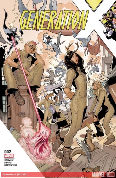
On the one hand, “Generation X” #2 does exactly what an X-book should be doing in this day and age. It focuses on a core team of mutants, brought together with a common mission, made up of characters from different eras of the series. They are students at the Charles Xavier School, and their strong personalities are bound to create drama. The book doesn’t try to reinvent the wheel with Nightcrawler or Angel, and instead, brings mutants into focus who have been begging for some love for years, characters like Nature Girl, Jubilee, Bling!, Eye-Boy, and Quentin Quire.
On the other hand, “Generation X” #2 falls victim of the weight of Marvel’s peculiar publishing habits. It is only at the end of this, the second issue, that the premise even becomes clear, and any set-up or conflict thus far can be easily swept under the rug. That sort of decompressed style would work in a heavily promoted Brian Bendis comic, but “Generation X” is the kind of niche title Marvel has been quick to cancel lately. It’s hard to get attached to such a slow moving book when it feels like it could vanish at any moment.
The issue mainly follows Quentin Quire, who’s been a rising star in the X-books since Jason Aaron added him to the cast of “Wolverine and the X-Men.” Quire is still doing his rebellious teen shtick, and the other students are unimpressed. The school is attacked by Purifiers, who don’t have much of a motivation besides hating mutants, and the back-to-basics approach gets discarded in the final pages, when the true premise of the book is finally revealed (which would have been a good hook at the end of last issue, but I won’t be too specific because of spoiler reasons).
Continued belowThat means that the bulk of the issue’s plot is meaningless, we’re really looking at character work, and that could be cool! But X-Men work best when played out over a long period of time. They are, as Jay and Miles (of “Jay and Miles X-Plain the X-Men) say, “comics greatest superhero soap opera.” The soap opera elements are there, but I would struggle to tell you what they are. Everybody hates Quentin, Bling! desperately wants to be a real X-Men… and that’s sort of it so far. The story’s slow pace really works against it.
The artwork is solid, but in some places, it falters. The figures could have been designed by Mike Allred (which is a compliment), but there are faces that look… wrong. Quentin and Jubilee, in particular, contort their faces in uncomfortable ways, and Benjamin Deeds has a mouth that goes on for miles. What really does work is all the mutant business. Amilcar Pinna is great at showing Quentin’s pink psychic powers, and Bling!, who has metallic skin, still looks recognizably African-American, which a lot of artists struggle with. The body language is full of deliberate meaning, and the action is fun and easy to follow. Maybe the art will come together with time and experience. Adrian Alphona was in comics for ten years before he became the artist he is today.
All in all, “Generation X” is the kind of comic I want to love, but feel reluctant to get into. I’m trying not to hold editorial decisions against the comic, but the creative team seems poised to get washed away in the next crossover event or a slew of cancellations. It’s a shame because I really do want a book focusing on the more obscure mutants. I’m going to continue to read it but will be keeping an eye out for the inevitable (and tragic) cancellation.
Final Verdict: 6.8 – Creative hurdles hold back an X-book with a refreshing premise.
Josie and the Pussycats #7
Written by Cameron DeOrdio and Marguerite Bennett
Illustrated by Audrey Mok
Colored by Kelly Fitzpatrick
Lettered by Jack Morelli
Reviewed by John Schaidler
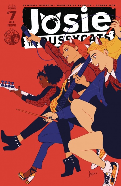
With an essentially stand-alone plot and no real cliffhanger to speak of, “Josie and the Pussycats” #7 could be a one-shot. Josie, Val, and Melody are back from Antarctica (and a rather inconvenient kidnapping episode) and ready to rock. While making their grand entrance at a prestigious awards show, however, the bandmates see a flyer for a one-night-only charity concert and immediately feel conflicted. On the one hand, the awards show is the culmination of everything they’ve worked for, but on the other hand, what is the point? Is rock stardom a means or an end? Luckily for us and the Pussycats, “Working women really can have it all” – just not before they fight their way out of a literal battle of the bands.
Like a tight power-pop four piece, writers by Cameron DeOrdio and Marguerite Bennett, illustrator Audrey Mok, and colorist Kelly Fitzpatrick fuel and feed off of each other, with each taking the lead for a moment, while also carving out time and space for the others to really shine. From the first downbeat to the last note, outstanding paneling, a concise, efficient script, and an almost Technicolor palette dominated by aquamarine, teal green, and leopard print golds and yellows, are seamlessly interwoven to drive the action forward, while cleverly revealing small moments of character insight. We care about these characters and we care about their journey.
Structurally, as well, this issue is tight and well crafted. The action steadily rises to a raucous double-page spread that practically smacks you in the face with motion lines and color and guitars swung like battle axes, then quietly fades away with the chorus of the Pussycats’ latest hit ringing out as the Pussycats spontaneously headline the charity concert for disadvantaged children.
Truly, “Josie” #7 has it all, from quiet, contemplative moments of existential introspection to moments of unbridled action to witty comedic banter (with many of the very best lines coming courtesy of “Fugue State Melody). It’s a highly effective and entertaining balancing act that never feels scattered or unfocused. And ironically, despite the lack of a cliffhanger per se, after turning the last page, you’re immediately left wanting more. In a good way.
Continued belowJosie and her pals may have already achieved rock stardom, but this journey feels like it’s just begun.
On a technical note, if you read this issue digitally, be sure to at least run through it in two-page mode. There’s only one legitimate double-page spread, but the whole issue flows better and packs a tighter visual punch while looking at both pages simultaneously – especially as the Pussycats battle their ice cold European foes Ur-C Major and their robot backup dancers.
Final Verdict: 8.3 Like a catchy, well-made pop gem, “Josie and the Pussycats” #7 is a satisfying read that leaves you wanting more. A great chance to check out this book, if you haven’t already, to see what the fuss is about.

Judge Dredd Funko Universe
Written by John Layman
Illustrated by Francesco Gaston and Troy Little
Colored by Wes Dzioba and Troy Little
Lettered by Shawn Lee and Troy Little
Reviewed by Nicholas Palmieri
John Layman and the artists of “Judge Dredd: Funko Universe” churn out exactly what you would expect from a combination of Judge Dredd, Funko, and John Layman. There are three eight-page stories here, and each one is at once fun, humorous, and satisfying.
Layman did a great job in structuring the issue so readers largely unfamiliar with Dredd who may have been enticed by the Funko designs (like yours truly) could follow. The first story works as an overview of Judge Dredd and the world he inhabits, the second is a more humorous stand-alone adventure tale, and the third brings in a bit of the larger Dredd mythos in a succinct way. Each story had heart and humor, usually through successfully satirizing action movie tropes.
The art in the first and last story by Gaston and Dzioba focused on capturing the atmosphere of Mega-City One with its futuristic buildings and crowded streets. It also had a big focus on juxtaposing the cuteness of the Funko designs against the action-based plots, which I enjoyed. Troy Little brought a far more animated style to the middle story, using extreme perspectives and filling the panels with small details like smoke, slime, and shadows. Little’s lettering also added so much to the story, with hand-lettered sound effects used as essential design elements in each panel and the actual text in the word balloons changing font style, size, and color for emphasis.
While there’s nothing life-changing here, I really enjoyed this issue. As an introduction to Judge Dredd or as a fun group of side stories for fans, these all succeeded. The only real downside is the price point, which at $4.99 seems a bit much for the casual readers this could appeal to.
Final Verdict: 7.9 – Great fun for this inexperienced Dredd reader.

Kill or Be Killed #9
Written by Ed Brubaker
Illustrated and Lettered by Sean Phillips
Colored by Elizabeth Breitweiser
Reviewed by Kent Falkenberg
By this point, you’re either drinking the Brubaker-Phillips Kool-Aid, or you’re not – and honestly, who doesn’t like Kool-Aid. “Kill or Be Killed” #9 continues their run of consistency with such poise that it really makes you consider if there was ever a time that this duo wasn’t lapping the field with their level of execution.
The mean streets of New York may have a modern sheen, but Phillips rubs them down with an unhealthy dose of ‘70s-era grime. And while Brubaker’s characters may name drop Lyft and Michael Moore – which even the narration admits is a dated reference – the denizens of this underworld seem to have souls scuffed black in a throwback, more obfuscated sense. They’re the kind of people you need to look in the eyes to tell the shitty thoughts they have in their heads, rather than just scrolling down the toxic venom of a Twitter feed. It seems like the only type of social media someone like Bogdan would be tied into is the network of junkies and rats that he uses to track down Rex. So while things might be wrapped up in some fancy new threads, at heart, it’s that same great, noir taste.
But there are little refinements in “Kill or Be Killed” #9 that show how these creators are constantly pushing themselves. There are the eyes lost to the shadows and the faint pull of a smirk creeping up the corner of his mouth as Dylan contemplates, “…things we all know are wrong, but just keep putting up with.” There’s a queasy implication to that half-smile that maybe he’s getting a bit too comfortable with the collection of his monthly tithe. But then again, he’s just seen his drug dealer’s van, so maybe he’s just happy to be re-upping his meds. Maybe.
Continued belowOr, there’s the scene immediately after, when Dylan jumps into shotgun beside Rex, placing himself dead center into Bogdan’s trap. The pacing is controlled by a series of tight panels that fight to cram Dylan and Rex and Bogdan into the same frame. They squeeze tighter as Dylan realizes he’s ensnared, the layout just screaming how claustrophobic and dire it is to be caught in a vehicle with a Russian gangster’s glock trained at the back of your head.
The final panel in the sequence finds Dylan leaning just out of the frame, as he makes a move to extricate. And all these themselves are overlaid atop a full page splash of him leaping from the van, where Philips’ artwork sweeps out to the full extents of the page, giving the impression that when he dives through the passenger door, he’s truly going for distance. It’s a beautiful example of tight control and emphatic release. Equal credit goes to Elizabeth Breitweiser as well for painting the dusk with red ochre and dull amber that imply flames somewhere in the distance. It makes the whole thing seem like a trap sprung in some forgotten sub-basement of Dante’s Inferno.
“Kill or Be Killed” #9 is not a perfect issue. The narrative conceit that Dylan already knows everything we’re witnessing downplays a bit of the tension. And while there’s nothing wrong with the flashback to Bogdan’s story in itself, the fact it’s brought up during the midst of a shootout dulls the immediacy of that gunplay. But that’s just a minor quibble – like not enough sugar in the Kool-Aid. It doesn’t mean you’ll ever stop drinking it.
But what’s there to say, really. It’s a Brubaker-Phillips-Breitweiser joint: great art, seedy people, greasy jungle. And the faintest hint that the whole demonic plot may just be some figment in a twisted kid’s head. Another round, please. And keep them coming.
Final Verdict: 8.0 – Still killer.
Mighty Morphin Power Rangers 2017 Annual #1
Written by Kyle Higgins, Jamal Campbell, Tom Taylor, Trey Moore, and Caitlin Kitteridge
Illustrated by Goni Montes, Jamal Campbell, Dan Mora, Frazer Irving, and Dajung Lee
Colored by Sarah Stern
Lettered by Ed Dukeshire and Jim Campbell
Reviewed by Matt Lune
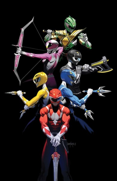
Some annuals choose to use the extra pages to tell one long if sometimes unnecessary story. Here though, we’re treated to five short stories that pull from all different points in MMPR history to tell five vastly different tales, ranging from humor, action, to downright Lovecraftian existential horror. We’ll get to that one, don’t worry. Rather than review the stories in order, let’s work our way up to the best in the issue.
First up is the six-page story ‘Search Party’ by series writer Kyle Higgins. This is the story that feels most like the ongoing run, and it tackles roughly the same time period as the main book too. It’s too short to really add anything of substance to the greater narrative, but it does accentuate the conflict that Tommy is struggling with and touches on his rough upbringing. Anything that helps to pad out that time period, however (something notoriously glossed over in the original series) can only increase your connection to the characters and the weight of the emotional beats in the ongoing series. The panel structure in this story is choppy and always skewed, giving a dynamic flow but also a sense of chaos and unease, which no doubt reflects Tommy’s emotional state.
Next up is the final story in the annual, ‘Sabrina’s Day Out,’ which sees a plan to discredit the Power Rangers by uncovering all the dirty secrets they’re hiding in their personal lives. Why Rita can’t just spy on them at all times like she already does is a mystery, but she decides to send Goldar and Scorpina down to mingle with the youth of Angel Grove and do some old fashioned detective work. How will Goldar go around undetected, you ask? Oh, it’s ok, he’s in disguise. This is the kind of bonkers that I love, and seeing Goldar in a hoodie and baseball cap, playing carnival games so that he can win a tiny toy of himself is genuinely hilarious. All credit to artist Dajung Lee for using the right amount of comedy and action to make the impact of Goldar in a hoodie – a sleeveless hoodie mind you, so his giant gold arms are still on display – just as fun as you’d want it to be.
Continued below‘Forever Mighty Morphin Black’ and ‘Trini’s Vacation’ are both great short stories that focus on the Black and Yellow Ranger respectively, arguably the two characters from the main cast that need the most development. The former is a fascinating, ‘Spider-Verse’-like tale that sees Zach whisked off to join a fight alongside what appears to be every other Black Power Ranger across time, space and alternate dimensions. Campbell finds an ingenious way to tell a Zach-centric story that manages to develop his character by drawing upon the emotional beats we’ve seen in the ongoing series, and the art is detailed and action-packed, especially when there are dozens of Black Rangers on the page, all looking distinctively different. Trini’s story is a little more light-hearted, again using the idea of isolating the character in order to truly study them. Here, Trini is on vacation and has to fight Goldar for a MacGuffin that’s fallen to the earth in a meteor. There’s an interesting flashback that sees a humanoid Zordon fighting Rita for said MacGuffin, but the real fun is in Dan Mora’s art, especially a scene that involves Goldar growing in size and Trini unable to call upon her Zord.
Finally is the 8-page story ‘Perfect,’ which pulls upon Lovecraftian themes of existentialist insanity, with gothic visuals reminiscent of Shelley’s Frankenstein to create a truly unsettling and unforgettable origin story for…Finster. You remember Finster? The strange little minion of Rita that molds all of her monsters and looks like a cross between Geppetto and Falkor the Luckdragon from Neverending Story? Yeah, he gets an origin here that will blow your mind, give you nightmares and ensure you never look at him the same way again. Trey Moore’s tragic, twisted script about a man driven mad by his obsessions, is given life by Frazer Irving’s claustrophobic, nightmarish art. Dark, sepia-toned panels with extreme close-ups and stark, dramatic lighting make this feel like if Hitchcock did a Victorian shadow play about Nosferatu and Frankenstein, it would look like this. Truly brilliant, and should not be missed.
Final Verdict: 8.2 – A fun if occasionally run-of-the-mill annual that’s elevated by an unexpected, gothic horror story about the unlikeliest of characters.
Moon Knight #14
Written by Jeff Lemire
Illustrated by Greg Smallwood
Colored by Jordie Bellaire
Lettered by VC’s Cory Petit
Reviewed by Gregory Ellner
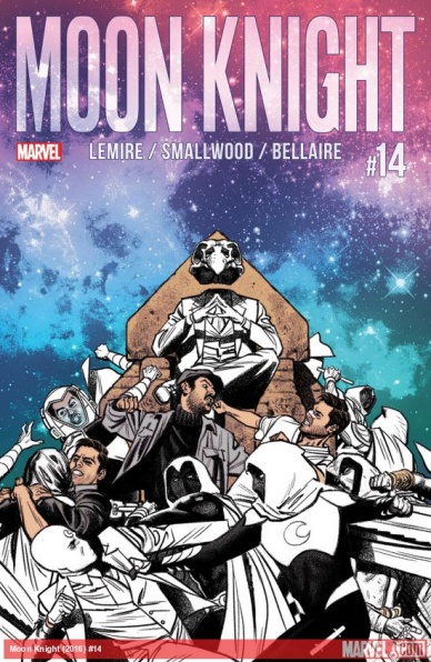
Storywise, Jeff Lemire’s writing is phenomenal. Thirteen prior issues of plotting, madness, and intrigue leading up to this one, and it shows in how Lemire presents his protagonist, in all of his fractured, imperfect glory. Marc Specter’s perception of reality may not be perfect, but as the story itself states, it’s “real enough,” which is the best that he can do and sufficient in his opinion. He’s broken at his core, but that shattered psyche does not mean he is ineffective. In fact, Lemire demonstrates that the Moon Knight’s many facets actually work together to make him an esoterically effective hero.
Since the beginning of his work with Lemire, Greg Smallwood’s artwork, in tandem with Jordie Bellaire’s coloring, has been mind-bendingly fantastic, with the mythological seamlessly interspersed with the mundane to the point that even readers may have difficulty telling which is the reality. The supernatural elements’ artwork seems, much like the earlier work from Declan Shalvey, to be drawn in a way that makes them feel distinct, but only very subtly wrong with how they are placed in the world as if they do not fit with the natural state of things. This dichotomy is best shown here, where while the Moon Knight and Mr. Knight have a supernatural “fuzziness” to them, Marc Specter, Jake Lockley, and Steven Grant each are drawn with sharper linework similar to the buildings and backgrounds.
As a conclusion to the arc, “Moon Knight” #14 works very well at establishing a new status quo for the eponymous character.
Final Verdict: 7.5- A well-drawn, well-written conclusion to over this run of “Moon Knight.”

Saga #43
Written by Brian K. Vaughan
Illustrated by Fiona Staples
Lettered by Fonografiks
Reviewed By Benjamin Birdie
I guess, would you call this a new season? Sure, okay. This new season of “Saga” kicks off with a splash page that instantly has a spot in the Pantheon Of Great “Saga” Opening Splash Pages. I won’t spoil it, but it’s a classic.
Continued belowInstead of a big time skip, we pick up the story pretty soon after we left off from last issue’s heartbreaking close. The issue also contains a recap so organic and unobtrusive that I didn’t even realize that what it was until writing this review. (It’s a 25 cent issue and the start of a new storyline so, oh right, of course, it’s designed as a jumping on point.)
It contains the same easy charm of well defined characters interacting, and all the crazy Fiona Staples-designed alien life we’ve come to expect (multi-colored zebras, walking talking owls in pink cowboy boots, you know the drill). There’s also an action-packed battle with shit demons.
The issue ends with an excited and unexpected development that will definitely lead to some interesting stories to come.
Final Verdict: 8.5 – “Saga” remains one of the prettiest, most poignant, and enjoyable reads on the stands. Can you believe there’s been 43 of these?
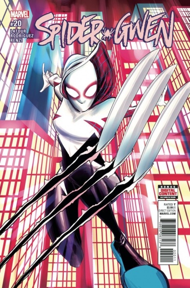
Spider-Gwen #20
Written by Jason Latour
Illustrated Robbi Rodriguez
Colored by Rico Renzi
Lettered by VC’s Clayton Cowles
Reviewed by Elias Rosner
Transitions are good. They help us move from idea to idea and, if they’re good enough, they can clearly connect the most disparate of storylines. While “Spider-Gwen” #20 may not need to do such heavy lifting to move its current story along, it is a transitional issue for its current storyline, Predators. I mean this in the most literal of senses too, as most of the issue sees Gwen and Harry Osborn running all over Earth-65’s neon-fueled version of Madripoor while they’re chased by Mr. Murderhands himself, Wolverine. Well, Earth-65 Wolverine. More on that a bit later.
Motion is the theme of this issue and Rodriguez’s placement of characters is able to convey this really well. During the first two pages, we’re given a spectacular chase scene of Gwen trying to catch up to Harry and in it, Rodriguez uses his paneling to show just how much of a speed difference there is between a very tired Harry Osborn and a desperate Gwen. He uses multiple images of Gwen in singular panels to convey to us, as if in a time-lapse, just how fast she is. By contrast, Harry is always running one panel at a time, huffing and puffing all the way.
Rodriguez’s style is very dynamic and stretchy, which lends itself to these sorts of scenes really well – exaggerating a body in a movement much like the middle frames of an old Walt Disney cartoon. But this large posing can make it difficult to follow a fight scene, as many times it feels like there’s a missing panel or two due to the large amounts of movement that happens between panels. Plus, his backgrounds tend to be a lot of lights and colored shapes that imply buildings, meaning that objects can just disappear into the void of lights and neon blue/pink rectangles that are the city of Madripoor.
As far as the motion of the story itself, the Murdock segments are obviously Latour and Rodriguez trying to set up future storylines but I kind of wish they were absent from this issue. They don’t add much, since the plans in them are kept extra-vague, and because of this, they don’t create any tension for Gwen’s plot. Almost everything that’s said we already knew, could infer or had no relevance to Gwen’s current problems. Instead, we could have gotten more character development for Mr. Muderha- I mean, Wolverine, beyond the fantastic two-page spread retelling of his origin. As it stands, his entire character is predicated on us already knowing who he is. That may be enough for now but if that’s all we get, I’m going to be disappointed. The same goes for Harry. We get a couple great character moments for him that I really appreciate (the d20 he carried around the world) but not enough of the issue is devoted to these types of moments.
This is a good issue though. It moves the plot along, has dynamic fight scenes and is always able to keep Gwen and her internal conflicts present. It just suffers from being an issue that is intent on setting up pieces for later instead of working on deepening the characters, something that Spider-Gwen has had trouble with for a while now.
Continued belowFinal VVerdict:7.0. A solid issue, with a couple clarity issues, but just not what “Spider-Gwen” needed right now.

Thanos #7
Written by Jeff Lemire
Illustrated by German Peralta
Colored by Rachelle Rosenberg
Lettered by VC’s Clayton Cowles
Reviewed by Alexander Jones
This latest installment of “Thanos’” ongoing series should be titled “Thanos and The No Good Very Bad Day.” The character is reeling from the events of a fight that occurred just a few issues ago and is trying to get his proverbial mojo back in gear. Jeff Lemire pushes the limits of Thanos’ character in this book by stripping the lead of all these resources making the character physically ill. There’s a certain joy in seeing a distraught Thanos struggle to survive without an army or magic gauntlets but this issue doesn’t give readers the chance to see what really makes the character special without his tricks.
While this issue may skew towards the simple side in the overall execution, there’s a lot of great room for artist German Peralta to show off of his raw talent. Gone are some of the more synthetic aspects of Mike Deodato’s digitally-oriented process in favor Peralta’s more traditional approach. Rachelle Rosenberg keeps the dark color palette of the series intact but seeing a more traditional pencil style in this book is a welcomed way for the series to not fall into the ultra-violent, ‘90s-esque approach that it can fall into much too often. Rosenberg’s approach to color in the series adds a lot of different color variation to the overall series, mixing up the art and approach to the rest of the comic.
The plotting in this comic is very sparse, but Lemire is able to give Thanos lots of characterization with little dialogue. It would have been great to see the writer slowly stretch this arc out further as the status quo of Thanos as a hermit is blown much too fast here. We’ve also seen Lemire write this kind of story before countless times in his creator-owned work like
“Sweet Tooth” and other superhero titles like “Bloodshot Reborn” where he bailed the lead character out of a heinous situation and re-established their brand new world.
Since the first issue of the comic, the new “Thanos” ongoing series has always had a tendency to go to dark and violent without showing off why the character is interesting in the first place. Lemire gets a chance to stretch out the medium of comics and test Peralta’s limit, but this title tears apart Thanos without getting to the core of what makes this character interesting in the first place. Just as the issue starts getting interesting, Lemire pulls the rug out from underneath the reader and shifts his mental state around.
Aside from a few conversations from previous issues, this comic doesn’t even present the intense emotions that the lead feels in thought provoking manner. This story still features excellent craft and takes a huge chance but Lemire doesn’t go far enough in this fascinating direction to make this comic matter.
Final Verdict: 6.8: “Thanos” #7 takes a chance but doesn’t commit to the interesting new direction.

Über: Invasion #6
Written by Kieron Gillen
Illustrated by Daniel Gete
Colored by Digikore Studios
Lettered by Kurt Hathaway
Reviewed by Forrest Sayrs
“Über” has always been a brutal book, but here at the end of what will be the first trade for “Über: Invasion,” the series takes a moment to catch its breath and wind up for what promises to be another devastating round of conflict. The anticipation is almost palpable.
I’ve seen a lot of reviewers comparing Jonathan Hickman’s “East of West” to Game of Thrones, but I think that “Über” is a stronger example. Kieron Gillen expertly balances a somewhat dizzying number of plot threads. Issue #6 features the return of the now-superhuman General Paton and the newly minted Battleship Yamato, both arcs that haven’t been seen since the tail end of “Über.”
Their returns are just two more elements of pressure Gillen is bringing to bear on the Allied forces. While the scenes in the book feel almost benign in comparison to the sheer destruction and violence of the first few issues, the building tension almost tangible. In the last few pages, we see General Paton pacing, almost antsy under the strain, leading to a brilliant moment of him finally snapping and declaring he will cross the Alps like Hannibal. Alternate history at its finest.
Continued belowDaniel Gete doesn’t have as much space to show off this issue, though, as always, his gritty, heavily shadowed style lends itself well to the pressure-cooker dialogue scenes. The attack on San Diego takes place during the day for a change of pace, leaving the whole section refreshingly bright. But without a real Tank on Tank combat scene, there’s nothing that feels up to the impressive standards Gete has set for himself.
Your enjoyment of this series, and even more so of this issue, is going to depend a lot on how much enjoyment you get from the intellectual exercise of this alternate history. While this issue doesn’t move anything forward, it is a key piece in a grand weave of pacing, narrative and diligent research that is “Über.”
Final Verdict: 8.1 With history balanced on the head of a pin, Gillen keeps the stakes high in this ambitious undertaking.


