
There’s a lot to cover on Wednesdays. We should know, as collectively, we read an insane amount of comics. Even with a large review staff, it’s hard to get to everything. With that in mind, we’re back with Wrapping Wednesday, where we look at some of the books we missed in what was another great week of comics.
Let’s get this party started.

Written by Evan Dorkin
Illustrated & Colored by Benjamin Dewey
Lettered by Nate Piekos of Blambot
Reviewed by Chris Egan
Evan Dorkin’s “Beasts of Burden” always works beautifully on its two main paths: cute talking animals and unsettling horror. ‘The Presence of Others’ #2 has a majority of heavy and impactful 7 dialogue that pushes the story to its climax, the bulk of it coming from the animal characters.
It is Dorkin’s faith in these characters that allows readers to go on this journey with them and not only take it seriously but to care about everything transpiring from page to page. This issue moves gracefully between light humor, somber drama, exciting action, and all-out terror.
Dewey’s art style is beautiful and exactly what this book needs. The juxtaposition of quaint family life and rural horror works so well. The use of gouache gives you that nice washed out watercolor look while maintaining full, sustained color. The harsh light accents give everything their sense of depth and weight, yet keeping a soft, surreal haze over every panel. It’s Fegredo meets Rockwell.
Brutal and, at times, horrifying this latest “Beasts of Burden” story keeps up the quality fans have come to expect.
Final Verdict: 7.5 – A balanced second half wraps up this most recent arc; giving us plenty of heart and truly disturbing imagery.
Written by David Avallone
Illustrated by Julius Ohta
Colored by Ellie Wright
Color Flats by Sheelagh D
Lettered by Taylor Esposito
Reviewed by Vanessa Boney
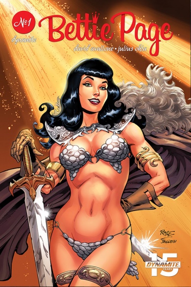
Avallone has crafted an adventurous, action-packed script with “Bettie Page: Unbound” #1. The story maintains its pace and remains engaging from the very first page to the last page one. “Bettie Page: Unbound” #1 is fast-paced and enthralling so much so that I did not even realize I was at the last page until there weren’t any more pages to flip! I was so engulfed in Bettie Page’s adventure that I could not wait to see what would happen next.
Interdimensional travel is nothing new in comics, but Avallone deviates a bit from the usual in “Bettie Page: Unbound” #1. Although Bettie Page has no idea what her mission entails, she springs right into action anyway; and the story isn’t slowed down with the reader following along as she fumbles her way through how to accomplish the said mission. Instead, she just instinctively becomes a badass, all the while being victorious in every battle, which enables the story to move along more quickly.
Everything about the art is on point in Bettie Page” #1. Ohta’s line work is neat and remains consistent from panel to panel. His illustrations perfectly depict each leg of Bettie Page’s journey. Ohta is also a master at drawing facial expressions that showcase the character’s emotions well. It is uncanny how much the comic Bettie Page looks like the real-life 1950’s icon in “Bettie Page: Unbound” #1; but what is most impressive is that Ohta illustrated unique faces and hairstyles for the lesser characters as opposed to generic, repetitive features. Even the level of detail and variation of the skeleton army is surprising. Moreover, Wright’s color choice compliments the script. The variety of gold, red, and blue hues – albeit in dull tones – add to the playfulness of the script.
Final Verdict: 8.9 – “Bettie Page: Unbound” #1 is the beginning of a fun, thrilling, and wild adventure.
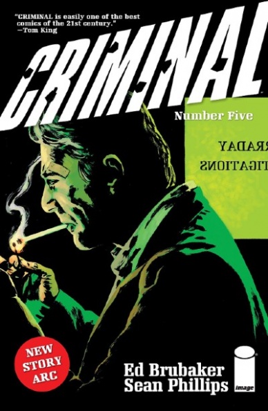
Written by Ed Brubaker
Illustrated by Sean Phillips
Colored by Jacob Phillips
Lettered by Sean Phillips
Reviewed by Niklynn Dunn
“Criminal” #5 by Ed Brubaker and Sean Phillips is a comic worth your $3.99. It’s a dense book. Not in the sense that it’s boring, but in the sense that there’s a lot on each page. The dynamic panel layout is what gives this comic that hefty feel. And even when it’s just character’s talking and you just see their faces, Sean Phillips’s art and Jacob Phillips’s colors have a way of sucking you into the world. The art with Brubaker’s dialogue grabbed me immediately from page one and made me feel like I was alongside Dan Farraday, the “good detective,” looking for a mysterious woman in a dim lit bar.
Continued belowOne of the best things about Phillip’s art in “Criminal” #5 is the facial expressions on each character. Facial expressions are key when you are being led through a murky, sneaky world like “Criminal. You don’t know who to trust in the “Criminal” world or the character’s intentions and each facial expression given by Phillips has something to tell the reader.
Storywise, on paper it’s similar to other crime stories told by Brubaker but nonetheless compelling. Why change the formula when it works so well?
A lot of Brubaker’s characters want to help the beautiful woman in trouble and the P.I. Farraday, who we are introduced to for the first time in “Criminal” #5, is no different. We see why he wants to help an ex-mistress and what’s interesting is that Farraday might even be an okay guy (for a character in “Criminal”). That’s if something isn’t eventually revealed about him. And the cliffhanger will send shivers down the spines of the hardcore “Criminal” fans out there. Though that’s not to say that a new reader couldn’t enjoy this issue. The brilliance of most “Criminal” arcs and “Criminal” #5, the beginning of ‘Cruel Summer’, is that its new-reader friendly.
Overall it’s simple if you’re a fan of the crime genre and comics you have got to be reading “Criminal.”
Final Verdict: 9.0 – You should buy two copies of “Criminal” #5. One for you and one for the person you know who loves reading crime novels.

Written by Tom Taylor
Pencils by Trevor Hairsine
Inked by Stefano Guadiano
Colored by Rainier Berendo
Reviewed by Matthew Blair
Despite not being a zombie story, and “DCeased” #2 is quick to point out that these virus-infected, flesh-eating, feral humans are totally not zombies, it certainly understands what makes them effective.
This story isn’t about the blood and gore, although there is plenty of that, it’s about the people who are left and the relationships they form while in the midst of horrific tragedy. Writer Tom Taylor has not only created a scenario that is truly apocalyptic and overwhelming for even the most powerful heroes, but he also balances it with some great little character moments that are both touching and heartbreaking. There are some great callbacks to DC’s history, such as the relationship between Joker and Harley Quinn along with Green Lantern and Green Arrow, but the highlight of the book is a conversation between Bruce and Damian Wayne that will probably make you cry.
The artwork of “DCeased” #2 has a soft and gentle feel to it that strikes a good balance between the horrific gore and violence and the quieter character moments. The not zombies look especially vicious. Furthermore, the pencils combine with the inks and colors to give the book a beautiful painted look that might turn some readers off by looking a bit blurry, but it’s still very effective. The only gripe I might have with the book is that the panel layout is a bit dull, but even then it allows the artwork to breathe and does a good job of avoiding any confusion over what’s going on in the story.
“DCeased” #2 is a very strong second issue that has plenty of great character moments that new readers will enjoy and longtime fans will appreciate coupled with beautiful artwork that is both sweet and terrifying. Highly recommended, and I can’t wait to see what happens next.
Final Verdict: 9.0 – A touching look into some of DC’s most famous relationships set against the backdrop of an overwhelming and horrifying apocalypse.
Written by Christopher Priest
Penciled by Fernando Pasarin
Inked by Ryan Winn
Colored by Jeremy Cox
Lettered by Willie Schubert
Reviewed by Alexander Jones
When “Deathstroke” tied in with “Teen Titans” for ‘The Terminus Agenda,’ readers hoped for the best. I hardly think anyone knew quite how important the crossover would be for the future of Slade Wilson. “Deathstroke” author Christopher Priest does a great job showing the fallout from the previous storyline while building layers upon layers of complicated plot developments from the title. “Deathstroke” #44 is an ambitious chapter that spins a spider-web of ideas together from past issues seamlessly.
Continued below“Deathstroke” #44 spins a narrative built directly upon the fallout from ‘The Terminus Agenda’ while seeding even more elements from past issues into the plot. Due to the involvement with the Legion of Doom, this installment does a good job adding elements from the core “Justice League” series into the fold. Due to the high amount of other titles referenced, it is admirable that “Deathstroke” is able to retain a strong sense of identity. The cast of “Teen Titans” even joins the crowded script for a few charming pages.
Artist Fernando Pasarin adds a lot of detail to the narrative. “Deathstroke” requires a lot of emphasis on detail with all the different cast members on-panel. Pasarin follows in the tradition of previous series artist Carlo Pagulayan with an incredible level of consistency. Pasarin creates impressive layouts in the issue and captures a couple of great sequences filled with motion. There are lots of pages loaded with panels that amp up the tension of the series. Pasarin breaks up character reactions into pages that have 12-panels. Even the pages loaded with panels are packed with detail.
The creative and self-reflexive nature of “Deathstroke” #44 is a thrilling tapestry of continuity. Loyal readers are treated to some of the most complicated storytelling on the shelf. There are an absurd amount of heroes and villains in the DC Universe colliding into this one story. On top of being a tightly plotted comic, “Deathstroke” #44 is creative, dramatic and funny.
Final Verdict: 8.0 – “Deathstroke” #44 melds recent DC continuity with the irreverent and bleak tone of past installments with great effect.

Written by Stephanie Phillips
Illustrated by Evgeniy Bornyakov
Colored by Lauren Affe
Lettered by Troy Peteri
Reviewed by Christa Harader
“Descendent” #2 puts in some work to try and flesh out its main mystery, with mixed results. With two ominous cult scenes in this issue, including a second that re-treads the threat of the first, it’s hard to take the mystery very seriously. Phillips is working with some interesting ideas, but there’s not enough here yet to sell the symbol or David’s conspiracy theories. Having a character exclaim that our protagonist must die twice in one issue feels tacky in the wrong way, and the tension built by the otherwise methodical storytelling dissipates pretty quickly after that.
Bornyakov’s art doesn’t stray too much from realism, with a hint of cartooning in the slender character builds and facial expressions. The cemetery splash feels superfluous with all the action crowded into the right side of the page, and Phillips and Bornyakov might have paced out that scene a little better by using a panel layout to isolate moments instead of dwarfing the characters with the landscape. Affe’s color work is decent, though the comic feels far too bright for its sinister premise, and Peteri picks a font that supports David’s ramblings and the slightly unhinged nature of reality in the book.
Overall, “Descendent” has an interesting premise, but there’s not much on the page after two issues to build interest or to distinguish this book from the herd.
Final Verdict: 5.5 – “Descendent” #2 overshoots the mark on sinister and ends up deflating the work it’s trying to do to drive its story.
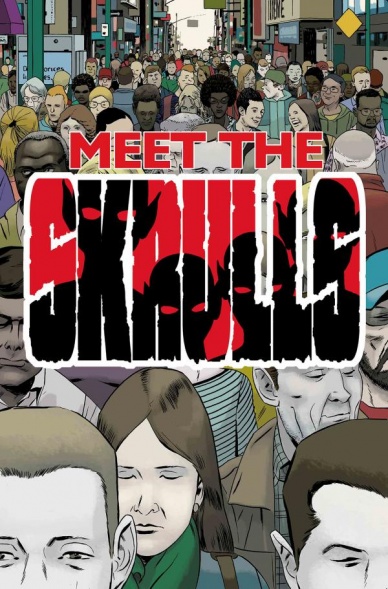
Written by Robbie Thompson
Illustrated by Niko Henrichon
Colored by Laurent Crossat
Lettered by VC’s Travis Lanham
Reviewed by Gustavo S. Lodi
The Skrulls have been around the Marvel Universe for decades, and their shape-shifting abilities have lent themselves to a number of situations and events, from morphing to high-powered individuals, to become a race of coordinated invaders. The mini – that now wraps – by Thompson, Henrichon, and the team took a more minimalistic approach to them, through the guise of spies on more focused missions.
There is plenty to appreciate about this issue and series. By choosing to frame the story on a family cell, the creative team was able to show their bonds growing stronger, to the point it breaks the larger racial trapping and mission they were assigned with. On the downside, and this does not come without some irony, characters look too much the same, making it harder to distinguish them from panel to panel. Maybe an unintended effect of the characters, but one that takes away from the narrative, rather than adding to it.
Continued belowStill, this final chapter works mostly on the positive side, with Henrichon and Crossat delivering both on quieter moments and the few action sequences. As a mostly covert operation type of book, the duo had to be inventive to turn talking pages into dynamic offerings, and they do so through creative page and panel layouts, and some choices of lightning and how close or far apart the camera is.
While by no means groundbreaking – the espionage genre has produced better stories on other medias – this go at the Skrulls from this angle deserves praise. Hopefully there will be more of them on this style in the future, as it opens doors to a number of discussion topics, from how single personalities can emerge from this type of society, the adversarial wishes that come from personal goals versus group ones, and how family bonds can grow from the most unexpected places.
Final Verdict: 7.5 – While not without its flaws, “Meet the Skrulls” #5 ends the mini-series on a positive note and should generate anticipation for future entries on this story.

Written by Gerry Duggan
Illustrated by Mike Deodato Jr.
Colored by Frank Martin
Lettered by VC’s Travis Lanham
Reviewed by Beau Q.
“Say what you mean, mean what you say.” Surely, this is the creative team’s mission statement, nay, mantra. When a book is named “Savage Avengers,” a book must exhibit the same eponymous qualities. Therefore, let’s examine what makes “Savage Avengers” #2 both savage and avenging.
Is it savage? Well, they’re in the Savage Land. Is there avenging? Several of the conflicts are tied directly to acts of vengeance, yes. But the book drinks deeply of its own thematic beginnings to truly live feral and untamed. Deodato Jr, no stranger to dark murder-misfits, depicts this wild realm where thicc conquerors and bubs gore as much as get gored by prioritizing his layouts to feature a singular moment every page, followed by the fallout. Think Frazetta covers as interiors rather than aping Windsor-Smith’s approach. Where some may see a mess, others will feel Deodato Jr’s heavy hand behind the chiaroscuro adorned 3D backdrops. In lesser hands, this graphic style could look sterile, static, but that’s not the case given Martin’s brushwork, which adds dynamic texture to every visceral moment, and him to my ever-growing list of colorists to watch out for.
Of the many violent moments within “Savage Avengers” #2– and, if you’re reading a book with that title, that is exactly what you’re paying for– Wolverine performing a medical procedure stands as a concise metaphor for this entire assembly arc– a return to violence albeit through trench mentality. Duggan, a seasoned “Deadpool” writer, also affects his trademark black humor in a scene we can only describe as “Punisher has an explosive BM.” Add in a penchant of Cimmerian blood fantasy, ambitious E. Howardesque narration, and an unerring need for everyone to be screaming, gored, and thrashing, then you get a book that not only bellows savage vengeance but absolutely follows through with the punch.
If the phrase, “say what you mean, mean what you say” wasn’t hanging above the creative team’s wicker beds, carved into an old tree stump when they set out making the book, then by the end of “Savage Avengers” #2, it will be.
Final Verdict: 8.1 – If you want to see Wolverine perform surgery and Conan smash a blood priest over the head with…*reads notes*…a Venom, then that is what you will see

Written by Gail Simone
Illustrated by Paolo Villanelli
Lettered by VC’s Joe Caramagna
Colored by Edgar Delgado
Reviewed by Michael Govan
One of my favorite Thor bits is when the Asgardians misunderstand modern society. You know, when Thor calls e-mail an electronic letter or in Avengers when he refers to Agent Coulson as ‘Son of Coul’. In this issue, that sort of misunderstanding gets Tony attacked by a dragon. His armor is probably not literally made out of iron but Malekith assumes it is. He’s nicknamed the ‘Golden Avenger’ and that’s enough for the dragon, Sandurang, to attack in search for his treasure. I don’t know why I find that mix-up so hilarious but it makes me chuckle.
Continued belowWriter Gail Simone isn’t exactly a comedic writer there’s always solid humor in her work. I enjoyed seeing the bromance between Tony and Rhodey, an often overlooked relationship in my opinion, and the bit about the cat donning armor is just fantastic. Sandurang is a delight as well. The dragon is just so extra. He threatens to use Rhodey’s skull for a toilet and offhandedly mentions that he took Agamatto’s other eye. He’s pure evil and campy in the best way. Paolo Villanellli’s art helps him look very menacing too. Sandurang is an imposing figure, to be sure.
I will say that I didn’t much care for Tony’s inner turmoil throughout the issue. In the virtual world, Tony drank alcohol. It’s certainly an interesting concept, whether that actually counts or not, but the execution hasn’t gripped me so far. Neither has the idea of Tony being a copy or ‘clone’ of the original. I don’t dislike the ideas but I am indifferent to how it’s playing out so far, an issue since it’s the focus of the book. Still, overall a pretty fun and enjoyable issue.
Final Verdict: 7.5 – Choose your superhero nickname more carefully next time, Tony.

Written by Robert Kirkman
Illustrated by Charlie Adlard
Colored by Cliff Rathburn
Lettered by Rus Wooton
Reviewed by Gregory Ellner
From the perspective of a reader who became disillusioned with “The Walking Dead,” or at least its adaptations, “The Walking Dead” #192 came as a surprise. Yes, it is the end of the fourth compendium, each of which collects eight of the six-issue volumes, and wraps up a major arc with a shocking moment, but, despite knowing it had to come eventually, this particular one still rang true.
Following the already surprising conclusion to #191, Kirkman makes ample use of the pages with a very long stretch of silent panels. Everything has been leading here, and the silence is golden, showing just how traumatic the experience is that it would be too much for mere words. That said, the event itself is rather anticlimactic… and that is the point. After all, not everyone gets a grand finale, and there are no exceptions to this rule. Only three words can be said for it all without spoiling anything: Rest in power.
As always, Charlie Adlard and Cliff Rathburn work together on the artwork, considering the whole of “The Walking Dead” is a grayscale comic. Sebastian Milton’s actions are shown in two different perspectives, both from his with a full look at his body, and from the angle of his victim, with him in a silhouette against a bright doorway. Throughout the rest of the issue, there are various perspective shots, from a close-up of someone putting down a walker to wider shots of an entire community, to even a sequence of head-only close-ups of a great many cast members. Everything is leading to this moment, and the artwork, with its various angles and shading styles, from darkened hallways to brighter streets and an in-between for jail cells, clearly shows how hard a society can take the fall of a major figure, and how shocking said fall can be when it is suddenly revealed seemingly out of nowhere.
Final Verdict: 8.75 – A truly tragic end to a beloved character pays off because of, not in spite of, its own anti-climax. Not every hero has their grand finale, especially not in “The Walking Dead.”


