
There’s a lot to cover on Wednesdays. We should know, as collectively, we read an insane amount of comics. Even with a large review staff, it’s hard to get to everything. With that in mind, we’re back with Wrapping Wednesday, where we look at some of the books we missed in what was another great week of comics.
Let’s get this party started.
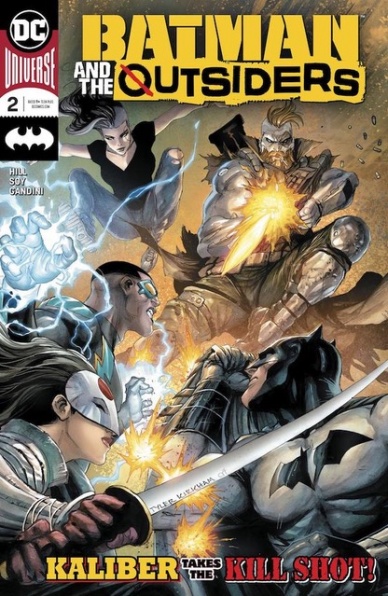
Written by Bryan Hill
Illustrated by Dexter Soy
Colored by Veronica Gandini
Lettered by Clayton Cowles
Reviewed by Gregory Ellner
“Batman and the Outsiders” is an oddly named book. It includes Batman, for sure, and he technically leads the team, but at the same time, it isn’t his book, but rather the Outsiders themselves. This statement isn’t to say that Bryan Hill’s writing is bad. In fact, not having Batman at the center of attention helps us to look deeper into his supporting cast, especially Black Lightning. However, if you’re coming into “Batman and the Outsiders” #2 looking for a Batman story, don’t assume anything of the sort.
Where Hill’s focus does lie is in the more traditionally supporting characters, and he plays them up to great effect. From Black Lightning to Katana to newcomers Kaliber and Sofia, everything has a distinct voice, and the way in which they interact with one another leads to intriguing, at times very comedic character moments. In a weird way, despite being only very newly introduced, Kaliber’s awkwardness, in particular, makes him into a key focus for reader amusement.
Dexter Soy’s artwork focuses in on the dark and the light, on deep shadows and how they can help to shape the three-dimensional nature of his penciling. The quieter moments, in particular, are rather detailed and realistic, but even the more action-oriented ones, such as someone gruesomely reattaching a lost arm, are relatable enough to make an audience wince.
Meanwhile, Veronica Gandini’s colors show distinct contrasts. From the disturbing green glow of Kaliber’s technology to the softer gradients applied to Sofia and the Outsiders and everything in between and beyond, the at-times haunting beauty of the Soy’s imagery really brings Hill’s script to life.
Final Verdict: 7.75 – With quieter moments and combat both, “Batman and the Outsiders” #2 continues to show why Hill, Soy, and Gandini are perfect for this book.
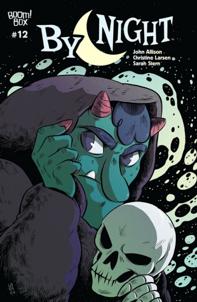
Written by John Allison
Illustrated by Christine Larson
Colored by Sarah Stern
Lettered by Jim Campbell
Reviewed by Elias Rosner
Can you believe Gardt was Darth Vader this entire time?! (Oops, some spoilers ahead.)
I kid, I kid. Obviously, that couldn’t happen because Marvel owns that license, not Boom. But, in reaching the end of issue #12, the same confusion and wonder at the ways the narrative has decided to diverge from the stated path evoked above were present…well, not quite the same. The twists in “By Night” made more sense and fit the narrative by making it more complex and satisfying instead of for cheap shock value or a joke and I’m off topic, aren’t I? What I’m trying to say is that “By Night” #12 managed to stick the landing despite all signs pointing to it having to be rushed.
There was too much to wrap up in issue #11 and, from where it appeared to be headed, not nearly enough pages to adequately cover it all. Instead, the crew used the tone of the story to subvert the inevitable battle and give us a finale and a denouement in one issue that felt true to the characters, earned for the story, and left the world open enough to return again. It also had a nice undercurrent of 70s/80s PG darkness that compliments the dry humor.
It’s nice to see comics that contain death and darkness and monsters that remain impactful and palatable to a wider age range. The story does not revel in the blood and gore thanks to Larson’s simple style and Stern flat coloring, which abstracts the horrific, such as the skeleton leaving Gardt’s body behind or the bloody bathroom body, keeping it sinister without the accompanying terror. The levity of the dialog helped with that as well.
Continued belowI also have to talk about Larson’s ability to fundamentally change the look of a character without making them unrecognizable or too similar to before. The way they hold themselves, their dress, and even hairstyle and face shapes, it all shifts as befits the time skip, simulating both their new maturity, or at least confidence in who they are, and how much one young person can change in a year, especially after not seeing the incremental changes.
While I still desire more resolution for, and exploration of, the otherworld, this was the perfect conclusion for Jane and Heather’s story as well as the town itself.
Final Verdict: 7.8 – By forgoing the set-up that issue #11 neatly delivered to it and instead providing us with a less neat but more satisfying conclusion, “By Night” #12 shows its roots in PG sci-fi films of the 70s and 80s and solidifies the quality of the series as a whole.

Written by Magdalene Visaggio
Art by Corin Howell
Colored by Valentina Pinto
Letters by Zakk Saam
Reviewed by Matthew Blair
“Calamity Kate” #4 is a sad story, but an interesting one. Writer Magdalene Visaggio has a very natural and human writing style and gives the reader a monster hunter who is incredibly capable but is also broken and exhausted. The issue is laden with small moments that are dripping with emotion that make Kate very relatable and the final fight scene with a vicious rival monster hunter is brutal and hard to watch. However, while this more natural style of writing may make the characters relatable, the lack of exposition or any type of summary talking about the previous issues will leave new readers lost and confused.
Just like the writing, the artwork in “Calamity Kate” #4 excels in the small moments. While the backgrounds and large establishing shot panels lack detail, artist Corin Howell excels at drawing characters, especially their feelings and emotions. The last shot the reader sees of Kate shows her sitting on the sidewalk of an airport terminal with her head in her hands and openly weeping. It’s a fantastic emotional moment that reminds the reader that you don’t need a lot of words to make a good comic.
As a standalone story about a broken warrior being forced to leave and say goodbye to people she loves, “Calamity Kate” #4 is good. However, as the final issue in a larger story, the comic is confusing and is probably not the best choice for first-time readers.
Final Verdict: 5.2 – A bittersweet ending to a storyline that has some good character moments, but if this issue grabbed your interest you’re better off getting the first issue or waiting for a trade.

Written by Peter J. Tomasi
Illustrated by Brad Walker
Inked by Andrew Hennessy
Colored by Nathan Fairbairn
Lettered by Rob Leigh
Reviewed by Vanessa Boney
Tomasi’s “Medieval” arc in Detective Comics is one of the best Batman and Robin team up stories in a while. It is truly a must read for any Batman and Robin fan. The synchronism of this father and son duo is enthralling; add to that Damien cracking a couple of jokes here and there and you’ve got a fun read. Also, there is no shortage of bat-gadgets in “Detective Comics” #1005, which is always a good time.
It is satisfying to see a villain who keeps Batman on his toes, and the introduction of the Arkham Knight is a much-needed one to spruce up Batman’s rogues’ gallery, but the conclusion to her arc in “Detective Comics” #1005 is undesirably anticlimactic. The Arkham Knight is defeated pretty easily, and the final showdown between the Dark Knight and the Arkham Knight is lackluster at best. While her wanting to be the contrasting light to Batman’s dark is executed well and understandable, her reasoning for blinding the entire population of Gotham as a means of purging them of Batman ultimately didn’t make much sense.
Although the script has its faults, the art is solid throughout “Detective Comics” #1005. Fairbairn’s colors do well with capturing the gloomy setting that surrounds our heroes and stays true to the dark, muted tones of Batman comics. Leigh’s letters are bold when they need to be, which impeccably emphasize the action panels, and Hennessy’s inks are on point.
Continued belowIt is evident that Walker really took his time, as the level of detail in almost every panel in “Detective Comics” #1005 is near flawless. The menacing look on Batman’s face whenever he is in a sticky situation efficaciously emotes his frustration and determination to save Gotham. Walker is also masterful at illustrating beautiful silhouettes that maintain detail. Batman’s muscular arms and Robin’s slender frame lose nothing in these specific panels, and their costumes remain distinct from head to toe.
Final Verdict: 7.0 – “Detective Comics” #1005 is a bit of a mixed bag, but an overall good comic worth picking up if not only for the amazing artwork.

Written by Joshua Williamson
Illustrated by Howard Porter
Lettered by Steve Wands
Colored by Hi-Fi
Reviewed by Michael Govan
I’m getting a bit tired of origin stories. Well, that isn’t entirely true. I enjoy new origin stories of new characters, such as the mystery that has been unfolding bit by bit within the pages of “Naomi”. I also really like ‘lost tales’ of established characters such as “Inhumans: Once and Future Kings” or “Rise of the Black Panther”, provided they bring something new to the mythos. When ‘Flash: Year One’ journeyed to the future, it felt like something new and unexpected. It would have been great to see Barry stay in the future for a bit longer, maybe even training under his future self. However, now we’re back in the present and familiar origin story territory.
It’s like watching Thomas and Martha Wayne get shot for the umpteenth time or watching Krypton explode yet again. It’s been done before and often at that. Maybe not to the degree of Batman or Supes, but we’re definitely very familiar with Barry’s secret origin by now. It’s hard to keep interested, frankly. In this issue, there’s a lot of ‘this familiar character’ before they were ‘famous’, so to speak. The stakes are really low and readers know very well that the Flash isn’t actually in any danger. The final page revealing he’s been shot falls flat. He’ll be healed up in a few hours, no doubt.
The artwork feels familiar as well, though in a good way. Howard Porter has drawn issues of “The Flash” before, albeit when Wally West was the Scarlet Speedster. His style is a good fit for action-packed superhero comics such as this one. He does a good job of capturing Barry’s super-speed and I particularly enjoyed the montage panels showing Flash in motion. Still, his work isn’t enough to completely buoy this issue.
Final Verdict: 5.5 – Please flash forward to something new…
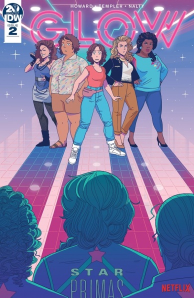
Written by Tini Howard
Illustrated by Hannah Templer
Colors by Rebecca Nalty
Lettered by Christa Miesner
Reviewed by Kenneth Laster
Comic Book Tie-Ins for live action properties are always difficult to nail down, but the team of Tini Howard, Hannah Templer, Rebecca Nalty, and Christa Miesner manage to create a story that feels genuine to GLOW and perfect for the comics medium. Howard’s script prompts a challenge the Gorgeous Ladies of Wrestling not only in their physical prowess but in Ruth’s assumptions on the solidarity of women in wrestling. The Star Primas offers an excellent foil for our titular protagonists as they make very clear they are not actresses and do not take kindly to having to lighten their craft as to not destroy the GLOW team.
Templer’s art walks an excellent balance between cartoon and likeness. Every depiction of the main cast resembles their live-action counterparts even as expressive stylized versions of them. Templer’s cartooning is excellently suited to Howard’s script as she expertly executes a number of gags without a hitch such as Melrose being showered in beef jerky or Sam’s understated “No,” when asked by Jenny to wrestle. Howard also does her place in capturing the likeness of the characters through behaviors and dialogue. Through Ruth’s earnest attempts to befriend the Star Primas, three times, Melrose’s overwhelming thirst for men, and Carmen’s wholesome wrestling with Desdemona before learning her big secret, Howard gets at what makes these characters fun to watch and translates that excellently to the comics arena.
Continued belowThese scenes get at how well the team has adapted these characters for comics. Each character is exaggerated just enough for us not to ask why this shouldn’t just be an episode of the show. The GLOW creative team does excellent work at understanding what makes these characters tick and creating a fun, vibrant comic that should satisfy fans waiting for a new season or just wanting to see their favorite Gorgeous Ladies of Wrestling in a new adventure and in a new medium.
Final Verdict: 8.0 – GLOW #2 is a very solid comic entry that continues a fun and interesting story that captures the voices of the characters of the show while adding an energy that can only be done in comics.
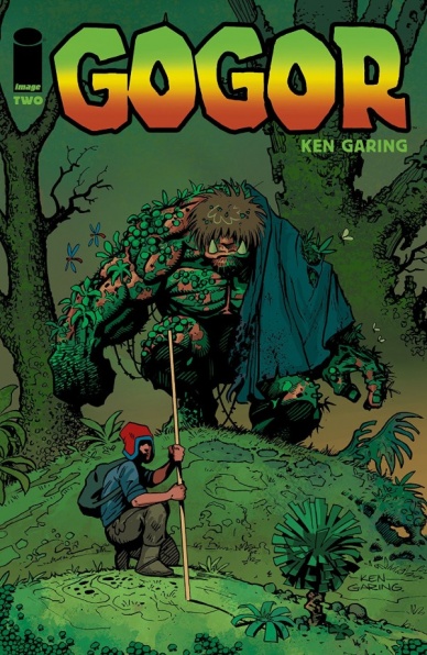
Written and Illustrated by Ken Garing
Reviewed by Shamus Clancy
In a comic book landscape of Swamp Thing and “The Immortal Hulk,” do-it-all creator Ken Garing is putting his own twist on the classic monster story with a more light-hearted, fantasy work in “Gogor.” Gogor, pronounced “gaw-gore” by the earthy being itself, has an underbite worthy of immediate orthodontic care and a gentle giant quality that separates it from the traditional monster fare.
Like its debut issue, “Gogor” #2 is heavy on exposition and world-building. The plot at this stage is still a bit too early to judge despite being a little formulaic: a militaristic, police-like force is taking over the homeland of Armano, the protagonist and archetypal farm boy hero of “Gogor.” Garing subverts some of those norms that could’ve otherwise come off as cliches with the inclusion of Gogor, who demands more page time and remains Armano’s best hope to free his people. The backstory is certainly necessary to construct a gripping comic book universe, but “Gogor” could benefit from a tad quicker pacing that highlights readers’ new favorite monster to a greater degree.
Garing’s penciling, while superb when depicting Gogor and other creatures (that reptilian-dinosaur humanoid leaps off the page and into my wildest imagination), could use a little more consistency overall. Armano can look different from panel to panel on the same page with differing jawlines and facial structures. Garing is certainly going for a streamlined, simplistic approach to his line work and he often hits that mark, but there is potential for something greater.
Continuing his work as a one-man creative team, Garing uses a lush color palette to produce a serene, pastoral setting throughout “Gogor,” invoking memories of iconic fantasy settings such as The Legend of Zelda and Super Mario 64. It makes for a welcoming contrast in a book based around the titular beast, which could have otherwise fallen prey to doomy and gloomy (think lots of greyscales) horror tropes.
“Gogor” is still building up its own mythology, but the pairing of Gogor and Armano has buddy cop movie written all over it, leaving it a worthwhile series to continue exploring.
Final Verdict: 7.2 – “Gogor” is heavy on fantastic beasts and fun, but needs to find a hook for readers in Gogor and Armano’s adventure going forward.

Written by Joshua Dysart
Illustrated by CAFU, Diego Yapur
Colored by Andrew Dalhouse
Lettered by Dave Sharpe
Cover illustrated by Mico Suayan, Ken Lashley, Nen Chang
Reviewed by Grace Taylor
“The Life and Death of Toyo Harada” #4 dives right into the action, with Toyo Harada’s most faithful band of PSIOTs fighting to save their main headquarters from Anti-Harada Operatives. Dysart really lets the supporting characters shine here as Ingrid, Gravedog, Mech Major, and LV-99 are forced to save not only the headquarters but Harada’s entire global mission. The firefights and explosion sequences by CAFU and Yapur pull us directly into the battle. I particularly enjoyed the back and forth psychic communication between Ingrid and Gravedog. We can almost feel Gravedog’s pain as his new brain implant malfunctions.
The standout among the characters in this issue is Angela Vessel. Literally, a vessel as the character’s body is a host for an interdimensional biological entity, she proves to be a ruthless but brilliant enemy. CAFU and Yapur’s choice to not give Vessel eyes makes her more unsettling and inhuman. Also, the Thing-like parasite she uses to communicate with Kozol’s forces will leave you disturbed for days.
Continued below“The Life and Death of Toyo Harada” #4 also continues to highlight the philosophical depth of Dysart’s writing. The flashback of Harada and his compound followers during the 1960s is a fitting setting for the psychedelic trips that consume Harada’s mind. Dalhouse’s choice of colors during these sequences provide great insight into his feelings and nightmares. As Harada forgets his past, we see a rainbow of explosive euphoric hallucinations; he is spiritually free. However, as he is haunted by his past and reality, the images in his mind turn bloody and violent – he cannot escape the inevitable pain.
We see a pattern of Harada abandoning and traumatizing his followers to pursue his dream of global peace, and both timelines in this issue do not prove any different. He has created a war to end all wars and is causing the suffering he once sought to avenge. However, like his followers, we are left with hope as Harada’s intentions are good overall, and we empathize with his desire to protect victims of war, much like his family. Will his team succeed in achieving his goal? I certainly intend to stick around to see if they will and I highly recommend that others do too.
Final Verdict: 8.9 – “The Life and Death of Toyo Harada” #4 pushes toward an exciting and high-stakes climax of the series but maintains the philosophical depth that goes hand-in-hand with its complex, god-like protagonist.

Written by John Layman
Illustrated by Afu Chan
Colored by Afu Chan
Lettered by Pat Brosseau
Reviewed by Niklynn Dunn
“Outer Darkness” is back! And I’ll be honest, I always meant to read this series, but never did until now at #7. And that was a big mistake on my part because from what I can tell from “Outer Darkness” #7, this series is something worth reading. A haunted house in space? SpaceCrew drama akin to something you would see in Star Trek or Mass Effect? I want to know more. “Outer Darkness” #7 combines both sci-fi and horror in a wacky way only John Layman can and the story of this issue totes the lines of humor, drama, and monstrous horror well. All of this combined with the gorgeous, subtly creepy art by Afu Chan makes me want to pick up the first trade of “Outer Darkness” and furthermore continue following Joshua Rigg and crew monthly.
A big question I have about “Outer Darkness” is, why isn’t Afu Chan a bigger name in the comic’s industry? Because his art is fantastic. His cleaned-line art is simple, but also isn’t. Chan’s art is almost Frank Quitely-esque with a heavy animation influence if that makes sense. Plus, his monsters in this issue, seemingly inspired by Junji Ito and Alien, are awesome and are just interesting to look at. The flashbacks about the haunted house, though a different kind of nightmare fuel from sci-fi creatures, dialed up the horror aspect too. Chan’s art really gives this book its voice.
Overall, Outer Darkness #7 is a solid sci-fi horror comic that tinkers with the usual tropes while also bringing something new to the table. If you’ve been curious about Outer Darkness, I say pick up this issue.
Final Verdict: 8.5 – Let John Layman and Afu Chan be your guide to the unknowns of outer space.
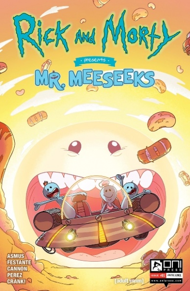
Written by James Asmus & Jim Festante
Illustrated by C.J. Cannon
Colored by Joshua Perez
Lettered by CRANK!
Reviewed by Chris Egan
Because apparently someone asked for this, Mr. Meeseeks felt like he had to deliver. What we get is a 30-page one-shot that starts with Summer asking a Mr. Meeseeks to help her with a chili recipe that quickly spins out of control as the Meeseeks travel to different worlds trying to answer the meaning of life…
As the Meeseeks go on their own adventure there are plenty of nods and callbacks to previous episodes and issues of “Rick & Morty.” Asmus and Festante write a pretty sharp, if slightly over-bearing, script. They hit some really clever and chuckle-worthy bits, and we see some new qualities in the weird blue titular creatures. They keep true to form with the in-depth life discussions and nihilism fans come to expect from this series. For as silly and funny as the story can be, it is a hefty story. Which is part of the joke. How do you seek the meaning of life in a single comic, even a slightly longer one, and keep it from either feeling like they glossed over the subject entirely or slogging your way through dialogue and exposition?
Continued belowIt always seems difficult to translate an animated series to comics. There seems to be a lapse not only in quality but in style. While it can be difficult to ask one artist to totally capture the style of another, it can be jarring to see major noticeable differences when it comes to cartoons as comic books. Cannon’s illustrations are as close to the animation quality as you can get. His work on facial expressions, especially on the Meeseeks are really great. They are all worth a smile and a laugh. And his eye for detailing this world is on point. The entire issue is full of little details and nods for fans to pick up on. Perez knocks the colors out of the park. He absolutely uses color to lift the work up the few times Cannon doesn’t quite manage to re-create the animation style.
Final Verdict: 6.5 – A fairly funny one-shot that lives up to the quality of a mid-range episode of Rick & Morty as a pair of spawned Meeseeks search for the meaning of life. It loses its balance more than once but does its best to course correct throughout.

Written by Doug Wagner
Illustrated by Daniel Hillyard and Adam Hughes
Colored by Laura Martin and Adam Hughes
Lettered by Ed Dukeshire
Reviewed by Beau Q.
What begins as an intriguing premise of a monkey’s paw car in a noir world quickly devolves into poorly written female protagonists and some questionable mise-en-scène.
As a genre, noir comes with inherently problematic tropes for women combined with every character exhibiting their hamartia to cartoonish levels– “I wanted to say goodbye, but I’m not so good with my words, so I used a gun” and the like. So then what is inherently attractive about such a dour genre, and even still, The Ride: Burning Desire #1?
Noir comes with dramatic lighting to frame moments with enough tension to imply a knife being used to cut it. Where this issue fails is in slow-burning the visuals to append a turnabout in chiaroscuro use in later issues when the drama heightens, assumedly. Hillyard’s line art feels static amongst Martin’s neon tints, and far too sterile to make sense when the scenery changes to a gritty (?) police station. Hughes’ artwork features remarkable silhouette use in a scene that is restrained where the phallic pieces are concerned, but not as much where the, trigger warning, soon-to-be-victimized female protagonist, Kiri, is concerned. The careless approach in establishing Kiri as an interesting character is what qualifies as a “strong female lead” for only the lowest common denomination crime thrillers.
Aside from pure visual aesthetic at play, noir also seduces through complex conflict, which is not present in The Ride: Burning Desire #1 at least. Each conflict begins as Wagner inflicts and ends as wanted – there is less a nuanced teleplay of human emotion, of cause and effect on display, as there is a crime comic written in bare bones.
Final Verdict: 4.4 – This Ride gave me a Burning Desire to skip it.
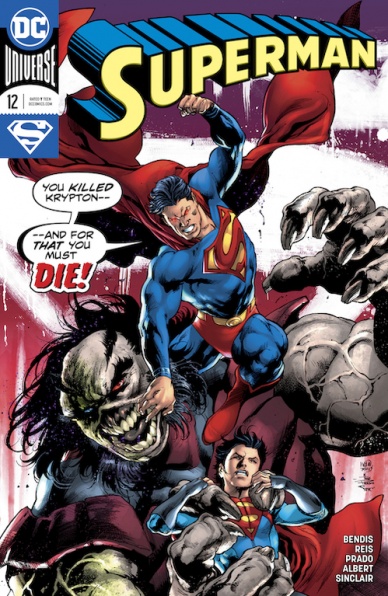
Written by Brian Michael Bendis
Penciled by Ivan Reis
Inked by Joe Prado and Oclair Albert
Colored by Alex Sinclair
Lettered by Josh Reed
Reviewed by Alexander Jones
DC’s monthly “Superman” title has a bad habit of meandering on the way to the finish line. The newest issue of the series, “Superman” #12 attempts to stitch the pieces of the narrative together with a surprising level of success. “Superman” #12 finally reveals the true meaning of ‘The Unity Saga’ to readers who have stuck with the series up to this point. While it is refreshing to see that author Brian Michael Bendis had a master plan in bringing a theme from the series together, it is disheartening to consider that it took so many issues to capture a small plot beat.
Even though “Superman” #12 has a bad habit of under-delivering on big promises, there are short moments which are well-written. It is interesting to see how Jonathan Kent’s relationship with Kara Zor-El and Clark Kent evolve starts to blossom. Bendis does a solid job fleshing out an interesting motivation for General Zod. Zod is provided a lot more context that better defines the role he plays in the narrative.
Continued belowThe artwork from Ivan Reis certainly makes the surroundings of the overall issue come off as epic. There are ambitious panel layouts and facial expressions that provide the issue with a bombastic feeling. However, the more muted approach to the coloring from Alex Sinclair holds the Reis art back from greatness. The traditional dark hues of purple and green do not compliment the pencils on the page. The scenes in Jor-El’s ship carry a boring green hue that imbues the scene with a sense of malaise. Reis depicts a lot of detail on each page of the issue. Reis draws a few solid splash pages that carry a lot of emotion and active body language.
“Superman” #12 is another compressed script that ties a lot of loose threads together. While it can be disappointing to point out how slow that plot of the title has moved over the past couple issues, “Superman” feels like it is back on course now. The motivation for General Zod finally adds some intrigue to the storytelling. Explaining and fleshing out the title of ‘The Unity Saga’ has given a stronger direction to the core “Superman” title.
Final Verdict: 7.5 – “Superman” #12 achieves a surrprising level of cohesion.
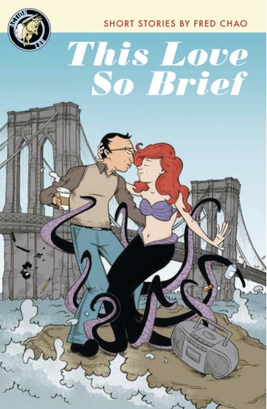
Written, Illustrated & Lettered by Fred Chao
Reviewed by Christa Harader
“This Love So Brief” collects several of Chao’s reflections on his love life in humorous vignettes, with good art and a keen sense of effective comics storytelling. Chao’s stories move like slice-of-life comics often do from one moment in time to reflections spanning his life, with one single instance thrown in to vary the book’s tone and pace.
Chao’s art is engaging and delicately cartoonish, with softness around the edges to capture his youth and his emotional states. His line is fine and precise with backgrounds often done in grays to help the foregrounded characters pop. In “3 A.M.” there’s some nice inking to sell the story’s quick hit of action and drama, as well. Lettering in “This Love So Brief” is as precise and gentle as Chao’s art, with a nice font that evokes a diary or letter format and tells us a bit about the character’s state of mind.
Though the book is autobiographical, Chao in the comic is a distinct character from Chao the creator, and the creator’s view of himself is poignant, touching and demonstrates a deepening understanding of his motivations over time. “This Love So Brief” is humorous and heartfelt at once, and makes for good comics entertainment.
Final Verdict: 7.5 – “This Love So Brief” is entertaining and expansive, with good art and solid craft in its storytelling.
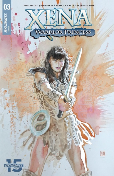
Written by Vita Ayala
Illustrated by Jordi Pérez
Colored by Rebecca Nalty
Lettered by Ariana Maher
Reviewed by Matt Ligeti
You probably know this already, but the “Xena: Warrior Princess” comic book is based on the TV series of the same name. Most seasons of that show had 22 episodes. Some of those episodes felt like filler. This issue felt like those episodes.
Don’t get me wrong – this is a quality comic, crafted by talented creators, and the score below is higher than it otherwise would be because of that. Vita Ayala nails the characters from the series so well, it’ll make you wonder if they studied the episodes with the character, Discord, in them as research. Ayala also gets new readers up to speed quickly and early on in the issue so well, you could almost start the series here.
Jordi Pérez also captures the spirit of the Xena: Warrior Princess TV series, but in an unexpected way: through camera angles and body language. The former is pretty self-explanatory, but it creates a virtually seamless experience going from TV 18+ years ago to the page. For the latter, Pérez captures the theatrical, exaggerated motions of the actors and brings that to the page. It’s a skill that suits Pérez’s style and pays off well for the comic.
Rebecca Nalty brings a new look to the book. Her colors bring the warmth of the sun and tropical plants, which is good since the issue takes place in Mexico. Many panels skip the background art, so Nalty’s vibrant palette, heavy with greens and blues, yellows and oranges, ends up being the central focus. The simplicity of the panels also works in Ariana Maher’s favor, giving her plenty of room to show off a variety of fun, organic sound effects through the action scenes. Also, her representation of an ancient, unknown language mixed with known words was a special treat.
As mentioned earlier, “Xena: Warrior Princess” #3 is an issue that is inarguably well-crafted. Ultimately, though, you probably have limited funds to purchase comic books, and you could most likely skip this issue without missing anything important in the series.
Final Verdict: 6.5 – Though well-executed, a low-stakes issue feels less like an adventure and more like a stepping stone to more important plot developments.


