
There’s a lot to cover on Wednesdays. We should know, as collectively, we read an insane amount of comics. Even with a large review staff, it’s hard to get to everything. With that in mind, we’re back with Wrapping Wednesday, where we look at some of the books we missed in what was another great week of comics.
Let’s get this party started.
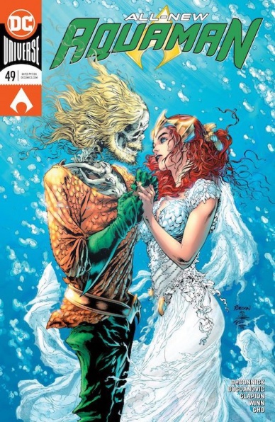
Written by Kelly Sue DeConnick
Illustrated by Viktor Bogdanovic
Inked by Jonathan Glapion, Daniel Henriques, and Ryan Winn
Colored by Sunny Gho
Lettered by Clayton Cowles
Reviewed by Alexander Jones
Writer Kelly Sue DeConnick began her “Aquaman” run back in December in issue #43. The first few chapters of the series featured an Arthur Curry stripped of his memory and purpose. “Aquaman” #49 reveals a couple of secrets that DeConnick has been hiding from readers for half of a year. Finally getting the chance to know what happened between Mera and Arthur’s relationship over the past couple of months is cathartic. DeConnick wisely adds even more tension with some of the revelations throughout the script. The plot of the issue finally has a sense of urgency added to Arthur’s main conflict.
DeConnick doesn’t abandon previous plot threads in the issue. The title retains a sense of mystery and oddly foreboding nature. I have been waiting for DeConnick to take the older aspects of the “Aquaman” mythology and meld them with some of her new ideas. This issue merges the two different tones surprisingly well. Each aspect of the narrative enriches the other. DeConnick carries a romantic tone as well, even depicting a few surprising sexual themes. The issue executes a bold, dynamic tone with action, mysticism, and romance.
The artistic craft has been set extremely high by penciler Robson Rocha in the initial installments of the title. While the art of Viktor Bogdanovic has been an asset to the series that carries the direction of former artists, it doesn’t quite match Rocha’s level of quality. Artists that try to match up too closely to styles that came before can be underwhelming. I would like to see Bogdanovic’s work in “Aquaman” be played specifically to his strengths as an artist. Bogdanovic’s pencils worked surprisingly well in a romantic context. DeConnick gives Bogdanovic the room to flesh out the scenes with less dialogue. The more relaxed body language shows the chemistry between Mera and Arthur.
Whereas previous issues were too obtuse, “Aquaman #49” finally finds the time to give readers a reason to emotionally invest in DeConnick’s narrative. “Aquaman” #49 melds two different eras of the title together seamlessly. While Bogdanovic’s pencils aren’t perfect, he carries the direction defined by Rocha and keeps the mysterious tone of “Aquaman” intact.
Final Verdict: 8.5 – “Aquaman #49” provides the subtext that will carry the title to a climactic anniversary issue.

Written by: Kyle Starks
Illustrated by: Erica Henderson
Lettered by: Deron Bennet
Reviewed by: Grace Taylor
“Assassin Nation” #4 is a great combination of humor, heart, and action. As more of Rankin’s team of assassins gets killed off, we get more attached to those who remain. The best part of the series continues to be the hilarious and vulgar dialogue between the assassins that clearly show the growing bond between the group. My favorite unlikely friendship is between the nerdy, whimsical Dave and burly manly-man, Fuck Tarkington.
The funny and sometimes emotional conversations between the characters really come through in Henderson’s art. Going back to Dave and Fuck, one of the funniest panels is when the two simultaneously point finger guns at each other to show “the power of friendship.” Similarly, the typically tough Trish showed her more girly side when she flashed back to her prom night. The pink, rosy hues of the panel backgrounds and the image of Trish in a beautiful blue Cinderella prom dress provided some levity to the more serious conversation surrounding their new assassination plan.
Along with humor, Henderson’s art doesn’t shy away from brutality – these are assassins after all. One of the more striking sequences of the book is a two-page spread of Maxwell Bishop’s flashback of the murder of his husband. Henderson takes us through the step-by-step trajectory of the bullet to his face, not sparing the gruesome explosion of blood and guts. The red color palette of the backgrounds and the shadowy figure of the person that shot him adds to the mystery and pulls us into Bishop’s nightmare.
Continued belowWhile Stark’s dialogue and jokes are his strengths in this series, engaging plot twists are not. The new development in “Assassin Nation” #4 was not surprising whatsoever. What is surprising to me is that none of these “pros” learn from their previous mission and continue to make the same mistakes. However, I am curious to see how the final confrontation turns out and which of these assassins manages to survive until the end.
Final Verdict: 7.9 – “Assassin Nation” #4 continues to excel with its action-packed sequences and character development. Although it falters a bit with plot momentum, it’s worth sticking it out for the final outcome.

Written by Leah Williams
Illustrated by Germán García
Colored by Addison Duke
Lettered by Crank!
Reviewed by Christa Harader
“Barbarella Dejah Thoris” #4 is our last foray into this delightful, heartfelt and exceedingly weird crossover and Williams and García nail their landing. The planet’s in peril and the two women must make a critical and time-sensitive decision to save it. Literally.
Williams doesn’t let up on the tenderness without sacrificing purpose or the forward thrust of the highly adventurous plot. There are enough zany detail and big, bold action to fit right in with both Dejah and Barbarella’s origins, and yet the relationship between the two women and the nature of life itself cuts through all the big set pieces like a subtle knife. There’s also no lack of humor, and García’s art is perfect for all occasions. His head-on shots of Dejah, in particular, are beautiful, and the big drain scene is wondrous, sad and a little frightening thanks to the scale at which we see it. Duke’s colors are gorgeous and as vibrant as ever, and Crank’s lettering keeps everything readable despite more dialogue from our incorporeal friend in this issue than the last.
“Barbarella Dejah Thoris” #4 is queer and tender while maintaining high-spot sci-fi adventure and old-school pulp storytelling. It’s a difficult marriage to achieve but Williams and the team do it exceptionally well. This mini is a real gem and should be on everyone’s shelves for a long time to come.
Final Verdict: 8.5 – “Barbarella Dejah Thoris” #4 wraps our short and high-action adventure with just the right notes of humor, sadness, and fun.
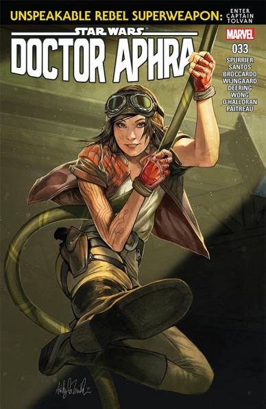
Written by Simon Spurrier
Illustrated by Wilton Santos, Caspar Wijngaard, and Andrea Broccardo
Colored by Chris O’Halloran and Stéphane Paitreau
Lettered by Joe Caramagna
Reviewed by Gregory Ellner
In theory, Simon Spurrier’s story he wants to tell through ‘Unspeakable Rebel Superweapon’ is a somewhat interesting one: the look in on the shady side of the Rebel Alliance. Unfortunately, despite some amusing moments from “Star Wars: Doctor Aphra” #33’s eponymous character, the second issue in the arc falls completely flat. On the one hand, we have Spurrier’s completely unsubtle writing, where not only is the officer’s rant gradually demonstrating him to be almost cartoonishly evil, but nearly every time he says something, another piece of a flashback at near the issue start plays over it, indulging in needless repetition that seems to almost insult the reader’s intelligence. On the other hand, we have the fact that nearly the entirety of the story is one massive infodump, one that is slowly laid out in a way that seems to just pad out the page count.
The entire issue’s story could have been told, and told well, in about half the pages, so the amount of decompression is extremely noticeable. The fact that this kind of “graying morals” concept was up in front for 2016’s Rogue One: A Star Wars Story (whose developments were mentioned in the series’s very first arc, no less), but is treated as a completely new development here just makes it worse.
A plethora of artists come to the table, from Wilton Santos, Caspar Wungaard, and Andrea Broccardo on pencils to Chris O’Halloran and Stéphane Paitreau on colors. They do a fantastic job of showing a breadth of emotion, especially in Chelli Aphra herself, but due to the sheer number, it’s difficult to tell who worked on which sections.
Continued belowFinal Verdict: 4.5- For an issue devoted to an ‘Unspeakable Rebel Superweapon,’ there seems to be quite a lot of speaking… and about things, including said superweapon, that logically aren’t that new as concepts in the first place.
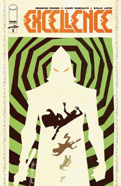
Written by Brandon Thomas
Illustrated by Khary Randolph
Colored by Emilio Lopez
Lettered by Deron Bennett
Reviewed by Shamus Clancy
While “Hogwarts meets Wakanda” remains the quick elevator pitch for “Excellence,” this issue begins extending the series beyond those parameters, as it starts to craft its own identity. “Excellence” #2 is a fitting release for the Wednesday after Father’s Day. The relationship between Raymond Dales and his son Spencer sit at the heart of “Excellence.”
Family trauma gets buried so deeply and held on to so strongly. Sins of the father become sins of the son. Writer Brandon Thomas understands that well, seamlessly putting readers in the shoes of both Raymond and Spencer, leaving them to reflect on their own parental or childhood responsibilities along the way. To see this in speculative fiction, in this medium particularly, is rare and only makes “Excellence” that much more rewarding of a read.
In credit to both Thomas’s plotting and the linework of Khary Randolph, “Excellence” makes, well, excellent, use of non-traditional panel structure, which, on top of its already non-linear storytelling, creating a funky trip into a burgeoning mythical realm. Colorist Emilio Lopez is a standout in the art department as well. Whether it be his purples that illustrate the power and nobility of the ten famous magical families of The Aegis, trippy blues and greens that soar when wands begin to rise or stark black shadowing, Lopez ensures that world of the Dales family is anything but dull.
With a robust art team on task and Thomas spinning a refreshing fantasy tale, “Excellence” has the potential to reach glistening magical heights while also staying steeped in grounded family drama.
Final Verdict: 8.1 – If “What if Erik Killmonger and T’Challa fought at the Ministry of Magic?” doesn’t hook you, I don’t know what will.

Written by Brian Azzarello
Illustrated by Maria Llovet
Lettered by AndWorld Design
Reviewed by Matt Ligeti
With “Faithless” #3, the cover tells you everything you need to know: this is basically a series about sex and Satan.
Fine, it’s more complicated and nuanced than that. But “Faithless” #3 is when the story starts ramping up, and for new readers just coming to the series here, it feels like that popular GIF from Community where Troy comes back to the apartment with a stack of pizzas only to find chaos and flames.
Maria Llovet’s art brings a chaotic world to life in a style that feels intentionally made to look rushed. It’s not a bad thing – far from it, actually. The line work is both disorderly and elegant, simple, yet detailed. It makes for beautiful pages, and Llovet must know it because she signs just about every other one.
The color application and sound effects (including some delightful and colorful musical notes in one scene), too, are charmingly, intentionally messy, matching the art style for an overall painted appearance. It’s tough to say whether we should credit Llovet or the unnamed letterer(s) from AndWorld Design for them, but they work well with the book’s tone. The hand-scrawled style of typeface and balloons that look hand-drawn fit right in with the artsy and asymmetric imperfection of the illustration.
Azzarello’s story will most likely be confusing to you if “Faithless” #3 is your first foray into the series, and unfortunately, it isn’t helped by Llovet’s character design. A few of the characters can look very similar, and though Llovet solves this by giving them different color hair, readers may get lost or puzzled unless they started the series at the first issue. Without a recap of events anywhere in the issue, it feels like a hodgepodge of nudity, demons, emotion, and very uncomfortable moments without context to anchor any meaning to these things.
“Faithless” is likely a very good, sexy, and demonic drama, but to enjoy it, you’ll need to start at the beginning of the series or wait for the trade. Otherwise, you’re just walking into chaos and flames.
Continued belowFinal Verdict: 6.5 – “Faithless” #3 makes for a solid, if niche, comic, but only if you’ve read the first two issues.
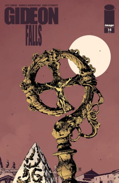
Written by Jeff Lemire
Illustrated by Andrea Sorrentino
Colored by Dave Stewart
Lettered by Steve Wands
Reviewed by Your Niklynn
“Gideon Falls” #14 continues what is one of the best comic book series on the shelves. In this issue, Jeff Lemire and Andrea Sorrentino zig-zag us through the future, past, and present, revealing answers to lingering questions while, like any good mystery, adding to the enigma that is “Gideon Falls.” The plot is thickening.
As far as the art in the book, Andrea Sorrentino continues to outdo himself. His panel layout in “Gideon Falls” #14 is crazy but easy to follow. Each panel and part on the page feels like a piece of a puzzle and that’s fitting because the plot is fragmented. The story is presented in bits and pieces at a time in “Gideon Falls” #14. In much of the issue, the layout grid of the book zooms in on the little parts, breaking down the bigger picture. And the tone presented by Sorrentino is pitch perfect. When Father Burke is disoriented, the art feels disorienting and when something is revealed, the art is on full display to show it’s important. Sorrentino is using every inch of the page. The last page reveal, formed in the shape of a cross, is haunting. I would be remiss not talk about Dave Stewart. His colors are icing on the cake. Stewart’s almost muted colors really help set the nightmarish tone of the book.
Overall, “Gideon Falls” #14 is yet another great chapter of “Gideon Falls.”
Final Verdict: 9.0 – A battle between good and evil is brewing.
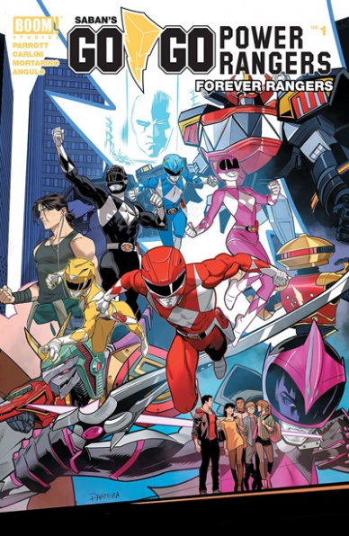
Written by Ryan Parrott
Illustrated by Eleonora Carlini, Francesco Mortarino, and Simona Di Gianfelice
Colored by Raúl Angulo and Katherine Lobo
Lettered by Ed Dukeshire
Reviewed by Beau Q.
Planned as a significant coda to the ongoing “Saban’s Go Go Power Rangers” arc, this double-sized one-shot fizzles where it should sizzle.
Crafting 22 pages of stellar art in a month is no ordinary feat, much less 40, so in order to land “Saban’s Go Go Power Rangers Forever Rangers” #1, Carlini, Di Gianfelice, and Mortarino share duties ending Rita’s final turning point and Alpha-1’s betrayal. Splitting the stylistic differences here would offer what “Saban’s Go Go Power Rangers Back To School” did in an interesting contrast between the climactic Zord battle and the denouement preceding “Mighty Morphin Power Rangers.” However, the book that makes it to shelves this Wednesday is full of inconsistent art– truly afraid of their stylistic differences rather than embracing them.
Carlini, Di Gianfelice, and Mortarino pen ambitious but lacking panel layouts marred by confusing panel content. Zord fights are not an easy feat to lay out or pace well. Kudos to the team for shooting high. Angulo, burdened to marry these pages, streamlined the art into one consistent, but wholly unstriking tone. Chalk it up to indecisive use of white gutter space during the climax and dynamic lighting shared between 4 different artists. Classic color
changing word balloons, homogenized in design, does help the wide-angle voiceover conversations.
Alpha-1, the plot twist antagonist for this arc, sees a neat, timely demise low on stakes and heat, absolutely ruining their searing heel turn in #20. In “Saban’s Go Go Power Rangers Forever Rangers” #1, our rangers reach a creative plateau fenced in by timeline continuity. Jason, Trini, Kimberly, and Rita see a much more dramatic end to their respective character arcs than the rest of the cast, though none of these stories share a note of finality, but rather of what to watch out for in the next season, as it were.
Final Verdict: 6.4 – Hope you didn’t like Alpha-1. Much more cleaning of the house than a coda, making room for the next crossover event in a one-shot rather than a 22-pager.
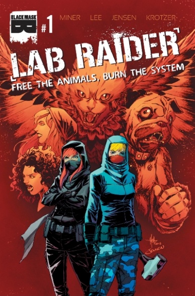
Written by Matt Miner
Illustrated by Creees Lee
Continued below
Colored by Josh Jensen
Lettered by Matt Krotzer
Reviewed by Chris Egan
What starts out as a run of the mill story of animal activists turns into a twisty path of mystery and horror. As Sarah and Jeanette are breaking into a lab to free the poor subjects of unknown experiments, the present day plot is intercut with moments from a year to six months prior showing how these two women started out as young activists and became something divisive. And that is where the higher quality of this comic comes from.
If this had just been a story of two women breaking into a lab and finding that these experiments were more than they expected, it would have just been a typical throwaway issue with nothing of note to keep readers interested. By Miner adding disturbing and satisfying backstory, it makes for an interesting read. It’s easy to understand and connect with these characters’ motivations, but their decisions are highly questionable.
Lee’s art style is reminiscent of pop-y anime with a dark side. It has the look of something you might find on Adult Swim which is nice to see. Jensen stays neatly in the lines and perfectly colors this book and moves scenes from realism to wild action and emotion with a gorgeous bright palette set against heavy, dark shadows.
Issue #1 works as both a story that could work on its own, as well as the beginning of something truly wild and bizarre.
Final Verdict: 7.5 – A quick and confident read,”Lab Raider” #1 carries multiple story threads that move between corporate sabotage and haunting thriller set to bright, beautiful art.

Written by Kelly Thompson
Illustrated and Colored by Veronica and Andy Fish
Lettered by Jack Morelli
Reviewed by Elias Rosner
This comic is so beautiful, y’all. The Fishes bring a vibrant, dark energy to the visuals of the comic, with saturated pinks and oranges melded with blues and purples, gradients and solids next to each other, creating a language of magic and wonder that deepens the world and the clashes between light and dark, between the mundane and the supernatural, between beauty and horror. Cartoonish abstractions, which break away from the fully realized and nuanced expressions elsewhere of Sabrina, help bring levity to the woods but the ominous nature of the art is never far away, creating a tension between the two that suits “Sabrina’s” many eras.
Issue #3 is, as most interstitial issues are, fairly light on story. There is the escape from the beast, the building of a romance and a friendship, as well as a host of mysteries that beg the asking of questions with only cryptic answers, but beyond this, we are left with a collection of character moments and the necessary work of building up the adventure that is Sabrina’s life. After two issues of re-introduction to the world and people, this issue was needed, even if it by the end, you’re left unsatisfied and wanting more.
Morelli’s lettering is joyfully varied, with the standard Archie Comics letters punctuated by spell captions that are white on black, with a thick, white border, as if the rules of the Earth are being twisted inside out to achieve the desired effects. And while this issue doesn’t seem to want to touch that particular topic, it does make sure to express the gravity of the situation Sabrina has found herself in, all the while retaining the fun and funny charm of the character that many are familiar with.
Thompson has captured a 2019 version of Sabrina, the teenage witch’s voice perfectly, something she has shown an aptitude for in all of her projects for Marvel and otherwise. It’s infectious, the joy and curiosity she exudes, a trait that is projected as much through the art as it is the words. The page that I think best captures this all is page 3, where Sabrina runs away from the multicolored-dragon/snake, coated in an invisibility spell, narrating and gloating to herself before she strikes her ankle on a tree root, alerting the beast, all the while her narration prepares to make the transition to the more tense, serious pages to come.
Continued belowIt’s an effective sequence and it might be the moment that has 100% sold me on this new comic. The previous two issues were good but somehow missing something and, while this issue is not perfect either, it’s just so fun and tense and delivers on all the aspects of “Sabrina” you could hope for without leaning too far into one of the many other takes we’ve had before (even if I do love the dire tone of the perpetually-on-hiatus “Chilling Adventures of Sabrina.”)
Final Verdict: 7.9 – “Sabrina: the Teenage Witch” #3 is fun, funny, tense, and everything a modern interpretation of the property should be, with the right balance of snark and darkness, and gorgeous visuals to match, even if the story itself is taking its sweet time.

Written by Paul Allor
Art by Adam Bryce Thomas
Letters by Christa Miesner
Reviewed by Matthew Blair
Full disclosure: I haven’t watched a lot of the Samurai Jack cartoon, but I have seen a few episodes from the early seasons and I like to think I have a fairly keen grasp of what the show is about and how it tells its story.
“Samurai Jack Lost Worlds” #2 is a functional and entirely unoffensive comic that feels like it could be a pretty good episode of the cartoon. Writer Paul Allor delivers a succinct and capable script for a one-shot comic that delivers a decently told story.
And that’s the problem.
The comic is so inoffensive and functional that it comes off as bland. There’s a pretty good message in it, but the message has been told a hundred times before in better stories. Now, it’s understandable that the comic wouldn’t want to take a lot of risks since it’s a licensed property, but it feels like there was a minimal amount of creative effort put into the script. It’s the kind of comic that would be good for younger readers and die-hard fans of the show, but don’t expect it to grab the attention of any potential new readers or fans.
As for the artwork, the big question that must be asked is does the art capture the appearance and essence of the show? The good news is that the art for “Samurai Jack Lost Worlds” #2 succeeds on both counts. Adam Bryce Thomas does a fine job of capturing the appearance and mannerisms of Jack and the supporting cast. The highlight of the comic is an eleven-page fight scene that has some good color work and tells a good story with minimal dialogue and solid action, something that the show did really well. However, just like the writing, the artwork is pretty simple, kind of boring, and a lot of the pages that aren’t taken up by the fight scene look rushed and cheap.
All in all, “Samurai Jack Lost Worlds” #2 is a decent comic that doesn’t take a lot of risks with its storytelling or art and is kind of forgettable. It’s a pleasant little one-shot story that young readers and fans of the show should enjoy.
Final Verdict: 5.9 – It’s fine. It won’t win any awards or become something that people talk about, but it’s okay if you like the show.

Written by Matthew Rosenberg
Illustrated by Salvador Larroca
Lettered by VC’s Joe Caramagna
Colored by Guru-eFX
Reviewed by Michael Govan
Not every mutant is going to be popular and cool like Wolverine. Marvel has a wide range of mutants lying around, some who fade into obscurity, some who are delightfully strange and weird. Personally, I have a soft spot for the likes of Beak and Maggott. More often than not, I appreciate when the underdogs of mutantkind step into the spotlight.
“Uncanny X-Men” #20 is not one of those times. It features the likes of the Nasty Boys, Shinobi Shaw, Trevor Fitzroy, and Fabian Cortez. Also…Psylocke but not Psylocke? I’ve always been confused by Betsy’s history, to be completely honest. It just feels like the title suffers a bit from constantly involving new, obscure characters. Remember this mutant? Remember that one? There’s a lot of that. Even the obscure mutants I like, here’s looking at you Marrow and Elixir, are reduced to hench-people or background characters.
Continued belowThe art is solid for this issue, to be fair. Salvador Larroca is a veteran X-Men artist, it’s always nice to see him drawing another title. The horror isn’t as captivating as in, let’s say, The Immortal Hulk but Shinobi’s death and zombie Banshee are fascinating to behold. At the same time, it’s not enough. The plot itself doesn’t feel terribly interesting. Characters act out of character to show that this is the ‘darkest timeline’ and the ‘end of mutants’ and all that. Spoiler alert: We all know it isn’t. Just like we all knew that Dark Beast would eventually live up to his name and do something shady. No big surprises. The one consolation is that Emma and Scott will be reunited soon. We’ll see how that goes.
Final Verdict: 5.0 – Hey, Hickman’s here in a month.
Written by Garth Ennis
Illustrated by Goran Sudzuka
Colored by Ive Svorcina
Lettered by Rob Steen
Reviewed by Vanessa Boney
“A Walk Through Hell” is very reminiscent of “The X-Files”, sprinkled with slightly more weirdness and horror. This series flew under my radar, and while I wasn’t completely enamored by “A Walk Through Hell” #11, I did feel a connection to the characters; particularly Shaw, and I am curious to discover what sequence of events lead them to this hellish point.
Ennis introduces puzzle piece after puzzle piece, jumping between past and present, taking the reader on a horrific ride with shocking twists and turns that ultimately lead nowhere, and give no clues as to how the sorry will end. “A Walk Through Hell” #11 delivers a stunning reveal, but there are still too many unanswered questions. With this being the penultimate issue, I expected more revelations and wanted more of a wind down to the story.
On the other hand, Sudzuka’s art is something to behold. The lines are clean, and even with the script moving from past to present throughout the comic, Sudzuka’s illustrations remain fluid from panel to panel. The flashback scenes have so much detail in comparison to the present-day scenes in the warehouse, which makes sense, as the warehouse is our characters’ small “hell”. Subtleties like an arched eyebrow or furrowed brow do not go unnoticed either. Svorcina’s brilliant colors help to further paint the picture of the script through the use of a variety of lighter colors for the past, and dark, eerie colors for the present.
Final Verdict: 6.0 – It is probably best to wait for the trade as “A Walk Through Hell” #11 is not a great jumping on point.

Written by the McElroys
Illustrated by André Lima Araújo
Colored by Chris O’Halloran
Lettered by Clayton Cowles
Reviewed by Kenneth Laster
War of the Realms: Journey into Mystery #5 concludes My Brother, My Brother, and Me and The Adventure Zone’s McElroys’ Journey into Marvel and neatly wraps up their babysitting road trip tie-in of War of the Realms. Joining the McElroy’s quest is Andre Lima Araújo on the artwork, colors by Chris O’Halloran and letters by Clayton Cowles. While fans of the McElroys’ content will be excited to get their voices and trademark humor in a Marvel setting, Marvel fans may think the same thing as first time MBMBAM listeners, “Wait, these guys all sound the same…”
The McElroys craft a funny script but the jokes come at the expense of distinct character voices with quips not differing whether they’re coming from Deathlockett or Doctor Druid.
As the last issue of this arc, the WOTR: Journey into Mystery #5 has a lot of loose ends to tie up and the McElroys do so with varying success. Ares’s semi-truck goons are a quick and underwhelming final threat and the brief mystery of who actually gives Ares orders in this issue is so heavily built up as a capital “M” Mystery that the reveal does not have any real impact. However, the revelation of Laussa and the team’s role in the greater War of the Realms crossover elevates the series by solidifying its importance to the main event.
Continued belowAraújo, O’Halloran, and Cowles work together and create a solid art team that pushes the book where it wants to go. Araújo’s fine line work and dynamic action blend the comedy and action that Journey Into Mystery aims for which is evident in Spider-Man’s almost slapstick fight with Ares. O’Halloran’s colors and Araújo’s lines fit together perfectly in action scenes with O’Halloran adding depth through color and enhancing Araújo’s dynamic motion on a page. While Clayton Cowles primarily stays safe with sound effects, he really gets in on the action with a “SMASH” in the panel of Thori driving an RV into Ares in one of the strongest images in the Journey Into Mystery #5.
The McElroy team has proven themselves as fantastic storytellers with the Adventure Zone, but the charm of their mostly improvised podcasting style does not translate smoothly to comics, much less an ensemble comic in the middle of a huge crossover. While funny, the jokes often come off as one of the McElroys wearing a Wonder Man mask rather than Wonder Man making a joke. However, that Wonder Man mask is beautifully rendered by Araújo and O’Halloran. All around War of the Realms: Journey Into Mystery #5 is the end to a fun tie in with great art, good humor, and lackluster characterization.
Final Verdict: 7.0 – War of the Realms: Journey into Mystery #5 guarantees to please McElroy fans, Marvel fans should be drawn in to see this art team tackle these fan-favorite characters.


