
There’s a lot to cover on Wednesdays. We should know, as collectively, we read an insane amount of comics. Even with a large review staff, it’s hard to get to everything. With that in mind, we’re back with Wrapping Wednesday, where we look at some of the books we missed in what was another great week of comics.
Let’s get this party started.

Written by Brian Azzarello
Illustrated and Colored by Lee Bermejo
Lettered by Jared K. Fletcher
Reviewed by Gregory Ellner
On the whole, “Batman: Damned” has been a rather forgettable experience. When it isn’t getting headlines for Bruce Wayne’s take on Nightwing’s secret identity’s given name or disgusting readers with gratuitous sexual assault scenes, there honestly isn’t much to speak of beyond it being the introduction to the DC Black Label line. Unfortunately, Brian Azzarello concludes his long-delayed three-part story as he had written it before: ridiculous and confusing without much reason to care.
On the one hand, we have the ridiculous. There is a refusal to outright say the superhero or supervillain names in the comic with a single late exception. It doesn’t work in Jessica Jones season one, and it doesn’t work here, with the effort put into talking around saying Batman is Batman or Enchantress is Enchantress and several other examples coming across as funny rather than serious, and for all of the wrong reasons. The story continues to be a center of ridicule when taking into account the fact that any of the “heroes” of the story are too incompetent at their single jobs unless they only appear in a single scene, as if being capable of doing what they were brought in for has an inverse relationship to their panel time.
Then comes the confusion. While it may be the point that Batman has little idea what he is doing (especially given the final pages), everything involving Enchantress gets next to no explanation, with every element just compounding on itself until it comes around to something incomprehensible. If there was a point to be made, it wasn’t made particularly well. If readers can’t understand what’s even going on, how can they be expected to root for any of the characters? If we have “heroes” willing to make a crack about a hero’s traumas for no reason, especially recent ones, why should we keep following them?
Why should we care about these people at all?
While Azzarello’s story doesn’t work, Lee Bermejo’s artwork, similar to that on “Joker” in 2008, does its best to make up for the problems, being “Batman: Damned” #3’s best element. Photorealistic imagery and dark color palettes make for an even more surreal experience when magic comes into play, nearly making the story worth it.
Final Verdict: 4.0 – Bermejo does his best to redeem this final installment, but much like its title, this comic is damned by its own pointlessness.
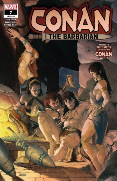
Written by Jason Aaron
Illustrated by Mahmud Asrar
Colored by Mathew Wilson
Lettered by VC’s Travis Lanham
Reviewed by Niklynn Dunn
Jason Aaron and Mahmud Asrar aren’t exactly reinventing the wheel with “Conan the Barbarian” #7, but that doesn’t matter. What they are doing is providing the readers with one heck of a solid Conan issue. If you like “Conan the Barbarian,” you’re probably going to like issue #7. And if you’ve been curious about Conan as a character or haven’t read a Conan story in a while, this is a good jumping on point. Jason Aaron writes “Conan the Barbarian” #7 in a way that is very accessible to new readers.
The story of “Conan the Barbarian” #7 is nothing flashy and sometimes that’s all a comic reader needs, especially coming from a character like Conan. A Conan story is kind of like the meat and potatoes meal of comics. The big plus of this issue is that it provides readers once again with fantastic Mahmud Asrar art. His fight scenes flow very well in “Conan the Barbarian” #7 and Mahmud definitely knows how to draw beautiful women. One might even say he draws a beautiful Conan (because let’s admit it, Mahmud does draw a beautiful Conan in “Conan the Barbarian” #7). His storytelling from panel to panel is top notch too. Mahmud does all the right things you want to see in the art of a Conan comic. It’s not flashy but does a great job of telling a story.
Continued belowWhen I say “Conan the Barbarian” #7 is another solid issue of “Conan the Barbarian”, I don’t mean this issue is “just okay.” Jason Aaron’s run on “Conan the Barbarian” has been highly enjoyable so far and “Conan the Barbarian” #7 just continues that greatness, no more or less. That’s not to say there isn’t any cleverness from Aaron throughout “Conan the Barbarian” #7. The setup is great. We’re used to seeing Conan being a lady’s man, but not exactly like this. Jason Aaron plays with the stereotypical image of Conan and uses it to provide a surprise. Aaron writes Conan in a more modern way. In “Conan the Barbarian” #7 Conan isn’t a total brute. Though of course, Conan is still very much Conan in many ways. And one of the most exciting things about this issue is the cliffhanger. The cliffhanger for sure will make you want to read more.
Final Verdict: 7.9 – “Conan the Barbarian” #7 is a clever tale of revenge with a twisted cliffhanger that gives us a glimpse of what Jason Aaron has in store for Conan’s future.

Written by Tim Seeley
Art by Corin Howell
Colors by Mark Englert
Letters by Marshall Dillon
Reviewed by Matthew Blair
We’ve had a lot of different types of vampires over the years. Interview with a Vampire gave us smoldering sexy vampires, Blade gave us bloodthirsty clubbing vampires, and Twilight gave us…well, Twilight vampires. “Dark Red” gives us something kind of new: white supremacist vampires.
“Dark Red” #4 continues a series created by people who love horror and monster comics. Tim Seely, the creator of the long-running “Hack and Slash” series from Image, knows how to write a long form comic. It’s very nice to pick up the fourth issue of a series and be able to figure out who is who and what is going on. The actual issue has a unique style of horror that blends genuine terror with humor and a sort of redneck/low income/six pack and trucker hat aesthetic that is very entertaining. As for the vampires themselves, they have the traditional weaknesses and internal politics we’ve seen before, but Seeley combines vampirism with old fashioned human racism to create monsters who are truly despicable and terrifyingly familiar. It’s a pretty interesting and unique idea.
The art of “Dark Red” #4 comes courtesy of “Calamity Kate” artist Corin Howell with colors by Mark Englert. Howell’s art serves the horror and the humor of the story well, but it’s at its best when she is drawing the vampires themselves. Most of the bad vampires have beady eyes and pointed ears, making them look ghoulish and inhuman and to top it off, one of these vampires is covered in tattoos that make him look like he spent quite a bit of time with a white power gang. Mark Englert’s colors deserve special mention as well, offering a grimy and grainy feel to the book that makes it almost feel like a cheap grindhouse exploitation film.
“Dark Red” #4 is the continuation of an interesting series created by people who love horror comics and are very good at making them. If you’re interested in horror comics as well, it is definitely worth your time.
Final Verdict: 8.6 – Only this creative team could combine redneck humor with racist vampires to create a story this good.

Written by Joshua Williamson
Illustrated by Howard Porter
Colored by Hi-Fi
Lettered by Steve Wands
Reviewed by Alexander Jones
Author Joshua Williamson kicks off the “The Flash” #73 with a pulse-pounding resolution paying off the cliffhanger of the previous issue. Williamson’s script looks incredibly harrowing thanks to the art from Howard Porter. Seeing the gruesome details and dramatic moments from the last chapter set in Barry’s apartment starts the issue off with an incredibly visceral note. Porter packs the pages with a claustrophobic feeling due to the high amount of panels loaded in the page. Williamson’s script allows readers to see multiple facets of Barry Allen’s life throughout the issue. Readers aren’t just segmented off to just Allen’s personal life with Iris. Williamson addresses new developments in Allen’s life while giving backstory to The Turtle.
Continued belowWilliamson does an excellent job addressing the shortcomings of The Turtle and ideas that make him different from Allen. Readers aren’t given plot alone in the issue as Williamson takes the time to flesh out Barry’s personality with his conversations with Iris and The Turtle. Allen is always late to meetings, his superhero work, and personal life. “The Flash” #73 plays up the idea of Barry’s absence to the full extent with Allen showing up late incessantly. Thankfully Williamson has grounded the narrative in enough reality for the material to feel novel despite the tropes used in the issue.
Porter’s work does an excellent job conveying the scattered, disorienting nature that Allen’s life is currently embroiled in. The issue packs as many in the page as possible to keep the momentum of the script. In the origin pages for The Turtle, Porter conveys a lot of direction and action. There are certain moments that don’t need any dialogue because the sequences are so clearly depicted in the art alone. “The Flash” #73 contains some of the strongest art from Porter to date.
Readers like me let out an audible groan when we first heard that Williamson was going back to Allen’s origin yet another time. However, Williamson has introduced enough elements new ‘Year One’ story for the moments to feel novel again. The Turtle is a great villain and the alternate dimension speed force and cliffhangers lend a lot of tension to the book. Porter’s art brings out a really fluid nature to “The Flash” that the script benefits from. I would like to see the more focused and frenetic energy from this part of the run be applied to the remaining issues going forward. ‘Year One’ has been a definite highlight in this incarnation of “The Flash.”
Final Verdict: 8.0 – “The Flash #73” is a frenetic comic book that fills in some of the gruesome details behind Barry Allen’s first days as The Flash.
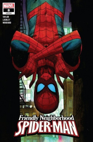
Written by Tom Taylor
Illustrated by Ken Lashley & Scott Hanna
Colored by Nolan Woodward
Lettered by Travis Lanham
Reviewed by Kenneth Laster
Tom Taylor and his rotating art team have taken Spider-Man in fresh directions with this revamp of “Friendly Neighborhood Spider-Man” and issue #8 in this series featuring Ken Lashley and Scott Hanna on art, with colors by Nolan Woodward and letters by Travis Lanham, adds another solid chapter in the well-connected web of Spider-Man’s New York.
Taylor shows enthusiasm for Peter Parker’s classic cast of characters and is just as comfortable writing them as Peter would be around them. Taylor’s interactions with Peter and Hobie Brown, the Prowler have a history which aids the stakes of Peter possibly having to bring him in. Taylor also handles new characters such as Detective Sebbins and Peter’s neighbor-revealed-superhero The Rumor with such care as well. Sebbins sensing Spider-Man protecting Prowler’s identity and firmly placing a line for how much she’s willing to turn her back to the law makes her stand out from any of the many police allies in this genre.
“Friendly Neighborhood Spider-Man” #8 continues the plot of Aunt May reopening the F.E.A.S.T Center, a status quo that should be familiar to fans of Spider-Man’s PS4 game. Taylor blends this element of established Spider-Man lore with a new villain that preys on desperate crowd funders which places this story directly in the political and cultural moment. The villain behind this cabal is not exactly memorable in design and other than the crowdfunding aspect neither does his organization. Despite those aspects, this is just the middle chapter in a larger story.
The art duties of Ken Lashley and Scott Hana are shared in “Friendly Neighborhood Spider-Man” #8 with Ken Lashley providing full art duties for the majority of the book with Scott Hana finishing on page 15. The team does not compare incredibly well to the series regular artist Juann Cabal’s incredibly clean line work but the work of colorist Nolan Woodward keeps the artwork consistent with the remainder of the series. Lashley does convey light more through his inks than Cabal tends to do which is most evident as Spider-Man is caught in Prowler’s booby traps and the use of Nolan Woodward coloring in those inks creates a very strong image on the page.
Continued belowAs a whole Friendly Neighborhood Spider-Man #8 is a solid chapter in Taylor’s second arc of this “Spider-Man” run. Lashley and Hanna’s artwork serves the story well and is distinct from Juann Cabal in a fresh way. Tom Taylor is bringing together ideas old and new to bring a version of Spider-Man that is full of heart and engrained in his community.
Final Verdict: 7.9 – “Friendly Neighborhood Spider-Man” #8 is a well-made chapter in an ongoing story with great character interactions and dialogue and proves that Taylor and team get the heart of Spider-Man.

Written and Illustrated by Andrew MacLean
Colored by Jordie Bellaire
Lettered by Andrew MacLean and Erin MacLean
Reviewed by Beau Q.
The greatest warriors are spoken of in song, so too is Norgal. Speaking of “Head Lopper” #12 as a heavy metal ballad with Andrew MacLean, the bard, is far too easy a comparison. Speaking of the latest finale in Norgal’s wanderings as a graphic album is much more apropos.
In our first two “Head Lopper” albums, MacLean spun simple, compelling tales in 4 parts building the Norgal mythos, but much less bridging the narrative gaps between them– Norgal’s Greatest Hits, if you will. In the latest arc, ‘The Knights of Venora,’ Norgal’s journey reaches an illuminating moment focusing on his relationship with Agatha the Blue Witch, though, in very MacLean fashion, this comes at a time of war with multiple powers converging around Norgal’s frumpy life.
For ‘The Knights of Venora,’ MacLean and Bellaire changed the Head Lopper look by being looser on shapes, tighter on hatching, and mellowing out the color mood to allow an easier read with seemingly smoother production time. Gone is the glow-in-the-dark festival poster color moods. Instead, Bellaire chooses to flat Norgal and company in human peaches and tans, such that the dark wizards and their snake familiars immediately stand out in purple and olive. “Head Lopper” #12 is where the streamlined MacLean line art hits its crescendo in expressive swipes and lumpy figures. With a touch of hand-lettering, the MacLeans make calculated exclamations seem like magical riffs, adapting to the audience’s reactions before they’ve come to realize them.
As endings go, “Head Lopper” #12 manages to end a rather chaotic war in one fell swoop, much like Norgal himself. All the NPC threads are tied up in what can only be described as a whirlwind of cause and effect. MacLean chooses to pad out the marquee violence with enough character drama to bring this arc home with one caveat– “To Be Continued…” What lies beyond for Norgal and Agatha will surely drive readers to the next “Head Lopper” album.
Final Verdict: 8.5 – Norgal gets the good ending after a murder, meeting a deity, and admitting his flaws. Therapeutic finale and encore for Head Lopper readers.

Written by Rob Sheridan
Illustrated by Barnaby Bagenda and Amancay Nahuelpan
Colored by Romulo Fajardo Jr.
Lettered by Nate Piekos of Blambot
Reviewed by Grace Taylor
In “High Level” #5 we finally arrive at the very bottom of the infamous High-Level complex, called Low Level. Here we get a glimpse of the desperate and destitute conditions where those who wish to ascend to High Level live. However, what should be an exciting turning point, tends to fall flat due to the somewhat formulaic storyline.
Much like the previous issues of the series, the high point of “High Level” #5 is the amount of detail that Bagenda and Nahuelpan provide in their beautiful cityscapes and background artwork. The image of the tower-like structure of High Level on page five, for instance, shows the sun rays streaming out from the top of the tower, among transcendent grey clouds; meanwhile, the city inhabited below is covered in rust, graffiti, and grime.
These background images (and stunning coloring by Romulo Fajardo Jr.) greatly contribute to the strong world-building of the series, as the dull decay of Low Level is in stark contrast to the neon, colorful, and uninhibited world of Pleasure Island from the previous issue. However, sometimes the details on the characters, specifically on their faces, suffers as the artists seem to focus on the amazing backgrounds. I can’t tell if Val has disfiguring bumps on her face in certain panels, for example.
Continued belowSheridan is good at developing the mystery in “High Level” #5 through the risks all the characters take to either reach ascension or help someone else to do so. Despite some of these interesting story ideas, I continue to be bored with the “chosen one” story arc surrounding Minnow. There could be more captivating and personal reasons for Thirteen to try to reach ascension, but unfortunately, her character development relies on her connection to Minnow.
However, what keeps me going is the hype surrounding the city of High Level itself. Can people truly attain a life of paradise through ascension? Will Minnow’s role provide a surprising conclusion despite its current predictable trajectory?
Final Verdict: 7.2 – “High Level” #5 excels at building its cyberpunk dystopian world, thanks to the masterful background artwork and character designs. The story can be a bit formulaic, but there is just enough mystery to keep you interested in ascending to the end of the series.

Written by Steve Orlando
Illustrated by Riley Rossmo
Colored by Ivan Plascencia
Lettered by AndWorld Design
Reviewed by Vanessa Boney
Martian Manhunter is a great character when written correctly. In my humble opinion, one of the most important qualifications for crafting an impressive Martian Manhunter story is a vivid imagination. His laundry list of impressive capabilities and his versatility open up the realm of possibilities for storytelling. Unfortunately, the last few attempts at Martian Manhunter series have been utter disappointments and did him no justice, as they relied heavily on him keeping his true identity secret and then being put in a situation where he needed to come clean because he was trying to redeem himself for some past atrocity, (stop me if you’ve heard this one before) as opposed to creating scenarios that showcase his amazing abilities. Needless to say, this current run of Martian Manhunter is so far shaping up to be no different.
“Martian Manhunter” #6 is not original, nor is it entertaining. Steve Orlando’s script is not engaging at all, as it is merely another origin story, and not to mention, a filler issue. While it is heartbreaking to see J’onn witness his family die right before his eyes, the scene evokes no emotion because the reader already knows it’s coming. “Martian Manhunter” #6 also feels rushed; jumping around in J’onn’s past in a way that inhibits the story from flowing seamlessly. The script would flow better if the events were revealed chronologically.
Unfortunately, the art in “Martian Manhunter” #6 is just as lackluster as the story. Although Riley Rossmo’s linework is clean, the art lacks detail and the illustrations are not eye-catching, failing to make “Martian Manhunter” #6 visually satisfying. The lack of detail in the illustrations also hurts the colors in “Martian Manhunter” #6. Since the color palette includes hues of the same color family, they blend together with no discernable line of demarcation, making it hard to decipher the images in some panels. But, if there is one plus about Rossmo’s work, it’s that it deviates from the DC house style, which is refreshing. Particularly noticeable are the exaggerated, disproportionate body parts and Diane Jones’s over the top hair.
Final Verdict: 5.0 – “Martian Manhunter” #6 is the cliché comic that you’ve read a hundred times.

Written by Cullen Bunn
Illustrated by Adam Gorham
Colored by José Villarrubia
Lettered by Dave Sharpe
Reviewed by Shamus Clancy
Between the most recent season of American Horror Story and the Marvel television series Cloak & Dagger, there’s no shortage of work in today’s pop culture landscape that tackles the mystical practices of Voodoo. A great hook is key to grabbing the audience’s attention when a concept feels slightly oversaturated across several mediums. Writer Cullen Bunn does have one with “Punk Mambo”: imagine a woman who feels ripped right from a Sex Pistols concert in 1978 and also happens to be a Voodoo Priestess.
Despite the allure of that concept and the Haitian magical dueling that the first two issues of “Punk Mambo” set up, this comic falls a little flat. The third issue in a five-issue miniseries should be a turning point, as tensions are heightened, conflicts reach a boiling point and magical spells are bouncing everywhere from panel to panel. Maybe the goalposts have been moved due to the promise of those early issues, but “Punk Mambo” #3 just feels like a laborious read that’s short on action and substance while straying from the intrigue of Bunn’s initial hook.
Continued belowDespite Bunn’s overall story being a tad disappointing, the “Punk Mambo” art team is quick to pick up the slack. Adam Gorham takes a rigid approach to his penciling, creating a rugged vibe that’s an ideal fit for the gritty, street-level backdrop of “Punk Mambo.” José Villarrubia’s coloring makes for a great ying to Gorham’s yang, as Punk Mambo’s pink hair, in addition to the neon blues and greens of her magical staff, contrast that grainy linework quite well.
A mini-series can be a double-edged sword: the finite nature of the story gives an author a clear sense of how to construct a narrative arc, but having just a few issues to spin that tale limits the scope and world-building aspects that can be reached in an ongoing run. Bunn has proven to be an excellent writer with his work on “Venom and “The Sixth Gun,” but he may not exactly stick the landing in “Punk Mambo.” With two issues remaining, Bunn certainly has time to flip the script, but might need help from Voodoo Queen Marie Laveau herself to get there.
Final Verdict: 6.7 – The premise of “Punk Mambo” remains tantalizing, but it feels a little more Avril Lavigne than Patti Smith at this point.

Written by Greg Pak
Illustrated by Ramon Bachs
Colored by Stephane Paitreau
Lettered by VC’s Travis Lanham
Reviewed by Chris Egan
“To The Letter” is the most recent ‘Age of Rebellion’ one-shot and it focuses on the second most powerful villain in the galaxy; by showing how little power he has compared to Palpatine. He may be feared, he may be powerful in the Force, but he is still under someone’s thumb. In a way, the story calls forward to Vader’s relationship with Tarkin in A New Hope. Even with his reputation and someone who he considers to be beneath him still orders him around. He never achieves the status he assumes, no matter what era of his life.
The story has space battles, war scenes, giant crab monsters, but none of it is interesting or engaging. Fans know Darth Vader’s story. This tries to reinforce the fact that no matter how much power he’s accrued, he is still a slave. Pak’s story holds no real weight or new ideas, which is unfortunate because he’s done some great work within the new “Star Wars” canon. That’s the problem with this conveyer belt strategy of producing such a long line of one-shots. Originality and quality start to waiver, especially when just a few writers have to produce so many issues over a short period.
Bach’s illustrations are fine. Simple and fall into the safety net of most of the comics outside of the main arcs. Same goes for Paitreau’s color work. It’s good, feels like the “Star Wars” palette, but isn’t as dynamic as one would hope from a Vader book.
Mildly fun, hardly entertaining, dry Vader action. Greg Pak’s stuff is starting to feel enslaved by the Disney machine.
Final Verdict 4.5 – I’m a person and my name is Anakin!

Written by Jody Houser
Illustrated by Edgar Salazar
Inked by Keith Champagne
Colored by Marissa Louise
Lettered by Nate Piekos
Reviewed by Jhoan Suriel
“Stranger Things Six #2” keeps the nice, tight pace established in the first issue. Writer Jody Houser continues to do some light worldbuilding around the titular character. Indeed the relationship between Six and Three as well as Dr. Brenner remains a key focus and it’s quite compelling. What makes Dr. Brenner and Six’s relationship compelling is the tension between Dr. Brenner and Six.
The pencils by Edgar Salazar and inks by Keith Champagne continues to make the Hawkins Lab feel oppressive with its drab environment. But panels that jump between the past and the present is the best thing about the art. For instance, on page twenty, there’s cool juxtaposition from Three’s face in the past to Dr. Brenner’s face in the present.
Additionally, Louise’s colors pop out and flesh out Salazar’s pencils and Champagne’s inks. Like with issue one, the past and present panels in “Stranger Things Six #2” feel different. Notably, Louise colors the past panels in bright colors such as a SIx’s yellow dress. In the present, the Hawkins Lab continues to feature drab colors such as grey, blue, and green.
Ultimately, “Stranger Things Six #2” a good second issue. We get some new revelations into SIx’s past and some nods to the Stranger Things TV show. Six continues to be a well-written heroine with an interesting cast of characters.
Final Verdict: 9.2 – New details and revelations makes for another well-paced issue.


