
There’s a lot to cover on Wednesdays. We should know, as collectively, we read an insane amount of comics. Even with a large review staff, it’s hard to get to everything. With that in mind, we’re back with Wrapping Wednesday, where we look at some of the books we missed in what was another great week of comics.
Let’s get this party started.
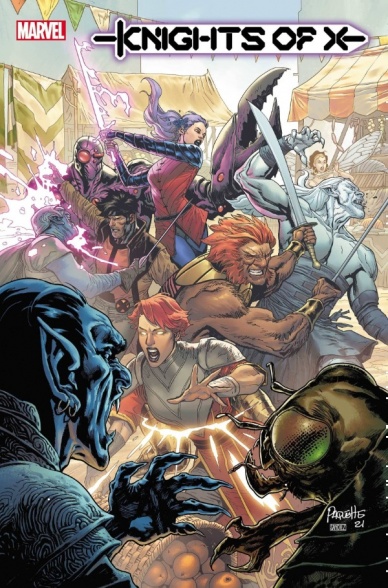
Knights of X #2
Written by Tini Howard
Illustrated by Bob Quinn
Colored by Erick Arciniega
Lettered by Ariana Maher
Reviewed by Quinn Tassin
“Knights of X” #2 is a tough comic. There’s a lot- probably too much- stuffed into it. We’ve got a massive cast, lots of worldbuilding, and parallel missions to follow. While the issue is admirably ambitious, it lacks the same excitement and goodwill that you might be more willing to give a first issue. Where “Knights of X” #1 threw a lot at readers, we could trust that things would become more clear shortly. With the second issue, instead of slowing down and processing this world and story at all, we’re basically thrown right into the action. While there are certainly a number of examples of series that see real benefits from jumping right into things, those don’t tend to be introducing readers to reshaped fantasy worlds that were confusing to begin with.
Now, there’s a lot of good in this issue. The cast’s voices are extremely well-captured, no matter how much focus a given character receives. The first half of the issue is filled to the brim characters and information in a way that feels manageable. The artwork is solid throughout. The staging is especially strong; in fight scenes that could easily be chaotic, there’s a sense of clarity. Characters are expressive and the environments their in are rendered with an eye for detail. The fight against the horde of mindless creatures is an especially strong visual moment here.
While the action is impressive, though, the second half of the issue falters in its writing. Where “Knights of X” #2 demands a certain level of thoughtfulness, the parallel fight sequences make the issue entirely overstuffed. It becomes hard to follow the plot while this is going on and some characters get lost in the shuffle. Plus, while it’s all pretty to look at, the fantasy angle that was working better than ever in the first issue of this series gets watered down. It feels like a generic X-Men action sequence with a magic twist instead of the product of a magic world. There’s a certain degree to which having the mutant experiences in Otherworld and on Earth match up really works thematically. Still, it would be nice for Otherworld to feel more discernible when it comes to what villains and missions look like.
Final Verdict: 7.0- A strong foundation and clear voice but overstuffed and missing some imagination
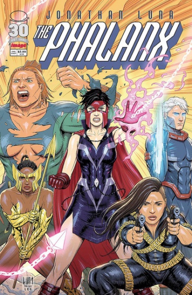
The Phalanx #1
Written, Illustrated, Colored, and Lettered by Jonathan Luna
Reviewed by Gregory Ellner
From the perspective of a reader with little to no information on the various characters in this apparent superhero universe, “The Phalanx” #1 is somewhat interesting. Given Jonathan Luna is in the spotlight on nearly every front, it seems reasonable to split his work up into its component parts for analysis.
The material appears mature from a visual and verbal standpoint, but not overly offensive. However, the usage of swearing and some nudity seem to be a poor excuse for “maturity.” The main reason it may be seen as genuinely mature is the fact that said nudity, is not overtly sexualized, nor is attention drawn to it in the text. The characters and the time period they hail from both are relatively easy to understand even without much if anything in the way of backstory, as is the villain of the issue, but the profanity, especially being nearly the first thing mentioned at all, stands out regardless.
Luna’s artwork is smooth and flowing, never over-emphasizing the characters beyond what they are actually doing. Unfortunately, there is at least one case, perhaps more, of repeated panels nearly exactly in succession, to the point that they almost feel that the dialogue within could have been contained to a single panel instead and was just split up to take up more space on the page. The action, including the fight scenes, remains attention-grabbing enough, but those hiccups still stand out.
Continued belowThe colors of “The Phalanx” #1 do flow well, bounded by the lighting of each scene rather than inherently dictated by the characters’ mental states. Still, this coloring cannot make up for the rest of the one-shot.
Final Verdict: 5.5- Perhaps intending to bring in a new audience, Jonathan Luna shows that not all superhero stories are inherently equal.
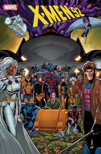
X-Men ‘92: House of XCII #2
Written by Steve Foxe
Illustrated by Salva Espin
Colored by Israel Silva
Lettered by VC’s Joe Sabino
Reviewed by Alexander Manzo
“X-Men ‘92” uses this second issue to continue the storyline and add context to the twist at the end of the first issue. Jubilee takes the role of Moira from the Jonathan Hickman run.
They are giving Jubilee a limited number of reincarnations to stop the sentinels from destroying mutants. With Steve Foxe giving this role to Jubilee, it also adds a light-hearted feel to the dark and dreary storyline due to her viewpoint of being a teenager, but he does make sure to give her both intellectual and emotional depth. Foxe also brings some fun to the storyline by making small changes that current x-readers will enjoy, such as Rogue being the new leader of the Marauders.
Between Salva Espin’s illustrations and Israel Silva’s colors, this is a beautiful re-telling of the Hickman’s creations through the lens of the old-school 90’s animation style. There is also this added layer of depth and funny, quirky style that comes with the exaggerated expressions even usually stone-faced characters like Wolverine bring that makes it light and fun. The action sequences can be seen as a little stiff and blocky, but due to the old-school style, it’s a good decision for the creative team not to worry about any blood or gore. Espin does a fun splash page reminiscent of “Tiger Beat” magazine, where it introduces the villains of the mini-series with headshots and likes and dislikes.
Final Verdict: It’s a fun story because it is a mix of a “What If..” storyline and a blast from the past with the art style. Definitely a book worth checking out whether you are a current x-reader or not.


