
There’s a lot to cover on Wednesdays. We should know, as collectively, we read an insane amount of comics. Even with a large review staff, it’s hard to get to everything. With that in mind, we’re back with Wrapping Wednesday, where we look at some of the books we missed in what was another great week of comics.
Let’s get this party started.
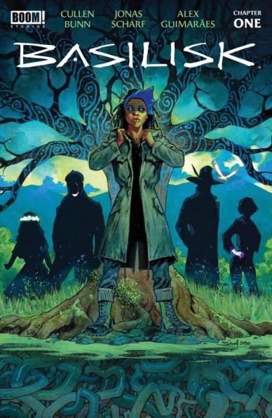
Basilisk #1
Written by Cullen Bunn
Illustrated by Jonas Scharf
Colored by Alex Guimaraes
Lettered by Ed Dukeshire
Reviewed by Conor Spielberg
“Basilisk” doesn’t offer much in terms of selling premise in the first issue, preferring to leave a sense of mystery for those who have enough faith to keep reading. This is a bold move in a medium that sells its stories piecemeal to leave the first issue with more questions than answers, but one that is admirable, albeit a little unsatisfying.
What little story we get revolves around two unnamed women speaking about a past event that takes place at the start of the comic. The opening scene where said event took place is stylistically different from the rest of the artwork and very abnormal when compared to the more conventional look of the rest of the comic. This is done to evoke a dreamlike surrealism and makes it clear that the character with cloth covering her eyes as well as her fellow companions are not of this world.
The lack of information and unwillingness to spell out what information that is given
creates a sense of mystery and intrigue and doesn’t prevent the reader from getting a strong sense of the two characters through the artwork and dialogue effectively conveying their emotional state and outlook when desired.
Final Verdict: 7.5 Strong sense of characters and interesting artwork.

Crush & Lobo #1
Written by Mariko Tamaki
Illustrated by Amancay Nahuelpan
Colored by Tamra Bonvillain
Lettered by Ariana Maher
Reviewed by Quinn Tassin
The titular Crush is one of the best kinds of protagonists, that is to say, an absolute mess. After leaving the Teen Titans Academy, she’s doing her thing, fighting bad guys, collecting travel mugs, and dating her lovely girlfriend, Katie. For the most part, “Crush & Lobo” #1 works well. Scribe Mariko Tamaki has a strong sense of who Crush is as a character and does well playing her off of other characters, particularly Katie. She’s a lovable but not quite likable main character. Every time she steps into a situation, you know she’s trying her best and you also know she’s going to mess things up somehow.
Tamaki does strong work displaying Crush’s deep insecurity and all of the defense mechanisms that come with that and hit makes for the start of a promising arc for her as a character. The party scene is most definitely the strongest in the issue. It displays Crush’s best and worst qualities and helps ground the whole issue. Tamaki succeeds less when it comes to the fourth-wall breaking narration, which is truly exhausting. It has the energy of a kid with a “do not enter” sign up on their bedroom door; surely that’s the point to a certain extent but Tamaki leans so far into it that that it becomes frustrating.
Amancay Nahuelpan’s art is wonderful and dynamic and Tamra Bonvillain’s colors are expectedly gorgeous. Nahuelpan has a sense of pace and liveliness that helps the issue feel deeply engaging. Bonvillain’s bold, vivid coloring brings it an extra oomph that makes the whole issue gorgeous. While the one real action sequence in the issue is fun, the real high point is, once again, the party. When Katie helps calm Crush down a bit and they got lost in their own world dancing together, we get lost in it, too. It’s a beautiful moment that demonstrates the potential of the series and with any luck, we’ll get a lot more like it.
All in all “Crush & Lobo” #1 is an undeniably fun read. It’s got a sympathetic protagonist and whatever Lobo is plotting is sure to be a wild ride. Whether this miniseries is going to have much more to offer is unclear but for now, it’s certainly worth watching.
Continued belowFinal Verdict: 7.7- “Crush & Lobo” #1 is a fun debut for the most rock and roll father-daughter duo in the DC Universe.

Green Lantern #3
Written by Geoffrey Thorne
Illustrated by Tom Raney and Marco Santucci
Colored by Michael Atiyeh
Lettered by Rob Leigh
Reviewed by Alexander Jones
Writer Geoffrey Thorne is taking a lot of risks with the new ongoing “Green Lantern” series at DC Comics. Issue #3 takes “Green Lantern” in yet another different direction and opens up this narrative for future possibilities. Thorne’s focus on Green Lantern John Stewart is not just a choice, it is the emotional core of this title. Stewart’s resolve and tenacity allow for his character to shine through the issue. Artists Tom Raney and Marco Santucci take the “Green Lantern” franchise’s artistic direction away from the hyper-polished look established by previous artists like Doug Mahnke. This less serious context allows for all of the Green Lanterns to shine through in this series instead of paying close attention to one core hero.
Artists Tom Raney and Marco Santucci have a much different vibe than recent “Green Lantern” pencilers. The duo both opt-in for a similar style that marks a more visceral approach to this franchise. Characters are emoting a lot. No two figures in the issue look quite the same. While I really like the strong expressions, Raney and Santucci’s expressions differ depending on the page. I wish Raney’s figures were more detailed and anatomically correct. Raney and Santucci both lend a cinematic touch that each artist delivers on with big panels. There’s a scene where Stewart comes in to save the day and the art takes a dramatic improvement with impressive framing for this scene. With such a large cast of Lanterns, it is great to see art that emphasizes the differences of each character.
“Green Lantern” #2 was hiding an excellent cliffhanger that this issue doesn’t feel the need to resolve right away. Thorne takes another hard-left turn here by deepening the supporting cast and establishing more reasons to invest in John Stewart. Even though the “Green Lantern” series has an impressive plot, the title is still building out a world and direction. The idea of the protagonist meeting someone and getting distracted from his mission is a plot device recently explored in the “Guardians of the Galaxy” title. I hope Thorne will continue to dedicate his time to show readers what makes this title unique from others. Thorne sticks around to follow up on the cliffhanger during the second story. The second entry takes even more creative risks and splits the screen time between a few different Lanterns.
“Green Lantern” #3 is the kind of comic book that will keep you guessing until the issue sticks with a premise. The sheer ambition that this creative team is lending towards “Green Lantern” is admirable by itself. “Green Lantern” is clearly still trying to establish a clear mission and direction but is definitely headed in the right direction.
Final Verdict: 7.5 – “Green Lantern” #3 is a solid issue that takes risks to push the series closer to greatness.

Marauders #21
Written by Gerry Duggan
Illustrated by Matteo Lolli
Colored by Edgar Delgado
Lettered by VC’s Cory Petit
Reviewed by Alexander Manzo
“Marauders” is the opening issue to ‘The Hellfire Gala’ event and follows Emma Frost welcoming her guests, X-Men, Avengers, government officials, and making sure things are going smoothly. The issue switches to various guests for a page or two, but it feels as though Emma is fully aware of all the ongoing conversations that are happening. There is no action in this issue, but in the final pages there is talk of something that will change everything for all parties. Gerry Duggan does a good job of creating this small banter between Emma and her guests that feels authentic to any host at a party trying to make sure everyone feels special. The fact that, in this case, it’s Emma gives this an ace in her back pocket kind of vibe.
One note that feels worth highlighting is the Avengers and Fantastic Four showing up to the event. This reveal gives the reader the idea that whatever is going to happen on Krakoa is truly going to effect the entire Marvel universe.
Continued belowThe art in “Marauders” by Matteo Lolli sets the bar for the entire Hellfire Event. The hype around the character’s costumes in previews were put on display. Lolli does a great job of giving characters nearly flawless skin, which fits perfectly considering this is a high-class event for both superheroes and government officials. No detail is spared in the panels. One panel in particular highlights this from a fan’s perspective as the Avengers enter the Krakoan gates. The reader can see the muscles from She-Hulk and Thor’s arms, Blade’s wrinkles in his jacket, and the various heights of each character that feels forgotten when seen from the front.
Edgar Delgado goes hand-in-hand with Lolli as well by having the character’s outfits really pop but still not taking away from the main event. The “ballroom” has its own island-feel with the use of blues and pinks creating a calm ambience for the guest. This fits well since it is believed that Emma has designed and curated this event herself.
Final Verdict: 8.8 – A solid opening to ‘The Hellfire Gala’ that feels like a fly on the wall at a fancy soiree.

Moths #1
Written by J. Michael Straczynski
Illustrated and colored by Mike Choi
Lettered by Sal Cipriano
Reviewed by Henry Finn
Far from the politics and global scale of “The Resistance,” spinoff “Moths” #1 sets the stage for an intimate story set in a world where millions are dead from a virus, and the survivors receive superpowers as they recover.
J. Michael Straczynski anchors the world through the lens of a strong protagonist, Emily Kai. She is self-assured, confident, and idealistic about her opportunities in life, and we learn to see the world through her eyes as a beautiful place to express yourself. Themes of destiny and acting with purpose through uncertainty are interwoven into the dialogue tastefully as Straczynski uses supporting cast to bounce philosophical questions off of Kai and introduce us into the world without being exposition-heavy. However, enough exposition is given for the book to be completely readable regardless if you have read the previous series or not.
Page by page, Mike Choi’s work stands out for many reasons and, because the work borders on being photorealistic, he is able to do very interesting things you don’t normally see in comics. Working with a combination of acrylic & digital paint along with photo references, Choi renders every panel thoughtfully and with incredible detail. He blends analog and digital painting seamlessly to create a rich world with completely believable characters. The way he renders light in each environment is incredible, as he meticulously crafts the lighting to match not only the direction but also the specific source. For instance, daylight streaming through a window looks white like real daylight, while at night streetlamps cast a familiar orange phosphorescent glow of the city streets. He also masterfully utilizes some visual techniques more often found in cinema, such as alternating blur between the background and foreground to help direct our vision more purposefully.
Between Straczynski’s intriguing use of the “what would you do if you had 24 hours to live” trope, and Choi’s far-out, almost experimental use of mediums, “Moths” #1 flies above the standard fare of new releases this month.
Final Verdict: 8.0 – A very intriguing and special book that deserves a long look.

The Nice House on the Lake #1
Written by James Tynion IV
Illustrated by Álvaro Martínez Bueno
Colored by Jordie Bellaire
Lettered by Andworld Design
Reviewed by Elias Rosner
If you’re a horror fan, you need to read this book. If you’re a fan of mysteries, you need to read this book. If you have ever had a weird conversation at a party/bar/wherever that you still remember to this day because it was deep in ways you can’t explain, you need to read this book. In short, everyone should read this book.
“The Nice House on the Lake” #1 does everything a first issue should do and more. By it’s end we’ve been introduced to the party of thirteen, starting with this issue’s focal character Ryan, the status quo, what changes in that status quo, a few big BIG mysteries, and a whole mess of beautiful human drama. Effectively and efficiently, the “Nice House” team draws you into the comic with a classic set up: secluded location, small group of semi-strangers who know each other far more than we know them, and a mysterious, always kept in shadows host. Before you know it, you’re picking favorites and that dread in the pit of your stomach starts to grow, incrementally, before dropping out altogether by issue’s end.
Continued belowThis is a book best experienced with little foreknowledge because of just how damn good this team is at revealing information, not because it is trying to catch you off guard, without over-exposing or giving unnecessary answers. The art contains an air of ominousness throughout, thanks in part to the framing scene of Ryan on the steps, surrounded by strange sculptures of symbols that recur throughout and a red & orange hue which, upon closer inspection, seems to be caused by fire. It’s all brought to gorgeous, horrifying life by Bueno & Bellaire while Andworld crushes it on the lettering.
I love the way they designed the icons for each character & the introduction bios as well as that one page by the pool. The choice of blue and white, with words fading in and out, perfectly simulated the din of a pool party and the snippets of conversation one gets in the misty haze of chlorine and bbq smoke. It is a quiet moment but indicative of the strengths of the team to not only bring the horror but to bring the warmth and wonder too. Is it no surprise, then, that I am already looking out for the next issue?
Final Verdict: 9.5 – “The Nice House on the Lake” is a debut that should not be missed from a team working in perfect synchronicity. It is horrific, it is intriguing, it is light on answers but heavy on information, and most of all, it speaks to the moment without necessarily being of it. This is a special book and I am glad to be getting in at the ground floor.

X-Force #20
Written by Benjamin Percy
Illustrated by Joshua Cassara
Lettered by VC’s Joe Caramagna
Colored by Guru-eFX
Reviewed by Michael Govan
The Hellfire Gala is THE event of the year! It’s time to show the humans how mutants party…well, not all mutants. SOME mutants can’t boogie or show off the flashiest of outfits. In “X-Force” #20, the titular team is hard at work, trying to keep the Gala secure.
It’s an interesting premise for sure and makes perfect sense. X-Force has been silently protecting Krakoa from the shadows (or trying to at least, one could debate how effective they’ve been), so of course they would be cast as the bouncers silently protecting the Hellfire Gala.
Though the comic is somewhat removed from the party, it is very connected to the other comics. This is the second part or the second tie-in of the Gala. The events will be continued in “Wolverine” #13. The shipment of Shi’ar logic diamonds that Wolverine receives on Emma’s behalf will likely be revisited in another title. Again, readers see the same meeting between Quentin Quire and Iron Man that they saw in this week’s “Marauders”. Well, not quite the same. The dialogue is extended and different here. That connectivity, and departure from the events of the previous issue, could be seen as a strength or weakness of this issue. That’s up to the reader’s subjective opinion.
Another potential issue is Beast’s descent into darkness that’s at the heart of this issue, and the title overall. While it is certainly believable that Beast would muddle deeper into moral ambiguity (and outright evil) and that Hank would think he knows better than everyone, this comic takes a BIG leap forward. There is a data page where Beast earnestly argues that he should be given god-like power/control over Krakoa. That might be a step too far. Likewise, while X-Force is a secret to the average Krakoan, is it believable that Emma and the Council were ignorant to Beast’s dealings until now? Is it believable that they would be so trusting of Hank, so incompetent?
On the other hand, there are definitely some fun moments. Hard not to have some with big guest stars like Iron Man and Deadpool (who is more funny than annoying here). The art is fantastic. Joshua Cassara’s artstyle is a great fit for the shady espionage vibe of “X-Force”. He draws several delightfully horrifying panels such as the Terra Verde being possessed by plants. Another great example is Emma sneaking up on Sage. Chilling.
However, Guru-eFX might be the star of this issue. The use of shadow makes several pages noticeably stronger. It highlights the quiet menace of Beast. Shows how sneaky the plant virus is moving throughout the party. Makes Wolverine and Emma both very imposing figures. Overall, definitely one of the stronger issues of “X-Force” in recent memory.
Final Verdict: 7.5 – A party for Krakoa means problems for X-Force in a fairly strong issue.


