
There’s a lot to cover on Wednesdays. We should know, as collectively, we read an insane amount of comics. Even with a large review staff, it’s hard to get to everything. With that in mind, we’re back with Wrapping Wednesday, where we look at some of the books we missed in what was another great week of comics.
Let’s get this party started.
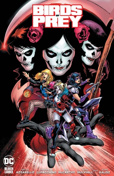
Written by Brian Azzarello
Illustrated by Emanuela Lupacchino
Colored by Trish Mulvihill with John Kalisz
Lettered by Steve Wands
Reviewed by Gregory Ellner
Brian Azzarello’s writing on “Birds of Prey” #1 is, in a word, haphazard. The story of the standalone issue seemingly attempts to create a variation on the Birds of Prey team from the 2020 live-action film within the context of the comic universe, but doing so without sufficient context for why they should stay together at all does not help, nor does the fact that it takes almost three-quarters of the story’s page length for them to even have a scene together in a one-shot adventure. The fact that the primary villains of the story are extremely one-note, virtually nameless, and low level even for starter antagonists is yet another problem with this de-facto “origin story” for this version of the eponymous team.
One of the most glaring problems in Azzarello’s storytelling for “Birds of Prey” #1 is his use of verbal profanity. Swear words have a place and can be effective in certain stories, even in other takes on the DC Universe itself. However, having everyone, including the relatively level-headed Steve Trevor, spout words like “shit” and more besides every other sentence comes across less as a natural form of speech and more as an attempt to try far too hard to seem “edgy” and take advantage of being in DC Black Label, rather than using the lessened censors to tell a mature tale.
One element that is well put together is the Joker, whose menace carries from Azzarello’s use of next to no dialogue from his mouth to Emanuela Lupacchino’s decision to never show his face, either keeping it in shadow or just off-panel. The overall effect turns the homicidal gang leader into more of a force of nature and unstoppable boogeyman than an individual human being, giving more credence to the crime-fighters’ horror on seeing he has arrived.
In general, Lupacchino’s artwork does its best to make up for the lackluster storytelling. Her artistry is always beautifully put together, and “Birds of Prey” #1 is no exception. Lupacchino uses thick, smooth lines to emphasize facial expressions and beauty in every face, especially with close-ups. Her mastery of body language also helps to showcase emotion and the fast pace of battle when it comes to it.
Meanwhile, Trish Mulvihill and John Kalisz further prop up the one-shot with their colors. Deep purples and browns draw attention to the darker sides of Huntress much the same as brighter yellow, white, red, and blue focus in on Harley Quinn, or other colors focus on several other members of the crew. The shade of the night is deep in Gotham, and the coloring helps to keep an emphasis on that when it counts, especially indoors and in contrast to muzzle flashes of gunfire.
Final Verdict: 6.0– A lackluster, trying-too-hard script is partially made up for with excellent artwork and colors.
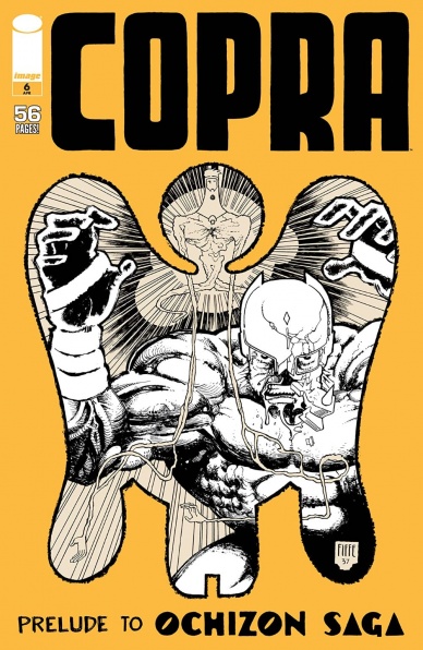
Written, Illustrated, Colored and Lettered by Michel Fiffe
Reviewed by Greg Lincoln
Audacious. What else could you call using twenty-four silent splash pages to begin an epic cosmic story inspired by Jack Kirby’s Fourth World when it nails it so well. Sure, if this was your first exposure to Michel Fiffe’s “Copra,” his loving homage to John Ostrander’s iconic run on “Suicide Squad,” the issue would likely fall pretty flat. But if you follow his book, are familiar with his inspirations, love his inspirations, love his characters, or his art in any combination, this issue will hook you.
His use of the splash pages gives the moments of this cosmic invasion a sense of scope. These twenty-four moments in the fight are all worth looking at in-depth. Most of the scenes show heroes trying to save the innocents around them, the moments Fiffe shows show the sheer intimidating power of the Ochizon invaders in that the heroes are mainly trying to keep people alive including themselves. Guthrie’s pages are particularly gripping, She is their target the rest is incidental and those slashes of her have such power. The silent art is an invitation to explore the pages and Fiffe gives you much to marvel at in this struggle. His inking style is all his own, the pages look like Fiffe at his smudgy best but they manage to evoke the cosmic power and force of Kirby even without the iconic Kirby dots.
Continued belowHe also includes “Negativeland,” a homage to various incarnations of the “Doom Patrol. It’s an older comic he shared via, has a dôjinshi sort of feel, and manages to be as pithy and tragic as the real series was at times. His characters aren’t superheroes they are just powered individuals living in an all too flawed and dangerous world. The real everyday interactions of Erebus and Neesha with their band friends stand out as the bright points in this one-time limited release mini-comic.
Final Verdict: 8.0 – Even at the price of $4.99, this issue scores an 8 for sheer audacity alone but it’s a 9 if Jack Kirby’s Fourth World is your kind of thing.
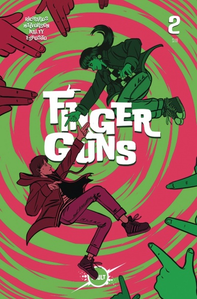
Written by Justin Richards
Illustrated by Val Halvorson
Colored by Rebecca Nalty
Lettered by Taylor Esposito
Reviewed by Jodi Odgers
“Finger Guns” #2 continues where the charming first issue left off. Whether they are dealing with broken families, shooting letters of the sign language alphabet at each other, or bonding over video games and music, main characters Sadie and Wes remain complex, charming, and highly relatable. The issue deepens the roots of emotional connection, both between the characters themselves and with the reader, and this has made “Finger Guns” #2 a touching second issue in what is already a strong series from Vault.
The aesthetic of “Finger Guns” is as eye-catching as it was in the first issue. Val Halvorson’s art style is clear and direct and works in perfect unison with Rebecca Nalty’s colorwork. Nalty has given the comic a unique layer of texture that helps “Finger Guns” look unlike any other comic. Halvorson leaves the backgrounds simple or bare in panels riddled with emotion, leaving space for Nalty to accentuate the moment with plain colors. This signaling removes all clutter, heightening the impact of emotional moments.
There are a number of these moments spread throughout the issue. Some are large, like the family confrontation that begins the issue and the heart-warming mother-daughter moment that follows. Others are small, like Wes and Sadie exploring their powers, or drawing closer to each other over video games.
Where the first issue of “Finger Guns” was more expository, this second issue is more exploratory. We explore the troubles in Sadie and Wes’s respective families. The main characters explore their powers, and the bond growing between them. Each exploration is more interesting than the last and leads up to a final page that has devastating implications. I eagerly await the revelations that future issues of “Finger Guns” will bring.
Final Verdict: 8.3 – A wonderfully human issue, filled with impactful emotional beats.

Written by Anthony Del Col
Illustrated by Joe Eisma
Colored by Salvatore Aiala
Lettered by Crank!
Reviewed by Quinn Tassin
Just in time for Nancy Drew’s big 9-0 comes “Nancy Drew & The Hardy Boys: The Death of Nancy Drew #1,” a fairly disappointing debut to the sequel to Anthony Del Col’s “The Big Lie.” The cardinal sin of Del Col’s writing lies in two things: its fundamental boringness and its utter predictability. The basic premise of the book is incredibly intriguing- the idea of Nancy Drew spiraling as she obsessing over a cabal called the Syndicate is cool! The Hardy Boys investigating her mysterious death is cool! But instead of really showing that to us, it tells us a whole lot. Rather than actually exploring character dynamics or interesting conspiracies, Del Col dedicates over half of the book to exposition. Nancy is, of course, revealed to be alive at the end of the issue in an almost offensively bad twist. I don’t say that because she should be dead (that would be actually offensive) but because it’s incredibly clear before even opening the book up that Nancy is going to be alive. Add all of that together, and you’ve got yourself a VERY boring reading experience.
The artwork leaves quite a bit to be desired, too. Joe Eisma’s pencils are okay here but far from his best work; the book has a sort of static feeling that makes it hard to connect to what’s going on. Take the Hardy Boy street punch for example. That’s supposed to have heft but instead it just kind of happens. Some moments, like the Nancy reveal, reach the level of pretty good but that’s the peak of the artwork here. Eisma is only hurt by colorist Salvatore Aiala, whose flat, muddy work dulls whatever the book has going for it visually. Honestly, the MVP of this whole thing has to be the letterer, Crank!, who deserves the honor not only because their lettering work is genuinely strong, but because they’re called Crank!.
Continued below“Nancy Drew & The Hardy Boys: The Death of Nancy Drew #1” has a lot going for it and has a lot of room to improve as it continues. But this was the debut and the fact that it had next to zero momentum is deeply disappointing.
Final Verdict: 5.0 – “The Death of Nancy Drew” has a promising premise but starts with an exposition-heavy, predictable whimper.
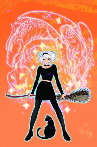
Written by Kelly Thompson
Illustrated and Colored by Veronica and Andy Fish
Lettered by Jack Morelli
Reviewed by Elias Rosner
There is something magical (heh) about Thompson & the Fishes’ run on “Sabrina.” It’s simple, it’s fun and it’s not afraid to wear its teenage angst on its sleeve. This combination made the first series a hit and I, for one, am glad we’re getting more of this team’s take on the character. A testament to Thompson’s grasp of the characters is how effortlessly “Something Wicked” succeeds at pleasing newcomers as well as fans of the first series.
Thompson doesn’t front-load us with recap information but includes enough relevant details, in mostly organic ways, to catch up those who missed the original up to speed on the important bits. Moreover, the comic opens by setting up this arc’s mysterious, dangerous threat rather than on Sabrina’s antics, witchy or teenage, a cold open of sorts to ease us into the story, making it feel like a new adventure rather than a continuation, and setting a darker tone for the book. It’s exciting, gripping, easy to grasp, and makes you want to continue on.
This really is down to Veronica and Andy Fish’s art and coloring. It’s easy to feel like we’re in a fantasy world full of magic but one with a deeply unsettling underbelly. Figures have rounded, warm features and open mannerisms, being drawn with fuzzy borders, but everything is seeped in shadowed oranges and purples and pinks, creating an atmosphere of horror and otherworldliness without breaking the world itself. It’s perfectly suited for the dual-nature of “Sabrina.”
There are some quibbles I have, like just how much story and new information, Thompson stuffs into “Something Wicked” #1, which can get rather overwhelming and make the issue feel compressed, as well as a panel or two where the placement of characters was inconsistent, leading to some spacial confusion on my end. It’s the final panel of the dinner scene; either Sabrina moved her chair to the other side of the table or the table changed shape for her to appear that close to Aunt Hilda… but Sabrina’s content face at dinner had to be shown. It had to. No, I will not be accepting questions at this time.
The final bit of praise I can give to this issue is to the always consistent and wonderful Archie comics Letterer: Jack Morelli. Most of the time it’s invisible, feeling integrated rather than placed on the art, but every so often he lets the balloons do something cool, like passing through a character’s legs to keep the flow and not obstruct the art, or letting it cascade, one word per balloon, to really emphasize how frustrated Sabrina is. It’s not always flashy but it’s damn consistent and thought through. That’s what this issue felt like too. Nothing flashy, unless you count the literal flashes Sabrina conjures, but made with clear thought and purpose.
Final Verdict: 8.7 – Sabrina is back and better than ever, and by better, I mean she’s in way over her head and I’m here for that sweet, sweet drama.

Written by Jeff Loveness
Illustrated by Brandon Peterson
Colored by Mike Atiyeh
Lettered by Rob Leigh
Reviewed by Alexander Jones
The insanity of “Shazam!” is a sight to behold each month. However, issue #12 is a special interlude to the title featuring the upcoming creative team of author Jeff Loveness and artist Brandon Peterson. Loveness and Peterson do a great job differentiating the tone of the series which gives readers a break from the heavily serialized Geoff Johns and Dale Eaglesham story. Billy and Freddy have a playful exchange and encounter with a crazy Shazam villain who is so lame Billy begins to doubt himself as a hero. Loveness and Peterson find a lot to say about Billy and add some meta-commentary on the status of “Shazam!” as a hero in the DC Universe.
Continued belowBrandon Peterson’s pencils appear over rendered and posed in certain instances. However, when the horror elements of the series creep into the book, Peterson changes the artistic vibe of the story. The beginning of the title has really simplistic page layouts that become more complicated during the fight scenes. Also, Peterson gets the chance to draw a couple of different settings in the issue and differentiates them using architecture. Mike Atiyeh’s colors make the title versatile and address the setting. Readers can instantly tell when a scene switches from one setting to another based on the colors alone. Peterson’s artwork even matches the odd tone of the series artist Dale Eaglesham during the bombastic second half of the chapter.
For readers who are having a hard time connecting with the core “Shazam!” title, issue #12 is a solid re-introduction to the hero. The title makes great use of the expanded DC Universe and features a whimsical tone perfect for “Shazam.” The breezy dialogue and complicated conflict within the story flow incredibly well. I hope the core series will implement the same tone while bringing a greater sense of ambition matching the Johns and Eaglesham “Shazam!” era that is about to come to an end. If the quality of the title can be sustained, readers are in good hands when “Shazam!” switches creative teams. “Shazam!” #12 asks an endearing question about the character and manages to find an interesting solution for Billy.
Final Verdict: 7.2 – “Shazam!” #12 is a solid interlude bridging readers into the next era of the title.
Written by Jackson Lanzing & Collin Kelly
Illustrated by Stephen Thompson
Colored by Charlie Kirchoff
Inked by Maria Keane (pgs. 6-20)
Lettered by Neil Uyetake
Reviewed by Chris Egan
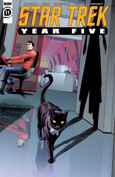
Serving as a sequel to the Star Trek season 2 finale “Assignment: Earth,” “Star Trek Year Five” #1 is an incredibly packed issue dealing with a laundry list of adversities to overcome within a hefty plot filled with layers of the subject matter. After another run-in with the Tholians, the crew of the Enterprise comes up against one of their former allies, Gary Seven. For newcomers, Gary Seven is a sort of interstellar secret agent who is deployed to change events in time and space. Using technology so advanced it comes across as something akin to magic, he is one of the most powerful beings to ever encounter Captain Kirk and co.
Having returned to the Enterprise with a mission of killing James Kirk amidst one of the most challenging moments in the history of the Federation, Gary Seven must carry out this task while, if ever so briefly, coming to terms with having to kill a man he respects. Issue #11 deals with time travel, diplomatic negotiations, romance, gender identity, species identity, and a good old fashioned heaping to space adventure. The script moves at a quick pace, feeling just as urgent as the plot suggests. We are given plenty of stories to chew on, but the dialogue, subtext, and plot are easily accessible without ever blowing past a detail or slogging through unnecessary exposition.
Lanzing and Kelly are masters of carrying on the canon of The Original Series. They know these characters and their story inside and out and the way they craft a plot that both honors the era in which the show originally aired and tells stories that are relevant to a 2020 audience can not be understated. Intricate plot threads are beautifully woven throughout each other. Because this series is giving us the final adventures of the initial five-year mission, we are getting closure that has been missing for over fifty years and leading us to connections between the original series (which ended in 1969), the 1973 animated series – which in a way served as season 4, and the crew’s reappearance in 1979’s Star Trek: The Motion Picture. This issue in particular is a standout in the current run and charges full steam ahead with incredible momentum, which is perfect for getting readers back into it after a few months off.
Stephen Thompson’s artwork should not be overlooked. He has painstakingly recreated the look of Star Trek, the ship looks like the original sets, character likenesses are spot-on. It truly is a feat to be reckoned with. With it being so common for artists to put their own spin on beloved characters, Thompson’s work on this book is exactly what a continuation of a t.v. series should be. It should look exactly like the show for a seamless leap from screen to page. The same goes for Charlie Kirchoff’s color work – absolutely flawless in terms of picking up where the show left off. This team is the perfect choice. This series has been a gift to fans, and an issue of this caliber is a reason for that.
Final Verdict: 8.5 – An outstanding issue that is doing a lot of heavy lifting in terms of story and canon continuation. It is everything a die-hard Trekkie could hope for.


